CSS3 flexbox弹性布局实例
常用例子
1.居中对齐
<!DOCTYPE html>

<head>

    <meta charset="utf-8">

    <style type="text/css">

        .flex-container{

            padding:;

            margin:;

            list-style:none;

            display:-webkit-box;

            display:-moz-box;

            display:-ms-flexbox;

            display:-webkit-flex;

            display:flex;

            -webkit-flex-flow:row nowrap;

            justify-content:space-around;

        }

        .flex-item{

            background:tomato;

            padding:5px;

            width:200px;

            height:150px;

            margin-top:10px;

            line-height:150px;

            color:white;

            font-weight:bold;

            font-size:3em;

            text-align:center

        }

    </style>

</head>

<body>

<ul class="flex-container">

   <li class="flex-item"></li>

    <li class="flex-item"></li>

    <li class="flex-item"></li>

    <li class="flex-item"></li>

    <li class="flex-item"></li>

    <li class="flex-item"></li>

</ul>

</body>

</html>
效果:

2.自适应导航
<!DOCTYPE html>

<head>

    <meta charset="utf-8">

    <style type="text/css">

        .navigation{

            list-style:none;

            margin:0;

            background:deepskyblue;

            display:-webkit-box;

            display:-moz-box;

            display:-ms-flexbox;

            display:-webkit-flex;

            display:flex;

            -webkit-flex-flow:row wrap;

            justify-content:flex-end

        }

        .navigation a{

            text-decoration:none;

            display:block;

            padding:1em;

            color:white

        }

        .navigation a:hover{

            background:#00AEE8

        }

        @media all and (max-width:800px){

            .navigation{justify-content:space-around}

        }

        @media all and (max-width:600px){

            .navigation{

                -webkit-flex-flow:column wrap;

                padding:0

            }

            .navigation a{

                text-align:center;

                padding:10px;

                border-top:1px solid rgba(255,255,255,0.3);

                border-bottom:1px solid rgba(0,0,0,0.1)}

            .navigation li:last-of-type a{border-bottom:none}

        }

    </style>

</head>

<body>

<ul class="navigation">

    <li><a href="#">Home</a></li>

    <li><a href="#">About</a></li>

    <li><a href="#">Products</a></li>

    <li><a href="#">Contact</a></li>

</ul>

</body>

</html>
效果:

/* Large */

.navigation {

  display: flex;

  flex-flow: row wrap;

  /* This aligns items to the end line on main-axis */

  justify-content: flex-end;

}

/* Medium screens */

@media all and (max-width: 800px) {

  .navigation {

    /* When on medium sized screens, we center it by evenly distributing empty space around items */

    justify-content: space-around;

  }

}

/* Small screens */

@media all and (max-width: 500px) {

  .navigation {

    /* On small screens, we are no longer using row direction but column */

    flex-direction: column;

  }

}
3.常见3栏移动优先布局
- 设置子元素从左到右,超出换行(flex-flow:row wrap;)。
- 默认情况下所有子元素拓展比例为1(flex-grow:1),伸缩比例为100%(flex-basis:100%)。
- 大于800px时,.main的拓展比例为2.伸缩值为0(flex-basis:0px),并且侧栏aside-1排列在第一位,main在第二位,aside-2在第三位。
- 大于600时。.aside元素的拓展比例为1(flex-grow:1),伸缩比例为auto(flex-basis:auto)。
<!DOCTYPE html>

<head>

    <meta charset="utf-8">

    <style type="text/css">

        .wrapper{

            display:-webkit-box;

            display:-moz-box;

            display:-ms-flexbox;

            display:-webkit-flex;

            display:flex;

            -webkit-flex-flow:row wrap;

            font-weight:bold;

            text-align:center

        }

        .wrapper > *{padding:10px;flex:1 100%}

        .header{background:tomato}

        .footer{background:lightgreen}

        .main{text-align:left;background:deepskyblue}

        .aside-1{background:gold}

        .aside-2{background:hotpink}

        @media all and (min-width:600px){.aside{flex:1 auto}

        }
         @media all and (min-width:800px){.main{flex:2 0px}

            .aside-1{order:1}

            .main{order:2}

            .aside-2{order:3}

            .footer{order:4}

        }

    </style>

</head>

<body>

<div class="wrapper">

    <header class="header">Header</header>

    <article class="main">

        <p>Pellentesque habitant morbi tristique senectus et netus et malesuada fames ac turpis egestas. Vestibulum tortor quam, feugiat vitae, ultricies eget, tempor sit amet, ante. Donec eu libero sit amet quam egestas semper. Aenean ultricies mi vitae est. Mauris placerat eleifend leo.</p>

    </article>

    <aside class="aside aside-1">Aside 1</aside>

    <aside class="aside aside-2">Aside 2</aside>

    <footer class="footer">Footer</footer>

</div>

</body>

</html>
效果:

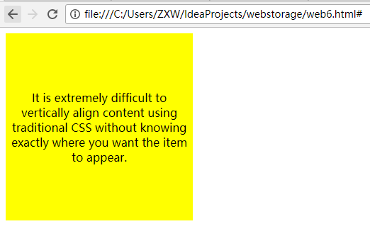
垂直居中对齐
<!DOCTYPE html>

<head>

    <meta charset="utf-8">

    <style type="text/css">

        著作权归作者所有。

        商业转载请联系作者获得授权,非商业转载请注明出处。

        链接:http://caibaojian.com/flexbox-example.html

                                 来源:http://caibaojian.com

                                           body {

                                               display: -webkit-flex;

                                               display: flex;

                                               flex-flow: column;

                                               -webkit-align-items: center;

                                               align-items: center;

                                               -webkit-justify-content: center;

                                               justify-content: center;

                                               width: %;

                                               height: %;

                                               background: lightgrey;

                                           }

        .content {

            /* also making content into a flex box so we can also vertically center its content */

            display: -webkit-flex;

            display: flex;

            -webkit-flex-flow: column;

            flex-flow: column;

            -webkit-justify-content: center;

            justify-content: center;

            text-align: center;

            width: 250px;

            height: 250px;

            padding: 7px;

            background: yellow;

        }

    </style>

</head>

<body>

<form>

    <body>

    <div class="content">

        <p>It is extremely difficult to vertically align content using traditional CSS without knowing exactly where you want the item to appear.

            </p>

    </div>

    </body>

</form>

</body>

</html>
博客帖子的典型页面布局
<!DOCTYPE html>

<head>

    <meta charset="utf-8">

    <style type="text/css">

        .post {

            display: flex;

            flex-flow: column wrap;

        }

        .post-meta {

            display: flex;

            flex-flow: row wrap;

            order: ;

        }

        .post-body {

            order: ;

        }

        .post-comments {

            order: ;

        }

        .comments-count {

            margin-left: auto;

        }

        .post-image {

            order: ;

            align-self: center;

        }

    </style>

</head>

<body>

<div class="post">

    <h1>This is my first blog post</h1>

    <div class="post-meta">

        <div class="author">Alex Cheng</div>

        <div class="datetime">-- : am</div>

        <div class="comments-count"> comments</div>

    </div>

    <div class="post-body">

        My first blog post.

    </div>

    <div class="post-image">

        <img src="http://placehold.it/500x200&text=1">

    </div>

    <div class="post-comments">

        <h3>Comments</h3>

        <ul>

            <li><div class="author">Bob</div><div>This is a good post.</div></li>

            <li><div class="autho">David</div><div>Good post.</div></li>

        </ul>

    </div>

</div>

</body>

</html>

2017-08-23 23:25:48
CSS3 flexbox弹性布局实例的更多相关文章
- css3 FlexBox 弹性布局
Flex 弹性布局 这个是css3中新添加的内容,现在已经支持所有的浏览器,利用Flex布局,可以简便.完整.响应式地实现各种页面布局. 注意:在设置 flex 后,子元素的flaot ,clear, ...
- CSS3中的Flexbox弹性布局(一)
CSS3引入了一种新的布局模式——Flexbox布局,即伸缩布局盒模型(Flexible Box),用来提供一个更加有效的方式制定.调整和分布一个容器里项目布局,即使它们的大小是未知或者动态的,这里简 ...
- CSS3中的Flexbox弹性布局(二)
flexbox详解 flexbox的出现是为了解决复杂的web布局,因为这种布局方式很灵活.容器的子元素可以任意方向进行排列.此属性目前处于非正式标准. flex布局模型不同于块和内联模型布局,块和内 ...
- CSS3之弹性布局
flexbox是CSS3提出的页面布局模块.flexbox可以把列表横向或者纵向排列,并且填满可以延伸到的空间.稍微复杂的布局可以通过嵌套flex container来实现. 利用flexbox可以方 ...
- 【RN - 基础】之FlexBox弹性布局
前言 弹性盒模型(The Flexible Box Module),又叫FlexBox,意为“弹性布局”,旨在通过弹性的方式来对齐和分布容器中内容的空间,使其能适应不同的屏幕,为盒装模型提供最大的灵活 ...
- CSS3 -- FlexBox(弹性盒子)
盒子模型 CSS中有一种基础设计模式叫盒模型,盒模型定义了Web页面中的元素如何来解析. 在盒模型中主要包括width.height.border.background.padding和margin这 ...
- Flexbox弹性布局
Flexbox,一种CSS3的布局模式,也叫做弹性盒子模型,用来为盒装模型提供最大的灵活性.最新版本兼容IE11+.firefox.safari.chrome.opera及移动端,但移动端ios7.1 ...
- Flexbox弹性布局,更优雅的布局
Flexbox,更优雅的布局 Flex 布局教程:语法篇 Flex 布局教程:实例篇 2009年,W3C提出了一种新的方案----Flex布局,可以简便.完整.响应式地实现各种页面布局.目前,它已经得 ...
- css flexbox 弹性布局
flexbox 即css flexible box layout. ie9及以下不支持flexbox. flex详细规范(https://www.w3.org/TR/css-flexbox/) 为什么 ...
随机推荐
- Gradle 学习笔记
配置 Gradle 的环境变量 export GRADLE_HOME=/opt/software/java/gradle-3.1 export PATH=\(PATH:\)GRADLE_HOME/bi ...
- 《SQL Server 2012 T-SQL基础》读书笔记 - 2.单表查询
Chapter 2 Single-Table Queries GROUP BY之后的阶段的操作对象就是组(可以把一组想象成很多行组成的)了,HAVING负责过滤掉一些组.分组后的COUNT(*)表示每 ...
- java创建对象方法列表
引用 不用构造方法也能创建对象 前言 java中对象创建的方法主要包括,1,使用new关键字,2.使用clone方法,3.反射机制,4.反序列化.其中1,3都会明确的显式的调用构造函数.2是在内存上对 ...
- Linux内核调试方法总结之dumpsys
dumpsys [用途]Android系统提供的dumpsys工具可以用来查看系统服务信息与状态. [使用说明] adb shell dumpsys <service> [<opti ...
- zabbix自定义模板监控oracle
zabbix服务器端安装:zabbix-3.2.6.tar.gzzabbix client端安装:zabbix-agent-3.2.6-1.x86_64.rpm 1.首先必须在目标机器安装zabbix ...
- Oracle-buffer cache、shared pool
http://blog.csdn.net/panfelix/article/details/38347059 buffer pool 和shared pool 详解 http://blog.csd ...
- day52—JavaScript拖拽事件的应用(自定义滚动条)
转行学开发,代码100天——2018-05-07 前面的记录里展示了JavaScript中鼠标拖拽功能,今天利用拖拽功能实现另一个应用场景——自定义滚动条(作为控制器)的用法. 常通过自定义滚动条控制 ...
- 去掉IE浏览器里的脚本控件提示
如果是你在网站制作网站让后进行测试,直接在IE浏览器中打开本地含有脚本或者ActiveX控件的页面时,IE就会弹出一个提示栏,说:”为了有利于保护安全性,Internet Explorer己限制此网页 ...
- VMware 虚拟化编程(1) — VMDK/VDDK/VixDiskLib/VADP 概念简析
目录 目录 VMDK VDDK VixDiskLib VADP VMDK VMDK(VMware's Virtual Machine Disk Format,VMware 虚拟磁盘格式):简单来说就是 ...
- 阶段1 语言基础+高级_1-3-Java语言高级_06-File类与IO流_05 IO字符流_7_字符输出流的续写和换行
追加写就是后面参数设置为true 加入换行符