WPF Expander style
<!--ExpanderStyle-->
<Style x:Key="ExpanderStyleOne" TargetType="{x:Type Expander}">
<Setter Property="Foreground" Value="#FF217cb5"/>
<Setter Property="FontFamily" Value="宋体" />
<Setter Property="FontSize" Value="14" />
<Setter Property="Background" Value="Transparent"/>
<Setter Property="HorizontalContentAlignment" Value="Stretch"/>
<Setter Property="VerticalContentAlignment" Value="Stretch"/>
<Setter Property="BorderBrush" Value="Transparent"/>
<Setter Property="BorderThickness" Value="0"/>
<Setter Property="Template">
<Setter.Value>
<ControlTemplate TargetType="{x:Type Expander}">
<Canvas Background="{TemplateBinding Background}" SnapsToDevicePixels="true">
<ToggleButton x:Name="HeaderSite"
Canvas.Top="0"
ContentTemplate="{TemplateBinding HeaderTemplate}"
ContentTemplateSelector="{TemplateBinding HeaderTemplateSelector}"
Content="{TemplateBinding Header}"
IsChecked="{Binding IsExpanded, Mode=TwoWay, RelativeSource={RelativeSource TemplatedParent}}"
Style="{DynamicResource ToggleButtonStyleOne}"/>
<Border x:Name="ExpandSite" HorizontalAlignment="{TemplateBinding HorizontalContentAlignment}"
VerticalAlignment="{TemplateBinding VerticalContentAlignment}"
Visibility="Collapsed"
Canvas.Top="56" Canvas.Left="0"
Focusable="false"
BorderBrush="{TemplateBinding BorderBrush}"
BorderThickness="{TemplateBinding BorderThickness}"
Width="{Binding ElementName=HeaderSite,Path=Width}"
Background="#FF6a8d9c">
<ContentPresenter Margin="0 0"
HorizontalAlignment="{TemplateBinding HorizontalContentAlignment}"
VerticalAlignment="{TemplateBinding VerticalContentAlignment}" />
</Border>
</Canvas>
<ControlTemplate.Triggers>
<Trigger Property="IsExpanded" Value="False">
<Setter Property="Visibility" TargetName="ExpandSite" Value="Visible"/>
</Trigger>
<Trigger Property="IsEnabled" Value="false">
<Setter Property="Foreground" Value="{DynamicResource {x:Static SystemColors.GrayTextBrushKey}}"/>
</Trigger>
</ControlTemplate.Triggers>
</ControlTemplate>
</Setter.Value>
</Setter>
</Style>
<Style x:Key="ToggleButtonStyleOne" TargetType="{x:Type ToggleButton}">
<Setter Property="FocusVisualStyle" Value="{x:Null}"/>
<Setter Property="Width" Value="285"/>
<Setter Property="Height" Value="56" />
<Setter Property="Background" Value="{DynamicResource ReviewGridbackground}" />
<Setter Property="Foreground" Value="#FF217cb5"/>
<Setter Property="FontSize" Value="14" />
<Setter Property="FontFamily" Value="宋体" />
<Setter Property="FontWeight" Value="Bold" />
<Setter Property="BorderThickness" Value="0"/>
<Setter Property="HorizontalContentAlignment" Value="Left"/>
<Setter Property="VerticalContentAlignment" Value="Center"/>
<Setter Property="Padding" Value="0 0"/>
<Setter Property="Template">
<Setter.Value>
<ControlTemplate TargetType="{x:Type ToggleButton}">
<Canvas Width="{TemplateBinding Width}" Height="{TemplateBinding Height}"
Background="{TemplateBinding Background}" SnapsToDevicePixels="True">
<Canvas x:Name="canvNormal" Visibility="Visible"
Width="{TemplateBinding Width}" Height="{TemplateBinding Height}"
Background="{TemplateBinding Background}" SnapsToDevicePixels="True" Canvas.Right="0">
<Button Width="235" Height="56" Opacity="0"/>
<Rectangle Width="15" Height="56" Fill="#4a5f6a" Canvas.Right="0"/>
<Image Source="../Image/1.PNG" Margin="235,0,0,0" Height="55" Width="15"/>
<!--<Path Data="M13.494,10.697l-3.497-3.6l-3.497,3.6L6.494,8.328l3.503-3.631l3.48,3.592L13.494,10.697z" Fill="#297eb4" Canvas.Right="4" Canvas.Top="15"/>
<Path Data="M13.494,10.697l-3.497-3.6l-3.497,3.6L6.494,8.328l3.503-3.631l3.48,3.592L13.494,10.697z" Fill="#297eb4" Canvas.Right="4" Canvas.Top="25"/>-->
<!--<Line X1="0" Y1="0" X2="0" Y2="15" Stroke="#297eb4" StrokeThickness="3"
Margin="6 10" StrokeDashArray="1" Canvas.Right="0"/>-->
<!--<Rectangle Width="{TemplateBinding Width}" Height="1" Canvas.Bottom="0" Fill="#FFbacfda" />-->
</Canvas>
<Canvas x:Name="canvChecked" Visibility="Hidden"
Width="{TemplateBinding Width}" Height="{TemplateBinding Height}"
Background="{TemplateBinding Background}" SnapsToDevicePixels="True" Canvas.Right="0">
<Button Width="235" Height="56" Opacity="0"/>
<Rectangle Width="15" Height="56" Fill="#4a5f6a" Canvas.Right="0"/>
<!--<Path Data="M13.494,10.697l-3.497-3.6l-3.497,3.6L6.494,8.328l3.503-3.631l3.48,3.592" Fill="#297eb4" Canvas.Right="4" Canvas.Top="8"/>
<Path Data="M13.494,10.697l-3.497-3.6l-3.497,3.6L6.494,8.328l3.503-3.631l3.48,3.592" Fill="#297eb4" Canvas.Right="4" Canvas.Top="15"/>-->
<Image Source="../Image/2.PNG" Margin="235,0,0,0" Height="55" Width="15"/>
<!--<Rectangle Width="{TemplateBinding Width}" Height="1" Canvas.Bottom="0" Fill="#FFbacfda" />-->
</Canvas>
<ContentPresenter HorizontalAlignment="{TemplateBinding HorizontalContentAlignment}"
Margin="{TemplateBinding Padding}"
RecognizesAccessKey="True"
SnapsToDevicePixels="{TemplateBinding SnapsToDevicePixels}"
VerticalAlignment="{TemplateBinding VerticalContentAlignment}"/>
</Canvas> <ControlTemplate.Triggers>
<!--<Trigger Property="IsPressed" Value="true">
<Setter Property="Background" Value="#FFd2e7f4" />
</Trigger>-->
<Trigger Property="IsChecked" Value="true">
<Setter Property="Visibility" TargetName="canvChecked" Value="Visible" />
<Setter Property="Visibility" TargetName="canvNormal" Value="Hidden" />
</Trigger>
<!--<Trigger Property="IsEnabled" Value="false">
<Setter Property="Foreground" Value="{DynamicResource {x:Static SystemColors.GrayTextBrushKey}}"/>
</Trigger>-->
</ControlTemplate.Triggers>
</ControlTemplate>
</Setter.Value>
</Setter>
</Style>
<Style x:Key="ExpanderStyleTwo" TargetType="{x:Type Expander}">
<Setter Property="Foreground" Value="#FF217cb5"/>
<Setter Property="FontFamily" Value="宋体" />
<Setter Property="FontSize" Value="14" />
<Setter Property="Background" Value="Transparent"/>
<Setter Property="HorizontalContentAlignment" Value="Stretch"/>
<Setter Property="VerticalContentAlignment" Value="Stretch"/>
<Setter Property="BorderBrush" Value="Transparent"/>
<Setter Property="BorderThickness" Value="0"/>
<Setter Property="Template">
<Setter.Value>
<ControlTemplate TargetType="{x:Type Expander}">
<Canvas Background="{TemplateBinding Background}" SnapsToDevicePixels="true">
<ToggleButton x:Name="HeaderSite"
Canvas.Top="0"
ContentTemplate="{TemplateBinding HeaderTemplate}"
ContentTemplateSelector="{TemplateBinding HeaderTemplateSelector}"
Content="{TemplateBinding Header}"
IsChecked="{Binding IsExpanded, Mode=TwoWay, RelativeSource={RelativeSource TemplatedParent}}"
Style="{DynamicResource ToggleButtonStyleTwo}"/>
<Border x:Name="ExpandSite" HorizontalAlignment="{TemplateBinding HorizontalContentAlignment}"
VerticalAlignment="{TemplateBinding VerticalContentAlignment}"
Visibility="Collapsed"
Canvas.Top="35" Canvas.Left="0"
Focusable="false"
BorderBrush="{TemplateBinding BorderBrush}"
BorderThickness="{TemplateBinding BorderThickness}"
Width="{Binding ElementName=HeaderSite,Path=Width}"
Background="#4a5f6a">
<ContentPresenter Margin="0 0"
HorizontalAlignment="{TemplateBinding HorizontalContentAlignment}"
VerticalAlignment="{TemplateBinding VerticalContentAlignment}" />
</Border>
</Canvas>
<ControlTemplate.Triggers>
<Trigger Property="IsExpanded" Value="False">
<Setter Property="Visibility" TargetName="ExpandSite" Value="Visible"/>
</Trigger>
<Trigger Property="IsEnabled" Value="false">
<Setter Property="Foreground" Value="{DynamicResource {x:Static SystemColors.GrayTextBrushKey}}"/>
</Trigger>
</ControlTemplate.Triggers>
</ControlTemplate>
</Setter.Value>
</Setter>
</Style>
<Style x:Key="ToggleButtonStyleTwo" TargetType="{x:Type ToggleButton}">
<Setter Property="FocusVisualStyle" Value="{x:Null}"/>
<Setter Property="Width" Value="250"/>
<Setter Property="Height" Value="56" />
<Setter Property="Background" Value="{DynamicResource ReviewGridbackground}" />
<Setter Property="Foreground" Value="#FF217cb5"/>
<Setter Property="FontSize" Value="14" />
<Setter Property="FontFamily" Value="宋体" />
<Setter Property="FontWeight" Value="Bold" />
<Setter Property="BorderThickness" Value="0"/>
<Setter Property="HorizontalContentAlignment" Value="Left"/>
<Setter Property="VerticalContentAlignment" Value="Center"/>
<Setter Property="Padding" Value="0 0"/>
<Setter Property="Template">
<Setter.Value>
<ControlTemplate TargetType="{x:Type ToggleButton}">
<Canvas Width="{TemplateBinding Width}" Height="{TemplateBinding Height}"
Background="{TemplateBinding Background}" SnapsToDevicePixels="True">
<Canvas x:Name="canvNormal" Visibility="Visible"
Width="{TemplateBinding Width}" Height="{TemplateBinding Height}"
Background="{TemplateBinding Background}" SnapsToDevicePixels="True" Canvas.Right="0">
<Button Width="250" Height="{TemplateBinding Height}" Opacity="0"/>
<!--<Rectangle Width="15" Height="35" Fill="#FFc7ebff" Canvas.Right="0"/>-->
<!--<Path Data="M13.494,10.697l-3.497-3.6l-3.497,3.6L6.494,8.328l3.503-3.631l3.48,3.592L13.494,10.697z" Fill="#297eb4" Canvas.Right="4" Canvas.Top="8"/>
<Path Data="M13.494,10.697l-3.497-3.6l-3.497,3.6L6.494,8.328l3.503-3.631l3.48,3.592L13.494,10.697z" Fill="#297eb4" Canvas.Right="4" Canvas.Top="15"/>-->
<!--<Line X1="0" Y1="0" X2="0" Y2="15" Stroke="#297eb4" StrokeThickness="3"
Margin="6 10" StrokeDashArray="1" Canvas.Right="0"/>-->
</Canvas>
<Canvas x:Name="canvChecked" Visibility="Hidden"
Width="{TemplateBinding Width}" Height="{TemplateBinding Height}"
Background="{TemplateBinding Background}" SnapsToDevicePixels="True" Canvas.Right="0">
<Button Width="250" Height="{TemplateBinding Height}" Opacity="0"/>
<!--<Rectangle Width="15" Height="35" Fill="#FFc7ebff" Canvas.Right="0"/>-->
<!--<Path Data="M13.494,10.697l-3.497-3.6l-3.497,3.6L6.494,8.328l3.503-3.631l3.48,3.592" Fill="#297eb4" Canvas.Right="4" Canvas.Top="8"/>
<Path Data="M13.494,10.697l-3.497-3.6l-3.497,3.6L6.494,8.328l3.503-3.631l3.48,3.592" Fill="#297eb4" Canvas.Right="4" Canvas.Top="15"/>-->
<!--<Image Source="image/1.PNG" Margin="228,-1,0,0"/>-->
<Rectangle Width="{TemplateBinding Width}" Height="1" Canvas.Bottom="0" Fill="#FFbacfda" />
</Canvas>
<ContentPresenter HorizontalAlignment="{TemplateBinding HorizontalContentAlignment}"
Margin="{TemplateBinding Padding}"
RecognizesAccessKey="True"
SnapsToDevicePixels="{TemplateBinding SnapsToDevicePixels}"
VerticalAlignment="{TemplateBinding VerticalContentAlignment}"/>
</Canvas> <!--<ControlTemplate.Triggers>
<Trigger Property="IsPressed" Value="true">
<Setter Property="Background" Value="#FFd2e7f4" />
</Trigger>
<Trigger Property="IsChecked" Value="true">
<Setter Property="Visibility" TargetName="canvChecked" Value="Visible" />
<Setter Property="Visibility" TargetName="canvNormal" Value="Hidden" />
</Trigger>
<Trigger Property="IsEnabled" Value="false">
<Setter Property="Foreground" Value="{DynamicResource {x:Static SystemColors.GrayTextBrushKey}}"/>
</Trigger>
</ControlTemplate.Triggers>-->
</ControlTemplate>
</Setter.Value>
</Setter>
</Style>
<Style x:Key="ExpanderStyleThree" TargetType="{x:Type Expander}">
<Setter Property="Foreground" Value="#FF217cb5"/>
<Setter Property="FontFamily" Value="宋体" />
<Setter Property="FontSize" Value="14" />
<Setter Property="Background" Value="Transparent"/>
<Setter Property="HorizontalContentAlignment" Value="Stretch"/>
<Setter Property="VerticalContentAlignment" Value="Stretch"/>
<Setter Property="BorderBrush" Value="Transparent"/>
<Setter Property="BorderThickness" Value="0"/>
<Setter Property="Template">
<Setter.Value>
<ControlTemplate TargetType="{x:Type Expander}">
<Canvas Background="{TemplateBinding Background}" SnapsToDevicePixels="true">
<ToggleButton x:Name="HeaderSite"
Canvas.Top="0"
ContentTemplate="{TemplateBinding HeaderTemplate}"
ContentTemplateSelector="{TemplateBinding HeaderTemplateSelector}"
Content="{TemplateBinding Header}"
IsChecked="{Binding IsExpanded, Mode=TwoWay, RelativeSource={RelativeSource TemplatedParent}}"
Style="{DynamicResource ToggleButtonStyleThree}"/>
<Border x:Name="ExpandSite" HorizontalAlignment="{TemplateBinding HorizontalContentAlignment}"
VerticalAlignment="{TemplateBinding VerticalContentAlignment}"
Visibility="Collapsed"
Canvas.Top="35" Canvas.Left="0"
Focusable="false"
BorderBrush="{TemplateBinding BorderBrush}"
BorderThickness="{TemplateBinding BorderThickness}"
Width="{Binding ElementName=HeaderSite,Path=Width}"
Background="#4a5f6a">
<ContentPresenter Margin="0 0"
HorizontalAlignment="{TemplateBinding HorizontalContentAlignment}"
VerticalAlignment="{TemplateBinding VerticalContentAlignment}" />
</Border>
</Canvas>
<ControlTemplate.Triggers>
<Trigger Property="IsExpanded" Value="False">
<Setter Property="Visibility" TargetName="ExpandSite" Value="Visible"/>
</Trigger>
<Trigger Property="IsEnabled" Value="false">
<Setter Property="Foreground" Value="{DynamicResource {x:Static SystemColors.GrayTextBrushKey}}"/>
</Trigger>
</ControlTemplate.Triggers>
</ControlTemplate>
</Setter.Value>
</Setter>
</Style>
<Style x:Key="ToggleButtonStyleThree" TargetType="{x:Type ToggleButton}">
<Setter Property="FocusVisualStyle" Value="{x:Null}"/>
<Setter Property="Width" Value="250"/>
<Setter Property="Height" Value="114" />
<Setter Property="Background" Value="{DynamicResource ReviewGridbackground}" />
<Setter Property="Foreground" Value="#FF217cb5"/>
<Setter Property="FontSize" Value="14" />
<Setter Property="FontFamily" Value="宋体" />
<Setter Property="FontWeight" Value="Bold" />
<Setter Property="BorderThickness" Value="0"/>
<Setter Property="HorizontalContentAlignment" Value="Left"/>
<Setter Property="VerticalContentAlignment" Value="Center"/>
<Setter Property="Padding" Value="0 0"/>
<Setter Property="Template">
<Setter.Value>
<ControlTemplate TargetType="{x:Type ToggleButton}">
<Canvas Width="{TemplateBinding Width}" Height="{TemplateBinding Height}"
Background="{TemplateBinding Background}" SnapsToDevicePixels="True">
<Canvas x:Name="canvNormal" Visibility="Visible"
Width="{TemplateBinding Width}" Height="{TemplateBinding Height}"
Background="{TemplateBinding Background}" SnapsToDevicePixels="True" Canvas.Right="0">
<Button Width="250" Height="{TemplateBinding Height}" Opacity="0"/>
<!--<Rectangle Width="15" Height="35" Fill="#FFc7ebff" Canvas.Right="0"/>-->
<!--<Path Data="M13.494,10.697l-3.497-3.6l-3.497,3.6L6.494,8.328l3.503-3.631l3.48,3.592L13.494,10.697z" Fill="#297eb4" Canvas.Right="4" Canvas.Top="8"/>
<Path Data="M13.494,10.697l-3.497-3.6l-3.497,3.6L6.494,8.328l3.503-3.631l3.48,3.592L13.494,10.697z" Fill="#297eb4" Canvas.Right="4" Canvas.Top="15"/>-->
<!--<Line X1="0" Y1="0" X2="0" Y2="15" Stroke="#297eb4" StrokeThickness="3"
Margin="6 10" StrokeDashArray="1" Canvas.Right="0"/>-->
</Canvas>
<Canvas x:Name="canvChecked" Visibility="Hidden"
Width="{TemplateBinding Width}" Height="{TemplateBinding Height}"
Background="{TemplateBinding Background}" SnapsToDevicePixels="True" Canvas.Right="0">
<Button Width="250" Height="{TemplateBinding Height}" Opacity="0"/>
<!--<Rectangle Width="15" Height="35" Fill="#FFc7ebff" Canvas.Right="0"/>-->
<!--<Path Data="M13.494,10.697l-3.497-3.6l-3.497,3.6L6.494,8.328l3.503-3.631l3.48,3.592" Fill="#297eb4" Canvas.Right="4" Canvas.Top="8"/>
<Path Data="M13.494,10.697l-3.497-3.6l-3.497,3.6L6.494,8.328l3.503-3.631l3.48,3.592" Fill="#297eb4" Canvas.Right="4" Canvas.Top="15"/>-->
<!--<Image Source="image/1.PNG" Margin="228,-1,0,0"/>-->
<Rectangle Width="{TemplateBinding Width}" Height="1" Canvas.Bottom="0" Fill="#4a5f6a" />
</Canvas>
<ContentPresenter HorizontalAlignment="{TemplateBinding HorizontalContentAlignment}"
Margin="{TemplateBinding Padding}"
RecognizesAccessKey="True"
SnapsToDevicePixels="{TemplateBinding SnapsToDevicePixels}"
VerticalAlignment="{TemplateBinding VerticalContentAlignment}"/>
</Canvas> <!--<ControlTemplate.Triggers>
<Trigger Property="IsPressed" Value="true">
<Setter Property="Background" Value="#FFd2e7f4" />
</Trigger>
<Trigger Property="IsChecked" Value="true">
<Setter Property="Visibility" TargetName="canvChecked" Value="Visible" />
<Setter Property="Visibility" TargetName="canvNormal" Value="Hidden" />
</Trigger>
<Trigger Property="IsEnabled" Value="false">
<Setter Property="Foreground" Value="{DynamicResource {x:Static SystemColors.GrayTextBrushKey}}"/>
</Trigger>
</ControlTemplate.Triggers>-->
</ControlTemplate>
</Setter.Value>
</Setter>
</Style>
使用Expander的示例:
 <Expander Name="ExpanderTools" Style="{DynamicResource ExpanderStyleOne}" IsExpanded="True" ExpandDirection="Down">

                    <Expander.Header>

                        <Grid Name="ExpanderToolsHeaderGrid">

                            <Grid.ColumnDefinitions>

                                <ColumnDefinition Width="2"/>

                                <ColumnDefinition Width="40"/>

                                <ColumnDefinition Width="40"/>

                                <ColumnDefinition Width="40"/>

                                <ColumnDefinition Width="40"/>

                                <ColumnDefinition Width="40"/>

                                <ColumnDefinition Width="40"/>

                                <ColumnDefinition Width="2"/>

                            </Grid.ColumnDefinitions>

                            <Grid.RowDefinitions>

                                <RowDefinition Height="5"/>

                                <RowDefinition Height="40"/>

                                <RowDefinition Height="5"/>

                                <RowDefinition/>

                            </Grid.RowDefinitions>

                            <ToggleButton Grid.Column="1" Grid.Row="1"  />

                            <ToggleButton Grid.Column="2" Grid.Row="1" />

                            <Button Grid.Column="3" Grid.Row="1"/>

                            <ToggleButton Grid.Column="4" Grid.Row="1" />

                            <ToggleButton Grid.Column="5" Grid.Row="1" />

                        </Grid>

                    </Expander.Header>

                    <Expander.Content>

                        <Grid Name="ExpanderToolsContentGrid" Background="#4a5f6a">

                            <Grid.ColumnDefinitions>

                                <ColumnDefinition Width="2"/>

                                <ColumnDefinition Width="40"/>

                                <ColumnDefinition Width="40"/>

                                <ColumnDefinition Width="40"/>

                                <ColumnDefinition Width="40"/>

                                <ColumnDefinition Width="40"/>

                                <ColumnDefinition Width="40"/>

                                <ColumnDefinition Width="2"/>

                            </Grid.ColumnDefinitions>

                            <Grid.RowDefinitions>

                                <RowDefinition Height="5"/>

                                <RowDefinition Height="40"/>

                                <RowDefinition Height="5"/>

                                <RowDefinition Height="40"/>

                                <RowDefinition Height="5"/>

                                <RowDefinition/>

                            </Grid.RowDefinitions>

                            <ToggleButton Grid.Column="1" Grid.Row="1" />

                            <ToggleButton Grid.Column="2" Grid.Row="1" />

                            <ToggleButton Grid.Column="3" Grid.Row="1" />

                            <ToggleButton Grid.Column="4" Grid.Row="1" />

                            <ToggleButton Grid.Column="5" Grid.Row="1" />

                            <ToggleButton Grid.Column="6" Grid.Row="1"/>

                            <ToggleButton Grid.Column="1" Grid.Row="3" />

                        </Grid>

                    </Expander.Content>

                </Expander>
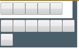
运行效果:
需要注意的是:Expander展开后,有可能会出现Expander内容区域范围到达其他内容区域时,显示其他区域的内容,造成交叉背景显示。
此时需要将被当区域控件的 Panel.ZIndex="-1" 该值设置为负数。
WPF Expander style的更多相关文章
- WPF 之 style文件的引用
总结一下WPF中Style样式的引用方法. 一.内联样式: 直接设置控件的Height.Width.Foreground.HorizontalAlignment.VerticalAlignment等属 ...
- WPF的Style的TargetType不同写法的异同
原文:WPF的Style的TargetType不同写法的异同 <Style TargetType="TextBlock"> <Setter Property=&q ...
- WPF Expander获得ToggleButton
原文:WPF Expander获得ToggleButton ToggleButton m_ToggleButton = this.Template.FindName("HeaderSite& ...
- WPF中Style文件的引用——使用xaml代码或者C#代码动态加载
原文:WPF中Style文件的引用--使用xaml代码或者C#代码动态加载 WPF中控件拥有很多依赖属性(Dependency Property),我们可以通过编写自定义Style文件来控制控件的外观 ...
- WPF 中style文件的引用
原文:WPF 中style文件的引用 总结一下WPF中Style样式的引用方法: 一,内联样式: 直接设置控件的Height.Width.Foreground.HorizontalAlignment. ...
- WPF整理-Style
"Consistency in a user interface is an important trait; there are many facets of consistency, ...
- [WPF] 为Style 里的button添加鼠标点击响应事件
一个TabControl, 用的是PagedTabControl style, 在style中有个button, button在style里已经写了click事件,但是现在还需要加上一段功能,就是在响 ...
- 继续聊WPF——Expander控件(2)
<Window x:Class="Expander_Sample2.Window1" xmlns="http://schemas.microsoft.com/win ...
- ControlTemplate in WPF —— Expander
<ResourceDictionary xmlns="http://schemas.microsoft.com/winfx/2006/xaml/presentation" x ...
- wpf 的style
<ResourceDictionary xmlns="http://schemas.microsoft.com/winfx/2006/xaml/presentation" x ...
随机推荐
- 表里不一--限制容器内存4G,free还是32G
前言 最近有个新同事问了我一个问题,明明通过limit给容器内存限制了4G,为什么进容器看到的还是宿主机的内存32G docker run -it --rm -m 512m ubuntu:18.04 ...
- 斐波那契数列(Java实现)
斐波那契数列 题目描述: 悲波那契数列(Fibonacci sequence)又称黄金分割数列,因数学家莱昂纳多·裴波那契(LeonardodaFibonacci)以兔子繁殖为例子而引入,故又称为&q ...
- 《前端运维》五、k8s--4机密信息存储与统一管理服务环境变量
一.储存机密信息 Secret 是 Kubernetes 内的一种资源类型,可以用它来存放一些机密信息(密码,token,密钥等).信息被存入后,我们可以使用挂载卷的方式挂载进我们的 Pod 内.当然 ...
- openEuler欧拉部署Harbor
一.系统优化 关闭防火墙 systemctl stop firewalld systemctl disable firewalld 二.安装Harbor wget https://github.co ...
- 鸿蒙应用开发从入门到入行 - 篇2:HarmonyOS开发快速基础入门
鸿蒙应用开发从入门到入行 第二天 - 开发工具与基础组件 导读:在本篇文章里,您将掌握鸿蒙开发工具DevEco的基本使用.ArkUI里的基础组件,并通过制作一个简单界面掌握使用 鸿蒙开发工具 - De ...
- Nlog基本使用
引入get包:NLog.Extensions.Logging 添加一个nlog.cofig文件 并设置属性,始终复制或较新则复制 <?xml version="1.0" en ...
- 首次公开,最新手机QQ客户端架构的技术演进实践
本文由腾讯技术何金源分享,原题"不畏移山,手机QQ技术架构升级变迁史",本文进行了排版和内容优化等. 1.引言 接上篇<总是被低估,从未被超越,揭秘QQ极致丝滑背后的硬核IM ...
- PyScript 使用(1)
今天按照官方文档进行pyscript的调用,发现paths下总是出现问题,于是调试了一下,问题解决了: # data.py import numpy as np def make_x_and_y(n) ...
- 【源码】Kafka订制协议如何处理粘拆包
前言 在上一篇随笔中,我们探讨了如何使用 Netty 处理自定义协议中的粘包和拆包问题.Netty 提供了高度封装的 API,帮助开发者轻松应对这一挑战,因此很多人都对其解决方案非常熟悉. 但如果我们 ...
- 并发编程之 ConcurrentLinkedQueue 源码
文章目录1 ConcurrentLinkedQueue的概述2 ConcurrentLinkedQueue的实现2.1 基本结构2.2 构造器2.2.1 ConcurrentLinkedQueue2. ...