WPF Expander style
<!--ExpanderStyle-->
<Style x:Key="ExpanderStyleOne" TargetType="{x:Type Expander}">
<Setter Property="Foreground" Value="#FF217cb5"/>
<Setter Property="FontFamily" Value="宋体" />
<Setter Property="FontSize" Value="14" />
<Setter Property="Background" Value="Transparent"/>
<Setter Property="HorizontalContentAlignment" Value="Stretch"/>
<Setter Property="VerticalContentAlignment" Value="Stretch"/>
<Setter Property="BorderBrush" Value="Transparent"/>
<Setter Property="BorderThickness" Value="0"/>
<Setter Property="Template">
<Setter.Value>
<ControlTemplate TargetType="{x:Type Expander}">
<Canvas Background="{TemplateBinding Background}" SnapsToDevicePixels="true">
<ToggleButton x:Name="HeaderSite"
Canvas.Top="0"
ContentTemplate="{TemplateBinding HeaderTemplate}"
ContentTemplateSelector="{TemplateBinding HeaderTemplateSelector}"
Content="{TemplateBinding Header}"
IsChecked="{Binding IsExpanded, Mode=TwoWay, RelativeSource={RelativeSource TemplatedParent}}"
Style="{DynamicResource ToggleButtonStyleOne}"/>
<Border x:Name="ExpandSite" HorizontalAlignment="{TemplateBinding HorizontalContentAlignment}"
VerticalAlignment="{TemplateBinding VerticalContentAlignment}"
Visibility="Collapsed"
Canvas.Top="56" Canvas.Left="0"
Focusable="false"
BorderBrush="{TemplateBinding BorderBrush}"
BorderThickness="{TemplateBinding BorderThickness}"
Width="{Binding ElementName=HeaderSite,Path=Width}"
Background="#FF6a8d9c">
<ContentPresenter Margin="0 0"
HorizontalAlignment="{TemplateBinding HorizontalContentAlignment}"
VerticalAlignment="{TemplateBinding VerticalContentAlignment}" />
</Border>
</Canvas>
<ControlTemplate.Triggers>
<Trigger Property="IsExpanded" Value="False">
<Setter Property="Visibility" TargetName="ExpandSite" Value="Visible"/>
</Trigger>
<Trigger Property="IsEnabled" Value="false">
<Setter Property="Foreground" Value="{DynamicResource {x:Static SystemColors.GrayTextBrushKey}}"/>
</Trigger>
</ControlTemplate.Triggers>
</ControlTemplate>
</Setter.Value>
</Setter>
</Style>
<Style x:Key="ToggleButtonStyleOne" TargetType="{x:Type ToggleButton}">
<Setter Property="FocusVisualStyle" Value="{x:Null}"/>
<Setter Property="Width" Value="285"/>
<Setter Property="Height" Value="56" />
<Setter Property="Background" Value="{DynamicResource ReviewGridbackground}" />
<Setter Property="Foreground" Value="#FF217cb5"/>
<Setter Property="FontSize" Value="14" />
<Setter Property="FontFamily" Value="宋体" />
<Setter Property="FontWeight" Value="Bold" />
<Setter Property="BorderThickness" Value="0"/>
<Setter Property="HorizontalContentAlignment" Value="Left"/>
<Setter Property="VerticalContentAlignment" Value="Center"/>
<Setter Property="Padding" Value="0 0"/>
<Setter Property="Template">
<Setter.Value>
<ControlTemplate TargetType="{x:Type ToggleButton}">
<Canvas Width="{TemplateBinding Width}" Height="{TemplateBinding Height}"
Background="{TemplateBinding Background}" SnapsToDevicePixels="True">
<Canvas x:Name="canvNormal" Visibility="Visible"
Width="{TemplateBinding Width}" Height="{TemplateBinding Height}"
Background="{TemplateBinding Background}" SnapsToDevicePixels="True" Canvas.Right="0">
<Button Width="235" Height="56" Opacity="0"/>
<Rectangle Width="15" Height="56" Fill="#4a5f6a" Canvas.Right="0"/>
<Image Source="../Image/1.PNG" Margin="235,0,0,0" Height="55" Width="15"/>
<!--<Path Data="M13.494,10.697l-3.497-3.6l-3.497,3.6L6.494,8.328l3.503-3.631l3.48,3.592L13.494,10.697z" Fill="#297eb4" Canvas.Right="4" Canvas.Top="15"/>
<Path Data="M13.494,10.697l-3.497-3.6l-3.497,3.6L6.494,8.328l3.503-3.631l3.48,3.592L13.494,10.697z" Fill="#297eb4" Canvas.Right="4" Canvas.Top="25"/>-->
<!--<Line X1="0" Y1="0" X2="0" Y2="15" Stroke="#297eb4" StrokeThickness="3"
Margin="6 10" StrokeDashArray="1" Canvas.Right="0"/>-->
<!--<Rectangle Width="{TemplateBinding Width}" Height="1" Canvas.Bottom="0" Fill="#FFbacfda" />-->
</Canvas>
<Canvas x:Name="canvChecked" Visibility="Hidden"
Width="{TemplateBinding Width}" Height="{TemplateBinding Height}"
Background="{TemplateBinding Background}" SnapsToDevicePixels="True" Canvas.Right="0">
<Button Width="235" Height="56" Opacity="0"/>
<Rectangle Width="15" Height="56" Fill="#4a5f6a" Canvas.Right="0"/>
<!--<Path Data="M13.494,10.697l-3.497-3.6l-3.497,3.6L6.494,8.328l3.503-3.631l3.48,3.592" Fill="#297eb4" Canvas.Right="4" Canvas.Top="8"/>
<Path Data="M13.494,10.697l-3.497-3.6l-3.497,3.6L6.494,8.328l3.503-3.631l3.48,3.592" Fill="#297eb4" Canvas.Right="4" Canvas.Top="15"/>-->
<Image Source="../Image/2.PNG" Margin="235,0,0,0" Height="55" Width="15"/>
<!--<Rectangle Width="{TemplateBinding Width}" Height="1" Canvas.Bottom="0" Fill="#FFbacfda" />-->
</Canvas>
<ContentPresenter HorizontalAlignment="{TemplateBinding HorizontalContentAlignment}"
Margin="{TemplateBinding Padding}"
RecognizesAccessKey="True"
SnapsToDevicePixels="{TemplateBinding SnapsToDevicePixels}"
VerticalAlignment="{TemplateBinding VerticalContentAlignment}"/>
</Canvas> <ControlTemplate.Triggers>
<!--<Trigger Property="IsPressed" Value="true">
<Setter Property="Background" Value="#FFd2e7f4" />
</Trigger>-->
<Trigger Property="IsChecked" Value="true">
<Setter Property="Visibility" TargetName="canvChecked" Value="Visible" />
<Setter Property="Visibility" TargetName="canvNormal" Value="Hidden" />
</Trigger>
<!--<Trigger Property="IsEnabled" Value="false">
<Setter Property="Foreground" Value="{DynamicResource {x:Static SystemColors.GrayTextBrushKey}}"/>
</Trigger>-->
</ControlTemplate.Triggers>
</ControlTemplate>
</Setter.Value>
</Setter>
</Style>
<Style x:Key="ExpanderStyleTwo" TargetType="{x:Type Expander}">
<Setter Property="Foreground" Value="#FF217cb5"/>
<Setter Property="FontFamily" Value="宋体" />
<Setter Property="FontSize" Value="14" />
<Setter Property="Background" Value="Transparent"/>
<Setter Property="HorizontalContentAlignment" Value="Stretch"/>
<Setter Property="VerticalContentAlignment" Value="Stretch"/>
<Setter Property="BorderBrush" Value="Transparent"/>
<Setter Property="BorderThickness" Value="0"/>
<Setter Property="Template">
<Setter.Value>
<ControlTemplate TargetType="{x:Type Expander}">
<Canvas Background="{TemplateBinding Background}" SnapsToDevicePixels="true">
<ToggleButton x:Name="HeaderSite"
Canvas.Top="0"
ContentTemplate="{TemplateBinding HeaderTemplate}"
ContentTemplateSelector="{TemplateBinding HeaderTemplateSelector}"
Content="{TemplateBinding Header}"
IsChecked="{Binding IsExpanded, Mode=TwoWay, RelativeSource={RelativeSource TemplatedParent}}"
Style="{DynamicResource ToggleButtonStyleTwo}"/>
<Border x:Name="ExpandSite" HorizontalAlignment="{TemplateBinding HorizontalContentAlignment}"
VerticalAlignment="{TemplateBinding VerticalContentAlignment}"
Visibility="Collapsed"
Canvas.Top="35" Canvas.Left="0"
Focusable="false"
BorderBrush="{TemplateBinding BorderBrush}"
BorderThickness="{TemplateBinding BorderThickness}"
Width="{Binding ElementName=HeaderSite,Path=Width}"
Background="#4a5f6a">
<ContentPresenter Margin="0 0"
HorizontalAlignment="{TemplateBinding HorizontalContentAlignment}"
VerticalAlignment="{TemplateBinding VerticalContentAlignment}" />
</Border>
</Canvas>
<ControlTemplate.Triggers>
<Trigger Property="IsExpanded" Value="False">
<Setter Property="Visibility" TargetName="ExpandSite" Value="Visible"/>
</Trigger>
<Trigger Property="IsEnabled" Value="false">
<Setter Property="Foreground" Value="{DynamicResource {x:Static SystemColors.GrayTextBrushKey}}"/>
</Trigger>
</ControlTemplate.Triggers>
</ControlTemplate>
</Setter.Value>
</Setter>
</Style>
<Style x:Key="ToggleButtonStyleTwo" TargetType="{x:Type ToggleButton}">
<Setter Property="FocusVisualStyle" Value="{x:Null}"/>
<Setter Property="Width" Value="250"/>
<Setter Property="Height" Value="56" />
<Setter Property="Background" Value="{DynamicResource ReviewGridbackground}" />
<Setter Property="Foreground" Value="#FF217cb5"/>
<Setter Property="FontSize" Value="14" />
<Setter Property="FontFamily" Value="宋体" />
<Setter Property="FontWeight" Value="Bold" />
<Setter Property="BorderThickness" Value="0"/>
<Setter Property="HorizontalContentAlignment" Value="Left"/>
<Setter Property="VerticalContentAlignment" Value="Center"/>
<Setter Property="Padding" Value="0 0"/>
<Setter Property="Template">
<Setter.Value>
<ControlTemplate TargetType="{x:Type ToggleButton}">
<Canvas Width="{TemplateBinding Width}" Height="{TemplateBinding Height}"
Background="{TemplateBinding Background}" SnapsToDevicePixels="True">
<Canvas x:Name="canvNormal" Visibility="Visible"
Width="{TemplateBinding Width}" Height="{TemplateBinding Height}"
Background="{TemplateBinding Background}" SnapsToDevicePixels="True" Canvas.Right="0">
<Button Width="250" Height="{TemplateBinding Height}" Opacity="0"/>
<!--<Rectangle Width="15" Height="35" Fill="#FFc7ebff" Canvas.Right="0"/>-->
<!--<Path Data="M13.494,10.697l-3.497-3.6l-3.497,3.6L6.494,8.328l3.503-3.631l3.48,3.592L13.494,10.697z" Fill="#297eb4" Canvas.Right="4" Canvas.Top="8"/>
<Path Data="M13.494,10.697l-3.497-3.6l-3.497,3.6L6.494,8.328l3.503-3.631l3.48,3.592L13.494,10.697z" Fill="#297eb4" Canvas.Right="4" Canvas.Top="15"/>-->
<!--<Line X1="0" Y1="0" X2="0" Y2="15" Stroke="#297eb4" StrokeThickness="3"
Margin="6 10" StrokeDashArray="1" Canvas.Right="0"/>-->
</Canvas>
<Canvas x:Name="canvChecked" Visibility="Hidden"
Width="{TemplateBinding Width}" Height="{TemplateBinding Height}"
Background="{TemplateBinding Background}" SnapsToDevicePixels="True" Canvas.Right="0">
<Button Width="250" Height="{TemplateBinding Height}" Opacity="0"/>
<!--<Rectangle Width="15" Height="35" Fill="#FFc7ebff" Canvas.Right="0"/>-->
<!--<Path Data="M13.494,10.697l-3.497-3.6l-3.497,3.6L6.494,8.328l3.503-3.631l3.48,3.592" Fill="#297eb4" Canvas.Right="4" Canvas.Top="8"/>
<Path Data="M13.494,10.697l-3.497-3.6l-3.497,3.6L6.494,8.328l3.503-3.631l3.48,3.592" Fill="#297eb4" Canvas.Right="4" Canvas.Top="15"/>-->
<!--<Image Source="image/1.PNG" Margin="228,-1,0,0"/>-->
<Rectangle Width="{TemplateBinding Width}" Height="1" Canvas.Bottom="0" Fill="#FFbacfda" />
</Canvas>
<ContentPresenter HorizontalAlignment="{TemplateBinding HorizontalContentAlignment}"
Margin="{TemplateBinding Padding}"
RecognizesAccessKey="True"
SnapsToDevicePixels="{TemplateBinding SnapsToDevicePixels}"
VerticalAlignment="{TemplateBinding VerticalContentAlignment}"/>
</Canvas> <!--<ControlTemplate.Triggers>
<Trigger Property="IsPressed" Value="true">
<Setter Property="Background" Value="#FFd2e7f4" />
</Trigger>
<Trigger Property="IsChecked" Value="true">
<Setter Property="Visibility" TargetName="canvChecked" Value="Visible" />
<Setter Property="Visibility" TargetName="canvNormal" Value="Hidden" />
</Trigger>
<Trigger Property="IsEnabled" Value="false">
<Setter Property="Foreground" Value="{DynamicResource {x:Static SystemColors.GrayTextBrushKey}}"/>
</Trigger>
</ControlTemplate.Triggers>-->
</ControlTemplate>
</Setter.Value>
</Setter>
</Style>
<Style x:Key="ExpanderStyleThree" TargetType="{x:Type Expander}">
<Setter Property="Foreground" Value="#FF217cb5"/>
<Setter Property="FontFamily" Value="宋体" />
<Setter Property="FontSize" Value="14" />
<Setter Property="Background" Value="Transparent"/>
<Setter Property="HorizontalContentAlignment" Value="Stretch"/>
<Setter Property="VerticalContentAlignment" Value="Stretch"/>
<Setter Property="BorderBrush" Value="Transparent"/>
<Setter Property="BorderThickness" Value="0"/>
<Setter Property="Template">
<Setter.Value>
<ControlTemplate TargetType="{x:Type Expander}">
<Canvas Background="{TemplateBinding Background}" SnapsToDevicePixels="true">
<ToggleButton x:Name="HeaderSite"
Canvas.Top="0"
ContentTemplate="{TemplateBinding HeaderTemplate}"
ContentTemplateSelector="{TemplateBinding HeaderTemplateSelector}"
Content="{TemplateBinding Header}"
IsChecked="{Binding IsExpanded, Mode=TwoWay, RelativeSource={RelativeSource TemplatedParent}}"
Style="{DynamicResource ToggleButtonStyleThree}"/>
<Border x:Name="ExpandSite" HorizontalAlignment="{TemplateBinding HorizontalContentAlignment}"
VerticalAlignment="{TemplateBinding VerticalContentAlignment}"
Visibility="Collapsed"
Canvas.Top="35" Canvas.Left="0"
Focusable="false"
BorderBrush="{TemplateBinding BorderBrush}"
BorderThickness="{TemplateBinding BorderThickness}"
Width="{Binding ElementName=HeaderSite,Path=Width}"
Background="#4a5f6a">
<ContentPresenter Margin="0 0"
HorizontalAlignment="{TemplateBinding HorizontalContentAlignment}"
VerticalAlignment="{TemplateBinding VerticalContentAlignment}" />
</Border>
</Canvas>
<ControlTemplate.Triggers>
<Trigger Property="IsExpanded" Value="False">
<Setter Property="Visibility" TargetName="ExpandSite" Value="Visible"/>
</Trigger>
<Trigger Property="IsEnabled" Value="false">
<Setter Property="Foreground" Value="{DynamicResource {x:Static SystemColors.GrayTextBrushKey}}"/>
</Trigger>
</ControlTemplate.Triggers>
</ControlTemplate>
</Setter.Value>
</Setter>
</Style>
<Style x:Key="ToggleButtonStyleThree" TargetType="{x:Type ToggleButton}">
<Setter Property="FocusVisualStyle" Value="{x:Null}"/>
<Setter Property="Width" Value="250"/>
<Setter Property="Height" Value="114" />
<Setter Property="Background" Value="{DynamicResource ReviewGridbackground}" />
<Setter Property="Foreground" Value="#FF217cb5"/>
<Setter Property="FontSize" Value="14" />
<Setter Property="FontFamily" Value="宋体" />
<Setter Property="FontWeight" Value="Bold" />
<Setter Property="BorderThickness" Value="0"/>
<Setter Property="HorizontalContentAlignment" Value="Left"/>
<Setter Property="VerticalContentAlignment" Value="Center"/>
<Setter Property="Padding" Value="0 0"/>
<Setter Property="Template">
<Setter.Value>
<ControlTemplate TargetType="{x:Type ToggleButton}">
<Canvas Width="{TemplateBinding Width}" Height="{TemplateBinding Height}"
Background="{TemplateBinding Background}" SnapsToDevicePixels="True">
<Canvas x:Name="canvNormal" Visibility="Visible"
Width="{TemplateBinding Width}" Height="{TemplateBinding Height}"
Background="{TemplateBinding Background}" SnapsToDevicePixels="True" Canvas.Right="0">
<Button Width="250" Height="{TemplateBinding Height}" Opacity="0"/>
<!--<Rectangle Width="15" Height="35" Fill="#FFc7ebff" Canvas.Right="0"/>-->
<!--<Path Data="M13.494,10.697l-3.497-3.6l-3.497,3.6L6.494,8.328l3.503-3.631l3.48,3.592L13.494,10.697z" Fill="#297eb4" Canvas.Right="4" Canvas.Top="8"/>
<Path Data="M13.494,10.697l-3.497-3.6l-3.497,3.6L6.494,8.328l3.503-3.631l3.48,3.592L13.494,10.697z" Fill="#297eb4" Canvas.Right="4" Canvas.Top="15"/>-->
<!--<Line X1="0" Y1="0" X2="0" Y2="15" Stroke="#297eb4" StrokeThickness="3"
Margin="6 10" StrokeDashArray="1" Canvas.Right="0"/>-->
</Canvas>
<Canvas x:Name="canvChecked" Visibility="Hidden"
Width="{TemplateBinding Width}" Height="{TemplateBinding Height}"
Background="{TemplateBinding Background}" SnapsToDevicePixels="True" Canvas.Right="0">
<Button Width="250" Height="{TemplateBinding Height}" Opacity="0"/>
<!--<Rectangle Width="15" Height="35" Fill="#FFc7ebff" Canvas.Right="0"/>-->
<!--<Path Data="M13.494,10.697l-3.497-3.6l-3.497,3.6L6.494,8.328l3.503-3.631l3.48,3.592" Fill="#297eb4" Canvas.Right="4" Canvas.Top="8"/>
<Path Data="M13.494,10.697l-3.497-3.6l-3.497,3.6L6.494,8.328l3.503-3.631l3.48,3.592" Fill="#297eb4" Canvas.Right="4" Canvas.Top="15"/>-->
<!--<Image Source="image/1.PNG" Margin="228,-1,0,0"/>-->
<Rectangle Width="{TemplateBinding Width}" Height="1" Canvas.Bottom="0" Fill="#4a5f6a" />
</Canvas>
<ContentPresenter HorizontalAlignment="{TemplateBinding HorizontalContentAlignment}"
Margin="{TemplateBinding Padding}"
RecognizesAccessKey="True"
SnapsToDevicePixels="{TemplateBinding SnapsToDevicePixels}"
VerticalAlignment="{TemplateBinding VerticalContentAlignment}"/>
</Canvas> <!--<ControlTemplate.Triggers>
<Trigger Property="IsPressed" Value="true">
<Setter Property="Background" Value="#FFd2e7f4" />
</Trigger>
<Trigger Property="IsChecked" Value="true">
<Setter Property="Visibility" TargetName="canvChecked" Value="Visible" />
<Setter Property="Visibility" TargetName="canvNormal" Value="Hidden" />
</Trigger>
<Trigger Property="IsEnabled" Value="false">
<Setter Property="Foreground" Value="{DynamicResource {x:Static SystemColors.GrayTextBrushKey}}"/>
</Trigger>
</ControlTemplate.Triggers>-->
</ControlTemplate>
</Setter.Value>
</Setter>
</Style>
使用Expander的示例:
 <Expander Name="ExpanderTools" Style="{DynamicResource ExpanderStyleOne}" IsExpanded="True" ExpandDirection="Down">

                    <Expander.Header>

                        <Grid Name="ExpanderToolsHeaderGrid">

                            <Grid.ColumnDefinitions>

                                <ColumnDefinition Width="2"/>

                                <ColumnDefinition Width="40"/>

                                <ColumnDefinition Width="40"/>

                                <ColumnDefinition Width="40"/>

                                <ColumnDefinition Width="40"/>

                                <ColumnDefinition Width="40"/>

                                <ColumnDefinition Width="40"/>

                                <ColumnDefinition Width="2"/>

                            </Grid.ColumnDefinitions>

                            <Grid.RowDefinitions>

                                <RowDefinition Height="5"/>

                                <RowDefinition Height="40"/>

                                <RowDefinition Height="5"/>

                                <RowDefinition/>

                            </Grid.RowDefinitions>

                            <ToggleButton Grid.Column="1" Grid.Row="1"  />

                            <ToggleButton Grid.Column="2" Grid.Row="1" />

                            <Button Grid.Column="3" Grid.Row="1"/>

                            <ToggleButton Grid.Column="4" Grid.Row="1" />

                            <ToggleButton Grid.Column="5" Grid.Row="1" />

                        </Grid>

                    </Expander.Header>

                    <Expander.Content>

                        <Grid Name="ExpanderToolsContentGrid" Background="#4a5f6a">

                            <Grid.ColumnDefinitions>

                                <ColumnDefinition Width="2"/>

                                <ColumnDefinition Width="40"/>

                                <ColumnDefinition Width="40"/>

                                <ColumnDefinition Width="40"/>

                                <ColumnDefinition Width="40"/>

                                <ColumnDefinition Width="40"/>

                                <ColumnDefinition Width="40"/>

                                <ColumnDefinition Width="2"/>

                            </Grid.ColumnDefinitions>

                            <Grid.RowDefinitions>

                                <RowDefinition Height="5"/>

                                <RowDefinition Height="40"/>

                                <RowDefinition Height="5"/>

                                <RowDefinition Height="40"/>

                                <RowDefinition Height="5"/>

                                <RowDefinition/>

                            </Grid.RowDefinitions>

                            <ToggleButton Grid.Column="1" Grid.Row="1" />

                            <ToggleButton Grid.Column="2" Grid.Row="1" />

                            <ToggleButton Grid.Column="3" Grid.Row="1" />

                            <ToggleButton Grid.Column="4" Grid.Row="1" />

                            <ToggleButton Grid.Column="5" Grid.Row="1" />

                            <ToggleButton Grid.Column="6" Grid.Row="1"/>

                            <ToggleButton Grid.Column="1" Grid.Row="3" />

                        </Grid>

                    </Expander.Content>

                </Expander>
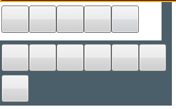
运行效果:
需要注意的是:Expander展开后,有可能会出现Expander内容区域范围到达其他内容区域时,显示其他区域的内容,造成交叉背景显示。
此时需要将被当区域控件的 Panel.ZIndex="-1" 该值设置为负数。
WPF Expander style的更多相关文章
- WPF 之 style文件的引用
总结一下WPF中Style样式的引用方法. 一.内联样式: 直接设置控件的Height.Width.Foreground.HorizontalAlignment.VerticalAlignment等属 ...
- WPF的Style的TargetType不同写法的异同
原文:WPF的Style的TargetType不同写法的异同 <Style TargetType="TextBlock"> <Setter Property=&q ...
- WPF Expander获得ToggleButton
原文:WPF Expander获得ToggleButton ToggleButton m_ToggleButton = this.Template.FindName("HeaderSite& ...
- WPF中Style文件的引用——使用xaml代码或者C#代码动态加载
原文:WPF中Style文件的引用--使用xaml代码或者C#代码动态加载 WPF中控件拥有很多依赖属性(Dependency Property),我们可以通过编写自定义Style文件来控制控件的外观 ...
- WPF 中style文件的引用
原文:WPF 中style文件的引用 总结一下WPF中Style样式的引用方法: 一,内联样式: 直接设置控件的Height.Width.Foreground.HorizontalAlignment. ...
- WPF整理-Style
"Consistency in a user interface is an important trait; there are many facets of consistency, ...
- [WPF] 为Style 里的button添加鼠标点击响应事件
一个TabControl, 用的是PagedTabControl style, 在style中有个button, button在style里已经写了click事件,但是现在还需要加上一段功能,就是在响 ...
- 继续聊WPF——Expander控件(2)
<Window x:Class="Expander_Sample2.Window1" xmlns="http://schemas.microsoft.com/win ...
- ControlTemplate in WPF —— Expander
<ResourceDictionary xmlns="http://schemas.microsoft.com/winfx/2006/xaml/presentation" x ...
- wpf 的style
<ResourceDictionary xmlns="http://schemas.microsoft.com/winfx/2006/xaml/presentation" x ...
随机推荐
- 精橙FPGA,一个承接FPGA代码设计的资深工程师团队。
一.我们是谁 精橙FPGA,一个承接FPGA代码设计的资深工程师团队. 二.服务内容 面向在校学生.职场工程师等人员,提供FPGA入门指导和FPGA代码设计外包服务. 三.业务范围 主要提供Xilin ...
- (二)Springboot + vue + 达梦数据库构建RBAC权限模型前后端分离脚手架保姆级教程(后端项目)
XX后台管理系统 Springboot + vue + dm8 的前后端分离项目,后端项目 https://spring.io https://start.aliyun.com 1. 创建项目 初始化 ...
- 让低版本gitlab焕新 —— 如何在低版本gitlab上实现高版本API功能
前言:本文主要记录了基于低版本gitlab(v3 api)实现in-line comment功能的过程中踩过的坑及相应的解决方案,理论上其他低版本gitlab不具备的API都可以参照此类方法进行实现( ...
- 【Amadeus原创】SQL Server查询某数据库所有表名行数和空间占用率
` select object_name(id) tablename, 8reserved/1024 reserved, rtrim(8dpages)+'kb' used, 8(reserved-dp ...
- node + vue 实现服务端单向推送消息,利用EventSource
场景:后台系统需要实时收到电池报警消息,并语音提醒,前台不需要发送任何东西,所以想的是,服务端单向推送 1. 实现EventSource参考博客: https://www.jqhtml.com/412 ...
- 2000 Star,是时候为我的开源项目更新下功能了
哈喽啊,我是阿朗,马上就要年末了,已经半年多没有更新文章了.年初定的计划早已经忘的一干二净.再不捡起来一点东西,就要2025年了. 要写点东西了. 你是一个博客撰写专家,你擅长开发领域,你喜欢使用通俗 ...
- HttpClientFactory in ASP.NET Core 2.1 Part 2:定义命名和类型化的客户端
HttpClientFactory in ASP.NET Core 2.1 Part 2:定义命名和类型化的客户端 原文地址:https://www.stevejgordon.co.uk/httpcl ...
- 解决用netty去做web服务时,post长度过大的问题
原文地址 http://my.oschina.net/momohuang/blog/114552 先说一下,本来是想自己写socket ,启动一个简单点的web服务用于接收数据的.写完之后,发现会有各 ...
- 第1章04节 | 常见开源OLAP技术架构对比
https://zhuanlan.zhihu.com/p/266402829 1. 什么是OLAP OLAP(On-line Analytical Processing,联机分析处理)是在基于数据仓库 ...
- kubernetes系列(九) - 深入掌握Service
1. Service概念 2. Service的类型 2.1 ClusterIP(默认) 2.1.1 原理 2.1.2 ClusterIP资源清单 2.2 NodePort 2.2.1 NodePor ...