bootstrap学习总结-02 网格布局
1 网格布局
Bootstrap 提供了一套响应式、移动设备优先的流式栅格系统,随着屏幕或视口(viewport)尺寸的增加,系统会自动分为最多12列。
<!DOCTYPE html>

<html>

    <head>

        <meta charset="utf-8" />

        <title></title>

        <link rel="stylesheet" href="css/index.css" />

        <meta name="viewport" content="width=device-width,initial-scale=1">

        <meta name="viewport" content="width=device-width, initial-scale=1, maximum-scale=1, user-scalable=no">

        <link rel="icon" href="./img/index.png">

        <link rel="stylesheet" href="http://cdn.bootcss.com/bootstrap/3.3.0/css/bootstrap.min.css">

        <!-- jQuery文件。务必在bootstrap.min.js 之前引入 -->

        <script src="http://cdn.bootcss.com/jquery/1.11.1/jquery.min.js"></script>

        <!-- 最新的 Bootstrap 核心 JavaScript 文件 -->

        <script src="http://cdn.bootcss.com/bootstrap/3.3.0/js/bootstrap.min.js"></script>

    </head>

    <body>

            <h1 class="page-header">使用<small>Bootstrap网格系统布局网页</small></h1>

            <p>

            </p>

            <h2 class="page-header">区块一</h2>

            <p>aaaaaaaaaaaaaaaaaaaaaaaaaaaa</p>

            <h2 class="page-header">区块二</h2>

            <p>bbbbbbbbbbbbbbbbbbbbbbbbbbb</p>

            <h2 class="page-header">区块三</h2>

            <p>cccccccccccccccccccccccccccccc</p>

    </body>

</html>
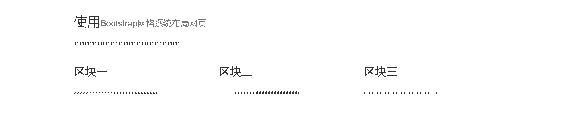
把显示的内容居中,分成三等份显示在同一排
<!DOCTYPE html>

<html>

    <head>

        <meta charset="utf-8" />

        <title></title>

        <link rel="stylesheet" href="css/index.css" />

        <meta name="viewport" content="width=device-width,initial-scale=1">

        <meta name="viewport" content="width=device-width, initial-scale=1, maximum-scale=1, user-scalable=no">

        <link rel="icon" href="./img/index.png">

        <link rel="stylesheet" href="http://cdn.bootcss.com/bootstrap/3.3.0/css/bootstrap.min.css">

        <!-- jQuery文件。务必在bootstrap.min.js 之前引入 -->

        <script src="http://cdn.bootcss.com/jquery/1.11.1/jquery.min.js"></script>

        <!-- 最新的 Bootstrap 核心 JavaScript 文件 -->

        <script src="http://cdn.bootcss.com/bootstrap/3.3.0/js/bootstrap.min.js"></script>

    </head>

    <body>

        <div class="container">

            <h1 class="page-header">使用<small>Bootstrap网格系统布局网页</small></h1>

            <p>

            </p>

            <div class="row">

                <div class="col-md-4">

                    <h2 class="page-header">区块一</h2>

                    <p>aaaaaaaaaaaaaaaaaaaaaaaaaaaa</p>

                </div>

                <div class="col-md-4">

                    <h2 class="page-header">区块二</h2>

                    <p>bbbbbbbbbbbbbbbbbbbbbbbbbbb</p>

                </div>

                <div class="col-md-4">

                    <h2 class="page-header">区块三</h2>

                    <p>cccccccccccccccccccccccccccccc</p>

                </div>

            </div>

        </div>

    </body>

</html>
知识点:
1)让显示的内容居中,使用css的class container.
container这个类设置了内容的宽度,并且让现实的内容居中。
2)把显示的内容显示在同一行,并且平均分为三份,需要使用css的class row
要在显示的内容上,添加网格的类。
显示的页面如下图:
2 嵌套布局
嵌套布局的网格宽度依赖于他的父网格的宽度。
<!DOCTYPE html>

<html>

    <head>

        <meta charset="utf-8" />

        <title></title>

        <link rel="stylesheet" href="css/index.css" />

        <meta name="viewport" content="width=device-width,initial-scale=1">

        <meta name="viewport" content="width=device-width, initial-scale=1, maximum-scale=1, user-scalable=no">

        <link rel="icon" href="./img/index.png">

        <link rel="stylesheet" href="http://cdn.bootcss.com/bootstrap/3.3.0/css/bootstrap.min.css">

        <!-- jQuery文件。务必在bootstrap.min.js 之前引入 -->

        <script src="http://cdn.bootcss.com/jquery/1.11.1/jquery.min.js"></script>

        <!-- 最新的 Bootstrap 核心 JavaScript 文件 -->

        <script src="http://cdn.bootcss.com/bootstrap/3.3.0/js/bootstrap.min.js"></script>

    </head>

    <body>

        <div class="container">

            <h1 class="page-header">使用<small>Bootstrap网格系统布局网页</small></h1>

            <p>

            </p>

            <div class="row">

                <div class="col-md-4">

                    <h2 class="page-header">区块一</h2>

                    <p>aaaaaaaaaaaaaaaaaaaaaaaaaaaa</p>

                </div>

                <div class="col-md-4">

                    <h2 class="page-header">区块二</h2>

                    <p>bbbbbbbbbbbbbbbbbbbbbbbbbbb</p>

                </div>

                <div class="col-md-4">

                    <h2 class="page-header">区块三</h2>

                    <p>cccccccccccccccccccccccccccccc</p>

                    <div class="row">

                        <div class="col-md-6">

                            <p>eeeee</p>

                        </div>

                        <div class="col-md-6">

                            <p>fffffff</p>

                        </div>

                    </div>

                </div>

            </div>

        </div>

    </body>

</html>
3 流式布局
将最外面的布局元素 .container 修改为 .container-fluid,就可以将固定宽度的栅格布局转换为 100% 宽度的布局。流动布局的内容会随着浏览器的大小进行自动缩放。
<!DOCTYPE html>

<html>

    <head>

        <meta charset="utf-8" />

        <title></title>

        <link rel="stylesheet" href="css/index.css" />

        <meta name="viewport" content="width=device-width,initial-scale=1">

        <meta name="viewport" content="width=device-width, initial-scale=1, maximum-scale=1, user-scalable=no">

        <link rel="icon" href="./img/index.png">

        <link rel="stylesheet" href="http://cdn.bootcss.com/bootstrap/3.3.0/css/bootstrap.min.css">

        <!-- jQuery文件。务必在bootstrap.min.js 之前引入 -->

        <script src="http://cdn.bootcss.com/jquery/1.11.1/jquery.min.js"></script>

        <!-- 最新的 Bootstrap 核心 JavaScript 文件 -->

        <script src="http://cdn.bootcss.com/bootstrap/3.3.0/js/bootstrap.min.js"></script>

    </head>

    <body>

        <div class="container-fluid">

            <h1 class="page-header">使用<small>Bootstrap网格系统布局网页</small></h1>

            <p>

            </p>

            <div class="row">

                <div class="col-md-4">

                    <h2 class="page-header">区块一</h2>

                    <p>aaaaaaaaaaaaaaaaaaaaaaaaaaaa</p>

                </div>

                <div class="col-md-4">

                    <h2 class="page-header">区块二</h2>

                    <p>bbbbbbbbbbbbbbbbbbbbbbbbbbb</p>

                </div>

                <div class="col-md-4">

                    <h2 class="page-header">区块三</h2>

                    <p>cccccccccccccccccccccccccccccc</p>

                    <div class="row">

                        <div class="col-md-6">

                            <p>eeeee</p>

                        </div>

                        <div class="col-md-6">

                            <p>fffffff</p>

                        </div>

                    </div>

                </div>

            </div>

        </div>

    </body>

</html>
4 响应式布局
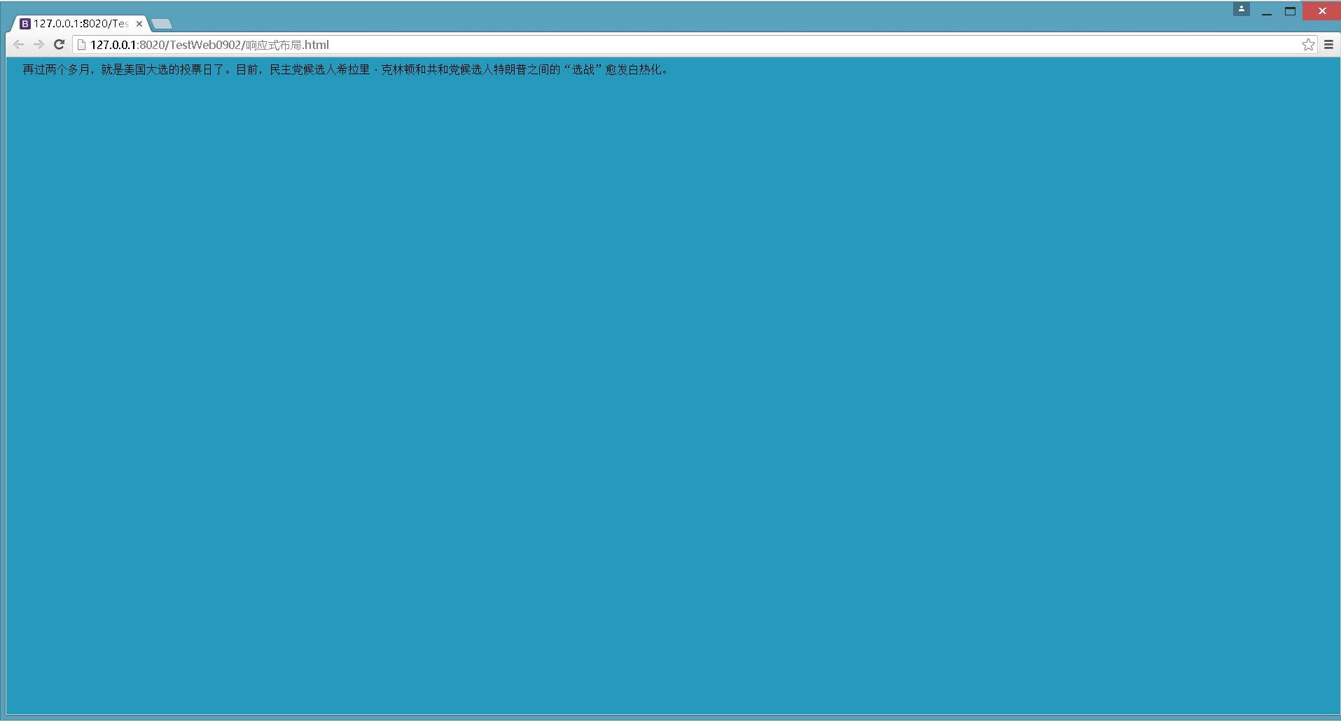
现在用户上网使用的设备都不一样,可能是大屏幕的桌面电脑,可能是平板电脑,或者是智能手机。这些上网设备的屏幕尺寸都不太一样。如果考虑显示在不同的页面的内容优化,可以考虑使用响应式布局的设计。
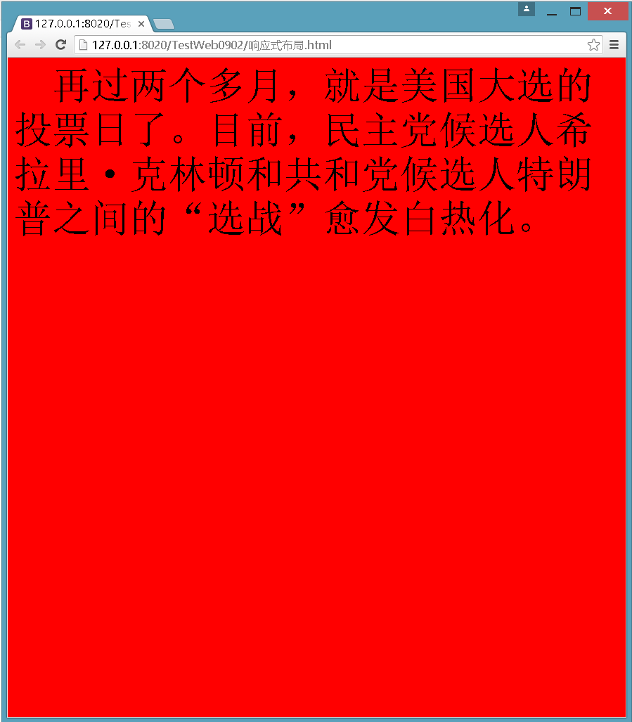
响应式布局是根据浏览器窗口的不同做出相应的变化。原理很简单使用了CSS3的media queries来判断浏览器窗口的尺寸。在CSS的样式表里去设置一些规则。当浏览器的尺寸大于或小于某个特定的尺寸时,使浏览器使用特定样式。 比如:页面宽度大于700像素时,文字大小变为55像素,背景颜色变为红色。
<style>
@media (min-width: 700px){

                body {

                    background-color: red;

                    font-size: 55px;

                }

}
</style>
@media (min-width: 700px){ 屏幕宽度 >= 768的设备 }
@media (max-width: 900){ 屏幕宽度 <=900的设备 }
响应式页面代码:
<!DOCTYPE html>

<html>

    <head>

        <meta charset="utf-8" />

        <title></title>

        <meta name="viewport" content="width=device-width,initial-scale=1">

        <meta name="viewport" content="width=device-width, initial-scale=1, maximum-scale=1, user-scalable=no">

        <style>

            body {

                background-color: #269ABC;

            }

            @media (min-width: 700px) and (max-width: 900px) {

                body {

                    background-color: red;

                    font-size: 55px;

                }

            }

        </style>

    </head>

    <body>

         再过两个多月,就是美国大选的投票日了。目前,民主党候选人希拉里·克林顿和共和党候选人特朗普之间的“选战”愈发白热化。

    </body>

</html>
当屏幕宽度大于700像素,小于900像素时,如下图所示:
当屏幕宽度大于700像素,小于900像素时,屏幕显示的内容发生了样式改变。
Bootstrap已经做好了响应式的布局设计。比如在桌面浏览器中,当最小宽度992px时,按照流式网格布局按照每行最多12列进行渲染页面。比如上面的流式网格布局,当屏幕宽度大于992像素时,如下图所示:
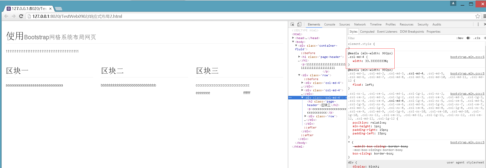
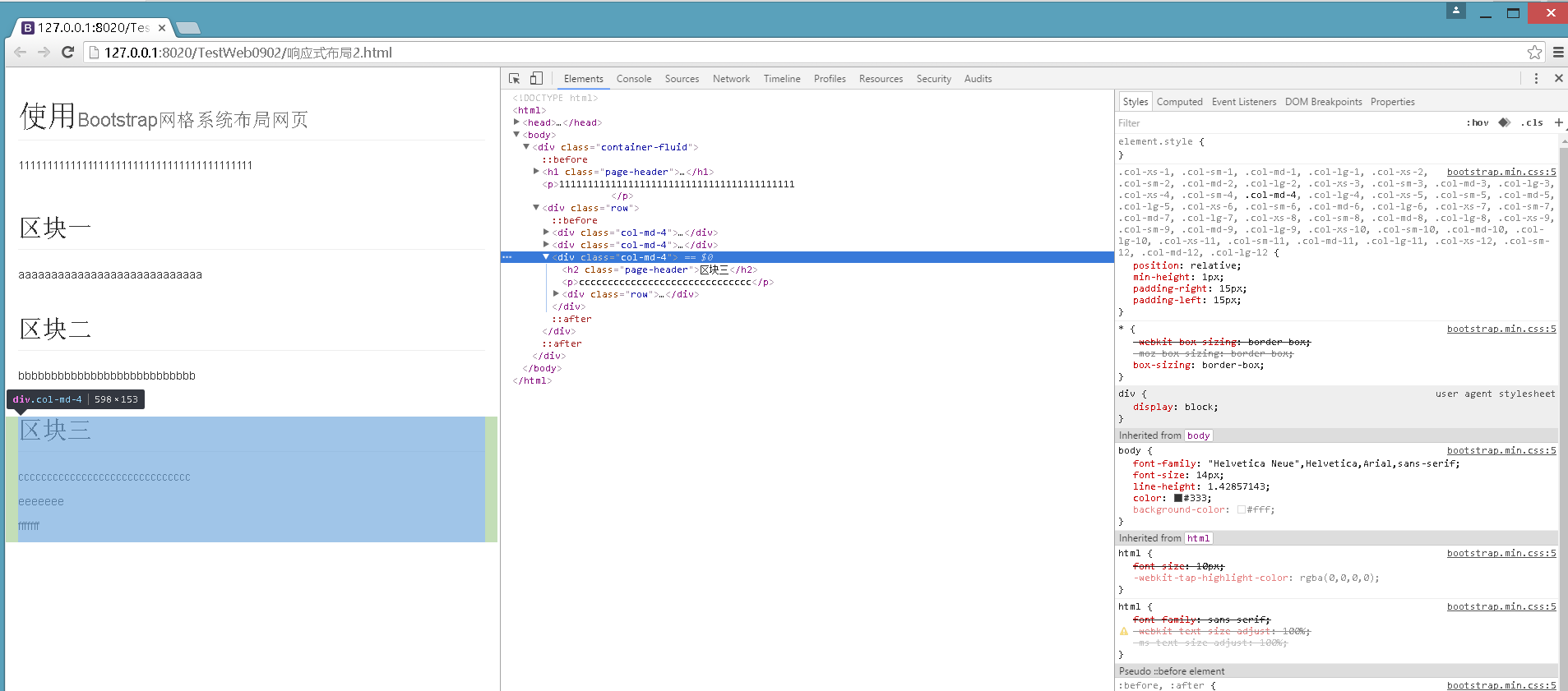
缩小屏幕宽度,当屏幕宽度小于992像素时,找不到对应的@media (min-width: 992px)规则,既当前选中元素的样式就发生了改变,如下图:
5 例子
<!DOCTYPE html>
<html>
<head>
<meta charset="utf-8" />
<title></title>
<link rel="stylesheet" href="css/index.css" />
<meta name="viewport" content="width=device-width,initial-scale=1">
<meta name="viewport" content="width=device-width, initial-scale=1, maximum-scale=1, user-scalable=no"> <link rel="icon" href="./img/index.png">
<link rel="stylesheet" href="http://cdn.bootcss.com/bootstrap/3.3.0/css/bootstrap.min.css"> <!-- jQuery文件。务必在bootstrap.min.js 之前引入 -->
<script src="http://cdn.bootcss.com/jquery/1.11.1/jquery.min.js"></script> <!-- 最新的 Bootstrap 核心 JavaScript 文件 -->
<script src="http://cdn.bootcss.com/bootstrap/3.3.0/js/bootstrap.min.js"></script>
</head> <body> <div class="container">
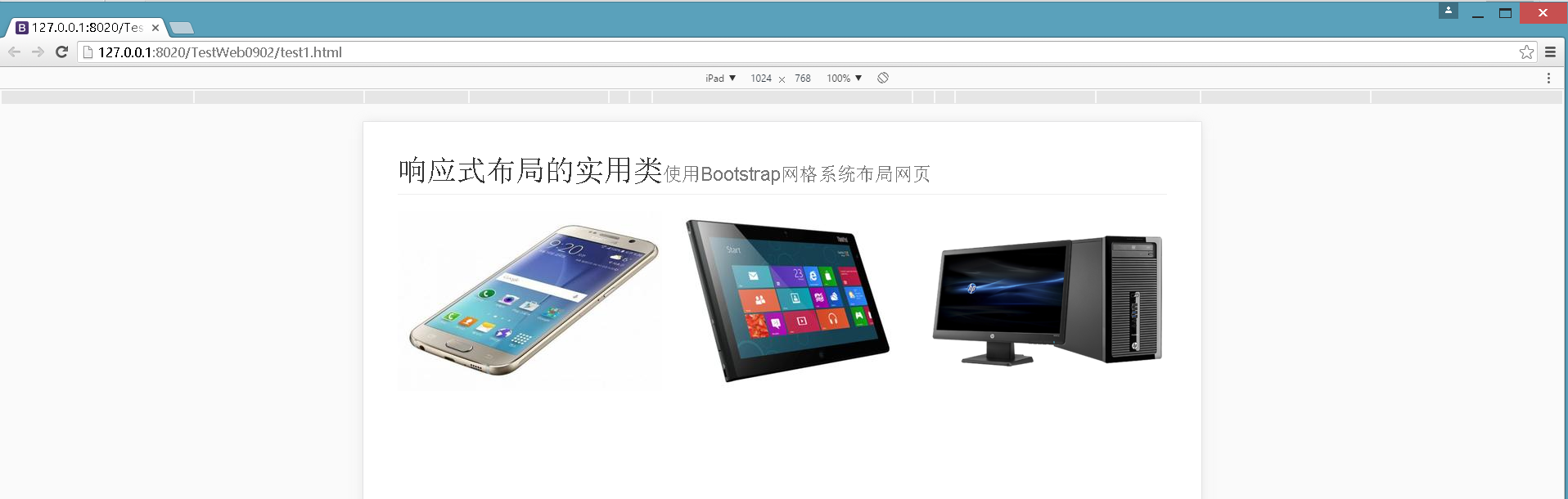
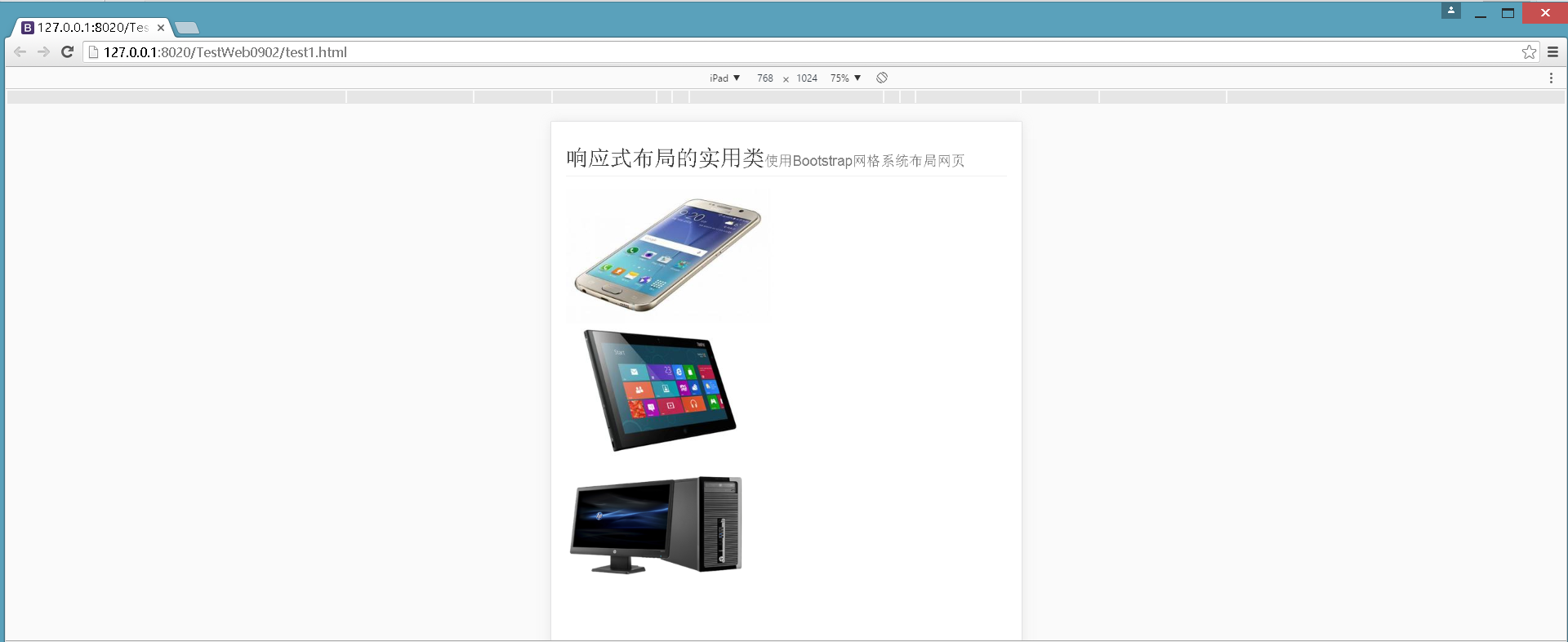
<h1 class="page-header">响应式布局的实用类<small>使用Bootstrap网格系统布局网页</small></h1>
<div class="row">
<div class="col-md-4" onclick="alert('phone')"><img src="img/phone.jpg" alt"智能手机"/></div>
<div class="col-md-4" onclick="alert('tablet')"><img src="img/tablet.jpg" alt"平板电脑"/></div>
<div class="col-md-4" onclick="alert('desktop')" ><img src="img/desktop.jpg" alt"桌面电脑"/></div>
</div>
</div>
</body> </html>
使用Ipad模拟器横向查看页面,如下图:
竖向显示页面如下图:
引用资料:
http://v3.bootcss.com/css/#grid
bootstrap学习总结-02 网格布局的更多相关文章
- 转:Bootstrap研究 精巧的网格布局系统
本网格布局系统属于Scaffolding(框架,布局)部分.在Scaffolding里面有(固定)网格布局(Grid System)和流式网格布局(Fluid Grid System).本文讨论第一种 ...
- Bootstrap3基础教程 02 网格布局
Bootstrap 提供了一套响应式.移动设备优先的流式网格系统,随着屏幕或视口(viewport)尺寸的增加,系统会自动分为最多列. 网页设计中的网格布局作用:组织内容,让网站易于浏览,并降低用户端 ...
- Bootstrap学习笔记-响应式布局原理
响应式布局的原理就是利用css3中@media媒体来实现的 <html> <head> <meta charset="utf-8"> <t ...
- 02网格布局Gridlayout
<span style="font-size:18px;"><?xml version="1.0" encoding="utf-8& ...
- Android零基础入门第32节:新推出的GridLayout网格布局
原文:Android零基础入门第32节:新推出的GridLayout网格布局 本期主要学习的是网格布局是Android 4.0新增的布局,和前面所学的TableLayout表格布局 有点类似,不过他有 ...
- 原生 CSS 网格布局学习笔记
下是来自Oliver Williams的帖子. Oliver已经学习了相当长时间的原生CSS网格,可以说是在CSS网格方面有一定的发言权.在这篇文章中,他将以非同寻常的思路分析自己的CSS网格布局学习 ...
- bootstrap学习笔记--bootstrap布局方式
Bootstrap 3 是移动设备优先的,在这个意义上,Bootstrap 代码从小屏幕设备(比如移动设备.平板电脑)开始,然后扩展到大屏幕设备(比如笔记本电脑.台式电脑)上的组件和网格. 移动设备优 ...
- Bootstrap系列 -- 10. 网格布局
一. 实现原理 网格布局是通过容器的大小,平均分为12份(可以修改),再调整内外边距,和表格布局有点类似但是也存在区别. 实现步骤如下: (1) 数据行.row 必须包含在容器.container 中 ...
- BootStrap网格布局
如何使用BootStrap样式 BootStrap与其他的开源库类似,直接引用它的css样式文件就可以使用了. <link rel="stylesheet" href=&qu ...
随机推荐
- C# 7.0 新特性2: 本地方法
本文参考Roslyn项目中的Issue:#259. 1. C# 7.0 新特性1: 基于Tuple的“多”返回值方法 2. C# 7.0 新特性2: 本地方法 3. C# 7.0 新特性3: 模式匹配 ...
- [转]Linux系统中‘dmesg’命令处理故障和收集系统信息的7种用法
'dmesg'命令显示linux内核的环形缓冲区信息,我们可以从中获得诸如系统架构.cpu.挂载的硬件,RAM等多个运行级别的大量的系统信息.当计算机启动时,系统内核(操作系统的核心部分)将会被加载到 ...
- express-partials与express4.x不兼容问题
在express中设置view engine为html,express-partials会导致语法不正确,其实只要做一行代码的改动就可以 function renderer(ext){ if(ext[ ...
- Linux 配置只安装 64 位软件包
Centos.RHEL等系统,yum 安装的时候有时候会安装32的,然而我们只需要安装64位的软件! 解决方法: yum只安装 64 位的包,只需在 /etc/yum.conf 中加入 "e ...
- Spring学习进阶 (三) Spring AOP
一.是什么AOP是Aspect Oriented Programing的简称,最初被译为“面向方面编程”:AOP通过横向抽取机制为无法通过纵向继承体系进行抽象的重复性代码提供了解决方案.比如事务的控制 ...
- git flow的使用
简介 Gitflow工作流程围绕项目发布定义了严格的分支模型.尽管它比Feature Branch Workflow更复杂一些,但它也为管理更大规模的项目提供了坚实的框架. 与Feature Bran ...
- ECharts图表中级入门之formatter:夜谈关于ECharts图表内的数据格式化方法
来源于:http://www.ithao123.cn/content-3751220.html 格式化之所以存在,主要是因为我们想把一些不够人性化的内容通过某种处理让其变得人性化,便于用户更好地理解内 ...
- SQL Server数据库转换成oracle
来源:http://blog.csdn.net/hzfu007/article/details/6182151 经常碰到需要把sql server的数据迁移到Oracle的情况. 在网上查找一下,有很 ...
- Android Retrofit网络请求Service,@Path、@Query、@QueryMap、@FieldMap (转)
GET请求 多个参数在URL问号之后,且个数不确定 http://api.stay4it.com/News?newsId=1&type=类型1- http://api.stay4it.com/ ...
- The resource identified by this request is only capable of generating responses with characteristics
[转]今天在调试springMVC的时候,在将一个对象返回为json串的时候,浏览器中出现异常: The resource identified by this request is only cap ...