
转:15 Best Responsive Web Design Testing Tools
Responsive Web Design is regarded as being the approach which suggests that web design and development should respond to the end-user’s behavior and environment based on their screen size, platform and orientation.
Responsiveness consists of a mix of flexible grids and layouts, images and an intelligent use of CSS media queries. When the end-user switches from their laptop over to their iPad, the website being viewed should automatically switch to accommodate that particular resolution, image size and scripting abilities.
In other words, the website should have the technology to automatically respond to the end-user’s preferences. This would eliminate the need for a different design and development phase every time a new gadget device is introduced on the market.
Along with all of the newest devices – also come varying screen resolutions, definitions and orientations. New devices with different screen resolutions are being developed every day, and each of these devices are able to handle variations in size, functionality as well as color.
With Responsiveness aimed at crafting sites to provide an optimal viewing experience, modern built web sites must now be able to support basic mobile devices that lack JavaScript. There are now many ways of validating and testing Responsive Web Designed websites, ranging from mobile site validators and mobile emulators to simultaneous testing tools.
In this article we would like to introduce our readers to several such tools by which to detect the Responsiveness of a website. Enjoy !
1. ProtoFluid 4
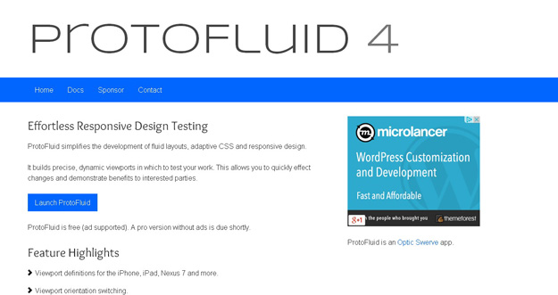
ProtoFluid simplifies the development of fluid layouts, adaptive CSS and responsive design. It builds precise, dynamic viewports in which to test your work. This allows you to quickly effect changes and demonstrate benefits to interested parties. It is free and lets you use other extensions like FireBug.
2. Viewport Resizer
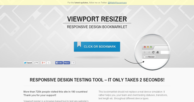
Viewport resizer is a browser-based tool to test any website’s responsiveness. Just save the bookmarklet, go to the page you want to test, click on your created bookmarklet and check all kinds of screen resolutions of the page. The smartest way to share your defined environment of devices and breakpoints directly with your team and client. However, this bookmarklet should not replace a real device simulation. It rather helps you, your team and client testing statuses, transitions, text length etc. throughout different device types.
3. Responsive.IS
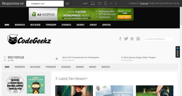
Responsive.Is is developed by TypeCast another impressive responsive design testing tool, which you can use to test your responsive design. Just type in a URL, and it will automatically change its size depending on the device you choose.
4. Respondr
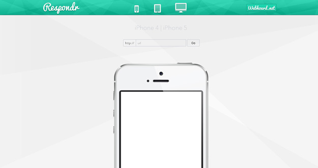
Respondr is a lightweight, pretty useful and handy tool that lets you test your websites on different devices. You need to enter the URL of the site/page that you want to test, and then select the device of your choice. You can select an iPhone, iPad, or desktop.
5. Froont
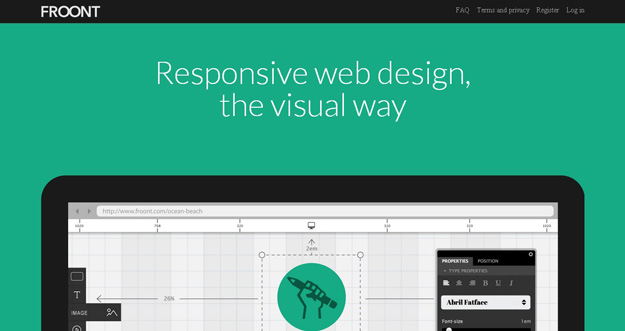
FROONT is a web-based design tool that runs in the browser and makes responsive web design accessible to all kinds of visual designers, even those without any coding skills.
FROONT makes responsive web design visual. Design can be done in-browser with intuitive drag-and-drop tools. After all, humans judge design with their eyes therefore it seems just normal to see right away how designs will look across all different screen sizes. Each project has its own URL,that makes it easy to test the designs on real devices right away.
6. Responsivepx
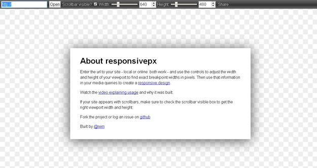
With responsivepx you need to Enter the url to your site – local or online: both work – and use the controls to adjust the width and height of your viewport to find exact breakpoint widths in pixels. Then use that information in your media queries to create a responsive design.
7. Responsive Web Design Testing Tool
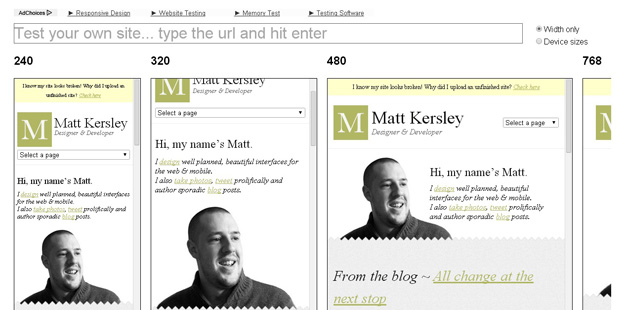
Responsive Web Design Testing tool has been built to help with testing your responsive websites while you design and build them.
8. Screenfly
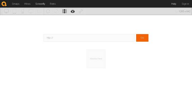
Screenfly lets you enter a URL to test, and then you choose phone, tablet, desktop, or TV. You can also enter a custom screensize, rotate the screen, and generate a URL to share with others for testing.
9. Review.js
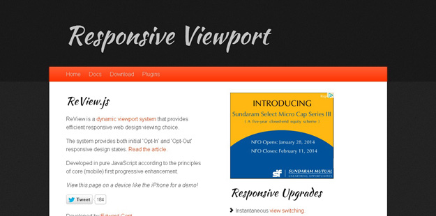
ReView is a dynamic viewport system that provides efficient responsive web design viewing choice. Developed in pure JavaScript according to the principles of core (mobile) first progressive enhancement. The system provides both initial ‘Opt-In’ and ‘Opt-Out’ responsive design states.
10. Responsinator
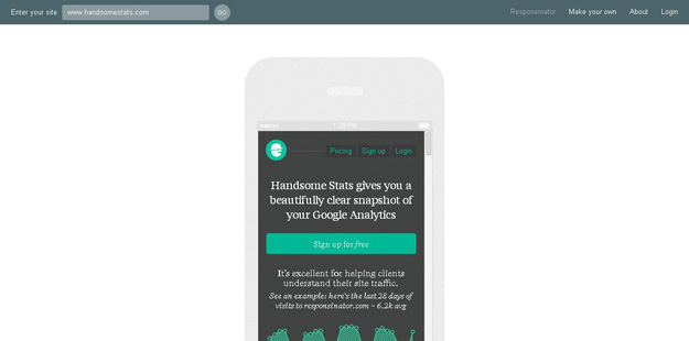
Responsinator helps website makers quickly get an indication of how their responsive site will look on the most popular devices Responsivator lets you test your web applications iphone and ipad, kindle and Android platform. It also shows your site both in portrait and landscape mode.
11. Resizemybrowser
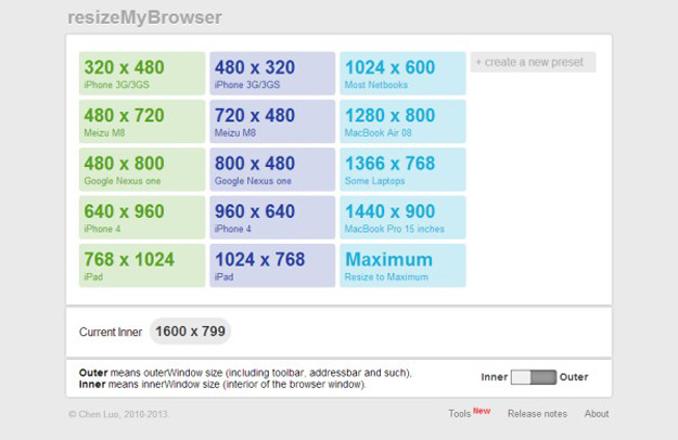
resizeMyBrowser allows you to choose the dimensions of your browser for testing. You can choose between 15 different presets, or you can enter your own custom screen sizes.
12. Responsive Design Bookmarklet
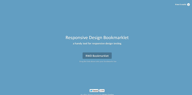
It’s a simple responsive design testing tool, you need to drag the bookmarklet above your bookmarks bar and it will be applied in your browser. You can then choose to preview the current page on screen widths the size of tablets and smartphones.
13. Adobe Edge Inspect CC
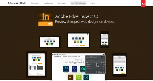
Adobe Edge lets you preview and inspect web designs on devices.
14. I am mobile
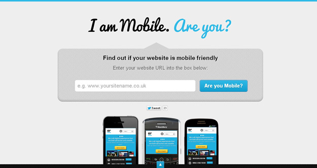
I am mobile is another good responsive design testing tool that test your web sites on various viewports and also gives you some tips to make your websites more mobile friendly.
15. Retina Images
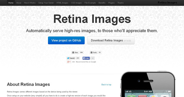
Retina Images serves different images based on the device being used by the viewer.
Once setup on your website (very simple!) all you have to do is create a high-res version of each image you would like optimized for retina screens and all the work is done for you. You don’t even need to change any img tags (providing they have a height or width).
原文来自于:http://codegeekz.com/responsive-web-design-testing-tools/
转:15 Best Responsive Web Design Testing Tools的更多相关文章
- Understanding Responsive Web Design: Cross-browser Compatibility
http://www.sitepoint.com/understanding-responsive-web-design-cross-browser-compatibility/ In the las ...
- 响应式Web设计(Responsive Web design)
中文名 响应式Web设计 提出时间 2010年5月 英 文 Responsive Web design 解 释 一个网站能够兼容多个终端 目 的 解决移动互联网的浏览 优 点 ...
- Responsive web design 学习笔记
Advanced Styling with Responsive Design 此笔记为Coursera同名课程笔记. Week1 什么是响应式设计? 响应式设计: It is designing y ...
- 自适应网页设计(Responsive Web Design)
引用:http://www.ruanyifeng.com/blog/2012/05/responsive_web_design.html 随着3G的普及,越来越多的人使用手机上网. 移动设备正超过桌面 ...
- 自适应网页设计(Responsive Web Design)(转)
随着3G的普及,越来越多的人使用手机上网. 移动设备正超过桌面设备,成为访问互联网的最常见终端.于是,网页设计师不得不面对一个难题:如何才能在不同大小的设备上呈现同样的网页? 手机的屏幕比较小,宽度通 ...
- (转)自适应网页设计(或称为响应式web设计)(Responsive Web Design)
随着3G的普及,越来越多的人使用手机上网. 移动设备正超过桌面设备,成为访问互联网的最常见终端.于是,网页设计师不得不面对一个难题:如何才能在不同大小的设备上呈现同样的网页? 手机的屏幕比较小,宽度通 ...
- 自适应网页设计(Responsive Web Design)(转)
作者: 阮一峰 出处:http://www.ruanyifeng.com/blog/2012/05/responsive_web_design.html 随着3G的普及,越来越多的人使用手机上网. 移 ...
- 阮一峰:自适应网页设计(Responsive Web Design)别名(响应式web设计)
随着3G的普及,越来越多的人使用手机上网. 移动设备正超过桌面设备,成为访问互联网的最常见终端.于是,网页设计师不得不面对一个难题:如何才能在不同大小的设备上呈现同样的网页? 手机的屏幕比较小,宽度通 ...
- [转]如何设计自适应屏幕大小的网页 Responsive Web Design
随着3G的普及,越来越多的人使用手机上网. 移动设备正超过桌面设备,成为访问互联网的最常见终端.于是,网页设计师不得不面对一个难题:如何才能在不同大小的设备上呈现同样的网页? 手机的屏幕比较小,宽度通 ...
随机推荐
- HDOJ 2117 Just a Numble(模拟除法)
Problem Description Now give you two integers n m, you just tell me the m-th number after radix poin ...
- Number Sequence - HDU 1711(KMP模板题)
题意:给你一个a串和一个b串,问b串是否是a串的子串,如果是返回b在a中最早出现的位置,否则输出-1 分析:应该是最简单的模板题了吧..... 代码如下: ==================== ...
- Navicat的快捷键
1.ctrl+q 打开查询窗口 2.ctrl+/ 注释sql语句 3.ctrl+shift +/ 解除注释 4.ctrl+r 运行查询窗口的sql语句 5.ctrl+shift+r 只运行选中的sql ...
- POJ 2001 Shortest Prefixes(字典树)
题目地址:POJ 2001 考察的字典树,利用的是建树时将每个点仅仅要走过就累加.最后从根节点開始遍历,当遍历到仅仅有1次走过的时候,就说明这个地方是最短的独立前缀.然后记录下长度,输出就可以. 代码 ...
- LeetCode Maximum Product Subarray 解题报告
LeetCode 新题又更新了.求:最大子数组乘积. https://oj.leetcode.com/problems/maximum-product-subarray/ 题目分析:求一个数组,连续子 ...
- [RxJS] Creation operator: create()
We have been using Observable.create() a lot in previous lessons, so let's take a closer look how do ...
- 子查询in和表连接效率
在数据查询时,尽量减少in子查询而使用表连接的方式进行,效率更高.
- js通用对象数组冒牌排序
数组对象通用 function sort(data, sortFiled, orderby) { var result = data, temp; for (var i = 0; i < res ...
- Chapter 7. Dependency Management Basics 依赖管理基础
This chapter introduces some of the basics of dependency management in Gradle. 7.1. What is dependen ...
- Tomcat 加入windows 服务自启动设置
基于J2ee技术开发,可以运行在Tomcat.weblogic.websphere等J2ee应用服务器上,对于一般访问量不是很高的客户我们推荐使用Tomcat(开源免费),一般情况下Tomcat服务需 ...