
css3小代码
1.三角
<!doctype html>

<html lang="en">

<head>

    <meta charset="UTF-8">

    <meta name="viewport" content="width=device-width,initial-scale=1,maximum-scale=1,minimum-scale=1,user-scalable=no"/>

    <meta name="format-detection" content="telphone=no, email=no"/>

    <meta name="apple-touch-fullscreen" content="yes"/>

    <meta name="apple-mobile-web-app-capable" content="yes"/>

    <meta name="apple-mobile-web-app-status-bar-style" content="black"/>

    <title>sanjiao</title>

    <style type="text/css">

        *{

            margin:0;

            padding:0;

        }

        .sanjiao{

            width: 0;

            height: 0;

            border-left: 50px solid transparent;

            border-right: 50px solid transparent;

            border-bottom: 100px solid red;

        }

        .sanjiao:hover{

            border-left: 50px solid transparent;

            border-right: 50px solid transparent;

            border-top: 100px solid red;

            transition: 5s all;

        }

        .arr_down_a{

            width: 0;

            height: 0;

            border-color:pink;

            display: block;

            border-left: 50px solid blue;

            border-right: 50px solid red;

            border-bottom: 100px solid yellow;

            border-top: 50px solid grey;

        }

        .test_a{

            width: 0;

            height: 0;

            display: block;

            border-left: 50px solid transparent;

            border-right: 50px solid transparent;

            border-bottom: none;

            border-top: 50px solid grey;

        }

        .triangle-bottomright {

            width: 0;

            height: 0;

            border-bottom: 100px solid red;

            border-left: 100px solid transparent;

        }

        .trans-scroll{

            width: 0;

            height: 0;

            display: block;

            margin-top: 60px;

            border-top: 6px solid #969696;

            border-left: 5px solid transparent;

            border-right: 5px solid transparent;

            border-bottom: 1px solid transparent;

        }

        .trans-scroll:hover{

            -moz-transform: rotate(180deg);

            -ms-transform: rotate(180deg);

            -o-transform: rotate(180deg);

            -webkit-transform: rotate(180deg);

            transform: rotate(180deg);

            transition: 500ms all;

        }

    </style>

</head>

<body>

<div class="sanjiao"></div>

<div class='arr_down_a'></div>

<div class='test_a' ></div>

<div class='triangle-bottomright' ></div>

<span class="trans-scroll"></span>

</body>

</html>
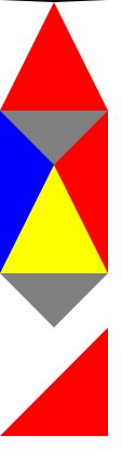
2.css兼容符号:
background:#ffc; /* 对firefox有效*/
*background:#ccc; /* 对ie7有效 */
_background:#000; /* 只对ie6有效 */
3.商品hover-animate
<!DOCTYPE html PUBLIC "-//W3C//DTD XHTML 1.0 Transitional//EN" "http://www.w3.org/TR/xhtml1/DTD/xhtml1-transitional.dtd">

<html xmlns="http://www.w3.org/1999/xhtml">

<head>

<meta http-equiv="Content-Type" content="text/html; charset=utf-8" />

<title>hover-animate</title>

<link rel="stylesheet" type="text/css" href="css/common.css"/>

    <style type="text/css">

        a{

            color: blueviolet;

        }

        .div-demo-box{

            padding: 20px;

        }

        .a-box{

            width: 290px;

            height: 250px;

            background-color: pink;

        }

        .a-box>img{

            display: block;

        }

        /*hover-animate 放大*/

        .hover-box{

            display: block;

            overflow: hidden;

        }

        .hover-box:hover .hover-animation {

          -webkit-transform: scale(1.05);

          -moz-transform: scale(1.05);

          -o-transform: scale(1.05);

          -ms-transform: scale(1.05);

          transform: scale(1.05);

          -webkit-transition: transform 1s ease;

          -moz-transition: transform 1s ease;

          -o-transition: transform 1s ease;

          -ms-transition: transform 1s ease;

          transition: transform 1s ease;

      }

      .hover-animation {

          -webkit-transform: scale(1);

          -moz-transform: scale(1);

          -o-transform: scale(1);

          -ms-transform: scale(1);

          transform: scale(1);

          -webkit-transition: transform 1s ease;

          -moz-transition: transform 1s ease;

          -o-transition: transform 1s ease;

          -ms-transition: transform 1s ease;

          transition: transform 1s ease;

      }

      /*hover-animate-shadow*/

      .hover-shadow {

          width: 100%;

          padding-top: 20px;

          padding-bottom: 20px;

          margin-bottom: 6px;

          border-bottom: #e3e2e2 solid 1px;

          box-shadow: 0 0 5px rgba(0, 0, 0, 0.1);

          background-color: pink;

      }

      .hover-shadow:after {

          clear: both;

          content: '';

          display: table;

      }

      /*@media only screen and (min-width: 320) {*/

          .hover-shadow {

            width: 286px;

            padding: 60px 10px 45px;

            margin-right: 10px;

            border-bottom: none;

            box-shadow: none;

            -webkit-transform: translate3d(0, 0, 0);

            -moz-transform: translate3d(0, 0, 0);

            -o-transform: translate3d(0, 0, 0);

            -ms-transform: translate3d(0, 0, 0);

            transform: translate3d(0, 0, 0);

            -webkit-transition: transform 0.3s ease;

            -moz-transition: transform 0.3s ease;

            -o-transition: transform 0.3s ease;

            -ms-transition: transform 0.3s ease;

            transition: transform 0.3s ease;

        }

        .hover-shadow:hover {

            box-shadow: 0 15px 30px rgba(0, 0, 0, 0.1);

            -webkit-transform: translate3d(0, -2px, 0);

            -moz-transform: translate3d(0, -2px, 0);

            -o-transform: translate3d(0, -2px, 0);

            -ms-transform: translate3d(0, -2px, 0);

            transform: translate3d(0, -2px, 0);

            -webkit-transition: transform 0.3s ease;

            -moz-transition: transform 0.3s ease;

            -o-transition: transform 0.3s ease;

            -ms-transition: transform 0.3s ease;

            transition: transform 0.3s ease;

        }

        /*商品题目+简介布局     */

        .brick-img{

            width: 100%;

            padding:0 40px;

            *width: 236px; /*IE7*/

            *margin: 0 auto;

            *padding: 0;

            display: block;

            box-sizing: border-box;

        }

        .brick-title {

          text-align: center;

          color: #141414;

          font-size: 1.6rem;

          margin-top: 12px;

          line-height: 20px;

        /*control text 1 line ...*/

          text-overflow: ellipsis;

          display: -webkit-box;

          -webkit-line-clamp: 1;

          -webkit-box-orient: vertical;

          overflow: hidden;

          text-align: center;

          height: 1.8rem;

      }

      .brick-desc {

          text-align: center;

          color: #a0a0a0;

          font-size: 12px;

          font-size: 0.75rem;

          line-height: 18px;

          margin-top: 4px;

           text-overflow: ellipsis;

          display: -webkit-box;

          -webkit-line-clamp: 2;

          -webkit-box-orient: vertical;

          overflow: hidden;

          text-align: center;

          height: 2.8rem;

      }

    </style>

</head>

<body>

<div class="div-demo-box">

    <h2>hover-animate

</h2>

<a href="javascript:void(0)" class="a-box hover-box">

    <img src="data:images/cris_ban_01.jpg" alt="" class="hover-animation" />

</a>

<!-- pc商品 -->

<div class="brick-box hover-shadow margin-top20">

  <a href="javascript:void(0)" class="display-block">

    <img src="data:images/cris_ban_01.jpg" alt="" class="brick-img" />

    <h3 class="brick-title">题目题目</h3>

    <p class="brick-desc">标题标题标题标题标题标题标题标题标题标题标题标题标题标题标题标题标题标题标题标题标题标题标题标题标题标题标题标题标题标题</p>

 </a>

</div>

</div>

</body>

</html>
css3小代码的更多相关文章
- 【processing】小代码
今天无意间发现的processing 很有兴趣 实现很简洁 void setup(){ } void draw(){ background(); && mouseY > heig ...
- 小代码编写神器:LINQPad 使用入门
原文:小代码编写神器:LINQPad 使用入门 一:概述 1:想查看程序运行结果,又不想启动 VS 怎么办? 2:想测试下自己的 C# 能力,不使用 VS 的智能感知,怎么办? 那么,我们有一个选择, ...
- 几个常用的CSS3样式代码以及不兼容的解决办法
原文:几个常用的CSS3样式代码以及不兼容的解决办法 border-radius实现圆角效果 CSS3代码: -webkit-border-radius:10px; -moz-border-radiu ...
- Python小代码_2_格式化输出
Python小代码_2_格式化输出 name = input("name:") age = input("age:") job = input("jo ...
- Python小代码_1_九九乘法表
Python小代码_1_九九乘法表 max_num = 9 row = 1 while row <= max_num: col = 1 while col <= row: print(st ...
- 简单的Java逻辑小代码(打擂台,冒泡排序,水仙花数,回文数,递归)
1.打擂台 简单的小代码,打擂台.纪念下过去,祝福下新人. public static void main(String[] args){ int[] ld = {1,4,2,10,8,9,5}; i ...
- python的mysql小代码
我因为懒,就想写个批量insert数据的小代码 这里是代码 # _*_ encoding:utf-8 _*_ import os import MySQLdb import numpy as np d ...
- 一段小代码秒懂C++右值引用和RVO(返回值优化)的误区
关于C++右值引用的参考文档里面有明确提到,右值引用可以延长临时变量的周期.如: std::string&& r3 = s1 + s1; // okay: rvalue referen ...
- css3 小图标提示特效
最近的计划,就是每天来几个特效,当然这里有限制,在什么候选区只能放一个,还每天有限制发布的,哎, 啊 终于写完了,看到一个挺好玩的东西,想到能不能用网页的特效做出来,试试呗!不过,一想肯东有很多的 相 ...
随机推荐
- 109 Convert Sorted List to Binary Search Tree 有序链表转换二叉搜索树
给定一个单元链表,元素按升序排序,将其转换为高度平衡的BST.对于这个问题,一个高度平衡的二叉树是指:其中每个节点的两个子树的深度相差不会超过 1 的二叉树.示例:给定的排序链表: [-10, -3, ...
- 101 Symmetric Tree 判断一颗二叉树是否是镜像二叉树
给定一个二叉树,检查它是否是它自己的镜像(即,围绕它的中心对称).例如,这个二叉树 [1,2,2,3,4,4,3] 是对称的. 1 / \ 2 2 / \ / \3 4 4 3但是 ...
- jQuery插件pagination.js源码解读
pagination的github地址:https://github.com/gbirke/jquery_pagination 公司用的是1.2的版本,所以我就读1.2的了. jQuery.fn.pa ...
- Java之构造方法及this、super关键字
有关构造方法的理解: 需要对对象的数据进行初始化,则创建一个构造方法,此方法名字和类名一样,但是没有返回值(类型和具体的值都没,但是可以写return;).构造方法是用来创建对象的,所以是不能被对象调 ...
- Spring MVC 入门实例报错404的解决方案
若启动服务器控制台报错,并且是未找到xml配置文件,初始化DispatchServlet失败,或者控制台未报错404,那么: 1.URL的排查: 格式-----------协议名://地址:端口号/上 ...
- functools模块中的函数
Python自带的functools模块提供了一些常用的高阶函数,也就是用于处理其它函数的特殊函数.换言之,就是能使用该模块对可调用对象进行处理.functools模块函数概览functools.cm ...
- mysql> set sql_mode='no_auto_value_on_zero';
mysql> set sql_mode='no_auto_value_on_zero';
- java代码(ascii与字母互转)
package test; /** * Java中将一个字符与对应Ascii码互转 * 1 byte = 8bit 可以表示 0-127 */ public class GetCharAscii { ...
- React学习实例总结,包含yeoman安装、webpack构建
1.安装yeoman 在安装nodeJs的基础上,输入命令:npm install -g yo grunt-cli bower,安装yeoman,grunt,bowerify 安装完成后,输入命令:y ...
- Django 表增加外键
1.创建临时表,并把原表的数据复制到临时表 先根据python manage syl article查看创建临时表 CREATE TABLE `article_article_temp` ( `id` ...