纯CSS画三角形(带边框)
实例一:
<!DOCTYPE html>

<html lang="en">

<head>

    <meta charset="UTF-8">

    <title>Title</title>

</head>

<style>

    .find-div-body{

        position: relative;

        top:30px;

        right:0px;

        width:400px;

        height:200px;

        padding:8px;

        background-color: #FFFFFF;

        border: #cccccc solid 1px;

        border-radius: 3px;

    }

    .find-div-body:before{

        box-sizing: content-box;

        width: 0px;

        height: 0px;

        position: absolute;

        top: -16px;;

        right:41px;

        padding:0;

        border-bottom:8px solid #FFFFFF;

        border-top:8px solid transparent;

        border-left:8px solid transparent;

        border-right:8px solid transparent;

        display: block;

        content:'';

        z-index: 12;

    }

    .find-div-body:after{

        box-sizing: content-box;

        width: 0px;

        height: 0px;

        position: absolute;

        top: -18px;;

        right:40px;

        padding:0;

        border-bottom:9px solid #cccccc;

        border-top:9px solid transparent;

        border-left:9px solid transparent;

        border-right:9px solid transparent;

        display: block;

        content:'';

        z-index:10

    }

</style>

<body>

    <div class="find-div-body">

</div>

</body>

</html>
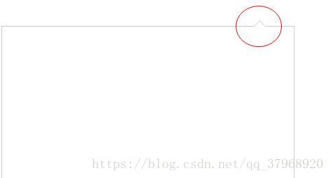
实现的效果如下图:
实例二:
<!DOCTYPE html>

<html lang="en">

<head>

    <meta charset="UTF-8">

    <title>Title</title>

</head>

<style>

    .find-div-body{

        position: relative;

        top:30px;

        left: 100px;

        width:400px;

        height:200px;

        padding:8px;

        background-color: #FFFFFF;

        border: #cccccc solid 1px;

        border-radius: 3px;

    }

    .find-div-body:before{

        box-sizing: content-box;

        width: 0px;

        height: 0px;

        position: absolute;

        top: 23px;;

        left: -16px;

        padding:0;

        border-right: 8px solid #FFFFFF;

        border-top:8px solid transparent;

        border-bottom: 8px solid transparent;

        border-left:8px solid transparent;

        display: block;

        content:'';

        z-index: 12;

    }

    .find-div-body:after{

        box-sizing: content-box;

        width: 0px;

        height: 0px;

        position: absolute;

        top: 22px;;

        left: -18px;

        padding:0;

        border-right: 9px solid #cccccc;

        border-top:9px solid transparent;

        border-bottom:9px solid transparent;

        border-left:9px solid transparent;

        display: block;

        content:'';

        z-index:10

    }

</style>

<body>

    <div class="find-div-body">

</div>

</body>

</html>
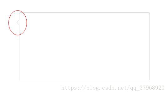
实现的效果如下图:
纯CSS画三角形(带边框)的更多相关文章
- 纯css画三角形
纯css画三角形与border元素相关 设置border的属性 width: 100px; height: 100px; border-style: solid; border-width: 100p ...
- 理解纯CSS画三角形
pure css draw a triangle code { display: inline-block; width: 300px; background-color: #E0E0E0 } .te ...
- 纯css画三角形,勾等形状
//三角形 .money-ul li.active:after { content: ""; position: absolute; bottom: 0; right: 0; bo ...
- 用纯css画个三角形
用纯css画个三角形以下是源代码: <!DOCTYPE html PUBLIC "-//W3C//DTD XHTML 1.0 Transitional//EN" " ...
- 三种纯CSS实现三角形的方法
看到像上图这样的 tip 的小三角,你会怎么办? 切个图上去?恩,不错,简单,兼容性也一级棒,不但好控制,那点小东西也增加不了多少图片的大小.但有没有更好更讲究技巧的办法呢?哈哈,那必须有啊,而且还不 ...
- CSS 魔法系列:纯 CSS 绘制三角形(各种角度)
我们的网页因为 CSS 而呈现千变万化的风格.这一看似简单的样式语言在使用中非常灵活,只要你发挥创意就能实现很多比人想象不到的效果.特别是随着 CSS3 的广泛使用,更多新奇的 CSS 作品涌现出来. ...
- 纯 CSS 实现三角形尖角箭头的实例
上次无意中发现了个使用纯 CSS 实现三角形尖角箭头的方法 http://blog.csdn.net/zhouzme/article/details/18901943 ,但没有怎么用上,也没有详细完整 ...
- 纯css竟可以做出边框这样长宽度的过渡效果
边框效果如下:鼠标移到下面方形,就有效果 要是没有效果,点这个:https://murenziwei.github.io/testGit/Untitled1.html 正如你所看到的,这边框颜色只 ...
- CSS学习笔记(8)--纯CSS绘制三角形(各种角度)
纯CSS绘制三角形(各种角度) CSS三角形绘制方法,学会了这个,其它的也就简单. 我们的网页因为 CSS 而呈现千变万化的风格.这一看似简单的样式语言在使用中非常灵活,只要你发挥创意就能实现很多 ...
随机推荐
- Java集合框架介绍。Java Collection Frameworks = JCF
Java集合框架 = Java Collection Frameworks = JCF . 为了方便理解,我画了一张思维脑图.
- MVC-Session
1.什么是Session? Session即会话,是指一个用户在一段时间内对某一个站点的一次访问. Session对象在.NET中对应HttpSessionState类,表示"会话状态& ...
- 论文阅读:Deformable ConvNets v2
论文地址:http://arxiv.org/abs/1811.11168 作者:pprp 时间:2019年5月11日 0. 摘要 DCNv1引入了可变形卷积,能更好的适应目标的几何变换.但是v1可视化 ...
- Python 包文件安装
https://pypi.tuna.tsinghua.edu.cn/simple/ 清华源 https://pypi.doubanio.com/simple/ 豆瓣源 pip install -i h ...
- Laravel 队列不执行的原因,job缓存
laravel关于异步消息队列queue不生效(job缓存)解决办法 php artisan queue:restart 每次修改代码都需要执行上面的命令,执行后成功解决! 然后再次执行 php ar ...
- 深入剖析TOMCAT
理解tomcat之搭建简易http服务器 做过java web的同学都对tomcat非常熟悉.我们在使用tomcat带来的便利的同时,是否想过tomcat是如何工作的呢?tomcat本质是一个http ...
- 利用JS对象把值传到后台
记得以前刚写asp.net 从前台往后台传值 都是var data=A,B,C,D,E; 循环添加用逗号隔开 后台还要被测试测出只输入,就错了 哈哈..后来用✈◆类似的符号隔开 不是长久之计... 现 ...
- ORM补充
- HTML 007 链接
HTML 链接 HTML 使用超级链接与网络上的另一个文档相连.几乎可以在所有的网页中找到链接.点击链接可以从一张页面跳转到另一张页面. 尝试一下 - 实例 HTML 链接如何在HTML文档中创建链接 ...
- DIV半透明层
想使用DIV半透明层时 只需加一个filter:alpha(Opacity=80);-moz-opacity:0.5;opacity: 0.5 0.5为半透明系数 使用前 使用后 style=& ...