手机端的viewport属性
Window.devicePixelRatio
This read-only property returns the ratio of the resolution in physical pixels to the resolution in CSS pixels for the current display device.
该值为分辨率之间的比,不是直接比较像素。分辨率是指单位英寸内像素数,类似于PPI。
pc端浏览器中dpr的值都为1,所以css中1px的元素在屏幕中占据1物理像素。
但在手机端,因为高分屏的出现,物理像素和css逻辑像素并不是1比1的关系。比如iPhone5中的dpr为2,就是2个物理像素对应1个逻辑像素。
另外缩放也会改变这种对应关系。
viewport
The width of the <html> element is
restricted by the width of the viewport. The <html> element takes 100% of
the width of that viewport.The viewport, in turn, is exactly equal to the
browser window: it’s been defined as such.(html的宽度由viewport的宽度决定)
document.documentElement.clientWidth,gives the dimensions
of the viewport, and not of the <html> element。 获取浏览器可视窗口的宽度(如果有滚动条时,不含滚动条的宽度)。
screen.width:屏幕的尺寸大小。You’re not interested in the physical size of
the screen, but in how many CSS pixels currently fit on it.
Media queries:针对不同尺寸的元素使用不同的样式。
Web developers are not interested in the device
width; it’s the width of the browser window that counts.So use width and forget
device-width — on desktop.
手机端
Mobile browser vendors want to offer their
clients the best possible experience, which right now means “as much like
desktop as possible.” That,
however, requires viewport to be split into two: the visual viewport and the
layout viewport. (为了能在移动设备上正常显示pc浏览器上的网站内容,引进了虚拟的layout viewport的概念。)
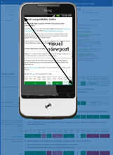
The visual viewport is the
part of the page that’s currently shown on-screen. The user may scroll to change
the part of the page he sees, or zoom to change the size of the visual
viewport.
How wide is the layout viewport? That differs
per browser. Safari iPhone uses 980px, Opera 850px, Android WebKit 800px, and
IE 974px. 所以pc页面的内容也能在手机上浏览,只是会缩的很小。
You can change the orientation of the frame(visual viewport), but the size and
shape of the large image (layout viewport) never changes.
Zooming
Many mobile browsers initially show any page in
fully zoomed-out mode. Most browsers zoom out to show the entire layout
viewport on the screen. browsers have chosen their dimensions of the layout
viewport such that it completely covers the screen in fully zoomed-out mode
(and is thus equal to the visual viewport). Thus the width and the height of
the layout viewport are equal to whatever can be shown on the screen in the
maximally zoomed-out mode. When the user zooms in these dimensions stay the
same.
Measuring the visual viewport
visual viewport, it is measured by window.innerWidth/Height,it shows how many CSS pixels currently fit on the screen.
Obviously the measurements change when the user zooms out or in, since more or
fewer CSS pixels fit into the screen.
Event coordinates
pageX/Y is still relative to the page in CSS pixels.
screenX/Y is relative to the screen in device pixels,
this is the same reference that clientX/Y uses, and device pixels are useless.

Meta viewport
<meta

name="viewport" content="width=320">
It is meant to resize the layout viewport. 因为移动端默认的layout
viewport比visual
viewport大,所以通过meta标签控制layout
viewport的属性达到更好的显示效果。
当设置width=device-width时,layout viewport就和visual viewport一样宽,但是屏幕会缩放到一定比率以显示所有内容。
缩放(zoom)和移动操作控制的是visual
viewport;
layout
viewport一旦初始化好后,就不会再变;可以通过meta标签的属性控制layout
viewport。
苹果6的显示效果(通过chrome测试时自动刷新常有问题,最好点击Toggle
device toolbar查看)

苹果6的dpr为2,物理分辨率为1334*750,所以visual viewport内宽可以显示375个css像素。
没有设置meta时,safari默认的layout viewport为980px,若页面的宽度小于layout
viewport的宽度,则显示980px。否则safari会不断缩小(zoom out)页面直到全部layout viewport在visual point中显示为止。
如果设置width而设定initail-scale的话,会缩放到合适比例,没有滚动条。

如果再设置initial-scale=1.0,则不会进行缩放,会产生滚动条,通过移动来显示全部内容:如下

摘自A tale of two viewports,对相关概念介绍的非常清楚。
手机端的viewport属性的更多相关文章
- fullpage 单屏高度超过屏幕高度,实现单屏内可以滚动并解决手机端单屏高度不正确的问题
最近接触了好几次jquery.fullpage.js这个插件,实现整屏的滑动,效果很炫,用fullpage来实现也很简单,但是也碰到了一些问题和大家分享一下 1.单屏高度超过屏幕高度,实现单屏的滑动 ...
- 涨姿势!手机端的META你知道多少?
一.天猫 <title>天猫触屏版</title> <meta content="text/html; charset=utf-8" http-equ ...
- 手机端的META你有多了解?
我们先来简单了解下meta标签:meta指元素可提供有关页面的元信息(meta-information),比如针对搜索引擎和更新频度的描述和关键词. 标签位于文档的头部,不包含任何内容. 标签的属性定 ...
- 第九十三节,html5+css3移动手机端流体布局,基础CSS,头部设计,轮播设计,底部设计
html5+css3移动手机端流体布局,基础CSS,头部设计,轮播设计,底部设计 基础CSS 首先将通用css属性写好 @charset "utf-8"; /*通用样式*/ /*去 ...
- 手机端的META你知道多少?
一.天猫 <title>天猫触屏版</title> <meta content="text/html; charset=utf-8" http-equ ...
- 学习手机端的META差异,打造自己的移动网页
我们先来简单了解下meta标签:meta指元素可提供有关页面的元信息(meta-information),比如针对搜索引擎和更新频度的描述和关键词. 标签位于文档的头部,不包含任何内容. 标签的属性定 ...
- 山西大同大学教务处学生端--送给学弟,学妹的礼物,可在PC端,手机端操作
解决问题:大同大学教务处官网学生端口一进去就卡住了,点上面一行的菜单无响应 转眼已是四年,想想自己大学即将结束,不由得让人感慨啊.这才刚开学几天,我就听到有同学在因为补考,选课的事情发愁.学校官方的教 ...
- 手机端的META你知道多少
一.天猫 <title>天猫触屏版</title> <meta content="text/html; charset=utf-8" http-equ ...
- 手机端的META
一.天猫 <title>天猫触屏版</title> <meta content="text/html; charset=utf-8" http-equ ...
随机推荐
- Linux简介与厂商版本下
2. Linux的厂商版本 在Linux内核基础上,我们还有许多厂商版本.即使有了内核和GNU软件,Linux的安装和编译并不是简单的工作,Linux厂商就是瞄准了这个市场.这些厂商会在Linux内核 ...
- web service 组件
web service 组件 基本的 web service 平台是 XML + HTTP.所有标准的 web service 使用以下组件: SOAP(简单对象访问协议) UDDI(通用描述.发现与 ...
- H5学习第四周
本周.我们结束了HTML标签和css样式部分,开始了JS的学习.JS是的内容和css,html基本上没有什么联系而且它比较需要逻辑思考能力,所以要从新开始学习. 使用js的三种方式: 1.html标签 ...
- Centos7部署Zabbix
转载于http://www.cnblogs.com/xqzt/p/5124894.html,更正了部分错误,并增加了个别问题处理办法. 一.Zabbix简介 zabbix是一个基于WEB界面的提供分布 ...
- 关于C++中的前置声明(附程序运行图)
实验于华中农业大学逸夫楼2017.3.10 在编写C++程序的时候,偶尔需要用到前置声明(Forward declaration).下面的程序中,带注释的那行就是类B的前置说明.这是必须的,因为类A中 ...
- Git托管
前面的话 本文将主要介绍如何使用Github来托管Git服务 SSH 大多数Git服务器都会选择使用SSH公钥来进行授权.系统中的每个用户都必须提供一个公钥用于授权 首先先确认一下是否已经有一个公钥了 ...
- 利用 force recovery 解决服务器 crash 导致 MySQL 重启失败的问题
小明同学在本机上安装了 MySQL 5.7.17 配合项目进行开发,并且已经有了一部分重要数据.某天小明在开发的时候,需要出去一趟就直接把电脑关掉了,没有让 MySQL 正常关闭,重启 MySQL 的 ...
- Java程序初始化的顺序
Java程序初始化的顺序 java程序初始化工作可以在许多不同的代码块中来完成(例如:静态代码块.构造函数等),他们执行的顺序如下: 父类静态变量 父类静态代码块 子类静态变量 子类静态代码块 父类非 ...
- Python资源汇总
Python 目录: 管理面板 算法和设计模式 反垃圾邮件 资产管理 音频 验证 构建工具 缓存 ChatOps工具 CMS 代码分析和Linter 命令行工具 兼容性 计算机视觉 并发和并行性 组态 ...
- [Day01] Python基础
明天要完成的任务如下: Python 四则运算 Python 数据结构 Python 元算符(in.not in.is.and.or) 用户输入 (input.raw_input) 流程控制 缩进 ...