css代码整理、收集
整理了一下之前用到过的css代码,实现一种效果或许有许多种写法,我这里整理了一下我个人认为兼容性比较好,结构比较简洁的代码……如有写得不对的地方敬请前辈们指点赐教一下,小弟不胜感激!此学习笔记是动态的——我日后发现有好的代码段会陆陆续续整理添加上去。
css:ellipsis省略号
<style>

.news{width:320px; text-overflow:ellipsis; -o-text-overflow:ellipsis; -moz-binding:url('ellipsis.xml#ellipsis'); -ms-text-overflow:ellipsis; -webkit-text-overflow:ellipsis; overflow:hidden;}

.news a{white-space:nowrap;}

</style>

<div class="news">

    <a href="javascript:void(0);">你好,我是个css省略号,支持各种浏览器,包括大IE6</a>

    <a href="javascript:void(0);">你好,我是个css省略号,支持各种浏览器,包括大IE6</a>

</div>
鼠标移过去图片慢慢变暗(亮)一点
也就是用到了透明(opacity),渐变(transition)实现,如下是变暗的情况:
<style>

.link_img{display:inline-block; width:auto; height:auto;}

.link_img:hover{  background-color:#000;}

.link_img:hover img{ display:block; filter:alpha(opacity=80); opacity:0.8; transition:all 0.5s ease-out; -webkit-transition:all 0.5s ease-out; -moz-transition:all 0.5s ease-out; -o-transition:all 0.5s ease-out;}

</style>

<a href="javascript:void(0);" class="link_img"><img src="data:images/zy_19.jpg" /></a>

<a href="javascript:void(0);" class="link_img"><img src="data:images/pro3.jpg" /></a>
css:border实现的三角形
如要实现汽包,如新浪微博里的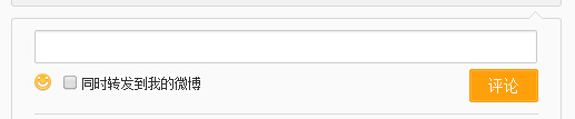 ,新浪里用到的是的是特殊字符“◆”,
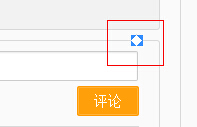 ,能实现兼容到IE6,html代码结构上不简洁了,在html里要多写了class为”WB_arrow“的一层代码,如图:
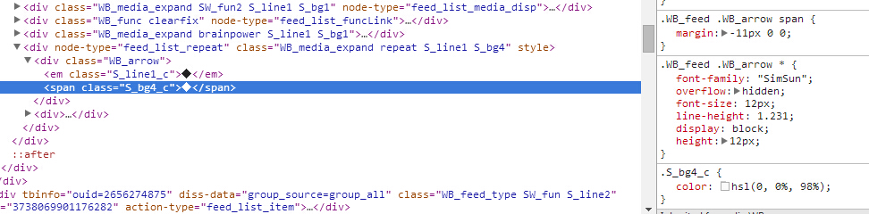
要简洁点,只能用border与伪类before,after了,附代码如下:
<!DOCTYPE html PUBLIC "-//W3C//DTD XHTML 1.0 Strict//EN" "http ://www.w3.org/TR/xhtml1/DTD/xhtml1-strict.dtd">
<html xmlns="http://www.w3.org/1999/xhtml">
<head>
<meta http-equiv="Content-Type" content="text/html; charset=utf-8" />
<title>css制作三角形</title>
<style type="text/css">
body{background-color:#E8E8E8;}
.triangle1{ display:inline-block; width:20px; height:20px; border-width:20px 30px 40px 50px; border-style:solid; border-color:green yellow blue red;}
.triangle2{ display:inline-block; width:0; height:0; border-width:20px 30px 40px 50px; border-style:solid; border-color:transparent yellow blue red;}
.triangle3{ display:inline-block; width:0; height:0; border-width:20px 30px 40px 50px; border-style:dashed solid solid solid; border-color:transparent yellow blue red;}
.triangle4{ display:inline-block; width:0; height:0; _line-height:0; border-width:20px 30px 40px 50px; border-style:dashed solid solid solid; border-color:transparent yellow blue red;}/*对于ie6要设置一下line-height,以及透明的border-style要设置成dashed*/ .rightdirection{ display:inline-block; width:0;height:0; _line-height:0; border-width:20px; border-style:dashed dashed dashed solid; border-color:transparent transparent transparent #333; }
.bottomdirection{ display:inline-block; width:0;height:0; border-width:20px; border-style:solid dashed dashed dashed; border-color: #333 transparent transparent transparent; }
.leftdirection{ display:inline-block; width:0;height:0; _line-height:0; border-width:20px; border-style:dashed solid dashed dashed; border-color: transparent #333 transparent transparent; }
.topdirection{ display:inline-block; width:0;height:0; border-width:20px; border-style:dashed dashed solid dashed; border-color: transparent transparent #333 transparent; } .dome{ margin-top:10px; width:200px; padding:10px; text-align:center; background-color:#ccc; border:1px solid #666; position:relative; left:30px;}
.dome:before{ display:block; content:""; border-width:8px 10px; border-style:dashed solid dashed dashed; border-color:transparent #666 transparent transparent; position:absolute; top:10px; left:-20px; z-index:1; }
.dome:after{ display:block; content:""; border-width:8px 10px; border-style:dashed solid dashed dashed; border-color:transparent #ccc transparent transparent; position:absolute; top:10px; left:-19px; z-index:2;}
</style>
</head>
<body>
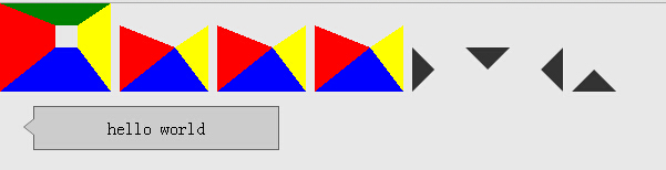
<em class="triangle1"></em>
<em class="triangle2"></em>
<em class="triangle3"></em>
<em class="triangle4"></em> <em class="rightdirection"></em>
<em class="bottomdirection"></em>
<em class="leftdirection"></em>
<em class="topdirection"></em> <div class="dome">hello world</div>
</body>
</html>
运行结果如下图:
IE6的截图: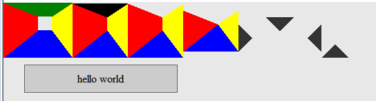
但是用伪类before,after的border在大IE6里不能做出三角形来,如要兼容IE6还得用新浪里的方法,或者用与新浪的相似,不过不是用特殊字符,而是也是用border做三角形,如下:
 <style>

 .dome{width:300px; padding:30px 20px; border:1px solid #beceeb; position:relative;}

 .dome .triangle{ position:absolute; bottom:0px; left:50px;}

 .dome .triangle .bot{

     _display:block;

     _line-height:0px;

     border-width:20px;

     border-style:solid dashed dashed dashed;

     border-color:#beceeb transparent transparent transparent;

     position:absolute;

     bottom:-40px;

 }

 .dome .triangle .top{

     _display:block;

     _line-height:0px;

     border-width:20px;

     border-style:solid dashed  dashed dashed;

     border-color:#FFF transparent transparent transparent;

     position:absolute;

     bottom:-39px;

 }

 </style>

 <div class="dome">

   <div class="triangle">

       <em class="bot"></em>

       <em class="top"></em>

   </div>

   <div class="txtBox">

      我是用border实现的三角形,html结构上跟新浪微博上的结构相似

   </div>

 </div>
css代码整理、收集的更多相关文章
- css代码整理
width:(宽度) height:(高度) border:1px solid red:(边框 :边框粗细 显示 颜色) border-radius:10deg:(边框变圆角) box-shadow: ...
- 转载网易博客:整理各大网站让网站变灰的css代码
2013-07-21 15:06:47 北京时间2013年4月20日8时02分四川省雅安市芦山县(北纬30.3,东经103.0)发生7.0级地震.震源深度13公里.各大网站将其网站变灰,本人整理了下部 ...
- 在sublimen中整理CSS代码及其兼容性问题
1,使用鼠标选中前面浅灰色缩进. 2,Ctrl+H 查找替换 点击 Find All 查找全部缩进. 3,按backspace向后删除两次,如下图所示: 4,向下按一次方向键,再向左按一次方向键,最 ...
- html Css PC 移动端 公用部分样式代码整理
css常用公用部分样式代码整理: body, html, div, blockquote, img, label, p, h1, h2, h3, h4, h5, h6, pre, ul, ol, li ...
- div+css通用兼容性代码整理
一.Div+css通用兼容性代码 你可以在css开头加入 *html{padding:0px} <style> *html{padding:0px} /* Clear Fix */ .cl ...
- 整理及优化CSS代码的7个原则
作为网页设计师(前端工程师),你可能还记得曾经的那个网页大小建议:一个网页(包括HTML.CSS.Javacript.Flash和图片)尽量不要超过30KB的大小,随着互联网的日益庞大,网络带宽也在飞 ...
- [No00007B]DreamweaverCC 的CSS代码格式化
Dreamweaver自带的代码格式化功能. 1.步骤:命令 -> 应用源格式. 2.你可以选择你的偏好.特别是css代码,有些人喜欢每个属性单独一行,有些人喜欢把所有属性写在同一行.步骤:编辑 ...
- 30+有用的CSS代码片段
在一篇文章中收集所有的CSS代码片段几乎是不可能的事情,但是我们这里列出了一些相对于其他的更有用的代码片段,不要被这些代码的长度所吓到,因为它们都很容易实现,并且具有良好的文档.除了那些解决常见的恼人 ...
- 如何写出优雅的CSS代码 ?(转)
对于同样的项目或者是一个网页,尽管最终每个前端开发工程师都可以实现相同的效果,但是他们所写的代码一定是不同的.有的优雅,看起来清晰易懂,代码具有可拓展性,这样的代码有利于团队合作和后期的维护:而有的混 ...
随机推荐
- java-map-IdentityHashMap
1.背景 今天翻开IdentityHashMap的时候,就傻眼了,这个到底是个逻辑啊,我的程序代码如下: IdentityHashMap<String,String> identityHa ...
- web安全:HTTPS
E1:搭建zoobar网站开启apache服务和mysql服务service apache2 startservice mysql start 建立数据库和表mysql->create data ...
- IOS动画总结
IOS动画总结 一.基本方式:使用UIView类的UIViewAnimation扩展 + (void)beginAnimations:(NSString *)animationID context ...
- 使用Reaver加PIN码秒破WPA-PSK密码
之前掌握到的破解WPA-PSK密码仅限于使用aircreack工具包获取handshake后挂字典爆破方式,而能否破解出wpa密码完全依赖于字典强度了.除了该方式外还有一个更有效的办法,就是使用路由P ...
- 【转】Android UI系列-----时间、日期、Toasts和进度条Dialog
原文网址:http://www.cnblogs.com/xiaoluo501395377/p/3421727.html 您可以通过点击 右下角 的按钮 来对文章内容作出评价, 也可以通过左下方的 关注 ...
- bzoj1965 [Ahoi2005]SHUFFLE 洗牌
Description 为了表彰小联为Samuel星球的探险所做出的贡献,小联被邀请参加Samuel星球近距离载人探险活动. 由于Samuel星球相当遥远,科学家们要在飞船中度过相当长的一段时间,小联 ...
- SRM 601 DIV1
A 枚举x , 然后对于确定的x , 最后总的apple数对应了唯一的orange数,因此问题转化为求apple的取值范围; apple的取值范围: max为每个bag取最多的apple , min为 ...
- vb安装过程中 ntvdm.exe[9696]中发生未处理的win32异常
最近电脑总是出问题导致我的学习效率很低,前几天在用VB6.0的时候有个知识点不太熟悉,于是按F1发现不会出来帮助文档.突然想到重新装系统之后忘记了安装MSDN帮助插件,就在我安装这个软件的时候发现电脑 ...
- jQuery的基本语法
index.html代码 <!DOCTYPE html> <html> <head> <meta charset="UTF-8"> ...
- 计算app内部缓存文件大小
#pragma mark - 计算单个文件大小 - (long long)fileSizeAtPath:(NSString*)filePath{ NSFileManager* manager = [N ...