Chinese Window Lattice And CSS
谁向云端着此亭,檐前树木映窗棂。
-- 释绍嵩《陪赵知府登桃岭山亭》
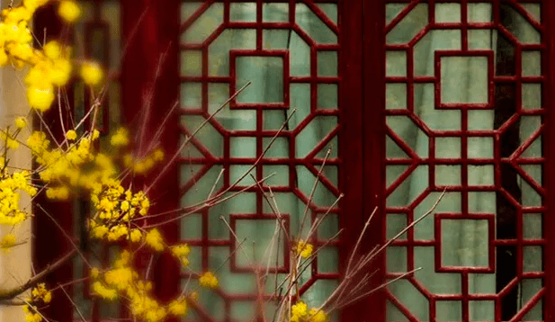 (image from 中国窗棂)
The traditional Chinese window lattice has a symmetrical beauty, as well as a very beautiful formal name -- 窗棂.
As a CSS lover, I've always wanted to draw them with CSS by hand. But that's never being easy. I thought using SVG might be much straightforward until I learned how to apply the -webkit-box-reflect property.
The property
Unfortunately, -webkit-box-reflect is non-standard. The standard way is to use element() function, which has been implemented in Firefox already.
Honestly the -webkit-box-reflect property seems much elegant to me because it has a better name and it doesn't rely on an extra id like element()does. I don't get why it wasn't accepted by the CSS WG.
There's also an article in detail about reflection in CSS along with several demos by Ana Tudor back from 2016.
Directions
The -webkit-box-reflect property provides four directions of reflection:above, below, left and right. This is how to use it:
.box {

  -webkit-box-reflect: above|below|left|right;

}
Perhaps because it's just an experimental property from the very beginning, there's no way yet to add multiple reflections to an element at once.
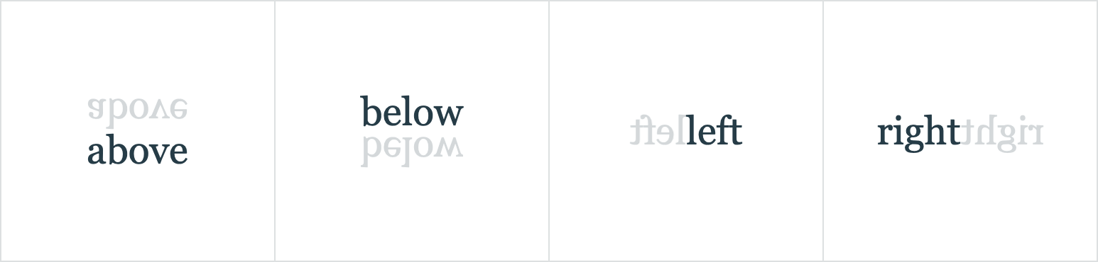
I think it would be much cooler to have multiple reflections and reflections in various degrees other than only 4 of them.
It's still exciting
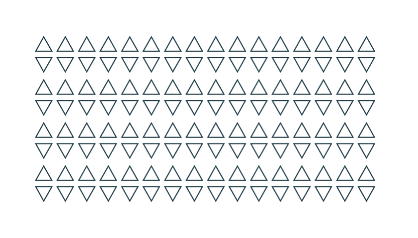
Let's start with a single div element and its reflection on the right side.
<div>△</div>

<style>

  div {

    -webkit-box-reflect: right;

  }

</div>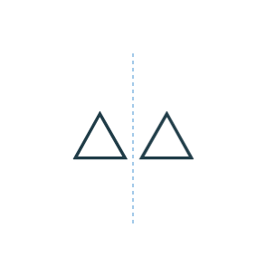
How to add another reflection?
Not long ago Chris Coyier introduced a trick in this article, about how to add shadows to a clipped element by applying drop-shadow to its parent node.
Yes, we can do something similar by adding a parent node and setting reflection to it.
<div class="parent">

  <div class="box">△</div>

</div>

<style>

  .box {

    -webkit-box-reflect: right;

  }

  .parent {

    -webkit-box-reflect: below;

  }

</style>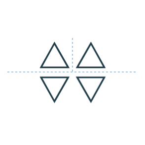
It's like unfolding a sheet of paper, first in half from left to right and then top to bottom. However, the order doesn't really matter.
Although it's not the exact result we wanted, it's so exciting to find a way to add multiple reflections.
Going deep
The total number of elements grows exponentially in this way, which is dependent on the depth of the nested divs.
So given 2 nested divs like the above, there will be 2^2 = 4 elements (including all the reflections). Given 7 of them will be 2^7 = 128 elements.
Seed
The innermost div can be treated as a seed. Since the whole graph composed with reflections will change with it.
For example, rotate it with -45 degree:
...

  <div>

    <div>

      <div class="seed">△</div>

    </div>

  </div>

...

<style>

  /* ... */

  .seed {

    /* ... */

    transform: rotate(-45deg);

  }

</style>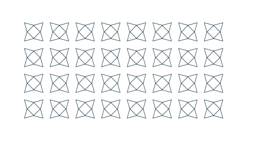
Or combine with any other properties and some old methods. It seems another different way to build Unicode Patterns as well.
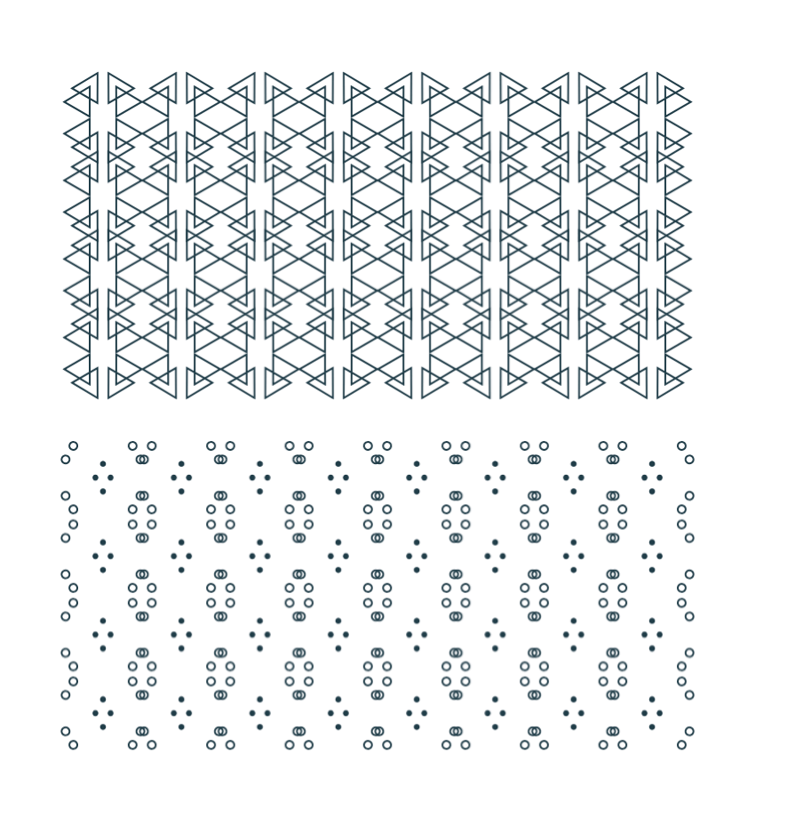
Chinese Window Lattice
So with the -webkit-box-reflect property and the technique described above, we can finally draw those symmetrical window lattices in CSS with very few lines of code.
I want to take the picture at the beginning of the article as an example. Let's see how to draw them step by step.
1. The seed element
First, find out the smallest part that can't be divided any further. Here we start from the part in the upper left corner as the seed element.
And then draw these lines with background linear-gradient. Using :emptyselector to target the seed element for simplicity.
<div></div>

<style>

  div:empty {

    width: 72px; height: 72px;

    --g: linear-gradient(#000, #000);

    --gs: linear-gradient(-45deg,

      transparent calc(50% - 1px), #000 calc(50% - 1px),

      #000 calc(50% + 1px), transparent calc(50% + 1px)

    );

    background:

      var(--g) 0 0 / 100% 2px,       var(--g) 100% 0 / 2px 48px,

      var(--g) 100% 48px / 24px 2px, var(--g) 48px 100% / 2px 24px,

      var(--g) 0 100% / 48px 2px,    var(--g) 0 0 / 2px 100%,

      var(--g) 0 46px / 24px 2px,    var(--g) 24px 100% / 2px 26px,

      var(--g) 100% 24px / 26px 2px, var(--g) 46px 0 / 2px 24px,

      var(--gs) 50% 50% / 24px 24px, var(--gs) 0 0 / 40px 40px;

    background-repeat: no-repeat;

  }

</style>
2. Add reflection
The reflection begins with the seed element itself. We pick "right" as an initial direction and use custom property to make it more intuitive.
<div style="--reflect: right -3px"></div>

<style>

  div {

    -webkit-box-reflect: var(--reflect);

  }

  div:empty {

    /* ... */

  }

</style>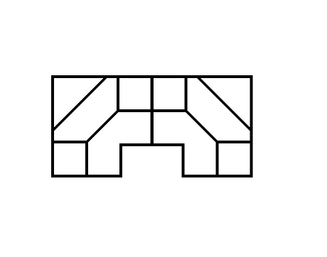
3. Continue unfolding
So we're going to add parent nodes for more reflections. It really helps to understand if you think of it as unfolding a sheet of paper.
<div style="--reflect: below -2px"></div>

  <div style="--reflect: right -3px"></div>

</div>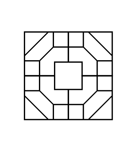
Add another one.
<div style="--reflect: below calc(200% - 6px)"></div>

  <div style="--reflect: below -2px"></div>

    <div style="--reflect: right -3px"></div>

  </div>

</div>
Repeat the process until we get the desired result.
<div style="--reflect: right calc(600% - 14px)">

  <div style="--reflect: right calc(200% - 6px)">

    <div style="--reflect: below calc(400% - 10px)">

      <div style="--reflect: below calc(200% - 6px)">

        <div style="--reflect: below -2px">

          <div style="--reflect: right -2px"></div>

        </div>

      </div>

    </div>

  </div>

</div>
That's it.
You can see the result and the complete source code on CodePen. But you know it works only in Chrome and Safari.
Conclusion
The solution using -webkit-box-reflect property is beautiful in some way. I really wish it had been accepted as a standard and can even do reflections in various directions. So that it may be possible to do JianZhi (Chinese Paper-cutting Art) in CSS.
from:https://yuanchuan.dev/2019/05/15/window-lattice-and-css.html
Chinese Window Lattice And CSS的更多相关文章
- 巧用 -webkit-box-reflect 倒影实现各类动效
在很久之前的一篇文章,有讲到 -webkit-box-reflect 这个属性 -- 从倒影说起,谈谈 CSS 继承 inherit -webkit-box-reflect 是一个非常有意思的属性,它 ...
- 关于获取、设置css样式封装的函数入门版
<html> <head> <meta charset="UTF-8"> <title>CSS样式的获取和设置:简单版</ti ...
- Css动画形式弹出遮罩层,内容区上下左右居中于不定宽高的容器中
<!DOCTYPE html> <html> <head> </head> <body id="body"> <! ...
- css+js回到顶部
.backToTop { display: none; width: 18px; line-height: 1.2; padding: 5px 0; background-color: #000; c ...
- 第四十二课:基于CSS的动画引擎
由于低版本浏览器不支持css3 animation,因此我们需要根据浏览器来选择不同的动画引擎.如果浏览器支持css3 animation,那么就使用此动画引擎,如果不支持,就使用javascript ...
- 【翻译】CSS水平和垂直居中的12种方法
英语原文链接 在CSS中有许多不同的方法能够做到水平和垂直居中,但很难去选择合适的那个.我会向你展示我所看到的所有的方法,帮助你在所面对的情境下选择最棒的那一个. 方法1 此方法将只能垂直居中单行文本 ...
- HTML/CSS实现的一个列表页
又到休息日,白天没事跟朋友去逛逛街,侃大山,晚上了,上网无趣,于是就想起该练练了, 这次是做了一个页面,最上面是一个banner 用到了一个jQuery的逻辑判断当banner初始top值小于wind ...
- BOM 浏览器对象模型_window 对象的常见 window.属性_window.方法
1. 常用属性 window.devicePixelRatio 像素比 = css / 物理像素 window.scrollX,window.scrollY 滚动条 卷曲距离 if ...
- 从CSS到houdini
0. 前言 平时写CSS,感觉有很多多余的代码或者不好实现的方法,于是有了预处理器的解决方案,主旨是write less &do more.其实原生css中,用上css变量也不差,加上bem命 ...
随机推荐
- IDEA配置tomcat日志乱码
第一步(tomcat7/8) tomcat:找到tomcat文件夹下的conf文件夹,去修改里面的logging.properties文件 两种修改方式(第一种方法不行再用第二种): 将文件中的5个U ...
- 0216 aop和打印数据库执行日志
需求 maven依赖 <dependency> <groupId>p6spy</groupId> <artifactId>p6spy</artif ...
- vue组件中的data为什么是函数?
一.vue组件中的data为什么是函数 为了保证组件的独立性 和 可 复用性,data 是一个函数,组件实例化的时候这个函数将会被调用,返回一个对象,计算机会给这个对象分配一个内存地址,你实例化几次, ...
- 转载:Cubic interpolation
https://www.paulinternet.nl/?page=bicubic Cubic interpolation If the values of a function f(x) and i ...
- Python之路Day05
字典 字典 -- dict Python的数据结构之一 字典是可变数据类型,无序的 定义 dic = {'key':'Value'} 键值对 字典的作用 存储数据,大大量的,将数据和数据起到关联作用 ...
- EF中的持久化场景
使用EF实现实体持久化(保存)到数据库有两种情况:在线场景和离线场景. 1.在线场景 在线场景中,context是上下文实例,读写都通过一个context. 这种方案适用于连接本地数据库或同一网络上的 ...
- Linux异常 时间戳 2018-10-08 11:17:22 是未来的 5288025.776562967 秒之后
原因:系统时间不对,有可能落后当前实际时间
- 《软件测试52讲》读书笔记 —— API测试怎么做
前言 文章中还介绍了测试工具,比如cURL.postman,单API如何测试:但这些都是偏基础的东西,且网上教程各式各样,就不再赘述了:这里主要讲的就是关于复杂场景的API测试要如何应对 API测试的 ...
- http请求常见错误状态码
一.HTTP 错误 400 400 请求出错 由于语法格式有误,服务器无法理解此请求.不作修改,客户程序就无法重复此请求. 原因:(调用方接口方法的实参和服务器接口方法的形参不一致) 1.前端提交数据 ...
- php 基础系列之 php快速入门
·插补操作 将简单变量写入一个由双引号引用的字符串中,就叫插补操作.例如: $test = 'xx'; echo "你好:$test"; 注意:插补操作只是双引号引用字符串的特性. ...