
CollapsingToolbarLayoutDemo【可折叠式标题栏,顺便带有CardView卡片式布局】
版权声明:本文为HaiyuKing原创文章,转载请注明出处!
前言
CollapsingToolBarLayout是一个作用于ToolBar基础之上的布局,它也是由Design Support库提供的。不过CollapsingToolBarLayout(可折叠的toolbar布局)是不能独立存在的,它在设计的时候就被限定只能作为AppBarLayout的直接子布局来使用。而APPBarLayout【垂直方向的LinearLayout】又必须是CoordinatiorLayout【加强版的FrameLayout】的子布局。
--摘自《第一行代码(第2版)》
CardView适用于实现卡片式布局效果的重要控件,由appcompat-v7库提供,实际上CardView也是一个FrameLayout,只是额外提供了圆角和阴影效果,看上去有立体的感觉。一般CardView用在ListView的item布局中,或者单独一个区域在导航栏下方。
效果图
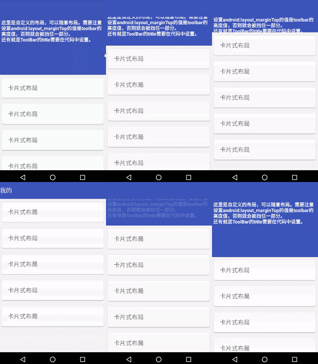
代码分析
activity_main.xml布局文件示意图:

使用步骤
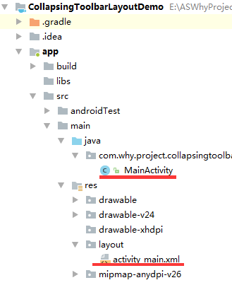
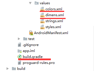
一、项目组织结构图
注意事项:
1、 导入类文件后需要change包名以及重新import R文件路径
2、 Values目录下的文件(strings.xml、dimens.xml、colors.xml等),如果项目中存在,则复制里面的内容,不要整个覆盖
二、导入步骤
(1)在build.gradle中引入design支持库【版本号跟appcompat保持一致】
apply plugin: 'com.android.application'

android {

    compileSdkVersion 27

    defaultConfig {

        applicationId "com.why.project.collapsingtoolbarlayoutdemo"

        minSdkVersion 16

        targetSdkVersion 27

        versionCode 1

        versionName "1.0"

        testInstrumentationRunner "android.support.test.runner.AndroidJUnitRunner"

    }

    buildTypes {

        release {

            minifyEnabled false

            proguardFiles getDefaultProguardFile('proguard-android.txt'), 'proguard-rules.pro'

        }

    }

}

dependencies {

    implementation fileTree(dir: 'libs', include: ['*.jar'])

    implementation 'com.android.support:appcompat-v7:27.1.1'

    implementation 'com.android.support.constraint:constraint-layout:1.1.2'

    testImplementation 'junit:junit:4.12'

    androidTestImplementation 'com.android.support.test:runner:1.0.2'

    androidTestImplementation 'com.android.support.test.espresso:espresso-core:3.0.2'

    //引入design库

    implementation 'com.android.support:design:27.1.1'

}
(2)修改styles.xml文件中的样式为NoActionBar
<resources>

    <!-- Base application theme. -->

    <style name="AppTheme" parent="Theme.AppCompat.Light.NoActionBar">

        <!-- Customize your theme here. -->

        <item name="colorPrimary">@color/colorPrimary</item>

        <item name="colorPrimaryDark">@color/colorPrimaryDark</item>

        <item name="colorAccent">@color/colorAccent</item>

    </style>

</resources>
(3)因为使用到了CardView,所以在build.gradle中引入cardview支持库【版本号跟appcompat保持一致】
apply plugin: 'com.android.application'

android {

    compileSdkVersion 27

    defaultConfig {

        applicationId "com.why.project.collapsingtoolbarlayoutdemo"

        minSdkVersion 16

        targetSdkVersion 27

        versionCode 1

        versionName "1.0"

        testInstrumentationRunner "android.support.test.runner.AndroidJUnitRunner"

    }

    buildTypes {

        release {

            minifyEnabled false

            proguardFiles getDefaultProguardFile('proguard-android.txt'), 'proguard-rules.pro'

        }

    }

}

dependencies {

    implementation fileTree(dir: 'libs', include: ['*.jar'])

    implementation 'com.android.support:appcompat-v7:27.1.1'

    implementation 'com.android.support.constraint:constraint-layout:1.1.2'

    testImplementation 'junit:junit:4.12'

    androidTestImplementation 'com.android.support.test:runner:1.0.2'

    androidTestImplementation 'com.android.support.test.espresso:espresso-core:3.0.2'

    //引入design库

    implementation 'com.android.support:design:27.1.1'

    //CardView

    implementation 'com.android.support:cardview-v7:27.1.1'

}
(4) 在colors.xml中添加以下代码
<?xml version="1.0" encoding="utf-8"?>

<resources>

    <color name="colorPrimary">#3F51B5</color>

    <color name="colorPrimaryDark">#303F9F</color>

    <color name="colorAccent">#FF4081</color>

    <!-- toolbar背景色 -->

    <color name="nav_bg">#3F51B5</color>

    <!-- toolbar标题颜色 -->

    <color name="nav_text_color">#ffffff</color>

</resources>
(5)在dimens.xml中添加以下代码
<?xml version="1.0" encoding="utf-8"?>

<resources>

    <!-- toolbar高度 -->

    <dimen name="nav_height">56dp</dimen>

</resources>
三、使用方法
(1)布局文件如下
<?xml version="1.0" encoding="utf-8"?>

<android.support.design.widget.CoordinatorLayout xmlns:android="http://schemas.android.com/apk/res/android"

    xmlns:app="http://schemas.android.com/apk/res-auto"

    android:layout_width="match_parent"

    android:layout_height="match_parent"

    android:background="#f4f4f4">

    <!-- 顶部导航栏 -->

    <android.support.design.widget.AppBarLayout

        android:id="@+id/appBar"

        android:layout_width="match_parent"

        android:layout_height="250dp"

        >

        <!--app:contentScrim设置折叠时工具栏布局的颜色,默认contentScrim是colorPrimary的色值

        app:statusBarScrim设置折叠时状态栏的颜色,statusBarScrim是colorPrimaryDark的色值。-->

        <!--app:layout_scrollFlags:

        设置滚动表现:

        1、 Scroll, 表示手指向上滑动的时候,CollapsingToolbarLayout也会向上滚出屏幕并且消失,这个属性必须要有。

        2、 exitUntilCollapsed, 表示这个layout会一直滚动离开屏幕范围,直到它收折成它的最小高度。不再移出屏幕-->

        <android.support.design.widget.CollapsingToolbarLayout

            android:id="@+id/collapsing_toolbar"

            android:layout_width="match_parent"

            android:layout_height="match_parent"

            app:contentScrim="@color/nav_bg"

            app:layout_scrollFlags="scroll|exitUntilCollapsed">

            <!-- 这里可以是一张图片或布局 -->

            <!--app:layout_collapseMode="parallax"设置为这个模式时,在内容滚动时,CollapsingToolbarLayout中的View(比如ImageView)也可以同时滚动,实现视差滚动效果, 通常和layout_collapseParallaxMultiplier(设置视差因子,值为0~1)搭配使用。-->

            <!--给layout_collapseParallaxMultiplier设置的值越大可以让滚动的效果更加明显。-->

            <!--android:layout_marginTop="@dimen/nav_height"-->

            <LinearLayout

                android:id="@+id/head_layout"

                android:layout_width="match_parent"

                android:layout_height="match_parent"

                android:orientation="vertical"

                android:background="@color/nav_bg"

                app:layout_collapseMode="parallax"

                app:layout_collapseParallaxMultiplier="0.8"

                android:layout_marginTop="@dimen/nav_height"

                android:padding="8dp">

                <TextView

                    android:layout_width="wrap_content"

                    android:layout_height="wrap_content"

                    android:text="这里是自定义的布局,可以随意布局。需要注意设置android:layout_marginTop的值是toolbar的高度值,否则就会被挡住一部分。\n还有就是ToolBar的title需要在代码中设置。"

                    android:textColor="#ffffff"

                    android:textSize="16sp"

                    android:textStyle="bold" />

            </LinearLayout>

            <!--app:layout_collapseMode="pin" 在view折叠的时候Toolbar仍然被固定在屏幕的顶部。-->

            <!-- 这里只是放一个Toolbar,不做任何处理 -->

            <android.support.v7.widget.Toolbar

                android:id="@+id/toolbar_base"

                android:layout_width="match_parent"

                android:layout_height="@dimen/nav_height"

                android:minHeight="@dimen/nav_height"

                android:background="@color/nav_bg"

                app:contentInsetStart="0dp"

                app:contentInsetStartWithNavigation="0dp"

                app:layout_collapseMode="pin"

                />

        </android.support.design.widget.CollapsingToolbarLayout>

    </android.support.design.widget.AppBarLayout>

    <!--中间滚动区域-->

    <!--app:layout_behavior="@string/appbar_scrolling_view_behavior"是一个系统字符串,值为:android.support.design.widget.AppBarLayout$ScrollingViewBehavior的常量值。

    唯一的作用是把自己(使用者)放到AppBarLayout的下面。(不能理解为什么叫ScrollingViewBehavior)所有View都能使用这个Behavior。-->

    <android.support.v4.widget.NestedScrollView

        android:layout_width="match_parent"

        android:layout_height="wrap_content"

        app:layout_behavior="@string/appbar_scrolling_view_behavior"

        >

        <LinearLayout

            android:layout_width="match_parent"

            android:layout_height="wrap_content"

            android:orientation="vertical">

            <android.support.v7.widget.CardView

                android:layout_width="match_parent"

                android:layout_height="wrap_content"

                android:background="#ffffff"

                android:layout_margin="10dp"

                app:cardCornerRadius="5dp">

                <TextView

                    android:layout_width="match_parent"

                    android:layout_height="wrap_content"

                    android:text="卡片式布局"

                    android:textSize="20sp"

                    android:layout_margin="20dp"/>

            </android.support.v7.widget.CardView>

            <android.support.v7.widget.CardView

                android:layout_width="match_parent"

                android:layout_height="wrap_content"

                android:background="#ffffff"

                android:layout_margin="10dp"

                app:cardCornerRadius="5dp">

                <TextView

                    android:layout_width="match_parent"

                    android:layout_height="wrap_content"

                    android:text="卡片式布局"

                    android:textSize="20sp"

                    android:layout_margin="20dp"/>

            </android.support.v7.widget.CardView>

            <android.support.v7.widget.CardView

                android:layout_width="match_parent"

                android:layout_height="wrap_content"

                android:background="#ffffff"

                android:layout_margin="10dp"

                app:cardCornerRadius="5dp">

                <TextView

                    android:layout_width="match_parent"

                    android:layout_height="wrap_content"

                    android:text="卡片式布局"

                    android:textSize="20sp"

                    android:layout_margin="20dp"/>

            </android.support.v7.widget.CardView>

            <android.support.v7.widget.CardView

                android:layout_width="match_parent"

                android:layout_height="wrap_content"

                android:background="#ffffff"

                android:layout_margin="10dp"

                app:cardCornerRadius="5dp">

                <TextView

                    android:layout_width="match_parent"

                    android:layout_height="wrap_content"

                    android:text="卡片式布局"

                    android:textSize="20sp"

                    android:layout_margin="20dp"/>

            </android.support.v7.widget.CardView>

            <android.support.v7.widget.CardView

                android:layout_width="match_parent"

                android:layout_height="wrap_content"

                android:background="#ffffff"

                android:layout_margin="10dp"

                app:cardCornerRadius="5dp">

                <TextView

                    android:layout_width="match_parent"

                    android:layout_height="wrap_content"

                    android:text="卡片式布局"

                    android:textSize="20sp"

                    android:layout_margin="20dp"/>

            </android.support.v7.widget.CardView>

        </LinearLayout>

    </android.support.v4.widget.NestedScrollView>

</android.support.design.widget.CoordinatorLayout>
(2)代码中控制显示隐藏标题
package com.why.project.collapsingtoolbarlayoutdemo;

import android.os.Bundle;

import android.support.design.widget.AppBarLayout;

import android.support.design.widget.CollapsingToolbarLayout;

import android.support.v7.app.AppCompatActivity;

import android.support.v7.widget.Toolbar;

import android.widget.LinearLayout;

public class MainActivity extends AppCompatActivity {

    private AppBarLayout appBarLayout;

    private CollapsingToolbarLayout mCollapsingToolbarLayout;

    private LinearLayout mHeadlayout;

    private Toolbar mToolbar;

    @Override

    protected void onCreate(Bundle savedInstanceState) {

        super.onCreate(savedInstanceState);

        setContentView(R.layout.activity_main);

        initViews();

        initToolBar();

        setTitleToCollapsingToolbarLayout();

    }

    private void initViews() {

        appBarLayout = findViewById(R.id.appBar);

        mCollapsingToolbarLayout = findViewById(R.id.collapsing_toolbar);

        mHeadlayout = findViewById(R.id.head_layout);

    }

    private void initToolBar() {

        mToolbar = findViewById(R.id.toolbar_base);

        setSupportActionBar(mToolbar);//由于toolbar只是一个普通控件,我们将ToolBar设置为ActionBar

    }

    /**

     * 使用CollapsingToolbarLayout必须把title设置到CollapsingToolbarLayout上,

     * 设置到Toolbar上则不会显示【备注:其实是可以的】

     */

    private void setTitleToCollapsingToolbarLayout() {

        appBarLayout.addOnOffsetChangedListener(new AppBarLayout.OnOffsetChangedListener() {

            @Override

            public void onOffsetChanged(AppBarLayout appBarLayout, int verticalOffset) {

                if (verticalOffset <= -mHeadlayout.getHeight() * 4 /5) {

                    mCollapsingToolbarLayout.setTitle("我的");//设置标题

                    //使用下面两个CollapsingToolbarLayout的方法设置展开透明->折叠时你想要的颜色

                    mCollapsingToolbarLayout.setExpandedTitleColor(getResources().getColor(android.R.color.transparent));

                    mCollapsingToolbarLayout.setCollapsedTitleTextColor(getResources().getColor(R.color.nav_text_color));

                } else {

                    mCollapsingToolbarLayout.setTitle("");

                }

            }

        });

    }

}
混淆配置
无
参考资料
CollapsingToolbarLayout用法详解(简洁易懂)
android新特性:使用CollapsingToolbarLayout实现折叠效果及问题解决
MaterialDesign系列文章(九)CardView的使用及适配
项目demo下载地址
https://github.com/haiyuKing/CollapsingToolbarLayoutDemo
CollapsingToolbarLayoutDemo【可折叠式标题栏,顺便带有CardView卡片式布局】的更多相关文章
- CardView卡片式布局
CardView适用于实现卡片式布局效果的重要控件,由appcompat-v7库提供,实际上CardView也是一个FrameLayout,只是额外提供了圆角和阴影效果,看上去有立体的感觉.一般Car ...
- android——卡片式布局
一.CardView <android.support.v7.widget.CardView xmlns:android="http://schemas.android.com/apk ...
- Android零基础入门第71节:CardView简单实现卡片式布局
还记得我们一共学过了多少UI控件了吗?都掌握的怎么样啊. 安卓中一些常用控件学习得差不多了,今天再来学习一个新的控件CardView,在实际开发中也有非常高的地位. 一.CardView简介 Card ...
- [Android] Android 卡片式控件CardView的优雅使用
[Android] Android 卡片式控件CardView的优雅使用 CardView是在安卓5.0提出的卡片式控件 其具体用法如下: 1.在app/build.gradle 文件中添加 comp ...
- android ——可折叠式标题栏
CollapsingToolbarLayout是一个作用于Toolbar上的布局,可以让Toolbar的效果变得更加丰富: 但是CollapsingToolbarLayout是不能独立存在的,它这能作 ...
- 树莓派Odroid等卡片式电脑上搭建NAS教程系列6-miniDLNA
目录: 1. 树莓派Odroid等卡片式电脑上搭建NAS教程系列1-Ubuntu系统安装 2. 树莓派Odroid等卡片式电脑上搭建NAS教程系列2-SSH连接访问 3. 树莓派Odroid等卡片式电 ...
- 卡片式大学综合英语词汇(Windows Phone 8.1 RT app)
简易卡片式记单词app.词库是原滋原味的大学综合英语词汇,包含语音,使用卡片式设计.离线词库,随时随地记单词. 商店:http://www.windowsphone.com/zh-cn/store/a ...
- 一个卡片式的ViewPager,带你玩转ViewPager的PageTransformer属性!
ViewPager的基本用法不必多说,这都很简单,我们可以在ViewPager中加载一个ImageView,也可以加载一个Fragment,这都是目前非常常见的用法.那么我今天说的是ViewPager ...
- 卡片式ViewPager,一屏展示多个pager item,设置高度不一致的tabBar
ViewPager的基本用法不必多说,这都很简单,我们可以在ViewPager中加载一个ImageView,也可以加载一个Fragment,这都是目前非常常见的用法.那么我今天说的是ViewPager ...
随机推荐
- Postman用法简介
转自:http://blog.csdn.net/flowerspring/article/details/52774399 Postman用法简介 转载 2016年10月10日 09:04:10 10 ...
- 安卓---RedioButton(单选按钮)、CheckBox(复选按钮)
<RadioGroup android:layout_width="fill_parent" android:layout_height="wrap_content ...
- Hibernate 操作数据库
com.tao.pojo实体类 package com.tao.pojo; public class User { private int id; private String name; priva ...
- BZOJ_4196_[Noi2015]软件包管理器_树链剖分
BZOJ_4196_[Noi2015]软件包管理器_树链剖分 题意: Linux用户和OSX用户一定对软件包管理器不会陌生.通过软件包管理器,你可以通过一行命令安装某一个软件包,然后软件包管理器会帮助 ...
- 操作系统--进程管理(Processing management)
一.进程的组成 进程通常由程序.数据和进程控制块(Process Control Block,PCB)组成. 二. 进程的状态以及状态切换 进程执行时的间断性决定了进程可能具有多种状态,最基本的三种状 ...
- 通俗易懂,什么是.NET?什么是.NET Framework?什么是.NET Core?
什么是.NET?什么是.NET Framework?本文将从上往下,循序渐进的介绍一系列相关.NET的概念,先从类型系统开始讲起,我将通过跨语言操作这个例子来逐渐引入一系列.NET的相关概念,这主要包 ...
- Scala 枚举介绍及深入应用
本文详细地总结了Scala枚举的几种实现方式,对我们更好地进行函数式编程有很好地指导和帮助. Scala 枚举示例和特性 枚举(Enumerations)是一种语言特性,对于建模有限的实体集来说特别有 ...
- mySql入门-(一)
学了很多乱七杂八的东西,但是依然停留在前端,在工作中一直和后端交流,但是不太了解数据库是怎么回事,为了加强学习,准备学习一些关于数据库相关的东西. 说起数据库可能会有很多很多,SQLServer.Or ...
- tomcat部署服务乱码问题
first:win+R -->输入regedit 打开注册列表HKEY_CURRENT_USER-->Console-->Tomcat-->CodePage修改成十进制6500 ...
- linux安装nvm node版本管理器 nvm常用命令 部署node服务器环境
1,nvm git地址点击打开链接,安装命令 curl -o- https://raw.githubusercontent.com/creationix/nvm/v0.33.11/install.sh ...