
安卓常用的xml控件配件的使用包含shape,declare-styleable、selector
今天就讲我所遇到的常用到的一些通过xml文件制作的背景效果,以后用到的话就直接使用啦!哈哈,我一向就是这么懒!
接下来,就开始介绍了
1、shape的使用,可以混合使用
xml控件配置属性
android:background="@drawable/shape"
标签
corners ----------圆角
gradient ----------渐变
padding ----------内容离边界距离
size ------------大小
solid ----------填充颜色
stroke ----------描边
注意的是corners的属性bottomLeftRadius为右下角、bottomRightRadius为左下角
shape制作圆角
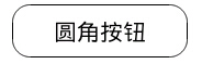
<Button

    android:layout_width="160dp"

    android:layout_height="wrap_content"

    android:background="@drawable/button_shape"

    android:text="圆角按钮"

    />

<?xml version="1.0" encoding="utf-8"?>

<shape xmlns:android="http://schemas.android.com/apk/res/android" >

    <solid android:color="#fff"/>

    <padding android:top="10px" android:bottom="10px"/>

    <corners android:radius="16px"/>

    <stroke android:width="1px" android:color="#000"/>

</shape>
shape制作虚线

没有dashGap属性则为实线
<View

    android:layout_width="match_parent"

    android:layout_height="5px"

    android:layout_marginTop="10dp"

    android:background="@drawable/line_shape"

    />
<?xml version="1.0" encoding="utf-8"?>

<shape xmlns:android="http://schemas.android.com/apk/res/android"

    android:shape="line" >

    <stroke

        android:dashGap="3dp"

        android:dashWidth="8dp"

        android:width="1dp"

        android:color="#63a219" />

    <size android:height="1dp" />

</shape>
shape制作渐变
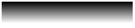
<View

    android:layout_width="match_parent"

    android:layout_height="50dp"

    android:layout_marginTop="10dp"

    android:background="@drawable/gra_shape"

    />
<?xml version="1.0" encoding="utf-8"?>

<shape xmlns:android="http://schemas.android.com/apk/res/android" >

    <gradient

        android:angle="270.0"

        android:endColor="#ffffff"

        android:startColor="#000000" />

</shape>
2、selector的使用
一.创建xml文件,位置:drawable/xxx.xml,同目录下记得要放相关图片
 <?xml version="1.0" encoding="utf-8"?>

 <selector xmlns:android="http://schemas.android.com/apk/res/android">

     <!-- 没有焦点时的背景图片 -->

     <item android:drawable="@drawable/handle_normal" android:state_enabled="true" android:state_window_focused="false"/>

     <!-- 触摸模式按下时的背景图片 -->

     <item android:drawable="@drawable/handle_pressed" android:state_pressed="true"/>

     <item android:drawable="@drawable/handle_focused" android:state_enabled="true" android:state_focused="true"/>

     <item android:drawable="@drawable/handle_normal" android:state_enabled="true"/>

     <!-- 获得焦点时的图片背景 -->

     <item android:drawable="@drawable/handle_focused" android:state_focused="true"/>

     <!--

     android:state_selected是选中

     android:state_focused是获得焦点

     android:state_pressed是点击

     android:state_enabled是设置是否响应事件,指所有事件

     -->

 </selector>
二.使用xml文件:
1.方法一:在listview中配置android:listSelector="@drawable/xxx
或者在listview的item中添加属性android:background="@drawable/xxx"
2.方法二:Drawable
drawable = getResources().getDrawable(R.drawable.xxx);
ListView.setSelector(drawable);但是这样会出现列表有时候为黑的情况,需要加上:android:cacheColorHint="@android:color/transparent"使其透明。
相关属性:
android:state_selected是选中
android:state_focused是获得焦点
android:state_pressed是点击
android:state_enabled是设置是否响应事件,指所有事件
根据这些状态同样可以设置button的selector效果。也可以设置selector改变button中的文字状态。
以下是配置button中的文字效果:
drawable/button_font.xml
     <?xml version="1.0" encoding="utf-8"?>

     <selector xmlns:android="http://schemas.android.com/apk/res/android">

         <item android:state_selected="true" android:color="#FFF" />

         <item android:state_focused="true" android:color="#FFF" />

         <item android:state_pressed="true" android:color="#FFF" />

         <item android:color="#000" />

     </selector>
Button还可以实现更复杂的效果,例如渐变
drawable/button_color.xml
 <span style="color:#330033;"><?xml version="1.0" encoding="utf-8"?>

 <selector xmlns:android="http://schemas.android.com/apk/res/android">         /

 <item android:state_pressed="true">//定义当button 处于pressed 状态时的形态。

                 <shape>

                 <gradient  android:startColor="#8600ff" />

                       <stroke   android:width="2dp" android:color="#000000" />

                        <corners android:radius="5dp" />

                        <padding android:left="10dp" android:top="10dp"

                                 android:bottom="10dp" android:right="10dp"/>

                  </shape>

 </item>

 <item android:state_focused="true">//定义当button获得 focus时的形态

                  <shape>

                        <gradient android:startColor="#eac100"/>

                        <stroke android:width="2dp" android:color="#333333"  color="#ffffff"/>

                        <corners android:radius="8dp" />

                        <padding android:left="10dp" android:top="10dp"

                                 android:bottom="10dp" android:right="10dp"/>

                 </shape>

  </item>

 </selector></span><span style="color:#ff0000;"> </span>
3、declare-styleable的使用
如何使用 declare-styleable
- 在创建 xml 到 objectName/res/values/ 命名为 attrs.xml
- 编辑文件内容为(示例)
<?xml version="1.0" encoding="utf-8"?>
<resources>
<declare-styleable name="test1">
<attr name="test" format = "float"></attr>
</declare-styleable>
</resources> - 在 layout 文件夹中的定义文件中,在使用处引用
<org.xiaoyunduo.MyText
xmlns:app="http://schemas.android.com/apk/res/org.xiaoyunduo"
android:id="@+id/add"
android:layout_width="wrap_content"
android:layout_height="wrap_content"
app:test="100"
android:text="@string/log_text_box_1_add_text"/>
//我记得以前不需要定义 xmlns 现在必须要定义可以直接使用android:test 的形式,现在必须要定义 xmlns 了。 - 在代码中获取 layout 文件中的值(最好是在构造方法中调用)
TypedArray a = context.obtainStyledAttributes(attrs, R.styleable.test1);//TypedArray是一个数组容器
float textSize = a.getFloat(R.styleable.test1_test, 30);//防止在XML文件里没有定义,就加上了默认值30 - 将获取到的值初始化到控件中
这里就不写了 在构造方法中值已经拿到,后面的爱怎么用就怎么用。
declare-styleable 定义说明:
1. reference:参考某一资源ID。
(1)属性定义:
<declare-styleable name = "名称">
<attr name = "background" format = "reference" />
</declare-styleable>
(2)属性使用:
<ImageView
android:layout_width = "42dip"
android:layout_height = "42dip"
android:background = "@drawable/图片ID"
/>
2. color:颜色值。
(1)属性定义:
<declare-styleable name = "名称">
<attr name = "textColor" format = "color" />
</declare-styleable>
(2)属性使用:
<TextView
android:layout_width = "42dip"
android:layout_height = "42dip"
android:textColor = "#00FF00"
/>
3. boolean:布尔值。
(1)属性定义:
<declare-styleable name = "名称">
<attr name = "focusable" format = "boolean" />
</declare-styleable>
(2)属性使用:
<Button
android:layout_width = "42dip"
android:layout_height = "42dip"
android:focusable = "true"
/>
4. dimension:尺寸值。
(1)属性定义:
<declare-styleable name = "名称">
<attr name = "layout_width" format = "dimension" />
</declare-styleable>
(2)属性使用:
<Button
android:layout_width = "42dip"
android:layout_height = "42dip"
/>
5. float:浮点值。
(1)属性定义:
<declare-styleable name = "AlphaAnimation">
<attr name = "fromAlpha" format = "float" />
<attr name = "toAlpha" format = "float" />
</declare-styleable>
(2)属性使用:
<alpha
android:fromAlpha = "1.0"
android:toAlpha = "0.7"
/>
6. integer:整型值。
(1)属性定义:
<declare-styleable name = "AnimatedRotateDrawable">
<attr name = "visible" />
<attr name = "frameDuration" format="integer" />
<attr name = "framesCount" format="integer" />
<attr name = "pivotX" />
<attr name = "pivotY" />
<attr name = "drawable" />
</declare-styleable>
(2)属性使用:
<animated-rotate
xmlns:android = "http://schemas.android.com/apk/res/android"
android:drawable = "@drawable/图片ID"
android:pivotX = "50%"
android:pivotY = "50%"
android:framesCount = "12"
android:frameDuration = "100"
/>
7. string:字符串。
(1)属性定义:
<declare-styleable name = "MapView">
<attr name = "apiKey" format = "string" />
</declare-styleable>
(2)属性使用:
<com.google.android.maps.MapView
android:layout_width = "fill_parent"
android:layout_height = "fill_parent"
android:apiKey = "0jOkQ80oD1JL9C6HAja99uGXCRiS2CGjKO_bc_g"
/>
8. fraction:百分数。
(1)属性定义:
<declare-styleable name="RotateDrawable">
<attr name = "visible" />
<attr name = "fromDegrees" format = "float" />
<attr name = "toDegrees" format = "float" />
<attr name = "pivotX" format = "fraction" />
<attr name = "pivotY" format = "fraction" />
<attr name = "drawable" />
</declare-styleable>
(2)属性使用:
<rotate
xmlns:android = "http://schemas.android.com/apk/res/android"
android:interpolator = "@anim/动画ID"
android:fromDegrees = "0"
android:toDegrees = "360"
android:pivotX = "200%"
android:pivotY = "300%"
android:duration = "5000"
android:repeatMode = "restart"
android:repeatCount = "infinite"
/>
9. enum:枚举值。
(1)属性定义:
<declare-styleable name="名称">
<attr name="orientation">
<enum name="horizontal" value="0" />
<enum name="vertical" value="1" />
</attr>
</declare-styleable>
(2)属性使用:
<LinearLayout
xmlns:android = "http://schemas.android.com/apk/res/android"
android:orientation = "vertical"
android:layout_width = "fill_parent"
android:layout_height = "fill_parent"
>
</LinearLayout>
10. flag:位或运算。
(1)属性定义:
<declare-styleable name="名称">
<attr name="windowSoftInputMode">
<flag name = "stateUnspecified" value = "0" />
<flag name = "stateUnchanged" value = "1" />
<flag name = "stateHidden" value = "2" />
<flag name = "stateAlwaysHidden" value = "3" />
<flag name = "stateVisible" value = "4" />
<flag name = "stateAlwaysVisible" value = "5" />
<flag name = "adjustUnspecified" value = "0x00" />
<flag name = "adjustResize" value = "0x10" />
<flag name = "adjustPan" value = "0x20" />
<flag name = "adjustNothing" value = "0x30" />
</attr>
</declare-styleable>
(2)属性使用:
<activity
android:name = ".StyleAndThemeActivity"
android:label = "@string/app_name"
android:windowSoftInputMode = "stateUnspecified | stateUnchanged | stateHidden">
<intent-filter>
<action android:name = "android.intent.action.MAIN" />
<category android:name = "android.intent.category.LAUNCHER" />
</intent-filter>
</activity>
注意:
属性定义时可以指定多种类型值。
(1)属性定义:
<declare-styleable name = "名称">
<attr name = "background" format = "reference|color" />
</declare-styleable>
(2)属性使用:
<ImageView
android:layout_width = "42dip"
android:layout_height = "42dip"
android:background = "@drawable/图片ID|#00FF00"
/>
定义命名空间
在自定义扩展的时候还可以自定义命名空间,但是我仿照 demo 的时候感觉不对。命名空间中的属性不能通过提示(alt+/)打出来,但 demo 的可以。
命名空间定义语法如下:(由于自己没整对此次贴的 drag_layout.xml 中的代码)
<RelativeLayout xmlns:android="http://schemas.android.com/apk/res/android"
xmlns:dot="http://schemas.android.com/apk/res/com.example.android.apis"
android:layout_width="match_parent"
android:layout_height="wrap_content"
android:orientation="vertical"
>
安卓常用的xml控件配件的使用包含shape,declare-styleable、selector的更多相关文章
- 常用的Activex 控件
1. Flash Player ActiveX Control 6.0.47.0 与FLASH 6.0配套的浏览器端动画播放插件 download.pchome.n ...
- Android常用框架和控件使用
Router框架 https://github.com/iqiyi/Andromeda/blob/master/CHINESE_README.md https://github.com/alibaba ...
- 常用的UI控件
关于本文:作为一名iOS软件工程师,熟练规范的使用常用的UI控件是必备的基础技能. 指示器(UIActivityIndicatorView)----转动的等待小菊花 提醒对话框(UIAlertView ...
- Android常用酷炫控件(开源项目)github地址汇总
转载一个很牛逼的控件收集帖... 第一部分 个性化控件(View) 主要介绍那些不错个性化的 View,包括 ListView.ActionBar.Menu.ViewPager.Gallery.Gri ...
- Android 常用炫酷控件(开源项目)git地址汇总
第一部分 个性化控件(View) 主要介绍那些不错个性化的 View,包括 ListView.ActionBar.Menu.ViewPager.Gallery.GridView.ImageView.P ...
- 【读书笔记《Android游戏编程之从零开始》】6.Android 游戏开发常用的系统控件(TabHost、ListView)
3.9 TabSpec与TabHost TabHost类官方文档地址:http://developer.android.com/reference/android/widget/TabHost.htm ...
- 【读书笔记《Android游戏编程之从零开始》】3.Android 游戏开发常用的系统控件(Button、Layout、ImageButton)
3.1 Button Button这控件不用多说,就是一个按钮,主要是点击后进行相应事件的响应. 给组件添加ID属性:定义格式为 android:id="@+id/name",这里 ...
- 常用的基本控件 android常用控件
1.TextView:(文本框):不能编辑 android:textColor="@color/tv_show_color" 字体颜色 android:textSize ...
- android菜鸟学习笔记12----Android控件(一) 几个常用的简单控件
主要参考<第一行代码> 1.TextView: 功能与传统的桌面应用开发中的Label控件相似,用于显示文本信息 如: <TextView android:layout_width= ...
随机推荐
- C#日期格式化,时间
日期转化一 为了达到不同的显示效果有时,我们需要对时间进行转化,默认格式为:2007-01-03 14:33:34 ,要转化为其他格式,要用到DateTime.ToString的方法(String, ...
- 如何对POST请求但是URL中也有参数/GET请求但是请求体中也有参数的情况进行安全扫描
通常情况下,GET的参数都在URL中,POST的参数都在请求体中,但是如题的情况也有,像使用方法PUT.DELETE的情况也有,这些情况该如何进行安全扫描呢?
- zabbix通过snmp监控linux主机
1.安装net-snmp [root@db01 ~]# yum install -y net-snmp 2.修改配置文件 [root@db01 ~]# vim /etc/snmp/snmpd.conf ...
- 2017.9.15 mybatis批量插入后实现主键回填
参考来自:mybatis mysql 批量insert 返回主键 注意:必须要在mybatis3.3.1及其以上才能实现. 1.service List branchEntryList = (Arra ...
- 固态硬盘(Solid State Drives)
固态硬盘(Solid State Drives) 学习了:https://baike.baidu.com/item/%E5%9B%BA%E6%80%81%E7%A1%AC%E7%9B%98/45351 ...
- SpringMVC 文本文件下载的配置
页面: <fieldset> <legend>Download annotator list</legend> <img src="pages/to ...
- Android 百度地图 简单实现--- 美食搜索
Android 百度地图 简单实现--- 美食 依赖包: 加入 Android 百度依赖包: 1 key: <!-- 开发人员 key --> <meta-dat ...
- MySQL架构组成之物理文件组成
一.日志文件 1.错误日志:Error Log 内容:MyQL Server 执行过程中全部较为严重的警告和错误信息,以及MySQL Server 每次启动和关闭的具体信息. 路径:默认存放位置在 ...
- Windows 用VS编译libevent源码
原理:从github上克隆libevent源码,然后使用cmake生成VS工程 github 上 libevent项目地址:https://github.com/libevent/libevent 第 ...
- 怎样把报表放到网页中显示(Web页面与报表简单集成样例)
1.问题描写叙述 如今用户开发的系统基本上趋向于BS架构的浏览器/server模式.这些系统可能由不同的语言开发.如HTML.ASP.JSP.PHP等.因此须要将制作好的报表嵌入到这些页面中. Fin ...