
你会用::before、::after吗
::before和::after伪元素的用法
一、介绍
css3为了区分伪类和伪元素,伪元素采用双冒号写法。
常见伪类——:hover,:link,:active,:target,:not(),:focus。
常见伪元素——::first-letter,::first-line,::before,::after,::selection。
::before和::after下特有的content,用于在css渲染中向元素逻辑上的头部或尾部添加内容。
这些添加不会出现在DOM中,不会改变文档内容,不可复制,仅仅是在css渲染层加入。
所以不要用:before或:after展示有实际意义的内容,尽量使用它们显示修饰性内容,例如图标。
举例:网站有些联系电话,希望在它们前加一个icon☎,就可以使用:before伪元素,如下:

<!DOCTYPE html>

<meta charset="utf-8" />

<style type="text/css">

    .phoneNumber::before {

    content:'\260E';

    font-size: 15px;

}

</style>

<p class="phoneNumber">12345645654</p>

Note:这些特殊字符的html,js和css的写法是不同的,具体可查看html特殊字符的html,js,css写法汇总。
二、content属性
::before和::after必须配合content属性来使用,content用来定义插入的内容,content必须有值,至少是空。默认情况下,伪类元素的display是默认值inline,可以通过设置display:block来改变其显示。
content可取以下值。
1、string
使用引号包一段字符串,将会向元素内容中添加字符串。如:a:after{content:""}
举例:
<!DOCTYPE html>

<meta charset="utf-8" />

<style type="text/css">

p::before{

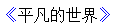
    content: "《";

    color: blue;

}

p::after{

    content: "》";

    color: blue;

}

</style>

<p>平凡的世界</p>
2、attr()
通过attr()调用当前元素的属性,比如将图片alt提示文字或者链接的href地址显示出来。
<style type="text/css">

a::after{

    content: "(" attr(href) ")";

}

</style>

<a href="http://www.cnblogs.com/starof">starof</a>

3、url()/uri()
用于引用媒体文件。
举例:“百度”前面给出一张图片,后面给出href属性。
<style>

a::before{

    content: url("https://www.baidu.com/img/baidu_jgylogo3.gif");

}

a::after{

    content:"("attr(href)")";

}

a{

    text-decoration: none;

}

</style>

---------------------------

<body>

<a href="http://www.baidu.com">百度</a>

</body>
效果:

4、counter()
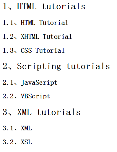
调用计数器,可以不使用列表元素实现序号功能。
配合counter-increment和counter-reset属性使用:
h2:before { counter-increment: chapter; content: "Chapter " counter(chapter) ". " }
代码:
<style>

body{

    counter-reset: section;

}

h1{

    counter-reset: subsection;

}

h1:before{

    counter-increment:section;

    content:counter(section) "、";

}

h2:before{

    counter-increment:subsection;

    content: counter(section) "." counter(subsection) "、";

}

</style>

------------------------------------------------

<body>

<h1>HTML tutorials</h1>

<h2>HTML Tutorial</h2>

<h2>XHTML Tutorial</h2>

<h2>CSS Tutorial</h2>

<h1>Scripting tutorials</h1>

<h2>JavaScript</h2>

<h2>VBScript</h2>

<h1>XML tutorials</h1>

<h2>XML</h2>

<h2>XSL</h2>

</body>
效果:
了解更多可参考:https://developer.mozilla.org/en-US/docs/Web/Guide/CSS/Counters
三、使用
1、清除浮动
清除浮动方法有多种,现在最常用的就是下面这种方法,仅需要以下样式即可在元素尾部自动清除浮动
.cf:before,

.cf:after {

    content: " ";

    display: table;

}

.cf:after {

    clear: both;

}

.cf {

    *zoom: 1;

}
2、模拟float:center的效果
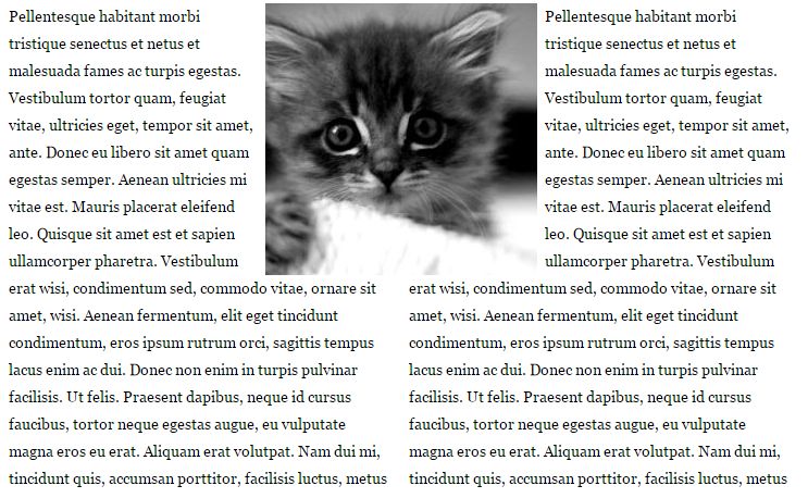
float没有center这个取值,但是可以通过伪类来模拟实现。
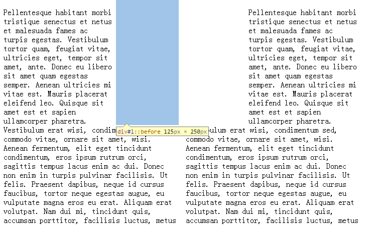
这个效果实现很有意思,左右通过::before float各自留出一半图片的位置,再把图片绝对定位上去。
核心css如下:
#page-wrap { width: 60%; margin: 40px auto; position: relative; }

#logo { position: absolute; top: 0; left: 50%; margin-left: -125px; }

#l, #r { width: 49%; }

#l { float: left; }

#r { float: right; }

#l:before, #r:before { content: ""; width: 125px; height: 250px; }

#l:before { float: right; }

#r:before { float: left; }
完整代码如下:
出自:https://css-tricks.com/float-center/
3、做出各种图形效果
举例:一个六角星
#star-six的div是一个正三角行,#star-six::after是一个倒三角形,通过绝对定位,调整其位置即可实现六角星的效果。
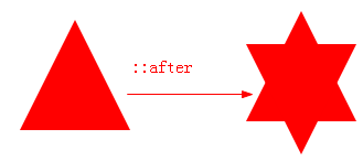
点我查看更多。
4、不使用图片创建小图标
举例:比如一个电话
很巧妙的应用一个div左border加圆角当机身,::before和::after配合圆角当听筒。
<style type="text/css">

    #phone{width:50px;height:50px;border-left:6px solid #EEB422;border-radius:20%;transform:rotate(-30deg);-webkit-transform:rotate(-30deg);margin:20px;margin-right:0px;position:relative;display: inline-block;top: -5px;}

    #phone:before{width:15px;height:15px;background:#EEB422;border-radius: 20%;content: "";position: absolute;left:-2px;top: 1px;}

    #phone:after{width:15px;height:15px;background:#EEB422;border-radius: 20%;content: "";position: absolute;left:-3px;top: 34px;}

</style>

<div id="wraper">

    <div id="phone"></div>

</div>

更多图标:
<!doctype html>

<html>

<head>

    <title>伪类标签使用</title>

</head>

<style type="text/css">

    #wraper{padding:10px;width:380px;height:380px;border:3px solid #ccc;margin:auto;}

    #power{width: 30px;height: 30px;margin:20px;border: 6px solid #EEB422;border-radius: 50%;position: relative;display: inline-block;}

    #power:before{width:7px;height:22px;background:#EEB422;position: absolute;left:8px;top:-13px;content: "";border: 3px solid #fff;}

    #play{width: 30px;height: 30px;margin:20px;border: 6px solid #EEB422;border-radius: 50%;position:relative;display: inline-block;background: #EEB422;}

    #play:before{border:11px solid transparent;border-left:17px solid #fff;content: "";position: absolute;left:9px;top: 3px;}

    #pause{width: 30px;height: 30px;margin:20px;border: 6px solid #EEB422;border-radius: 50%;position:relative;display: inline-block;background: #EEB422;}

    #pause:before{height:20px;width:5px;border:0px solid transparent;border-left:8px solid #fff;border-right:8px solid #fff;content: "";position: absolute;left:4px;top: 5px;}

    #stop{width: 30px;height: 30px;margin:20px;border: 6px solid #EEB422;border-radius: 50%;position:relative;display: inline-block;background: #EEB422;}

    #stop:before{height:17px;width:17px;background:#fff;content: "";position: absolute;left:6px;top: 6px;}

    #comment{width: 50px;height: 25px;margin:20px;border: 6px solid #EEB422;border-radius: 20%;position:relative;display: inline-block;background: #EEB422;}

    #comment:before{border:10px solid transparent;border-top:10px solid #EEB422;content: "";position: absolute;left:28px;top: 28px;}

    #comment:after{content: "....";position: absolute;color: #fff;font-size: 26px;top: -10px;left: 2px;}

    #like{width: 50px;height: 30px;margin:20px;border-radius: 55%;transform:rotate(55deg);-webkit-transform:rotate(55deg);position:relative;display: inline-block;background: #EEB422;}

    #like:before{width:50px;height:30px;border-radius: 55%;transform:rotate(-110deg);-webkit-transform:rotate(-110deg);background:#EEB422;content: "";position: absolute;left:8px;top: -12px;}

    #search{width: 20px;height: 20px;border:4px solid #EEB422;border-radius:50%;margin:20px;position:relative;display: inline-block;top: -5px;left: -5px;}

    #search:before{width:20px;height:5px;background:#EEB422;transform:rotate(45deg);-webkit-transform:rotate(45deg);content: "";position: absolute;left:15px;top: 22px;}

    #home{width: 30px;height: 30px;background:#EEB422;margin:20px;position:relative;display: inline-block;top: 5px;}

    #home:before{width:6px;height:12px;background:#fff;content: "";position: absolute;left:12px;top: 20px;}

    #home:after{border:25px solid transparent;border-bottom:20px solid #EEB422;content: "";position: absolute;top: -38px;left:-10px;}

    #photo{width:40px;height:30px;background:#EEB422;margin:20px;position:relative;display: inline-block;top: 5px;}

    #photo:before{width:13px;height:13px;border:4px solid #fff;border-radius:50%;background:#EEB422;content: "";position: absolute;left:10px;top: 5px;}

    #photo:after{width:15px;height:10px;background:#EEB422;content: "";position: absolute;top: -7px;left:13px;}

    #photo{width:40px;height:30px;background:#EEB422;margin:20px;position:relative;display: inline-block;top: 5px;}

    #email{width:50px;height:35px;background:#EEB422;margin:20px;position:relative;display: inline-block;top: 5px;}

    #email:before{border:25px solid transparent;border-top:20px solid #fff;content: "";position: absolute;left:0px;top: 2px;}

    #email:after{border:25px solid transparent;border-top:20px solid #EEB422;content: "";position: absolute;top:0px;}

    #file{width:30px;height:45px;border:4px solid #EEB422;margin:20px;position:relative;display: inline-block;top: 5px;}

    #file:before{border:10px solid #fff;border-right:10px solid #EEB422;border-bottom:10px solid #EEB422;content: "";position: absolute;left:-4px;top: -4px;}

    #file:after{width:20px;height:5px;border-top:3px solid #EEB422;border-bottom:3px solid #EEB422;content: "";position: absolute;left: 5px;top: 25px;}

    #history{width:35px;height:35px;border:4px solid #EEB422;border-radius: 50%;margin:20px;position:relative;display: inline-block;top: 5px;}

    #history:before{width:14px;height:14px;border-bottom:4px solid #EEB422;border-left:4px solid #EEB422;content: "";position: absolute;left:14px;top: 3px;}

    #video{width:50px;height:35px;background:#EEB422;border-radius: 20%;margin:20px;position:relative;display: inline-block;top: -5px;}

    #video:before{width:6px;height:6px;border:11px solid transparent;border-right:11px solid #EEB422;content: "";position: absolute;left:35px;top: 4px;}

    #video:after{width:10px;height:10px;border:6px solid transparent;border-top:6px solid #EEB422;border-left:6px solid #EEB422;transform:rotate(45deg);-webkit-transform:rotate(45deg);content: "";position: absolute;left:13px;top: 35px;}

    #tags{width:50px;height:25px;background:#EEB422;border-radius: 35% 0% 0% 35%;transform:rotate(45deg);-webkit-transform:rotate(45deg);margin:20px;margin-left:35px;position:relative;display: inline-block;top: -5px;}

    #tags:before{width:10px;height:10px;border-radius:50%;background:#fff;content: "";position: absolute;left:7px;top: 7px;}

    #phone{width:50px;height:50px;border-left:6px solid #EEB422;border-radius:20%;transform:rotate(-30deg);-webkit-transform:rotate(-30deg);margin:20px;margin-right:0px;position:relative;display: inline-block;top: -5px;}

    #phone:before{width:15px;height:15px;background:#EEB422;border-radius: 20%;content: "";position: absolute;left:-2px;top: 1px;}

    #phone:after{width:15px;height:15px;background:#EEB422;border-radius: 20%;content: "";position: absolute;left:-3px;top: 34px;}

    #profile{width: 40px;height:15px;background:#EEB422;border-radius: 45% 45% 0 0;margin:20px;position:relative;display: inline-block;top: 0px;}

    #profile:before{width: 20px;height:22px;background:#EEB422;border-radius:40%;content: "";position: absolute;left: 10px;top: -22px;}

</style>

<body>

    <div id="wraper">

        <div id="power"></div>

        <div id="play"></div>

        <div id="pause"></div>

        <div id="stop"></div>

        <div id="comment"></div>

        <div id="like"></div>

        <div id="search"></div>

        <div id="home"></div>

        <div id="photo"></div>

        <div id="email"></div>

        <div id="file"></div>

        <div id="history"></div>

        <div id="video"></div>

        <div id="tags"></div>

        <div id="phone"></div>

        <div id="profile"></div>

    </div>

</body>

</html>
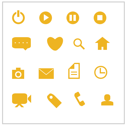
这个效果来自:http://www.w3cfuns.com/blog-5444604-5402127.html
有大神用伪元素创建了84种小图标,具体可查看http://nicolasgallagher.com/pure-css-gui-icons/
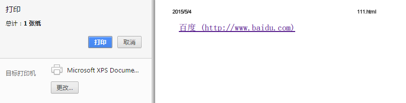
5、显示打印网页的URL
<style>

@media print {

  a[href]:after {

    content: " (" attr(href) ") ";

  }

}

</style><body>

<a href="http://www.baidu.com">百度</a>

</body>
6、给blockquote添加引号
经常用到给blockquote 引用段添加巨大的引号作为背景,可以用 ::before 来代替 background 。好处是即可以给背景留下空间,还可以直接使用文字而非图片:
<meta charset="utf-8"/>

<style type="text/css">

    blockquote::before {

    content: open-quote;

    color: #ddd;

    z-index: -1;

    font-size:80px;

}

</style>

<blockquote>引用一个段落,双引号用::before伪元素实现</blockquote>

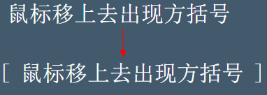
7、超链接特效
举例:配合 CSS定位实现一个鼠标移上去,超链接出现方括号的效果
<meta charset="utf-8" />

<style type="text/css">

body{

    background-color: #425a6c;

}

    a {

    position: relative;

    display: inline-block;

    outline: none;

    color: #fff;

    text-decoration: none;

    font-size: 32px;

    padding: 5px 20px;

}

a:hover::before, a:hover::after { position: absolute; }

a:hover::before { content: "\5B"; left: -10px; }

a:hover::after { content: "\5D"; right:  -10px; }

</style>

<a>鼠标移上去出现方括号</a>
更多创意链接特效可参考: Creative Link Effects 。
8、::before和::after实现多背景图片
举例:一个标签应用5张背景图
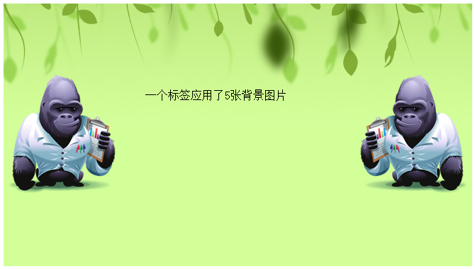
原效果来自:Multiple Backgrounds and Borders with CSS 2.1
这个效果看的真的是脑洞大开,虽然多背景图用css3的background-image很容易就能实现。但是这篇文章是10年写的,已经过去5年了,想想也正是他们这样的尝试和努力才加速了css3标准的制定,让今天的开发更easy。今天的我们又能为5年后的开发人员做些什么贡献呢?
本文作者starof,因知识本身在变化,作者也在不断学习成长,文章内容也不定时更新,为避免误导读者,方便追根溯源,请诸位转载注明出处:http://www.cnblogs.com/starof/p/4459991.html有问题欢迎与我讨论,共同进步。
随机推荐
- SVN使用教程之-分支/标记 合并 subeclipse
首先说下为什么我们需要用到分支-合并.比如项目demo下有两个小组,svn下有一个trunk版.由于客户需求突然变化,导致项目需要做较大改动,此时项目组决定由小组1继续完成原来正进行到一半的工作[某个 ...
- codewars-random(4)
问题简介:算多长时间用本金能得到想要的利息,基础题. 代码:function calculateYears(principal, interest, tax, desired) { // you ...
- Spark-GraphxAPI学习笔记
图的集合视图 graph包含三个基本的类集合视图: val vertices: VertexRDD[VD] val edges: EdgeRDD[ED] val triplets: RDD[EdgeT ...
- 基于DDD的.NET项目搭建
第一次写博客有点小激动,废话不多说先上图: 01_Client:存放UI相关的项目,比如ASP.NET MVC或者相关的Web Model及View Model项目. 02_Hosting:存放与Se ...
- perl的列表(List)和数组(Array)
If a scalar is the "singular" in Perl, as we described it at the beginning of Chapter 2, t ...
- DOM学习笔记--入门1
HTML DOM 是关于如何获取.修改.添加或删除 HTML 元素的标准. 首先节点有很多种,不仅仅HTML元素是节点,尤其 要注意文本节点的存在. 根据 W3C 的 HTML DOM 标准,HTML ...
- feature2d相关
1.Harris角点检测 是基于灰度图像的角点检测. 灰度变化率函数如下: 其中的w(x,y)为加权函数,可为常数或为高斯函数.之后对E(u,v)进行泰勒级数的展开与化简,最终得到 ,,Ix,Iy是图 ...
- CODE[VS]-数的计算-递推-天梯白银
题目描述 Description 我们要求找出具有下列性质数的个数(包含输入的自然数n): 先输入一个自然数n(n<=1000),然后对此自然数按照如下方法进行处理: 1.不作任何处理; 2.在 ...
- CodeForces 671A Recycling Bottles
暴力. 每个人找到一个入口,也就是从回收站到这个入口走的路程由人的位置到入口的路程来替代. 因此,只要找两个人分别从哪里入口就可以了.注意:有可能只要一个人走,另一人不走. #pragma comme ...
- CodeForces 706D Vasiliy's Multiset
字典树. 比较经典的题目了.把每一个数字都插入到字典树中,询问的时候如果$x$的第$i$位是$p$,那么尝试着在字典树上往$pXOR1$的节点走下去,没有$pXOR1$节点的话再走$p$的.删除操作的 ...