css3动画使用技巧之——transform-delay为负值时的应用。
<html> <head> <title>css3动画delay为负值时的效果</title> <meta charset="UTF-8"/> <style type="text/css"> .he{ width: 400px; height: 200px; background: #eee; margin: 0 auto; text-align: center; line-height: 200px; } .he div{ width: 4px; height: 30px; background-color: green; display: inline-block; animation-name: myniy; animation-duration: 1.2s; animation-iteration-count: infinite; -webkit-animation-name: myniy; -webkit-animation-duration: 1.2s; -webkit-animation-iteration-count: infinite; -moz-animation-duration: 1.2s; -moz-animation-name: myniy; -moz-animation-iteration-count: infinite; } .m1{ animation-delay: -1.1s; -webkit-animation-delay: -1.1s; -moz-animation-delay: -1.1s; } .m2{ animation-delay: -1.0s; -webkit-animation-delay: -1.0s; -moz-animation-delay: -1.0s; } .m3{ animation-delay: -0.9s; -webkit-animation-delay: -0.9s; -moz-animation-delay: -0.9s; } .m4{ animation-delay: -0.8s; -webkit-animation-delay: -0.8s; -moz-animation-delay: -0.8s; } .m5{ animation-delay: -0.7s; -webkit-animation-delay: -0.7s; -moz-animation-delay: -0.7s; } .m6{ animation-delay: -0.6s; -webkit-animation-delay: -0.6s; -moz-animation-delay: -0.6s; } @keyframes myniy{ 0%,30%,70%,100%{ transform: scale(1,0.5); } 50%{ transform: scale(1); } } @-webkit-keyframes myniy{ 0%,30%,70%,100%{ transform: scale(1,0.5); } 50%{ transform: scale(1); } } @-moz-keyframes myniy{ 0%,30%,70%,100%{ transform: scale(1,0.5); } 50%{ transform: scale(1); } } </style> </head> <body> <div class="he"> <div class="m1"></div> <div class="m2"></div> <div class="m3"></div> <div class="m4"></div> <div class="m5"></div> <div class="m6"></div> </div> </body></html>
运行效果图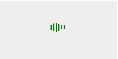
animation-delay为负值时表示,动画跳过多少秒进入动画周期。
上面要注意的地方,关键帧对称
 0%,30%,70%,100%{
                    transform: scale(1,0.5);
                }
 50%{
                    transform: scale(1);
                }延迟为-(1.2-0.1)开始
css3动画使用技巧之——transform-delay为负值时的应用。的更多相关文章
- css3动画使用技巧之—JQ配合css3实现轮播之animation-delay应用
<!DOCTYPE html> <html> <head> <title>css3动画使用技巧之—JQ配合css3实现轮播之animation-dela ...
- 用css3动画 @keyframes里设置transform:rotate(); 控制动画暂停和运动用属性:animation-play-state:paused暂停,在微信和safari里设置paused无效,在QQ里是正常的
这几天遇到了两个很奇葩的问题,终于找到原因,趁还记得解决方法,赶紧记下来: 用css3动画 @keyframes里设置transform:rotate(); 控制动画暂停和运动可以用属性:animat ...
- css3动画使用技巧之—border旋转时的应用。
<html> <head> <title>css3动画border旋转时的应用.</title> <meta charset="UTF- ...
- CSS3动画属性:变形(transform)
Transform字面上就是变形,改变的意思.在CSS3中transform主要包括以下几种:旋转rotate.扭曲skew.缩放scale和移动translate以及矩阵变形matrix. 语法 t ...
- css3动画属性系列之transform细讲scale缩放
下面我们从3个方面开始介绍: 1.scale(x,y) 对元素进行缩放 X表示水平方向缩放的倍数 | Y表示垂直方向的缩放倍数 Y是一个可选参数,没有设置的话,则表示X,Y两个方向的缩放倍数是一样的. ...
- css3动画属性系列之transform细讲旋转rotate
1.语法: transform: none | <transform-function> [<transform-function>]* 2.取值: none ...
- CSS3动画理解与应用
CSS3动画理解与应用 Transform:对元素进行变形:Transition:对元素某个属性或多个属性的变化,进行控制(时间等),类似flash的补间动画.但只有两个关键贞.开始,结束.Anima ...
- css3中的变形(transform)、过渡(transtion)、动画(animation)
Transform字面上就是变形,改变的意思.在CSS3中transform主要包括以下几种:旋转rotate.扭曲skew.缩放scale和移动translate以及矩阵变形matrix.下面我们一 ...
- 使用transform和transition制作CSS3动画
<!DOCTYPE HTML> <html lang="en-US"> <head> <meta charset="UTF-8& ...
随机推荐
- java 泛型中 T、E ... 和 问号(通配符)的区别
一.泛型中T.E ... 是泛型类.泛型方法定义时候用的. 1.泛型类定义在类后面 紧跟类名后面 public class TestClassDefine<T>{} 2.泛型方法定义在方 ...
- 在Visual Studio中使用Pseudovariables来帮助调试
博客搬到了fresky.github.io - Dawei XU,请各位看官挪步.最新的一篇是:在Visual Studio中使用Pseudovariables来帮助调试.
- HTML表单综合实例
当作最近没怎么敲代码的练手把 <html> <head><title>LAMP学员基本信息</title></head> <body& ...
- HTML中Select的使用具体解释
<html> <head> <SCRIPT LANGUAGE="JavaScript"> <!-- //oSelect 列表的底部加入了一 ...
- VS2005配置CPPUnit进行单元測试
一. 编译CPPUnitproject 1. 解压文件cppunit-1.12.1.tar.gz. 2. 编译$BASE/src/cppunit/CppUnitLibraries.dsw中的cpp ...
- java中synchronized使用方法
synchronized的一个简单样例 public class TextThread { /** * @param args */ public static void main(String[ ...
- JSLink to render the list to show people detail info with picture
I create a custom list, and create a poeple column to store poeple detail info with picture in this ...
- [译]信仰是怎样毁掉程序猿的How religion destroys programmers
作者原文地址 作者John Sonmez 英文水平不够高,翻译不太准确. 翻译地址:译文 尽管文章是13年的,可是这段时间恰好看到.net开源核心之后,各种java和.net掐架. 语言之争有些牵涉到 ...
- RxAndroid结合Retrofit,看看谁才是最佳拍档!
这篇博文酝酿好久了,今天终于下定决心开始写!RxAndroid和Retrofit都算是当下非常流行的Android开发框架,这两个框架光是单独使用就已经爽歪歪了,那么将RxAndroid和Retrof ...
- iOS之GCDAsyncSocket第三方库的使用
Socket描述了一个IP.端口对.它简化了程序员的操作,知道对方的IP以及PORT就可以给对方发送消息,再由服务器端来处理发送的这些消息.所以,Socket一定包含了通信的双发,即客户端(Clien ...