【转】用CSS代码写出的各种形状图形的方法
一共收集整理了图形20个,比较实用,同时也为了熟悉CSS的代码。整合了一下,有错误欢迎指出。
1.正方形

#square {width: 100px;height: 100px;background: red;}2.长方形

#rectangle {width: 200px;height: 100px;background: red;}3.左上三角

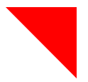
#triangle-topleft {width: 0;height: 0;border-top: 100px solid red; border-right: 100px solid transparent;}4.右上三角
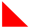
#triangle-topright {width: 0;height: 0;border-top: 100px solid red; border-left: 100px solid transparent;}5.左下三角
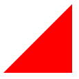
#triangle-bottomleft {width: 0;height: 0;border-bottom: 100px solid red; border-right: 100px solid transparent;}6.右下三角
#triangle-bottomright {width: 0;height: 0;border-bottom: 100px solid red; border-left: 100px solid transparent;}7.平行四边形
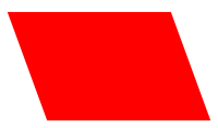
#parallelogram {width: 150px;height: 100px;-webkit-transform: skew(20deg); -moz-transform: skew(20deg); -o-transform: skew(20deg);background: red;}8.梯形
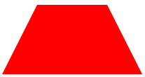
#trapezoid {border-bottom: 100px solid red;border-left: 50px solid transparent;border-right: 50px solid transparent;height: 0;width: 100px;}9.六角星

#star-six {width: 0;height: 0;border-left: 50px solid transparent;border-right: 50px solid transparent;border-bottom: 100px solid red;position: relative;}#star-six:after {width: 0;height: 0;border-left: 50px solid transparent;border-right: 50px solid transparent;border-top: 100px solid red;position: absolute;content: "";top: 30px;left: -50px;}10.五角星

#star-five { margin: 50px 0; position: relative; display: block; color: red; width: 0px; height: 0px; border-right: 100px solid transparent; border-bottom: 70px solid red; border-left: 100px solid transparent; -moz-transform: rotate(35deg); -webkit-transform: rotate(35deg); -ms-transform: rotate(35deg); -o-transform: rotate(35deg);}#star-five:before { border-bottom: 80px solid red; border-left: 30px solid transparent; border-right: 30px solid transparent; position: absolute; height: 0; width: 0; top: -45px; left: -65px; display: block; content: ''; -webkit-transform: rotate(-35deg); -moz-transform: rotate(-35deg); -ms-transform: rotate(-35deg); -o-transform: rotate(-35deg); }#star-five:after { position: absolute; display: block; color: red; top: 3px; left: -105px; width: 0px; height: 0px; border-right: 100px solid transparent; border-bottom: 70px solid red; border-left: 100px solid transparent; -webkit-transform: rotate(-70deg); -moz-transform: rotate(-70deg); -ms-transform: rotate(-70deg); -o-transform: rotate(-70deg); content: '';}11.五边形

#pentagon { position: relative; width: 54px; border-width: 50px 18px 0; border-style: solid; border-color: red transparent;}#pentagon:before { content: ""; position: absolute; height: 0; width: 0; top: -85px; left: -18px; border-width: 0 45px 35px; border-style: solid; border-color: transparent transparent red;}12.六边形

#hexagon {width: 100px;height: 55px;background: red;position: relative;}#hexagon:before {content: "";position: absolute;top: -25px; left: 0;width: 0;height: 0;border-left: 50px solid transparent;border-right: 50px solid transparent;border-bottom: 25px solid red;}#hexagon:after {content: "";position: absolute;bottom: -25px; left: 0;width: 0;height: 0;border-left: 50px solid transparent;border-right: 50px solid transparent;border-top: 25px solid red;}13.桃心

#heart { position: relative; width: 100px; height: 90px;}#heart:before,#heart:after { position: absolute; content: ""; left: 50px; top: 0; width: 50px; height: 80px; background: red; -moz-border-radius: 50px 50px 0 0; border-radius: 50px 50px 0 0; -webkit-transform: rotate(-45deg); -moz-transform: rotate(-45deg); -ms-transform: rotate(-45deg); -o-transform: rotate(-45deg); transform: rotate(-45deg); -webkit-transform-origin: 0 100%; -moz-transform-origin: 0 100%; -ms-transform-origin: 0 100%; -o-transform-origin: 0 100%; transform-origin: 0 100%;}#heart:after { left: 0; -webkit-transform: rotate(45deg); -moz-transform: rotate(45deg); -ms-transform: rotate(45deg); -o-transform: rotate(45deg); transform: rotate(45deg); -webkit-transform-origin: 100% 100%; -moz-transform-origin: 100% 100%; -ms-transform-origin: 100% 100%; -o-transform-origin: 100% 100%; transform-origin :100% 100%;}14.无限大符号
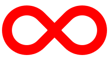
#infinity { position: relative; width: 212px; height: 100px;} #infinity:before,#infinity:after { content: ""; position: absolute; top: 0; left: 0; width: 60px; height: 60px; border: 20px solid red; -moz-border-radius: 50px 50px 0 50px; border-radius: 50px 50px 0 50px; -webkit-transform: rotate(-45deg); -moz-transform: rotate(-45deg); -ms-transform: rotate(-45deg); -o-transform: rotate(-45deg); transform: rotate(-45deg);} #infinity:after { left: auto; right: 0; -moz-border-radius: 50px 50px 50px 0; border-radius: 50px 50px 50px 0; -webkit-transform: rotate(45deg); -moz-transform: rotate(45deg); -ms-transform: rotate(45deg); -o-transform: rotate(45deg); transform: rotate(45deg);}15.蛋
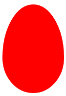
#egg { display:block; width: 126px; height: 180px; background-color: red; -webkit-border-radius: 63px 63px 63px 63px / 108px 108px 72px 72px; border-radius: 50% 50% 50% 50% / 60% 60% 40% 40%;}16.提示对话框

#talkbubble { width: 120px; height: 80px; background: red; position: relative; -moz-border-radius: 10px; -webkit-border-radius: 10px; border-radius: 10px;}#talkbubble:before { content:""; position: absolute; right: 100%; top: 26px; width: 0; height: 0; border-top: 13px solid transparent; border-right: 26px solid red; border-bottom: 13px solid transparent;}17.十二角星

#burst-8 { background: red; width: 80px; height: 80px; position: relative; text-align: center; -webkit-transform: rotate(20deg); -moz-transform: rotate(20deg); -ms-transform: rotate(20deg); -o-transform: rotate(20eg); transform: rotate(20deg);}#burst-8:before { content: ""; position: absolute; top: 0; left: 0; height: 80px; width: 80px; background: red; -webkit-transform: rotate(135deg); -moz-transform: rotate(135deg); -ms-transform: rotate(135deg); -o-transform: rotate(135deg); transform: rotate(135deg);}18.八角星

#burst-8 { background: red; width: 80px; height: 80px; position: relative; text-align: center; -webkit-transform: rotate(20deg); -moz-transform: rotate(20deg); -ms-transform: rotate(20deg); -o-transform: rotate(20eg); transform: rotate(20deg);}#burst-8:before { content: ""; position: absolute; top: 0; left: 0; height: 80px; width: 80px; background: red; -webkit-transform: rotate(135deg); -moz-transform: rotate(135deg); -ms-transform: rotate(135deg); -o-transform: rotate(135deg); transform: rotate(135deg);}19.钻石
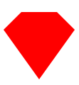
#cut-diamond { border-style: solid; border-color: transparent transparent red transparent; border-width: 0 25px 25px 25px; height: 0; width: 50px; position: relative; margin: 20px 0 50px 0;}#cut-diamond:after { content: ""; position: absolute; top: 25px; left: -25px; width: 0; height: 0; border-style: solid; border-color: red transparent transparent transparent; border-width: 70px 50px 0 50px;}20.八卦

#yin-yang {width: 96px;height: 48px;background: #eee;border-color: red;border-style: solid;border-width: 2px 2px 50px 2px;border-radius: 100%;position: relative;}#yin-yang:before {content: "";position: absolute;top: 50%;left: 0;background: #eee;border: 18px solid red;border-radius: 100%;width: 12px;height: 12px;}#yin-yang:after {content: "";position: absolute;top: 50%;left: 50%;background: red;border: 18px solid #eee;border-radius:100%;width: 12px;height: 12px;}

原文地址http://blogread.cn/it/article/7891?f=wb
【转】用CSS代码写出的各种形状图形的方法的更多相关文章
- CSS代码写出的各种形状图形
做网页设计时经常要用到各种形状的图形,对于规则的图形很简单,但是对于不规则的图形,一般我们都是用图片,今天就在这里教大家怎样用css代码写出各种规则不同的图形 1.正方形 #square {width ...
- 教你用CSS代码写出的各种形状图形
做网页设计时经常要用到各种形状的图形,对于规则的图形很简单,但是对于不规则的图形,一般我们都是用图片,今天就在这里教大家怎样用css代码写出各种规则不同的图形 1.正方形 #square {width ...
- CSS代码实例:用CSS代码写出的各种形状图形
一共收集整理了图形20个,比较实用,同时也为了熟悉CSS的代码.整合了一下,有错误欢迎指出. 1.正方形 #square { width: 100px; height: 100px; backgrou ...
- 【技能】使用纯CSS+html写出方向箭头,简单慷慨,好看
使用纯CSS+html写出方向箭头,贴出来就能够用,100%原创 <html> <head> <title></title> <meta http ...
- [置顶]
如何用PYTHON代码写出音乐
如何用PYTHON代码写出音乐 什么是MIDI 博主本人虽然五音不全,而且唱歌还很难听,但是还是非常喜欢听歌的.我一直在做这样的尝试,就是通过人工智能算法实现机器自动的作词和编曲(在这里预告下,通过深 ...
- 程序员面试京东前端,现场JavaScript代码写出魔方特效
程序员面试京东前端,现场JS代码写出魔方特效,成功搞定20K月薪 今天小编我逛论坛,看到了一位程序员小伙子,因为是有了两年工作经验,然后去京东面试前端岗,一面二面轻松就过了,到了技术面这一块,小伙干脆 ...
- 用最简单的代码写出banner图轮播效果
以下视频是由[赵一鸣随笔]博客提供的“用最简单的代码写出banner图轮播效果”. 查看全屏高清视频,请点击链接:http://www.zymseo.com/58.html
- JS函数 编程练习 使用javascript代码写出一个函数:实现传入两个整数后弹出较大的整数。
编程练习 使用javascript代码写出一个函数:实现传入两个整数后弹出较大的整数. 任务 第一步: 编写代码完成一个函数的定义吧. 第二步: 我们来补充函数体中的控制语句,完成函数功能吧. 提示: ...
- 如何组织css,写出高质量的css代码
!如何组织css一:css的API 属于基础部分,这部分的能力用“对”和“错”来评判. 比如说把文字设置为红色,只能用color:red:这种写法是对的,其他任何写法都是错的. 二:css框架 不能用 ...
随机推荐
- Spring+Mybatis+MySql+Maven 简单的事务管理案例
利用Maven来管理项目中的JAR包,同时使用Spring在业务处理层进行事务管理.数据库使用MySq,数据处理层使用Spring和Mybatis结合. 本案例代码主要结构如图: 1.数据库脚本 -- ...
- freeswitch
FreeSWITCH 是一个电话的软交换解决方案,包括一个软电话和软交换机用以提供语音和聊天的产品驱动.FreeSWITCH 可以用作交换机引擎.PBX.多媒体网关以及多媒体服务器等.可以用作一个简单 ...
- HDU 1058 优先队列or堆
本来应当是一道优先队列或者堆的题 因为每个数都应该是已经得到的数*2 *3 *5 *7而得到的 但是 2*7 大于 3*2 这就必须保证每次取得都是没有拿过的最小的数 但是它主动降低难度在样例里卖了个 ...
- 10. 求N分之一序列前N项和
求N分之一序列前N项和 #include <stdio.h> int main() { int i, n; double item, sum; while (scanf("%d& ...
- PHP学习(五)----jQuery和JSON数据
对于jQuery: jQuery 是一个 JavaScript 库. jQuery 极大地简化了 JavaScript 编程.
- static的作用,this(),super()用法
1:static{}表示静态代码块:在java虚拟机(jvm)加载该类时,会执行这个代码块一次,静态代码块在new()对象之前就加载了 2: this()与surper()区别:surper()是从子 ...
- scandir 使用示例
int filter_fn(const struct dirent * ent) { if (ent->d_type != DT_REG) return 0; r ...
- postgre去重复记录
postgre去重复记录,主要用到row定位的一个系统表示 “ctid”,能查出纯净的不重复的记录,那要删掉重复值也就容易了,自己去折腾吧. 我所涉及的是得到不重复的记录,就一句话: select c ...
- .Net Install类的Install、Commit等事件触发顺序
.Net Install类的Install.Commit等事件触发顺序 空间 首先是Install其中调用base.Install过程中导致OnBeforeInstallOnAfterInstal ...
- nrf51822裸机教程-SPI(主)
关于SPI总线的介绍这里就不细说了,网上有很多介绍SPI总线时序的. SPI总线的本质就是一个环形总线结构,在时钟驱动下两个双向移位寄存器进行数据交换. 所以SPI总线的特色就是:传输一字节数据的同时 ...