[R可视化]ggplot2库介绍及其实例
前言
ggplot是一个拥有一套完备语法且容易上手的绘图系统,在Python和R中都能引入并使用,在数据分析可视化领域拥有极为广泛的应用。本篇从R的角度介绍如何使用ggplot2包,首先给几个我觉得最值得推荐的理由:
- 采用“图层”叠加的设计方式,一方面可以增加不同的图之间的联系,另一方面也有利于学习和理解该
package,photoshop的老玩家应该比较能理解这个带来的巨大便利 - 适用范围广,拥有详尽的文档,通过
?和对应的函数即可在R中找到函数说明文档和对应的实例 - 在
R和Python中均可使用,降低两门语言之间互相过度的学习成本
基本概念
本文采用ggplot2的自带数据集diamonds。
> head(diamonds)

# A tibble: 6 x 10

  carat cut       color clarity depth table price     x     y     z

  <dbl> <ord>     <ord> <ord>   <dbl> <dbl> <int> <dbl> <dbl> <dbl>

1 0.23  Ideal     E     SI2      61.5    55   326  3.95  3.98  2.43

2 0.21  Premium   E     SI1      59.8    61   326  3.89  3.84  2.31

3 0.23  Good      E     VS1      56.9    65   327  4.05  4.07  2.31

4 0.290 Premium   I     VS2      62.4    58   334  4.2   4.23  2.63

5 0.31  Good      J     SI2      63.3    58   335  4.34  4.35  2.75

6 0.24  Very Good J     VVS2     62.8    57   336  3.94  3.96  2.48

# 变量含义

price  : price in US dollars (\$326–\$18,823)

carat  : weight of the diamond (0.2–5.01)

cut    :   quality of the cut (Fair, Good, Very Good, Premium, Ideal)

color  : diamond colour, from D (best) to J (worst)

clarity: a measurement of how clear the diamond is (I1 (worst), SI2, SI1, VS2, VS1, VVS2, VVS1, IF (best))

x      : length in mm (0–10.74)

y      : width in mm (0–58.9)

z      : depth in mm (0–31.8)

depth  : total depth percentage = z / mean(x, y) = 2 * z / (x + y) (43–79)

table  : width of top of diamond relative to widest point (43–95)
基于图层和画布的概念,ggplot2引申出如下的语法框架:
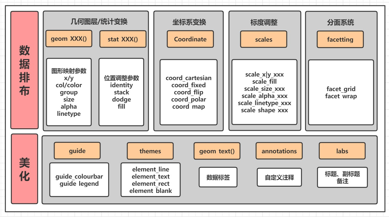
data:数据源,一般是data.frame结构,否则会被转化为该结构- 个性映射与共性映射:
ggplot()中的mapping = aes()参数属于共性映射,会被之后的geom_xxx()和stat_xxx()所继承,而geom_xxx()和stat_xxx()中的映射参数属于个性映射,仅作用于内部 mapping:映射,包括颜色类型映射color;fill、形状类型映射linetype;size;shape和位置类型映射x,y等geom_xxx:几何对象,常见的包括点图、折线图、柱形图和直方图等,也包括辅助绘制的曲线、斜线、水平线、竖线和文本等aesthetic attributes:图形参数,包括colour;size;hape等facetting:分面,将数据集划分为多个子集subset,然后对于每个子集都绘制相同的图表theme:指定图表的主题
ggplot(data = NALL, mapping = aes(x = , y = )) +   # 数据集

    geom_xxx()|stat_xxx() +       # 几何图层/统计变换

    coord_xxx() +  # 坐标变换, 默认笛卡尔坐标系

    scale_xxx() +  # 标度调整, 调整具体的标度

    facet_xxx() +  # 分面, 将其中一个变量进行分面变换

    guides() +     # 图例调整

    theme()        # 主题系统
这些概念可以等看完全文再回过头看,相当于一个汇总,这些概念都掌握了基本
ggplot2的核心逻辑也就理解了
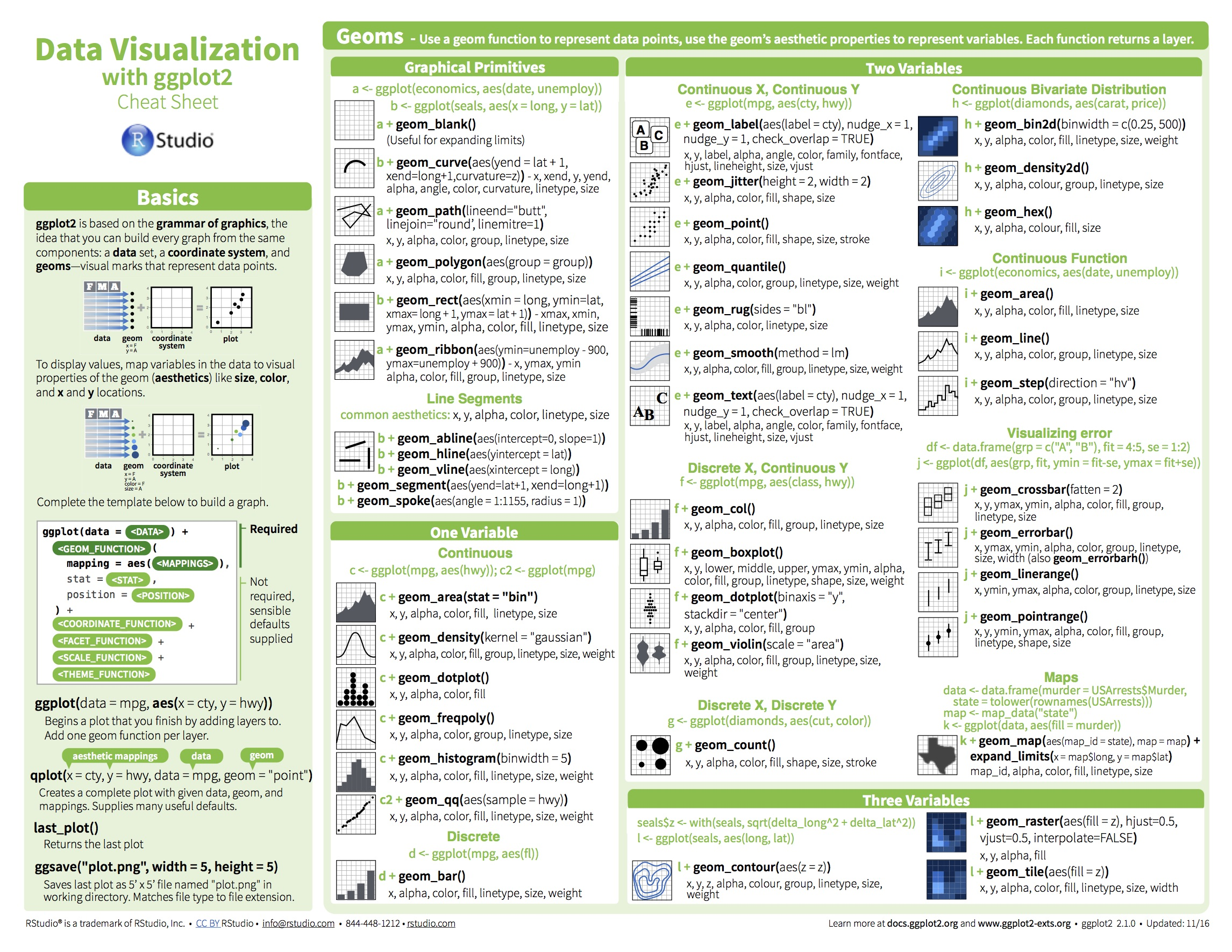
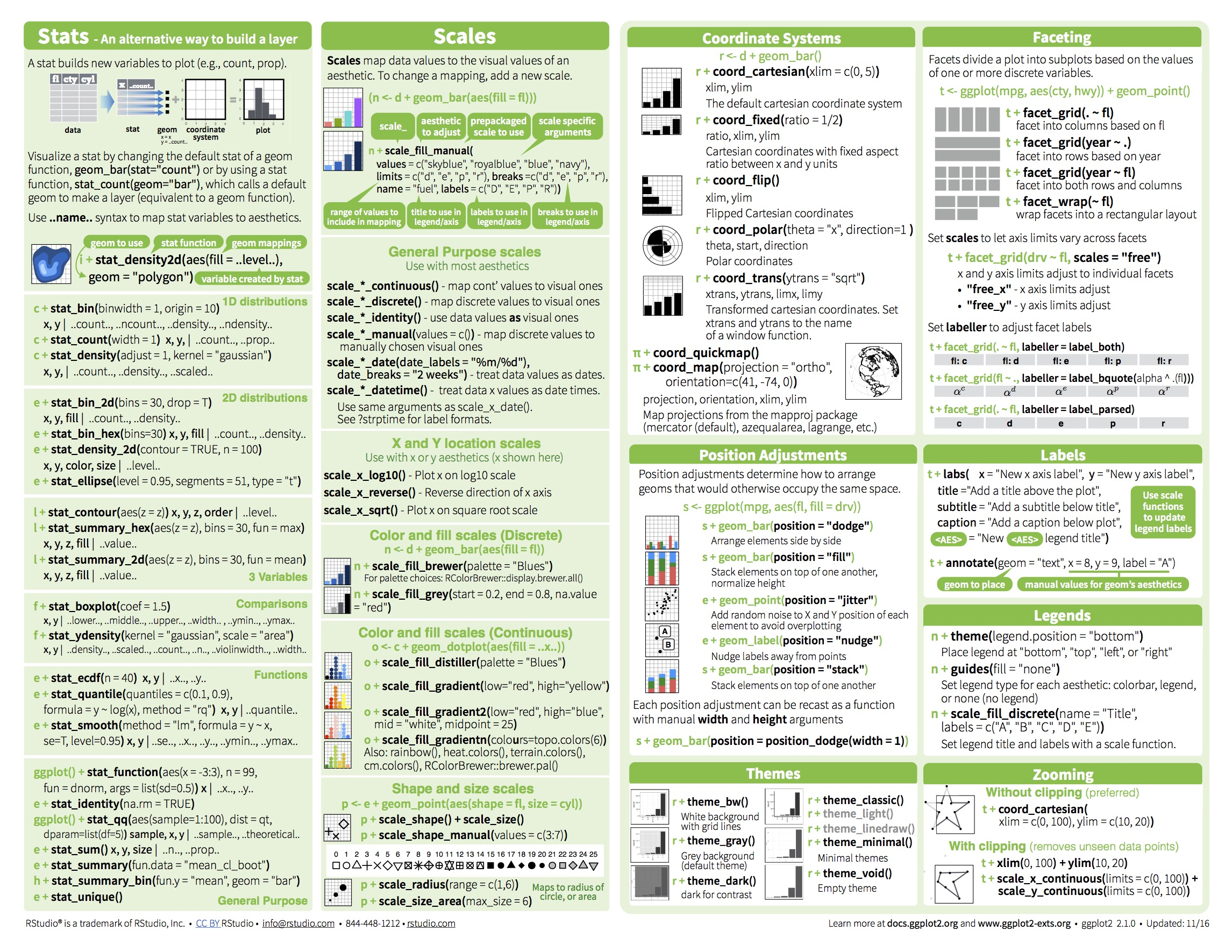
一些核心概念的含义可以从RStudio官方的cheat sheet图中大致得知:
一些栗子
通过实例和
RCode从浅到深介绍ggplot2的语法。
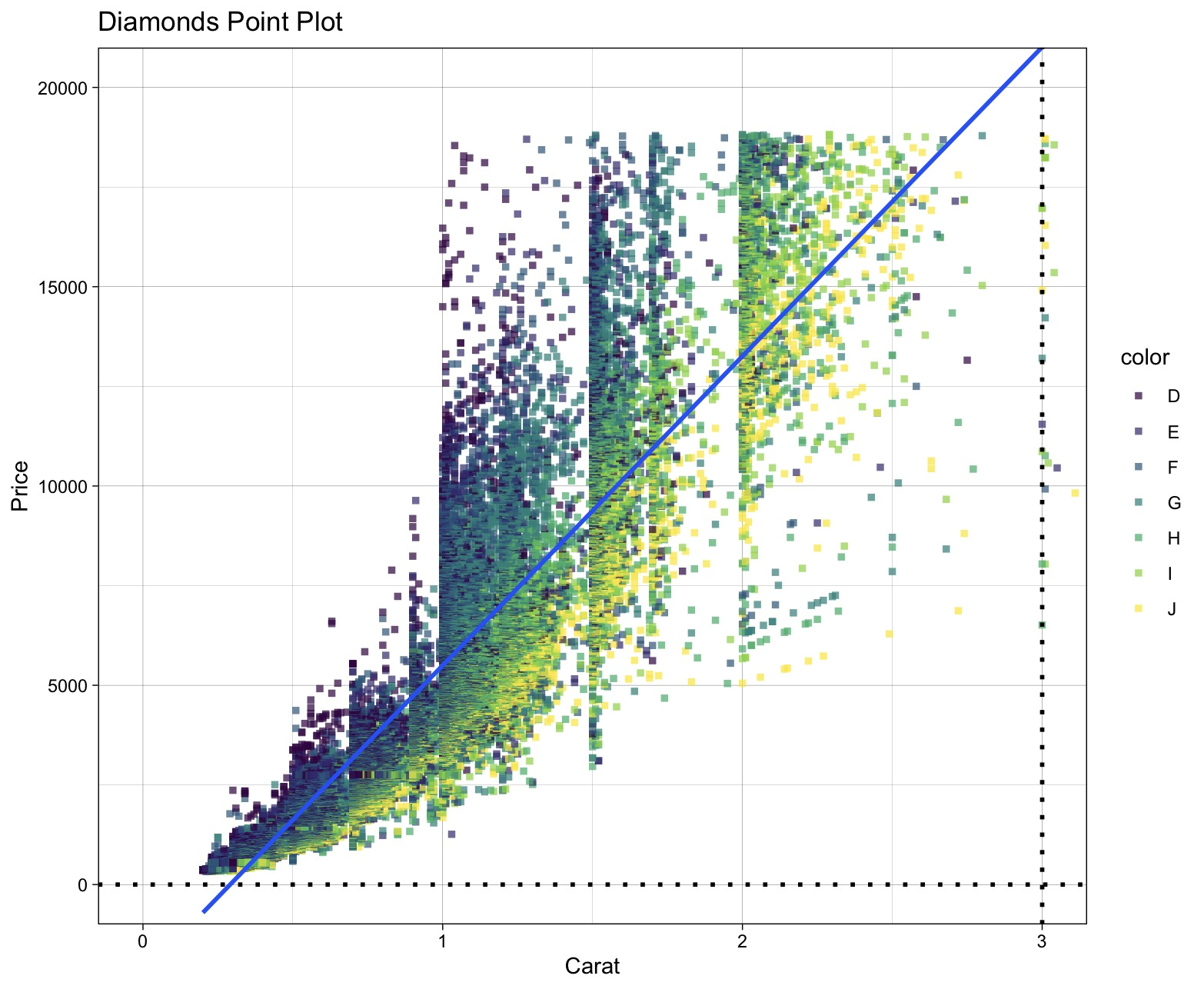
1. 五脏俱全的散点图
library(ggplot2)

# 表明我们使用diamonds数据集,

ggplot(diamonds) +

  # 绘制散点图: 横坐标x为depth, 纵坐标y为price, 点的颜色通过color列区分,alpha透明度,size点大小,shape形状(实心正方形),stroke点边框的宽度

  geom_point(aes(x = carat, y = price, colour = color), alpha=0.7, size=1.0, shape=15, stroke=1) +

  # 添加拟合线

  geom_smooth(aes(x = carat, y = price), method = 'glm') +

  # 添加水平线

  geom_hline(yintercept = 0, size = 1, linetype = "dotted", color = "black") +

  # 添加垂直线

  geom_vline(xintercept = 3, size = 1, linetype = "dotted", color = "black") +

  # 添加坐标轴与图像标题

  labs(title = "Diamonds Point Plot", x = "Carat", y = "Price") +

  # 调整坐标轴的显示范围

  coord_cartesian(xlim = c(0, 3), ylim = c(0, 20000)) +

  # 更换主题, 这个主题比较简洁, 也可以在ggthemes包中获取其他主题

  theme_linedraw()
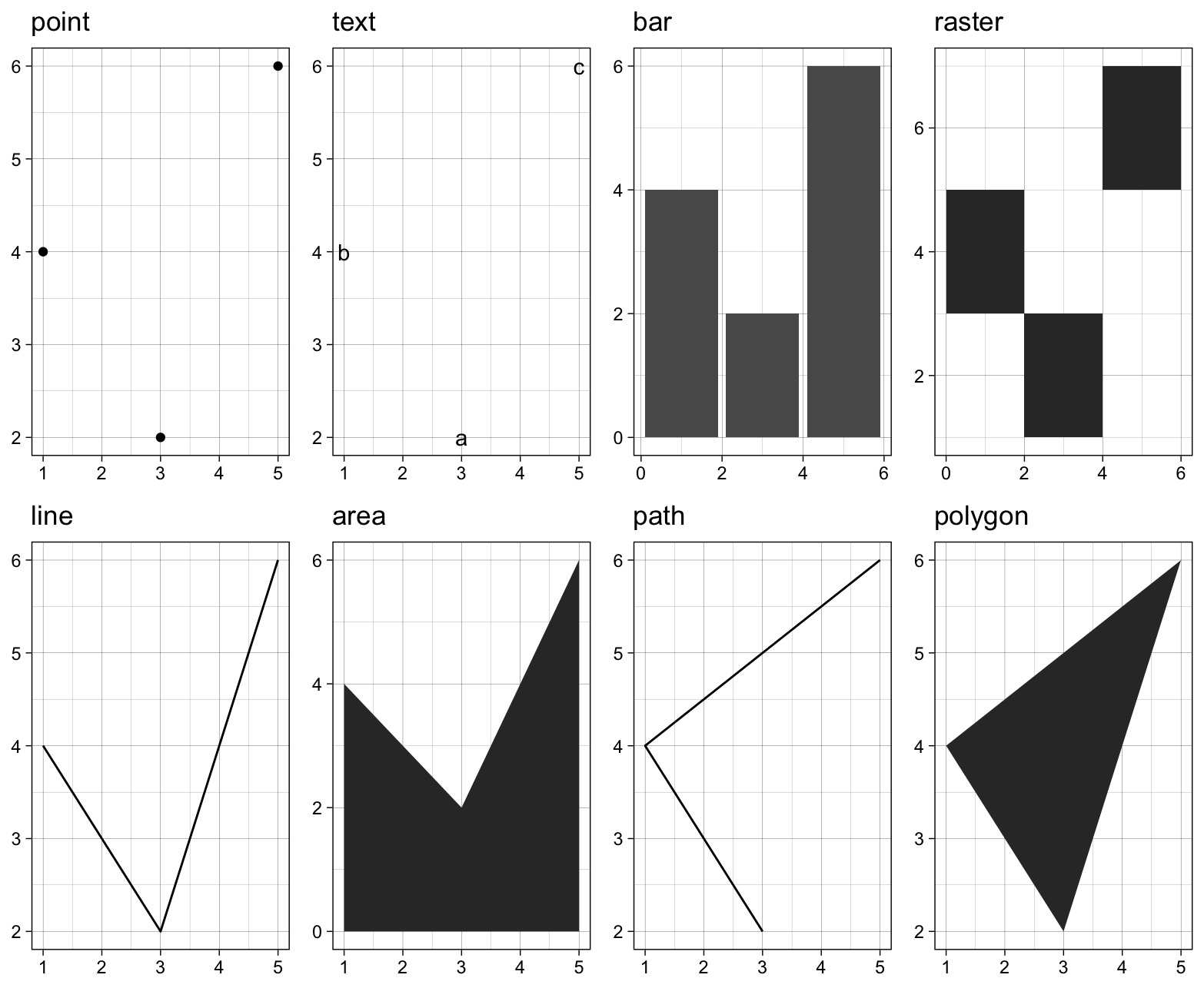
2. 自定义图片布局&多种几何绘图
library(gridExtra)

#建立数据集

df <- data.frame(

  x = c(3, 1, 5),

  y = c(2, 4, 6),

  label = c("a","b","c")

)

p <- ggplot(df, aes(x, y, label = label)) +

  # 去掉横坐标信息

  labs(x = NULL, y = NULL) +

  # 切换主题

  theme_linedraw()

p1 <- p + geom_point() + ggtitle("point")

p2 <- p + geom_text() + ggtitle("text")

p3 <- p + geom_bar(stat = "identity") + ggtitle("bar")

p4 <- p + geom_tile() + ggtitle("raster")

p5 <- p + geom_line() + ggtitle("line")

p6 <- p + geom_area() + ggtitle("area")

p7 <- p + geom_path() + ggtitle("path")

p8 <- p + geom_polygon() + ggtitle("polygon")

# 构造ggplot图片列表

plots <- list(p1, p2, p3, p4, p5, p6, p7, p8)

# 自定义图片布局

gridExtra::grid.arrange(grobs = plots, ncol = 4)
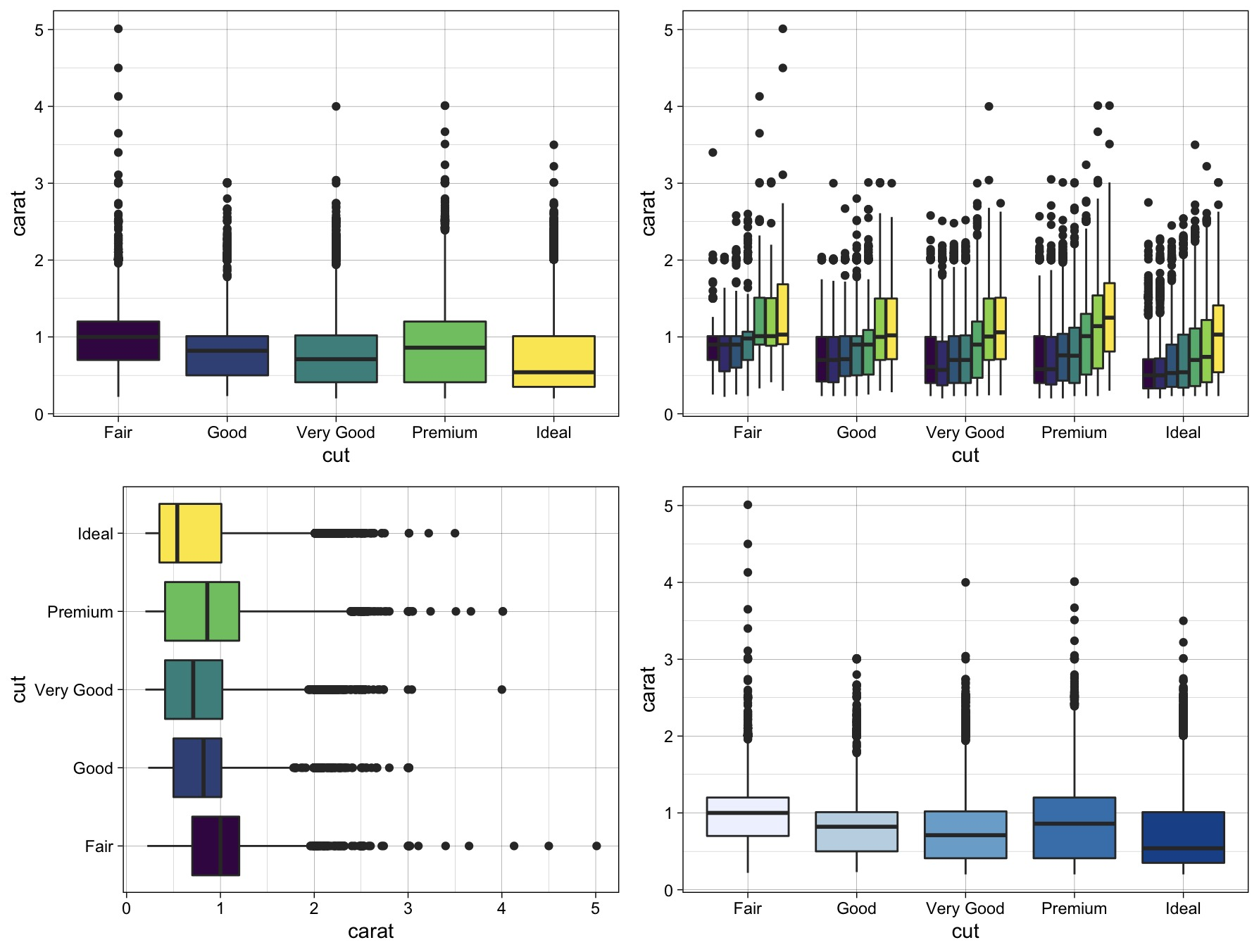
3. 箱线图
统计学中展示数据分散情况的直观图形,在探索性分析中常常用于展示在某个因子型变量下因变量的分散程度。
下面展示箱线图最长使用的一些方法:
library(ggplot2) # 绘图

library(ggsci)   # 使用配色

# 使用diamonds数据框, 分类变量为cut, 目标变量为depth

p <- ggplot(diamonds, aes(x = cut, y = carat)) +

  theme_linedraw()

# 一个因子型变量时, 直接用颜色区分不同类别, 后面表示将图例设置在右上角

p1 <- p + geom_boxplot(aes(fill = cut)) + theme(legend.position = "None")

# 两个因子型变量时, 可以将其中一个因子型变量设为x, 将另一个因子型变量设为用图例颜色区分

p2 <- p + geom_boxplot(aes(fill = color)) + theme(legend.position = "None")

# 将箱线图进行转置

p3 <- p + geom_boxplot(aes(fill = cut)) + coord_flip() + theme(legend.position = "None")

# 使用现成的配色方案: 包括scale_fill_jama(), scale_fill_nejm(), scale_fill_lancet(), scale_fill_brewer()(蓝色系)

p4 <- p + geom_boxplot(aes(fill = cut)) + scale_fill_brewer() + theme(legend.position = "None")

# 构造ggplot图片列表

plots <- list(p1, p2, p3, p4)

# 自定义图片布局

gridExtra::grid.arrange(grobs = plots, ncol = 2)
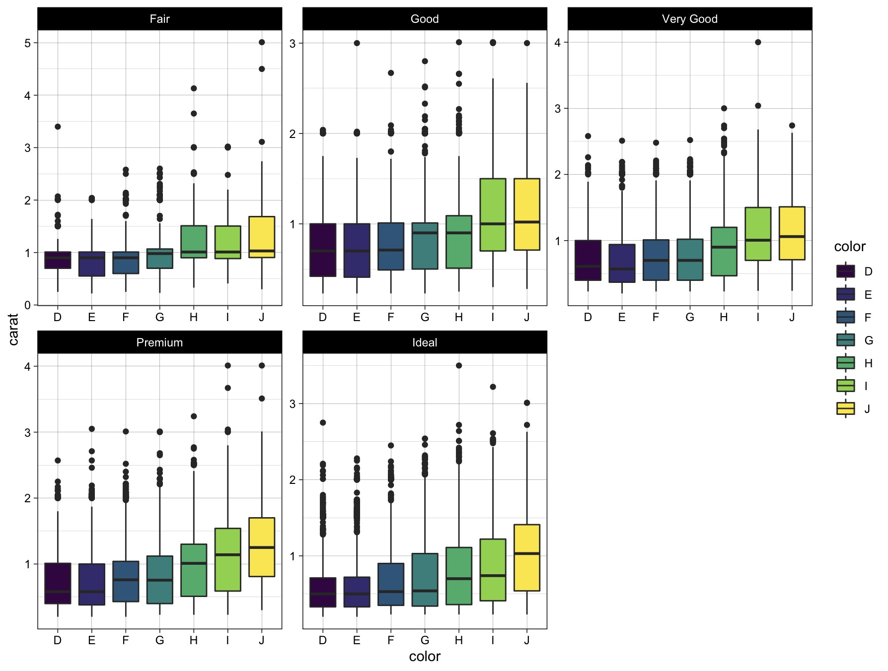
当研究某个连续型变量的箱线图涉及多个离散型分类变量时,我们常使用分面facetting来提高图表的可视性。
library(ggplot2)

ggplot(diamonds, aes(x = color, y = carat)) +

  # 切换主题

  theme_linedraw() +

  # 箱线图颜色根据因子型变量color填色

  geom_boxplot(aes(fill = color)) +

  # 分面: 本质上是将数据框按照因子型变量color类划分为多个子数据集subset, 在每个子数据集上绘制相同的箱线图

  # 注意一般都要加scales="free", 否则子数据集数据尺度相差较大时会被拉扯开

  facet_wrap(~cut, scales="free")
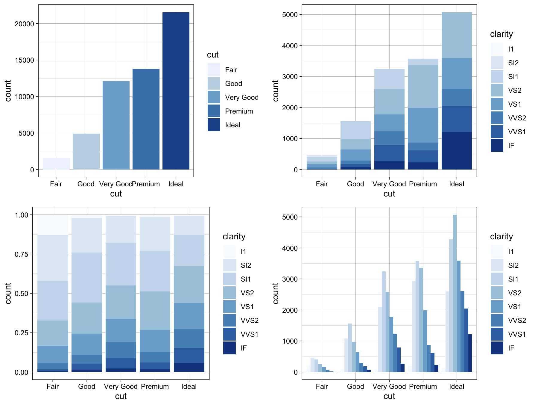
4. 直方图
library(ggplo2)

# 普通的直方图

p1 <- ggplot(data = diamonds) +

  geom_bar(mapping = aes(x = cut, fill = cut)) +

  theme_linedraw() +

  scale_fill_brewer()

# 堆积直方图

p2 <- ggplot(data = diamonds) +

  geom_bar(mapping = aes(x = cut, fill = clarity), position = "identity") +

  theme_linedraw() +

  scale_fill_brewer()

# 累积直方图

p3 <- ggplot(data = diamonds) +

  geom_bar(mapping = aes(x = cut, fill = clarity), position = "fill") +

  theme_linedraw() +

  scale_fill_brewer()

# 分类直方图

p4 <- ggplot(data = diamonds) +

  geom_bar(mapping = aes(x = cut, fill = clarity), position = "dodge") +

  theme_linedraw() +

  scale_fill_brewer()

# 构造ggplot图片列表

plots <- list(p1, p2, p3, p4)

# 自定义图片布局

gridExtra::grid.arrange(grobs = plots, ncol = 2)
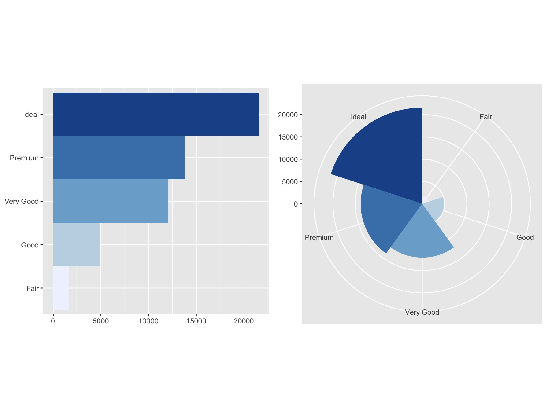
5. 坐标系统
除了前面箱线图使用的coord_flip()方法实现了坐标轴转置,ggplot还提供了很多和坐标系统相关的功能。
library(ggplot2)

bar <- ggplot(data = diamonds) +

  geom_bar(mapping = aes(x = cut, fill = cut), show.legend = FALSE, width = 1) +

  # 指定比率: 长宽比为1, 便于展示图形

  theme(aspect.ratio = 1) +

  scale_fill_brewer() +

  labs(x = NULL, y = NULL)

# 坐标轴转置

bar1 <- bar + coord_flip()

# 绘制极坐标

bar2 <- bar + coord_polar()

# 构造ggplot图片列表

plots <- list(bar1, bar2)

# 自定义图片布局

gridExtra::grid.arrange(grobs = plots, ncol = 2)
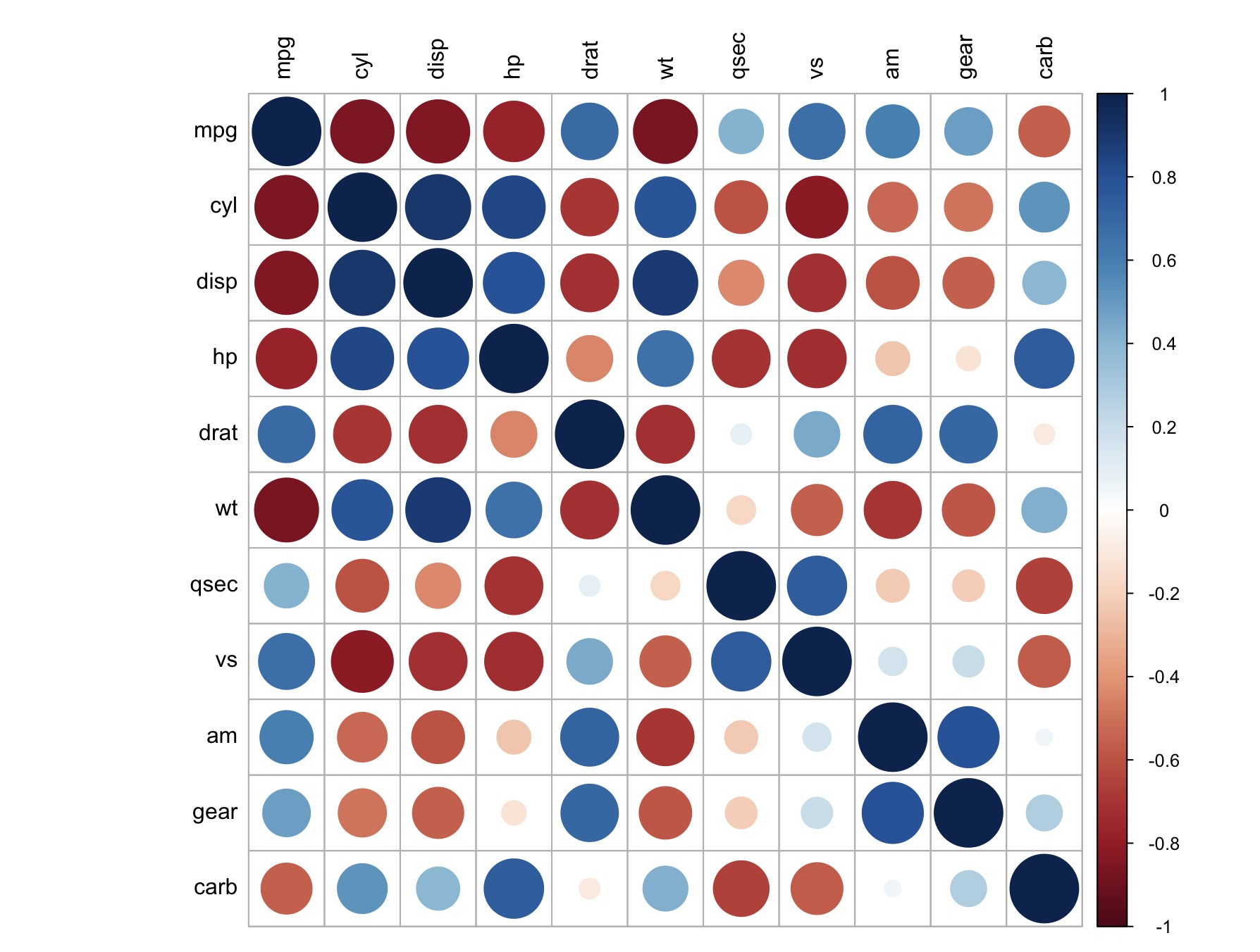
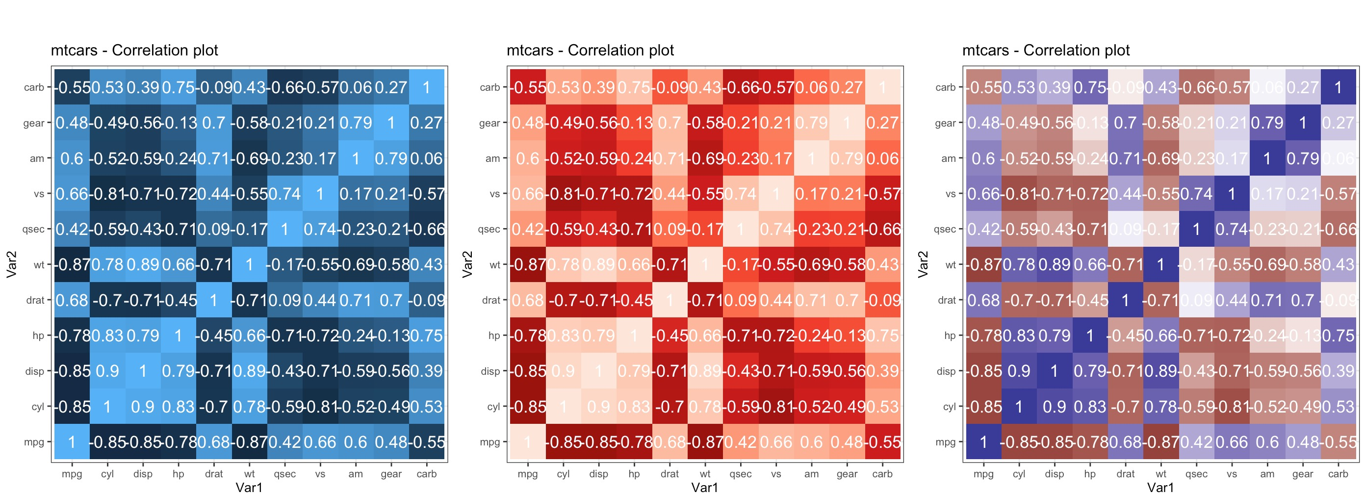
6. 瓦片图、 热力图
机器学习中探索性分析我们可以通过corrplot直接绘制所有变量的相关系数图,用于判断总体的相关系数情况。
library(corrplot)

#计算数据集的相关系数矩阵并可视化

mycor = cor(mtcars)

corrplot(mycor, tl.col = "black")
ggplot提供了更加个性化的瓦片图绘制:
library(RColorBrewer)

# 生成相关系数矩阵

corr <- round(cor(mtcars), 2)

df <- reshape2::melt(corr)

p1 <- ggplot(df, aes(x = Var1, y = Var2, fill = value, label = value)) +

  geom_tile() +

  theme_bw() +

  geom_text(aes(label = value, size = 0.3), color = "white") +

  labs(title = "mtcars - Correlation plot") +

  theme(text = element_text(size = 10), legend.position = "none", aspect.ratio = 1)

p2 <- p1 + scale_fill_distiller(palette = "Reds")

p3 <- p1 + scale_fill_gradient2()

gridExtra::grid.arrange(p1, p2, p3, ncol=3)
更多例子
有经典的50个ggplot2绘图示例:
http://r-statistics.co/Top50-Ggplot2-Visualizations-MasterList-R-Code.html
Reference
[1] https://ggplot2-book.org/introduction.html#welcome-to-ggplot2
[2] https://rstudio.com/resources/cheatsheets/
[3] https://r4ds.had.co.nz/data-visualisation.html
[4] https://www.sohu.com/a/320024110_718302
[R可视化]ggplot2库介绍及其实例的更多相关文章
- lxml库介绍及实例
XPath常用规则 表达式 描述 nodename 选取此节点的所有子节点 / 从当前节点选取直接子节点 // 从当前节点选取子孙节点 . 选取当前节点 .. 选取当前节点的父节点 @ 选取属性 h ...
- Common Lisp第三方库介绍 | (R "think-of-lisper" 'Albertlee)
Common Lisp第三方库介绍 | (R "think-of-lisper" 'Albertlee) Common Lisp第三方库介绍 一个丰富且高质量的开发库集合,对于实际 ...
- R语言 ggplot2包
R语言 ggplot2包的学习 分析数据要做的第一件事情,就是观察它.对于每个变量,哪些值是最常见的?值域是大是小?是否有异常观测? ggplot2图形之基本语法: ggplot2的核心理念是将 ...
- Tstrings类简单介绍及实例
用TStrings保存文件;var S: TStrings;begin S := TStringList.Create(); { ... } S.SaveToFile('config.txt' ...
- Android开发中用到的框架、库介绍
Android开发中用到的框架介绍,主要记录一些比较生僻的不常用的框架,不断更新中...... 网路资源:http://www.kuqin.com/shuoit/20140907/341967.htm ...
- 利用Python进行数据分析——重要的Python库介绍
利用Python进行数据分析--重要的Python库介绍 一.NumPy 用于数组执行元素级计算及直接对数组执行数学运算 线性代数运算.傅里叶运算.随机数的生成 用于C/C++等代码的集成 二.pan ...
- 机器学习 python库 介绍
开源机器学习库介绍 MLlib in Apache Spark:Spark下的分布式机器学习库.官网 scikit-learn:基于SciPy的机器学习模块.官网 LibRec:一个专注于推荐算法的j ...
- Linux守护进程简单介绍和实例具体解释
Linux守护进程简单介绍和实例具体解释 简单介绍 守护进程(Daemon)是执行在后台的一种特殊进程.它独立于控制终端而且周期性地执行某种任务或等待处理某些发生的事件.守护进程是一种非常实用的进程. ...
- GitHub上排名前100的Android开源库介绍
GitHub上排名前100的Android开源库介绍 文章来源: http://www.open-open.com/news/view/1587067#6734290-qzone-1-31660-bf ...
随机推荐
- [转]#include< > 和 #include” ” 的区别
原文网址:https://www.cnblogs.com/LeoFeng/p/5346530.html 一.#include< > #include< > 引用的是编译器的类库 ...
- flex图片垂直居中
html <view class="person_info_more"> <image class="more" src="/ima ...
- 1.3.1 apache的配置(下)
(1)httpd.conf的配置 使用文本编辑工具(推荐使用Editplus.UltraEdit等工具),打开httpd.conf. 其中,行首为#的部分为注释部分,不会被apache服务器程序进行读 ...
- 永恒之蓝(MS17-010)检测与利用
目录 利用Nmap检测 MSF反弹SHELL 注意 乱码 参考 利用Nmap检测 命令: nmap -p445 --script smb-vuln-ms17-010 [IP] # 如果运行报错,可以加 ...
- C++入门(2):为何还学C++?
本文首发 | 公众号:lunvey 提及编程语言,最近很火的当属Python和Java,似乎C++没落了,真的是这样吗? 转行做程序员,掌握一门编程语言,也就是职业技能,我相信更多的是在乎未来发展而不 ...
- LeetCode-宝石与石头
宝石与石头 LeetCode-771 使用哈希表. 这里使用内置算法库中的map /** * 给定字符串J 代表石头中宝石的类型,和字符串 S代表你拥有的石头. * S 中每个字符代表了一种你拥有的 ...
- golang操作mysql2
目录 Go操作MySQL 连接 下载依赖 使用MySQL驱动 初始化连接 SetMaxOpenConns SetMaxIdleConns CRUD 建库建表 查询 单行查询 多行查询 插入数据 更新数 ...
- 模式识别Pattern Recognition
双目摄像头,单目摄像头缺少深度 Train->test->train->test->predicive
- Google单元测试框架gtest之官方sample笔记4--事件监控之内存泄漏测试
sample 10 使用event listener监控Water类的创建和销毁.在Water类中,有一个静态变量allocated,创建一次值加一,销毁一次值减一.为了实现这个功能,重载了new和d ...
- SpringMVC-02 第一个SpringMVC程序
SpringMVC-02 第一个SpringMVC程序 第一个SpringMVC程序 配置版 新建一个Moudle , springmvc-02-hello,确定依赖导入进去了 1.配置web.xml ...