
firemonkey ListView DynamicAppearance
Go Up to FireMonkey Application Design
Contents
[hide]
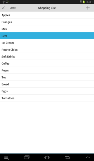
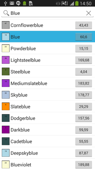
You can customize the appearance of a FireMonkey list view by modifying the layout of the list items, including the caption, the associated image, text details, or the accessory icon.
Customizing the List View Appearance Properties
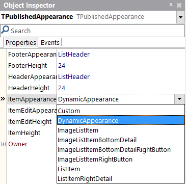
At design time, you can change the footer, header, and the list items appearance (also for the editing mode) by modifying the values of the properties in the ItemAppearance property. The ItemAppearance property controls the footer, the header, and the item appearance size (normal and in editing mode).
The following appearance properties of a ListView are grouped in the Object Inspector and in the StructureView, and you can modify their values to customize your list view appearance.
Footer properties
- FooterHeight. This property designates the list footer height (in pixels). Default value:
24. - FooterAppearance. This property designates the footer graphical appearance. Possible values are:
CustomandListHeader. Default value:ListHeader.
Header properties
- HeaderHeight. This property designates the list header height (in pixels). Default value:
24. - HeaderAppearance. This property designates the header graphical appearance. Possible values are:
CustomandListHeader. Default value:ListHeader.
List item properties
- ItemHeight. This property designates the item height (in pixels). Default value:
44. - ItemAppearance. This property designates the item graphical appearance (image, caption, accessory button, etc.). Default value:
ListItem.
- Choose between the following values:
| Property | Visible objects |
|---|---|
| Custom | See Using the Custom Value |
| DynamicAppearance | See Using the DynamicAppearance Value |
| ImageListItem | An image, a caption, and an accessory graphical button |
| ImageListItemBottomDetail | An image, a caption, a detail text, and an accessory graphical button |
| ImageListItemBottomDetailRightButton | An image, a caption, a detail text, and an accessory text button |
| ImageListItemRightButton | An image, a caption, and an accessory text button |
| ListItem | A caption and an accessory graphical button |
| ListItemRightDetail | A caption, a detail text, and an accessory graphical button |
See FMX.ListViewCustomBottomDetail Sample and other Samples.
Edited list item properties
- ItemEditHeight. This property designates the item height (in pixels) when in edit mode. Default value:
44. - ItemEditAppearance. This property designates the item graphical appearance when in edit mode. Default value:
ListItemShowCheck.
- Choose between the following values:
| Property | Visible objects |
|---|---|
| Custom | See Using the Custom Value |
| DynamicAppearance | See Using the DynamicAppearance Value |
| ImageListItemBottomDetailRightButtonShowCheck | An image, a caption, a detail text, a check box glyph button, and a text button |
| ImageListItemBottomDetailShowCheck | An image, a caption, a detail text, a check box glyph button, and an accessory graphical button |
| ImageListItemDelete | An image, a caption, a delete glyph button, and an accessory graphical button |
| ImageListItemRightButtonDelete | An image, a caption, a delete glyph button, and a text button |
| ImageListItemRightButtonShowCheck | An image, a caption, a check box glyph button, and a text button |
| ImageListItemShowCheck | An image, a caption, a check box glyph button, and an accessory graphical button |
| ListItemDelete | A caption, a delete glyph button, and an accessory graphical button |
| ListItemRightDetailDelete | A caption, a detail text, a delete glyph button, and an accessory graphical button |
| ListItemRightDetailShowCheck | A caption, a detail text, a check box glyph button, and an accessory graphical button |
| ListItemShowCheck | A caption, a check box glyph button, and an accessory graphical button |
See FMX.ListViewCustomBottomDetail Sample and other Samples.
How to Modify List View Appearance Properties
Use the StructureView and the Object Inspector to find the List View component.
- In the Structure View, locate the ListView component and then click
ItemAppearancein the hierarchy. - In the Object Inspector, modify each property (FooterAppearance, HeaderAppearance, ItemAppearance, ItemEditAppearance) to the desired value.
Customizable Item Appearances
The DynamicAppearance and Custom values allows you to customize the appearance of the items in a ListView. You can use the Customvalue for the FooterAppearance, HeaderAppearance, ItemAppearance and ItemEditAppearance properties of the items in the ListView, while you can use the DynamicAppearance for the ItemAppearance and ItemEditAppearance properties of the items in the ListView. You can also use built-in search filtering with the DynamicAppearance mode (*added in Subscription Update 1).
Using the DynamicAppearance Value
The DynamicAppearance allows you to dynamically customize the item appearance of the ListView at design time. The difference between DynamicAppearance and the other item appearance properties is that the DynamicAppearance allows you to add as many objects as you want to the appearance of your item.
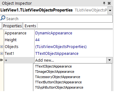
By default, the DynamicAppearence contains a single text object. To add more objects, select Item from IteamAppearance in theStructureView. Then, in the Object Inspector, click the + property and select any of the available objects. The available objects are:
- TTextObjectAppearance. Describes the graphical appearance of the text object of the list view item.
- TImageObjectAppearance. Describes the graphical appearance of the icon object of the list view item.
- TAccessoryObjectAppearance. Describes the graphical appearance of the accessory object of the list view item.
- TTextButtonObjectAppearance. Describes the graphical appearance of the text button object of the list view item.
- TGlyphButtonObjectAppearance. Describes the graphical appearance of a glyph button (graphical image) of the list view item.
You can customize the objects of the item appearance at design time by selecting an object in the StructureView and changing its properties in the Object Inspector. Among the things you can customize, these are some examples: the font type, text size or text alignment in text objects or the button type in button objects. Moreover, you can visually customize the objects of the item appearance enabling the Toggle DesignMode.
- Tip: As you can add as many objects as you want, it is highly recommended to use the DynamicAppearance with the Toggle DesignMode enabled.
Using the Custom Value
Selecting the Custom appearance value enables the following objects in the item appearance:
- Accessory. It is an instance of TAccessoryObjectAppearance. Not visible by default.
- Detail. It is an instance of TTextObjectAppearance. Not visible by default.
- GlyphButton. It is an instance of TGlyphButtonObjectAppearance. Not visible by default.
- Image. It is an instance of TImageObjectAppearance. Not visible by default.
- Text. It is an instance of TTextObjectAppearance. Visible by default.
- TextButton. It is an instance of TTextButtonObjectAppearance. Not visible by default.
- Note: You can customize the objects of the item appearance at design time by changing their properties using the Object Inspector or enabling the Toggle DesignMode.
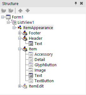
To set the visibility of the desired objects:
- Enable the Visible property (by setting its value to
True) in the Object Inspector for any of the desired objects and modify the properties according to your needs. - Enable the Visible property for any of the objects, by setting it to
Truein the source code.
Delphi:
AItem.Objects.AccessoryObject.Visible := True;
C++:
void __fastcall TForm1::SetEditItemProperties( TItemAppearanceObjects * AObjects)

{

	AObjects->GlyphButton->Visible = true;

}
The Toggle Design Mode
The Toggle DesignMode allows you to visually customize the item appearance of a ListView at design time. You can select this mode for any ItemAppearance property (Custom, DynamicAppearance, ListItem, ImageListItem, etc.).
- Tip: The Toggle DesignMode is highly recommended when using the DynamicAppearance because the DynamicAppearance allows you to freely customize the ItemAppearance.
To select the Toggle DesignMode, right-click the TListView object in the StructureView or in the TForm and select it. The Toggle DesignMode changes the design-time view of the ListView object from a blank box to a design preview of the ListView item. Then, you can:
- Visually customize the item appearance in the form.
- Visualize the changes that you make to the item appearance properties using the Object Inspector.
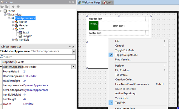
Create a Customized Appearance Class
You can create and install a new customized appearance class and use it in your design, by installing a new package. This package defines the classes that implement a custom appearance for list view items. You can customize the fields as necessary, to implement a rating image for instance (a control that shows a different image based on a numeric value).
How to use the Customized Appearance Class
- Implement a new TListView appearance package. The following samples contain different examples that customize the list view appearance to show:
- Install the customized appearance package in the IDE.
- Once installed, the new appearance can be used with a TListView component in the Object Instpector.
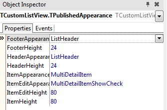
- Note: The MultiDetailItem value is a customized appearance package, previously installed in the IDE.
See Also
- Mobile Tutorial: Using LiveBindings to Populate a ListView (iOS and Android)
- FireMonkey Native iOS Controls
- FMX.ListView.TAppearanceListView.ItemAppearance
- FMX.ListView.Appearances.TPublishedAppearance.FooterHeight
- FMX.ListView.Appearances.TPublishedAppearance.FooterAppearance
- FMX.ListView.Appearances.TPublishedAppearance.HeaderHeight
- FMX.ListView.Appearances.TPublishedAppearance.HeaderAppearance
- FMX.ListView.Appearances.TPublishedAppearance.ItemHeight
- FMX.ListView.Appearances.TPublishedAppearance.ItemAppearance
- FMX.ListView.Appearances.TPublishedAppearance.ItemEditHeight
- FMX.ListView.Appearances.TPublishedAppearance.ItemEditAppearance
Samples
http://docwiki.embarcadero.com/RADStudio/Berlin/en/Customizing_FireMonkey_ListView_Appearance
firemonkey ListView DynamicAppearance的更多相关文章
- delphi Firemonkey ListView 使用参考
delphi Firemonkey ListView 使用参考 Tokyo版本 http://docwiki.embarcadero.com/RADStudio/Tokyo/en/Customizin ...
- Firemonkey ListView 点击事件
Firemonkey ListView 的点击事件一直让人摸不着头绪(各平台触发规则不太相同),因为它提供了点击相关的事件就有如下: OnChange:改变项目触发. OnClick:点击触发. On ...
- FireMonkey ListView 自动计算行高
说明:展示 ListView 视其每一行 Item 的 Detail 字串长度自动调整高度(可每行高度不同). 适用:Delphi XE7 / XE8 源码下载:[原创]ListView_自动计算行高 ...
- Firemonkey ListView 获取项目右方「>」(Accessory) 事件
适用:XE6 或更高版本 说明:ListView 在基本的项目里提供了 Accessory(项目右方「>」符号),但要如何分辨是否按下>或者项目本身呢?在 XE6 提供了 OnItemCl ...
- [示例] Firemonkey ListView 仿 iPhone X 浏海
Apple iPhone X 推出后,全屏上多了一个浏海,虽然褒贬不一,也有 Xcode 开发者做出了不错的 ListView 效果,当然 Delphi 也不落人後,马上试做看看. 源码下载:[示例] ...
- 【转】FireMonkey ListView 自动计算行高
说明:展示 ListView 视其每一行 Item 的 Detail 字串长度自动调整高度(可每行高度不同). 适用:Delphi XE7 / XE8 源码下载:[原创]ListView_自动计算行高 ...
- 如何改变 FMX ListView 颜色
需求:改变 ListView 颜色 适用:Firemonkey 任何平台 操作:Style 是改变控件外观最便捷的途径,ListView 也不例外,下面示范使用 StyleBook 来设定 ListV ...
- XE7 & FMX 那些年我们一起上过的控件:ListView 之 (3) 加载数据时如何显示自定义样式
本文介绍一下ListView下如何加载数据.及使用进度条反馈当前进度给用户. 注意: 原创作品,请尊重作者劳动成果,转载请注明出处!!!原文永久固定地址:http://www.cnblogs.com/ ...
- 张高兴的 UWP 开发笔记:横向 ListView
ListView 默认的排列方向是纵向 ( Orientation="Vertical" ) ,但如果我们需要横向显示的 ListView 怎么办? Blend for Visua ...
随机推荐
- hihoCoder 1033 : 交错和 数位dp
思路:数位dp,dp(i, j, k)表示考虑i位数,每位数可以任意取[0~9],并且这i位数的交错和为j,k=1表示前缀全是0(如000456),k=0表示前缀不为0.注意,前缀是否为0是这道题的一 ...
- day4(while 、练习题)
一.while ... else 方法 while else 的作用就是,确定循环正确执行完毕,else里面可以提示完成的情况. 二.练习题 1.编译型语言是编译完之后执行,解释性语言是边编译边执行, ...
- 深刻理解iosBlock
深刻理解iosBlock ///一个控制器里的方法 - (void)setRefreshHeader { ACWeakSelf(self); self.tableView.mj_header = [M ...
- TypeError: Error #1034: 强制转换类型失败:无法将 mx.controls::DataGrid@9a7c0a1 转换为 spark.core.IViewport。
1.错误描述 TypeError: Error #1034: 强制转换类型失败:无法将 mx.controls::DataGrid@9aa90a1 转换为 spark.core.IViewport. ...
- 芝麻HTTP:如何寻找爬虫入口
寻找爬虫入口 1 .本次任务的入口 这个爬虫的更好的入口就是我们平常使用的搜索引擎.搜索引擎虽然有很多种,但是其实都是在干一件事,收录网页,处理,然后提供搜索服务.在平时使用的过程中,我们通常都是直接 ...
- vue的ajax请求之axios
axios.get(this.apiUrl+'good/info',{params:{'goodsid':'sp441153'}}) .then(function(response){ console ...
- 摘抄--全面理解面向对象的 JavaScript
全面理解面向对象的 JavaScript JavaScript 函数式脚本语言特性以及其看似随意的编写风格,导致长期以来人们对这一门语言的误解,即认为 JavaScript 不是一门面向对象的语言,或 ...
- Word巧用大纲视图 快速重排版面
对于由于内容顺序混乱而造成的目录顺序不当的文章,通常我们一定会想到先对文档内容进行手工排序,然后重新提取目录.但这样操作显然麻烦,而且也容易出错.对于从正文内容自动提取出来的目录,由于按住Ctrl键单 ...
- 小例子理解SQL的左连接与右连接
假设有A,B两个表. 表A记录如下: aID aNum a20050111 a20050112 a20050113 a20050114 a20050115 表B记录如下: bID bName ---- ...
- [Python爬虫]使用Selenium操作浏览器订购火车票
这个专题主要说的是Python在爬虫方面的应用,包括爬取和处理部分 [Python爬虫]使用Python爬取动态网页-腾讯动漫(Selenium) [Python爬虫]使用Python爬取静态网页-斗 ...