用css画一个哆啦A梦
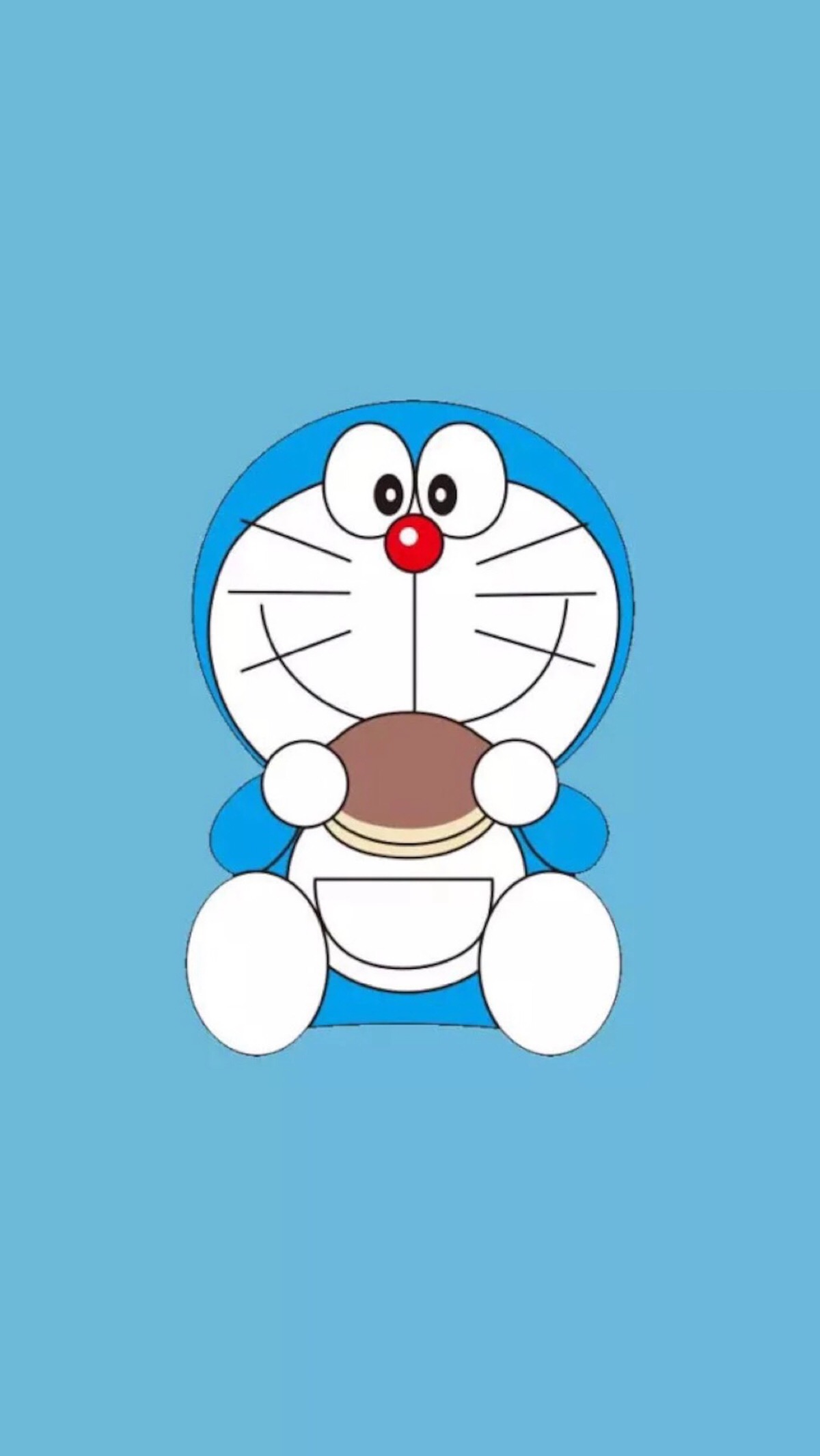
原图:
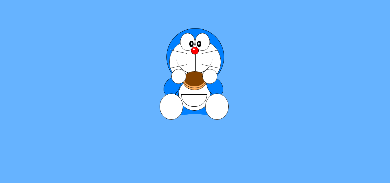
效果图:
虽然说没用啥什么高级的技巧,但这让我感受到了CSS的乐趣!
好好学习,天天向上!
<!DOCTYPE html>

<html>

<head>

    <title></title>

    <style type="text/css">

    body{

        background-color: #66B3FF;

        height: 300px;

        overflow: hidden;

    }

        #head{

            width: 200px;

            height: 200px;

            position: absolute;

            left: 50%;

            top:31%;

            margin-left: -100px;

            margin-top: -100px;

            background-color: #0080FF;

            border-radius: 999px;

            border: 1px solid black;

        }

        #face{

            width: 179px;

            height: 150px;

            position: absolute;

            left: 43.4%;

            top:22%;

            background-color: white;

            border-radius: 999px;

            border: 1px solid black;

        }

        #leftEye{

            width: 50px;

            height: 60px;

            position: absolute;

            left:46.2%;

            top:18%;

            background-color: white;

            border-radius: 50%;

            border: 1px solid black;

        }

        #rightEye{

            width: 50px;

            height: 60px;

            position: absolute;

            left:50%;

            top:18%;

            background-color: white;

            border-radius: 50%;

            border: 1px solid black;

        }

        #leftEye1{

            width: 13px;

            height: 20px;

            position: absolute;

            left:48.5%;

            top:22.2%;

            background-color: black;

            border-radius: 50%;

            border: 1px solid black;

        }

        #rightEye1{

            width: 13px;

            height: 20px;

            position: absolute;

            left:50.5%;

            top:22.2%;

            background-color: black;

            border-radius: 50%;

            border: 1px solid black;

        }

        #leftEye2{

            width: 5px;

            height: 8px;

            position: absolute;

            left:48.9%;

            top:23%;

            background-color: white;

            border-radius: 50%;

            border: 1px solid black;

        }

        #rightEye2{

            width: 5px;

            height: 8px;

            position: absolute;

            left:50.7%;

            top:23%;

            background-color: white;

            border-radius: 50%;

            border: 1px solid black;

        }

        #nose{

            width: 25px;

            height: 25px;

            position: absolute;

            left:49%;

            top:25.5%;

            background-color: red;

            border-radius: 50%;

            border: 1px solid black;

        }

        #nose1{

            width: 6px;

            height: 6px;

            position: absolute;

            left:49.5%;

            top:26.5%;

            background-color: white;

            border-radius: 50%;

        }

        #line{

            width: 1px;

            height: 100px;

            position: absolute;

            left:49.9%;

            top:29.7%;

            background-color: white;

            border-left: 2px solid #000000;

            margin-left: 1px;

        }

        #line1{

            width: 60px;

            height: 1px;

            position: absolute;

            left:43.5%;

            top:28%;

            background-color: white;

            border-bottom: 1px solid #000000;

            margin-left: 1px;

            transform:rotate(12deg);

        }

            #line2{

            width: 60px;

            height: 1px;

            position: absolute;

            left:43.5%;

            top:32%;

            background-color: white;

            border-bottom: 1px solid #000000;

            margin-left: 1px;

        }

            #line3{

            width: 60px;

            height: 1px;

            position: absolute;

            left:43.5%;

            top:36%;

            background-color: white;

            border-bottom: 1px solid #000000;

            margin-left: 1px;

            transform:rotate(-12deg);

        }

        #line4{

            width: 60px;

            height: 1px;

            position: absolute;

            left:51.6%;

            top:28%;

            background-color: white;

            border-bottom: 1px solid #000000;

            margin-left: 1px;

            transform:rotate(-12deg);

        }

        #line5{

            width: 60px;

            height: 1px;

            position: absolute;

            left:51.6%;

            top:32%;

            background-color: white;

            border-bottom: 1px solid #000000;

            margin-left: 1px;

        }

        #line6{

            width: 60px;

            height: 1px;

            position: absolute;

            left:51.6%;

            top:36%;

            background-color: white;

            border-bottom: 1px solid #000000;

            margin-left: 1px;

            transform:rotate(12deg);

        }

        #mouse{

            width: 130px;

            height: 130px;

            position: absolute;

            left: 45.1%;

            top:30%;

            margin-left: -0.5px;

            background-color: white;

            border-radius: 0 0 65px 65px;

            border-bottom: 2px solid black;

            height: 65px;

        }

        #food{

            width: 80px;

            height: 62px;

            position: absolute;

            left:46.9%;

            top:39.2%;

            background-color:#FFAF60;

            border-radius: 50%;

            border: 1px solid black;

        }

        #food1{

            width: 78px;

            height: 57px;

            position: absolute;

            left:47%;

            top:38.9%;

            background-color: #FFAF60;

            border-radius: 50%;

            border: 1px solid black;

        }

        #food2{

            width: 73px;

            height: 52px;

            position: absolute;

            left:47.2%;

            top:39.1%;

            background-color:#844200;

            border-radius: 50%;

        }

        #leftFist{

            width: 50px;

            height: 50px;

            position: absolute;

            left:45%;

            top:40%;

            margin-left: -15px;

            margin-top: -15px;

            background-color: white;

            border-radius: 999px;

            border: 1px solid black;

        }

        #rightFist{

            width: 50px;

            height: 50px;

            position: absolute;

            left:53%;

            top:40%;

            margin-left: -15px;

            margin-top: -15px;

            background-color: white;

            border-radius: 999px;

            border: 1px solid black;

        }

        #leftHand{

            width: 50px;

            height: 70px;

            position: absolute;

            left:43.3%;

            top:44%;

            margin-left: -15px;

            margin-top: -15px;

            background-color: #0080FF;

            border-radius: 50%;

            transform:rotate(34deg);

            border: 1px solid black;

        }

        #rightHand{

            width: 50px;

            height: 70px;

            position: absolute;

            left:54.3%;

            top:44%;

            margin-left: -15px;

            margin-top: -15px;

            background-color: #0080FF;

            border-radius: 50%;

            transform:rotate(-34deg);

            border: 1px solid black;

        }

        #tummy{

            width: 110px;

            height: 110px;

            position: absolute;

            left: 53.1%;

            top:58.5%;

            margin-left: -100px;

            margin-top: -100px;

            background-color: white;

            border-radius: 999px;

            border: 1px solid black;

        }

        #bodyy{

            width: 135px;

            height: 115px;

            position: absolute;

            left: 44.7%;

            top:45%;

            background-color: #0080FF;

        }

        #cover{

            width: 400px;

            height: 400px;

            position: absolute;

            left: 35.3%;

            top:62.3%;

            background-color:#66B3FF;

            border-radius: 50%;

        }

        #leftLeg{

            width: 80px;

            height: 90px;

            position: absolute;

            left:42%;

            top:53.5%;

            margin-left: -15px;

            margin-top: -15px;

            background-color: white;

            border-radius: 50%;

            border: 1px solid black;

        }

        #rightLeg{

            width: 80px;

            height: 90px;

            position: absolute;

            left:53.7%;

            top:53.5%;

            margin-left: -15px;

            margin-top: -15px;

            background-color: white;

            border-radius: 50%;

            border: 1px solid black;

        }

        #pocket{

            width: 88px;

            height: 82px;

            position: absolute;

            left: 46.5%;

            top:51.6%;

            margin-left: -0.5px;

            background-color: white;

            border-radius: 0 0 41px 41px;

            border: 1px solid black;

            height: 41px;

        }

    </style>

</head>

<body>

        <div id="head"></div>

        <div id="face"></div>

        <div id="leftEye"></div>

        <div id="rightEye"></div>

        <div id="leftEye1"></div>

        <div id="rightEye1"></div>

        <div id="leftEye2"></div>

        <div id="rightEye2"></div>

        <div id="nose"></div>

        <div id="nose1"></div>

        <div id="bodyy"></div>

        <div id="tummy"></div>

        <div id="mouse"></div>

        <div id="line"></div>

        <div id="line1"></div>

        <div id="line2"></div>

        <div id="line3"></div>

        <div id="line4"></div>

        <div id="line5"></div>

        <div id="line6"></div>

        <div id="food"></div>

        <div id="food1"></div>

        <div id="food2"></div>

        <div id="leftHand"></div>

        <div id="rightHand"></div>

        <div id="cover"></div>

        <div id="leftFist"></div>

        <div id="rightFist"></div>

        <div id="leftLeg"></div>

        <div id="rightLeg"></div>

        <div id="pocket"></div>

</body>

</html>
用css画一个哆啦A梦的更多相关文章
- [css]我要用css画幅画(七) - 哆啦A梦
接着之前的[css]我要用css画幅画(六),今天画的有所不同,画的是哆啦A梦,我们小时候对他的称呼其实是小叮当机器猫. (PS:这次我要做的事情,很多人已经做过,这并不是什么创新,我只是在学习并记录 ...
- 使用css画一个箭头
<!DOCTYPE html> <html> <head> <meta charset="utf-8"> <meta name ...
- css画一个提示框
用css画一个如下图的提示框: 代码如下: <!DOCTYPE html> <html lang="en"> <head> <meta c ...
- 【前端切图】用css画一个卡通形象-小猪佩奇
最近在腾讯云技术社区遇到了一位奇才,用css画出了一个社会人小猪佩奇,不得不服.研究了一下他的文章https://segmentfault.com/a/1190000014909658,感觉甚是有趣, ...
- CSS画一个三角形,CSS绘制空心三角形,CSS实现箭头
壹 ❀ 引 这两天因为项目工作较少,闲下来去看了GitHub上关于面试题日更收录的文章,毕竟明年有新的打算.在CSS收录中有一题是 用css创建一个三角形,并简述原理 .当然对于我来说画一个三角形是 ...
- div+css画一个小猪佩奇
用DIV+CSS画一个小猪佩奇,挺可爱的,嘻嘻. HTML部分(全是DIV) <!-- 小猪佩奇整体容器 --> <div class="pig_container&quo ...
- Effective前端3:用CSS画一个三角形
p { text-indent: 2em } .triangle-container p { text-indent: 0 } img { margin: 15px 0 } 三角形的场景很常见,打开一 ...
- 用CSS画一个带阴影的三角形的示例代码
1. 思路 怎么用CSS3画一个带阴影的三角形呢 ? 有童鞋说, 这还不简单吗 网上有很多解决方案, 但其实大多都是实现不太完美的, 存在一些问题 假设我们做一个向下的三角形箭头 常见的方法大致有两种 ...
- Effective前端1---chapter 2 用CSS画一个三角形
1.CSS画三角形的画法 第一步:三角形可以用border画出来,首先一个有四个border的div长这样: <div class="triangle"></di ...
随机推荐
- QTP自动化测试流程
1)准备TestCase - 在进行自动化之前,将测试内容进行文档化,不建议直接录制脚本 - 在录制脚本之前设计好脚本,便于录制过程的流畅 - 由于测试用例设 ...
- FutureTask理解
一.概述 FutureTask包装器是一种非常便利的机制,同时实现了Future和Runnable接口. 类图如下: FutureTask是一种可以取消的异步的计算任务.它的计算是通过Callable ...
- java.util.BitSet 详细分析 学习笔记
1,BitSet类 大小可动态改变, 取值为true或false的位集合.用于表示一组布尔标志. 此类实现了一个按需增长的位向量.位 set 的每个组件都有一个 boolean 值.用非负的 ...
- MongoDB安装与配置
参考文档:MongoDB官方文档 版本:3.6.4 从版本3.6开始,MongoDB需要Windows Server 2008 R2,Windows 7或更高版本. 第一步,在下载中心下载最新版本的M ...
- 基于gtid的复制
Ⅰ.GTID的介绍 global transaction id identifier 全局事务id gtid = server_uuid + transaction_id server_uuid是全局 ...
- SpringData ES中一些底层原理的分析
之前写过一篇SpringData ES 关于字段名和索引中的列名字不一致导致的查询问题,顺便深入学习下Spring Data Elasticsearch. Spring Data Elasticsea ...
- js文件引用的问题顺带复习css引用
js文件包含在<script>块中用scr引用,css在link和@import来引用,css不是本篇的重点,直接引用一个博主的总结: “ 区别1:link是XHTML标签,除了加载CSS ...
- 4.app是怎么炼成的
很多刚进入app后端的小伙伴,有的是之前没有接触过这个行业,有的是只在学校学习了基本的技术知识,不知道开发app的整个流程是怎么样的,因此心里会有一股恐惧.听着别人口中的一大串app相关的术语,也不知 ...
- go语言nsq源码解读七 lookup_protocol_v1.go
本篇将解读nsqlookup处理tcp请求的核心代码文件lookup_protocol_v1.go. 1234567891011121314151617181920212223242526272829 ...
- Grafana简单使用
下载安装 Grafana也是用GO语言写的,无任何依赖,安装非常简单. 启动 sudo service grafana-server start 运行 直接访问:http://your_ip:3000 ...