纯CSS绘制的图形一览
整理网上一些使用纯CSS绘制的图形示例~~纯属抄袭,哈哈。。。仅仅是为了自己以后查看!
Square(正方形)

#square {

    width: 100px;

    height: 100px;

    background: red;

}
Rectangle(矩形)

#rectangle {

    width: 200px;

    height: 100px;

    background: red;

}
Circle(圆形)
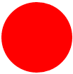
#circle {

    width: 100px;

    height: 100px;

    background: red;

    -moz-border-radius: 50px;

    -webkit-border-radius: 50px;

    border-radius: 50px;

}

/* 可以使用百分比值(大于50%),但是低版本的Android不支持 */
Oval(椭圆形)
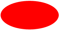
#oval {

    width: 200px;

    height: 100px;

    background: red;

    -moz-border-radius: 100px / 50px;

    -webkit-border-radius: 100px / 50px;

    border-radius: 100px / 50px;

}

/* 可以使用百分比值(大于50%),但是低版本的Android不支持 */
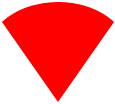
Triangle Up(向上的三角形)
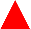
#triangle-up {

    width:;

    height:;

    border-left: 50px solid transparent;

    border-right: 50px solid transparent;

    border-bottom: 100px solid red;

}
Triangle Down(向下)
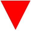
#triangle-down {

    width:;

    height:;

    border-left: 50px solid transparent;

    border-right: 50px solid transparent;

    border-top: 100px solid red;

}
Triangle Left(向左)
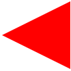
#triangle-left {

    width:;

    height:;

    border-top: 50px solid transparent;

    border-right: 100px solid red;

    border-bottom: 50px solid transparent;

}
Triangle Right(向右)

#triangle-right {

    width:;

    height:;

    border-top: 50px solid transparent;

    border-left: 100px solid red;

    border-bottom: 50px solid transparent;

}
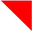
Triangle Top Left(左上)

#triangle-topleft {

    width:;

    height:;

    border-top: 100px solid red;

    border-right: 100px solid transparent;

}
Triangle Top Right(右上)
#triangle-topright {

    width:;

    height:;

    border-top: 100px solid red;

    border-left: 100px solid transparent;

}
Triangle Bottom Left(左下)
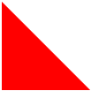
#triangle-bottomleft {

    width:;

    height:;

    border-bottom: 100px solid red;

    border-right: 100px solid transparent;

}
Triangle Bottom Right(右下)

#triangle-bottomright {

    width:;

    height:;

    border-bottom: 100px solid red;

    border-left: 100px solid transparent;

}
Curved Tail Arrow(弯尾箭头)
#curvedarrow {

  position: relative;

  width:;

  height:;

  border-top: 9px solid transparent;

  border-right: 9px solid red;

  -webkit-transform: rotate(10deg);

  -moz-transform: rotate(10deg);

  -ms-transform: rotate(10deg);

  -o-transform: rotate(10deg);

}

#curvedarrow:after {

  content: "";

  position: absolute;

  border: 0 solid transparent;

  border-top: 3px solid red;

  border-radius: 20px 0 0 0;

  top: -12px;

  left: -9px;

  width: 12px;

  height: 12px;

  -webkit-transform: rotate(45deg);

  -moz-transform: rotate(45deg);

  -ms-transform: rotate(45deg);

  -o-transform: rotate(45deg);

}
Trapezoid(梯形)
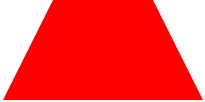
#trapezoid {

    border-bottom: 100px solid red;

    border-left: 50px solid transparent;

    border-right: 50px solid transparent;

    height:;

    width: 100px;

}
Parallelogram(平行四边形)

#parallelogram {

    width: 150px;

    height: 100px;

    -webkit-transform: skew(20deg);

       -moz-transform: skew(20deg);

         -o-transform: skew(20deg);

    background: red;

}
Star (6-points)(六角星)

#star-six {

    width:;

    height:;

    border-left: 50px solid transparent;

    border-right: 50px solid transparent;

    border-bottom: 100px solid red;

    position: relative;

}

#star-six:after {

    width:;

    height:;

    border-left: 50px solid transparent;

    border-right: 50px solid transparent;

    border-top: 100px solid red;

    position: absolute;

    content: "";

    top: 30px;

    left: -50px;

}
Star (5-points)(五角星)

#star-five {

   margin: 50px 0;

   position: relative;

   display: block;

   color: red;

   width: 0px;

   height: 0px;

   border-right:  100px solid transparent;

   border-bottom: 70px  solid red;

   border-left:   100px solid transparent;

   -moz-transform:    rotate(35deg);

   -webkit-transform: rotate(35deg);

   -ms-transform:     rotate(35deg);

   -o-transform:      rotate(35deg);

}

#star-five:before {

   border-bottom: 80px solid red;

   border-left: 30px solid transparent;

   border-right: 30px solid transparent;

   position: absolute;

   height:;

   width:;

   top: -45px;

   left: -65px;

   display: block;

   content: '';

   -webkit-transform: rotate(-35deg);

   -moz-transform:    rotate(-35deg);

   -ms-transform:     rotate(-35deg);

   -o-transform:      rotate(-35deg);

}

#star-five:after {

   position: absolute;

   display: block;

   color: red;

   top: 3px;

   left: -105px;

   width: 0px;

   height: 0px;

   border-right: 100px solid transparent;

   border-bottom: 70px solid red;

   border-left: 100px solid transparent;

   -webkit-transform: rotate(-70deg);

   -moz-transform:    rotate(-70deg);

   -ms-transform:     rotate(-70deg);

   -o-transform:      rotate(-70deg);

   content: '';

}
Pentagon(五边形)

#pentagon {

    position: relative;

    width: 54px;

    border-width: 50px 18px 0;

    border-style: solid;

    border-color: red transparent;

}

#pentagon:before {

    content: "";

    position: absolute;

    height:;

    width:;

    top: -85px;

    left: -18px;

    border-width: 0 45px 35px;

    border-style: solid;

    border-color: transparent transparent red;

}
Hexagon(六边形)
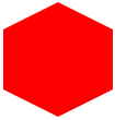
#hexagon {

    width: 100px;

    height: 55px;

    background: red;

    position: relative;

}

#hexagon:before {

    content: "";

    position: absolute;

    top: -25px;

    left:;

    width:;

    height:;

    border-left: 50px solid transparent;

    border-right: 50px solid transparent;

    border-bottom: 25px solid red;

}

#hexagon:after {

    content: "";

    position: absolute;

    bottom: -25px;

    left:;

    width:;

    height:;

    border-left: 50px solid transparent;

    border-right: 50px solid transparent;

    border-top: 25px solid red;

}
Octagon(八边形)
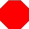
#octagon {

    width: 100px;

    height: 100px;

    background: red;

    position: relative;

}

#octagon:before {

    content: "";

    position: absolute;

    top:;

    left:;

    border-bottom: 29px solid red;

    border-left: 29px solid #fff;

    border-right: 29px solid #fff;

    width: 42px;

    height:;

}

#octagon:after {

    content: "";

    position: absolute;

    bottom:;

    left:;

    border-top: 29px solid red;

    border-left: 29px solid #fff;

    border-right: 29px solid #fff;

    width: 42px;

    height:;

}
Heart(心形)

#heart {

    position: relative;

    width: 100px;

    height: 90px;

}

#heart:before,

#heart:after {

    position: absolute;

    content: "";

    left: 50px;

    top:;

    width: 50px;

    height: 80px;

    background: red;

    -moz-border-radius: 50px 50px 0 0;

    border-radius: 50px 50px 0 0;

    -webkit-transform: rotate(-45deg);

       -moz-transform: rotate(-45deg);

        -ms-transform: rotate(-45deg);

         -o-transform: rotate(-45deg);

            transform: rotate(-45deg);

    -webkit-transform-origin: 0 100%;

       -moz-transform-origin: 0 100%;

        -ms-transform-origin: 0 100%;

         -o-transform-origin: 0 100%;

            transform-origin: 0 100%;

}

#heart:after {

    left:;

    -webkit-transform: rotate(45deg);

       -moz-transform: rotate(45deg);

        -ms-transform: rotate(45deg);

         -o-transform: rotate(45deg);

            transform: rotate(45deg);

    -webkit-transform-origin: 100% 100%;

       -moz-transform-origin: 100% 100%;

        -ms-transform-origin: 100% 100%;

         -o-transform-origin: 100% 100%;

            transform-origin :100% 100%;

}
Infinity(无限符图形)

#infinity {

    position: relative;

    width: 212px;

    height: 100px;

}

#infinity:before,

#infinity:after {

    content: "";

    position: absolute;

    top:;

    left:;

    width: 60px;

    height: 60px;

    border: 20px solid red;

    -moz-border-radius: 50px 50px 0 50px;

         border-radius: 50px 50px 0 50px;

    -webkit-transform: rotate(-45deg);

       -moz-transform: rotate(-45deg);

        -ms-transform: rotate(-45deg);

         -o-transform: rotate(-45deg);

            transform: rotate(-45deg);

}

#infinity:after {

    left: auto;

    right:;

    -moz-border-radius: 50px 50px 50px 0;

         border-radius: 50px 50px 50px 0;

    -webkit-transform: rotate(45deg);

       -moz-transform: rotate(45deg);

        -ms-transform: rotate(45deg);

         -o-transform: rotate(45deg);

            transform: rotate(45deg);

}
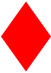
Diamond Square(菱形)
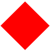
#diamond {

    width:;

    height:;

    border: 50px solid transparent;

    border-bottom-color: red;

    position: relative;

    top: -50px;

}

#diamond:after {

    content: '';

    position: absolute;

    left: -50px;

    top: 50px;

    width:;

    height:;

    border: 50px solid transparent;

    border-top-color: red;

}
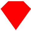
Diamond Shield(钻石盾牌)
#diamond-shield {

    width:;

    height:;

    border: 50px solid transparent;

    border-bottom: 20px solid red;

    position: relative;

    top: -50px;

}

#diamond-shield:after {

    content: '';

    position: absolute;

    left: -50px; top: 20px;

    width:;

    height:;

    border: 50px solid transparent;

    border-top: 70px solid red;

}
Diamond Narrow

#diamond-narrow {

    width:;

    height:;

    border: 50px solid transparent;

    border-bottom: 70px solid red;

    position: relative;

    top: -50px;

}

#diamond-narrow:after {

    content: '';

    position: absolute;

    left: -50px; top: 70px;

    width:;

    height:;

    border: 50px solid transparent;

    border-top: 70px solid red;

}
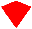
Cut Diamond(砖石形)
#cut-diamond {

    border-style: solid;

    border-color: transparent transparent red transparent;

    border-width: 0 25px 25px 25px;

    height:;

    width: 50px;

    position: relative;

    margin: 20px 0 50px 0;

}

#cut-diamond:after {

    content: "";

    position: absolute;

    top: 25px;

    left: -25px;

    width:;

    height:;

    border-style: solid;

    border-color: red transparent transparent transparent;

    border-width: 70px 50px 0 50px;

}
Egg(鸡蛋)
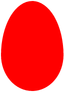
#egg {

   display:block;

   width: 126px;

   height: 180px;

   background-color: red;

   -webkit-border-radius: 63px 63px 63px 63px / 108px 108px 72px 72px;

   border-radius:         50%  50%  50%  50%  / 60%   60%   40%  40%;

}
Pac-Man(吃豆人)

#pacman {

  width: 0px;

  height: 0px;

  border-right: 60px solid transparent;

  border-top: 60px solid red;

  border-left: 60px solid red;

  border-bottom: 60px solid red;

  border-top-left-radius: 60px;

  border-top-right-radius: 60px;

  border-bottom-left-radius: 60px;

  border-bottom-right-radius: 60px;

}
Talk Bubble(聊天框)
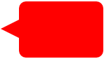
#talkbubble {

   width: 120px;

   height: 80px;

   background: red;

   position: relative;

   -moz-border-radius:    10px;

   -webkit-border-radius: 10px;

   border-radius:         10px;

}

#talkbubble:before {

   content:"";

   position: absolute;

   right: 100%;

   top: 26px;

   width:;

   height:;

   border-top: 13px solid transparent;

   border-right: 26px solid red;

   border-bottom: 13px solid transparent;

}
12 Point Burst(爆炸形状)

#burst-12 {

    background: red;

    width: 80px;

    height: 80px;

    position: relative;

    text-align: center;

}

#burst-12:before, #burst-12:after {

    content: "";

    position: absolute;

    top:;

    left:;

    height: 80px;

    width: 80px;

    background: red;

}

#burst-12:before {

    -webkit-transform: rotate(30deg);

       -moz-transform: rotate(30deg);

        -ms-transform: rotate(30deg);

         -o-transform: rotate(30deg);

}

#burst-12:after {

    -webkit-transform: rotate(60deg);

       -moz-transform: rotate(60deg);

        -ms-transform: rotate(60deg);

         -o-transform: rotate(60deg);

}
Yin Yang(阴阳八卦)
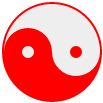
#yin-yang {

    width: 96px;

    height: 48px;

    background: #eee;

    border-color: red;

    border-style: solid;

    border-width: 2px 2px 50px 2px;

    border-radius: 100%;

    position: relative;

}

#yin-yang:before {

    content: "";

    position: absolute;

    top: 50%;

    left:;

    background: #eee;

    border: 18px solid red;

    border-radius: 100%;

    width: 12px;

    height: 12px;

}

#yin-yang:after {

    content: "";

    position: absolute;

    top: 50%;

    left: 50%;

    background: red;

    border: 18px solid #eee;

    border-radius:100%;

    width: 12px;

    height: 12px;

}
Badge Ribbon(徽章丝带)

#badge-ribbon {

 position: relative;

 background: red;

 height: 100px;

 width: 100px;

 -moz-border-radius:    50px;

 -webkit-border-radius: 50px;

 border-radius:         50px;

}

#badge-ribbon:before,

#badge-ribbon:after {

  content: '';

  position: absolute;

  border-bottom: 70px solid red;

  border-left: 40px solid transparent;

  border-right: 40px solid transparent;

  top: 70px;

  left: -10px;

  -webkit-transform: rotate(-140deg);

  -moz-transform:    rotate(-140deg);

  -ms-transform:     rotate(-140deg);

  -o-transform:      rotate(-140deg);

}

#badge-ribbon:after {

  left: auto;

  right: -10px;

  -webkit-transform: rotate(140deg);

  -moz-transform:    rotate(140deg);

  -ms-transform:     rotate(140deg);

  -o-transform:      rotate(140deg);

}
Space Invader(太空入侵者)
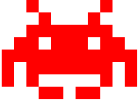
#space-invader{

  box-shadow:

    0 0 0 1em red,

    0 1em 0 1em red,

    -2.5em 1.5em 0 .5em red,

    2.5em 1.5em 0 .5em red,

    -3em -3em 0 0 red,

    3em -3em 0 0 red,

    -2em -2em 0 0 red,

    2em -2em 0 0 red,

    -3em -1em 0 0 red,

    -2em -1em 0 0 red,

    2em -1em 0 0 red,

    3em -1em 0 0 red,

    -4em 0 0 0 red,

    -3em 0 0 0 red,

    3em 0 0 0 red,

    4em 0 0 0 red,

    -5em 1em 0 0 red,

    -4em 1em 0 0 red,

    4em 1em 0 0 red,

    5em 1em 0 0 red,

    -5em 2em 0 0 red,

    5em 2em 0 0 red,

    -5em 3em 0 0 red,

    -3em 3em 0 0 red,

    3em 3em 0 0 red,

    5em 3em 0 0 red,

    -2em 4em 0 0 red,

    -1em 4em 0 0 red,

    1em 4em 0 0 red,

    2em 4em 0 0 red;

    background: red;

    width: 1em;

    height: 1em;

    overflow: hidden;

    margin: 50px 0 70px 65px;

  }
TV Screen(电视屏幕)
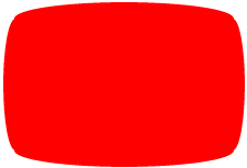
#tv {

  position: relative;

  width: 200px;

  height: 150px;

  margin: 20px 0;

  background: red;

  border-radius: 50% / 10%;

  color: white;

  text-align: center;

  text-indent: .1em;

}

#tv:before {

  content: '';

  position: absolute;

  top: 10%;

  bottom: 10%;

  right: -5%;

  left: -5%;

  background: inherit;

  border-radius: 5% / 50%;

}
Chevron(雪佛龙)
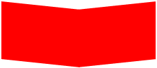
#chevron {

  position: relative;

  text-align: center;

  padding: 12px;

  margin-bottom: 6px;

  height: 60px;

  width: 200px;

}

#chevron:before {

  content: '';

  position: absolute;

  top:;

  left:;

  height: 100%;

  width: 51%;

  background: red;

  -webkit-transform: skew(0deg, 6deg);

  -moz-transform: skew(0deg, 6deg);

  -ms-transform: skew(0deg, 6deg);

  -o-transform: skew(0deg, 6deg);

  transform: skew(0deg, 6deg);

}

#chevron:after {

  content: '';

  position: absolute;

  top:;

  right:;

  height: 100%;

  width: 50%;

  background: red;

  -webkit-transform: skew(0deg, -6deg);

  -moz-transform: skew(0deg, -6deg);

  -ms-transform: skew(0deg, -6deg);

  -o-transform: skew(0deg, -6deg);

  transform: skew(0deg, -6deg);

}
Magnifying Glass(放大镜)

#magnifying-glass{

 font-size: 10em; /* This controls the size. */

 display: inline-block;

 width: 0.4em;

 height: 0.4em;

 border: 0.1em solid red;

 position: relative;

 border-radius: 0.35em;

}

#magnifying-glass::before{

 content: "";

 display: inline-block;

 position: absolute;

 right: -0.25em;

 bottom: -0.1em;

 border-width:;

 background: red;

 width: 0.35em;

 height: 0.08em;

 -webkit-transform: rotate(45deg);

    -moz-transform: rotate(45deg);

     -ms-transform: rotate(45deg);

      -o-transform: rotate(45deg);

}
Facebook Icon(Facebook图标)

#facebook-icon {

  background: red;

  text-indent: -999em;

  width: 100px;

  height: 110px;

  border-radius: 5px;

  position: relative;

  overflow: hidden;

  border: 15px solid red;

  border-bottom:;

}

#facebook-icon::before {

  content: "/20";

  position: absolute;

  background: red;

  width: 40px;

  height: 90px;

  bottom: -30px;

  right: -37px;

  border: 20px solid #eee;

  border-radius: 25px;

}

#facebook-icon::after {

  content: "/20";

  position: absolute;

  width: 55px;

  top: 50px;

  height: 20px;

  background: #eee;

  right: 5px;

}
Cone(圆锥形)
#cone {

  width:;

  height:;

  border-left: 70px solid transparent;

  border-right: 70px solid transparent;

  border-top: 100px solid red;

  -moz-border-radius: 50%;

  -webkit-border-radius: 50%;

  border-radius: 50%;

}
Moon(月亮)

#moon {

  width: 80px;

  height: 80px;

  border-radius: 50%;

  box-shadow: 15px 15px 0 0 red;

}
Cross(十字架)
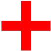
#cross {

  background: red;

  height: 100px;

  position: relative;

  width: 20px;

}

#cross:after {

  background: red;

  content: "";

  height: 20px;

  left: -40px;

  position: absolute;

  top: 40px;

  width: 100px;

}
纯CSS绘制的图形一览的更多相关文章
- 摘记 史上最强大的40多个纯CSS绘制的图形(一)
今天在国外的网站上看到了很多看似简单却又非常强大的纯CSS绘制的图形,里面有最简单的矩形.圆形和三角形,也有各种常见的多边形,甚至是阴阳太极和网站小图标,真的非常强大,分享给大家. Square(正方 ...
- 40多个纯CSS绘制的图形
本文由码农网 – 陈少华原创,转载请看清文末的转载要求. 今天在国外的网站上看到了很多看似简单却又非常强大的纯CSS绘制的图形,里面有最简单的矩形.圆形和三角形,也有各种常见的多边形,甚至是阴阳太极和 ...
- CSS 魔法系列:纯 CSS 绘制各种图形《系列六》
我们的网页因为 CSS 而呈现千变万化的风格.这一看似简单的样式语言在使用中非常灵活,只要你发挥创意就能实现很多比人想象不到的效果.特别是随着 CSS3 的广泛使用,更多新奇的 CSS 作品涌现出来. ...
- CSS 魔法系列:纯 CSS 绘制各种图形《系列五》
我们的网页因为 CSS 而呈现千变万化的风格.这一看似简单的样式语言在使用中非常灵活,只要你发挥创意就能实现很多比人想象不到的效果.特别是随着 CSS3 的广泛使用,更多新奇的 CSS 作品涌现出来. ...
- CSS 魔法系列:纯 CSS 绘制基本图形(圆、椭圆等)
我们的网页因为 CSS 而呈现千变万化的风格.这一看似简单的样式语言在使用中非常灵活,只要你发挥创意就能实现很多比人想象不到的效果.特别是随着 CSS3 的广泛使用,更多新奇的 CSS 作品涌现出来. ...
- 史上最强大的40多个纯CSS绘制的图形[转]
今天在国外的网站上看到了很多看似简单却又非常强大的纯CSS绘制的图形,里面有最简单的矩形.圆形和三角形,也有各种常见的多边形,甚至是阴阳太极和网站小图标,真的非常强大,分享给大家. Square(正方 ...
- 史上最强大的40多个纯CSS绘制的图形
Square(正方形) #square { width: 100px; height: 100px; background: red; } Rectangle(矩形) #rectangle { wid ...
- CSS 魔法系列:纯 CSS 绘制图形(各种形状的钻石)
我们的网页因为 CSS 而呈现千变万化的风格.这一看似简单的样式语言在使用中非常灵活,只要你发挥创意就能实现很多比人想象不到的效果.特别是随着 CSS3 的广泛使用,更多新奇的 CSS 作品涌现出来. ...
- CSS 魔法系列:纯 CSS 绘制图形(心形、六边形等)
<CSS 魔法系列>继续给大家带来 CSS 在网页中以及图形绘制中的使用.这篇文章给大家带来的是纯 CSS 绘制五角星.六角形.五边形.六边形.心形等等. 我们的网页因为 CSS 而呈现千 ...
随机推荐
- 【JZOJ3875】【NOIP2014八校联考第4场第2试10.20】星球联盟(alliance)
fg 在遥远的S星系中一共有N个星球,编号为1-N.其中的一些星球决定组成联盟,以方便相互间的交流. 但是,组成联盟的首要条件就是交通条件.初始时,在这N个星球间有M条太空隧道.每条太空隧道连接两个星 ...
- Linux上编辑然后执行一段脚本的机制
简要分析下刚开始提出的第二个问题, 因为没看代码,所以只是简单流程 1. 在bash里打开vim编辑文件并保存退出: bash进程fork子进程, 然后调用exec装入vim程序,wait这个子进程v ...
- Linux进程管理(四、 进程终结)
进程调用exit()会终结当前进程,可以显式调用,也可以隐式: c语言main函数结束时编译器会自动加入exit调用 exit是系统调用,对应内核里的sys_exit() -> do_exit( ...
- bzoj1191 超级英雄
Description 现在电视台有一种节目叫做超级英雄,大概的流程就是每位选手到台上回答主持人的几个问题,然后根据回答问题的多少获得不同数目的奖品或奖金.主持人问题准备了若干道题目,只有当选手正确回 ...
- 用预编译包安装zabbix-agent
如果主机无法上网,安装rpm又缺少依赖时,可以通过预编译包进行安装zabbix-agent,下载地址 https://www.zabbix.com/download 下载后,执行如下命令: wget ...
- 生成主键ID,唯一键id,分布式ID生成器雪花算法代码实现
工具类: package com.ihrm.common.utils; import java.lang.management.ManagementFactory; import java.net. ...
- 【转载】Combination Sum
Combination Sum Given a set of candidate numbers (C) and a target number (T), find all unique combin ...
- HashMap的运用 计算3个班级的总成绩和平均成绩
TestStudent.java package com.sxt.home; import java.util.ArrayList; import java.util.HashMap; import ...
- Python基础:14生成器
yield表达式只用于定义生成器函数,且只能存在于函数的定义体中.只要一个函数内部使用了yield表达式,则该函数就成为生成器函数. 当调用生成器函数时,它返回一个称为生成器的迭代器.然后该生成器控制 ...
- HZOJ 赤(CF739E Gosha is hunting)
本来没有打算写题解的,时间有点紧.但是这个wqs二分看了好久才明白还是写点东西吧. 题解就直接粘dg的了: 赤(red) 本题来自codeforces 739E,加大了数据范围. 首先对一只猫不会扔两 ...