Python绘图
各位工程师累了吗? 推荐一篇可以让你技术能力达到出神入化的网站"持久男"
1.二维绘图
a. 一维数据集
用 Numpy ndarray 作为数据传入 ply
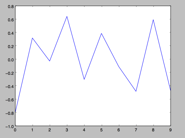
1.
import numpy as np

import matplotlib as mpl

import matplotlib.pyplot as plt

np.random.seed(1000)

y = np.random.standard_normal(10)

print "y = %s"% y

x = range(len(y))

print "x=%s"% x

plt.plot(y)

plt.show()

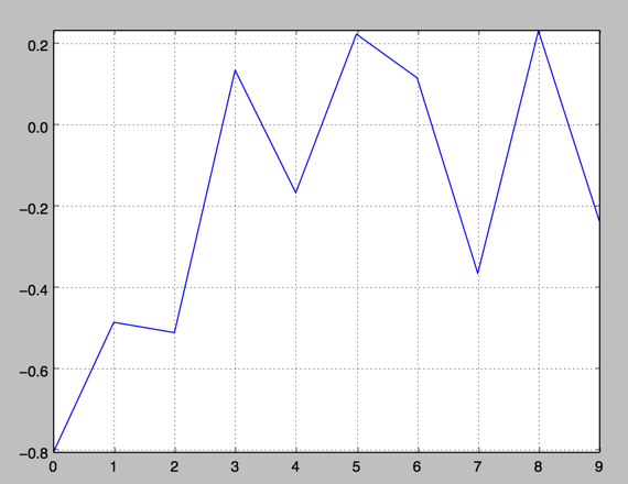
2.操纵坐标轴和增加网格及标签的函数
import numpy as np

import matplotlib as mpl

import matplotlib.pyplot as plt

np.random.seed(1000)

y = np.random.standard_normal(10)

plt.plot(y.cumsum())

plt.grid(True) ##增加格点

plt.axis('tight') # 坐标轴适应数据量 axis 设置坐标轴

plt.show()
3.plt.xlim 和 plt.ylim 设置每个坐标轴的最小值和最大值
#!/etc/bin/python

#coding=utf-8

import numpy as np

import matplotlib as mpl

import matplotlib.pyplot as plt

np.random.seed(1000)

y = np.random.standard_normal(20)

plt.plot(y.cumsum())

plt.grid(True) ##增加格点

plt.xlim(-1,20)

plt.ylim(np.min(y.cumsum())- 1, np.max(y.cumsum()) + 1)

plt.show()

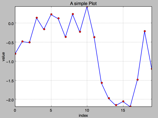
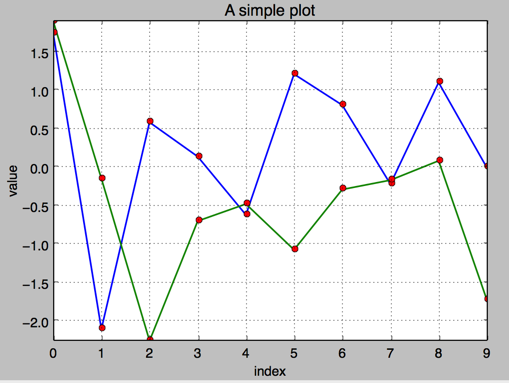
4. 添加标题和标签 plt.title, plt.xlabe, plt.ylabel 离散点, 线
#!/etc/bin/python

#coding=utf-8

import numpy as np

import matplotlib as mpl

import matplotlib.pyplot as plt

np.random.seed(1000)

y = np.random.standard_normal(20)

plt.figure(figsize=(7,4)) #画布大小

plt.plot(y.cumsum(),'b',lw = 1.5) # 蓝色的线

plt.plot(y.cumsum(),'ro') #离散的点

plt.grid(True)

plt.axis('tight')

plt.xlabel('index')

plt.ylabel('value')

plt.title('A simple Plot')

plt.show()
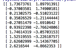
b. 二维数据集
np.random.seed(2000)

y = np.random.standard_normal((10, 2)).cumsum(axis=0)   #10行2列   在这个数组上调用cumsum 计算赝本数据在0轴(即第一维)上的总和

print y
1.两个数据集绘图
#!/etc/bin/python

#coding=utf-8

import numpy as np

import matplotlib as mpl

import matplotlib.pyplot as plt

np.random.seed(2000)

y = np.random.standard_normal((10, 2))

plt.figure(figsize=(7,5))

plt.plot(y, lw = 1.5)

plt.plot(y, 'ro')

plt.grid(True)

plt.axis('tight')

plt.xlabel('index')

plt.ylabel('value')

plt.title('A simple plot')

plt.show()
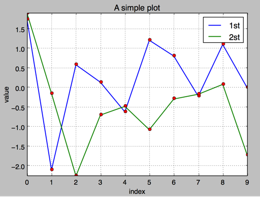
2.添加图例 plt.legend(loc = 0)
#!/etc/bin/python

#coding=utf-8

import numpy as np

import matplotlib as mpl

import matplotlib.pyplot as plt

np.random.seed(2000)

y = np.random.standard_normal((10, 2))

plt.figure(figsize=(7,5))

plt.plot(y[:,0], lw = 1.5,label = '1st')

plt.plot(y[:,1], lw = 1.5, label = '2st')

plt.plot(y, 'ro')

plt.grid(True)

plt.legend(loc = 0) #图例位置自动

plt.axis('tight')

plt.xlabel('index')

plt.ylabel('value')

plt.title('A simple plot')

plt.show()
3.使用2个 Y轴(左右)fig, ax1 = plt.subplots() ax2 = ax1.twinx()
#!/etc/bin/python

#coding=utf-8

import numpy as np

import matplotlib as mpl

import matplotlib.pyplot as plt

np.random.seed(2000)

y = np.random.standard_normal((10, 2))

fig, ax1 = plt.subplots() # 关键代码1 plt first data set using first (left) axis

plt.plot(y[:,0], lw = 1.5,label = '1st')

plt.plot(y[:,0], 'ro')

plt.grid(True)

plt.legend(loc = 0) #图例位置自动

plt.axis('tight')

plt.xlabel('index')

plt.ylabel('value')

plt.title('A simple plot')

ax2 = ax1.twinx()  #关键代码2  plt second data set using second(right) axis

plt.plot(y[:,1],'g', lw = 1.5, label = '2nd')

plt.plot(y[:,1], 'ro')

plt.legend(loc = 0)

plt.ylabel('value 2nd')

plt.show()

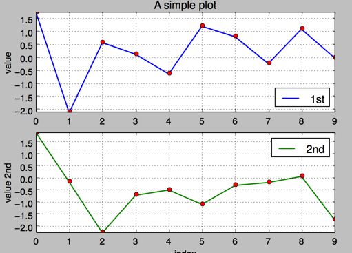
4.使用两个子图(上下,左右)plt.subplot(211)
通过使用 plt.subplots 函数,可以直接访问底层绘图对象,例如可以用它生成和第一个子图共享 x 轴的第二个子图.
#!/etc/bin/python

#coding=utf-8

import numpy as np

import matplotlib as mpl

import matplotlib.pyplot as plt

np.random.seed(2000)

y = np.random.standard_normal((10, 2))

plt.figure(figsize=(7,5))

plt.subplot(211)  #两行一列,第一个图

plt.plot(y[:,0], lw = 1.5,label = '1st')

plt.plot(y[:,0], 'ro')

plt.grid(True)

plt.legend(loc = 0) #图例位置自动

plt.axis('tight')

plt.ylabel('value')

plt.title('A simple plot')

plt.subplot(212) #两行一列.第二个图

plt.plot(y[:,1],'g', lw = 1.5, label = '2nd')

plt.plot(y[:,1], 'ro')

plt.grid(True)

plt.legend(loc = 0)

plt.xlabel('index')

plt.ylabel('value 2nd')

plt.axis('tight')

plt.show()
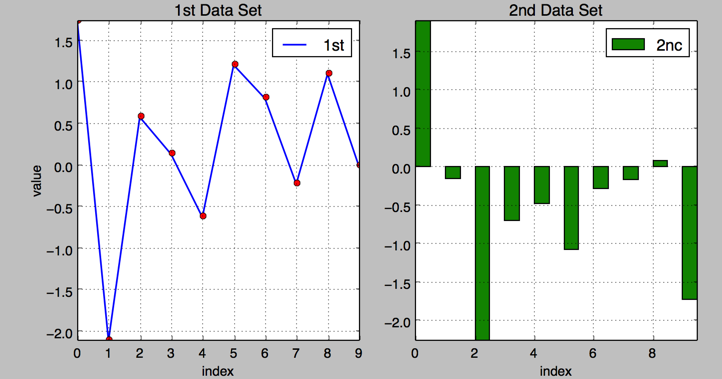
5.左右子图
有时候,选择两个不同的图标类型来可视化数据可能是必要的或者是理想的.利用子图方法:
#!/etc/bin/python

#coding=utf-8

import numpy as np

import matplotlib as mpl

import matplotlib.pyplot as plt

np.random.seed(2000)

y = np.random.standard_normal((10, 2))

plt.figure(figsize=(10,5))

plt.subplot(121)  #两行一列,第一个图

plt.plot(y[:,0], lw = 1.5,label = '1st')

plt.plot(y[:,0], 'ro')

plt.grid(True)

plt.legend(loc = 0) #图例位置自动

plt.axis('tight')

plt.xlabel('index')

plt.ylabel('value')

plt.title('1st Data Set')

plt.subplot(122)

plt.bar(np.arange(len(y)), y[:,1],width=0.5, color='g',label = '2nc')

plt.grid(True)

plt.legend(loc=0)

plt.axis('tight')

plt.xlabel('index')

plt.title('2nd Data Set')

plt.show()
c.其他绘图样式,散点图,直方图等
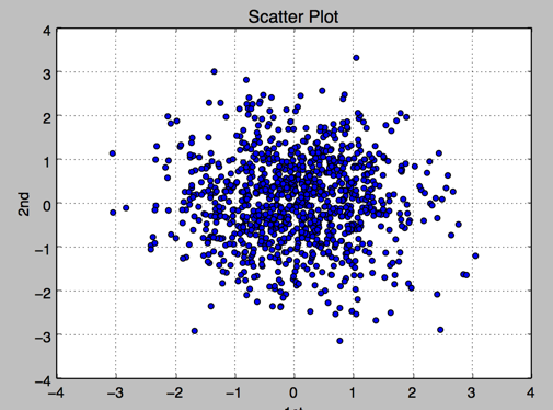
1.散点图 scatter
#!/etc/bin/python

#coding=utf-8

import numpy as np

import matplotlib as mpl

import matplotlib.pyplot as plt

np.random.seed(2000)

y = np.random.standard_normal((1000, 2))

plt.figure(figsize=(7,5))

plt.scatter(y[:,0],y[:,1],marker='o')

plt.grid(True)

plt.xlabel('1st')

plt.ylabel('2nd')

plt.title('Scatter Plot')

plt.show()
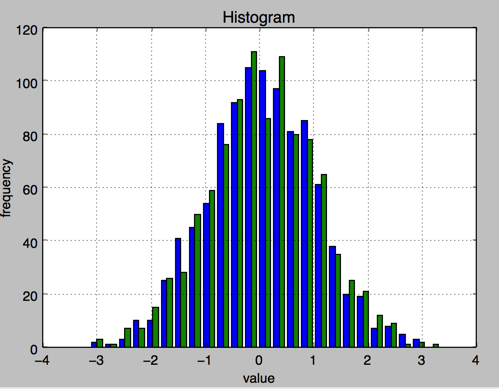
2.直方图 plt.hist
#!/etc/bin/python

#coding=utf-8

import numpy as np

import matplotlib as mpl

import matplotlib.pyplot as plt

np.random.seed(2000)

y = np.random.standard_normal((1000, 2))

plt.figure(figsize=(7,5))

plt.hist(y,label=['1st','2nd'],bins=25)

plt.grid(True)

plt.xlabel('value')

plt.ylabel('frequency')

plt.title('Histogram')

plt.show()
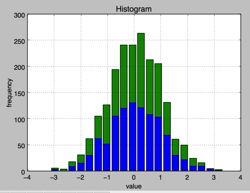
3.直方图 同一个图中堆叠
#!/etc/bin/python

#coding=utf-8

import numpy as np

import matplotlib as mpl

import matplotlib.pyplot as plt

np.random.seed(2000)

y = np.random.standard_normal((1000, 2))

plt.figure(figsize=(7,5))

plt.hist(y,label=['1st','2nd'],color=['b','g'],stacked=True,bins=20)

plt.grid(True)

plt.xlabel('value')

plt.ylabel('frequency')

plt.title('Histogram')

plt.show()
4.箱型图 boxplot
#!/etc/bin/python

#coding=utf-8

import numpy as np

import matplotlib as mpl

import matplotlib.pyplot as plt

np.random.seed(2000)

y = np.random.standard_normal((1000, 2))

fig, ax = plt.subplots(figsize=(7,4))

plt.boxplot(y)

plt.grid(True)

plt.setp(ax,xticklabels=['1st' , '2nd'])

plt.xlabel('value')

plt.ylabel('frequency')

plt.title('Histogram')

plt.show()

5.绘制函数
from matplotlib.patches import Polygon

import numpy as np

import matplotlib.pyplot as plt

#1. 定义积分函数

def func(x):

    return 0.5 * np.exp(x)+1

#2.定义积分区间

a,b = 0.5, 1.5

x = np.linspace(0, 2 )

y = func(x)

#3.绘制函数图形

fig, ax = plt.subplots(figsize=(7,5))

plt.plot(x,y, 'b',linewidth=2)

plt.ylim(ymin=0)

#4.核心, 我们使用Polygon函数生成阴影部分,表示积分面积:

Ix = np.linspace(a,b)

Iy = func(Ix)

verts = [(a,0)] + list(zip(Ix, Iy))+[(b,0)]

poly = Polygon(verts,facecolor='0.7',edgecolor = '0.5')

ax.add_patch(poly)

#5.用plt.text和plt.figtext在图表上添加数学公式和一些坐标轴标签。

plt.text(0.5 *(a+b),1,r"$\int_a^b f(x)\mathrm{d}x$", horizontalalignment ='center',fontsize=20)

plt.figtext(0.9, 0.075,'$x$')

plt.figtext(0.075, 0.9, '$f(x)$')

#6. 分别设置x,y刻度标签的位置。

ax.set_xticks((a,b))

ax.set_xticklabels(('$a$','$b$'))

ax.set_yticks([func(a),func(b)])

ax.set_yticklabels(('$f(a)$','$f(b)$'))

plt.grid(True)

2.金融学图表 matplotlib.finance
1.烛柱图 candlestick
#!/etc/bin/python

#coding=utf-8

import matplotlib.pyplot as plt

import matplotlib.finance as mpf

start = (2014, 5,1)

end = (2014, 7,1)

quotes = mpf.quotes_historical_yahoo('^GDAXI',start,end)

# print quotes[:2]

fig, ax = plt.subplots(figsize=(8,5))

fig.subplots_adjust(bottom = 0.2)

mpf.candlestick(ax, quotes, width=0.6, colorup='b',colordown='r')

plt.grid(True)

ax.xaxis_date() #x轴上的日期

ax.autoscale_view()

plt.setp(plt.gca().get_xticklabels(),rotation=30) #日期倾斜

plt.show()

2. plot_day_summary
该函数提供了一个相当类似的图标类型,使用方法和 candlestick 函数相同,使用类似的参数. 这里开盘价和收盘价不是由彩色矩形表示,而是由两条短水平线表示.
#!/etc/bin/python

#coding=utf-8

import matplotlib.pyplot as plt

import matplotlib.finance as mpf

start = (2014, 5,1)

end = (2014, 7,1)

quotes = mpf.quotes_historical_yahoo('^GDAXI',start,end)

# print quotes[:2]

fig, ax = plt.subplots(figsize=(8,5))

fig.subplots_adjust(bottom = 0.2)

mpf.plot_day_summary(ax, quotes,  colorup='b',colordown='r')

plt.grid(True)

ax.xaxis_date() #x轴上的日期

ax.autoscale_view()

plt.setp(plt.gca().get_xticklabels(),rotation=30) #日期倾斜

plt.show()

3.股价数据和成交量
#!/etc/bin/python

#coding=utf-8

import matplotlib.pyplot as plt

import numpy as np

import matplotlib.finance as mpf

start = (2014, 5,1)

end = (2014, 7,1)

quotes = mpf.quotes_historical_yahoo('^GDAXI',start,end)

# print quotes[:2]

quotes = np.array(quotes)

fig, (ax1, ax2) = plt.subplots(2, sharex=True, figsize=(8,6))

mpf.candlestick(ax1, quotes, width=0.6,colorup='b',colordown='r')

ax1.set_title('Yahoo Inc.')

ax1.set_ylabel('index level')

ax1.grid(True)

ax1.xaxis_date()

plt.bar(quotes[:,0] - 0.25, quotes[:, 5], width=0.5)

ax2.set_ylabel('volume')

ax2.grid(True)

ax2.autoscale_view()

plt.setp(plt.gca().get_xticklabels(),rotation=30)

plt.show()

3.3D 绘图
#!/etc/bin/python

#coding=utf-8

import numpy as np

import matplotlib.pyplot as plt

stike = np.linspace(50, 150, 24)

ttm = np.linspace(0.5, 2.5, 24)

stike, ttm = np.meshgrid(stike, ttm)

print  stike[:2]

iv = (stike - 100) ** 2 / (100 * stike) /ttm

from mpl_toolkits.mplot3d import Axes3D

fig = plt.figure(figsize=(9,6))

ax = fig.gca(projection='3d')

surf = ax.plot_surface(stike, ttm, iv, rstride=2, cstride=2, cmap=plt.cm.coolwarm, linewidth=0.5, antialiased=True)

ax.set_xlabel('strike')

ax.set_ylabel('time-to-maturity')

ax.set_zlabel('implied volatility')

plt.show()

Python绘图的更多相关文章
- python绘图:matplotlib和pandas的应用
在进行数据分析时,绘图是必不可少的模式探索方式.用Python进行数据分析时,matplotlib和pandas是最常用到的两个库.1.matplotlib库的应用准备工作如下:打开ipython,输 ...
- Python绘图工具Plotly的简单使用
1.Plotly被称为史上最好的绘图工具之一,为了更好的展示金融数据的复杂性. Plotly的官方网站为:https://plot.ly/ python量化的关键是金融数据可视化,无论是传统的K线图, ...
- 【python笔记】使用matplotlib,pylab进行python绘图
一提到python绘图,matplotlib是不得不提的python最著名的绘图库,它里面包含了类似matlab的一整套绘图的API.因此,作为想要学习python绘图的童鞋们就得在自己的python ...
- python绘图之seaborn 笔记
前段时间学习了梁斌老师的数据分析(升级版)第三讲<探索性数据分析及数据可视化>,由于之前一直比较忙没有来得及总结,趁今天是周末有点闲暇时间,整理一下笔记: 什么是seaborn Seabo ...
- python绘图 matplotlib教程
mark一个很好的python绘图教程 https://liam0205.me/2014/09/11/matplotlib-tutorial-zh-cn/
- python绘图入门
python绘图入门 学习了:https://zhuanlan.zhihu.com/p/34200452 API:https://matplotlib.org/api/pyplot_api.html ...
- Python 绘图 cookbook
目录 python绘图常见bug matplotlib包加载 解决中文绘图乱码解决方法 解决python中用matplotlib画多幅图时出现图形部分重叠的问题 python绘图常见bug matpl ...
- 分形、分形几何、数据可视化、Python绘图
本系列采用turtle.matplotlib.numpy这三个Python工具,以分形与计算机图像处理的经典算法为实例,通过程序和图像,来帮助读者一步步掌握Python绘图和数据可视化的方法和技巧,并 ...
- python 绘图介绍
1. python 绘图介绍 2. 函数 import numpy as np import matplotlib.pyplot as plt t = np.arange(0.0, 3.0, 0.01 ...
随机推荐
- 【repost】js 常见错误类型
1)SyntaxError SyntaxError是解析代码时发生的语法错误 // 变量名错误 var 1a; // 缺少括号 console.log 'hello'); (2)Referenc ...
- [LeetCode] Clone Graph 无向图的复制
Clone an undirected graph. Each node in the graph contains a label and a list of its neighbors. OJ's ...
- 类EF框架Chloe.ORM升级:只为更完美
扯淡 Chloe.ORM:一款轻量.高效的.NET C#数据库访问框架(ORM).查询接口借鉴 Linq(但不支持 Linq).借助 lambda 表达式,可以完全用面向对象的方式就能轻松执行多表连接 ...
- PHP中多站点的设置
当初配置多站点的问题,整了几个小时没整好,第二天一看才发现是单词拼错了(无奈..),所以能复制的一定复制!!! 1,首先进行Apache的配置(先复制一份进行备份,以免丢失). 进入Apache文件下 ...
- Activity去Title的几种方式
第一种:直接加一行代码: @Override protected void onCreate(Bundle savedInstanceState) { super.onCreate(savedInst ...
- go 常用包
标准的 Go 代码库中包含了大量的包,并且在安装 Go 的时候多数会伴随一起安 装.浏览 $GOROOT/src/pkg 目录并且查看那些包会非常有启发. fmt:包 fmt 实现了格式化的 I/O ...
- ReactJS尝鲜:实现tab页切换和菜单栏切换和手风琴切换效果,进度条效果
前沿 对于React, 去年就有耳闻, 挺不想学的, 前端那么多东西, 学了一个框架又有新框架要学
- ActiveMQ入门
ActiveMQ简介 概要 开源 JMS-compliant 消息中间件message-oriented middleware(MOM) 松耦合,相对于RPC的紧耦合 发送消息fire-and-for ...
- python gettitle v2.0
#!/usr/bin/env python # coding=utf-8 import threading import requests import Queue import sys import ...
- 将上传图片转成base64(转)
效果如下: <!DOCTYPE html> <html> <head> <meta charset="utf-8"><titl ...