Bootstrap CSS 表单
表单布局
Bootstrap 提供了下列类型的表单布局:
- 垂直表单(默认)
- 内联表单
- 水平表单
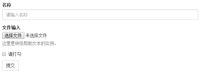
垂直或基本表单
基本的表单结构是 Bootstrap 自带的,个别的表单控件自动接收一些全局样式。下面列出了创建基本表单的步骤:
- 向父 <form> 元素添加 role="form"。
- 把标签和控件放在一个带有 class .form-group 的 <div> 中。这是获取最佳间距所必需的。
- 向所有的文本元素 <input>、<textarea> 和 <select> 添加 class .form-control。
<form role="form">

   <div class="form-group">

      <label for="name">名称</label>

      <input type="text" class="form-control" id="name"

         placeholder="请输入名称">

   </div>

   <div class="form-group">

      <label for="inputfile">文件输入</label>

      <input type="file" id="inputfile">

      <p class="help-block">这里是块级帮助文本的实例。</p>

   </div>

   <div class="checkbox">

      <label>

      <input type="checkbox"> 请打勾

      </label>

   </div>

   <button type="submit" class="btn btn-default">提交</button>

</form>
实现的效果如图:
内联表单
如果需要创建一个表单,它的所有元素是内联的,向左对齐的,标签是并排的,请向 <form> 标签添加 class .form-inline。
<form class="form-inline" role="form">

   <div class="form-group">

      <label class="sr-only" for="name">名称</label>

      <input type="text" class="form-control" id="name"

         placeholder="请输入名称">

   </div>

   <div class="form-group">

      <label class="sr-only" for="inputfile">文件输入</label>

      <input type="file" id="inputfile">

   </div>

   <div class="checkbox">

      <label>

      <input type="checkbox"> 请打勾

      </label>

   </div>

   <button type="submit" class="btn btn-default">提交</button>

</form>
结果如下所示:

- 默认情况下,Bootstrap 中的 input、select 和 textarea 有 100% 宽度。在使用内联表单时,您需要在表单控件上设置一个宽度。
- 使用 class .sr-only,您可以隐藏内联表单的标签。
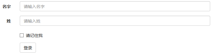
水平表单
水平表单与其他表单不仅标记的数量上不同,而且表单的呈现形式也不同。如需创建一个水平布局的表单,请按下面的几个步骤进行:
- 向父 <form> 元素添加 class .form-horizontal。
- 把标签和控件放在一个带有 class .form-group 的 <div> 中。
- 向标签添加 class .control-label。
<form class="form-horizontal" role="form">

   <div class="form-group">

      <label for="firstname" class="col-sm-2 control-label">名字</label>

      <div class="col-sm-10">

         <input type="text" class="form-control" id="firstname"

            placeholder="请输入名字">

      </div>

   </div>

   <div class="form-group">

      <label for="lastname" class="col-sm-2 control-label">姓</label>

      <div class="col-sm-10">

         <input type="text" class="form-control" id="lastname"

            placeholder="请输入姓">

      </div>

   </div>

   <div class="form-group">

      <div class="col-sm-offset-2 col-sm-10">

         <div class="checkbox">

            <label>

               <input type="checkbox"> 请记住我

            </label>

         </div>

      </div>

   </div>

   <div class="form-group">

      <div class="col-sm-offset-2 col-sm-10">

         <button type="submit" class="btn btn-default">登录</button>

      </div>

   </div>

</form>
结果如下所示:
支持的表单控件
Bootstrap 支持最常见的表单控件,主要是 input、textarea、checkbox、radio 和 select。
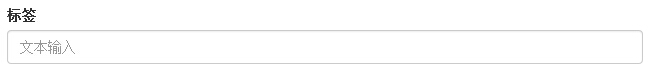
输入框(Input)
最常见的表单文本字段是输入框 input。用户可以在其中输入大多数必要的表单数据。Bootstrap 提供了对所有原生的 HTML5 的 input 类型的支持,包括:text、password、datetime、datetime-local、date、month、time、week、number、email、url、search、tel和 color。适当的 type 声明是必需的,这样才能让 input 获得完整的样式。
<form role="form">

  <div class="form-group">

    <label for="name">标签</label>

    <input type="text" class="form-control" placeholder="文本输入">

  </div>

 </form>
结果如下所示:
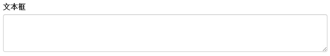
文本框(Textarea)
当您需要进行多行输入的时,则可以使用文本框 textarea。必要时可以改变 rows 属性(较少的行 = 较小的盒子,较多的行 = 较大的盒子)。
form role="form">

  <div class="form-group">

    <label for="name">文本框</label>

    <textarea class="form-control" rows="3"></textarea>

  </div>

</form>
结果如下所示:
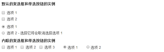
复选框((Checkbox)和单选框(Radio)
复选框和单选按钮用于让用户从一系列预设置的选项中进行选择。
- 当创建表单时,如果您想让用户从列表中选择若干个选项时,请使用 checkbox。如果您限制用户只能选择一个选项,请使用 radio。
- 对一系列复选框和单选框使用 .checkbox-inline 或 .radio-inline class,控制它们显示在同一行上。
下面的实例演示了这两种类型(默认和内联):
<label for="name">默认的复选框和单选按钮的实例</label>

<div class="checkbox">

   <label><input type="checkbox" value="">选项 1</label>

</div>

<div class="checkbox">

   <label><input type="checkbox" value="">选项 2</label>

</div>

<div class="radio">

   <label>

      <input type="radio" name="optionsRadios" id="optionsRadios1"

         value="option1" checked> 选项 1

   </label>

</div>

<div class="radio">

   <label>

      <input type="radio" name="optionsRadios" id="optionsRadios2"

         value="option2">

         选项 2 - 选择它将会取消选择选项 1

   </label>

</div>

<label for="name">内联的复选框和单选按钮的实例</label>

<div>

   <label class="checkbox-inline">

      <input type="checkbox" id="inlineCheckbox1" value="option1"> 选项 1

   </label>

   <label class="checkbox-inline">

      <input type="checkbox" id="inlineCheckbox2" value="option2"> 选项 2

   </label>

   <label class="checkbox-inline">

      <input type="checkbox" id="inlineCheckbox3" value="option3"> 选项 3

   </label>

   <label class="checkbox-inline">

      <input type="radio" name="optionsRadiosinline" id="optionsRadios3"

         value="option1" checked> 选项 1

   </label>

   <label class="checkbox-inline">

      <input type="radio" name="optionsRadiosinline" id="optionsRadios4"

         value="option2"> 选项 2

   </label>

</div>
结果如下所示:
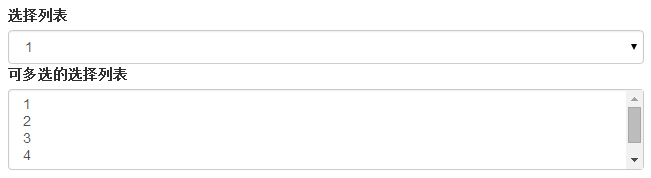
选择框(Select)
当您想让用户从多个选项中进行选择,但是默认情况下只能选择一个选项时,则使用选择框。
- 使用 <select> 展示列表选项,通常是那些用户很熟悉的选择列表,比如州或者数字。
- 使用 multiple="multiple" 允许用户选择多个选项。
下面的实例演示了这两种类型(select 和 multiple):
<form role="form">

   <div class="form-group">

      <label for="name">选择列表</label>

      <select class="form-control">

         <option>1</option>

         <option>2</option>

         <option>3</option>

         <option>4</option>

         <option>5</option>

      </select>

      <label for="name">可多选的选择列表</label>

      <select multiple class="form-control">

         <option>1</option>

         <option>2</option>

         <option>3</option>

         <option>4</option>

         <option>5</option>

      </select>

   </div>

</form>
结果如下所示:
静态控件
当您需要在一个水平表单内的表单标签后放置纯文本时,请在 <p> 上使用 class .form-control-static。
<form class="form-horizontal" role="form">

  <div class="form-group">

    <label class="col-sm-2 control-label">Email</label>

    <div class="col-sm-10">

      <p class="form-control-static">email@example.com</p>

    </div>

  </div>

  <div class="form-group">

    <label for="inputPassword" class="col-sm-2 control-label">密码</label>

    <div class="col-sm-10">

      <input type="password" class="form-control" id="inputPassword"

         placeholder="请输入密码">

    </div>

  </div>

</form>
结果如下所示:

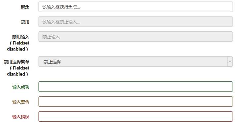
表单控件状态
除了 :focus 状态(即,用户点击 input 或使用 tab 键聚焦到 input 上),Bootstrap 还为禁用的输入框定义了样式,并提供了表单验证的 class。
输入框焦点
当输入框 input 接收到 :focus 时,输入框的轮廓会被移除,同时应用 box-shadow。
禁用的输入框 input
如果您想要禁用一个输入框 input,只需要简单地添加 disabled 属性,这不仅会禁用输入框,还会改变输入框的样式以及当鼠标的指针悬停在元素上时鼠标指针的样式。
禁用的字段集 fieldset
对 <fieldset> 添加 disabled 属性来禁用 <fieldset> 内的所有控件。
验证状态
Bootstrap 包含了错误、警告和成功消息的验证样式。只需要对父元素简单地添加适当的 class(.has-warning、 .has-error 或 .has-success)即可使用验证状态。
下面的实例演示了所有控件状态:
<form class="form-horizontal" role="form">

   <div class="form-group">

      <label class="col-sm-2 control-label">聚焦</label>

      <div class="col-sm-10">

         <input class="form-control" id="focusedInput" type="text"

            value="该输入框获得焦点...">

      </div>

   </div>

   <div class="form-group">

      <label for="inputPassword" class="col-sm-2 control-label">

         禁用

      </label>

      <div class="col-sm-10">

         <input class="form-control" id="disabledInput" type="text"

            placeholder="该输入框禁止输入..." disabled>

      </div>

   </div>

   <fieldset disabled>

      <div class="form-group">

         <label for="disabledTextInput"  class="col-sm-2 control-label">

            禁用输入(Fieldset disabled)

         </label>

         <div class="col-sm-10">

            <input type="text" id="disabledTextInput" class="form-control"

               placeholder="禁止输入">

         </div>

      </div>

      <div class="form-group">

         <label for="disabledSelect"  class="col-sm-2 control-label">

            禁用选择菜单(Fieldset disabled)

         </label>

         <div class="col-sm-10">

            <select id="disabledSelect" class="form-control">

               <option>禁止选择</option>

            </select>

         </div>

      </div>

   </fieldset>

   <div class="form-group has-success">

      <label class="col-sm-2 control-label" for="inputSuccess">

         输入成功

      </label>

      <div class="col-sm-10">

         <input type="text" class="form-control" id="inputSuccess">

      </div>

   </div>

   <div class="form-group has-warning">

      <label class="col-sm-2 control-label" for="inputWarning">

         输入警告

      </label>

      <div class="col-sm-10">

         <input type="text" class="form-control" id="inputWarning">

      </div>

   </div>

   <div class="form-group has-error">

      <label class="col-sm-2 control-label" for="inputError">

         输入错误

      </label>

      <div class="col-sm-10">

         <input type="text" class="form-control" id="inputError">

      </div>

   </div>

</form>
结果如下所示:
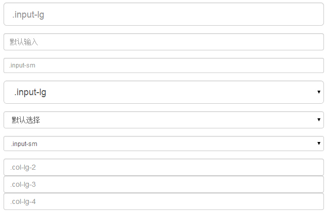
表单控件大小
您可以分别使用 class .input-lg 和 .col-lg-* 来设置表单的高度和宽度。下面的实例演示了这点:
<form role="form">

   <div class="form-group">

      <input class="form-control input-lg" type="text"

         placeholder=".input-lg">

   </div>

   <div class="form-group">

      <input class="form-control" type="text" placeholder="默认输入">

   </div>

   <div class="form-group">

      <input class="form-control input-sm" type="text"

         placeholder=".input-sm">

   </div>

   <div class="form-group">

   </div>

   <div class="form-group">

      <select class="form-control input-lg">

         <option value="">.input-lg</option>

      </select>

   </div>

   <div class="form-group">

      <select class="form-control">

         <option value="">默认选择</option>

      </select>

   </div>

   <div class="form-group">

      <select class="form-control input-sm">

         <option value="">.input-sm</option>

      </select>

   </div>

   <div class="row">

      <div class="col-lg-2">

         <input type="text" class="form-control" placeholder=".col-lg-2">

      </div>

      <div class="col-lg-3">

         <input type="text" class="form-control" placeholder=".col-lg-3">

      </div>

      <div class="col-lg-4">

         <input type="text" class="form-control" placeholder=".col-lg-4">

      </div>

   </div>

</form>
结果如下所示:
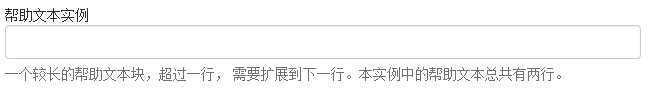
表单帮助文本
Bootstrap 表单控件可以在输入框 input 上有一个块级帮助文本。为了添加一个占用整个宽度的内容块,请在 <input> 后使用 .help-block。下面的实例演示了这点:
<form role="form">

   <span>帮助文本实例</span>

   <input class="form-control" type="text" placeholder="">

   <span class="help-block">一个较长的帮助文本块,超过一行,

   需要扩展到下一行。本实例中的帮助文本总共有两行。</span>

</form>
结果如下所示:
Bootstrap CSS 表单的更多相关文章
- bootstrap -- css -- 表单控件
若干css样式 .form-control { display: block; width: 100%; height: 34px; padding: 6px 12px; font-size: 14p ...
- bootstrap CSS表单、按钮和字体图标
基础表单 <form role="form"> <div class="form-group"> <l ...
- Bootstrap之表单控件状态
Bootstrap中的表单控件状态主要有三种:焦点状态,禁用状态,验证状态. 一.焦点状态:该状态告诉用户可输入或选择东西 焦点状态通过伪类“:focus”以实现. bootstrap.css相应 ...
- BootStrap 智能表单系列 六 表单数据绑定(编辑页面的数据绑定)
本章介绍如何在生成表单后,将一个model的数据展示到form表单中(一般用于编辑页面) 代码如下(连接地址:https://github.com/xiexingen/Bootstrap-SmartF ...
- BootStrap 智能表单系列 七 验证的支持
但凡是涉及到用户编辑信息然后保存的页面,都涉及到一个数据是否符合要求的检查,需要客服端和服务器端的校验的问题: 客服端的校验主要是为了提高用户体验,而服务器端的校验为了数据的合格性 该插件也为您支持到 ...
- BootStrap 智能表单系列 四 表单布局介绍
表单的布局分为自动布局和自定义布局两种: 自动布局就是根据配置项中第二级配置项中数组的长度来自动使用不同的bootstrap栅格,通过设置autoLayout为true可以实现自动布局 自动以布局就是 ...
- BootStrap 智能表单系列 三 分块表单配置的介绍
相信广大博友肯定碰到过一个编辑页面分了很多块的情况,智能表单插件已经为您支持了这种情况, 代码如下(链接地址:https://github.com/xiexingen/Bootstrap-SmartF ...
- BootStrap 智能表单系列 二 BootStrap支持的类型简介
代码如下(链接地址:https://github.com/xiexingen/Bootstrap-SmartForm/blob/master/demo/form1-basic.html): <! ...
- bootstrap 基础表单 内联表单 横向表单
bootstrap 基础表单 内联表单 横向表单 <!DOCTYPE html> <html> <head> <title></title> ...
随机推荐
- C#创建目录,文件名过滤特殊字符串,非法字符
string invalid = new string(Path.GetInvalidFileNameChars()) + new string(Path.GetInvalidPathChars()) ...
- mysql数据库权限及编码
CREATE DATABASE IF NOT EXISTS yourdbname DEFAULT CHARSET utf8 COLLATE utf8_general_ci; 在tigase中,发送消息 ...
- [Cordova] Plugin里使用iOS Framework
[Cordova] Plugin里使用iOS Framework 前言 开发Cordova Plugin的时候,在Native Code里使用第三方Library,除了可以加速项目的时程.也避免了重复 ...
- 【翻译】理念:无冲突的扩展本地DOM原型
菜鸟翻译,望大家多多指正哈 原文:http://lea.verou.me/2015/04/idea-extending-native-dom-prototypes-without-collisions ...
- django基础篇
Python的WEB框架有Django.Tornado.Flask 等多种,Django相较与其他WEB框架其优势为:大而全,框架本身集成了ORM.模型绑定.模板引擎.缓存.Session等诸多功能. ...
- iOS之获取屏幕尺寸
//app尺寸,去掉状态栏 CGRect appRect = [UIScreenmainScreen].applicationFrame; NSLog(@"%f, %f, %f,%f&quo ...
- ios 提取html 字符串中的img 的地址(图片地址)
本文原文地址 http://www.cnblogs.com/qianLL/p/6082287.html 有时候 后台返回的是一串html'字符串 我们需要把里面的图片地址提取出来 这个关键就是一个正 ...
- iOS 为什么app都是异步编程
iOS 为什么app都是异步编程 对本文题目首先需要了解一下什么是异步编程,异步编程即多线程编程. 多线程是一个比较轻量级的方法来实现单个应用程序内多个代码执行路径. 在具体理解多线程之前先看一个都理 ...
- NSLog 占位符
转自:http://blog.sina.com.cn/s/blog_75f190280101dmj8.html [iOS]Objective-C占位符使用 (2013-10-21 10:24:16) ...
- Xamarin For Visual Studio 3.0.54.0 完整离线破解版(C# 开发Android、IOS工具 吾乐吧软件站分享)
Xamarin For Visual Studio就是原本的Xamarin For Android 以及 Xamarin For iOS,最新版的已经把两个独立的插件合并为一个exe安装包了.为了区分 ...