css过渡模块和2d转换模块
今天,我们一起来研究一下css3中的过渡模块、2d转换模块和3d转换模块
一、过渡模块transition
(一)过度模块的三要素:
1、必须要有属性发生变化
2、必须告诉系统哪个属性需要执行过渡效果
3、必须告诉系统过渡效果持续时长
ps:当多个属性需要同时执行过渡效果时用逗号隔开即可
transition-property: width, background-color;
transition-duration: 5s, 5s;
示例代码:
<!DOCTYPE html>

<html lang="en">

<head>

    <meta charset="UTF-8">

    <title>过渡模块</title>

    <style>

        *{

            margin: 0;

            padding: 0;

        }

        div{

            width: 100px;

            height: 50px;

            background-color: red;

            /*告诉系统哪个属性需要执行过渡效果*/

            transition-property: width, background-color;

            /*告诉系统过渡效果持续的时长*/

            transition-duration: 5s, 5s;

        }

        /*
  用来改变元素的属性
  :hover这个伪类选择器除了可以用在a标签上, 还可以用在其它的任何标签上

*/

        div:hover{

            width: 300px;

            background-color: blue;

        }

    </style>

</head>

<body>

<div></div>

</body>

</html>
效果图:
 变化前
变化前
 变化中
变化中
 变化后
变化后
(二)过渡模块的其它属性:
1、告诉系统延迟多少秒之后才开始过渡动画:transition-delay: 2s;
2、告诉系统过渡动画的运动的速度:transition-timing-function: linear;
示例代码:
<!DOCTYPE html>

<html lang="en">

<head>

    <meta charset="UTF-8">

    <title>89-过渡模块-其它属性</title>

    <style>

        *{

            margin: 0;

            padding: 0;

        }

        div {

            width: 100px;

            height: 50px;

            background-color: red;

            transition-property: width;

            transition-duration: 5s;

            /*告诉系统延迟多少秒之后才开始过渡动画*/

            transition-delay: 2s;

        }

        div:hover{

            width: 300px;

        }

        ul{

            width: 800px;

            height: 500px;

            margin: 0 auto;

            background-color: pink;

            border: 1px solid #000;

        }

        ul li{

            list-style: none;

            width: 100px;

            height: 50px;

            margin-top: 50px;

            background-color: blue;

            transition-property: margin-left;

            transition-duration: 10s;

        }

        ul:hover li{

            margin-left: 700px;

        }

        ul li:nth-child(1){

            /*告诉系统过渡动画的运动的速度*/

            transition-timing-function: linear;

        }

        ul li:nth-child(2){

            transition-timing-function: ease;

        }

        ul li:nth-child(3){

            transition-timing-function: ease-in;

        }

        ul li:nth-child(4){

            transition-timing-function: ease-out;

        }

        ul li:nth-child(5){

            transition-timing-function: ease-in-out;

        }

    </style>

</head>

<body>

<!--<div></div>-->

<ul>

    <li>linear</li>

    <li>ease</li>

    <li>ease-in</li>

    <li>ease-out</li>

    <li>ease-in-out</li>

</ul>

</body>

</html>
不同的运动速度会导致不同的过渡效果,请看运行效果图:
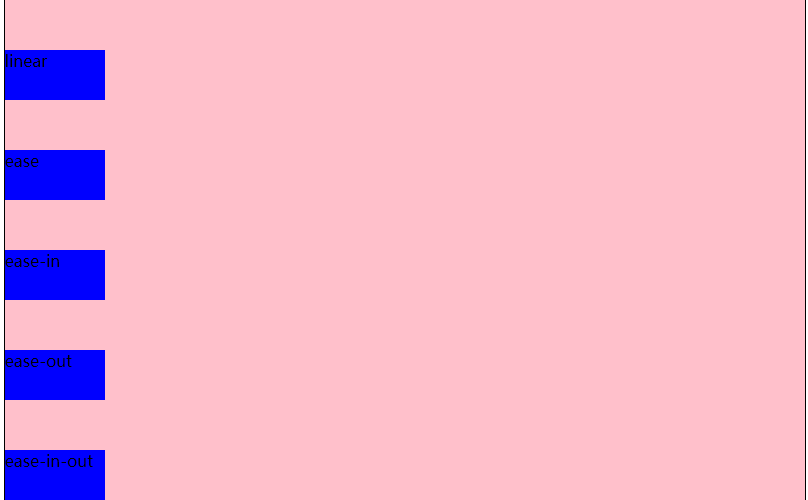 运动前
运动前
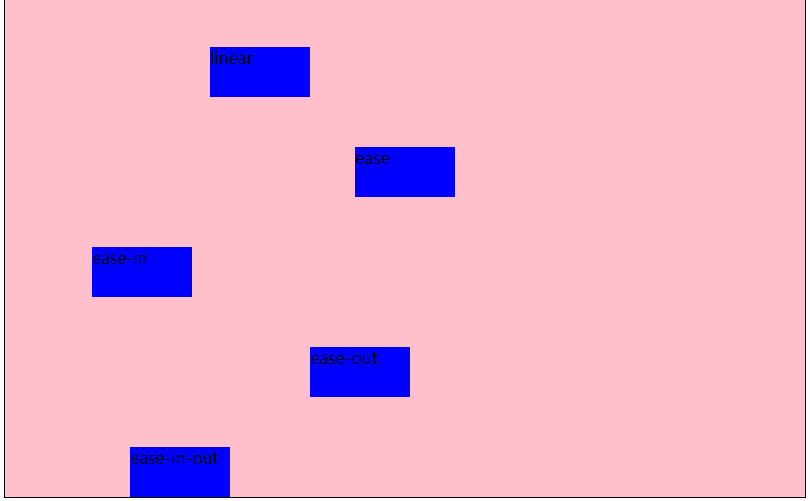 运动中
运动中
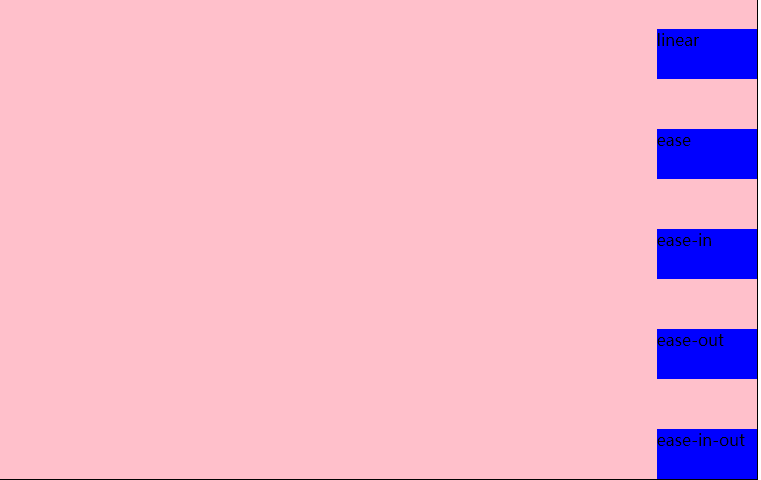 运动后
运动后
(三)过渡连写格式
transition: 过渡属性 过渡时长 运动速度 延迟时间;
过渡连写注意点
1和分开写一样, 如果想给多个属性添加过渡效果也是用逗号隔开即可
2连写的时可以省略后面的两个参数, 因为只要编写了前面的两个参数就已经满足了过渡的三要素
3如果多个属性运动的速度/延迟的时间/持续时间都一样, 那么可以简写为:transition:all 0s;
示例代码:
<!DOCTYPE html>

<html lang="en">

<head>

    <meta charset="UTF-8">

    <title>过渡模块的连写</title>

    <style>

        *{

            margin: 0;

            padding: 0;

        }

        div {

            width: 100px;

            height: 50px;

            background-color: red;

            /*注释中为简写前的代码:

            transition-property: width;

            ransition-duration: 5s;

            transition: width 5s linear 0s,background-color 5s linear 0s;

            transition: background-color 5s linear 0s;

            transition: width 5s,background-color 5s,height 5s;*/

            /*下面为简写后的代码*/

            transition: all 5s;

        }

        div:hover{

            width: 300px;

            height: 300px;

            background-color: blue;

        }

    </style>

</head>

<body>

<div></div>

</body>

</html>
(四)过度模块的编写套路和案例
编写套路:
1、不要管过渡, 先编写基本界面
2、修改我们认为需要修改的属性
3、再回过头去给被修改属性的那个元素添加过渡即可
案例1:
思路:
1、先做好基本页面布局,给div和span添加样式表;
2、考虑怎么实现要做的效果,和需要变动的属性
3、给属性添加过渡效果,在只有一种属性变动或多个属性过渡时间等相同的情况下推荐使用:transition:all 1s;
<!DOCTYPE html>

<html lang="en">

<head>

    <meta charset="UTF-8">

    <title>过渡模块-弹性效果</title>

    <style>

        *{

            margin: 0;

            padding: 0;

        }

        div{

            height: 150px;

            background-color: green;

            margin-top: 100px;

            text-align: center;

            line-height: 150px;

        }

        div span{

            font-size: 80px;

            transition: margin 3s;

        }

        div:hover span{

            margin: 0 20px;

        }

    </style>

</head>

<body>

<div>

    <span>L</span>

    <span>M</span>

    <span>S</span>

    <span>码</span>

    <span>农</span>

    <span>来</span>

    <span>过</span>

    <span>渡</span>

</div>

</body>

</html>
示例图片:
 过渡前
过渡前
 过渡中
过渡中
 过度后
过度后
案例2:
手风琴效果,示例代码:
<!DOCTYPE html>

<html lang="en">

<head>

    <meta charset="UTF-8">

    <title>过渡模块-手风琴效果</title>

    <style>

        *{

            margin: 0;

            padding: 0;

        }

        ul{

            width: 960px;

            height: 300px;

            margin: 100px auto;

            border: 1px solid #000;

            overflow: hidden;

        }

        ul li{

            list-style: none;

            width: 160px;

            height: 300px;

            float: left;

            transition: width 0.5s;

        }

        ul:hover li{

            width: 100px;

        }

        ul li:hover{

            width: 460px;

        }

    </style>

</head>

<body>

<ul>
/*这里为了方便使用了行内样式表,实际应用中一般为图片,要注意样式与内容分离*/

    <li style="background-color: #ccc;"></li>

    <li style="background-color: #e5ce8a;"></li>

    <li style="background-color: #eac123;"></li>

    <li style="background-color: #a00;"></li>

    <li style="background-color: #cc0;"></li>

    <li style="background-color: #0cc;"></li>

</ul>

</body>

</html>
思路:
1、通过浮动做好基本布局,如图:
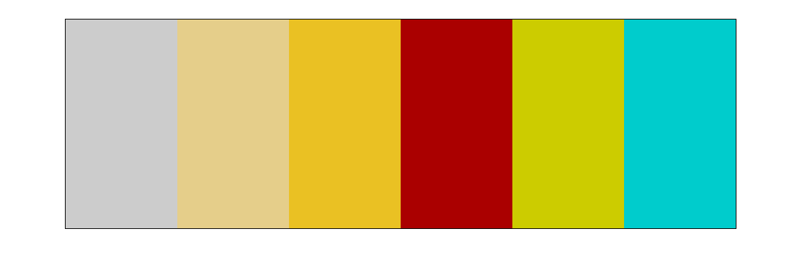
2、考虑需要实现的效果,如下图,即鼠标移入后,具有:hover事件的li宽度变大,其余的等大。
我们可以通过ul的:hover事件让所有的li变小,然后通过li的:hover时间来使当前li宽度变大。案例事小,思路是大,这种思路在以后的js中或者其他的地方经常用到,即先将所有元素初始化,在单独改变需要改变的元素属性。

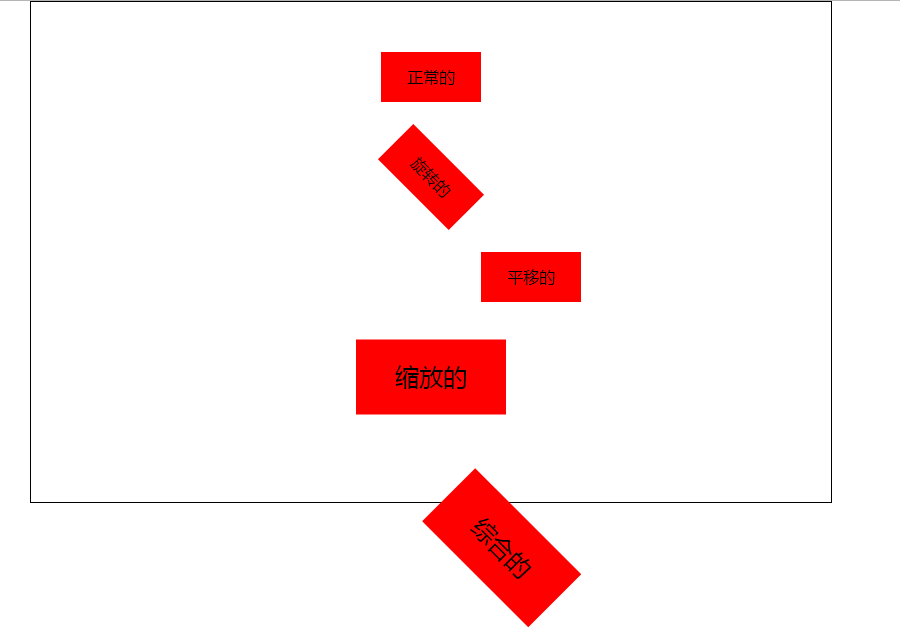
二、2d转换模块transform
(一)写法:transform:值;transform的值常用的有3种:
1、旋转:其中deg是单位, 代表多少度:transform: rotate(45deg);
2、移动:第一个参数:水平方向,第二个参数:垂直方向,transform: translate(100px, 0px);
3、缩放:第一个参数:水平方向,第二个参数:垂直方向,transform: scale(0.5, 0.5);transform: scale(1.5);
注意点:
如果取值是1, 代表不变
如果取值大于1, 代表需要放大
如果取值小于1, 代表需要缩小
如果水平和垂直缩放都一样, 那么可以简写为一个参数
ps:1、如果需要进行多个转换, 那么用空格隔开
2、2D的转换模块会修改元素的坐标系, 所以旋转之后再平移就不是水平平移的
示例代码:
<!DOCTYPE html>

<html lang="en">

<head>

    <meta charset="UTF-8">

    <title>2D转换模块</title>

    <style>

        *{

            margin: 0;

            padding: 0;

        }

        ul{

            width: 800px;

            height: 500px;

            border: 1px solid #000;

            margin: 0 auto;

        }

        ul li{

            list-style: none;

            width: 100px;

            height: 50px;

            background-color: red;

            margin: 0 auto;

            margin-top: 50px;

            text-align: center;

            line-height: 50px;

        }

        ul li:nth-child(2){

            transform: rotate(45deg);

        }

        ul li:nth-child(3){

            transform: translate(100px, 0px);

        }

        ul li:nth-child(4){

            transform: scale(1.5);

        }

        ul li:nth-child(5){

            transform: rotate(45deg) translate(100px, 0px) scale(1.5, 1.5);

            /*transform: translate(100px, 0px);*/

        }

    </style>

</head>

<body>

<ul>

    <li>正常的</li>

    <li>旋转的</li>

    <li>平移的</li>

    <li>缩放的</li>

    <li>综合的</li>

</ul>

</body>

</html>
示例图片:
(二)转换模块的形变中心点:
默认情况下所有的元素都是以自己的中心点作为参考来旋转的, 我们可以通过形变中心点属性来修改它的参考点。
1、写法:transform-origin: left top;第一个参数:水平方向,第二个参数:垂直方向。
ps:取值有三种形式
具体像素:transform-origin: 200px 0px;
百分比:transform-origin: 50% 50%;
特殊关键字:transform-origin: center center;
2、示例代码:
<!DOCTYPE html>

<html lang="en">

<head>

    <meta charset="UTF-8">

    <title>2D转换模块的形变中心点</title>

    <style>

        *{

            margin: 0;

            padding: 0;

        }

        ul{

            width: 200px;

            height: 200px;

            border: 1px solid #000;

            margin: 100px auto;

            position: relative;

        }

        ul li{

            list-style: none;

            width: 200px;

            height: 200px;

            position: absolute;

            left: 0;

            top: 0;

            transform-origin: left top;

        }

        ul li:nth-child(1){

            background-color: red;

            transform: rotate(30deg);

        }

        ul li:nth-child(2){

            background-color: green;

            transform: rotate(50deg);

        }

        ul li:nth-child(3){

            background-color: blue;

            transform: rotate(70deg);

        }

    </style>

</head>

<body>

<ul>

    <li></li>

    <li></li>

    <li></li>

</ul>

</body>

</html>

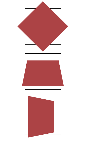
(三)2d转换模块的旋转轴
rotate旋转属性旋转是默认都是围绕z轴旋转,若需要改变旋转轴可以在rotate后加上旋转轴,即:rotateX();rotateY();rotateZ();
1、当围绕x和y轴旋转时就会改变属性距离我们的距离,也就是透视,什么事透视呢,就是近大远小。
2、你会发现元素围绕x轴或y轴旋转时并没有金达远小的效果,这时你需要添加一个透视属性:perspective: 500px;注意:这个属性需要添加在元素的父容器上;
<!DOCTYPE html>

<html lang="en">

<head>

    <meta charset="UTF-8">

    <title>旋转轴向</title>

    <style>

        *{

            margin: 0;

            padding: 0;

        }

        ul{

            width: 800px;

            height: 500px;

            margin: 0 auto;

        }

        ul li{

            list-style: none;

            width: 200px;

            height: 200px;

            margin: 0 auto;

            margin-top: 50px;

            border: 1px solid #000;

            transform:perspective(500px);
       }

        ul li div{

            width: 200px;

            height: 200px;

            background-color: #ac4345;

        }

        ul li:nth-child(1) div{

            transform: rotateZ(45deg);

        }

        ul li:nth-child(2) div{

            transform: rotateX(45deg);

        }

        ul li:nth-child(3) div{

            transform: rotateY(45deg);

        }

    </style>

</head>

<body>

<ul>

    <li><div></div></li>

    <li><div></div></li>

    <li><div></div></li>

</ul>

</body>

</html>
示例图片:
今天的分享到这里就结束了,希望大家能有一些收获。大家有什么意见和建议也可以在留言区留言,谢谢大家的支持。
css过渡模块和2d转换模块的更多相关文章
- 前端学习笔记之CSS过渡模块
阅读目录 一 伪类选择器复习 二 过渡模块的基本使用 三 控制过渡的速度transition-timing-function 四 过渡模块连写 一 伪类选择器复习 注意点: #1 a标签的伪类选择器可 ...
- CSS学习笔记-02. 2D转换模块-形变中心点
简单粗暴,直接上重点: transform-origin 接下来是代码. 首先 勾勒出 3个重叠的div 接着 给3个div分别添加 transform: rotate . <!DOCTYPE ...
- CSS之2D转换模块
CSS 2D转换模块 transform 参考W3手册 transform 属性向元素应用从2D 或3D转换.该属性允许我们对元素进行旋转.缩放.移动或者倾斜. 格式: transform: none ...
- css过渡和2d详解及案例
css过渡和2d详解及案例(案例在下方,不要着急) 本文重点: 1.在2D变化使用过程中,有些需求需要两种或两种以上的变化同时使用, 值得注意的是尽量把位移变化放在最前面,把其他变化放在最后面,属性值 ...
- CSS学习笔记-05 过渡模块的基本用法
话说 1对情侣两情相悦,你情我愿.时机成熟,夜深人静...咳 ,如果就这么直奔主题,是不是有点猴急,所以,还是要来点前戏@. 铛 铛, 这个时候 过渡模块出现了. 划重点: 上代码: <!DOC ...
- CSS学习笔记-过渡模块
过渡模块: 1.过渡三要素 1.1必须要有属性发生变化 1.2必须告诉系统哪个属性需要执行过渡效果 1.3必须告诉系统过渡效果持续时长 2.格式: ...
- CSS学习笔记-2D转换模块
2D转换模块: 1.旋转 1.1格式: transform:rotate(45deg); 1.2含义: 表示旋转多少度 ...
- CSS动画之过渡模块
:hover伪类选择器可以用于所有的选择器(只有在悬停时,执行选择器的属性)CSS3中新增过渡模块:transition property(属性)duration(过渡效果花费的时间)timing-f ...
- CSS3 02. 边框、边框圆角、边框阴影、边框图片、渐变、线性渐变、径向渐变、背景、过渡transition、2D转换
边框圆角 border-radius 每个角可以设置两个值,x值.y值 border-top-left-radius:水平半径 垂直半径 border-radius:水平半径/垂直半径 border- ...
随机推荐
- 强大的健身软件——Keep
Keep是一款具有社交属性的健身工具类产品.用户可利用碎片化的时间,随时随地选择适合自己的视频健身课程,进行真人同步训练.完成后还可以"打卡"晒成就. 你可根据器械.部位.难度 ...
- 在.NET项目中使用PostSharp,使用MemoryCache实现缓存的处理(转)
在之前一篇随笔<在.NET项目中使用PostSharp,实现AOP面向切面编程处理>介绍了PostSharp框架的使用,试用PostSharp能给我带来很多便利和优势,减少代码冗余,提高可 ...
- Solr vs. Elasticsearch谁是开源搜索引擎王者
当前是云计算和数据快速增长的时代,今天的应用程序正以PB级和ZB级的速度生产数据,但人们依然在不停的追求更高更快的性能需求.随着数据的堆积,如何快速有效的搜索这些数据,成为对后端服务的挑战.本文,我们 ...
- node c++多线程插件 第一天 c++线程相关函数
因为不会c++,今天主要是学习了一下c++的东西,感觉非常麻烦. 目前知道了c++里创建线程createThread,返回一个内核对象(HANDLE),我的理解是,c++中系统层面上的操作(线程,文件 ...
- 1702: [Usaco2007 Mar]Gold Balanced Lineup 平衡的队列
1702: [Usaco2007 Mar]Gold Balanced Lineup 平衡的队列 Time Limit: 5 Sec Memory Limit: 64 MBSubmit: 510 S ...
- 基于AGS JS开发自定义贴图图层
文章版权由作者李晓晖和博客园共有,若转载请于明显处标明出处:http://www.cnblogs.com/naaoveGIS/ 1.前言 假设一个景区有多张图片需要在地图上展示,并且随着地图的缩放而缩 ...
- Java第一次作业
(一)学习总结 1.在java中通过Scanner类完成控制台的输入,Scanner类实现基本数据输入的方法是什么? import java.util.Scanner; System.out.prin ...
- ###Intent的使用(活动中穿梭)
让活动切换有两种方式 显示意图和隐式意图 显示意图:只能在本应用中穿梭: 隐式意图:可以调用其他应用程序的活动,包括系统应用,但是需要配置清单文件 显式Intent 1) 创建一个新的活动 2) 确定 ...
- 记一次企业级爬虫系统升级改造(六):基于Redis实现免费的IP代理池
前言: 首先表示抱歉,春节后一直较忙,未及时更新该系列文章. 近期,由于监控的站源越来越多,就偶有站源做了反爬机制,造成我们的SupportYun系统小爬虫服务时常被封IP,不能进行数据采集. 这时候 ...
- Java线程池使用和分析(一)
线程池是可以控制线程创建.释放,并通过某种策略尝试复用线程去执行任务的一种管理框架,从而实现线程资源与任务之间的一种平衡. 以下分析基于 JDK1.7 以下是本文的目录大纲: 一.线程池架构 二.Th ...