前端之html5和css3
圆角,透明度,rgba
CSS3圆角
设置某一个角的圆角,比如设置左上角的圆角:
border-top-left-radius:30px 60px;
同时分别设置四个角: border-radius:30px 60px 120px 150px;
设置四个圆角相同:
border-radius:50%;
rgba(新的颜色值表示法)
1、盒子透明度表示法:opacity:0.1;filter:alpha(opacity=10)(兼容IE);
2、rgba(0,0,0,0.1) 前三个数值表示颜色,第四个数值表示颜色的透明度
CSS3阴影
box-shadow:h-shadow v-shadow blur spread color inset;
分别设置阴影:水平偏移 垂直偏移 羽化大小 扩展大小 颜色 是否内阴影
<style type="text/css">

.box{

width:200px;

height:50px;

background-color:gold;

/* box-shadow:10px 10px 5px 2px pink inset; */

box-shadow:10px 10px 5px 2px pink;

}

</style>

......

<div class="box"></div>

<!-- 给盒子加上了粉红色的阴影 -->
css3圆角示例
<!DOCTYPE html>

<html lang="en">

<head>

    <meta charset="UTF-8">

    <title>css3圆角</title>

    <meta name="viewport" content="width=device-width, initial-scale=1">

    <style>

        .box {

            width: 300px;

            height: 300px;

            background-color: aqua;

            border: 3px solid black;

            margin: 50px auto 0;

            /*border-top-left-radius: 30px 60px;  !* 椭圆形角 *!*/

            border-top-left-radius: 60px; /* 圆角 */

            border-top-right-radius: 100px; /* 圆角 */

        }

        .box2 {

            width: 300px;

            height: 300px;

            background-color: aqua;

            border: 3px solid black;

            margin: 50px auto 0;

            /*border-radius: 150px;*/

            border-radius: 50%;

        }

    </style>

</head>

<body>

<div class="box"></div>

<div class="box2"></div>

</body>

</html>
css3圆角示例
透明度rgba示例
<!DOCTYPE html>

<html lang="en">

<head>

    <meta charset="UTF-8">

    <title>透明度</title>

    <meta name="viewport" content="width=device-width, initial-scale=1">

    <style>

        body {

            background: url(../../images/banner01.jpg);

        }

        .box {

            width: 300px;

            height: 100px;

            background-color: black;

            font-size: 20px;

            color: white;

            text-align: center;

            line-height: 100px;

            /* 元素透明度的完整写法,会将背景和字体的透明度的变化 */

            opacity:0.3;

            filter:alpha(opacity=30);  /* 兼容ie */

        }

        .box2 {

            width: 300px;

            height: 100px;

            background-color: rgba(0,0,0,0.3);  /* 仅会设置背景的透明度 */

            font-size: 20px;

            color: white;

            text-align: center;

            line-height: 100px;

            margin-top: 50px;

        }

    </style>

</head>

<body>

<div class="box">这是一个div标签</div>

<div class="box2">这是一个div2标签</div>

</body>

</html>
透明度rgba示例
transition动画
CSS3 transition动画
1、transition-property 设置过渡的属性,比如:width height background-color
2、transition-duration 设置过渡的时间,比如:1s 500ms
3、transition-timing-function 设置过渡的运动方式
linear 匀速
- ease 开始和结束慢速
- ease-in 开始是慢速
- ease-out 结束时慢速
- ease-in-out 开始和结束时慢速
- cubic-bezier(n,n,n,n)
比如:cubic-bezier(0.845, -0.375, 0.215, 1.335)
曲线设置网站:https://matthewlein.com/ceaser/
4、transition-delay 设置动画的延迟
5、transition: property duration timing-function delay 同时设置四个属性
一般用缓冲状态;
鼠标移动到图形上变化动画
<!DOCTYPE html>

<html lang="en">

<head>

    <meta charset="UTF-8">

    <title>动画</title>

    <meta name="viewport" content="width=device-width, initial-scale=1">

    <style>

        .box {

            width: 100px;

            height: 100px;

            background-color: aqua;

            /*transition: width 1s ease;*/

            /*transition: width 1s ease 1s;  !* 延迟一秒再做动画 *!*/

            /*transition: width 1s ease, height 1s ease 1s;  !* 宽先动,高延迟一秒再动 *!*/

            /*transition: width 1s ease, height 1s ease 1s, background-color 1s ease 2s;  !* 宽先动,高延迟一秒再动 *!*/

            /*transition: width 1s ease, height 1s ease, background-color 1s ease;  !* 所有的一起动 *!*/

            transition: all 1s ease;  /* 所有的一起动,相当于上面一句 */

        }

        .box:hover {

            /*width: 600px;*/

            width: 600px;

            height: 500px;

            background-color: gray;

        }

    </style>

</head>

<body>

<div class="box"></div>

</body>

</html>
鼠标移动到图形上变化动画
鼠标移动图片弹出说明动画
<!DOCTYPE html>

<html lang="en">

<head>

    <meta charset="UTF-8">

    <title>图片说明文字</title>

    <meta name="viewport" content="width=device-width, initial-scale=1">

    <style>

        .pic_con {

            width: 200px;

            height: 300px;

            margin: 50px auto 0;

            position: relative;

            overflow: hidden;

        }

        .pic_info {

            position: absolute;

            left: 0;

            top: 300px;

            width: 200px;

            height: 120px;

            background-color: rgba(0,0,0,0.3);

            color: white;

            transition: all 500ms ease;

        }

        .pic_con:hover .pic_info {

            top: 180px;

        }

    </style>

</head>

<body>

<div class="pic_con">

    <img src="../../images/banner01.jpg" alt="产品图片">

    <div class="pic_info">

        <h3>文字标题</h3>

        <p>文字说明</p>

    </div>

</div>

</body>

</html>
鼠标移动图片弹出说明动画
transform变换
CSS3 transform变换
1、translate(x,y) 设置盒子位移
2、scale(x,y) 设置盒子缩放
3、rotate(deg) 设置盒子旋转
4、skew(x-angle,y-angle) 设置盒子斜切
5、perspective 设置透视距离
6、transform-style flat | preserve-3d 设置盒子是否按3d空间显示
7、translateX、translateY、translateZ 设置三维移动
8、rotateX、rotateY、rotateZ 设置三维旋转
9、scaleX、scaleY、scaleZ 设置三维缩放
10、tranform-origin 设置变形的中心点
11、backface-visibility 设置盒子背面是否可见
transform是一个静态的效果,不是做动画的;但可以和动画进行配合使用;
其中,旋转用的比较多;
位移,缩放,旋转,斜切示例
<!DOCTYPE html>

<html lang="en">

<head>

    <meta charset="UTF-8">

    <title>transform</title>

    <meta name="viewport" content="width=device-width, initial-scale=1">

    <style>

        .box {

            width: 200px;

            height: 200px;

            border: 3px solid black;

            margin: 50px auto 0;

            background-color: aqua;

            /* translate位移一比定位做的位移性能高,建议使用这种; */

            transform: translate(0px, 0px);

            transition: all 500ms ease;  /* 通过transition将下面hover的效果实现动画化 */

        }

        .box:hover {

            transform: translate(30px, 30px);

        }

        .box2 {

            width: 200px;

            height: 200px;

            border: 3px solid black;

            margin: 50px auto 0;

            background-color: aqua;

            transform: scale(1,1);  /* 垂直缩放 */

            transition: all 500ms ease;  /* 通过transition将下面hover的效果实现动画化 */

        }

        .box2:hover {

            transform: scale(2,2);

        }

        .box3 {

            width: 200px;

            height: 200px;

            border: 3px solid black;

            margin: 50px auto 0;

            background-color: aqua;

            transform: rotate(0deg);  /* 旋转 */

            transition: all 500ms ease;  /* 通过transition将下面hover的效果实现动画化 */

        }

        .box3:hover {

            transform: rotate(45deg);

        }

        .box4 {

            width: 200px;

            height: 200px;

            border: 3px solid black;

            margin: 50px auto 0;

            background-color: aqua;

            transform: skew(0,0);  /* 斜切,将图形倾斜 */

            transition: all 500ms ease;  /* 通过transition将下面hover的效果实现动画化 */

        }

        .box4:hover {

            transform: skew(45deg,0);

        }

    </style>

</head>

<body>

<div class="box"></div>

<div class="box2"></div>

<div class="box3"></div>

<div class="box4"></div>

</body>

</html>
位移,缩放,旋转,斜切示例
transform-origin变换中心示例
<!DOCTYPE html>

<html lang="en">

<head>

    <meta charset="UTF-8">

    <title>变换中心</title>

    <meta name="viewport" content="width=device-width, initial-scale=1">

    <style>

        .box01, .box02, .box03, .box04 {

            width: 200px;

            height: 200px;

            border: 2px solid black;

            background-color: aqua;

            margin: 30px;

            float: left;

            transition: all 500ms ease;

        }

        .box02 {transform-origin: left center}

        .box03 {transform-origin: left top}

        .box04 {transform-origin: 50px 50px}  /* 相对于第四个盒子最左上角的下面50排序,右边50px转动 */

        .box01:hover, .box02:hover, .box03:hover, .box04:hover {transform: rotate(90deg)}

    </style>

</head>

<body>

<div class="box01"></div>

<div class="box02"></div>

<div class="box03"></div>

<div class="box04"></div>

</body>

</html>
transform-origin变换中心示例
图片翻转示例
<!DOCTYPE html>

<html lang="en">

<head>

    <meta charset="UTF-8">

    <title> 图片翻转示例</title>

    <meta name="viewport" content="width=device-width, initial-scale=1">

    <style>

        .box {

            width: 700px;

            height: 272px;

            border: 2px solid black;

            /*background-color: aqua;*/

            margin: 50px auto 0;

            transform-style:preserve-3d;

            position: relative;

        }

        .box img {

            position: absolute;

            left: 0;

            top: 0;

            transform: perspective(800px) rotateY(0deg);

            transition: all 1s ease;

        }

        .box:hover img {

            transform: perspective(800px) rotateY(180deg);

        }

    </style>

</head>

<body>

<div class="box">

    <img src="../../images/location_bg.jpg" alt="花的图片">

</div>

</body>

</html>
图片翻转示例
翻面动画示例
<!DOCTYPE html>

<html lang="en">

<head>

    <meta charset="UTF-8">

    <title> 图片翻转示例</title>

    <meta name="viewport" content="width=device-width, initial-scale=1">

    <style>

        .box {

            width: 700px;

            height: 272px;

            border: 2px solid black;

            /*background-color: aqua;*/

            margin: 50px auto 0;

            transform-style:preserve-3d;

            position: relative;

        }

        .box img {

            position: absolute;

            left: 200px;

            top: 0;

            transform: perspective(800px) rotateY(0deg);

            transition: all 1s ease;

            backface-visibility: hidden;  /* 设置盒子背面不可见 */

        }

        .box:hover img {

            transform: perspective(800px) rotateY(180deg);

        }

        .box .back {

            width: 300px;

            height: 272px;

            background-color: pink;

            position: absolute;

            left: 200px;

            top: 0;

            transition: all 1s ease;

            font-size: 20px;

            text-align: center;

            line-height: 272px;

            transform: perspective(800px) rotateY(-180deg);

            backface-visibility: hidden;  /* 设置盒子背面不可见 */

        }

        .box:hover .back {

            transform: perspective(800px) rotateY(0deg);

        }

    </style>

</head>

<body>

<div class="box">

    <img src="../../images/location_bg.jpg" alt="花的图片">

    <div class="back">图片的说明文字</div>

</div>

</body>

</html>
animation动画
CSS3 animation动画
1、@keyframes 定义关键帧动画
2、animation-name 动画名称
3、animation-duration 动画时间
4、animation-timing-function 动画曲线
linear 匀速
ease 开始和结束慢速
ease-in 开始是慢速
ease-out 结束时慢速
ease-in-out 开始和结束时慢速
steps 动画步数
5、animation-delay 动画延迟
6、animation-iteration-count 动画播放次数 n|infinite
7、animation-direction
normal 默认动画结束不返回
alternate 动画结束后返回
8、animation-play-state 动画状态
paused 停止
running 运动
9、animation-fill-mode 动画前后的状态
none 不改变默认行为
forwards 当动画完成后,保持最后一个属性值(在最后一个关键帧中定义)
backwards 在 animation-delay 所指定的一段时间内,在动画显示之前,应用开始属性值(在第一个关键帧中定义)
both 向前和向后填充模式都被应用
10、animation:name duration timing-function delay iteration-count direction;同时设置多个属性
animation使用示例
<!DOCTYPE html>

<html lang="en">

<head>

    <meta charset="UTF-8">

    <title>animation动画</title>

    <meta name="viewport" content="width=device-width, initial-scale=1">

    <style>

        /* 定义动画 */

        @keyframes moving {

            from {

                width: 100px;

            }

            to {

                width: 500px;

            }

        }

        .box {

            width: 100px;

            height: 100px;

            background-color: aqua;

            /*animation: moving 1s ease;*/

            /*animation: moving 1s ease 1s;  !*延迟一秒*!*/

            /*animation: moving 1s ease 0s 5;  !*反复五次,可以不写延迟*!*/

            /*animation: moving 1s ease 0s 5 alternate;  !*反复五次,并且返回,来回算两次*!*/

            animation: moving 1s ease 0s infinite alternate;  /*反复无数次*/

            animation-play-state: paused;  /*默认不移动*/

        }

        .box:hover {

            /*animation-play-state: paused;  !*鼠标放在图形上停止移动,拿走继续移动*!*/

            animation-play-state: running;  /*鼠标放在图形上开始移动,拿走不移动*/

        }

    </style>

</head>

<body>

<div class="box"></div>

</body>

</html>
animation使用示例
风车旋转示例
<!DOCTYPE html>

<html lang="en">

<head>

    <meta charset="UTF-8">

    <title>风车旋转</title>

    <meta name="viewport" content="width=device-width, initial-scale=1">

    <style>

        @keyframes rotating {

            from {

                transform: rotate(0deg);

            }

            to {

                transform: rotate(360deg);

            }

        }

        .cycle {

            display: block;

            width: 400px;

            height: 400px;

            margin: 50px auto 0;

            animation: rotating 1s linear infinite;

        }

    </style>

</head>

<body>

<img src="./images/fengche.png" alt="风车图片" class="cycle">

</body>

</html>
风车旋转示例
风车图片

loading动画的制作
css3新增选择器,不用写过多的class,直接用某某下的某某的第几个即可;
loading动画
<!DOCTYPE html>

<html lang="en">

<head>

    <meta charset="UTF-8">

    <title>等待动画</title>

    <meta name="viewport" content="width=device-width, initial-scale=1">

    <style>

        @keyframes loading {

            from {

                transform: scale(1, 1);

            }

            to {

                transform: scale(1, 0.5);

            }

        }

        .con {

            width: 300px;

            height: 158px;

            border: 2px solid black;

            margin: 50px auto 0;

        }

        .con div {

            width: 30px;

            height: 100px;

            float: left;

            background-color: aqua;

            margin: 15px;

            border-radius: 15px;

            animation: loading 500ms ease 0s infinite alternate;

        }

        .con div:nth-child(1) {background-color: red;}

        .con div:nth-child(2) {background-color: green; animation-delay: 200ms}

        .con div:nth-child(3) {background-color: blue; animation-delay: 400ms}

        .con div:nth-child(4) {background-color: aqua; animation-delay: 600ms}

        .con div:nth-child(5) {background-color: gray; animation-delay: 800ms}

        .con p {text-align: center}

    </style>

</head>

<body>

<div class="con">

    <div></div>

    <div></div>

    <div></div>

    <div></div>

    <div></div>

    <p>loading...</p>

</div>

</body>

</html>
loading动画
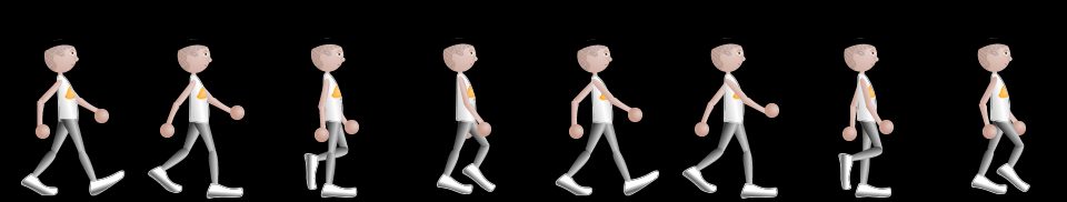
走路动画
animation步数的应用-走路动画
<!DOCTYPE html>

<html lang="en">

<head>

    <meta charset="UTF-8">

    <title>走路动画</title>

    <meta name="viewport" content="width=device-width, initial-scale=1">

    <style>

        @keyframes walking {

            from {

                left: 0;

            }

            to {

                left: -960px;

            }

        }

        .box {

            width: 120px;

            height: 180px;

            border: 2px solid black;

            margin: 50px auto 0;

            overflow: hidden;

            position: relative;

        }

        .box img {

            position: absolute;

            left: 0;

            top: 0;

            animation: walking 1s steps(8) infinite;

        }

    </style>

</head>

<body>

<div class="box">

    <img src="./images/walking.png" alt="走路图片">

</div>

</body>

</html>
走路动画示例
走路图片
CSS权重
CSS权重指的是样式的优先级,有两条或多条样式作用于一个元素,权重高的那条样式对元素起作用,权重相同的,后写的样式会覆盖前面写的样式。
权重的等级
可以把样式的应用方式分为几个等级,按照等级来计算权重
1、!important,加在样式属性值后,权重值为 10000
2、内联样式,如:style=””,权重值为1000
3、ID选择器,如:#content,权重值为100
4、类,伪类和属性选择器,如: content、:hover 权重值为10
5、标签选择器和伪元素选择器,如:div、p、:before 权重值为1
6、通用选择器(*)、子选择器(>)、相邻选择器(+)、同胞选择器(~)、权重值为0;
<!DOCTYPE html>

<html lang="en">

<head>

    <meta charset="UTF-8">

    <title>Document</title>

    <style type="text/css">

        .box{

            color:red!important;

        }

        /* body #content .main_content h2{

            color:blue;

        } */

        #content div.main_content h2{

            color:blue;

        }

        #content .main_content h2{

            color:red;

        }

    </style>

</head>

<body>

    <div class="box" style="color:blue">这是一个div元素</div>

    <div id="content">

        <div class="main_content">

            <h2>这是一个h2标题</h2>

        </div>

    </div>

</body>

</html>
css权重计算示例
CSS3新增选择器
1、E:nth-child(n):匹配元素类型为E且是父元素的第n个子元素
<style type="text/css">

    .list div:nth-child(2){

        background-color:red;

    }

</style>

......

<div class="list">

    <h2>1</h2>

    <div>2</div>

    <div>3</div>

    <div>4</div>

    <div>5</div>

</div>

<!-- 第2个子元素div匹配 -->
2、E:nth-last-child(n):匹配元素类型为E且是父元素的倒数第n个子元素(与上一项顺序相反)
3、E:first-child:匹配元素类型为E且是父元素的第一个子元素
4、E:last-child:匹配元素类型为E且是父元素的最后一个子元素
5、E:only-child:匹配元素类型为E且是父元素中唯一的子元素
6、E:nth-of-type(n):匹配父元素的第n个类型为E的子元素
7、E:nth-last-of-type(n):匹配父元素的倒数第n个类型为E的子元素(与上一项顺序相反)
8、E:first-of-type:匹配父元素的第一个类型为E的子元素
9、E:last-of-type:匹配父元素的最后一个类型为E的子元素
10、E:only-of-type:匹配父元素中唯一子元素是E的子元素
11、E:empty 选择一个空的元素
12、E:enabled 可用的表单控件
13、E:disabled 失效的表单控件
14、E:checked 选中的checkbox
15、E:not(s) 不包含某元素
<style type="text/css">

    .list div:not(:nth-child(2)){

        background-color:red;

    }

</style>

......

<div class="list">

    <h2>1</h2>

    <div>2</div>

    <div>3</div>

    <div>4</div>

    <div>5</div>

</div>

<!-- 第 3、4、5 子元素div匹配 -->
16、E:target 对应锚点的样式
<style type="text/css">

    h2:target{

        color:red;

    }

</style>

......

<a href="#tit01">标题一</a>

......

<h2 id="tit01">标题一</h2>

<!-- 点击链接,h2标题变红 -->
17、E > F E元素下面第一层子集
18、E ~ F E元素后面的兄弟元素
19、E + F 紧挨着的兄弟元素
属性选择器:
1、E[data-attr] 含有data-attr属性的元素
<style type="text/css">

    div[data-attr='ok']{

        color:red;

    }

</style>

......

<div data-attr="ok">这是一个div元素</div>

<!-- 点击链接,h2标题变红 -->
2、E[data-attr='ok'] 含有data-attr属性的元素且它的值为“ok”
3、E[data-attr^='ok'] 含有data-attr属性的元素且它的值的开头含有“ok”
4、E[data-attr$='ok'] 含有data-attr属性的元素且它的值的结尾含有“ok”
5、E[data-attr*='ok'] 含有data-attr属性的元素且它的值中含有“ok”
css新增选择器示例01
<!DOCTYPE html>

<html lang="en">

<head>

    <meta charset="UTF-8">

    <title>Document</title>

    <style type="text/css">

        /*  匹配第二个类型是div子元素  */

        .con div:nth-child(2){

            color:red;

        }

        .con div:nth-child(3){

            color:pink;

        }

        /*

        .list li:nth-child(1){

            background-color:red;

        }

        等同于下面的写法:

        */

        .list li:first-child{

            background-color:red;

        }

        /* .list li:nth-child(8){

            background-color:green;

        }

        等同于下面的写法:

        */

        .list li:last-child{

            background-color:green;

        }

        /*

            2n:偶数行;

            2n+1:奇数行;

         */

        .list2 li:nth-child(2n+1){

            background-color:gold;

        }

    </style>

</head>

<body>

    <div class="con">

        <h3>标题</h3>

        <div>这是一个div</div>

        <div>这是第二个div</div>

    </div>

    <ul class="list">

        <li>1</li>

        <li>2</li>

        <li>3</li>

        <li>4</li>

        <li>5</li>

        <li>6</li>

        <li>7</li>

        <li>8</li>

    </ul>

    <ul class="list2">

        <li>1</li>

        <li>2</li>

        <li>3</li>

        <li>4</li>

        <li>5</li>

        <li>6</li>

        <li>7</li>

        <li>8</li>

    </ul>

</body>

</html>
css新增选择器01
css新增选择器示例02
<!DOCTYPE html>

<html lang="en">

<head>

    <meta charset="UTF-8">

    <title>Document</title>

    <style type="text/css">

        .box > div{

            border:1px solid red;

            padding:10px;

            margin:10px;

        }

        .box2 .title2{

            color:red;

        }

        .box2 .title2 ~ p{

            color:pink

        }

        .box2 .title2 + p{

            color:gold;

        }

        .box2 .title1 + p{

            color:green;

        }

    </style>

</head>

<body>

    <div class="box">

        <div>

            <div>这是div里面的文字</div>

        </div>

    </div>

    <div class="box2">

        <h3 class="title1">这是标题一</h3>

        <p>这是段落一</p>

        <h3 class="title2">这是标题二</h3>

        <p>这是段落二</p>

        <p>这是段落二二</p>

        <h3>这是标题三</h3>

        <p>这是段落三</p>

    </div>

</body>

</html>
css新增选择器示例02
css新增选择器示例03
<!DOCTYPE html>

<html lang="en">

<head>

    <meta charset="UTF-8">

    <title>Document</title>

    <style type="text/css">

        /* 匹配所有有class属性的div    */

        .con div[class]{

            background-color:gold;

            margin-bottom:10px;

        }

         /* 匹配class属性值是ok的div  */

        .con div[class="ok"]{

            background-color:pink

        }

        /* 匹配class属性值是“ok”开头的div  */

        .con div[class^="ok"]{

            text-indent:30px;

        }

        /* 匹配class属性值是“ok”结尾的div  */

        .con div[class$="ok"]{

            font-size:30px;

        }

        /* 匹配class属性值含有“ok”的div  */

        .con div[class*="ok"]{

            border-bottom:2px solid #000;

        }

    </style>

</head>

<body>

    <div class="con">

        <div class="ok">1</div>

        <div class="okabc">2</div>

        <div class="abcok">3</div>

        <div class="abcok123">4</div>

        <div>5</div>

    </div>

</body>

</html>
css新增选择器示例03
CSS3前缀和H5新增标签
CSS浏览器前缀
浏览器样式前缀
为了让CSS3样式兼容,需要将某些样式加上浏览器前缀:
-ms- 兼容IE浏览器
-moz- 兼容firefox
-o- 兼容opera
-webkit- 兼容chrome 和 safari
比如:
div

{

    -ms-transform: rotate(30deg);

    -webkit-transform: rotate(30deg);

    -o-transform: rotate(30deg);

    -moz-transform: rotate(30deg);

    transform: rotate(30deg);

}
自动添加浏览器前缀
目前的状况是,有些CSS3属性需要加前缀,有些不需要加,有些只需要加一部分,这些加前缀的工作可以交给插件来完成,比如安装: autoprefixer
Sublime text 中安装 autoprefixer 执行 preferences/key Bindings-Users 设置快捷键 { "keys": ["ctrl+alt+x"], "command": "autoprefixer" } 通过此工具可以按照最新的前缀使用情况给样式自动加前缀。
在写好的样式处按ctrl+alt+x即可自动添加前缀;
h5新增标签
HTML5新结构标签
h5新增的主要语义化标签如下:
1、header 页面头部、页眉
2、nav 页面导航
3、article 一篇文章
4、section 文章中的章节
5、aside 侧边栏
6、footer 页面底部、页脚
PC端兼容h5的新标签的方法,在页面中引入以下js文件:
<script type="text/javascript" src="//cdn.bootcss.com/html5shiv/r29/html5.js"></script>
h5新增标签示例
<!DOCTYPE html>

<html lang="en">

<head>

    <meta charset="UTF-8">

    <title>Document</title>

</head>

<body>

    <div class="header"></div>

    <header></header>

    <div class="menu"></div>

    <nav></nav>

    <div class="footer"></div>

    <footer></footer>

</body>

</html>
HTML5 音频和视频
html5增加了audio和video标签,提供了在页面上插入音频和视频的标准方法。
audio标签
支持格式:ogg、wav、mp3
对应属性:
1、autoplay 自动播放
2、controls 显示播放器
3、loop 循环播放
4、preload 预加载
5、muted 静音
举例:
<audio src="source/audio.mp3" autoplay controls loop preload></audio>

<!-- 或者用如下方式:  -->

<audio  autoplay controls loop preload>

    <source src="source/audio.mp3" type="">

    <source src="source/audio02.wav" type="">

</audio>
source标签的作用是提供多个媒体文件地址,如果一个地址的文件不兼容,就使用下一个地址。
video标签
支持格式:ogg、mp4、webM
属性:
1、width
2、height
3、Poster
可选第三方播放器:
1、cyberplayer
2、tencentPlayer
3、youkuplayer
HTML5 新增表单控件
新增类型:网址 邮箱 日期 时间 星期 数量 范围 电话 颜色 搜索
<label>网址:</label><input type="url" name="" required><br><br>

<label>邮箱:</label><input type="email" name="" required><br><br>

<label>日期:</label><input type="date" name=""><br><br>

<label>时间:</label><input type="time" name=""><br><br>

<label>星期:</label><input type="week" name=""><br><br>

<label>数量:</label><input type="number" name=""> <br><br>

<label>范围:</label><input type="range" name=""><br><br>

<label>电话:</label><input type="tel" name=""><br><br>

<label>颜色:</label><input type="color" name=""><br><br>

<label>搜索:</label><input type="search" name=""><br><br>
新增常用表单控件属性:
1、placeholder 设置文本框默认提示文字
2、autofocus 自动获得焦点
3、autocomplete 联想关键词
h5新增表单控件属性示例
<!DOCTYPE html>

<html lang="en">

<head>

    <meta charset="UTF-8">

    <title>Document</title>

</head>

<body>

    <input type="text" name="" placeholder="搜索">

    <input type="text" name="" autofocus>

</body>

</html>
前端之html5和css3的更多相关文章
- 《web前端设计基础——HTML5、CSS3、JavaScript》 张树明版 简答题简单整理
web前端设计基础——HTML5.CSS3.JavaScript 简答题整理 第一章 (1)解释一下名词的含义:IP地址.URL.域名 iP定义了如何连入因特网,以及数据如何在主机间传输的标准. ...
- js框架Modernizr是什么东西? 他是前端开发HTML5和CSS3的强有力前端js检测类库
最近在研究modernizr的前端框架,发现这个Modernir对前端写页面非常友好,并且能够很快的建立起适应任何设备的html页面哦.在这里分享下基础教程,让大伙对modernizr是什么?做什么用 ...
- 21、前端知识点--html5和css3新特性汇总
跳转到该链接 新特性汇总版: https://www.cnblogs.com/donve/p/10697745.html HTML5和CSS3的新特性(浓缩好记版) https://blog.csdn ...
- 20、前端知识点--html5和css3特性(一)
[html5/css3]css中的flex弹性布局学习总结 https://blog.csdn.net/Umbrella_Um/article/details/99490209 用CSS/CSS3 实 ...
- 前端:HTML5和CSS3新特性一览
转载:https://www.cnblogs.com/star91/p/5659134.html
- (近万字)一篇文章带你了解HTML5和CSS3开发基础与应用-适合前端面试必备
作者 | Jeskson 来源 | 达达前端小酒馆 HTML5和CSS3开发基础与应用,详细说明HTML5的新特性和新增加元素,CSS3的新特性,新增加的选择器,新的布局,盒子模型,文本,边框,渐变, ...
- Web 前端开发精华文章推荐(jQuery、HTML5、CSS3)【系列十二】
2012年12月12日,[<Web 前端开发人员和设计师必读文章>系列十二]和大家见面了.梦想天空博客关注 前端开发 技术,分享各种增强网站用户体验的 jQuery 插件,展示前沿的 HT ...
- Web 前端开发精华文章集锦(jQuery、HTML5、CSS3)【系列十七】
<Web 前端开发精华文章推荐>2013年第五期(总第十七期)和大家见面了.梦想天空博客关注 前端开发 技术,分享各种增强网站用户体验的 jQuery 插件,展示前沿的 HTML5 和 C ...
- Web 前端开发精华文章推荐(HTML5、CSS3、jQuery)【系列二十三】
<Web 前端开发精华文章推荐>2014年第2期(总第23期)和大家见面了.梦想天空博客关注 前端开发 技术,分享各类能够提升网站用户体验的优秀 jQuery 插件,展示前沿的 HTML5 ...
随机推荐
- Python 分析到底是谁操纵《庆余年》上了热搜?
庆余年电视剧终于在前两天上了,这两天赶紧爬取数据看一下它的表现. 庆余年 <庆余年>是作家猫腻的小说.这部从2007年就开更的作品拥有固定的书迷群体,也在文学IP价值榜上有名. ...
- Java实现自定义注解开发
Java实现自定义注解开发 一直都对注解开发挺好奇的,最近终于有时间自己实践了一把,记录一下 万一后期会用到呢 哈哈哈 首先我们了解一下自定义注解的标准示例,注解类使用 @interface 关键字修 ...
- 第420期 Python 周刊
文章.教程或讲座 Python 数据科学教程:分析 Stack Overflow 2019 年开发者调查表** https://www.youtube.com/watch?v=_P7X8tMplsw ...
- Windows10 搭建Kafka集群
下载Kafka 1.下载Kafka:http://mirror.bit.edu.cn/apache/kafka/2.3.0/kafka_2.12-2.3.0.tgz 2.解压后复制Kafka文件夹,分 ...
- 多线程六 同步容器&并发容器
同步容器(使用的是synchronized,并且不一定是百分百安全) 本篇续 -- 线程之间的通信 ,介绍java提供的并发集合,既然正确的使用wait和notify比较困难,java平台为我们提供了 ...
- ubuntu18.10 上安装docker容器
网上有的安装步骤太复杂,并且安装过程中容易出错,其它安装不难,只需一条命令即可. 安装成功后,使用命令查看docker状态 systemctl status docker 安装前更新下包源 sudo ...
- 深入浅出之js闭包知识点梳理(一)
简单认识闭包 前言:和大多数编程语言一样,js也采用词法作用域,即函数的执行依赖于变量作用域,这个作用域是在函数定义时决定的,而不是函数调用时决定的.函数对象可以通过作用域链关联起来,函数体内部的 ...
- Docker启动时提示Get Permission Denied while trying to connect解决方法
环境描述 vmware15虚拟机安装centos7.4 64位系统,docker版本19.03.2 问题描述 安装完docker后,执行docker相关命令 docker run ubuntu:15. ...
- 使用docker简单搭建个人博客
首先介绍需要的yml文件,docker-compose.yml: version: '3.3' services: db: image: mysql:5.7 volumes: - db_data:/v ...
- Linux—软连接与硬连接
软链接的创建,删除,修改 创建软链接:ln -s[目标文件或目录][软链接地址] 解释:软链接地址相当于快捷方式,目标文件或目录才是真正的内容.[软链接地址]指“快捷键”文件名称,该文件是被指令创建的 ...