FCC---CSS Flexbox: Align Elements Using the justify-content Property
Sometimes the flex items within a flex container do not fill all the space in the container. It is common to want to tell CSS how to align and space out the flex items a certain way. Fortunately, the justify-content property has several options to do this. But first, there is some important terminology to understand before reviewing those options.
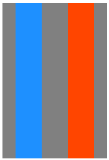
Here is a useful image showing a row to illustrate the concepts below.
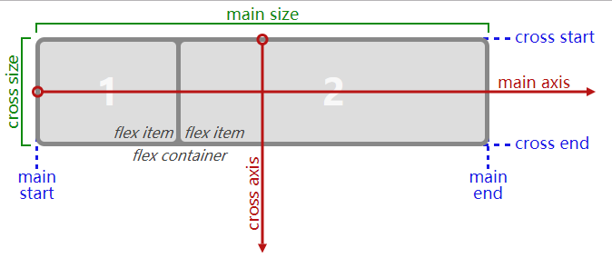
Recall that setting a flex container as a row places the flex items side-by-side from left-to-right. A flex container set as a column places the flex items in a vertical stack from top-to-bottom. For each, the direction the flex items are arranged is called the main axis. For a row, this is a horizontal line that cuts through each item. And for a column, the main axis is a vertical line through the items.
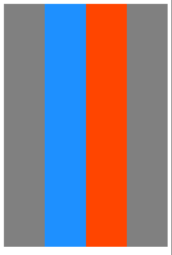
There are several options for how to space the flex items along the line that is the main axis. One of the most commonly used is justify-content: center;, which aligns all the flex items to the center inside the flex container. Others options include:
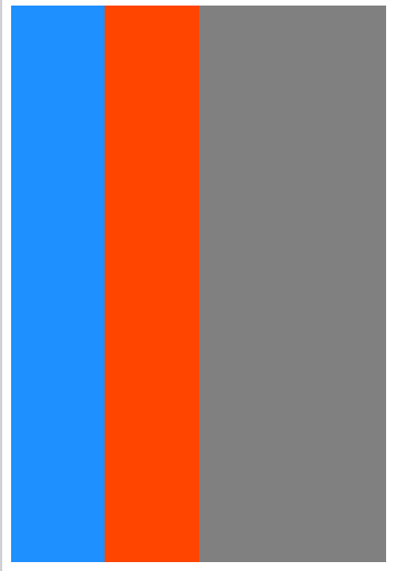
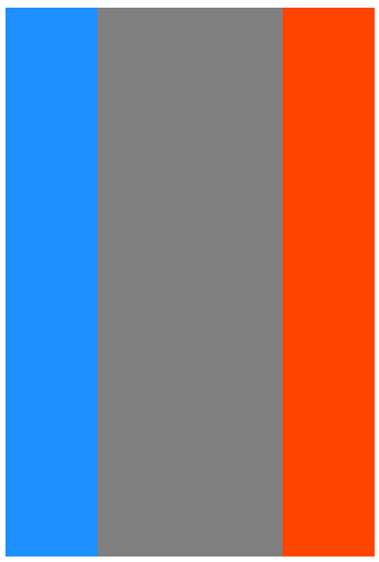
flex-start: aligns items to the start of the flex container. For a row, this pushes the items to the left of the container. For a column, this pushes the items to the top of the container. This is the default alignment if nojustify-contentis specified.flex-end: aligns items to the end of the flex container. For a row, this pushes the items to the right of the container. For a column, this pushes the items to the bottom of the container.space-between: aligns items to the center of the main axis, with extra space placed between the items. The first and last items are pushed to the very edge of the flex container. For example, in a row the first item is against the left side of the container, the last item is against the right side of the container, then the remaining space is distributed evenly among the other items.space-around: similar tospace-betweenbut the first and last items are not locked to the edges of the container, the space is distributed around all the items with a half space on either end of the flex container.space-evenly: Distributes space evenly between the flex items with a full space at either end of the flex container
An example helps show this property in action. Add the CSS property justify-content to the #box-container element, and give it a value of center.
Bonus
Try the other options for the justify-content property in the code editor to see their differences. But note that a value of center is the only one that will pass this challenge.
换上上面提到的几个属性,都可以操作,体会实际效果~
from:
to:
FCC---CSS Flexbox: Align Elements Using the justify-content Property的更多相关文章
- CSS Flexbox 学习指南、工具与框架
Flexbox 是一种更有效的布局方式,它能更好的分配容器空间,并控制项目的对齐.虽然,掌握它的理论有些复杂,但幸运的是,我们可以借助开放的网络来学习并逐步掌握它. 在本文中,我们整合了一些最佳的 F ...
- CSS Flexbox 弹性盒子模型
CSS Flexbox 弹性盒子模型 设置元素样式为 display: flex 或 display: inline-flex, 让元素变成flex容器, 从而可以通过flex模式布局它的子元素. f ...
- CSS#Flex-box, border-size, onresize() event, Media Queries
Flexbox Pseudo-classes box-sizing: border-box HTML DOM event resize() @media Queries: 根据一些css条件,触发一 ...
- css flexbox 弹性布局
flexbox 即css flexible box layout. ie9及以下不支持flexbox. flex详细规范(https://www.w3.org/TR/css-flexbox/) 为什么 ...
- CSS: Flexbox
Use flexbox to create a responsive website, containing a flexible navigation bar and flexible conten ...
- 使用css Flexbox实现垂直居中
CSS布局对我们来说一直是个噩梦,我们都认为flexbox是我们的救世主.是否真的如我们说说,还有待观察,但是flexbox确非常轻松的解决css长久一来比较难解决的居中问题.让我们来看看到底有多容易 ...
- [CSS] Target empty elements using the :empty pseudo-class
You can target an element that has no child elements by using the :empty pseudo-class. With browser ...
- [CSS] Dynamically Size Elements with Pure CSS
Learn how to size elements based on the dimensions of the viewport, even when the browser is resized ...
- [CSS] Target Positional Elements Using *-Of-Type CSS pseudo-classes
Learn how to target elements based on their position inside of a parent element in relation to its s ...
随机推荐
- /proc/cpuinfo文件解读(超易理解)
在linux系统中,提供了/proc目录下文件,显示系统的软硬件信息.如果想了解系统中CPU的提供商和相关配置信息,则可以查/proc/cpuinfo.但是此文件输出项较多,不易理解.例如我们想获取, ...
- selenium常用命令之页面元素定位
WebDriver driver= new ChromeDriver(); <input type="text" id="phone" name=&q ...
- Floyd && Dijkstra +邻接表 +链式前向星(真题讲解来源:城市路)
1381:城市路(Dijkstra) 时间限制: 1000 ms 内存限制: 65536 KB提交数: 4066 通过数: 1163 [题目描述] 罗老师被邀请参加一个舞会,是 ...
- web接口与restful规范
web接口 接口定义: 通过网络,规定了前后台信息交互规则的url链接,在web程序中也就是联系前台页面与后台数据库的媒介. 接口特点 url:长得像返回数据的url链接, 例如下面的搜索音乐 [ht ...
- Linux基本架构
Linux linux设计思想 1.程序应该小而专一,程序应该尽量的小,且只专注于一件事上,不要开发那些看起来有用但是90%的情况都用不到的特性: 2.程序不只要考虑性能, 程序的可移植性更重要,sh ...
- Python的特有的参数传递(*和**)
目录 值传递 引用传递 python的传递方式具有两种值传递和引用传递.除此之外,python中还允许包裹方式的参数传递,这未不确定参数个数和参数类型的函数调用提供了基础: 值传递 int.float ...
- linux中安装tensorflow
liunxsudo apt-get install python-pip python-dev python2.X -> pippython3.X -> pip3 pip --versio ...
- PAT甲级专题|最短路
PAT甲级最短路 主要算法:dijkstra 求最短最长路.dfs图论搜索. 1018,dijkstra记录路径 + dfs搜索路径最值 25分,错误点暂时找不出.. 如果只用dijkstra没法做, ...
- rem布局方案
移动端适配,老生常谈的问题,这次再谈一次. 闲话少说,直奔正题. 一些像素概念 物理像素:即实际的每一个物理像素,也就是移动设备上每一个物理显示单元(点) 设备逻辑像素(css中的px):可以理解为一 ...
- NIO-Channel
目录 NIO-Channel 目录 前言 什么是Channel 通道类型 如何使用 ServerSocketChannel SocketChannel FileChannel 总结 相关文献 NIO- ...