WPF 10天修炼 第五天- 内容控件
WPF内容控件
在WPF中,所有呈现在用户界面上的对象都称为用户界面元素。但是只有派生自System.Windows.Controls.Control类的对象才称为控件。内容控件通常是指具有Content属性的控件,Content属性并非定义在每个控件中,而是定义在基类System.Windows.Controls命名空间的ContentControl类中。注意:Content属性只接收单个内容元素。
WPF内容控件分类
1、 直接继承ContentControl的控件
2、 继承HeaderedContentControl的控件
3、 继承ItemsControl的控件
4、 继承HeaderedItemsControl的控件
直接继承ContentControl的控件
也可以成为单项内容控件,这种控件只能指定一个内容元素。WPF中包含的单项内容控件:
Button:按钮控件
CheckBox:复选框控件
ComboBoxItem:单选框列表项
ContentControl:内容控件的基类
Frame:页框架
GridViewColumnHeader:按钮控件的标题头
GroupItem:组合框的组合项。
Label:标签控件。
ListBoxItem:列表项。
ListViewItem:列表视图项。
NavigationWindow:导航窗口。
RadioButton:单选按钮。
RepeatButton:重复按钮。
ScrollViewer:滚动查看器,或称为滚动面板。
StatusBarItem:状态项。
ToggleButton:选中按钮。
ToolTip:提示控件。
UserControl:用户控件。
Window:WPF窗口
继承HeaderedContentControl的控件
这类控件包含一个标头和一个内容项目。HeaderedContentControl类派生自ContentControl,继承了其Content属性,同时又定了类型Object的Header属性。Header提供了控件的标头。WPF中包含的这类控件有3个:
Exapander:带标题的折叠控件。
GroupBox:组合框控件。
TabItem:这是TabControl控件内的一个Tab项。
继承ItemsControl的控件
这类控件包含一个内容项的集合。例如ListBox控件就是一个典型的ItemsControl控件,该控件具有ListBxItem内容项的集合。
继承HeaderedItemsControl的控件
该类控件包含一个标头和一个内容项的集合。HeaderedItemsControl类继承ItemsControl类。在WPF中有3个这种类型的控件。
MenuItem:菜单项控件。
ToolBar:工具条控件。
TreeviewItem:树状图。
Content属性
WPF中的Content属性可接收的对象分为两大类:
1、 继承自UIElement基类的对象:UIElement定义了WPF中的布局、输入及路由等。是WPF的核心子系统。这种类型的对象具有可视化特性,WPF将使用UIElement.OnRedner方法来显示派生自该类的对象,OnRender方法将生成一个绘图呈现,在需要时进行绘制。
2、 继承自其他类的对象:WPF的处理方法很简单,通过调用该对象的ToString方法来显示一行文本。
内容容器控件
ScrollViewer滚动条控件
<Window x:Class="WPFDemo.ScrollViewerDemo"
xmlns="http://schemas.microsoft.com/winfx/2006/xaml/presentation"
xmlns:x="http://schemas.microsoft.com/winfx/2006/xaml"
xmlns:d="http://schemas.microsoft.com/expression/blend/2008"
xmlns:mc="http://schemas.openxmlformats.org/markup-compatibility/2006"
xmlns:local="clr-namespace:WPFDemo"
mc:Ignorable="d"
WindowStartupLocation="CenterScreen"
Title="ScrollViewerDemo" Height="300" Width="300">
<ScrollViewer>
<Grid Height="400">
<Grid.RowDefinitions>
<RowDefinition />
<RowDefinition />
<RowDefinition />
<RowDefinition />
<RowDefinition />
</Grid.RowDefinitions>
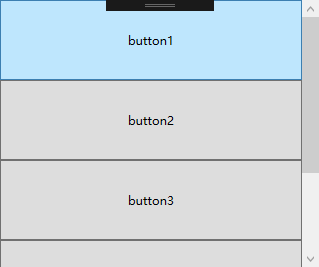
<Button Name="button1" Content="button1" Grid.Row="0"></Button>
<Button Name="button2" Content="button2" Grid.Row="1"></Button>
<Button Name="button3" Content="button3" Grid.Row="2"></Button>
<Button Name="button4" Content="button4" Grid.Row="3"></Button>
<Button Name="button5" Content="button5" Grid.Row="4"></Button>
</Grid>
</ScrollViewer>
</Window>
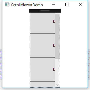
默认情况下ScrollViewer总是显示一个垂直的滚动条。可以通过调整VerticalScrollBarVisibility属性来设置滚动条的显示方式。也可以使用HorizontalScrollBarVisibility属性设置水平滚动条的显示方式。
<ScrollViewer  Width="100">

        <Grid Height="400">

            <Grid.RowDefinitions>

                <RowDefinition />

                <RowDefinition />

                <RowDefinition />

                <RowDefinition />

                <RowDefinition />

            </Grid.RowDefinitions>

            <Button Name="button1" Content="button1" Grid.Row="0" Width="200"></Button>

            <Button Name="button2" Content="button2" Grid.Row="1" Width="200"></Button>

            <Button Name="button3" Content="button3" Grid.Row="2" Width="200"></Button>

            <Button Name="button4" Content="button4" Grid.Row="3" Width="200"></Button>

            <Button Name="button5" Content="button5" Grid.Row="4" Width="200"></Button>

        </Grid>

    </ScrollViewer>
设置横向滚动条显示
<ScrollViewer  Width="100" HorizontalScrollBarVisibility="Auto">

        <Grid Height="400">

            <Grid.RowDefinitions>

                <RowDefinition />

                <RowDefinition />

                <RowDefinition />

                <RowDefinition />

                <RowDefinition />

            </Grid.RowDefinitions>

            <Button Name="button1" Content="button1" Grid.Row="0" Width="200"></Button>

            <Button Name="button2" Content="button2" Grid.Row="1" Width="200"></Button>

            <Button Name="button3" Content="button3" Grid.Row="2" Width="200"></Button>

            <Button Name="button4" Content="button4" Grid.Row="3" Width="200"></Button>

            <Button Name="button5" Content="button5" Grid.Row="4" Width="200"></Button>

        </Grid>

    </ScrollViewer>

HorizontalScrollBarVisibility属性和VerticalScrollBarVisibility这两个属性都是ScrollBarVisibility枚举类型的值。下表是ScrollBarVisibility枚举值:
|
枚举值 |
描述 |
|
Disabled |
禁止显示滚动条,即使当前视图区域无法显示所有内容,滚动条也不出现 |
|
Auto |
当前视图区域可以容纳所有内容时,不显示滚动条,否则自动显示滚动条。 |
|
Hidden |
隐藏滚动条的显示,但是用户可以通过键盘等进行滚动。该属性主要用于自定义滚动方式。 |
|
Visible |
无论如何滚动条都会显示。 |
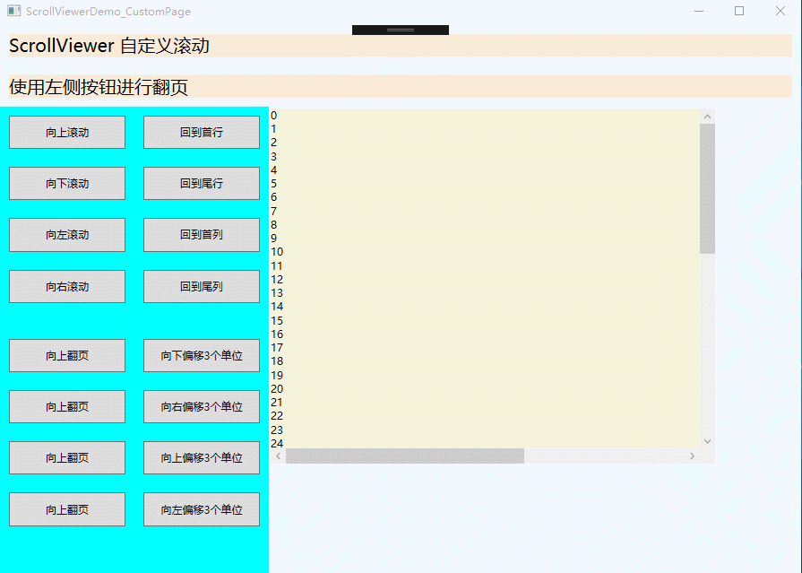
使用下面实例演示ScrollViewer自定义滚动
<Window x:Class="WPFDemo.ScrollViewerDemo_CustomPage"

        xmlns="http://schemas.microsoft.com/winfx/2006/xaml/presentation"

        xmlns:x="http://schemas.microsoft.com/winfx/2006/xaml"

        xmlns:d="http://schemas.microsoft.com/expression/blend/2008"

        xmlns:mc="http://schemas.openxmlformats.org/markup-compatibility/2006"

        xmlns:local="clr-namespace:WPFDemo"

        mc:Ignorable="d"

        Title="ScrollViewerDemo_CustomPage" Height="300" Width="300">

    <DockPanel Background="AliceBlue">

        <TextBlock DockPanel.Dock="Top" Text="ScrollViewer 自定义滚动" FontSize="20" Background="AntiqueWhite" Margin="10"></TextBlock>

        <TextBlock DockPanel.Dock="Top" Text="使用左侧按钮进行翻页" FontSize="20" Background="AntiqueWhite" Margin="10"></TextBlock>

        <StackPanel DockPanel.Dock="Left" Width="150" Background="Aqua">

            <Button Name="btnLineUp" Content="向上滚动"    Margin="10" Padding="10" Click="btnLineUp_Click" />

            <Button Name="btnLineDown" Content="向下滚动"  Margin="10" Padding="10" Click="btnLineDown_Click" />

            <Button Name="btnLineLeft" Content="向左滚动"  Margin="10" Padding="10" Click="btnLineLeft_Click" />

            <Button Name="btnLineRight" Content="向右滚动" Margin="10" Padding="10" Click="btnLineRight_Click" />

            <Button Name="btnPageUp" Content="向上翻页"    Margin="10,30,10,10" Padding="10" Click="btnPageUp_Click" />

            <Button Name="btnPageDown" Content="向上翻页"  Margin="10" Padding="10" Click="btnPageDown_Click" />

            <Button Name="btnPageLeft" Content="向左翻页"  Margin="10" Padding="10" Click="btnPageLeft_Click" />

            <Button Name="btnPageRight" Content="向右翻页" Margin="10" Padding="10" Click="btnPageRight_Click" />

        </StackPanel>

        <StackPanel DockPanel.Dock="Left" Width="150" Background="Aqua">

            <Button Name="btnLineHome" Content="回到首行"    Margin="10" Padding="10" Click="btnLineHome_Click" />

            <Button Name="btnLineEnd" Content="回到尾行"    Margin="10" Padding="10" Click="btnLineEnd_Click" />

            <Button Name="btnColumnHome" Content="回到首列"    Margin="10" Padding="10" Click="btnColumnHome_Click" />

            <Button Name="btnColumnEnd" Content="回到尾列"    Margin="10" Padding="10" Click="btnColumnEnd_Click" />

            <Button Name="btnLineOffsetUp" Content="向下偏移3个单位"    Margin="10,30,10,10" Padding="10" Click="btnLineOffsetUp_Click" />

            <Button Name="btnColumnOffsetRight" Content="向右偏移3个单位"    Margin="10" Padding="10" Click="btnColumnOffsetRight_Click" />

            <Button Name="btnLineOffsetDown" Content="向上偏移3个单位"    Margin="10" Padding="10" Click="btnLineOffsetDown_Click" />

            <Button Name="btnColumnOffsetLeft" Content="向左偏移3个单位"    Margin="10" Padding="10" Click="btnColumnOffsetLeft_Click" />

        </StackPanel>

        <Border Width="500" Height="400" BorderThickness="2" Background="Beige"  VerticalAlignment="Top" HorizontalAlignment="Left">

            <ScrollViewer Name="SVText" HorizontalScrollBarVisibility="Auto" VerticalScrollBarVisibility="Visible">

                <TextBlock Name="txtText" Width="800" Height="900" TextWrapping="Wrap"></TextBlock>

            </ScrollViewer>

        </Border>

    </DockPanel>

</Window>
添加后台代码
namespace WPFDemo

{

    /// <summary>

    /// ScrollViewerDemo_CustomPage.xaml 的交互逻辑

    /// </summary>

    public partial class ScrollViewerDemo_CustomPage : Window

    {

        public ScrollViewerDemo_CustomPage()

        {

            InitializeComponent();

            BindText();

        }

        public void BindText()

        {

            for (int i = 0; i < 1000; i++)

            {

                txtText.Text += i + "\r\n";

            }

        }

        private void btnLineUp_Click(object sender, RoutedEventArgs e)

        {

            SVText.LineUp();

        }

        private void btnLineDown_Click(object sender, RoutedEventArgs e)

        {

            SVText.LineDown();

        }

        private void btnLineLeft_Click(object sender, RoutedEventArgs e)

        {

            SVText.LineLeft();

        }

        private void btnLineRight_Click(object sender, RoutedEventArgs e)

        {

            SVText.LineRight();

        }

        private void btnPageUp_Click(object sender, RoutedEventArgs e)

        {

            SVText.PageUp();

        }

        private void btnPageDown_Click(object sender, RoutedEventArgs e)

        {

            SVText.PageDown();

        }

        private void btnPageLeft_Click(object sender, RoutedEventArgs e)

        {

            SVText.PageLeft();

        }

        private void btnPageRight_Click(object sender, RoutedEventArgs e)

        {

            SVText.PageRight();

        }

        private void btnLineHome_Click(object sender, RoutedEventArgs e)

        {

            SVText.ScrollToHome();

        }

        private void btnLineEnd_Click(object sender, RoutedEventArgs e)

        {

            SVText.ScrollToEnd();

        }

        private void btnColumnHome_Click(object sender, RoutedEventArgs e)

        {

            SVText.ScrollToLeftEnd();

        }

        private void btnColumnEnd_Click(object sender, RoutedEventArgs e)

        {

            SVText.ScrollToRightEnd();

        }

        private void btnLineOffsetUp_Click(object sender, RoutedEventArgs e)

        {

            SVText.ScrollToVerticalOffset(SVText.VerticalOffset + 3);

        }

        private void btnColumnOffsetRight_Click(object sender, RoutedEventArgs e)

        {

            SVText.ScrollToHorizontalOffset(SVText.HorizontalOffset + 3);

        }

        private void btnLineOffsetDown_Click(object sender, RoutedEventArgs e)

        {

            SVText.ScrollToVerticalOffset(SVText.VerticalOffset - 3);

        }

        private void btnColumnOffsetLeft_Click(object sender, RoutedEventArgs e)

        {

            SVText.ScrollToHorizontalOffset(SVText.HorizontalOffset - 3);

        }

    }

}
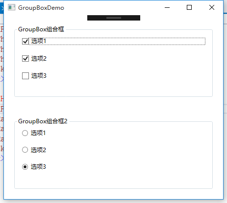
GroupBox组合框
<Window x:Class="WPFDemo.GroupBoxDemo"

        xmlns="http://schemas.microsoft.com/winfx/2006/xaml/presentation"

        xmlns:x="http://schemas.microsoft.com/winfx/2006/xaml"

        xmlns:d="http://schemas.microsoft.com/expression/blend/2008"

        xmlns:mc="http://schemas.openxmlformats.org/markup-compatibility/2006"

        xmlns:local="clr-namespace:WPFDemo"

        mc:Ignorable="d"

        Title="GroupBoxDemo" Height="300" Width="300">

    <Grid>

        <Grid.RowDefinitions>

            <RowDefinition />

            <RowDefinition />

        </Grid.RowDefinitions>

        <GroupBox Header="GroupBox组合框" Grid.Row="0" Margin="20">

            <StackPanel>

                <CheckBox Margin="10">选项1</CheckBox>

                <CheckBox Margin="10">选项2</CheckBox>

                <CheckBox Margin="10">选项3</CheckBox>

            </StackPanel>

        </GroupBox>

        <GroupBox Header="GroupBox组合框2" Grid.Row="1" Margin="20">

            <StackPanel>

                <RadioButton Margin="10">选项1</RadioButton>

                <RadioButton Margin="10">选项2</RadioButton>

                <RadioButton Margin="10">选项3</RadioButton>

            </StackPanel>

        </GroupBox>

    </Grid>

</Window>
TabItem标签页控件
<Window x:Class="WPFDemo.TabItemDemo"

        xmlns="http://schemas.microsoft.com/winfx/2006/xaml/presentation"

        xmlns:x="http://schemas.microsoft.com/winfx/2006/xaml"

        xmlns:d="http://schemas.microsoft.com/expression/blend/2008"

        xmlns:mc="http://schemas.openxmlformats.org/markup-compatibility/2006"

        xmlns:local="clr-namespace:WPFDemo"

        mc:Ignorable="d"

        Title="TabItemDemo" Height="300" Width="300">

    <Grid>

        <TabControl>

            <TabItem Header="选项卡1">

                <StackPanel>

                    <CheckBox  Margin="5">选项1</CheckBox>

                    <CheckBox  Margin="5">选项2</CheckBox>

                    <CheckBox  Margin="5">选项3</CheckBox>

                </StackPanel>

            </TabItem>

            <TabItem Header="选项卡2" IsSelected="True">

                <Grid>

                    <Grid.RowDefinitions>

                        <RowDefinition/>

                        <RowDefinition/>

                    </Grid.RowDefinitions>

                    <GroupBox Header="GroupBox1" Margin="10" Grid.Row="0">

                        <StackPanel>

                            <CheckBox Margin="5">选项1</CheckBox>

                            <CheckBox Margin="5">选项2</CheckBox>

                            <CheckBox Margin="5">选项3</CheckBox>

                        </StackPanel>

                    </GroupBox>

                    <GroupBox Header="GroupBox2" Margin="10" Grid.Row="1">

                        <StackPanel>

                            <RadioButton Margin="5">选项1</RadioButton>

                            <RadioButton Margin="5">选项2</RadioButton>

                            <RadioButton Margin="5">选项3</RadioButton>

                        </StackPanel>

                    </GroupBox>

                </Grid>

            </TabItem>

            <TabItem Header="选项卡3">

                <StackPanel>

                    <RadioButton  Margin="5">选项1</RadioButton>

                    <RadioButton  Margin="5">选项2</RadioButton>

                    <RadioButton  Margin="5">选项3</RadioButton>

                </StackPanel>

            </TabItem>

        </TabControl>

    </Grid>

</Window>
Expander可折叠控件
属性:
IsExpanded:获取和设置Expander控件的折叠状态。
ExpandDirection:获取或设置Expander控件内容展开的方向。枚举值:包含Up、Down、Left、Right,分别为上下左右。
事件:
Collapsed:当Expander折叠时,在内容实际被收起前触发该事件。
Expanded:当Expander展开时,在内容实际被显示前触发该事件。
<Window x:Class="WPFDemo.ExpanderDemo"

        xmlns="http://schemas.microsoft.com/winfx/2006/xaml/presentation"

        xmlns:x="http://schemas.microsoft.com/winfx/2006/xaml"

        xmlns:d="http://schemas.microsoft.com/expression/blend/2008"

        xmlns:mc="http://schemas.openxmlformats.org/markup-compatibility/2006"

        xmlns:local="clr-namespace:WPFDemo"

        mc:Ignorable="d"

        Title="ExpanderDemo" Height="300" Width="300">

    <Grid>

        <Grid.RowDefinitions>

            <RowDefinition Height="Auto"/>

            <RowDefinition Height="Auto"/>

            <RowDefinition Height="Auto"/>

            <RowDefinition Height="Auto"/>

        </Grid.RowDefinitions>

        <Expander Header="折叠菜单1" Grid.Row="0" Background="AliceBlue"   >

            <StackPanel>

                <CheckBox Margin="5">选项1</CheckBox>

                <CheckBox Margin="5">选项2</CheckBox>

                <CheckBox Margin="5">选项3</CheckBox>

            </StackPanel>

        </Expander>

        <Expander Header="折叠菜单2" Grid.Row="1"  Background="Aqua" IsExpanded="True">

            <StackPanel>

                <CheckBox Margin="5">选项1</CheckBox>

                <CheckBox Margin="5">选项2</CheckBox>

                <CheckBox Margin="5">选项3</CheckBox>

            </StackPanel>

        </Expander>

        <Expander Header="展开我时我才加载内容,折叠回去我清空内容" Grid.Row="2" Background="Beige"  Collapsed="Expander_Collapsed" Expanded="Expander_Expanded">

            <ScrollViewer MaxHeight="120" HorizontalScrollBarVisibility="Disabled">

                <TextBlock Name="txtText"></TextBlock>

            </ScrollViewer>

        </Expander>

        <Expander Grid.Row="3" Background="Beige" >

            <Expander.Header>

                <StackPanel>

                    <TextBlock>我是自定义折叠菜单Header</TextBlock>

                    <Button>在Header中添加按钮</Button>

                </StackPanel>

            </Expander.Header>

            <StackPanel>

                <CheckBox Margin="5">选项1</CheckBox>

                <CheckBox Margin="5">选项2</CheckBox>

                <CheckBox Margin="5">选项3</CheckBox>

            </StackPanel>

        </Expander>

    </Grid>

</Window>
WPF 10天修炼 第五天- 内容控件的更多相关文章
- WPF 后台获得 数据模板里的内容控件(DataTemplate)
原文:WPF 后台获得 数据模板里的内容控件(DataTemplate) 假如 <Window.Resources> 里 有一个 Datatemplate 我想获得TextBlo ...
- 【WPF学习】第二十五章 日期控件
WPF包含两个日期控件:Calender和DatePicker.这两个控件都被设计为允许用户选择日期. Calendar控件显示日期,在与Windows操作系统中看到的日历(例如,当配置系统日期时看到 ...
- 在WPF中获取DataGridTemplateColumn模板定义的内容控件
xaml格式描述: <DataGrid Name="dataGrid" Grid.Row="1" ItemsSource="{Binding}& ...
- 在WPF中获取DATAGRIDTEMPLATECOLUMN模板定义的内容控件(转载)
原文:http://www.cnblogs.com/eric_ibm/p/3772516.html xaml格式描述: <DataGrid Name="dataGrid" G ...
- WPF 10天修炼 第四天- WPF布局容器
WPF布局 WPF的窗口也就是Window类,是一个内容控件,该控件派生自ContentControl.内容控件有一个Content属性,该属性有一个限制,只能放置一个用户界面元素,或一个字符串.为了 ...
- WPF自定义控件(五)の用户控件(完结)
用户控件,WPF中是继承自UserControl的控件,我们可以在里面融合我们的业务逻辑. 示例:(一个厌恶选择的用户控件) 后端: using iMicClassBase; using iMicCl ...
- 【WPF学习】第二十章 内容控件
内容控件(content control)是更特殊的控件类型,它们可包含并显示一块内容.从技术角度看,内容控件时可以包含单个嵌套元素的控件.与布局容器不同的是,内容控件只能包含一个子元素,而布局容器主 ...
- WPF自学入门(六)WPF带标题的内容控件简单介绍
在WPF自学入门(二)WPF-XAML布局控件的文章中分别介绍StackPanel,WarpPanel,DockPanel,Grid,Canvas五种布局容器的使用,可以让我们大致了解容器可以使用在什 ...
- WPF 入门笔记之控件内容控件
一.控件类 在WPF中和用户交互的元素,或者说.能够接受焦点,并且接收键盘鼠标输入的元素所有的控件都继承于Control类. 1. 常用属性: 1.1 Foreground:前景画刷/前景色(文本颜色 ...
随机推荐
- DAY30、网络编程
一.网络编程 软件开发 c/s架构 c:客户端 s:服务端 b/s架构 b:浏览器 s:服务端 本质:b/s其实也是c/s 服务端:24小时不间断提供服务,谁来救服务谁 客户端:想什么时候体验服务,就 ...
- mysql原生语句基础知识
要操作数据库,首先要登录mysql: *mysql -u root -p 密码 创建数据库: *create database Runoob(数据库名); 删除数据库: *drop database ...
- Java 写 Log
. 一个最基本的例子 使用Logging框架写Log基本上就三个步骤 引入loggerg类和logger工厂类 声明logger 记录日志 下面看一个例子 //1. 引入slf4j接口的Logger和 ...
- 【NLP】选择目标序列:贪心搜索和Beam search
构建seq2seq模型,并训练完成后,我们只要将源句子输入进训练好的模型,执行一次前向传播就能得到目标句子,但是值得注意的是: seq2seq模型的decoder部分实际上相当于一个语言模型,相比于R ...
- Android P添加一个可以让system_server进程访问的hal service需要改动的sepolicy文件
在device/sepolicy/common目录中: 修改文件attributes: attribute hal_newXX;attribute hal_newXX_client;attribute ...
- ubuntu14.04按照mysql5.7
1.安装mysql5.5 https://www.cnblogs.com/zhuyp1015/p/3561470.html https://www.cnblogs.com/ruofengzhishan ...
- Auto Layout Masonry
1. Auto layout 1.1 NSLayoutConstraint 1.1.1 约束类 ios6.0可用 为了更好的适配各个尺寸 1.1.2 constraintWithItem:attrib ...
- nginx 项目部署
一.nginx 想必我们大多数人都是通过访问网站而开始接触互联网的吧.我们平时访问的网站服务 就是 Web 网络服务,一般是指允许用户通过浏览器访问到互联网中各种资源的服务. Web 网络服务是一种被 ...
- iptables防火墙规则积累
1.内网IP地址端口映射: 通过访问本机地址的3389端口,可以访问到192.168.1.139的远程桌面服务: -A PREROUTING -p tcp -m tcp --dport 3389 ...
- setTimeout与setInterval
setTimeout() 方法用于在指定的毫秒数后调用函数或计算表达式. 语法:setTimeout(code/function, milliseconds, param1, param2, ...) ...