WPF 10天修炼 第五天- 内容控件
WPF内容控件
在WPF中,所有呈现在用户界面上的对象都称为用户界面元素。但是只有派生自System.Windows.Controls.Control类的对象才称为控件。内容控件通常是指具有Content属性的控件,Content属性并非定义在每个控件中,而是定义在基类System.Windows.Controls命名空间的ContentControl类中。注意:Content属性只接收单个内容元素。
WPF内容控件分类
1、 直接继承ContentControl的控件
2、 继承HeaderedContentControl的控件
3、 继承ItemsControl的控件
4、 继承HeaderedItemsControl的控件
直接继承ContentControl的控件
也可以成为单项内容控件,这种控件只能指定一个内容元素。WPF中包含的单项内容控件:
Button:按钮控件
CheckBox:复选框控件
ComboBoxItem:单选框列表项
ContentControl:内容控件的基类
Frame:页框架
GridViewColumnHeader:按钮控件的标题头
GroupItem:组合框的组合项。
Label:标签控件。
ListBoxItem:列表项。
ListViewItem:列表视图项。
NavigationWindow:导航窗口。
RadioButton:单选按钮。
RepeatButton:重复按钮。
ScrollViewer:滚动查看器,或称为滚动面板。
StatusBarItem:状态项。
ToggleButton:选中按钮。
ToolTip:提示控件。
UserControl:用户控件。
Window:WPF窗口
继承HeaderedContentControl的控件
这类控件包含一个标头和一个内容项目。HeaderedContentControl类派生自ContentControl,继承了其Content属性,同时又定了类型Object的Header属性。Header提供了控件的标头。WPF中包含的这类控件有3个:
Exapander:带标题的折叠控件。
GroupBox:组合框控件。
TabItem:这是TabControl控件内的一个Tab项。
继承ItemsControl的控件
这类控件包含一个内容项的集合。例如ListBox控件就是一个典型的ItemsControl控件,该控件具有ListBxItem内容项的集合。
继承HeaderedItemsControl的控件
该类控件包含一个标头和一个内容项的集合。HeaderedItemsControl类继承ItemsControl类。在WPF中有3个这种类型的控件。
MenuItem:菜单项控件。
ToolBar:工具条控件。
TreeviewItem:树状图。
Content属性
WPF中的Content属性可接收的对象分为两大类:
1、 继承自UIElement基类的对象:UIElement定义了WPF中的布局、输入及路由等。是WPF的核心子系统。这种类型的对象具有可视化特性,WPF将使用UIElement.OnRedner方法来显示派生自该类的对象,OnRender方法将生成一个绘图呈现,在需要时进行绘制。
2、 继承自其他类的对象:WPF的处理方法很简单,通过调用该对象的ToString方法来显示一行文本。
内容容器控件
ScrollViewer滚动条控件
<Window x:Class="WPFDemo.ScrollViewerDemo"
xmlns="http://schemas.microsoft.com/winfx/2006/xaml/presentation"
xmlns:x="http://schemas.microsoft.com/winfx/2006/xaml"
xmlns:d="http://schemas.microsoft.com/expression/blend/2008"
xmlns:mc="http://schemas.openxmlformats.org/markup-compatibility/2006"
xmlns:local="clr-namespace:WPFDemo"
mc:Ignorable="d"
WindowStartupLocation="CenterScreen"
Title="ScrollViewerDemo" Height="300" Width="300">
<ScrollViewer>
<Grid Height="400">
<Grid.RowDefinitions>
<RowDefinition />
<RowDefinition />
<RowDefinition />
<RowDefinition />
<RowDefinition />
</Grid.RowDefinitions>
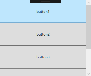
<Button Name="button1" Content="button1" Grid.Row="0"></Button>
<Button Name="button2" Content="button2" Grid.Row="1"></Button>
<Button Name="button3" Content="button3" Grid.Row="2"></Button>
<Button Name="button4" Content="button4" Grid.Row="3"></Button>
<Button Name="button5" Content="button5" Grid.Row="4"></Button>
</Grid>
</ScrollViewer>
</Window>
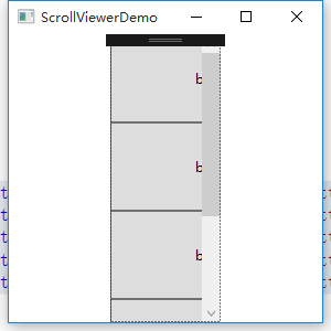
默认情况下ScrollViewer总是显示一个垂直的滚动条。可以通过调整VerticalScrollBarVisibility属性来设置滚动条的显示方式。也可以使用HorizontalScrollBarVisibility属性设置水平滚动条的显示方式。
<ScrollViewer  Width="100">

        <Grid Height="400">

            <Grid.RowDefinitions>

                <RowDefinition />

                <RowDefinition />

                <RowDefinition />

                <RowDefinition />

                <RowDefinition />

            </Grid.RowDefinitions>

            <Button Name="button1" Content="button1" Grid.Row="0" Width="200"></Button>

            <Button Name="button2" Content="button2" Grid.Row="1" Width="200"></Button>

            <Button Name="button3" Content="button3" Grid.Row="2" Width="200"></Button>

            <Button Name="button4" Content="button4" Grid.Row="3" Width="200"></Button>

            <Button Name="button5" Content="button5" Grid.Row="4" Width="200"></Button>

        </Grid>

    </ScrollViewer>
设置横向滚动条显示
<ScrollViewer  Width="100" HorizontalScrollBarVisibility="Auto">

        <Grid Height="400">

            <Grid.RowDefinitions>

                <RowDefinition />

                <RowDefinition />

                <RowDefinition />

                <RowDefinition />

                <RowDefinition />

            </Grid.RowDefinitions>

            <Button Name="button1" Content="button1" Grid.Row="0" Width="200"></Button>

            <Button Name="button2" Content="button2" Grid.Row="1" Width="200"></Button>

            <Button Name="button3" Content="button3" Grid.Row="2" Width="200"></Button>

            <Button Name="button4" Content="button4" Grid.Row="3" Width="200"></Button>

            <Button Name="button5" Content="button5" Grid.Row="4" Width="200"></Button>

        </Grid>

    </ScrollViewer>

HorizontalScrollBarVisibility属性和VerticalScrollBarVisibility这两个属性都是ScrollBarVisibility枚举类型的值。下表是ScrollBarVisibility枚举值:
|
枚举值 |
描述 |
|
Disabled |
禁止显示滚动条,即使当前视图区域无法显示所有内容,滚动条也不出现 |
|
Auto |
当前视图区域可以容纳所有内容时,不显示滚动条,否则自动显示滚动条。 |
|
Hidden |
隐藏滚动条的显示,但是用户可以通过键盘等进行滚动。该属性主要用于自定义滚动方式。 |
|
Visible |
无论如何滚动条都会显示。 |
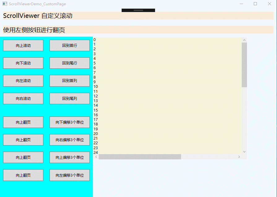
使用下面实例演示ScrollViewer自定义滚动
<Window x:Class="WPFDemo.ScrollViewerDemo_CustomPage"

        xmlns="http://schemas.microsoft.com/winfx/2006/xaml/presentation"

        xmlns:x="http://schemas.microsoft.com/winfx/2006/xaml"

        xmlns:d="http://schemas.microsoft.com/expression/blend/2008"

        xmlns:mc="http://schemas.openxmlformats.org/markup-compatibility/2006"

        xmlns:local="clr-namespace:WPFDemo"

        mc:Ignorable="d"

        Title="ScrollViewerDemo_CustomPage" Height="300" Width="300">

    <DockPanel Background="AliceBlue">

        <TextBlock DockPanel.Dock="Top" Text="ScrollViewer 自定义滚动" FontSize="20" Background="AntiqueWhite" Margin="10"></TextBlock>

        <TextBlock DockPanel.Dock="Top" Text="使用左侧按钮进行翻页" FontSize="20" Background="AntiqueWhite" Margin="10"></TextBlock>

        <StackPanel DockPanel.Dock="Left" Width="150" Background="Aqua">

            <Button Name="btnLineUp" Content="向上滚动"    Margin="10" Padding="10" Click="btnLineUp_Click" />

            <Button Name="btnLineDown" Content="向下滚动"  Margin="10" Padding="10" Click="btnLineDown_Click" />

            <Button Name="btnLineLeft" Content="向左滚动"  Margin="10" Padding="10" Click="btnLineLeft_Click" />

            <Button Name="btnLineRight" Content="向右滚动" Margin="10" Padding="10" Click="btnLineRight_Click" />

            <Button Name="btnPageUp" Content="向上翻页"    Margin="10,30,10,10" Padding="10" Click="btnPageUp_Click" />

            <Button Name="btnPageDown" Content="向上翻页"  Margin="10" Padding="10" Click="btnPageDown_Click" />

            <Button Name="btnPageLeft" Content="向左翻页"  Margin="10" Padding="10" Click="btnPageLeft_Click" />

            <Button Name="btnPageRight" Content="向右翻页" Margin="10" Padding="10" Click="btnPageRight_Click" />

        </StackPanel>

        <StackPanel DockPanel.Dock="Left" Width="150" Background="Aqua">

            <Button Name="btnLineHome" Content="回到首行"    Margin="10" Padding="10" Click="btnLineHome_Click" />

            <Button Name="btnLineEnd" Content="回到尾行"    Margin="10" Padding="10" Click="btnLineEnd_Click" />

            <Button Name="btnColumnHome" Content="回到首列"    Margin="10" Padding="10" Click="btnColumnHome_Click" />

            <Button Name="btnColumnEnd" Content="回到尾列"    Margin="10" Padding="10" Click="btnColumnEnd_Click" />

            <Button Name="btnLineOffsetUp" Content="向下偏移3个单位"    Margin="10,30,10,10" Padding="10" Click="btnLineOffsetUp_Click" />

            <Button Name="btnColumnOffsetRight" Content="向右偏移3个单位"    Margin="10" Padding="10" Click="btnColumnOffsetRight_Click" />

            <Button Name="btnLineOffsetDown" Content="向上偏移3个单位"    Margin="10" Padding="10" Click="btnLineOffsetDown_Click" />

            <Button Name="btnColumnOffsetLeft" Content="向左偏移3个单位"    Margin="10" Padding="10" Click="btnColumnOffsetLeft_Click" />

        </StackPanel>

        <Border Width="500" Height="400" BorderThickness="2" Background="Beige"  VerticalAlignment="Top" HorizontalAlignment="Left">

            <ScrollViewer Name="SVText" HorizontalScrollBarVisibility="Auto" VerticalScrollBarVisibility="Visible">

                <TextBlock Name="txtText" Width="800" Height="900" TextWrapping="Wrap"></TextBlock>

            </ScrollViewer>

        </Border>

    </DockPanel>

</Window>
添加后台代码
namespace WPFDemo

{

    /// <summary>

    /// ScrollViewerDemo_CustomPage.xaml 的交互逻辑

    /// </summary>

    public partial class ScrollViewerDemo_CustomPage : Window

    {

        public ScrollViewerDemo_CustomPage()

        {

            InitializeComponent();

            BindText();

        }

        public void BindText()

        {

            for (int i = 0; i < 1000; i++)

            {

                txtText.Text += i + "\r\n";

            }

        }

        private void btnLineUp_Click(object sender, RoutedEventArgs e)

        {

            SVText.LineUp();

        }

        private void btnLineDown_Click(object sender, RoutedEventArgs e)

        {

            SVText.LineDown();

        }

        private void btnLineLeft_Click(object sender, RoutedEventArgs e)

        {

            SVText.LineLeft();

        }

        private void btnLineRight_Click(object sender, RoutedEventArgs e)

        {

            SVText.LineRight();

        }

        private void btnPageUp_Click(object sender, RoutedEventArgs e)

        {

            SVText.PageUp();

        }

        private void btnPageDown_Click(object sender, RoutedEventArgs e)

        {

            SVText.PageDown();

        }

        private void btnPageLeft_Click(object sender, RoutedEventArgs e)

        {

            SVText.PageLeft();

        }

        private void btnPageRight_Click(object sender, RoutedEventArgs e)

        {

            SVText.PageRight();

        }

        private void btnLineHome_Click(object sender, RoutedEventArgs e)

        {

            SVText.ScrollToHome();

        }

        private void btnLineEnd_Click(object sender, RoutedEventArgs e)

        {

            SVText.ScrollToEnd();

        }

        private void btnColumnHome_Click(object sender, RoutedEventArgs e)

        {

            SVText.ScrollToLeftEnd();

        }

        private void btnColumnEnd_Click(object sender, RoutedEventArgs e)

        {

            SVText.ScrollToRightEnd();

        }

        private void btnLineOffsetUp_Click(object sender, RoutedEventArgs e)

        {

            SVText.ScrollToVerticalOffset(SVText.VerticalOffset + 3);

        }

        private void btnColumnOffsetRight_Click(object sender, RoutedEventArgs e)

        {

            SVText.ScrollToHorizontalOffset(SVText.HorizontalOffset + 3);

        }

        private void btnLineOffsetDown_Click(object sender, RoutedEventArgs e)

        {

            SVText.ScrollToVerticalOffset(SVText.VerticalOffset - 3);

        }

        private void btnColumnOffsetLeft_Click(object sender, RoutedEventArgs e)

        {

            SVText.ScrollToHorizontalOffset(SVText.HorizontalOffset - 3);

        }

    }

}
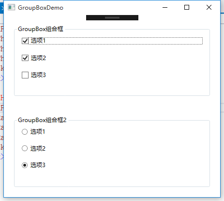
GroupBox组合框
<Window x:Class="WPFDemo.GroupBoxDemo"

        xmlns="http://schemas.microsoft.com/winfx/2006/xaml/presentation"

        xmlns:x="http://schemas.microsoft.com/winfx/2006/xaml"

        xmlns:d="http://schemas.microsoft.com/expression/blend/2008"

        xmlns:mc="http://schemas.openxmlformats.org/markup-compatibility/2006"

        xmlns:local="clr-namespace:WPFDemo"

        mc:Ignorable="d"

        Title="GroupBoxDemo" Height="300" Width="300">

    <Grid>

        <Grid.RowDefinitions>

            <RowDefinition />

            <RowDefinition />

        </Grid.RowDefinitions>

        <GroupBox Header="GroupBox组合框" Grid.Row="0" Margin="20">

            <StackPanel>

                <CheckBox Margin="10">选项1</CheckBox>

                <CheckBox Margin="10">选项2</CheckBox>

                <CheckBox Margin="10">选项3</CheckBox>

            </StackPanel>

        </GroupBox>

        <GroupBox Header="GroupBox组合框2" Grid.Row="1" Margin="20">

            <StackPanel>

                <RadioButton Margin="10">选项1</RadioButton>

                <RadioButton Margin="10">选项2</RadioButton>

                <RadioButton Margin="10">选项3</RadioButton>

            </StackPanel>

        </GroupBox>

    </Grid>

</Window>
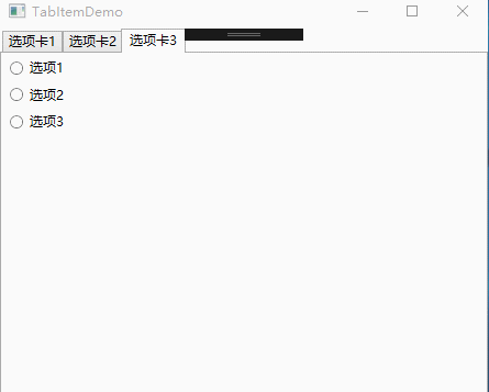
TabItem标签页控件
<Window x:Class="WPFDemo.TabItemDemo"

        xmlns="http://schemas.microsoft.com/winfx/2006/xaml/presentation"

        xmlns:x="http://schemas.microsoft.com/winfx/2006/xaml"

        xmlns:d="http://schemas.microsoft.com/expression/blend/2008"

        xmlns:mc="http://schemas.openxmlformats.org/markup-compatibility/2006"

        xmlns:local="clr-namespace:WPFDemo"

        mc:Ignorable="d"

        Title="TabItemDemo" Height="300" Width="300">

    <Grid>

        <TabControl>

            <TabItem Header="选项卡1">

                <StackPanel>

                    <CheckBox  Margin="5">选项1</CheckBox>

                    <CheckBox  Margin="5">选项2</CheckBox>

                    <CheckBox  Margin="5">选项3</CheckBox>

                </StackPanel>

            </TabItem>

            <TabItem Header="选项卡2" IsSelected="True">

                <Grid>

                    <Grid.RowDefinitions>

                        <RowDefinition/>

                        <RowDefinition/>

                    </Grid.RowDefinitions>

                    <GroupBox Header="GroupBox1" Margin="10" Grid.Row="0">

                        <StackPanel>

                            <CheckBox Margin="5">选项1</CheckBox>

                            <CheckBox Margin="5">选项2</CheckBox>

                            <CheckBox Margin="5">选项3</CheckBox>

                        </StackPanel>

                    </GroupBox>

                    <GroupBox Header="GroupBox2" Margin="10" Grid.Row="1">

                        <StackPanel>

                            <RadioButton Margin="5">选项1</RadioButton>

                            <RadioButton Margin="5">选项2</RadioButton>

                            <RadioButton Margin="5">选项3</RadioButton>

                        </StackPanel>

                    </GroupBox>

                </Grid>

            </TabItem>

            <TabItem Header="选项卡3">

                <StackPanel>

                    <RadioButton  Margin="5">选项1</RadioButton>

                    <RadioButton  Margin="5">选项2</RadioButton>

                    <RadioButton  Margin="5">选项3</RadioButton>

                </StackPanel>

            </TabItem>

        </TabControl>

    </Grid>

</Window>
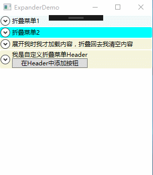
Expander可折叠控件
属性:
IsExpanded:获取和设置Expander控件的折叠状态。
ExpandDirection:获取或设置Expander控件内容展开的方向。枚举值:包含Up、Down、Left、Right,分别为上下左右。
事件:
Collapsed:当Expander折叠时,在内容实际被收起前触发该事件。
Expanded:当Expander展开时,在内容实际被显示前触发该事件。
<Window x:Class="WPFDemo.ExpanderDemo"

        xmlns="http://schemas.microsoft.com/winfx/2006/xaml/presentation"

        xmlns:x="http://schemas.microsoft.com/winfx/2006/xaml"

        xmlns:d="http://schemas.microsoft.com/expression/blend/2008"

        xmlns:mc="http://schemas.openxmlformats.org/markup-compatibility/2006"

        xmlns:local="clr-namespace:WPFDemo"

        mc:Ignorable="d"

        Title="ExpanderDemo" Height="300" Width="300">

    <Grid>

        <Grid.RowDefinitions>

            <RowDefinition Height="Auto"/>

            <RowDefinition Height="Auto"/>

            <RowDefinition Height="Auto"/>

            <RowDefinition Height="Auto"/>

        </Grid.RowDefinitions>

        <Expander Header="折叠菜单1" Grid.Row="0" Background="AliceBlue"   >

            <StackPanel>

                <CheckBox Margin="5">选项1</CheckBox>

                <CheckBox Margin="5">选项2</CheckBox>

                <CheckBox Margin="5">选项3</CheckBox>

            </StackPanel>

        </Expander>

        <Expander Header="折叠菜单2" Grid.Row="1"  Background="Aqua" IsExpanded="True">

            <StackPanel>

                <CheckBox Margin="5">选项1</CheckBox>

                <CheckBox Margin="5">选项2</CheckBox>

                <CheckBox Margin="5">选项3</CheckBox>

            </StackPanel>

        </Expander>

        <Expander Header="展开我时我才加载内容,折叠回去我清空内容" Grid.Row="2" Background="Beige"  Collapsed="Expander_Collapsed" Expanded="Expander_Expanded">

            <ScrollViewer MaxHeight="120" HorizontalScrollBarVisibility="Disabled">

                <TextBlock Name="txtText"></TextBlock>

            </ScrollViewer>

        </Expander>

        <Expander Grid.Row="3" Background="Beige" >

            <Expander.Header>

                <StackPanel>

                    <TextBlock>我是自定义折叠菜单Header</TextBlock>

                    <Button>在Header中添加按钮</Button>

                </StackPanel>

            </Expander.Header>

            <StackPanel>

                <CheckBox Margin="5">选项1</CheckBox>

                <CheckBox Margin="5">选项2</CheckBox>

                <CheckBox Margin="5">选项3</CheckBox>

            </StackPanel>

        </Expander>

    </Grid>

</Window>
WPF 10天修炼 第五天- 内容控件的更多相关文章
- WPF 后台获得 数据模板里的内容控件(DataTemplate)
原文:WPF 后台获得 数据模板里的内容控件(DataTemplate) 假如 <Window.Resources> 里 有一个 Datatemplate 我想获得TextBlo ...
- 【WPF学习】第二十五章 日期控件
WPF包含两个日期控件:Calender和DatePicker.这两个控件都被设计为允许用户选择日期. Calendar控件显示日期,在与Windows操作系统中看到的日历(例如,当配置系统日期时看到 ...
- 在WPF中获取DataGridTemplateColumn模板定义的内容控件
xaml格式描述: <DataGrid Name="dataGrid" Grid.Row="1" ItemsSource="{Binding}& ...
- 在WPF中获取DATAGRIDTEMPLATECOLUMN模板定义的内容控件(转载)
原文:http://www.cnblogs.com/eric_ibm/p/3772516.html xaml格式描述: <DataGrid Name="dataGrid" G ...
- WPF 10天修炼 第四天- WPF布局容器
WPF布局 WPF的窗口也就是Window类,是一个内容控件,该控件派生自ContentControl.内容控件有一个Content属性,该属性有一个限制,只能放置一个用户界面元素,或一个字符串.为了 ...
- WPF自定义控件(五)の用户控件(完结)
用户控件,WPF中是继承自UserControl的控件,我们可以在里面融合我们的业务逻辑. 示例:(一个厌恶选择的用户控件) 后端: using iMicClassBase; using iMicCl ...
- 【WPF学习】第二十章 内容控件
内容控件(content control)是更特殊的控件类型,它们可包含并显示一块内容.从技术角度看,内容控件时可以包含单个嵌套元素的控件.与布局容器不同的是,内容控件只能包含一个子元素,而布局容器主 ...
- WPF自学入门(六)WPF带标题的内容控件简单介绍
在WPF自学入门(二)WPF-XAML布局控件的文章中分别介绍StackPanel,WarpPanel,DockPanel,Grid,Canvas五种布局容器的使用,可以让我们大致了解容器可以使用在什 ...
- WPF 入门笔记之控件内容控件
一.控件类 在WPF中和用户交互的元素,或者说.能够接受焦点,并且接收键盘鼠标输入的元素所有的控件都继承于Control类. 1. 常用属性: 1.1 Foreground:前景画刷/前景色(文本颜色 ...
随机推荐
- linux系统docker版本升级或安装
如果存在旧版本,则先卸载 最好先将镜像导出保存,以免升级后丢失或者无法使用 如有正在运行的容器,先停止 $ docker ps -q | xargs docker stop 关闭docker服务 $ ...
- [转帖]创建文件或修改文件时间 touch
Linux命令(五)创建文件或修改文件时间 touch https://www.cnblogs.com/ay-a/p/7900274.html touch -t .x86_64.rpm 记得 wind ...
- xml 解析参考文档
https://www.cnblogs.com/a1656344531/archive/2012/11/28/2792863.html
- Leetcode 5
HashTable Easy 1. 136. Single Number 0与0异或是0,1与1异或也是0,那么我们会得到0 class Solution { public: int singleNu ...
- Java 获取指定日期范围内的每个月,每季度,每一年
/** *根据时间范围获得月份集 * @return */ public static List<String> getRangeSet(String beg ...
- java网页爬数据获取class中的空格
<ul class=""> <li class="avatar_img"><img src="http://avatar ...
- 洛谷P1169[ZJOI2007]棋盘制作
题目 一道悬线法的裸题,悬线法主要是可以处理最大子矩阵的问题. 而这道题就是比较经典的可以用悬线法来处理的题. 而悬线法其实就是把矩阵中对应的每个位置上的元素分别向左向上向右,寻找到不能到达的地方,然 ...
- 【AGC030D】Inversion Sum DP
题目大意 有一个序列 \(a_1,a_2,\ldots,a_n\),有 \(q\) 次操作,每次操作给你两个数 \(x,y\),你可以交换 \(a_x,a_y\),或者什么都不做. 问你所有 \(2^ ...
- [SDOI2013]森林 主席树+启发式合并
这题的想法真的很妙啊. 看到题的第一眼,我先想到树链剖分,并把\(DFS\)序当成一段区间上主席树.但是会发现在询问的时候,可能会非常复杂,因为你需要把路径拆成很多条轻链和重链,它们还不一定连续,很难 ...
- iis7设置ftp
目前是所有网站一个域下.ftp登录后可看到所有网站,目前想ftp一个网站,查看了下服务器,貌似只有serv-u这么个东西,还不能再创建第二个域.不得其解.百度发现两篇文章正好: http://blog ...