(六)HTML5立方体动画设置
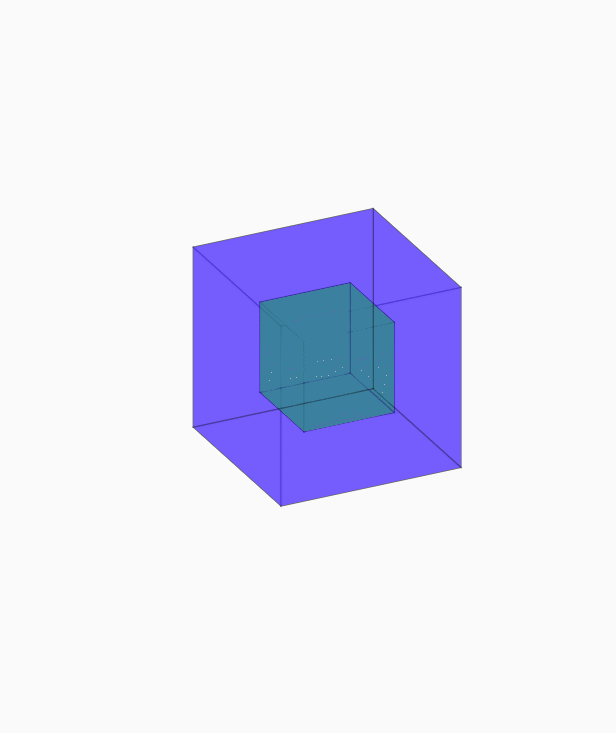
<!doctype html>

<html lang="en">

<head>

<meta charset="UTF-8">

<title>立方体动画</title>

<style type="text/css">

body,div,p,ul,ol,li,dl,dt,dd,table,tr,td,form,hr,fieldset,h1,h2,h3,h4,h5,h6,img,input{

margin:0;

padding:0;

}

html,body{

height: 100%;

}

body{

/*background: url(img/body_bg.png) repeat-x;*/

background-size: 100% 100%;

display: flex;

justify-content: center;

align-items: center;

}

.box{

width: 200px;

height: 200px;

/*background: blue;*/

transform-style: preserve-3d;

/*transform:rotateY(30deg) rotateX(-15deg);*/

animation:lft_ani 8s infinite linear;

}

.box a{

display: block;

opacity: .4;

border: 1px solid black;

transform-style:preserve-3d;

}

.box .small{

width: 100px;

height: 100px;

background: #18fa07;

position: absolute;

left: 50px;

top: 50px;

}

.box .big{

width: 200px;

height: 200px;

background:#2501fd;

position: absolute;

left: 0;

top: 0;

transition: all 1s;

}

.box .big:nth-of-type(1){

transform:translateZ(100px);

}

.box .big:nth-of-type(2){

transform:translateZ(-100px);

}

.box .big:nth-of-type(3){

transform:rotateY(-90deg) translateZ(100px);

}

.box .big:nth-of-type(4){

transform:rotateY(90deg) translateZ(100px);

}

.box .big:nth-of-type(5){

transform:rotateX(90deg) translateZ(100px);

}

.box .big:nth-of-type(6){

transform:rotateX(-90deg) translateZ(100px);

}

.box:hover .big:nth-of-type(1){

transform:translateZ(150px);

}

.box:hover .big:nth-of-type(2){

transform:translateZ(-150px);

}

.box:hover .big:nth-of-type(3){

transform:rotateY(-90deg) translateZ(150px);

}

.box:hover .big:nth-of-type(4){

transform:rotateY(90deg) translateZ(150px);

}

.box:hover .big:nth-of-type(5){

transform:rotateX(90deg) translateZ(150px);

}

.box:hover .big:nth-of-type(6){

transform:rotateX(-90deg) translateZ(150px);

}

.box:hover{

animation:lft_ani 8s infinite linear paused;

}

.box .small:nth-of-type(7){

transform:translateZ(50px);

}

.box .small:nth-of-type(8){

transform:translateZ(-50px);

}

.box .small:nth-of-type(9){

transform:rotateY(-90deg) translateZ(50px);

}

.box .small:nth-of-type(10){

transform:rotateY(90deg) translateZ(50px);

}

.box .small:nth-of-type(11){

transform:rotateX(90deg) translateZ(50px);

}

.box .small:nth-of-type(12){

transform:rotateX(-90deg) translateZ(50px);

}

@keyframes lft_ani{

0%{

transform:rotateX(0deg) rotateY(0deg);

}

100%{

transform:rotateX(360deg) rotateY(360deg);

}

}

</style>

</head>

<body>

<div class="box">

<a href="#" class="big"></a>

<a href="#" class="big"></a>

<a href="#" class="big"></a>

<a href="#" class="big"></a>

<a href="#" class="big"></a>

<a href="#" class="big"></a>

<a href="#" class="small"></a>

<a href="#" class="small"></a>

<a href="#" class="small"></a>

<a href="#" class="small"></a>

<a href="#" class="small"></a>

<a href="#" class="small"></a>

</div>

</body>

</html>
(六)HTML5立方体动画设置的更多相关文章
- HTML5 3D动画效果
对以前来讲,3D动画拿到网页上展示是一件非常奢侈的事情,第一是浏览器不够先进,第二是大部分只能用flash实现伪3D.HTML5的出现,让实现网页3D动画变得非常简单,当然前提是你不要再使用像IE67 ...
- 7款超酷HTML5 3D动画精选应用及源码
对以前来讲,3D动画拿到网页上展示是一件非常奢侈的事情,第一是浏览器不够先进,第二是大部分只能用flash实现伪3D.HTML5的出现,让实现网页3D动画变得非常简单,当然前提是你不要再使用像IE67 ...
- 超给力的HTML5 3D动画欣赏及源码下载
HTML5有着非常巨大的魅力,尤其是CSS3和Cavnas,可以帮助页面渲染得非常炫酷.值得一提的是,利用HTML5的3D特性可以帮助你更加方便地在网页上实现3D动画特效.本文分享的这些HTML5 3 ...
- 基于HTML5/CSS3可折叠的3D立方体动画
今天要给大家带来另外一款CSS3 3D立方体动画,尤其在DEMO2中可以看到,鼠标滑过立方体后,它将会被打开,从里面弹出另外一个小立方体,动画效果非常酷,非常逼真. 在线预览 源码下载 实现的代码 ...
- 【转】15个无比华丽的HTML5/CSS3动画应用
原文转自:http://www.html5cn.org/article-7089-1.html 前几天,HTML5标准已经尘埃落定,未来的Web将会是由HTML5主导,当然作为开发者对这一喜讯更为动心 ...
- 8个经典炫酷的HTML5 Canvas动画欣赏
HTML5非常强大,尤其是Canvas技术的应用,让HTML5几乎可以完成所有Flash能完成的效果.本文精选了8个经典炫酷的HTML5 Canvas动画欣赏,每一个都提供全部的源代码,希望对你有所帮 ...
- 8款效果惊艳的HTML5 3D动画
1.HTML5 WebGL水面水波荡漾特效 之前已经向各位分享过一款很逼真的HTML5水波荡漾特效,效果还算不错.今天再向大家分享一款更加给力的HTML5水波动画,画面上是一个大水池,水池底部是一颗大 ...
- 纯CSS3超酷3D旋转立方体动画特效
简要教程 这是一款神奇的纯 CSS3 立方体动画特效插件.使用CSS3来制作动画效果已经成为WEB前端开发的一种时尚,从简单的颜色和尺寸动画,到复杂的旋转.翻转动画, CSS3 展现了它无穷的魅力.使 ...
- 14款超时尚的HTML5时钟动画
时钟动画在网页应用中也非常广泛,在一些个人博客中,我们经常会看到一些相当个性化的HTML5时钟动画.今天我们向大家分享了14款形态各异的超时尚HTML5时钟动画,其中有圆盘时钟.3D时钟.个性化时钟等 ...
随机推荐
- javascript Date对象 之 date初始化
javascript Date对象 --> 日期初始化: 总结: 日期初始化的 方式: 1. new Date( yyyy, M(+), d(+), h(+), m(+), s(+) ); 2. ...
- filter方法解析
filter一般用于将数组中的某些元素过滤掉,并生成一个新的数组 基本语法如下: var newArray= arrayObj.filter(functionObj); newArray 根据过滤条件 ...
- 无网络环境用pip安装python类包
1.现在有网络的电脑安装相应的包 pip install django 2.安装完成后 打包 1)新建一个文件夹(package),用来存放包: 2)执行 pip list #查看安装的包 pip f ...
- LeetCode——Reverse String
LeetCode--Reverse String Question Write a function that takes a string as input and returns the stri ...
- android studio 慢的问题
转自:http://www.jianshu.com/p/e1c0b46e317c 在使用Android studio的时候常常遇到这样的问题,从github或是其他地方导入项目,Android stu ...
- 如何在MyEclipse中更改servlet模板 Jsp模板
http://blog.csdn.net/sjw890821sjw/article/details/6995190 刚换上Myeclipse9.0,结果要修改servlet模板的时候不像Myeclps ...
- BZOJ3205/UOJ107 [Apio2013]机器人
本文版权归ljh2000和博客园共有,欢迎转载,但须保留此声明,并给出原文链接,谢谢合作. 本文作者:ljh2000 作者博客:http://www.cnblogs.com/ljh2000-jump/ ...
- netty的异常分析 IllegalReferenceCountException refCnt: 0
netty的异常 IllegalReferenceCountException refCnt: 0 这是因为Netty有引用计数器的原因,自从Netty 4开始,对象的生命周期由它们的引用计数(ref ...
- Codeforces Round #448 (Div. 2)C. Square Subsets
可以用状压dp,也可以用线型基,但是状压dp没看台懂... 线型基的重要性质 性质一:最高位1的位置互不相同 性质二:任意一个可以用这些向量组合出的向量x,组合方式唯一 性质三:线性基的任意一个子集异 ...
- 51nod 1009 数位dp入门
http://www.51nod.com/onlineJudge/questionCode.html#!problemId=1009 1009 数字1的数量 基准时间限制:1 秒 空间限制:13107 ...