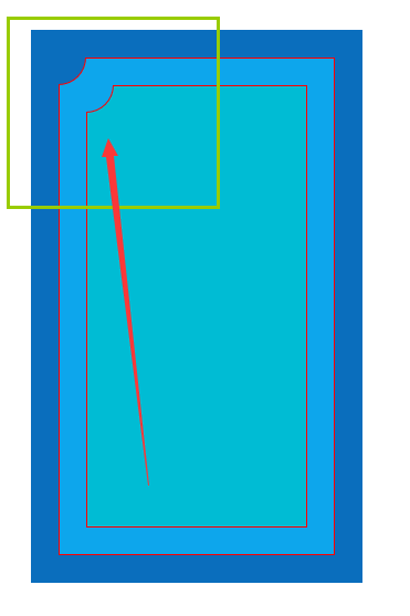
CSS3 四边形 凹角写法
<!DOCTYPE html>

<html lang="en">

<head>

    <meta charset="UTF-8">

    <title>Title</title>

    <style>

        .outer{

            position: absolute;

            left: 100px;

            top: 100px;

            width: 300px;

            height: 500px;

            background-color: #0a6ebd;

            display: flex;

            justify-content: center;

            align-items: center;

            box-sizing: border-box;

            border: 1px solid #0a6ebd;

        }

        .inner-1{

            width: 250px;

            height: 450px;

            box-sizing: border-box;

            background-color: #0da6ec;

            position: relative;

            display: flex;

            justify-content: center;

            align-items: center;

            border: 1px solid red;

            border-top-left-radius: 25px;

        }

        .inner-2{

            width: 200px;

            height: 400px;

            box-sizing: border-box;

            background-color: #00bcd4;

            position: relative;

            border: 1px solid red;

            border-top-left-radius: 25px;

        }

        .left-corner{

            width: 25px;

            height: 25px;

            /* border-radius: 100%; */

            border-bottom-right-radius: 100%;

            background-color: inherit;

            position: absolute;

            left: -1px;

            top: -1px;

            z-index:;

            border-bottom: 1px solid red;

            border-right: 1px solid red;

            box-sizing: border-box;

        }

    </style>

</head>

<body>

    <div class="outer">

        <div class="inner-1">

            <div class="left-corner" style="background-color: #0a6ebd;"></div>

            <div class="inner-2">

                <div class="left-corner" style="background-color: #0da6ec;"></div>

            </div>

        </div>

    </div>

</body>

</html>
CSS3 四边形 凹角写法的更多相关文章
- 简单了解css3样式表写法和优先级
css3和css有什么区别?首先css3是css(层叠样式表)技术的升级版本,而css是一种用来表现HTML(标准通用标记语言的一个应用)或XML(标准通用标记语言的一个子集)等文件样式的计算机语言. ...
- 移动端轮播完整版css3加原生写法
<!doctype html><html><head> <meta charset="UTF-8"> <meta name=& ...
- css3网站响应式写法
css3响应式写法因为media不支持ie9以下的浏览器 所有要加个判断<pre> <!-- 全部通用的 --><link rel="stylesheet&qu ...
- 石子合并(直线版+环形版)&(朴素写法+四边形优化+GarsiaWachs算法)
石子合并-直线版 (点击此处查看题目) 朴素写法 最简单常见的写法就是通过枚举分割点,求出每个区间合并的最小花费,从而得到整个区间的最小花费,时间复杂度为O(n^3),核心代码如下: ; i < ...
- css3的媒体查询(Media Queries)
我今天就总结一下响应式设计的核心CSS技术Media(媒体查询器)的用法. 先看一个简单的例子: <link rel="stylesheet" media="scr ...
- CSS3 之 Media(媒体查询器)
1.响应式Media(媒体查询器) (1)<link rel=“stylesheet” media=“screen and (max-width: 600px)” href=“small.css ...
- CSS3的媒体查询(Media Queries)与移动设备显示尺寸大全
媒体查询介绍 我今天就总结一下响应式设计的核心CSS技术Media(媒体查询器)的用法. 先看一个简单的例子: <link rel="stylesheet" media=&q ...
- css3 2D转换(2D Transform) 动画(Animation)
transform 版本:CSS3 内核类型 写法 Webkit(Chrome/Safari) -webkit-transform Gecko(Firefox) -moz-transform Pres ...
- css3のborder-radius
css3のborder-radius 今天主要练习了一下border-radius这个属性,这个是最常用的属性,所以先从它开始学习和总结吧. 我觉得需要注意以下几点: 1.书写规范: -webkit- ...
随机推荐
- solr 命令
本文为转载内容:源地址:http://blog.csdn.net/matthewei6/article/details/50620600 查看帮助 bin/solr -help ...
- [RK3288][Android6.0] 关于uboot中logo相关知识点小结【转】
本文转载自:http://blog.csdn.net/kris_fei/article/details/76256224 Platform: Rockchip OS: Android 6.0 Kern ...
- python 判断是否为有效域名
import re pattern = re.compile( r'^(([a-zA-Z]{1})|([a-zA-Z]{1}[a-zA-Z]{1})|' r'([a-zA-Z]{1}[0-9]{1}) ...
- ValueError: Some of types cannot be determined by the first 100 rows, please try again with sampling
ValueError: Some of types cannot be determined by the first 100 rows, please try again with sampling ...
- 并不对劲的字符串专题(二):kmp
据说这些并不对劲的内容是<信息学奥赛一本通提高篇>的配套练习. 先感叹一句<信息学奥赛一本通提高篇>上对kmp的解释和matrix67的博客相似度99%(还抄错了),莫非mat ...
- Mybatis拦截器(插件实现原理)
在mybatis的mybatis.cfg.xml中插入: <plugins> <plugin interceptor="cn.sxt.util.PageIntercepto ...
- apache-ab并发负载压力测试 不错
ab -n 3000 -c 3000 http://www.test.com/ c 100 即:每次并发3000 个 n 10000 即: 共发送3000 个请求 ab -t 60 -c 100 ht ...
- bzoj 4571 美味 —— 主席树
题目:https://www.lydsy.com/JudgeOnline/problem.php?id=4571 区间找异或值最大,还带加法,可以用主席树: 可以按位考虑,然后通过加上之前已经有的答案 ...
- 去除inline-block的间隙
产生间隙的原因就是标签之间的空格,去除的方法: 1 设置父元素的font-size:0;空格字符的宽高都为0, <div class="demo1 demo2"> &l ...
- 869C
dp 我好像很zz... 想了好长好长时间,然后没想出来,怒掉rating... 其实我们可以吧三种颜色两两计算,因为这样加入第三种颜色不会影响之前的方案,那么我们跑一个dp,计算数量分别为a,b的方 ...