css中元素居中总结
很多时候,我们需要让元素居中显示:1. 一段文本的水平居中,2. 一张图片的水平居中,3. 一个块级元素的水平居中;4. 单行文本的竖直居中,5. 不确定高度的一段文本竖直居中,6. 确定高度的块级元素竖直居中等等。现在分别对其进行总结下(这篇文章也在 imooc 里发表过手记,可是因为板式的原因不太容易读懂。):
更新(20181115):
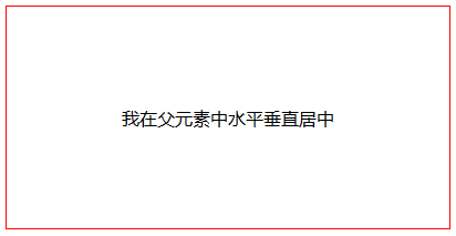
让元素水平垂直居中,也可以使用让元素显示为单元格,让单元格原本的垂直居中发挥作用:
<div class="parent">

  <div class="child">我在父元素中水平垂直居中</div>

</div>
.parent {

  width: 400px;

  height: 200px;

  border: 1px solid #f00;

  display: table-cell;

  text-align: center;

  vertical-align: middle;

}
1. 让元素水平居中,使用 text-align: center;
<div class="text-center">水平居中</div>

.text-center {

    width: 200px;

    height: 100px;

    text-align: center;  /* 让文本水平居中 */

    color: #fff;

    background-color: #f54;

}

2. 让图片水平居中,父元素使用 text-align: center;
<div class="img-center">

    <img src="fenjing.jpg" alt="蓝天白云青山绿水">

</div>

.img-center {

    width: 200px;

    height: 120px;

    text-align: center; /* 让图片水平居中 */

    background-color: #f54;

}

说明:
图片是行内元素,从一开始我视频学习的时候,有一个老师好像说过图片是行内块级元素(inline-block),听起来好像很有道理的,因为图片可以使用 text-align: center; 将其水平居中显示,并且还能设置宽和高,很长时间以来没有怀疑过!后来喜欢上了“溯本求源”,才发现了原来不是那么回事:
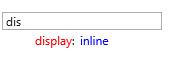
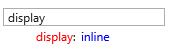
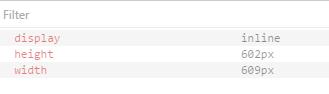
在 ie, edge, chrome, firefox, opera 中对于 img 的默认显示方式是: display: inline;
ie:
edge:
chrome:

firefox:

opera:
img 是 inline,还是比较容易想得通,像文本一样可以通过 text-align: center; 设置为水平居中
3. 块级元素水平居中,使用 margin-right: auto; margin-left: auto;
<div class="parent-box">

    <div class="child-box">块级元素水平居中</div>

</div>

.parent-box {

    width: 250px;

    height: 150px;

    background-color: #f98;

}

.child-box {

    width: 200px;

    height: 100px;

    background-color: #f00;

    margin-left: auto;

    margin-right: auto;

}

4. 单行文本的垂直居中,让 line-height 和 height 相等。
<div class="text-middle">单行文本竖直居中</div>

.text-middle {

    width: 200px;

    height: 100px;

    line-height: 100px;

    background-color: #f00;

    color: #fff;

}

注意:
这里说的 height 和 line-height 相等,有一个注意事项:
当 box-sizing: content-box; 时(这也是默认的值)。将 height 和 line-height 的值设置为一样就行了;当 box-sizing: border-box; 时, line-height 的值要从 height 里减去 padding-top, padding-bottom, border-top, border-bottom 四个的值,也就是和分配给内容的有效高度相等。
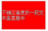
5. 不确定高度的一段文本竖直居中,这里不适用高度,使用 padding-top: ...; padding-bottom: ...; padding-top 和 padding-bottom 值相同.
<div class="text-middle-padding">不确定高度的一段文本竖直居中</div>

.text-middle-padding {

    width: 150px;

    padding-top: 30px;

    padding-bottom: 30px;

    color: #fff;

    background-color: #f00;

}
说明:对于高度确定的元素,它的文本的行数不确定的情况下,怎么让文本垂直居中呢?在后面会提到。
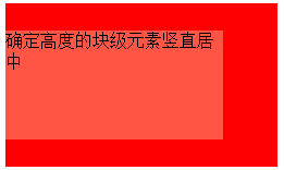
6. 确定高度的块级元素竖直居中,使用 position: absolute; top: 50%; margin-top: ...;(margin-top的值为自身高度的值的一半的负值);
<div class="parent-box">

    <div class="child-box">确定高度的块级元素竖直居中</div>

</div>

.parent-box {

  position: relative;

  width: 250px;

  height: 150px;

  background-color: #f00;

}

.child-box {

    position: absolute;

    top: 50%;

    width: 200px;

    height: 100px;

    margin-top: -50px;

    background-color: #f54;

}
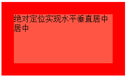
7. 绝对定位实现水平垂直居中,使用 position: absolute; top: 0; right: 0; bottom: 0; left: 0; margin: auto;
<div class="parent-box">

    <div class="child-box">绝对定位实现水平垂直居中居中</div>

</div>

.parent-box {

    position: relative;

    width: 250px;

    height: 150px;

    background-color: #f00;

}

.child-box {

    position: absolute;

    top:;

    right:;

    bottom:;

    left:;

    width: 200px;

    height: 100px;

    margin: auto;

    background-color: #f54;

}
说明:对于块儿级元素的垂直居中,推荐这么做,这也是我比较喜欢的方法。
需要注意的地方是,对父元素要使用 position: relative; 对子元素要使用 position: absolute; top: 0; right: 0; bottom: 0; left: 0; margin: auto; 缺一不可。如果只需要垂直居中,right: 0; 和 left: 0; 可以省略不写,margin: auto; 可以换成 margin-top: auto; margin-bottom: auto;;如果只需要水平居中,top: 0; bottom: 0; 可以省略不写,margin: auto; 可以换成 margin-rihgt: auto; margin-left: auto; 。
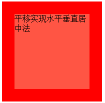
8. 平移实现水平垂直居中法:通过使用 transform: translate(-50%,-50%); 添加厂商前缀 -webkit- 兼容 Safari 和 Chrome
<div class="parent-box">

    <div class="child-box">平移实现水平垂直居中法</div>

</div>

.parent-box {

    width: 200px;

    height: 200px;

    background-color: #f00;

}

.child-box {

    position: relative;

    top: 50%;

    left: 50%;

    width: 150px;

    height: 150px;

    background-color: #f54;

    -webkit-transform: translate(-50%,-50%);

            transform: translate(-50%,-50%);

}
9. 让浏览器计算子元素的宽高并让其水平垂直居中:通过使用定位position: absolute; top:...; right: ...; bottom: ...; left: ...; 四个方向上的值缺一不可。
<div class="parent-box">

    <div class="child-box">让浏览器计算子元素的宽高并让其水平垂直居中</div>

</div>

.parent-box {

    position: relative;

    width: 200px;

    height: 200px;

    background-color: #f00;

}

.child-box {

    position: absolute;

    top: 20%;

    right: 20%;

    bottom: 20%;

    left: 20%;

    background-color: #f54;

}
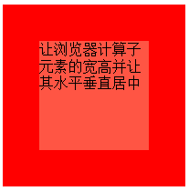
对于子元素,上下左右的定位值可以用 px 作为单位,也可以用 % 作为单位。
10. css3伸缩布局实现元素水平垂直居中,通过使用 display:flex; align-items: center; justify-content: center;
<div class="parent-box">

    <div class="child-box">我是子元素,这里使用了 css3 的弹性伸缩布局</div>

</div>

.parent-box {

    width: 400px;

    height: 150px;

    display: flex;

    justify-content: center; /* 让子元素水平居中 */

    align-items: center; /* 让子元素垂直居中 */

    border: 1px solid #999;

}

.child-box {

    background-color: #fe5454;

    color: #fff;

}
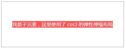
说明:
ie 10 及以上版本浏览器支持,chrome, firefox, opera, edge 均支持,不需要添加厂商前缀。
另外:这里也解释了第5点中“对于高度确定的元素,它的文本的行数不确定的情况下,怎么让文本垂直居中呢?”的问题,使用这里提到的 css3 弹性布局方式。对付元素使用 display: flex; justify-content: center; align-items: center; 来解决。
注意:
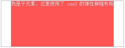
1. 如果不添加 justify-content: center; 子元素不会水平居中;
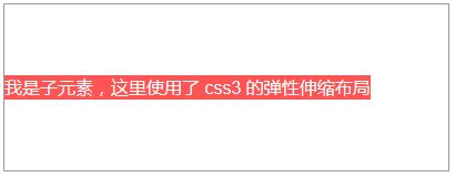
2. 如果不添加 align-items: center; 子元素会铺满父元素的高度,而不是我们希望的只有包含住文本的高度!
记忆方法:
我们知道:text-align: justify; 能将文本按照两端对其的方式对文本进行布局,这个处理的是水平方向上的问题。联想记忆,justify-content 也是处理水平方向上的事情,所以 justify-contnet: center; 就是让元素水平居中了。
更新(20170220)
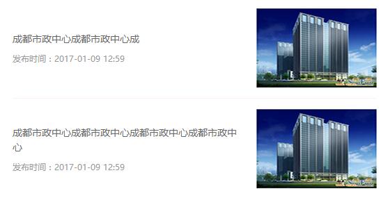
对于第五点中提到的不确定高度的多行文本竖直居中的问题,最近又在项目中遇到了。在新闻列表页面,每一个项目列表包含图片(居左) ,时间和标题(居右),然后不论标题是多少行,多要使文本和图片看起来竖直居中。
这其实很简单,就用到了两个属性:{ display: inline-block; vertical-align: middle; },本来 vertical-align: middle; 的意思就是竖直排列方式为居中,可只有在 display: inline-block; 的情况下才起作用。
顺便贴上代码:
<li class="news-item">

    <a href="/case/74.html" title="成都市政中心">

        <div class="news-item-text">

            <h4>成都市政中心成都市政中心成</h4>

            <div class="item-info">

                发布时间:<time>2017-01-09 12:59</time>

            </div>

        </div>

        <img src="img/1-1612011611540-L.jpg" alt="成都市政中心" class="news-item-img">

    </a>

</li>

<li class="news-item">

    <a href="/case/74.html" title="成都市政中心">

        <div class="news-item-text">

            <h4>成都市政中心成都市政中心成都市政中心成都市政中心</h4>

            <div class="item-info">

                发布时间:<time>2017-01-09 12:59</time>

            </div>

        </div>

        <img src="img/1-1612011611540-L.jpg" alt="成都市政中心" class="news-item-img">

    </a>

</li>
/*===公司动态===*/.news-item {

    padding-top: 15px;

    padding-bottom: 15px;

    border-bottom: 1px solid #fee;

}

.news-item a {

    display: block;

    font-size:;

}

.news-item-text {

    width: 67%;

    padding-right: 14px;

    display: inline-block;

    vertical-align: middle;

}

.news-item-text h4 {

    font-weight:;

    font-size: 14px;

    line-height: 1.5;

    color: #666;

}

.news-item-text .item-info {

    font-size: 12px;

    margin-top: 10px;

    color: #999;

}

.news-item-img {

    display: inline-block;

    vertical-align: middle;

    width: 33%;

    height: auto;

    min-height: 60px;

}
(更新20170928)
对于水平竖直居中,还可以参照表格单元格的方式:
<div class="parent-box">

    <div class="child-box"></div>

</div>
.parent-box {

    width: 300px;

    height: 300px;

    border: 1px solid #ccc;

    text-align: center;

    display: table-cell;

    vertical-align: middle;

}

.child-box {

    display: inline-block;

    width: 200px;

    height: 200px;

    background-color: #ccc;

}
扩展:
需求:我们经常做分页时,需要将分页的列表项置于水平居中的位置,就像下面的 dom 一样:
<ul class="pagination">
<li><a href="#">«</a></li>
<li><a href="#">1</a></li>
<li><a href="#">2</a></li>
<li><a href="#">3</a></li>
<li><a href="#">4</a></li>
<li><a href="#">5</a></li>
<li><a href="#">»</a></li>
</ul>
解决方法:
可以为父元素 ul 添加 text-align: center; 同时给子元素 li 添加 display: inline-block;
完整的代码:
<ul class="pagination">
<li><a href="#">«</a></li>
<li><a href="#">1</a></li>
<li><a href="#">2</a></li>
<li><a href="#">3</a></li>
<li><a href="#">4</a></li>
<li><a href="#">5</a></li>
<li><a href="#">»</a></li>
</ul>
ul.pagination {

    margin-top: 20px;

    text-align: center;

    font-size:; /* 设置 font-size 的大小为 0,目的是让显示方式为 inline-block 的子元素去除外边距(外边距是由于 html 的空格所导致的) */

}

ul.pagination li { display: inline-block; }

ul.pagination li a {

    display: inline-block;

    padding: 7px 14px;

    border-width: 1px 0 1px 1px;

    border-style: solid;

    border-color: #f1f2f3;

    font-size: 15px;  /* 这里一定要设置 font-size,别指望去继承了,因为如果不设置,将会继承 ul 的大小 0 */

    transition: all .3s ease 0;

}

ul.pagination li:first-child a {

    border-top-left-radius: 5px;

    border-bottom-left-radius: 5px;

}

ul.pagination li:last-child a {

    border-right: 1px solid #f1f2f3;

    border-top-right-radius: 5px;

    border-bottom-right-radius: 5px;

}

ul.pagination li a:hover {

    background-color: #fe5454;

    color: #fff;

    border-color: #fe5454;

}
css中元素居中总结的更多相关文章
- css中关于居中的那点事儿
css中关于居中的那点事儿 关于居中,无论是水平居中,还是垂直居中都有很多方式,下面我来介绍一些常用的. 第一部分:水平居中 1.实现行内元素的居中.方法:在行内元素外面的块元素的样式中添加:text ...
- css中的居中问题
前两天写了一篇关于display:table的用法,里面涉及到居中的问题,这两天愈发觉得css中的居中是一个值得关注的问题,现总结如下. 一.垂直居中 (1)inline或者inline-*元素 1. ...
- CSS中各种居中方法
CSS中各种居中方法,本文回顾一下,便于后续的使用. 水平居中方法 1.行内元素居中 行内元素居中是只针对行内元素的,比如文本(text).图片(img).按钮等行内元素,可通过给父元素设置 text ...
- css中各种居中的奇技淫巧总结
css中各种居中的奇技淫巧总结 第一种,在固定布局中比较常用的技巧设置container的margin:0 auto: 第二种(从布局中入手) css .outer{ height:200 ...
- CSS中各种各样居中方法的总结
在开发前端页面的时候,元素的居中是一个永远都绕不开的问题.看似简单的居中二字,其实蕴含着许许多多的情况,对应着很多的处理方法,本文就试图对页面布局中的居中问题进行总结~~ 居中问题分为水平居中和竖直居 ...
- 使用CSS完成元素居中的七种方法
在网页布局中元素水平居中比元素垂直居中要简单不少,同时实现水平居中和垂直居中往往是最难的.现在是响应式设计的时代,我们很难确切的知道元素的准确高度和宽度,所以一些方案不大适用.据我所知, 在CSS中至 ...
- CSS实现元素居中原理解析
在 CSS 中要设置元素水平垂直居中是一个非常常见的需求了.但就是这样一个从理论上来看似乎实现起来极其简单的,在实践中,它往往难住了很多人. 让元素水平居中相对比较简单:如果它是一个行内元素,就对它的 ...
- CSS中各种居中的问题
1.元素水平居中 1.1 在父元素上使用text-align: center; father { text-align: center; } 1.2 margin: 0 auto; 在上一个问题中,我 ...
- css 使元素居中
css使元素水平居中 1.对于行内元素的水平居中 给父元素设置text-align:center <div style="text-align:center;">居中显 ...
随机推荐
- HTML5 Wijmo:控制 Wijmo Grid 插件的编辑模式
Wijmo jQuery 插件经常应用于在财务类网站中创建平滑和良好用户体验的交互表格.WijGrid 插件用于显示.排序.分组和编辑数据.今天我们来分享下如何控件WijGrid插件的编辑模式. 在本 ...
- 并发式IO的解决方案:多路非阻塞式IO、多路复用、异步IO
在Linux应用编程中的并发式IO的三种解决方案是: (1) 多路非阻塞式IO (2) 多路复用 (3) 异步IO 以下代码将以操作鼠标和键盘为实例来演示. 1. 多路非阻塞式IO 多路非阻塞式IO访 ...
- 内核移植和文件系统制作(4):UBIFS根文件系统制作总结
UBIFS文件系统简介: 无排序区块图像文件系统(UnsortedBlock Image File System, UBIFS)是用于固态硬盘存储设备上,并与LogFS相互竞争,作为JFFS2的后继文 ...
- 容器--ArrayList
一.前言 作为List的重要实现之一,ArrayList已经成了我们编写程序时不可或缺的重要容器之一,面试的时候也经常会被问到,所以,深入理解其实现机制,无论是对于我们正确使用这个类来说,还是准备面试 ...
- IOC容器中bean的生命周期
一.Bean的生命周期 Spring IOC容器可以管理Bean的生命周期,允许在Bean生命周期的特定点执行定制的任务. Spring IOC容器对Bean的生命周期进行管理的过程如下: (1).通 ...
- [moka收藏]php正则表达式验证
手机号验证规则[['mobile'], 'match','pattern' =>"/^1[34578]\\d{9}$/"], [['sendmail_limit'],'mat ...
- 浅谈一下缓存策略以及memcached 、redis区别
缓存策略三要素:缓存命中率 缓存更新策略 最大缓存容量.衡量一个缓存方案的好坏标准是:缓存命中率.缓存命中率越高,缓存方法设计的越好. 三者之间的关系为:当缓存到达最大的缓存容量时,会触发缓存更 ...
- Javascript-回调函数浅谈
回调函数就是一个通过函数指针调用的函数.如果你把函数的指针(地址)作为参数传递给另一个函数,当这个指针被用来调用其所指向的函数时,我们就说这是回调函数.回调函数不是由该函数的实现方直接调用,而是在特定 ...
- 新技能,利用Reflector来修改dll引用
继上次<ArcObject10.1降级至10.0>又遇到版本降级问题.通常的方式有: 方案一:重新编译 将源代码加载到解决方案中,修改相应dll的版本,比较快捷的方式是多选后,设置属性中特 ...
- 我在用的mac软件(1)--终端环境之iTerm2
之前一直有朋友要我分享下在用的mac软件,今天有空就来写一下,可能不止于软件,会有一些配置或者工具,或者叫环境更合适.有些可能一句话带过,有些会详细介绍.也不分类了,想到哪个就写出来.如果已经写的足够 ...