CSS边框作图
原文
简书原文:https://www.jianshu.com/p/537a878304f2
大纲
1、border-style的值
2、利用border作图——基本图形
3、利用border作图——特殊图形
1、border-style的值
<!DOCTYPE html>

<html>

<head>

<meta http-equiv="Content-Type" content="text/html; charset=UTF-8" />

<title>inline-block</title>

<style>

*{

    margin: 0;

    padding: 0;

}

div{

    margin:100px auto;

}

</style>

<link rel="stylesheet" href="styles.css" type="text/css"/>

</head>

<body>

<div>

</div>

</body>

</html>
div{
width:100px;
height:100px;
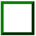
border:20px green;
border-style:solid;
}
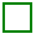
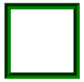
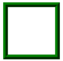
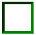
不同的border-style的值获得的效果是不同的
1.1、solid:定义实线
1.2、double:定义双线,双线的宽度等于 border-width 的值

1.3、dotted:定义点状边框,在大多数浏览器中呈现为实线

1.4、dashed:定义虚线,在大多数浏览器中呈现为实线

1.5、groove:定义 3D 凹槽边框,其效果取决于 border-color 的值
1.6、ridge:定义 3D 垄状边框,其效果取决于 border-color 的值
1.7、inset:定义 3D inset 边框,其效果取决于 border-color 的值
1.8、outset:定义 3D outset 边框,其效果取决于 border-color 的值
2、利用border作图——基本图形
基本的html文件,基本图形在这个html中的div上创造
<!DOCTYPE html>

<html>

<head>

<meta http-equiv="Content-Type" content="text/html; charset=UTF-8" />

<title>inline-block</title>

<style>

*{

    margin: 0;

    padding: 0;

}

div{

    margin:100px auto;

}

</style>

<link rel="stylesheet" href="styles.css" type="text/css"/>

</head>

<body>

<div>

</div>

</body>

</html>
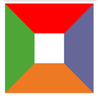
2.1、给不同的边框设置不同的颜色
div{

    width:100px;

    height:100px;

    border-top:100px solid red;

    border-bottom:100px solid orange;

    border-left:100px solid green;

    border-right:100px solid blue;

}
2.2、将DIV的宽高设置为0
div{

    width:0;

    height:0;

    border-top:100px solid red;

    border-bottom:100px solid orange;

    border-left:100px solid green;

    border-right:100px solid blue;

}

2.3、梯形
div{

    width:100px;

    height:0;

    font-size:0;

    line-height:0;

    overflow:hidden;

    border-bottom:100px solid orange;

    border-left:100px dashed transparent;

    border-right:100px dashed transparent;

}

2.4、三角形
/*

    切记高度和宽度都要设置为0,通过边框的width来控制三角形的大小

    通过调整不同方向的边框显示颜色和邻近的边框的透明可以得到不同方向上的等腰三角形

    或者

    可以设置两个邻近边框,一个显示颜色一个不显示颜色从而形成不同方向上的直角三角形

*/

/*等腰三角形*/

div{

    width:0;

    height:0;

    font-size:0;

    line-height:0;

    overflow:hidden;

    border-bottom:100px solid orange;

    border-left:100px dashed transparent;

    border-right:100px dashed transparent;

}

/*直角三角形*/

div{

    width:0;

    height:0;

    font-size:0;

    line-height:0;

    overflow:hidden;

    border-bottom:100px solid orange;

    border-left:100px dashed transparent;

}

3、利用border作图——特殊图形
3.1、叠加三角形
<div class=box>

    <span class="arrow_1"></span>

    <span class="arrow_2"></span>

</div>

<!--

    设置不同方向的两个三角形从而叠加出不同方向的三角形箭头

-->
.box{

    position:relative;

}

.box span{

    width:0;

    height:0;

    font-size:0;

    line-height:0;

    overflow:hidden;

    position:absolute;

}

span.arrow_1{

    border-top:20px solid #beceeb;

    border-left:20px dashed transparent;

    border-right:20px dashed transparent;

    left:80px;

    bottom:-20px;

    z-index:1;

}

span.arrow_2{

    border-top:20px solid #ffffff;

    border-left:20px dashed transparent;

    border-right:20px dashed transparent;

    left:80px;

    bottom:-13px;

    z-index:2;

}

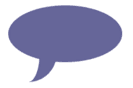
3.2、叠加两个相反方向的三角形
<div class="triangle-updown">

</div>
.triangle-updown {

    width: 0;

    height: 0;

    border-left: 50px solid transparent;

    border-right: 50px solid transparent;

    border-bottom: 100px solid #669;

    position: relative;

    margin-bottom: 50px

}

.triangle-updown:after {

    content: " ";

    width: 0;

    height: 0;

    border-left: 50px solid transparent;

    border-right: 50px solid transparent;

    border-top: 100px solid #669;

    position: absolute;

    top: 50px;

    left: -50px;

}

3.3、利用椭圆形的叠加形成心形
.heart {

    width: 160px;

    height: 200px;

    position: relative

}

.heart:before {

    content: " ";

    border: 0 solid transparent;

    -moz-border-radius: 100px;

    -webkit-border-radius: 100px;

    border-radius: 100px 100px 0 0;

    width: 80px;

    height: 120px;

    background: #669;

    -moz-transform: rotate(-45deg);

    -ms-transform: rotate(-45deg);

    -o-transform: rotate(-45deg);

    -webkit-transform: rotate(-45deg);

    position: absolute;

    left: 20px;

}

.heart:after {

    content: " ";

    border: 0 solid transparent;

    -moz-border-radius: 100px;

    -webkit-border-radius: 100px;

    border-radius: 100px 100px 0 0;

    width: 80px;

    height: 120px;

    background: #669;

    -moz-transform: rotate(45deg);

    -ms-transform: rotate(45deg);

    -o-transform: rotate(45deg);

    -webkit-transform: rotate(45deg);

    position: absolute;

    left: 48px;

    top: 0px;

}

3.4、椭圆提示泡
.oval-pop {

    width: 200px;

    height: 100px;

    background: #669;

    -moz-border-radius: 100px / 50px;

    -webkit-border-radius: 100px / 50px;

    border-radius: 100px / 50px;

    margin-bottom: 50px;

    position: relative

}

.oval-pop:after {

    content: "";

    border: 0 solid transparent;

    border-bottom: 30px solid #669;

    -moz-border-radius: 0 0 0 200px;

    -webkit-border-radius: 0 0 0 200px;

    border-radius: 0 0 0 200px;

    width: 50px;

    height: 50px;

    position: relative;

    margin-top: 20px;

    -webkit-transform: rotate(-90deg);

    -moz-transform: rotate(-90deg);

    -ms-transform: rotate(-90deg);

    -o-transform: rotate(-90deg);

    position: absolute;

    top: 50px;

    left: 20px

}
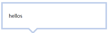
3.5、对话框1
<div class=box>

    <span class="arrow_1"></span>

    <span class="arrow_2"></span>

    hellos

</div>
.box{

    width:300px;

    padding:30px 20px;

    border:5px solid #beceeb;

    position:relative;

}

.box span{

    width:0;

    height:0;

    font-size:0;

    line-height:0;

    overflow:hidden;

    position:absolute;

}

span.arrow_1{

    border-top:20px solid #beceeb;

    border-left:20px dashed transparent;

    border-right:20px dashed transparent;

    left:80px;

    bottom:-20px;

    z-index:1;

}

span.arrow_2{

    border-top:20px solid #ffffff;

    border-left:20px dashed transparent;

    border-right:20px dashed transparent;

    left:80px;

    bottom:-13px;

    z-index:2;

}
3.6、对话框2——伪类
<div class=box>

    <span>hellos</span>

</div>
.box{

    width:300px;

    padding:30px 20px;

    border:5px solid #beceeb;

    position:relative;

}

.box:after,.box:before{

    content:'';

    width:0;

    height:0;

    font-size:0;

    line-height:0;

    overflow:hidden;

    position:absolute;

}

.box:after{

    border-top:20px solid #beceeb;

    border-left:20px dashed transparent;

    border-right:20px dashed transparent;

    left:80px;

    bottom:-20px;

    z-index:1;

}

.box:before{

    border-top:20px solid #ffffff;

    border-left:20px dashed transparent;

    border-right:20px dashed transparent;

    left:80px;

    bottom:-13px;

    z-index:2;

}

参考网址
https://www.cnblogs.com/wanghuih/p/5836635.html
http://www.cnblogs.com/pigtail/archive/2013/02/17/2914119.html
https://www.w3cplus.com/css/create-shapes-with-css
CSS边框作图的更多相关文章
- 理解CSS边框border
前面的话 边框是CSS盒模型属性中默默无闻的一个普通属性,CSS3的到来,但得边框属性重新焕发了光彩.本文将详细介绍CSS边框 基础样式 边框是一条以空格分隔的集合样式,包括边框粗细(边框宽度 ...
- 第 17 章 CSS 边框与背景[下]
学习要点: 1.设置背景 主讲教师:李炎恢 本章主要探讨 HTML5 中 CSS 边框和背景,通过边框和背景的样式设置,给元素增加更丰富的外观. 一.设置背景 盒模型的尺寸可以通过两种方式实现可见性, ...
- 第 17 章 CSS 边框与背景[上]
学习要点: 1.声明边框 2.边框样式 3.圆角边框 主讲教师:李炎恢 本章主要探讨 HTML5 中 CSS 边框和背景,通过边框和背景的样式设置,给元素增加更丰富的外观. 一.声明边框 边框的声明有 ...
- CSS 边框 阴影 效果
CSS 边框 阴影 效果 以下将css实现阴影效果,以便须要朋友们,直接上代码 #shadow1{ width: 200px; height: 100px; color: white; backgro ...
- CSS 边框
CSS 边框属性 CSS边框属性允许你指定一个元素边框的样式和颜色. 边框样式 边框样式属性指定要显示什么样的边界. border-style属性用来定义边框的样式 border-style 值: ...
- 第七十四节,css边框与背景
css边框与背景 学习要点: 1.声明边框 2.边框样式 3.圆角边框 本章主要探讨HTML5中CSS边框和背景,通过边框和背景的样式设置,给元素增加更丰富的外观. 声明边框 边框的声明有三个属性设 ...
- css边框小结
css边框 CSS对界面的分割如上图,他们的含义如下: contend:包含HTML元素中包含的文本,图像或其他媒体. padding:内容和边框之间的空格. 你可以想像这样的内在空间. ...
- CSS边框效果
前面的话 本文将详细介绍CSS边框效果 半透明边框 border:10px solid hsla(0, 0%, 100%,.5); background-clip:padding-box; 缝边效果 ...
- 复习-css边框和背景属性
css边框和背景属性 border:所有边框属性 border-width:四条边框的宽度 border-style:设置边框样式,主要有dotted.solid.double border-colo ...
随机推荐
- 解决xorm逆向mssql报datetime2不兼容的异常错误
xorm作为golang开发者的一大利器,深受大家的喜爱,可是最近在逆向mssql的时候,报了这么一个错误: 最后找了半天发现xorm没有预置DateTime2类型,经过几番折腾,在xorm源码的en ...
- 洛谷 P2021 faebdc玩扑克
P2021 faebdc玩扑克 题目背景 faebdc和zky在玩一个小游戏 题目描述 zky有n个扑克牌,编号从1到n,zky把它排成一个序列,每次把最上方的扑克牌放在牌堆底,然后把下一张扑克牌拿出 ...
- CCNP路由实验之十五 NAT(网络地址转换)
CCNP路由实验之十五 NAT(网络地址转换) 众所周知,要让自己的电脑连上Internet,必须要到运营商(ISP)申请一个上网账号,依据此账号申请自己的宽频业务(拨号上网.商业固定IP等等) ...
- android图片特效处理之图片叠加
这篇将讲到图片特效处理的图片叠加效果.跟前面一样是对像素点进行处理,可参照前面的android图像处理系列之七--图片涂鸦,水印-图片叠加和android图像处理系列之六--给图片添加边框(下)-图片 ...
- php学习笔记6
PHP 字符串变量 PHP 中的字符串变量 字符串变量用于包含有字符的值. 在创建字符串之后,我们就可以对它进行操作了.您可以直接在函数中使用字符串,或者把它存储在变量中. 在下面的实例中,我们创建一 ...
- Spider_req
requests模块 安装(用管理员身份去打开Anaconda Prompt) conda install requests python -m pip install requests # 以管理员 ...
- pycharm 配置autopep8(亲测可行)
autopep8是一个可以将Python代码自动排版为PEP8风格第三方包,使用它可以轻松地排版出格式优美整齐的代码.网络上有很多介绍如何在pycharm中配置autopep8的方案,但很多方案中还是 ...
- 洛谷 P1724 东风谷早苗
P1724 东风谷早苗 题目描述 在幻想乡,东风谷早苗是以高达控闻名的高中生宅巫女.某一天,早苗终于入手了最新款的钢达姆模型.作为最新的钢达姆,当然有了与以往不同的功能了,那就是它能够自动行走,厉害吧 ...
- HDU 3584 Cube (三维树状数组)
Problem Description Given an N*N*N cube A, whose elements are either 0 or 1. A[i, j, k] means the nu ...
- cookie记住用户名密码
<script src="js/jquery.cookie.js" type="text/javascript"></script> $ ...