CSS边框作图
原文
简书原文:https://www.jianshu.com/p/537a878304f2
大纲
1、border-style的值
2、利用border作图——基本图形
3、利用border作图——特殊图形
1、border-style的值
<!DOCTYPE html>

<html>

<head>

<meta http-equiv="Content-Type" content="text/html; charset=UTF-8" />

<title>inline-block</title>

<style>

*{

    margin: 0;

    padding: 0;

}

div{

    margin:100px auto;

}

</style>

<link rel="stylesheet" href="styles.css" type="text/css"/>

</head>

<body>

<div>

</div>

</body>

</html>
div{
width:100px;
height:100px;
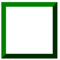
border:20px green;
border-style:solid;
}
不同的border-style的值获得的效果是不同的
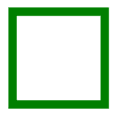
1.1、solid:定义实线
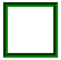
1.2、double:定义双线,双线的宽度等于 border-width 的值

1.3、dotted:定义点状边框,在大多数浏览器中呈现为实线

1.4、dashed:定义虚线,在大多数浏览器中呈现为实线

1.5、groove:定义 3D 凹槽边框,其效果取决于 border-color 的值
1.6、ridge:定义 3D 垄状边框,其效果取决于 border-color 的值
1.7、inset:定义 3D inset 边框,其效果取决于 border-color 的值
1.8、outset:定义 3D outset 边框,其效果取决于 border-color 的值
2、利用border作图——基本图形
基本的html文件,基本图形在这个html中的div上创造
<!DOCTYPE html>

<html>

<head>

<meta http-equiv="Content-Type" content="text/html; charset=UTF-8" />

<title>inline-block</title>

<style>

*{

    margin: 0;

    padding: 0;

}

div{

    margin:100px auto;

}

</style>

<link rel="stylesheet" href="styles.css" type="text/css"/>

</head>

<body>

<div>

</div>

</body>

</html>
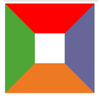
2.1、给不同的边框设置不同的颜色
div{

    width:100px;

    height:100px;

    border-top:100px solid red;

    border-bottom:100px solid orange;

    border-left:100px solid green;

    border-right:100px solid blue;

}
2.2、将DIV的宽高设置为0
div{

    width:0;

    height:0;

    border-top:100px solid red;

    border-bottom:100px solid orange;

    border-left:100px solid green;

    border-right:100px solid blue;

}

2.3、梯形
div{

    width:100px;

    height:0;

    font-size:0;

    line-height:0;

    overflow:hidden;

    border-bottom:100px solid orange;

    border-left:100px dashed transparent;

    border-right:100px dashed transparent;

}

2.4、三角形
/*

    切记高度和宽度都要设置为0,通过边框的width来控制三角形的大小

    通过调整不同方向的边框显示颜色和邻近的边框的透明可以得到不同方向上的等腰三角形

    或者

    可以设置两个邻近边框,一个显示颜色一个不显示颜色从而形成不同方向上的直角三角形

*/

/*等腰三角形*/

div{

    width:0;

    height:0;

    font-size:0;

    line-height:0;

    overflow:hidden;

    border-bottom:100px solid orange;

    border-left:100px dashed transparent;

    border-right:100px dashed transparent;

}

/*直角三角形*/

div{

    width:0;

    height:0;

    font-size:0;

    line-height:0;

    overflow:hidden;

    border-bottom:100px solid orange;

    border-left:100px dashed transparent;

}

3、利用border作图——特殊图形
3.1、叠加三角形
<div class=box>

    <span class="arrow_1"></span>

    <span class="arrow_2"></span>

</div>

<!--

    设置不同方向的两个三角形从而叠加出不同方向的三角形箭头

-->
.box{

    position:relative;

}

.box span{

    width:0;

    height:0;

    font-size:0;

    line-height:0;

    overflow:hidden;

    position:absolute;

}

span.arrow_1{

    border-top:20px solid #beceeb;

    border-left:20px dashed transparent;

    border-right:20px dashed transparent;

    left:80px;

    bottom:-20px;

    z-index:1;

}

span.arrow_2{

    border-top:20px solid #ffffff;

    border-left:20px dashed transparent;

    border-right:20px dashed transparent;

    left:80px;

    bottom:-13px;

    z-index:2;

}

3.2、叠加两个相反方向的三角形
<div class="triangle-updown">

</div>
.triangle-updown {

    width: 0;

    height: 0;

    border-left: 50px solid transparent;

    border-right: 50px solid transparent;

    border-bottom: 100px solid #669;

    position: relative;

    margin-bottom: 50px

}

.triangle-updown:after {

    content: " ";

    width: 0;

    height: 0;

    border-left: 50px solid transparent;

    border-right: 50px solid transparent;

    border-top: 100px solid #669;

    position: absolute;

    top: 50px;

    left: -50px;

}

3.3、利用椭圆形的叠加形成心形
.heart {

    width: 160px;

    height: 200px;

    position: relative

}

.heart:before {

    content: " ";

    border: 0 solid transparent;

    -moz-border-radius: 100px;

    -webkit-border-radius: 100px;

    border-radius: 100px 100px 0 0;

    width: 80px;

    height: 120px;

    background: #669;

    -moz-transform: rotate(-45deg);

    -ms-transform: rotate(-45deg);

    -o-transform: rotate(-45deg);

    -webkit-transform: rotate(-45deg);

    position: absolute;

    left: 20px;

}

.heart:after {

    content: " ";

    border: 0 solid transparent;

    -moz-border-radius: 100px;

    -webkit-border-radius: 100px;

    border-radius: 100px 100px 0 0;

    width: 80px;

    height: 120px;

    background: #669;

    -moz-transform: rotate(45deg);

    -ms-transform: rotate(45deg);

    -o-transform: rotate(45deg);

    -webkit-transform: rotate(45deg);

    position: absolute;

    left: 48px;

    top: 0px;

}

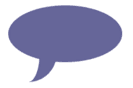
3.4、椭圆提示泡
.oval-pop {

    width: 200px;

    height: 100px;

    background: #669;

    -moz-border-radius: 100px / 50px;

    -webkit-border-radius: 100px / 50px;

    border-radius: 100px / 50px;

    margin-bottom: 50px;

    position: relative

}

.oval-pop:after {

    content: "";

    border: 0 solid transparent;

    border-bottom: 30px solid #669;

    -moz-border-radius: 0 0 0 200px;

    -webkit-border-radius: 0 0 0 200px;

    border-radius: 0 0 0 200px;

    width: 50px;

    height: 50px;

    position: relative;

    margin-top: 20px;

    -webkit-transform: rotate(-90deg);

    -moz-transform: rotate(-90deg);

    -ms-transform: rotate(-90deg);

    -o-transform: rotate(-90deg);

    position: absolute;

    top: 50px;

    left: 20px

}
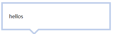
3.5、对话框1
<div class=box>

    <span class="arrow_1"></span>

    <span class="arrow_2"></span>

    hellos

</div>
.box{

    width:300px;

    padding:30px 20px;

    border:5px solid #beceeb;

    position:relative;

}

.box span{

    width:0;

    height:0;

    font-size:0;

    line-height:0;

    overflow:hidden;

    position:absolute;

}

span.arrow_1{

    border-top:20px solid #beceeb;

    border-left:20px dashed transparent;

    border-right:20px dashed transparent;

    left:80px;

    bottom:-20px;

    z-index:1;

}

span.arrow_2{

    border-top:20px solid #ffffff;

    border-left:20px dashed transparent;

    border-right:20px dashed transparent;

    left:80px;

    bottom:-13px;

    z-index:2;

}
3.6、对话框2——伪类
<div class=box>

    <span>hellos</span>

</div>
.box{

    width:300px;

    padding:30px 20px;

    border:5px solid #beceeb;

    position:relative;

}

.box:after,.box:before{

    content:'';

    width:0;

    height:0;

    font-size:0;

    line-height:0;

    overflow:hidden;

    position:absolute;

}

.box:after{

    border-top:20px solid #beceeb;

    border-left:20px dashed transparent;

    border-right:20px dashed transparent;

    left:80px;

    bottom:-20px;

    z-index:1;

}

.box:before{

    border-top:20px solid #ffffff;

    border-left:20px dashed transparent;

    border-right:20px dashed transparent;

    left:80px;

    bottom:-13px;

    z-index:2;

}

参考网址
https://www.cnblogs.com/wanghuih/p/5836635.html
http://www.cnblogs.com/pigtail/archive/2013/02/17/2914119.html
https://www.w3cplus.com/css/create-shapes-with-css
CSS边框作图的更多相关文章
- 理解CSS边框border
前面的话 边框是CSS盒模型属性中默默无闻的一个普通属性,CSS3的到来,但得边框属性重新焕发了光彩.本文将详细介绍CSS边框 基础样式 边框是一条以空格分隔的集合样式,包括边框粗细(边框宽度 ...
- 第 17 章 CSS 边框与背景[下]
学习要点: 1.设置背景 主讲教师:李炎恢 本章主要探讨 HTML5 中 CSS 边框和背景,通过边框和背景的样式设置,给元素增加更丰富的外观. 一.设置背景 盒模型的尺寸可以通过两种方式实现可见性, ...
- 第 17 章 CSS 边框与背景[上]
学习要点: 1.声明边框 2.边框样式 3.圆角边框 主讲教师:李炎恢 本章主要探讨 HTML5 中 CSS 边框和背景,通过边框和背景的样式设置,给元素增加更丰富的外观. 一.声明边框 边框的声明有 ...
- CSS 边框 阴影 效果
CSS 边框 阴影 效果 以下将css实现阴影效果,以便须要朋友们,直接上代码 #shadow1{ width: 200px; height: 100px; color: white; backgro ...
- CSS 边框
CSS 边框属性 CSS边框属性允许你指定一个元素边框的样式和颜色. 边框样式 边框样式属性指定要显示什么样的边界. border-style属性用来定义边框的样式 border-style 值: ...
- 第七十四节,css边框与背景
css边框与背景 学习要点: 1.声明边框 2.边框样式 3.圆角边框 本章主要探讨HTML5中CSS边框和背景,通过边框和背景的样式设置,给元素增加更丰富的外观. 声明边框 边框的声明有三个属性设 ...
- css边框小结
css边框 CSS对界面的分割如上图,他们的含义如下: contend:包含HTML元素中包含的文本,图像或其他媒体. padding:内容和边框之间的空格. 你可以想像这样的内在空间. ...
- CSS边框效果
前面的话 本文将详细介绍CSS边框效果 半透明边框 border:10px solid hsla(0, 0%, 100%,.5); background-clip:padding-box; 缝边效果 ...
- 复习-css边框和背景属性
css边框和背景属性 border:所有边框属性 border-width:四条边框的宽度 border-style:设置边框样式,主要有dotted.solid.double border-colo ...
随机推荐
- 让checkbox不选中
今天在做项目的时候.遇到一个问题.须要把选中的checkbox置空,即将选中的checkbox不选中. 最后,发现一个方法非常好使,特此记录. $("input[type='checkbox ...
- LeetCode OJ Basic Calculator II
Basic Calculator II 题目 思路 和这个一样:Basic Calculator I 代码 class ExpressionTransformation { public: strin ...
- Android控件开发之Gallery3D效果
package xiaosi.GalleryFlow; import android.app.Activity; import android.os.Bundle; public class Gall ...
- 65.十一级指针实现百万qq号的增删查改以及排序写入
运行结果: 内存使用情况: 写入文件排序好的数据: 创建文件地址以及创建十一级指针 char *path = "QQ.txt"; char *sortpath = "QQ ...
- Flume的client
Client:生产数据,运行在一个独立的线程.
- eclipse创建maven
第一步: 第二步 第三步: 第四步: 第五步: 第六步: <?xml version="1.0" encoding="UTF-8"?> <we ...
- Codeforces 451 E. Devu and Flowers(组合数学,数论,容斥原理)
传送门 解题思路: 假如只有 s 束花束并且不考虑 f ,那么根据隔板法的可重复的情况时,这里的答案就是 假如说只有一个 f 受到限制,其不合法时一定是取了超过 f 的花束 那么根据组合数,我们仍然可 ...
- Android Studio使用Mob来获取手机验证码的源码
本文来自:CSDN 感谢作者:qq_35812301(其实就是我的号!) 查看原文:http://blog.csdn.net/qq_35812301/article/details/79150775 ...
- View源码分析如何创建
本文来自http://blog.csdn.net/liuxian13183/ ,引用必须注明出处! 文/jj120522 博主导读:View是Android中最重要的控件,几乎所有的控件都与View相 ...
- [Javascript AST] 2. Introduction: Write a simple ESLint rule
What we want to do is checking if user write nested if statements which actually can combine to one: ...