
WPF中如何为ItemsControl添加ScrollViewer并显示ScrollBar
今天在开发的过程中突然碰到了一个问题,本来的意图是想当ItemsControl中加载的Item达到一定数量时,会出现ScrollViewer并出现垂直的滚动条,但是实际上并不能够达成目标,对于熟手来说这个问题非常简单,但是如果不了解WPF的模板的原理,可能并不清楚这些,这里举出一个例子来论证。
<Window x:Class="TestItemsControl.MainWindow"

        xmlns="http://schemas.microsoft.com/winfx/2006/xaml/presentation"

        xmlns:x="http://schemas.microsoft.com/winfx/2006/xaml"

        Title="MainWindow" Height="350" Width="525">

    <Window.Resources>

        <Style x:Key="ItemsControlStyle1" TargetType="{x:Type ItemsControl}">

            <Setter Property="Template">

                <Setter.Value>

                    <ControlTemplate TargetType="{x:Type ItemsControl}">

                        <Border BorderBrush="{TemplateBinding BorderBrush}"

                                BorderThickness="{TemplateBinding BorderThickness}"

                                Background="{TemplateBinding Background}"

                                Padding="{TemplateBinding Padding}" SnapsToDevicePixels="True">

                                <ItemsPresenter SnapsToDevicePixels="{TemplateBinding SnapsToDevicePixels}"/>

                        </Border>

                    </ControlTemplate>

                </Setter.Value>

            </Setter>

        </Style>

    </Window.Resources>

    <Grid>

        <ItemsControl Width="100"

                      Height="100"

                      Background="Teal"

                      Style="{DynamicResource ItemsControlStyle1}">

                <TextBox Text="1" Foreground="Red" Height="20" TextAlignment="Center"></TextBox>

                <TextBox Text="1" Foreground="Red" Height="20" TextAlignment="Center"></TextBox>

              <TextBox Text="2" Foreground="Red" Height="20" TextAlignment="Center"></TextBox>

              <TextBox Text="3" Foreground="Red" Height="20" TextAlignment="Center"></TextBox>

              <TextBox Text="4" Foreground="Red" Height="20" TextAlignment="Center"></TextBox>

              <TextBox Text="5" Foreground="Red" Height="20" TextAlignment="Center"></TextBox>

              <TextBox Text="6" Foreground="Red" Height="20" TextAlignment="Center"></TextBox>

        </ItemsControl>

    </Grid>

</Window>
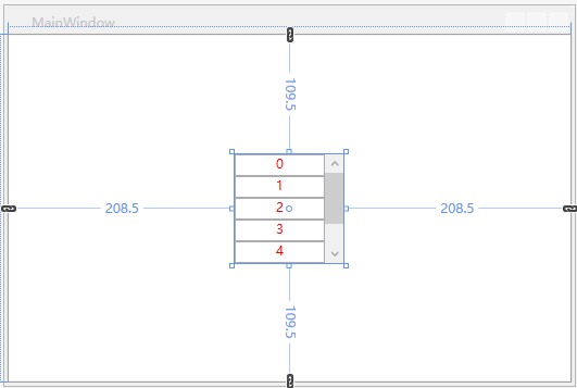
执行上述代码我们会发现不会出现ScrollBar,我们定义了ItemsControl的高度为100,当下面的Item超过了这个高度后多出的部分直接被剪切掉了,通过查看Window.Resources中的模板,那么我们可以很好理解,因为ItemsControl的结构是一个Border里面嵌套了一个ItemsPresenter,根本么有ScrollViewer,所以当然不会出现ScrollBar。这个问题非常好解决,直接修改ItemsControl的模板,在Border里面加上一个ScrollViewer,问题解决。
 <Style x:Key="ItemsControlStyle1" TargetType="{x:Type ItemsControl}">

            <Setter Property="Template">

                <Setter.Value>

                    <ControlTemplate TargetType="{x:Type ItemsControl}">

                        <Border BorderBrush="{TemplateBinding BorderBrush}"

                                BorderThickness="{TemplateBinding BorderThickness}"

                                Background="{TemplateBinding Background}"

                                Padding="{TemplateBinding Padding}" SnapsToDevicePixels="True">

                            <ScrollViewer>

                                <ItemsPresenter SnapsToDevicePixels="{TemplateBinding SnapsToDevicePixels}"/>

                            </ScrollViewer>

                        </Border>

                    </ControlTemplate>

                </Setter.Value>

            </Setter>

        </Style>
效果如下所示:
下面来一步步深入,讨论一些复杂的问题。
在进行最终的问题解释之前,首先来探讨一下ItemsControl这个控件。
MSDN的解释是:表示用于呈现的项的集合的控件。
再看一下它的集成关系:
System.Object
System.Windows.Threading.DispatcherObject
System.Windows.DependencyObject
System.Windows.Media.Visual
System.Windows.UIElement
System.Windows.FrameworkElement
System.Windows.Controls.Control
System.Windows.Controls.ItemsControl
System.Windows.Controls.HeaderedItemsControl
System.Windows.Controls.Primitives.DataGridCellsPresenter
System.Windows.Controls.Primitives.DataGridColumnHeadersPresenter
System.Windows.Controls.Primitives.MenuBase
System.Windows.Controls.Primitives.Selector
System.Windows.Controls.Primitives.StatusBar
System.Windows.Controls.Ribbon.RibbonContextualTabGroupItemsControl
System.Windows.Controls.Ribbon.RibbonControlGroup
System.Windows.Controls.Ribbon.RibbonGallery
System.Windows.Controls.Ribbon.RibbonQuickAccessToolBar
System.Windows.Controls.Ribbon.RibbonTabHeaderItemsControl
System.Windows.Controls.TreeView
通过这些继承关系,我们可以发现ItemsControl是很多包含Items的集合的控件的基类,比如ListBox还有TreeView等等。
关于ItemsControl中有几个非常重要的概念需要理解:
1 Template 这个不用说ItemsControl的模板,用于展现ItemsControl最终由什么构成,即外表呈现。
<ItemsControl.Template>

                                <ControlTemplate TargetType="ItemsControl">

                                    <ScrollViewer x:Name="scrollViewer"

                                                  VerticalScrollBarVisibility="Auto"

                                                  Padding="5">

                                        <ItemsPresenter ></ItemsPresenter>

                                    </ScrollViewer>

                                </ControlTemplate>

                            </ItemsControl.Template>
2 ItemsPanel属性,这个非常重要,这个是Items项的父容器,它决定了Items以何种方式去呈现,比如常用的Grid、 StackPanel、WrapPanel、UniformGrid、DockPanel等,甚至可以是自定义的Panel。
 <ItemsControl.ItemsPanel>

                                <ItemsPanelTemplate>

                                    <WrapPanel  Width="Auto"

                                                Height="Auto"

                                                MaxWidth="500"

                                                IsItemsHost="True"

                                                HorizontalAlignment="Left"

                                                VerticalAlignment="Center">

                                    </WrapPanel>

                                </ItemsPanelTemplate>

                            </ItemsControl.ItemsPanel>
3 ItemTemplate,这个属性表示每个Item将以何种方式呈现,有了这三种属性我们就可以定义我们需要的各种形式的界面。(下面的代码稍稍复杂一些)
<ItemsControl.ItemTemplate>
<DataTemplate>
<Grid Margin="0,0,10,3"
HorizontalAlignment="Left"
VerticalAlignment="Center">
<Grid.ColumnDefinitions>
<ColumnDefinition Width="*"></ColumnDefinition>
<ColumnDefinition Width="*"></ColumnDefinition>
</Grid.ColumnDefinitions>
<Grid.RowDefinitions>
<RowDefinition Height="*"></RowDefinition>
<RowDefinition Height="*"></RowDefinition>
</Grid.RowDefinitions>
<Border Name="DutyPerson"
Grid.Row="0"
Grid.RowSpan="2"
Grid.Column="0"
Grid.ColumnSpan="2"
BorderBrush="#bdbdbd"
BorderThickness="1"
Padding="0"
Width="70"
Height="32"
ContextMenu="{StaticResource SetLeader}">
<StackPanel>
<TextBox x:Name="dutyPersonTextBox"
Text="{Binding DutyPersonName,Mode=TwoWay,UpdateSourceTrigger=PropertyChanged}"
BorderThickness="0"
Height="30">
<TextBox.ToolTip>
<ToolTip HorizontalOffset="-18"
VerticalOffset="5"
BorderBrush="Transparent"
Background="Transparent"
HasDropShadow="False"
Placement="Top"
Visibility="{Binding IsLeader,Converter={StaticResource BoolToVisibility}}">
<Grid Margin="0">
<Image x:Name="personToolTipImage"
Stretch="Uniform"
RenderOptions.BitmapScalingMode="NearestNeighbor"
Width="88"
Height="36"
VerticalAlignment="Bottom"
Source="/AIPAnnouncement;component/ControlViews/Sources/Images/气泡.png">
</Image>
<TextBlock Text="领导"
FontSize="13"
HorizontalAlignment="Center"
VerticalAlignment="Center">
</TextBlock>
</Grid>
</ToolTip>
</TextBox.ToolTip>
<i:Interaction.Triggers>
<i:EventTrigger EventName="TextChanged">
<interactive:ExInvokeCommandAction Command="{Binding DataContext.ModifyDutyPersonCommand,RelativeSource={RelativeSource Mode=FindAncestor, AncestorType=my:AnnouncementApp}}"
CommandParameter="{Binding RelativeSource={RelativeSource Mode=FindAncestor, AncestorType=TextBox}}">
</interactive:ExInvokeCommandAction>
</i:EventTrigger>
<i:EventTrigger EventName="GotFocus">
<interactive:ExInvokeCommandAction Command="{Binding DataContext.TextBoxGotFocus,RelativeSource={RelativeSource Mode=FindAncestor, AncestorType=my:AnnouncementApp}}"
CommandParameter="{Binding RelativeSource={RelativeSource Mode=FindAncestor, AncestorType=TextBox}}">
</interactive:ExInvokeCommandAction>
</i:EventTrigger>
</i:Interaction.Triggers>
</TextBox>
<Popup x:Name="popup"
PlacementTarget="{Binding ElementName=dutyPersonTextBox}"
Width="{Binding ActualWidth,ElementName=dutyPersonTextBox}"
IsOpen="{Binding ElementName=dutyPersonTextBox,Path=IsKeyboardFocused, Mode=OneWay}"
StaysOpen="True">
<Grid Background="Red">
<ListBox x:Name="lb_selecthistorymembers"
SnapsToDevicePixels="true"
ItemsSource="{Binding DataContext.SpecificHistoryMembers,RelativeSource={RelativeSource Mode=FindAncestor,AncestorType=my:AnnouncementApp},Mode=TwoWay}"
HorizontalAlignment="Stretch"
ScrollViewer.HorizontalScrollBarVisibility="Disabled"
Background="#fff"
BorderThickness="1">
<i:Interaction.Triggers>
<i:EventTrigger EventName="SelectionChanged">
<interactive:ExInvokeCommandAction Command="{Binding DataContext.OnSelectHistoryMembersListBoxSelected,RelativeSource={RelativeSource Mode=FindAncestor,AncestorType=my:AnnouncementApp},Mode=TwoWay}"
CommandParameter="{Binding RelativeSource={RelativeSource Mode=FindAncestor, AncestorType=ListBox}}">
</interactive:ExInvokeCommandAction>
</i:EventTrigger>
</i:Interaction.Triggers>
<ListBox.ItemContainerStyle>
<Style TargetType="ListBoxItem">
<Setter Property="Template">
<Setter.Value>
<ControlTemplate TargetType="{x:Type ListBoxItem}">
<Border x:Name="Bd"
Height="Auto"
Width="Auto"
BorderBrush="{TemplateBinding BorderBrush}"
BorderThickness="0"
Background="{TemplateBinding Background}"
SnapsToDevicePixels="true">
<ContentPresenter HorizontalAlignment="{TemplateBinding HorizontalContentAlignment}"
SnapsToDevicePixels="{TemplateBinding SnapsToDevicePixels}"
VerticalAlignment="{TemplateBinding VerticalContentAlignment}"/>
</Border>
<ControlTemplate.Triggers>
<Trigger Property="IsEnabled"
Value="false">
<Setter Property="Foreground"
Value="{DynamicResource {x:Static SystemColors.GrayTextBrushKey}}"/>
</Trigger>
</ControlTemplate.Triggers>
</ControlTemplate>
</Setter.Value>
</Setter>
<Setter Property="HorizontalAlignment" Value="Stretch"></Setter>
<Setter Property="VerticalAlignment" Value="Center"></Setter>
<Setter Property="HorizontalContentAlignment" Value="Stretch"></Setter>
</Style>
</ListBox.ItemContainerStyle>
<ListBox.ItemsPanel>
<ItemsPanelTemplate>
<StackPanel IsItemsHost="True"
HorizontalAlignment="Left"
VerticalAlignment="Center"
Width="{Binding ActualWidth,ElementName=dutyPersonTextBox}"
>
</StackPanel>
</ItemsPanelTemplate>
</ListBox.ItemsPanel>
<ListBox.ItemTemplate>
<DataTemplate>
<Border Name="Border"
BorderThickness="0">
<Grid Margin="2,1,1,1">
<Label x:Name="label"
Content="{Binding SpecificHistoryDutyPersonName}"
HorizontalAlignment="Stretch"
HorizontalContentAlignment="Center"
FontSize="13">
</Label>
</Grid>
</Border>
<DataTemplate.Triggers>
<Trigger Property="IsMouseOver"
Value="true">
<Setter Property="Background"
Value="#00a3d9"
TargetName="Border">
</Setter>
<Setter Property="Background"
Value="#f8f3f0"
TargetName="label">
</Setter>
</Trigger>
</DataTemplate.Triggers>
</DataTemplate>
</ListBox.ItemTemplate>
</ListBox>
</Grid>
</Popup>
</StackPanel>
</Border> <xui:Button x:Name="deleteAnnouncementItem"
Grid.Row="0"
Grid.Column="1"
Height="14"
Width="14"
Opacity="0"
HorizontalAlignment="Right"
VerticalAlignment="Top">
<i:Interaction.Triggers>
<i:EventTrigger EventName="Click">
<interactive:ExInvokeCommandAction
Command="{Binding DataContext.DutyPersonDeleteCommand,RelativeSource={RelativeSource Mode=FindAncestor, AncestorType=my:AnnouncementApp}}"
CommandParameter="{Binding RelativeSource={RelativeSource Mode=FindAncestor, AncestorType=xui:Button}}">
</interactive:ExInvokeCommandAction>
</i:EventTrigger>
</i:Interaction.Triggers>
<Button.Background>
<ImageBrush ImageSource="/AIPAnnouncement;Component/ControlViews/Sources/Images/关闭.png">
</ImageBrush>
</Button.Background>
</xui:Button>
</Grid>
<DataTemplate.Triggers>
<DataTrigger Binding="{Binding IsLeader}"
Value="true">
<Setter Property="BorderBrush"
Value="#f00"
TargetName="DutyPerson">
</Setter>
</DataTrigger>
<Trigger Property="IsMouseOver"
Value="true"
SourceName="DutyPerson">
<Setter Property="BorderThickness"
Value="0"
TargetName="DutyPerson">
</Setter>
</Trigger>
<Trigger Property="IsMouseOver"
Value="true"
SourceName="deleteAnnouncementItem">
<Setter Property="Opacity"
Value="1"
TargetName="deleteAnnouncementItem">
</Setter>
</Trigger>
</DataTemplate.Triggers>
</DataTemplate>
</ItemsControl.ItemTemplate>
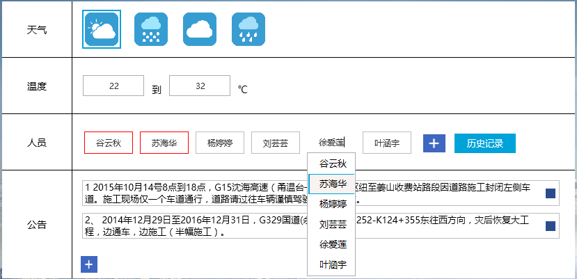
这里面的每一个Item定义成了类似于百度的搜索框一样的东西,当我们在文本输入框中输入文字时,会弹出一个Popup,里面是一个ListBox,我们可以从中挑选我们需要的选项,最后加入到TextBox中去,这里做了一个模板,在每一个TextBox下面添加一个Popup,当输入文字时会自动检索当前历史记录中是否存在当前项,这里面的核心是 IsOpen="{Binding ElementName=dutyPersonTextBox,Path=IsKeyboardFocused, Mode=OneWay}" StaysOpen=”true” 这句的意思表示当前的Popup是否打开是取决于dutyPersonTextBox(一个TextBox控件)是否获得鼠标的焦点,这里使用IsKeyboardFocused来表示鼠标是否获取到焦点,后面我们会看一看具体效果的图片。
刚开始的时候,没有很多思考,当自己定义ItemsControl的ItemsPanel时,给它赋了一个定值,这里就埋下了一个很大的隐患,所以我们在不断的往ItemsControl中添加Item的项时,ItemsControl的高度只会维持在70,因为Items的容器ItemsPanel的高度就决定了ItemsControl的高度,当超过这个高度的时候会自动地去剪裁掉多余的部分,这是WPF的一个基本机理,所以我们在设置ItemsPanel的容器WrapPanel的时候一定要将Height设置为Auto,这样我们就能看到ItemsPanel的高度自动增加,这是其中一个方面,另外一个方面就是当我们必须设置ItemsPanel的高度或者是其父容器的高度为一个固定值假设为FixHeight,这样当随着Item的项的增多,ItemsPanel容器的高度超过FixHeight时,我们就会发现ScrollBar会出现,这些东西都是需要我们去不断地思考和总结的一些结论。 WPF的这种机理在很多的地方都是可以看到的,例如当我们往WrapPanel中添加项目时,为了保证能够使添加的项自动添加到第二行,那么我们必须为WrapPanel设置一个宽度,这样当我们添加项时才会自动跳转到下一行,因为如果我们不设置这个值,默认的高度和宽度都是Auto,这个在使用中必须要十分注意,并且平时多积累,才能真正地学以致用。
今天就总结这么多,最后看一看最终的效果,其中第三行人员这一行就是使用ItemsControl做出来的效果。
WPF中如何为ItemsControl添加ScrollViewer并显示ScrollBar的更多相关文章
- easyui中如何为validatebox添加事件(onblur、onclick等)
在我们一般html的input标签,textbox事件可以直接使用onblur().onclick()事件,但是在easyui的validatebox没有onblur事件, 如果我们需要为valida ...
- idea中向pom.xml添加依赖时显示”not found dependency“
总结: 起因:再输入hibernate-core的version时,开始写的是对的,就是 5.0.11.Final(这个也是跟着教程来的),直接就报错了,左等右等没用,也点过maven的reimpor ...
- WPF中添加Winform用户自定义控件
过程:创建WPF工程->创建Winform用户自定义控件工程->WPF中引用控件->添加到Xaml页面 1.首先在WPF工程的解决方案上右击选择添加新建项目: 选择Windows窗体 ...
- 简述WPF中的画刷(Brush)
原文:简述WPF中的画刷(Brush) -------------------------------------------------------------------------------- ...
- WPF中, 启用添加到RichTextBox中的控件
原文:WPF中, 启用添加到RichTextBox中的控件 WPF中, 启用添加到RichTextBox中的控件 ...
- VS编程,WPF中两个滚动条 ScrollViewer 同步滚动的一种方法
原文:VS编程,WPF中两个滚动条 ScrollViewer 同步滚动的一种方法 版权声明:我不生产代码,我只是代码的搬运工. https://blog.csdn.net/qq_43307934/ar ...
- 在WPF中添加3D特性
原文:在WPF中添加3D特性 35.4 在WPF中添加3D特性 本节介绍WPF中的3D特性,其中包含了开始使用该特性的信息. 提示: WPF中的3D特性在System.Windows.Media.M ...
- WPF中ItemsControl应用虚拟化时找到子元素的方法
原文:WPF中ItemsControl应用虚拟化时找到子元素的方法 wpf的虚拟化技术会使UI的控件只初始化看的到的子元素, 而不是所有子元素都被初始化,这样会提高UI性能. 但是我们经常会遇到一个 ...
- WPF中TreeView控件数据绑定和后台动态添加数据(二)
写在前面:在(一)中,介绍了TreeView控件MVVM模式下数据绑定的方法.在这篇文章中,将总结给节点添加事件的方法,这样说有些不对,总之实现的效果就是点击某个节点,将出现对应于该节点的页面或者数据 ...
随机推荐
- [ZJOI2015]诸神眷顾的幻想乡
嘟嘟嘟 这题除了暴力我就不会了,感觉得用SAM,但是又和普通的SAM不一样. 看了题解才知道,这东西叫广义后缀自动机. 就是解决例如多个串的本质不同的子串的个数这样的问题. 做法就是每插入完一个串,就 ...
- Jenkins控制台显示乱码
方案: 解决控制台中文乱码问题: 点击左侧“系统管理”——右侧选择“系统设置”——“全局属性”,选择第一项:Environment variables,键值对列表,点击增加: 键:LANG 值:zh. ...
- P2690 接苹果 (DP)
补一下dp的思路: dp[i][j]表示第 i 分钟转 j 次所得到的最大值.很容易得到这个dp的推导式. 图中¢()函数表示成立为1, 不成立为0的函数. #include<cmath> ...
- SSH远程SOLARIS11时被拒绝
在虚拟机中新安装的solaris11,安装过程中配置了静态IP地址用以方便ssh连接,使用root用户ssh连接时,密码没有错,但总是提示密码被拒绝,连接established 代表是通的,telne ...
- 小技巧:改变 VS Code 工作区页面背景
效果图: 步骤(一): 1.点击页面左上角 文件/首选项/设置 2.在搜索框中输入:background 如下图. 3.找到 Background: Custom Images 选项并点击在 ...
- MySql 建表出现的问题:[ERR] 1064 - You have an error in your SQL syntax; check the manual.......
使用 MySql 建表出现的问题 在使用 Navicat Premium 运行 sql 语句进行建表时,MySQL 报错如下: 建表语句: DROP DATABASE IF EXISTS javawe ...
- redis学习(三)——List数据类型
一.概述 在Redis中,List类型是按照插入顺序排序的字符串链表.和数据结构中的普通链表一样,我们可以在其头部(left)和尾部(right)添加新的元素.在插入时,如果该键并不存在,R ...
- Ubuntu18.04安装Tensorflow
1.Ubuntu安装Python3.6: 首先拉取远程仓库 sudo add-apt-repository ppa:jonathonf/python-3.6 更新源 sudo apt-get upda ...
- scrapy 爬取糗事百科
安装scrapy conda install scrapy 创建scrapy项目 scrapy startproject qiubai 启动pycharm,发现新增加了qiubai这个目录 在spid ...
- MFC 坦克定位
最近学习MFC,写了个用键盘上下左右移动的坦克界面,效果图: 先用VC++新建一个最简单的MFC项目,基于Dialog的 1. 添加坦克图片资源:略 2. 添加3个变量:x, y, m_bitmap ...