
关于iPhone X 适配
直接上代码,具体原理自己搜索网上一大堆
<!DOCTYPE html>

<html>

<head>

    <meta name="viewport" content="initial-scale=1">

    <!--<meta name="viewport" content="initial-scale=1, viewport-fit=cover">-->

    <meta name="viewport" content="width=device-width,initial-scale=1.0, minimum-scale=1.0, maximum-scale=1.0, user-scalable=no, viewport-fit=cover">

    <!--<meta name="viewport" content="width=device-width, initial-scale=1.0, viewport-fit=cover">-->

    <title></title>

    <style>

        body {

            margin: 0;

            font-family: Helvetica;

            font-size: 16pt;

            -webkit-text-size-adjust: 100%;

            background-color: #eef;

            padding-top: env(safe-area-inset-top);

            padding-left: env(safe-area-inset-left);

            padding-right: env(safe-area-inset-right);

            padding-bottom: env(safe-area-inset-bottom);

        }

        * {

            box-sizing: border-box;

        }

        #topBar {

            background-color: #729fcf;

            padding: env(safe-area-inset-top) env(safe-area-inset-right) 0 env(safe-area-inset-left);

        }

        #topBar a {

            display: inline-block;

            height: 100%;

            padding: 12px;

            border-right: 3px solid rgba(255, 255, 255, 0.5);

            color: white;

            text-decoration: none;

            font-weight: bold;

            font-size: 18pt;

        }

        #topBar a:last-child {

            border-right: none;

        }

        #bottomBar {

            position: fixed;

            left: 0;

            right: 0;

            bottom: 0;

            background-color: #3465a4;

            text-align: center;

            padding: 8px;

            padding-left: env(safe-area-inset-left);

            padding-right: env(safe-area-inset-right);

            padding-bottom: env(safe-area-inset-bottom);

        }

        #bottomBar a {

            padding: 0 24px;

            color: white;

            font-size: 12pt;

            text-decoration: none;

        }

        h1 {

            margin: 12px 0 0 0;

        }

        h2 {

            color: #aaa;

            font-size: 12pt;

            text-align: left;

            margin: 0;

        }

        .post {

            width: 100%;

            margin-bottom: 50px;

            padding: 12px;

            padding-left: env(safe-area-inset-left);

            padding-right: env(safe-area-inset-right);

        }

        .post p:first-child {

            margin: 0;

        }

    </style>

</head>

<body>

<div id="topBar"><a href="#">Blog</a><a href="#">Photos</a><a href="#">Projects</a></div>

<div class="post">

    <h1>Welcome</h1>

    <h2>two hours ago</h2>

    <p>Hi!</p>

    <p>Welcome to my sample blog!</p>

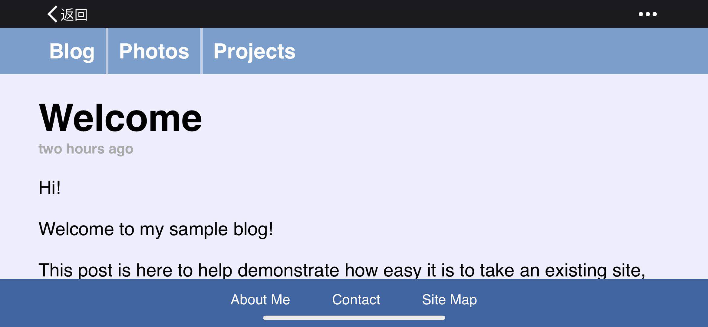
    <p>This post is here to help demonstrate how easy it is to take an existing site, along with full-width bars and fixed-position elements, and make it take full advantage of iPhone X's edge-to-edge display.</p>

    <p>The actual post describing how to adopt the new API is over on the <a href="https://webkit.org/blog/7929/designing-websites-for-iphone-x/">WebKit blog</a>.</p>

    <p>There, you will learn all about new WebKit features, including <code>viewport-fit</code>, <code>constant()</code>, safe area insets, and <code>min()</code> and <code>max()</code>.</p>

    <p>There, you will learn all about new WebKit features, including <code>viewport-fit</code>, <code>constant()</code>, safe area insets, and <code>min()</code> and <code>max()</code>.</p>

    <p>There, you will learn all about new WebKit features, including <code>viewport-fit</code>, <code>constant()</code>, safe area insets, and <code>min()</code> and <code>max()</code>.</p>

    <p>There, you will learn all about new WebKit features, including <code>viewport-fit</code>, <code>constant()</code>, safe area insets, and <code>min()</code> and <code>max()</code>.</p>

    <p>There, you will learn all about new WebKit features, including <code>viewport-fit</code>, <code>constant()</code>, safe area insets, and <code>min()</code> and <code>max()</code>.</p>

    <p>There, you will learn all about new WebKit features, including <code>viewport-fit</code>, <code>constant()</code>, safe area insets, and <code>min()</code> and <code>max()</code>.</p>

    <p>There, you will learn all about new WebKit features, including <code>viewport-fit</code>, <code>constant()</code>, safe area insets, and <code>min()</code> and <code>max()</code>.</p>

    <p>There, you will learn all about new WebKit features, including <code>viewport-fit</code>, <code>constant()</code>, safe area insets, and <code>min()</code> and <code>max()</code>.</p>

    <p>There, you will learn all about new WebKit features, including <code>viewport-fit</code>, <code>constant()</code>, safe area insets, and <code>min()</code> and <code>max()</code>.</p>

    <p>There, you will learn all about new WebKit features, including <code>viewport-fit</code>, <code>constant()</code>, safe area insets, and <code>min()</code> and <code>max()</code>.</p>

    <p>There, you will learn all about new WebKit features, including <code>viewport-fit</code>, <code>constant()</code>, safe area insets, and <code>min()</code> and <code>max()</code>.</p>

    <p>There, you will learn all about new WebKit features, including <code>viewport-fit</code>, <code>constant()</code>, safe area insets, and <code>min()</code> and <code>max()</code>.</p>

    <p>There, you will learn all about new WebKit features, including <code>viewport-fit</code>, <code>constant()</code>, safe area insets, and <code>min()</code> and <code>max()</code>.</p>

    <p>There, you will learn all about new WebKit features, including <code>viewport-fit</code>, <code>constant()</code>, safe area insets, and <code>min()</code> and <code>max()</code>.</p>

    <p>There, you will learn all about new WebKit features, including <code>viewport-fit</code>, <code>constant()</code>, safe area insets, and <code>min()</code> and <code>max()</code>.</p>

    <p>There, you will learn all about new WebKit features, including <code>viewport-fit</code>, <code>constant()</code>, safe area insets, and <code>min()</code> and <code>max()</code>.</p>

    <p>There, you will learn all about new WebKit features, including <code>viewport-fit</code>, <code>constant()</code>, safe area insets, and <code>min()</code> and <code>max()</code>.</p>

    <p>There, you will learn all about new WebKit features, including <code>viewport-fit</code>, <code>constant()</code>, safe area insets, and <code>min()</code> and <code>max()</code>.</p>

    <p>There, you will learn all about new WebKit features, including <code>viewport-fit</code>, <code>constant()</code>, safe area insets, and <code>min()</code> and <code>max()</code>.</p>

    <p>There, you will learn all about new WebKit features, including <code>viewport-fit</code>, <code>constant()</code>, safe area insets, and <code>min()</code> and <code>max()</code>.</p>

    <p>There, you will learn all about new WebKit features, including <code>viewport-fit</code>, <code>constant()</code>, safe area insets, and <code>min()</code> and <code>max()</code>.</p>

    <p>There, you will learn all about new WebKit features, including <code>viewport-fit</code>, <code>constant()</code>, safe area insets, and <code>min()</code> and <code>max()</code>.</p>

    <p>There, you will learn all about new WebKit features, including <code>viewport-fit</code>, <code>constant()</code>, safe area insets, and <code>min()</code> and <code>max()</code>.</p>

    <p>I hope that it helps you adopt these new features in your websites.</p>

</div>

<div id="bottomBar"><a href="#">About Me</a><a href="#">Contact</a><a href="#">Site Map</a></div>

</body>

</html>

关于iPhone X 适配的更多相关文章
- iOS开发点滴:iPhone屏幕适配
最近开始做iOS开发,遇到一些小问题和解决方法,记录下. 今天是iPhone屏幕适配 iPhone5出来之后屏幕就有iPhone就有了2种尺寸:3.5寸和4寸,xcode 5 的IB设计器里面界面 ...
- 大屏iPhone的适配 +iOS 图片尺寸要求
摘自:http://blog.ibireme.com/2014/09/16/adapted_to_iphone6/ 苹果公司官网设计介绍到:Retina显示屏的超高像素密度已超过人眼能分辨的范围.Re ...
- iOS 11 & iPhone X 适配资料集
本文主要简单谈谈并收集一些关于 iOS 11 & iPhone X 的适配及设计指南. iPhone X 众所周知,iPhone X 屏幕与其他的 iPhone 设备均不同,苹果称 iPhon ...
- 混合式App开发 Apicloud 官方iPhone X 适配
iPhone X 适配 由于iPhone X的特殊造型,为了方便开发者对iPhone X进行适配,苹果在iOS 11中引入了Safe Area的概念,引擎也在api对象下添加了safeArea属性和s ...
- 微信小程序中的iPhone X适配问题
微信小程序中的iPhone X适配问题 小程序中下方的导航会被iPhone X下面的那条黑线盖住[微笑脸],所以要专门为了iPhone X做样式上的适配[微笑脸] wx.getSystemInfo({ ...
- 移动端iPhone系列适配问题的一些坑
完成移动端的开发项目之后,发现谷歌自带的调试器似乎没有什么太大的作用,整天借同事的苹果手机测bug,尽管同事不厌其烦,但还是觉得这iPhone系列适配问题适配到想逃逃逃,好在项目已经顺利完成,测试通过 ...
- iOS - iPhone屏幕适配/启动图适配/APP图标适配(iPhone最全尺寸包含iPhoneX/XR/XS/XS Max等)
趁iPhone新品还没有发布,先整理一下屏幕适配.启动图适配.APP图标适配的笔记,方便以后查阅: 注:部分图片来源于网络 违删; (一)iPhone屏幕适配: (1)屏幕分辨率: ①设计尺寸规范(表 ...
- iPhone屏幕适配,历史及现状(http://hjcapple.github.io/2014/10/10/iphone-screen.html)
iPhone屏幕适配,历史及现状 初代iPhone 2007年,初代iPhone发布,屏幕的宽高是320×480像素.下文也是按照宽度,高度的顺序排列.这个分辨率一直到iPhone 3GS的也保持不变 ...
- iPhone X适配方案
iPhone X适配方案 https://github.com/Wscats/iPhone-X 绝对长度单位 英寸 厘米 毫米 磅 pc inch cm mm pt pica 相对长度单位 是网页设计 ...
- ipad和iphone的适配
关于xib或者storybord下iphone的横竖屏的适配以及ipad的适配 ios8出现了Size Classes,解决了各种屏幕适配的问题,他把屏幕的宽和高分别分成了三种,把屏幕总共分成了九种情 ...
随机推荐
- treeMultiselect 去掉勾选项
场景描述:弹窗,显示树形结构,节点层次可变(可只有一级节点,也可是多级节点),限制只能选择一个节点! 1.修改jquery.tree-multiselect.min.js 文件 2.前台页面 参考代码 ...
- 异常【kubelet cgroup driver:cgroupfs跟docker cgroup driver:systemd不一致】
修改docker.service vi /lib/systemd/system/docker.service 找到 --exec-opt native.cgroupdriver=systemd \ 修 ...
- Ubuntu 18.04 LTS版本 GIMP安装
为何安装? GIMP全称GNU Image Manipulation Program,是Linux下的一款图片处理软件,功能基本完备,用户体验不错. 如何安装? 命令:sudo apt install ...
- head引入样式
引入CSS(base基础样式,index页面样式): <link rel="stylesheet" type="text/css" href=" ...
- ubuntu安装mysql数据库方法
ubuntu基于linux的免费开源桌面PC操作系统,十分契合英特尔的超极本定位,支持x86.64位和ppc架构.一个比较流行的Linux操作系统,不仅简单易用,而且和Windows相容性非常好.那么 ...
- UI5-技术篇-Hybrid App-3-jsbin百度地图
今天研究了下如何在SAPUI5中加载百度地图,现将相关过程进行备注. 1.实现思路 1.1了解百度地图相关应用过程 A.百度地图申请应用AK:http://lbsyun.baidu.com/apico ...
- SIM7000C TCP
SIM7000C是基于高通MDM9206平台开发LTE CAT M1(eMTC) 和NB-IoT模块,能支持LTETDD/LTE-FDD/GSM/GPRS/EDGE多个频段,上下行数据流量峰值达到37 ...
- iOS应用状态保存和恢复
当应用被后台Kill掉的时候希望从后台返回的时候显示进入后台之前的内容 在Appdelegate中设置 - (BOOL)application:(UIApplication *)application ...
- netaddr网络地址工具python
print("==========1==========") from netaddr import IPNetwork # IPNetwork('192.168.7.80/30' ...
- JSP页面嵌套c:forEach
做java web项目有时候会需要在页面使用嵌套<c:forEach>遍历一个List,但是嵌套很容易忽略一些东西导致出错 后台代码: List<Map<String, Obj ...