css3学习笔记之图片
圆角图片
border-radius:
|
1
2
3
4
5
6
7
8
9
10
11
12
13
14
15
16
17
18
|
<!DOCTYPE html><html><head><style>img { border-radius: 8px;}</style></head><body><h2>圆角图片</h2><p>使用 border-radius 属性来创建圆角图片:</p><img src="paris.jpg" alt="Paris" width="400" height="300"></body></html> |

|
1
2
3
4
5
6
7
8
9
10
11
12
13
14
15
16
17
18
|
<!DOCTYPE html><html><head><style>img { border-radius: 50%;}</style></head><body><h2>椭圆形图片</h2><p>使用 border-radius 属性来创建椭圆形图片:</p><img src="paris.jpg" alt="Paris" width="400" height="300"></body></html> |

缩略图
|
1
2
3
4
5
6
7
8
9
10
11
12
13
14
15
16
17
18
19
20
|
<!DOCTYPE html><html><head><style>img { border: 1px solid red; border-radius: 4px; padding: 5px;}</style></head><body><h2>缩略图</h2><p>我们使用 border 属性来创建缩略图。</p><img src="paris.jpg" alt="Paris" width="400" height="300"></body></html> |

响应式图片
响应式图片会自动适配各种尺寸的屏幕。
|
1
2
3
4
5
6
7
8
9
10
11
12
13
14
15
16
17
18
19
20
|
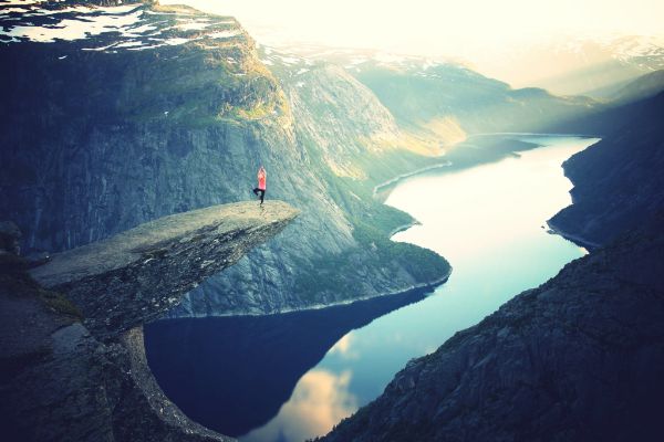
<!DOCTYPE html><html><head><style>img { max-width: 100%; height: auto;}</style></head><body><h2>响应式图片</h2><p>响应式图片会自动适配各种尺寸的屏幕。</p><p>通过重置浏览器大小查看效果:</p><img src="http://www.runoob.com/wp-content/uploads/2016/04/trolltunga.jpg" alt="Norway" width="1000" height="300"></body></html> |

图片文本
|
1
2
3
4
5
6
7
8
9
10
11
12
13
14
15
16
17
18
19
20
21
22
23
24
25
26
27
28
29
30
31
32
33
34
35
36
37
38
39
40
41
42
43
44
45
46
47
48
49
50
51
52
53
54
55
56
57
58
59
60
61
62
63
64
65
66
67
68
|
<!DOCTYPE html><html><head><style>.container { position: relative;}.topleft { position: absolute; top: 8px; left: 16px; font-size: 18px;}.topright { position: absolute; top: 8px; right: 16px; font-size: 18px;}.bottomleft { position: absolute; bottom: 8px; left: 16px; font-size: 18px;}.bottomright { position: absolute; bottom: 8px; right: 16px; font-size: 18px;}.center { position: absolute; left: 0; top: 50%; width: 100%; text-align: center; font-size: 18px;}img { width: 100%; height: auto; opacity: 0.3;}</style></head><body><h2>图片文本</h2><p>在图片左上角添加文本信息:</p><div class="container"> <img src="http://www.runoob.com/wp-content/uploads/2016/04/trolltunga.jpg" alt="Norway" width="1000" height="300"> <div class="topleft">左上角</div> <div class="topright">右上角</div> <div class="bottomleft">左下角</div> <div class="bottomright">右下角</div> <div class="center">居中</div></div></body></html> |

卡片式图片
|
1
2
3
4
5
6
7
8
9
10
11
12
13
14
15
16
17
18
19
20
21
22
23
24
25
26
27
28
29
30
|
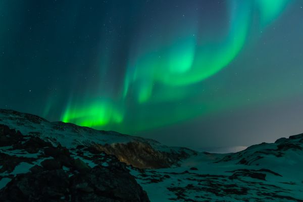
<!DOCTYPE html><html><head><style>body {margin:25px;}div.polaroid { width: 80%; background-color: white; box-shadow: 0 4px 8px 0 rgba(0, 0, 0, 0.2), 0 6px 20px 0 rgba(0, 0, 0, 0.19); margin-bottom: 25px;}div.container { text-align: center; padding: 10px 20px;}</style></head><body><div class="polaroid"> <img src="lights600x400.jpg" alt="Norway" style="width:100%"> <div class="container"> <p>Northern Lights in Norway</p> </div></div></body></html> |

图片滤镜
|
1
2
3
4
5
6
7
8
9
10
11
12
13
14
15
16
17
18
19
20
21
22
23
24
25
26
27
28
29
30
31
32
33
34
35
36
37
38
39
40
41
|
<!DOCTYPE html><html><head><style>img { width: 33%; height: auto; float: left; max-width: 235px;}.blur {-webkit-filter: blur(4px);filter: blur(4px);}.brightness {-webkit-filter: brightness(250%);filter: brightness(250%);}.contrast {-webkit-filter: contrast(180%);filter: contrast(180%);}.grayscale {-webkit-filter: grayscale(100%);filter: grayscale(100%);}.huerotate {-webkit-filter: hue-rotate(180deg);filter: hue-rotate(180deg);}.invert {-webkit-filter: invert(100%);filter: invert(100%);}.opacity {-webkit-filter: opacity(50%);filter: opacity(50%);}.saturate {-webkit-filter: saturate(7); filter: saturate(7);}.sepia {-webkit-filter: sepia(100%);filter: sepia(100%);}.shadow {-webkit-filter: drop-shadow(8px 8px 10px green);filter: drop-shadow(8px 8px 10px green);}</style></head><body><p><strong>注意:</strong> Internet Explorer <span lang="no-bok">或 Safari 5.1 (及更早版本)</span> 不支持该属性。</p><img src="pineapple.jpg" alt="Pineapple" width="300" height="300"><img class="blur" src="pineapple.jpg" alt="Pineapple" width="300" height="300"><img class="brightness" src="pineapple.jpg" alt="Pineapple" width="300" height="300"><img class="contrast" src="pineapple.jpg" alt="Pineapple" width="300" height="300"><img class="grayscale" src="pineapple.jpg" alt="Pineapple" width="300" height="300"><img class="huerotate" src="pineapple.jpg" alt="Pineapple" width="300" height="300"><img class="invert" src="pineapple.jpg" alt="Pineapple" width="300" height="300"><img class="opacity" src="pineapple.jpg" alt="Pineapple" width="300" height="300"><img class="saturate" src="pineapple.jpg" alt="Pineapple" width="300" height="300"><img class="sepia" src="pineapple.jpg" alt="Pineapple" width="300" height="300"><img class="shadow" src="pineapple.jpg" alt="Pineapple" width="300" height="300"></body></html> |


响应式图片相册
|
1
2
3
4
5
6
7
8
9
10
11
12
13
14
15
16
17
18
19
20
21
22
23
24
25
26
27
28
29
30
31
32
33
34
35
36
37
38
39
40
41
42
43
44
45
46
47
48
49
50
51
52
53
54
55
56
57
58
59
60
61
62
63
64
65
66
67
68
69
70
71
72
73
74
75
76
77
78
79
80
81
82
83
84
85
86
87
88
89
90
91
92
93
94
95
96
97
98
99
100
101
102
|
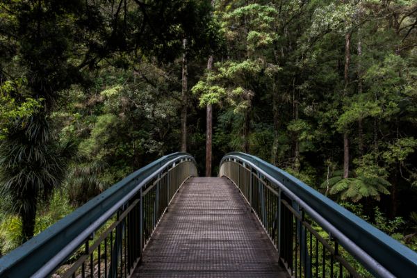
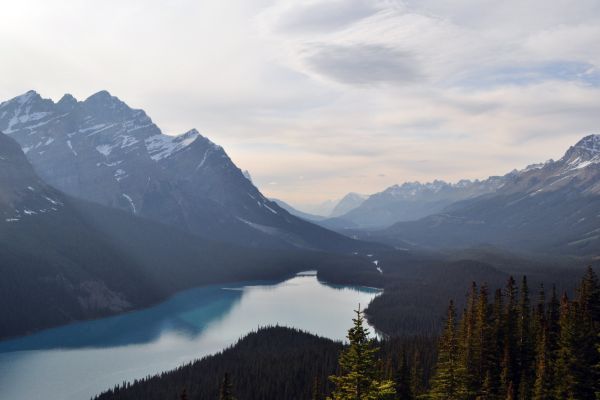
<!DOCTYPE html><html><head><style>div.img { border: 1px solid #ccc;}div.img:hover { border: 1px solid #777;}div.img img { width: 100%; height: auto;}div.desc { padding: 15px; text-align: center;}* { box-sizing: border-box;}.responsive { padding: 0 6px; float: left; width: 24.99999%;}@media only screen and (max-width: 700px){ .responsive { width: 49.99999%; margin: 6px 0; }}@media only screen and (max-width: 500px){ .responsive { width: 100%; }}.clearfix:after { content: ""; display: table; clear: both;}</style></head><body><h2 style="text-align:center">响应式图片相册</h2><div class="responsive"> <div class="img"> <a target="_blank" href="img_fjords.jpg"> <img src="http://www.runoob.com/wp-content/uploads/2016/04/img_fjords.jpg" alt="Trolltunga Norway" width="300" height="200"> </a> <div class="desc">Add a description of the image here</div> </div></div><div class="responsive"> <div class="img"> <a target="_blank" href="img_forest.jpg"> <img src="http://www.runoob.com/wp-content/uploads/2016/04/img_forest.jpg" alt="Forest" width="600" height="400"> </a> <div class="desc">Add a description of the image here</div> </div></div><div class="responsive"> <div class="img"> <a target="_blank" href="img_lights.jpg"> <img src="http://www.runoob.com/wp-content/uploads/2016/04/img_lights.jpg" alt="Northern Lights" width="600" height="400"> </a> <div class="desc">Add a description of the image here</div> </div></div><div class="responsive"> <div class="img"> <a target="_blank" href="img_mountains.jpg"> <img src="http://www.runoob.com/wp-content/uploads/2016/04/img_mountains.jpg" alt="Mountains" width="600" height="400"> </a> <div class="desc">Add a description of the image here</div> </div></div><div class="clearfix"></div><div style="padding:6px;"> <h4>重置浏览器大小查看效果</h4></div></body></html> |


图片 Modal(模态)
本实例演示了如何结合 CSS 和 JavaScript 来一起渲染图片。
首先,我们使用 CSS 来创建 modal 窗口 (对话框), 默认是隐藏的。
然后,我们使用 JavaScript 来显示模态窗口,当我们点击图片时,图片会在弹出的窗口中显示:
|
1
2
3
4
5
6
7
8
9
10
11
12
13
14
15
16
17
18
19
20
21
22
23
24
25
26
27
28
29
30
31
32
33
34
35
36
37
38
39
40
41
42
43
44
45
46
47
48
49
50
51
52
53
54
55
56
57
58
59
60
61
62
63
64
65
66
67
68
69
70
71
72
73
74
75
76
77
78
79
80
81
82
83
84
85
86
87
88
89
90
91
92
93
94
95
96
97
98
99
100
101
102
103
104
105
106
107
108
109
110
111
112
113
114
115
116
117
118
119
120
121
122
123
124
125
126
127
128
129
130
131
132
|
<!DOCTYPE html><html><head><style>#myImg { border-radius: 5px; cursor: pointer; transition: 0.3s;}#myImg:hover {opacity: 0.7;}/* The Modal (background) */.modal { display: none; /* Hidden by default */ position: fixed; /* Stay in place */ z-index: 1; /* Sit on top */ padding-top: 100px; /* Location of the box */ left: 0; top: 0; width: 100%; /* Full width */ height: 100%; /* Full height */ overflow: auto; /* Enable scroll if needed */ background-color: rgb(0,0,0); /* Fallback color */ background-color: rgba(0,0,0,0.9); /* Black w/ opacity */}/* Modal Content (image) */.modal-content { margin: auto; display: block; width: 80%; max-width: 700px;}/* Caption of Modal Image */#caption { margin: auto; display: block; width: 80%; max-width: 700px; text-align: center; color: #ccc; padding: 10px 0; height: 150px;}/* Add Animation */.modal-content, #caption { -webkit-animation-name: zoom; -webkit-animation-duration: 0.6s; animation-name: zoom; animation-duration: 0.6s;}@-webkit-keyframes zoom { from {-webkit-transform: scale(0)} to {-webkit-transform: scale(1)}}@keyframes zoom { from {transform: scale(0.1)} to {transform: scale(1)}}/* The Close Button */.close { position: absolute; top: 15px; right: 35px; color: #f1f1f1; font-size: 40px; font-weight: bold; transition: 0.3s;}.close:hover,.close:focus { color: #bbb; text-decoration: none; cursor: pointer;}/* 100% Image Width on Smaller Screens */@media only screen and (max-width: 700px){ .modal-content { width: 100%; }}</style></head><body><h2>图片模态框</h2><p>本实例演示了如何结合 CSS 和 JavaScript 来一起渲染图片。</p><p>首先,我们使用 CSS 来创建 modal 窗口 (对话框), 默认是隐藏的。<p><p>然后,我们使用 JavaScript 来显示模态窗口,当我们点击图片时,图片会在弹出的窗口中显示:</p><img id="myImg" src="http://www.runoob.com/wp-content/uploads/2016/04/img_lights.jpg" alt="Northern Lights, Norway" width="300" height="200"><!-- The Modal --><div id="myModal" class="modal"> <span class="close">×</span> <img class="modal-content" id="img01"> <div id="caption"></div></div><script>// 获取模态窗口var modal = document.getElementById('myModal');// 获取图片模态框,alt 属性作为图片弹出中文本描述var img = document.getElementById('myImg');var modalImg = document.getElementById("img01");var captionText = document.getElementById("caption");img.onclick = function(){ modal.style.display = "block"; modalImg.src = this.src; modalImg.alt = this.alt; captionText.innerHTML = this.alt;}// 获取 <span> 元素,设置关闭模态框按钮var span = document.getElementsByClassName("close")[0];// 点击 <span> 元素上的 (x), 关闭模态框span.onclick = function() { modal.style.display = "none";}</script></body></html> |


css3学习笔记之图片的更多相关文章
- CSS3学习笔记(3)-CSS3边框
p{ font-size: 15px; } .alexrootdiv>div{ background: #eeeeee; border: 1px solid #aaa; width: 99%; ...
- [置顶] iOS学习笔记47——图片异步加载之EGOImageLoading
上次在<iOS学习笔记46——图片异步加载之SDWebImage>中介绍过一个开源的图片异步加载库,今天来介绍另外一个功能类似的EGOImageLoading,看名字知道,之前的一篇学习笔 ...
- CSS3学习笔记之linear-gradient
我觉得CSS3很不错,自己也稍微看过,并且尝试过一些属性.对我自己而言,我没有勇气说我学过CSS3,我觉得任何自己看来很小的事情,也只是站在自己的角度来评判.就算的是"简单的"HT ...
- Webpack4 学习笔记五 图片解析、输出的文件划分目录
前言 此内容是个人学习笔记,以便日后翻阅.非教程,如有错误还请指出 webpack打包图片和划分文件路径 使用图片的方式 通过 new Image() 在 css中设置 background-imag ...
- CSS3 学习笔记(边框 背景 字体 图片 旋转等)
边框 盒子圆角 border-radius:5px / 20%: border-radius:5px 4px 3px 2px; 左上,右上,右下,左下 盒子阴影 box-shadow:box-shad ...
- CSS3学习笔记1-选择器和新增属性
前言:之前自学了一些关于CSS3的知识,在学习过程中也遇到过坑,不过总算磕磕绊绊的学习完了关于CSS3的相关知识,于是最近把之前的笔记和代码整理了一下,也算是一个对CSS3知识的回顾复习吧,也希望能够 ...
- HTML5+CSS3学习笔记(二) 页面布局:HTML5新元素及其特性
HTML5的语义化标签以及属性,可以让开发者非常方便地实现清晰的web页面布局,加上CSS3的效果渲染,快速建立丰富灵活的web页面显得非常简单. 本次学习HTML5的新标签元素有: <head ...
- 我的CSS3学习笔记
1.元字符使用: []: 全部可选项 ||:并列 |:多选一 ?: 0个或者一个 *:0个或者多个 {}: 范围 2.CSS3属性选择器: E[attr]:存在attr属性即可: E[attr=val ...
- html5和css3学习笔记
HTML5针对移动端,移动端的浏览器主要是chrome,是webkit内核; app(applicatin):应用; native app:原生的app sadsadsadad 单标签可以省略结尾标记 ...
随机推荐
- HDU 1999 不可摸数
/* 中文题意: 中文翻译: 题目大意:见红字(例如以下) 解题思路:打表,将每一个数的合数之和存在一个数组之中 难点具体解释:用两个for循环写的,第二个for循环主要是解释两个数相乘不超过这个最大 ...
- ios开发——实用技术篇Swift篇&多点触摸与手势识别
多点触摸与手势识别 //点击事件 var atap = UITapGestureRecognizer(target: self, action: "tapDo:") self.vi ...
- C/C++产生随机数
<一> C/C++如何产生随机数:这里要用到的是rand()函数, srand()函数,C语言/C++里没有自带的random(int number)函数. (1) 假设你仅仅要产生随机 ...
- 分享一个jQuery动态网格布局插件:Masonry(转)
在线演示 Masonry是 一款非常强大的jQuery动态网格布局插件,可以帮助开发人员快速开发类似剪贴画的界面效果.和CSS中float的效果不太一样的地方在 于,float先水平排列,然后再垂直排 ...
- F5 负载均衡
http://xjsunjie.blog.51cto.com/blog/999372/697285 http://www.eimhe.com/thread-142659-1-1.html
- 百度API_Demo
package com.test.www; import java.io.BufferedReader; import java.io.IOException; import java.io.Inpu ...
- Redis 列表(List)
Redis列表是简单的字符串列表,按照插入顺序排序.你可以添加一个元素导列表的头部(左边)或者尾部(右边) 一个列表最多可以包含 232 - 1 个元素 (4294967295, 每个列表超过40亿个 ...
- PHP.1-网站开发概述
网站开发概述 网站开发从本质来说,就是软件开发 1.B/S软件体系统结构 BS:浏览器与服务器的结构[降低客户端电脑的负荷,减轻维护成本,对CS的改进,可随时随地进行业务处理] #对美工要求比较高,注 ...
- ASP.NET MVC 之 路由配置
主要操作在App_Start 目录下的 RouteConfig.cs 文件. 一.Url构造方式 1.命名参数规范+匿名对象 routes.MapRoute( name: "Default& ...
- SSH框架整合面试题
1. 谈谈你mvc的理解MVC是Model-View-Controler的简称.即模型-视图-控制器.MVC是一种设计模式,它强制性的把应用程序的输入.处理和输出分开.MVC中的模型.视图.控制器它们 ...