【CSS3】---background-origin background-clip background-size
background-origin
设置元素背景图片的原始起始位置。
语法:
background-origin : border-box | padding-box | content-box;
参数分别表示背景图片是从边框,还是内边距(默认值),或者是内容区域开始显示。
效果如下:
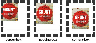
需要注意的是,如果背景不是no-repeat,这个属性无效,它会从边框开始显示。
例子:
<!DOCTYPE html>

<html>

<head>

<meta charset="utf-8">

<title>背景原点</title>

<style type="text/css">

.wrap {

    width:220px;

    border:20px dashed #000;

    padding:20px;

    font-weight:bold;

    color:#000;

    background:#ccc url(http://static.mukewang.com/static/img/logo_index.png) no-repeat;

    background-origin:content-box;//内容区域显示

    position: relative;

}

.wrap span {

    position: absolute;

    left:0;

    top:0;

}

.content {

    height:80px;

    border:1px solid #333;

}

</style>

</head>

<body>

<div class="wrap"><span>padding</span>

    <div class="content">content</div>

</div>

</body>

</html>
效果:
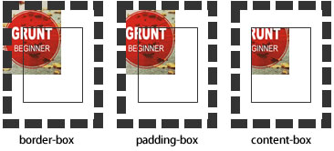
background-clip
用来将背景图片做适当的裁剪以适应实际需要。
语法:
background-clip : border-box | padding-box | content-box | no-clip
参数分别表示从边框、或内填充,或者内容区域向外裁剪背景。no-clip表示不裁切,和参数border-box显示同样的效果。backgroud-clip默认值为border-box。
效果如下图所示:
例子:
<!DOCTYPE html>

<html>

<head>

<meta charset="utf-8">

<title>背景裁切</title>

<style type="text/css">

.wrap {

    width:220px;

    border:20px dashed #000;

    padding:20px;

    font-weight:bold;

    color:#000;

    background:#ccc url(http://static.mukewang.com/static/img/logo_index.png) no-repeat;

    background-origin: border-box;

    background-clip:padding-box;

    position: relative;

}

.wrap span {

    position: absolute;

    left:0;

    top:0;

}

.content {

    height:80px;

    border:1px solid #333;

}

</style>

</head>

<body>

<div class="wrap"><span>padding</span>

    <div class="content">content</div>

</div>

</body>

</html>
效果: padding-box效果:
background-size
设置背景图片的大小,以长度值或百分比显示,还可以通过cover和contain来对图片进行伸缩。
语法:
background-size: auto | <长度值> | <百分比> | cover | contain
取值说明:
1、auto:默认值,不改变背景图片的原始高度和宽度;
2、<长度值>:成对出现如200px 50px,将背景图片宽高依次设置为前面两个值,当设置一个值时,将其作为图片宽度值来等比缩放;
3、<百分比>:0%~100%之间的任何值,将背景图片宽高依次设置为所在元素宽高乘以前面百分比得出的数值,当设置一个值时同上;
4、cover:顾名思义为覆盖,即将背景图片等比缩放以填满整个容器;
5、contain:容纳,即将背景图片等比缩放至某一边紧贴容器边缘为止。
提示:大家可以在右边的编辑窗口输入自己的代码尝试不同取值的效果。
multiple backgrounds
多重背景,也就是CSS2里background的属性外加origin、clip和size组成的新background的多次叠加,缩写时为用逗号隔开的每组值;用分解写法时,如果有多个背景图片,而其他属性只有一个(例如background-repeat只有一个),表明所有背景图片应用该属性值。
语法缩写如下:
background : [background-color] | [background-image] | [background-position][/background-size] | [background-repeat] | [background-attachment] | [background-clip] | [background-origin],...
可以把上面的缩写拆解成以下形式:
background-image:url1,url2,...,urlN;
background-repeat : repeat1,repeat2,...,repeatN;

backround-position : position1,position2,...,positionN;

background-size : size1,size2,...,sizeN;

background-attachment : attachment1,attachment2,...,attachmentN;

background-clip : clip1,clip2,...,clipN;

background-origin : origin1,origin2,...,originN;

background-color : color;
注意:
- 用逗号隔开每组 background 的缩写值;
- 如果有 size 值,需要紧跟 position 并且用 "/" 隔开;
- 如果有多个背景图片,而其他属性只有一个(例如 background-repeat 只有一个),表明所有背景图片应用该属性值。
- background-color 只能设置一个。
举例:
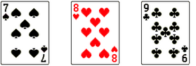
有三张单独的图片:


使用多背景技术实现:
例子:
<!DOCTYPE html>

<html>

<head>

<meta charset="utf-8">

<title>多重背景</title>

<style type="text/css">

.demo{

    width: 300px;

    height: 140px;

    border: 1px solid #999;

    background-image: url(http://img.mukewang.com/54cf2365000140e600740095.jpg),

                      url(http://img.mukewang.com/54cf238a0001728d00740095.jpg),

                      url(http://img.mukewang.com/54cf23b60001fd9700740096.jpg);

    background-position: left top, 100px 0, 200px 0;

    background-repeat: no-repeat, no-repeat, no-repeat;

    margin:0 0 20px 0;

}

.task {

    width: 300px;

    height: 140px;

    border: 1px solid #999;

    background:url(http://static.mukewang.com/static/img/logo_index.png) left top/75% 50% no-repeat,

               url(http://static.mukewang.com/static/img/logo_index.png) right bottom/50% 45% no-repeat;

}

</style>

</head>

<body>

<div class="demo"></div>

<div class="task"></div>

</body>

</html>
效果:
【CSS3】---background-origin background-clip background-size的更多相关文章
- 【CSS3】Advanced8:CSS Backgrounds: Multiples, Size, and Origin
1.Multiples,Size,and Origin eg:background-image:url(bg.png),url(bullet.png) 0 50% no-repeat,url(arro ...
- 【CSS3】 - 初识CSS3
.navdemo{ width:560px; height: 50px; font:bold 0/50px Arial; text-align:center; margin:40px auto 0; ...
- 【微信支付】分享一个失败的案例 跨域405(Method Not Allowed)问题 关于IM的一些思考与实践 基于WebSocketSharp 的IM 简单实现 【css3】旋转倒计时 【Html5】-- 塔台管制 H5情景意识 --飞机 谈谈转行
[微信支付]分享一个失败的案例 2018-06-04 08:24 by stoneniqiu, 2744 阅读, 29 评论, 收藏, 编辑 这个项目是去年做的,开始客户还在推广,几个月后发现服务器已 ...
- 【android】ImageView的src和background的区别以及两者的妙用
一.ImageView中XML属性src和background的区别: background会根据ImageView组件给定的长宽进行拉伸,而src就存放的是原图的大小,不会进行拉伸 .src是图片内 ...
- 【android】ImageView的src和background以及两者之间的神奇的差异
一.ImageView中XML属性src和background的差别: background会依据ImageView组件给定的长宽进行拉伸.而src就存放的是原图的大小,不会进行拉伸.src是图片内容 ...
- -_-#【CSS3】CSS3 gradient transition with background-position
CSS3 gradient transition with background-position <!DOCTYPE html> <html> <head> &l ...
- 【CSS3】---first-of-type选择器+nth-of-type(n)选择器
first-of-type选择器 “:first-of-type”选择器类似于“:first-child”选择器,不同之处就是指定了元素的类型,其主要用来定位一个父元素下的某个类型的第一个子元素. 示 ...
- 【CSS3】选择器
<!DOCTYPE html> <html> <head> <meta charset="utf-8"> <title> ...
- 【css3】画‘百分比圆’
<!DOCTYPE html> <html lang="en"> <head> <meta charset="UTF-8&quo ...
随机推荐
- css3 过度效果之物体向上冒出
<!DOCTYPE HTML> <html> <head> <meta charset="utf-8"/> <meta nam ...
- DBCP连接池介绍
DBCP连接池介绍 ----------------------------- 目前 DBCP 有两个版本分别是 1.3 和 1.4. DBCP 1.3 版本需要运行于 JDK 1.4-1.5 ,支持 ...
- Codeforces Gym 100463E Spies 并查集
Spies Time Limit: 20 Sec Memory Limit: 256 MB 题目连接 http://codeforces.com/gym/100463/attachments Desc ...
- 50个Android开发人员必备UI效果源码[转载]
50个Android开发人员必备UI效果源码[转载] http://blog.csdn.net/qq1059458376/article/details/8145497 Android 仿微信之主页面 ...
- 手把手让你爱上Android sdk自带“9妹”(9patch 工具)
前几天群成员讨论过关于9patch的工具[我比较喜欢喊它9妹子,西西(*^_^*)].然后研究了一下,比较简单但是很实用的一个Android sdk 自带工具.这里给大家做一个分享下经验! 1.什么是 ...
- handler looper 和 线程
Handler的概念: 顾名思义,handler在英语中是“操作着,处理者的意思”,而官方的文档给出的概念是,handler允许你发送或者处理Message对象或者Runable对象,这两个对象都是 ...
- CENTOS YUM软件源
CentOS 7.0 使用 YUM 安装 MySQL 报错 问题现象 CentOS 7.0 使用 YUM 安装 MySQL 时出现类似如下错误信息: File contains no section ...
- 如何使用strace+pstack利器分析程序性能
http://www.cnblogs.com/bangerlee/archive/2012/04/30/2476190.html
- #import与@class的区别
转自:http://www.cnblogs.com/jqyp/archive/2012/01/13/2321707.html 1.import会包含这个类的所有信息,包括实体变量和方法,而@class ...
- 《转》Java中HashMap详解
HashMap 和 HashSet 是 Java Collection Framework 的两个重要成员,其中 HashMap 是 Map 接口的常用实现类,HashSet 是 Set 接口的常用实 ...