【CSS3】---background-origin background-clip background-size
background-origin
设置元素背景图片的原始起始位置。
语法:
background-origin : border-box | padding-box | content-box;
参数分别表示背景图片是从边框,还是内边距(默认值),或者是内容区域开始显示。
效果如下:
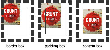
需要注意的是,如果背景不是no-repeat,这个属性无效,它会从边框开始显示。
例子:
<!DOCTYPE html>

<html>

<head>

<meta charset="utf-8">

<title>背景原点</title>

<style type="text/css">

.wrap {

    width:220px;

    border:20px dashed #000;

    padding:20px;

    font-weight:bold;

    color:#000;

    background:#ccc url(http://static.mukewang.com/static/img/logo_index.png) no-repeat;

    background-origin:content-box;//内容区域显示

    position: relative;

}

.wrap span {

    position: absolute;

    left:0;

    top:0;

}

.content {

    height:80px;

    border:1px solid #333;

}

</style>

</head>

<body>

<div class="wrap"><span>padding</span>

    <div class="content">content</div>

</div>

</body>

</html>
效果:
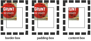
background-clip
用来将背景图片做适当的裁剪以适应实际需要。
语法:
background-clip : border-box | padding-box | content-box | no-clip
参数分别表示从边框、或内填充,或者内容区域向外裁剪背景。no-clip表示不裁切,和参数border-box显示同样的效果。backgroud-clip默认值为border-box。
效果如下图所示:
例子:
<!DOCTYPE html>

<html>

<head>

<meta charset="utf-8">

<title>背景裁切</title>

<style type="text/css">

.wrap {

    width:220px;

    border:20px dashed #000;

    padding:20px;

    font-weight:bold;

    color:#000;

    background:#ccc url(http://static.mukewang.com/static/img/logo_index.png) no-repeat;

    background-origin: border-box;

    background-clip:padding-box;

    position: relative;

}

.wrap span {

    position: absolute;

    left:0;

    top:0;

}

.content {

    height:80px;

    border:1px solid #333;

}

</style>

</head>

<body>

<div class="wrap"><span>padding</span>

    <div class="content">content</div>

</div>

</body>

</html>
效果: padding-box效果:
background-size
设置背景图片的大小,以长度值或百分比显示,还可以通过cover和contain来对图片进行伸缩。
语法:
background-size: auto | <长度值> | <百分比> | cover | contain
取值说明:
1、auto:默认值,不改变背景图片的原始高度和宽度;
2、<长度值>:成对出现如200px 50px,将背景图片宽高依次设置为前面两个值,当设置一个值时,将其作为图片宽度值来等比缩放;
3、<百分比>:0%~100%之间的任何值,将背景图片宽高依次设置为所在元素宽高乘以前面百分比得出的数值,当设置一个值时同上;
4、cover:顾名思义为覆盖,即将背景图片等比缩放以填满整个容器;
5、contain:容纳,即将背景图片等比缩放至某一边紧贴容器边缘为止。
提示:大家可以在右边的编辑窗口输入自己的代码尝试不同取值的效果。
multiple backgrounds
多重背景,也就是CSS2里background的属性外加origin、clip和size组成的新background的多次叠加,缩写时为用逗号隔开的每组值;用分解写法时,如果有多个背景图片,而其他属性只有一个(例如background-repeat只有一个),表明所有背景图片应用该属性值。
语法缩写如下:
background : [background-color] | [background-image] | [background-position][/background-size] | [background-repeat] | [background-attachment] | [background-clip] | [background-origin],...
可以把上面的缩写拆解成以下形式:
background-image:url1,url2,...,urlN;
background-repeat : repeat1,repeat2,...,repeatN;

backround-position : position1,position2,...,positionN;

background-size : size1,size2,...,sizeN;

background-attachment : attachment1,attachment2,...,attachmentN;

background-clip : clip1,clip2,...,clipN;

background-origin : origin1,origin2,...,originN;

background-color : color;
注意:
- 用逗号隔开每组 background 的缩写值;
- 如果有 size 值,需要紧跟 position 并且用 "/" 隔开;
- 如果有多个背景图片,而其他属性只有一个(例如 background-repeat 只有一个),表明所有背景图片应用该属性值。
- background-color 只能设置一个。
举例:
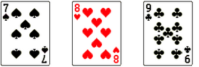
有三张单独的图片:


使用多背景技术实现:
例子:
<!DOCTYPE html>

<html>

<head>

<meta charset="utf-8">

<title>多重背景</title>

<style type="text/css">

.demo{

    width: 300px;

    height: 140px;

    border: 1px solid #999;

    background-image: url(http://img.mukewang.com/54cf2365000140e600740095.jpg),

                      url(http://img.mukewang.com/54cf238a0001728d00740095.jpg),

                      url(http://img.mukewang.com/54cf23b60001fd9700740096.jpg);

    background-position: left top, 100px 0, 200px 0;

    background-repeat: no-repeat, no-repeat, no-repeat;

    margin:0 0 20px 0;

}

.task {

    width: 300px;

    height: 140px;

    border: 1px solid #999;

    background:url(http://static.mukewang.com/static/img/logo_index.png) left top/75% 50% no-repeat,

               url(http://static.mukewang.com/static/img/logo_index.png) right bottom/50% 45% no-repeat;

}

</style>

</head>

<body>

<div class="demo"></div>

<div class="task"></div>

</body>

</html>
效果:
【CSS3】---background-origin background-clip background-size的更多相关文章
- 【CSS3】Advanced8:CSS Backgrounds: Multiples, Size, and Origin
1.Multiples,Size,and Origin eg:background-image:url(bg.png),url(bullet.png) 0 50% no-repeat,url(arro ...
- 【CSS3】 - 初识CSS3
.navdemo{ width:560px; height: 50px; font:bold 0/50px Arial; text-align:center; margin:40px auto 0; ...
- 【微信支付】分享一个失败的案例 跨域405(Method Not Allowed)问题 关于IM的一些思考与实践 基于WebSocketSharp 的IM 简单实现 【css3】旋转倒计时 【Html5】-- 塔台管制 H5情景意识 --飞机 谈谈转行
[微信支付]分享一个失败的案例 2018-06-04 08:24 by stoneniqiu, 2744 阅读, 29 评论, 收藏, 编辑 这个项目是去年做的,开始客户还在推广,几个月后发现服务器已 ...
- 【android】ImageView的src和background的区别以及两者的妙用
一.ImageView中XML属性src和background的区别: background会根据ImageView组件给定的长宽进行拉伸,而src就存放的是原图的大小,不会进行拉伸 .src是图片内 ...
- 【android】ImageView的src和background以及两者之间的神奇的差异
一.ImageView中XML属性src和background的差别: background会依据ImageView组件给定的长宽进行拉伸.而src就存放的是原图的大小,不会进行拉伸.src是图片内容 ...
- -_-#【CSS3】CSS3 gradient transition with background-position
CSS3 gradient transition with background-position <!DOCTYPE html> <html> <head> &l ...
- 【CSS3】---first-of-type选择器+nth-of-type(n)选择器
first-of-type选择器 “:first-of-type”选择器类似于“:first-child”选择器,不同之处就是指定了元素的类型,其主要用来定位一个父元素下的某个类型的第一个子元素. 示 ...
- 【CSS3】选择器
<!DOCTYPE html> <html> <head> <meta charset="utf-8"> <title> ...
- 【css3】画‘百分比圆’
<!DOCTYPE html> <html lang="en"> <head> <meta charset="UTF-8&quo ...
随机推荐
- PHP抓取豆瓣读书爬虫代码
<?php//演示地址 http://asizu.sinaapp.com/reptile_douban.php//数据量不是特别大,没有写抓完数据便停止. 喜欢的朋友拿去自己改改就好了 head ...
- MFC非模态对话框中屏蔽ESC键
个人的编程经验认为:对于非模态对话框,按下ESC键和点击红叉都会响应OnCancel()函数,而不会去响应OnClose()函数. 我们都知道,如果想屏蔽Enter键,只须重写OnOK()函数即可(重 ...
- canvas 动态飞速旋转的矩形
<!DOCTYPE html> <html xmlns="http://www.w3.org/1999/xhtml"> <head> <m ...
- linux 源码编译(转)
源代码的用处无非是以下两点;1、软件根据用户的需要加以定制;2、二次开发;注:要根据软件的许可证书约定为准,开发者许可二次开发才行;1、源码包的打包格式;源代码一般以file.tar.gz file. ...
- 【M18】分期摊还预期的计算成本
1.基本思想就是:如果将来肯定要做某件事,并且这件事情耗时,提前把东西准备好,先做一部分.常用的使用场景有: 2.考虑一个大的数据集合,集合中元素不断变化.经常要取出里面的最大值,正常的做法是:每次调 ...
- 你已经毁了JavaScript
以前 过去我们在页面上用很时尚的方式写了一些确实很可怕的代码,它给我们带来了巨大的麻烦.可能很多人现在还在这样做,但他们不会看这篇博文,我们可以假装他们不存在. JS的伟大/了不起/让人惊讶的地方在于 ...
- org.apache.catalina.mbeans.ServerLifecycleListener
Tomcat 启动报错: java.lang.ClassNotFoundException: org.apache.catalina.mbeans.ServerLifecycleListener at ...
- 内存泄露调试之 visual leak detector 工具【转】
本文参考此文:http://kangzj.net/visual-leak-detector-download/ 另外一种检查内存泄露的工具:visual leak detector 简称 vl ...
- 编辑器TP
http://www.itshipin.com/blog/archives/category/php/thinkphp
- [Ramda] Filter, Reject and Partition
We'll learn how to get a subset of an array by specifying items to include with filter, or items to ...