html+ccs3太阳系行星运转动画
做一个太阳系八大行星的运转动画,不包括行星的卫星,所有行星围绕太阳公转,行星采用纯色,暂时没有自转。
效果静态图:
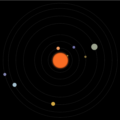
动画中包括:太阳及各行星,运行轨道,行星公转动画。
先画好草图,设计好大小和位置,根据公转周期计算好动画执行的时间。
html的结构:
一个class为solarsys的div,作为太阳系容器元素,该div的position为relative。
行星轨道和行星都用div,position为absolute。
容器用relative和内部元素采用absolute的定位方式,比较简单的能实现效果,缺点就是大小是固定的。
    <div class="solarsys">

        <!--太阳-->

        <div class='sun'></div>

        <!--水星轨道-->

        <div class='mercuryOrbit'></div>

        <!--水星-->

        <div class='mercury'></div>

        <!--金星轨道-->

        <div class='venusOrbit'></div>

        <!--金星-->

        <div class='venus'></div>

        <!--地球轨道-->

        <div class='earthOrbit'></div>

        <!--地球-->

        <div class='earth'></div>

        <!--火星轨道-->

        <div class='marsOrbit'></div>

        <!--火星-->

        <div class='mars'></div>

        <!--木星轨道-->

        <div class='jupiterOrbit'></div>

        <!--木星-->

        <div class='jupiter'></div>

        <!--土星轨道-->

        <div class='saturnOrbit'></div>

        <!--土星-->

        <div class='saturn'></div>

        <!--天王星轨道-->

        <div class='uranusOrbit'></div>

        <!--天王星-->

        <div class='uranus'></div>

        <!--海王星轨道-->

        <div class='neptuneOrbit'></div>

        <!--海王星-->

        <div class='neptune'></div>

    </div>
太阳系容器div的css:
定宽,定高,relative定位,页面内剧中对齐。
        .solarsys{

            width: 800px;

            height: 800px;;

            position: relative;

            margin: 0 auto;

            background-color: #000000;

            padding: 0;

            transform: scale(1);

        }
太阳div的css:
按照设计的大小和位置,设定宽高,left,top。
设定颜色。
通过把boder-radius生成50%,把一个正方形变成圆形。
通过box-shadow的4层颜色设置实现太阳光晕。
        .sun {

            left:357px;

            top:357px;

            height: 90px;

            width: 90px;

            background-color: rgb(248,107,35);

            border-radius: 50%;

            box-shadow: 5px 5px 10px rgb(248,107,35), -5px -5px 10px rgb(248,107,35), 5px -5px 10px rgb(248,107,35), -5px 5px 10px rgb(248,107,35);

            position: absolute;

            margin: 0;

        }
行星轨道div的css:
假设是水星轨道。
按照设计的大小和位置,设定宽高,left,top。
背景色透明。
通过把boder-radius生成50%,把一个正方形变成圆形。
boder的类型设成虚线。
boder的颜色设成灰色。
宽度设1。
        .mercuryOrbit {

            left:342.5px;

            top:342.5px;

            height: 115px;

            width: 115px;

            background-color: transparent;

            border-radius: 50%;

            border-style: dashed;

            border-color: gray;

            position: absolute;

            border-width: 1px;

            margin: 0px;

            padding: 0px;

        }
行星div的css:
假设是水星。
按照设计的大小和位置,设定宽高,left,top。
设置颜色。
通过把boder-radius生成50%,把一个正方形变成圆形。
将transfrom-origin设定成当前div的左上角相对于整个太阳系容器的中心点的横向和纵向的偏移量。加上旋转动画后就是围绕着中心点旋转效果。
做一个animation,引用rotate关键帧动画,线性永久执行,这里的执行时长是根据行星的公转周期计算出来。
        .mercury {

            left:337.5px;

            top:395px;

            height: 10px;

            width: 10px;

            background-color: rgb(166,138,56);

            border-radius: 50%;

            position: absolute;

            transform-origin: 62.5px 5px;

            animation: rotate 1.5s infinite linear;

        }
rotate关键帧动画:
逆时针旋转。
        @keyframes rotate {

            100% {

                transform: rotate(-360deg);

            }

        }
基本结构完成。
仅在chrome中测试过。
全部代码:
<html>

<head>

    <style>

        .solarsys{

            width: 800px;

            height: 800px;;

            position: relative;

            margin: 0 auto;

            background-color: #000000;

            padding: 0;

            transform: scale(1);

        }

        /*太阳*/

        .sun {

            left:357px;

            top:357px;

            height: 90px;

            width: 90px;

            background-color: rgb(248,107,35);

            border-radius: 50%;

            box-shadow: 5px 5px 10px rgb(248,107,35), -5px -5px 10px rgb(248,107,35), 5px -5px 10px rgb(248,107,35), -5px 5px 10px rgb(248,107,35);

            position: absolute;

            margin: 0;

        }

        /*水星*/

        .mercury {

            left:337.5px;

            top:395px;

            height: 10px;

            width: 10px;

            background-color: rgb(166,138,56);

            border-radius: 50%;

            position: absolute;

            transform-origin: 62.5px 5px;

            animation: rotate 1.5s infinite linear;

        }

        /*水星轨道*/

        .mercuryOrbit {

            left:342.5px;

            top:342.5px;

            height: 115px;

            width: 115px;

            background-color: transparent;

            border-radius: 50%;

            border-style: dashed;

            border-color: gray;

            position: absolute;

            border-width: 1px;

            margin: 0px;

            padding: 0px;

        }

        /*金星*/

        .venus {

            left:309px;

            top:389px;

            height: 22px;

            width: 22px;

            background-color: rgb(246,157,97);

            border-radius: 50%;

            position: absolute;

            transform-origin: 91px 11px;

            animation: rotate 3.84s infinite linear;

        }

        /*金星轨道*/

        .venusOrbit {

            left:320px;

            top:320px;

            height: 160px;

            width: 160px;

            background-color: transparent;

            border-radius: 50%;

            border-style: dashed;

            border-color: gray;

            position: absolute;

            border-width: 1px;

            /*margin: 100px;*/

            /*transform-origin: -75px -75px;*/

            /*animation: rotate 4s infinite linear;*/

            margin: 0px;

            padding: 0px;

        }

        /*地球*/

        .earth {

            left:266.5px;

            top:391px;

            height: 18px;

            width: 18px;

            background-color: rgb(115,114,174);

            border-radius: 50%;

            position: absolute;

            transform-origin: 134px 9px;

            animation: rotate 6.25s infinite linear;

        }

        /*地球轨道*/

        .earthOrbit {

            left:275px;

            top:275px;

            height: 250px;

            width: 250px;

            background-color: transparent;

            border-radius: 50%;

            border-style: dashed;

            border-color: gray;

            position: absolute;

            border-width: 1px;

            /*margin: 100px;*/

            /*transform-origin: -75px -75px;*/

            /*animation: rotate 4s infinite linear;*/

            margin: 0px;

            padding: 0px;

        }

        /*火星*/

        .mars {

            left:222.5px;

            top:392.5px;

            height: 15px;

            width: 15px;

            background-color: rgb(140,119,63);

            border-radius: 50%;

            position: absolute;

            transform-origin: 177.5px 7.5px;

            animation: rotate 11.75s infinite linear;

        }

         /*火星轨道*/

        .marsOrbit {

            left:230px;

            top:230px;

            height: 340px;

            width: 340px;

            background-color: transparent;

            border-radius: 50%;

            border-style: dashed;

            border-color: gray;

            position: absolute;

            border-width: 1px;

            /*margin: 100px;*/

            /*transform-origin: -75px -75px;*/

            /*animation: rotate 4s infinite linear;*/

            margin: 0px;

            padding: 0px;

        }

        /*木星*/

        .jupiter {

            left:134px;

            top:379px;

            height: 42px;

            width: 42px;

            background-color: rgb(156,164,143);

            border-radius: 50%;

            position: absolute;

            transform-origin: 266px 21px;

            animation: rotate 74.04s infinite linear;

        }

        /*木星轨道*/

        .jupiterOrbit {

            left:155px;

            top:155px;

            height: 490px;

            width: 490px;

            background-color: transparent;

            border-radius: 50%;

            border-style: dashed;

            border-color: gray;

            position: absolute;

            border-width: 1px;

            /*margin: 100px;*/

            /*transform-origin: -75px -75px;*/

            /*animation: rotate 4s infinite linear;*/

            margin: 0px;

            padding: 0px;

        }

        /*土星*/

        .saturn {

            left:92px;

            top:387px;

            height: 26px;

            width: 26px;

            background-color: rgb(215,171,68);

            border-radius: 50%;

            position: absolute;

            transform-origin: 308px 13px;

            animation: rotate 183.92s infinite linear;

        }

        /*土星轨道*/

        .saturnOrbit {

            left:105px;

            top:105px;

            height: 590px;

            width: 590px;

            background-color: transparent;

            border-radius: 50%;

            border-style: dashed;

            border-color: gray;

            position: absolute;

            border-width: 1px;

            /*margin: 100px;*/

            /*transform-origin: -75px -75px;*/

            /*animation: rotate 4s infinite linear;*/

            margin: 0px;

            padding: 0px;

        }

        /*天王星*/

        .uranus {

            left:41.5px;

            top:386.5px;

            height: 27px;

            width: 27px;

            background-color: rgb(164,192,206);

            border-radius: 50%;

            position: absolute;

            transform-origin: 358.5px 13.5px;

            animation: rotate 524.46s infinite linear;

        }

        /*天王星轨道*/

        .uranusOrbit {

            left:55px;

            top:55px;

            height: 690px;

            width: 690px;

            background-color: transparent;

            border-radius: 50%;

            border-style: dashed;

            border-color: gray;

            position: absolute;

            border-width: 1px;

            /*margin: 100px;*/

            /*transform-origin: -75px -75px;*/

            /*animation: rotate 4s infinite linear;*/

            margin: 0px;

            padding: 0px;

        }

        /*海王星*/

        .neptune {

            left:10px;

            top:390px;

            height: 20px;

            width: 20px;

            background-color: rgb(133,136,180);

            border-radius: 50%;

            position: absolute;

            transform-origin: 390px 10px;

            animation: rotate 1028.76s infinite linear;

        }

        /*海王星轨道*/

        .neptuneOrbit {

            left:20px;

            top:20px;

            height: 760px;

            width: 760px;

            background-color: transparent;

            border-radius: 50%;

            border-style: dashed;

            border-color: gray;

            position: absolute;

            border-width: 1px;

            /*margin: 100px;*/

            /*transform-origin: -75px -75px;*/

            /*animation: rotate 4s infinite linear;*/

            margin: 0px;

            padding: 0px;

        }

        @keyframes rotate {

            100% {

                transform: rotate(-360deg);

            }

        }

    </style>

</head>

<body>

    <div class="solarsys">

        <!--太阳-->

        <div class='sun'></div>

        <!--水星轨道-->

        <div class='mercuryOrbit'></div>

        <!--水星-->

        <div class='mercury'></div>

        <!--金星轨道-->

        <div class='venusOrbit'></div>

        <!--金星-->

        <div class='venus'></div>

        <!--地球轨道-->

        <div class='earthOrbit'></div>

        <!--地球-->

        <div class='earth'></div>

        <!--火星轨道-->

        <div class='marsOrbit'></div>

        <!--火星-->

        <div class='mars'></div>

        <!--木星轨道-->

        <div class='jupiterOrbit'></div>

        <!--木星-->

        <div class='jupiter'></div>

        <!--土星轨道-->

        <div class='saturnOrbit'></div>

        <!--土星-->

        <div class='saturn'></div>

        <!--天王星轨道-->

        <div class='uranusOrbit'></div>

        <!--天王星-->

        <div class='uranus'></div>

        <!--海王星轨道-->

        <div class='neptuneOrbit'></div>

        <!--海王星-->

        <div class='neptune'></div>

    </div>

</body>

</html>
html+ccs3太阳系行星运转动画的更多相关文章
- html+ccs3太阳系行星运转动画之土星有个环,地球有颗小卫星
在上一篇<html+ccs3太阳系行星运转动画>中实现了太阳系八大行星的基本运转动画. 太阳系又何止这些内容,为丰富一下动画,接下来增加“土星环”和“月球”来充盈太阳系动画. 下面是充盈后 ...
- 【Web动画】CSS3 3D 行星运转 && 浏览器渲染原理
承接上一篇:[CSS3进阶]酷炫的3D旋转透视 . 最近入坑 Web 动画,所以把自己的学习过程记录一下分享给大家. CSS3 3D 行星运转 demo 页面请戳:Demo.(建议使用Chrome打开 ...
- 使用css3的动画模拟太阳系行星公转
本文介绍使用css3的animation画一个太阳系行星公转的动画,再加以改进,讨论如何画椭圆的运行轨迹.然后分析京东和人人网使用animation的实际案例,最后结合css3的clip-path做一 ...
- three.js模拟实现太阳系行星体系
概况如下: 1.SphereGeometry实现自转的太阳: 2.RingGeometry实现太阳系星系的公转轨道: 3.ImageUtils加载球体和各行星贴图: 4.canvas中createRa ...
- css3加js做一个简单的3D行星运转效果
前几天在园子里看到一篇关于CSS3D行星运转的文章,原文在这里,感觉这个效果也太酷炫了,于是自己也就心血来潮的来尝试的做了一下.因为懒得去用什么插件了,于是就原生的JS写,效果有点粗超,还有一些地方处 ...
- OpenGL 太阳系行星拾取例子(GL_SELECT) VS2008 + glut实现
太阳系:Solar System 以太阳(Sun)为中心,由内到外分别是: 水星(Mercury) 金星(Venus) 地球(Earth) 火星(Mars) 木星(Jupiter) 土星(Saturn ...
- 认识我们的太阳系(Solar System)
一.初识太阳系 如果太阳是一颗篮球,那么我们的地球是什么?? 如果太阳系里最大的行星:木星是一颗足球,那么我们的地球是什么?? 如果我们的地球是一颗排球,那么其他行星是什么?? 由此,我们可以看到,我 ...
- 一个流行的网页动画JS库
animejs https://animejs.com/ Anime.js (/ˈæn.ə.meɪ/) is a lightweight JavaScript animation library wi ...
- 简单的转盘抽奖——CSS动画优化
前言 前两天去一家公司面试,被问到一些小游戏的东西.面试官提到了刷红包还有抽奖这些怎么实现,当时简单说了下思路,回来之后想想还是说的太轻描淡写了,干说不做就是耍流氓,所以就做了一个(Demo & ...
随机推荐
- 关于Android避免按钮重复点击事件
最近测试人员测试我们的APP的时候,喜欢快速点击某个按钮,出现一个页面出现多次,测试人员能不能禁止这样.我自己点击了几下,确实存在这个问题,也感觉用户体验不太好.于是乎后来我搜了下加一个方法放在我们U ...
- spring源码分析之<context:property-placeholder/>和<property-override/>
在一个spring xml配置文件中,NamespaceHandler是DefaultBeanDefinitionDocumentReader用来处理自定义命名空间的基础接口.其层次结构如下: < ...
- javascript动画系列第一篇——模拟拖拽
× 目录 [1]原理介绍 [2]代码实现 [3]代码优化[4]拖拽冲突[5]IE兼容 前面的话 从本文开始,介绍javascript动画系列.javascript本身是具有原生拖放功能的,但是由于兼容 ...
- Java多态性——分派
一.基本概念 Java是一门面向对象的程序设计语言,因为Java具备面向对象的三个基本特征:封装.继承和多态.这三个特征并不是各自独立的,从一定角度上看,封装和继承几乎都是为多态而准备的.多态性主要体 ...
- 调用微信退款接口或发红包接口时出现System.Security.Cryptography.CryptographicException: 出现了内部错误 解决办法
我总结了一下出现证书无法加载的原因有以下三个 1.证书密码不正确,微信证书密码就是商户号 解决办法:请检查证书密码是不是和商户号一致 2.IIS设置错误,未加载用户配置文件 解决办法:找到网站使用的应 ...
- 如何使用swing创建一个BeatBox
首先,我们需要回顾一些内容(2017-01-04 14:32:14): 1.Swing组件 Swing的组件(component,或者称之为元件),是较widget更为正确的术语,它们就是会放在GUI ...
- 2003-Can't connect to mysql server on localhost (10061)
mysql数据库出现2003-Can't connect to mysql server on localhost (10061)问题 解决办法:查看wampserver服务器是否启动,如果没有启动启 ...
- centos6.5 nginx-1.8.0和ftp搭建图片服务器
一.Nginx的安装步骤 1.Nginx安装环境: gcc: 安装nginx需要先将官网下载的源码进行编译,编译依赖gcc环境,如果没有gcc环境,需要安装gcc:yum install gcc-c+ ...
- .NET面试题系列[5] - 垃圾回收:概念与策略
面试出现频率:经常出现,但通常不会问的十分深入.通常来说,看完我这篇文章就足够应付面试了.面试时主要考察垃圾回收的基本概念,标记-压缩算法,以及对于微软的垃圾回收模板的理解.知道什么时候需要继承IDi ...
- web前端的春天 or 噩梦
「 微信应用号可以做什么」 简单说,微信"小程序"可以为开发者提供基于微信的表单.导航.地图.媒体和位置等开发组件,让他们在微信的网页里构建一个 HTML 5 应用.同时微信还开放 ...