【Demo】CSS3元素旋转、缩放、移动或倾斜
CSS3元素旋转、缩放、移动或倾斜
代码:
<!DOCTYPE html>

<html lang="en">

<head>

    <meta charset="UTF-8">

    <title>Document</title>

    <style type="text/css">

        *{

            margin: 0;

            padding: 0;

        }

        .container{

            width: 900px;

            margin:0 auto;

        }

        header{

            text-align: center;

            line-height: 60px;

        }

        section{

            width: 200px;

            height: 200px;

            border:2px solid #ddd;

            float: left;

            margin:10px;

            border-radius: 10px;

            background: #fff;

            position: relative;

        }

        section h3{

            width: 200px;

            height: 200px;

            text-align: center;

            line-height: 120px;

            color: blue;

            background: rgba(0,0,0,0.1);

            border-radius: 10px;

            display: none;

            position: absolute;

            top:0;

            left:0;

            z-index: 9;

        }

        section:hover h3{

            display: block;

        }

        .content{

            width: 100px;

            height: 100px;

            margin:50px;

            border-radius: 10px;

            background-image: linear-gradient(pink,gray);

            transition: all 1s linear;

        }

        .box{

            width: 100px;

            height: 100px;

            background: gray;

            border-radius: 10px;

            transition: all 1s linear;

        }

        .item:nth-of-type(1):hover .content{

            transform:translate(50px,50px);

        }

        .item:nth-of-type(2):hover .content .box{

            transform:translateX(50px);

        }

        .item:nth-of-type(3):hover .content .box{

            transform:translateY(50px);

        }

        .item:nth-of-type(4):hover .content .box{

            transform:perspective(300px) translateZ(-100px);

        }

        .item:nth-of-type(5):hover .content{

            /*默认顺时针旋转,旋转中心为当前元素中心点*/

            transform:rotate(360deg);

            /*设置当前元素旋转中心点*/

            /*transform-origin: 0 0;*/

        }

        .item:nth-of-type(6):hover .content{

            transform:rotateX(360deg);

        }

        .item:nth-of-type(7):hover .content{

            transform:rotateY(360deg);

        }

        .item:nth-of-type(8):hover .content{

            transform:rotateZ(360deg);

        }

        .item:nth-of-type(9):hover .content{

            transform:skew(60deg,60deg);

        }

        .item:nth-of-type(10):hover .content{

            transform:scale(1.5,1.5);

        }

        .item:nth-of-type(11):hover .content{

            transform:scaleX(2);

        }

        .item:nth-of-type(12):hover .content{

            transform:scaleY(2);

        }

        .item:nth-of-type(13):hover .content{

            /*在z轴上的位置已经按照z轴进行了缩放 - 它看起来更接近你,因此更大,但是实际的尺寸(宽度和高度)不变。*/

            transform:perspective(300px) translateZ(-100px);

        }

        .item:nth-of-type(14):hover .content{

            /*在z轴上的位置已经按照z轴进行了缩放 - 它看起来更接近你,因此更大,但是实际的尺寸(宽度和高度)不变。*/

            transform:perspective(300px) scaleZ(10) translateZ(-100px);

        }

        .item:nth-of-type(15):hover .content{

            transform:perspective(100px) rotateX(360deg);

        }

        .item:nth-of-type(16):hover .content{

            transform:perspective(100px) rotateY(360deg);

        }

    </style>

</head>

<body>

<div class="container">

    <header>

        <h2>transform属性</h2>

    </header>

    <section class="item">

        <h3>translate平移2D</h3>

        <div class="content"></div>

    </section>

    <section class="item">

        <h3>translateX</h3>

        <div class="content">

            <div class="box"></div>

        </div>

    </section>

    <section class="item">

        <h3>translateY</h3>

        <div class="content">

            <div class="box"></div>

        </div>

    </section>

    <section class="item">

        <h3>translateZ</h3>

        <div class="content">

            <div class="box"></div>

        </div>

    </section>

    <section class="item">

        <h3>rotate旋转</h3>

        <div class="content"></div>

    </section>

    <section class="item">

        <h3>3D旋转 rotateX()</h3>

        <div class="content"></div>

    </section>

    <section class="item">

        <h3>3D旋转 rotateY()</h3>

        <div class="content"></div>

    </section>

    <section class="item">

        <h3>3D旋转 rotateZ()</h3>

        <div class="content"></div>

    </section>

    <section class="item">

        <h3>3D翻转 skew()</h3>

        <div class="content"></div>

    </section>

    <section class="item">

        <h3>放大 scloe()</h3>

        <div class="content"></div>

    </section>

    <section class="item">

        <h3>X轴放大 scaleX()</h3>

        <div class="content"></div>

    </section>

    <section class="item">

        <h3>Y轴放大 scaleY()</h3>

        <div class="content"></div>

    </section>

    <section class="item">

        <h3>Z轴放大缩小(右边对比图)</h3>

        <div class="content"></div>

    </section>

    <section class="item">

        <h3>Z轴放大缩小(越近越大,越远越小) scaleZ()</h3>

        <div class="content"></div>

    </section>

    <section class="item">

        <h3> 3D透视图perspective(n) X轴旋转</h3>

        <div class="content"></div>

    </section>

    <section class="item">

        <h3> 3D透视图perspective(n) Y轴旋转</h3>

        <div class="content"></div>

    </section>

</div>

</body>

</html>
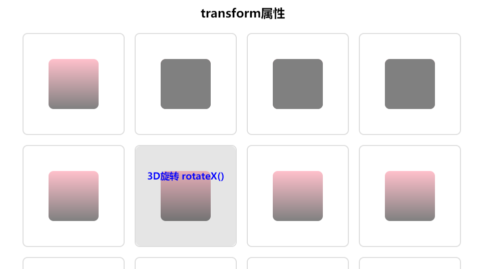
实现效果:
【Demo】CSS3元素旋转、缩放、移动或倾斜的更多相关文章
- CSS3实现元素旋转
-webkit-transform:rotate(30deg); 参数代表顺时针自旋转角度 这个元素还提供了文本倾斜的方法 - HTML5与CSS3 P299
- CSS3制作旋转导航
慕课网学习CSS3时,遇到个习题,觉得有必要总结学习下:CSS3制作旋转导航 慕课网习题地址:http://www.imooc.com/code/1883 示例及源码地址:http://codepen ...
- css3制作旋转动画
现在的css3真是强大,之前很多动画都是用jq来实现,但是css3制作的动画要比jq实现起来简单很多,今天呢,我自己也写了一个css旋转动画和大家分享.效果如下面的图片 思路:1.制作之前呢,我们先来 ...
- CSS3 3D旋转下拉菜单--兼容性不太好
<!DOCTYPE html> <html xmlns="http://www.w3.org/1999/xhtml"> <head> <m ...
- CSS3动画旋转——(图片360°旋转)
今天在重构网页特效的时候,想着用到一个css3的旋转特效.简单来一个demo. html <div class="box"> <img src="./y ...
- osg矩阵变换节点-----平移旋转缩放
osg矩阵变换节点-----平移旋转缩放 转自:http://www.cnblogs.com/ylwn817/articles/1973396.html 平移旋转缩放这个三个是osg矩阵操作中,最常见 ...
- 纯css3实现旋转的太极图
效果图: 代码如下: <!DOCTYPE html> <html> <head lang="zh"> <meta charset=&quo ...
- osg中使用MatrixTransform来实现模型的平移/旋转/缩放
osg中使用MatrixTransform来实现模型的平移/旋转/缩放 转自:http://www.cnblogs.com/kekec/archive/2011/08/15/2139893.html# ...
- CSS3实现旋转的太极图(二):只用1个DIV
效果预览: PS: 1.昨天用3个DIV实现了太极图(点击查看),,今天试着用1个Div来做. 2.公司刚忙过双10周年庆,最近空闲下来,闲着也是闲着,总得写点东西吧. 3.高手莫喷,小弟仅仅是没 ...
随机推荐
- Spring源码学习之IOC实现原理(二)-ApplicationContext
一.Spring核心组件结构 总的来说Spring共有三个核心组件,分别为Core,Context,Bean.三大核心组件的协同工作主要表现在 :Bean是包装我们应用程序自定义对象Object的,O ...
- T-SQL数据库备份
/*1.--得到数据库的文件目录 @dbname 指定要取得目录的数据库名 如果指定的数据不存在,返回安装SQL时设置的默认数据目录 如果指定NULL,则返回默认的SQL备份目录名 */ /*--调用 ...
- Oracle下Update语句
Update更新 格式: update table _name(表名) set col_name(列名) =expr(表达式) where conti(条件) 案例1: update 语法可以用新值 ...
- 阿里云 elastic search 重启 过程
阿里云 es 重启 elasticsearch 重启 过程 实例变更中 53.13% 准备ECS资源 已完成节点数:4/4, 进度:100% 准备容器服务 进度:100% 变 ...
- Rochambeau---poj2912||zoj2751(并查集类似于食物链)
题目链接:http://poj.org/problem?id=2912 http://acm.zju.edu.cn/onlinejudge/showProblem.do?problemId=1751 ...
- python中的Redis键空间通知(过期回调)
介绍 Redis是一个内存数据结构存储库,用于缓存,高速数据摄取,处理消息队列,分布式锁定等等. 使用Redis优于其他内存存储的优点是Redis提供持久性和数据结构,如列表,集合,有序集和散列. 在 ...
- php源码编译常见错误解决方案大全
php源码编译常见错误解决方案大全http://www.cnlvzi.com/index.php/Index/article/id/143 在CentOS编译PHP5的时候有时会遇到以下的一些错误信息 ...
- POJ2115:C Looooops(一元线性同余方程)
题目: http://poj.org/problem?id=2115 要求: 会求最优解,会求这d个解,即(x+(i-1)*b/d)modm;(看最后那个博客的链接地址) 前两天用二元一次线性方程解过 ...
- NodeJS学习笔记三
map map对象是一个简单的键/值映射.任何值(包括对象和原始值)都可以用作一个键或一个值. var m = new Map(); var o = {p: "Hello World&quo ...
- smart基础
主要是libs里面的smarty类,和init.inc.php配置文件 剩下的是php文件夹.模板文件夹,临时文件夹.缓存文件夹.配置文件夹.插件文件夹 调用main文件夹中的php文件,通过libs ...