【Demo】CSS3元素旋转、缩放、移动或倾斜
CSS3元素旋转、缩放、移动或倾斜
代码:
<!DOCTYPE html>
<html lang="en">
<head>
<meta charset="UTF-8">
<title>Document</title>
<style type="text/css"> *{
margin: 0;
padding: 0;
}
.container{
width: 900px;
margin:0 auto;
}
header{
text-align: center;
line-height: 60px;
}
section{
width: 200px;
height: 200px;
border:2px solid #ddd;
float: left;
margin:10px;
border-radius: 10px;
background: #fff;
position: relative;
}
section h3{
width: 200px;
height: 200px;
text-align: center;
line-height: 120px;
color: blue;
background: rgba(0,0,0,0.1);
border-radius: 10px;
display: none;
position: absolute;
top:0;
left:0;
z-index: 9;
}
section:hover h3{
display: block;
} .content{
width: 100px;
height: 100px;
margin:50px;
border-radius: 10px;
background-image: linear-gradient(pink,gray);
transition: all 1s linear;
}
.box{
width: 100px;
height: 100px;
background: gray;
border-radius: 10px;
transition: all 1s linear;
}
.item:nth-of-type(1):hover .content{
transform:translate(50px,50px);
}
.item:nth-of-type(2):hover .content .box{
transform:translateX(50px);
}
.item:nth-of-type(3):hover .content .box{
transform:translateY(50px);
}
.item:nth-of-type(4):hover .content .box{
transform:perspective(300px) translateZ(-100px);
}
.item:nth-of-type(5):hover .content{
/*默认顺时针旋转,旋转中心为当前元素中心点*/
transform:rotate(360deg);
/*设置当前元素旋转中心点*/
/*transform-origin: 0 0;*/
}
.item:nth-of-type(6):hover .content{
transform:rotateX(360deg);
}
.item:nth-of-type(7):hover .content{
transform:rotateY(360deg);
}
.item:nth-of-type(8):hover .content{
transform:rotateZ(360deg);
}
.item:nth-of-type(9):hover .content{
transform:skew(60deg,60deg);
}
.item:nth-of-type(10):hover .content{
transform:scale(1.5,1.5);
}
.item:nth-of-type(11):hover .content{
transform:scaleX(2);
}
.item:nth-of-type(12):hover .content{
transform:scaleY(2);
}
.item:nth-of-type(13):hover .content{
/*在z轴上的位置已经按照z轴进行了缩放 - 它看起来更接近你,因此更大,但是实际的尺寸(宽度和高度)不变。*/
transform:perspective(300px) translateZ(-100px);
}
.item:nth-of-type(14):hover .content{
/*在z轴上的位置已经按照z轴进行了缩放 - 它看起来更接近你,因此更大,但是实际的尺寸(宽度和高度)不变。*/
transform:perspective(300px) scaleZ(10) translateZ(-100px);
}
.item:nth-of-type(15):hover .content{
transform:perspective(100px) rotateX(360deg);
}
.item:nth-of-type(16):hover .content{
transform:perspective(100px) rotateY(360deg);
}
</style>
</head>
<body> <div class="container"> <header>
<h2>transform属性</h2>
</header>
<section class="item">
<h3>translate平移2D</h3>
<div class="content"></div>
</section>
<section class="item">
<h3>translateX</h3>
<div class="content">
<div class="box"></div>
</div>
</section>
<section class="item">
<h3>translateY</h3>
<div class="content">
<div class="box"></div>
</div>
</section>
<section class="item">
<h3>translateZ</h3>
<div class="content">
<div class="box"></div>
</div>
</section>
<section class="item">
<h3>rotate旋转</h3>
<div class="content"></div>
</section>
<section class="item">
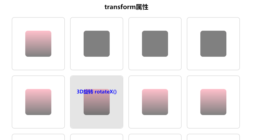
<h3>3D旋转 rotateX()</h3>
<div class="content"></div>
</section>
<section class="item">
<h3>3D旋转 rotateY()</h3>
<div class="content"></div>
</section>
<section class="item">
<h3>3D旋转 rotateZ()</h3>
<div class="content"></div>
</section>
<section class="item">
<h3>3D翻转 skew()</h3>
<div class="content"></div>
</section>
<section class="item">
<h3>放大 scloe()</h3>
<div class="content"></div>
</section>
<section class="item">
<h3>X轴放大 scaleX()</h3>
<div class="content"></div>
</section>
<section class="item">
<h3>Y轴放大 scaleY()</h3>
<div class="content"></div>
</section>
<section class="item">
<h3>Z轴放大缩小(右边对比图)</h3>
<div class="content"></div>
</section>
<section class="item">
<h3>Z轴放大缩小(越近越大,越远越小) scaleZ()</h3>
<div class="content"></div>
</section>
<section class="item">
<h3> 3D透视图perspective(n) X轴旋转</h3>
<div class="content"></div>
</section>
<section class="item">
<h3> 3D透视图perspective(n) Y轴旋转</h3>
<div class="content"></div>
</section>
</div>
</body>
</html>
实现效果:
【Demo】CSS3元素旋转、缩放、移动或倾斜的更多相关文章
- CSS3实现元素旋转
-webkit-transform:rotate(30deg); 参数代表顺时针自旋转角度 这个元素还提供了文本倾斜的方法 - HTML5与CSS3 P299
- CSS3制作旋转导航
慕课网学习CSS3时,遇到个习题,觉得有必要总结学习下:CSS3制作旋转导航 慕课网习题地址:http://www.imooc.com/code/1883 示例及源码地址:http://codepen ...
- css3制作旋转动画
现在的css3真是强大,之前很多动画都是用jq来实现,但是css3制作的动画要比jq实现起来简单很多,今天呢,我自己也写了一个css旋转动画和大家分享.效果如下面的图片 思路:1.制作之前呢,我们先来 ...
- CSS3 3D旋转下拉菜单--兼容性不太好
<!DOCTYPE html> <html xmlns="http://www.w3.org/1999/xhtml"> <head> <m ...
- CSS3动画旋转——(图片360°旋转)
今天在重构网页特效的时候,想着用到一个css3的旋转特效.简单来一个demo. html <div class="box"> <img src="./y ...
- osg矩阵变换节点-----平移旋转缩放
osg矩阵变换节点-----平移旋转缩放 转自:http://www.cnblogs.com/ylwn817/articles/1973396.html 平移旋转缩放这个三个是osg矩阵操作中,最常见 ...
- 纯css3实现旋转的太极图
效果图: 代码如下: <!DOCTYPE html> <html> <head lang="zh"> <meta charset=&quo ...
- osg中使用MatrixTransform来实现模型的平移/旋转/缩放
osg中使用MatrixTransform来实现模型的平移/旋转/缩放 转自:http://www.cnblogs.com/kekec/archive/2011/08/15/2139893.html# ...
- CSS3实现旋转的太极图(二):只用1个DIV
效果预览: PS: 1.昨天用3个DIV实现了太极图(点击查看),,今天试着用1个Div来做. 2.公司刚忙过双10周年庆,最近空闲下来,闲着也是闲着,总得写点东西吧. 3.高手莫喷,小弟仅仅是没 ...
随机推荐
- jq和axios的取消请求
场景: 分页: 每次点击分页会发送请求,如果上一次请求还未获取到,下一次请求已经开始且先一步获取到,那么数据上会出现问题. 快速点击会发送多次请求,多次点击的时候一般的做法我们会定义一个flag,此时 ...
- Oracle下Delete语句
Delete语句 基本语法: delete from 表名 where 条件 注意事项: 1,如果不使用where子句,将表中所有数据全部删除 delete from test; 2,如果要删除某列的 ...
- Oracle等待事件之db file sequential read/ db file parallel read
1.产生原因 db file sequential read这个是非常常见的I/O 相关的等待事件.表示发生了与索引扫描相关的等待.意味着I/O 出现了问题,通常表示I/O竞争或者I/O 需求太多. ...
- centos7 iptables/firewalld docker open port
here are multiple "hackish" ways to do it: scan kernel logs, as mentioned by Jiri (but you ...
- Java 算法-快速幂
1 什么是快速幂? 快速幂,顾名思义就是快速的求次幂,例如:a^b,普通的算法就是累乘,这样的计算方法的时间复杂度就是O(n),而快速幂的方法使得次幂的计算方法的时间复杂度降低到O(logn). 假 ...
- 小米范工具系列之一:小米范 web查找器
最新版本1.5,下载地址:http://pan.baidu.com/s/1c1NDSVe 文件名web finder,请使用java1.8运行 小米范 web查找器主要功能为快速端口扫描,并识别we ...
- Linux下编译安装PHP扩展redis
[Redis] 先安装tcl: yum install tcl [下载和安装] 官网http://redis.io/ 下载最新的稳定版本,这里是3.2.0, 然后解压文件并进入. $ sudo ta ...
- Specifications查询
Spring Data JPA支持JPA2.0的Criteria查询,相应的接口是JpaSpecificationExecutor. Criteria 查询:是一种类型安全和更面向对象的查询 这个接口 ...
- Webwork 学习笔记
1. 首先配置一个简单的webwork应用 核心jar: commons-logging.jarognl.jaroscore.jarvelocity-dep.jarwebwork-2.1.7.jarx ...
- 028-B+树(一)
B+ 树 这部分主要学习:什么是B+树? 了解了 B 树后再来了解下它的变形版:B+ 树,它比 B 树的查询性能更高. 一棵 B+ 树需要满足以下条件: 节点的子树数和关键字数相同(B 树是关键字数比 ...