CSS常用布局整理
固定宽度布局
1-2-1布局(浮动)
<html xmlns="http://www.w3.org/1999/xhtml">

<head>

<title>固定宽度-float</title>

<style type="text/css">

#header,#footer,#container{

    width: 760px;

    margin: 0 auto;

}

#content {

    float: left;

    width: 500px;

    background: #d5ddf3;

}

#side {

    float: left;

    width: 260px;

    background: #d2d8de;

}

#footer {

    clear: both;

    background: #d5ddf3;

}

</style>

</head>

<body>

    <h2>Page Header</h2>

</div>

<div id="container">

    <div id="content">

        <h2>Page Content 1</h2>

        <p>This is content.This is content.This is content.This is content.This is content.This is content.This is content.This is content.This is content.This is content.This is content.This is content.This is content.This is content.This is content.This is content.This is content.This is content.This is content.This is content.This is content.</p>

    </div>

    <div id="side">

        <h2>Side Bar 1</h2>

        <p>This is side.This is side.This is side.This is side.This is side.This is side.This is side.This is side.</p>

    </div>

</div>

<div id="footer">

        <h2>Page Footer</h2>

</div>

</body>

</html>
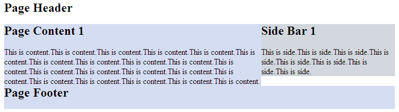
效果图:

正中间的两个div都浮动起来,且包含块的宽度是固定值。Footer清除浮动防止浮动块覆盖。
1-2-1布局(绝对定位)
<html xmlns="http://www.w3.org/1999/xhtml">

<head>

<title>固定宽度-absolute</title>

<style type="text/css">

#header,#footer,#container{

    width: 760px;

    margin: 0 auto;

}

#container{

    position:relative;

}

#content {

    width: 500px;

    margin-right:260px;

    background: #d5ddf3;

}

#side {

    position:absolute;

    top:0;

    right:0;

    width: 260px;

    background: #d2d8de;

}

#footer {

    background: #d5ddf3;

}

</style>

</head>

<body>

    <h2>Page Header</h2>

</div>

<div id="container">

    <div id="content">

        <h2>Page Content 1</h2>

        <p>This is content.This is content.This is content.This is content.This is content.This is content.This is content.This is content.This is content.This is content.This is content.This is content.This is content.This is content.This is content.This is content.This is content.This is content.This is content.This is content.This is content.</p>

    </div>

    <div id="side">

        <h2>Side Bar 1</h2>

        <p>This is side.This is side.This is side.This is side.This is side.This is side.This is side.This is side.</p>

    </div>

</div>

<div id="footer">

        <h2>Page Footer</h2>

</div>

</body>

</html>
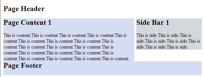
效果图:
但是有一点要注意,由于用绝对定位的块脱离的文档流,当绝对定位块高度小于旁边块高度的时候,会与其他块重叠。
流式布局
<html xmlns="http://www.w3.org/1999/xhtml">

<head>

<title>float</title>

<style type="text/css">

#header,#footer,#container{

    width: 85%;

    margin:0 auto;

}

#content {

    float:left;

    width: 66%;

    background: #d5ddf3;

}

#side {

    float:right;

    width: 33%;

    background: #d2d8de;

}

#footer {

    cleat:both;

    background: #d5ddf3;

}

</style>

</head>

<body>

<div id="header">

    <h2>Page Header</h2>

</div>

<div id="container">

    <div id="content">

        <h2>Page Content 1</h2>

        <p>This is content.This is content.This is content.This is content.This is content.This is content.This is content.This is content.This is content.This is content.This is content.This is content.This is content.This is content.This is content.This is content.This is content.This is content.This is content.This is content.This is content.</p>

    </div>

    <div id="side">

        <h2>Side Bar 1</h2>

        <p>This is side.This is side.This is side.This is side.This is side.This is side.This is side.This is side.</p>

    </div>

</div>

<div id="footer">

        <h2>Page Footer</h2>

</div>

</body>

</html>
效果图:
注意:确保不要使得某列的宽度太大。
另外,百分比布局经常会结合min-width和max-width使用。
CSS常用布局整理的更多相关文章
- CSS常用布局整理(二)
1-2-1单列变宽布局 side列定宽300px,content列变宽,尺寸是100%-300px.核心的问题就是浮动列的宽度应该等于“100% - 300px”,而CSS显然不支持这种带有减法运算的 ...
- CSS常用布局实现方法
CSS 布局对我来说,既熟悉又陌生.我既能实现它,又没有很好的了解它.所以想总结一下,梳理一下 CSS 中常用的一列,两列,三列布局等的实现方法.本文小白,仅供参考.但也要了解下浮动,定位等. 一.一 ...
- css常用布局
1.一列布局 html: <div class="header"></div> <div class="body">< ...
- css 常用布局
「前端那些事儿」③ CSS 布局方案 我们在日常开发中经常遇到布局问题,下面罗列几种常用的css布局方案 话不多说,上代码! 居中布局 以下居中布局均以不定宽为前提,定宽情况包含其中 1.水平居中 a ...
- HTML/CSS 常用单词整理
页面布局(layout) header 头部/页眉: index 首页/索引: logo 标志: nav/sub_nav 导航/子导航: banner 横幅广告: main/content 主体/内容 ...
- CSS常用布局方式-两列布局、三列布局
CSS基础 2.几种布局方式1)table布局 当年主流的布局方式,第一种是通过table tr td布局 示例: <style type="text/css"> ta ...
- html+css 常用布局
1.中间固定宽度,两侧自适应 1.1 flex布局 <!DOCTYPE html><html lang="en"> <head> <met ...
- CSS常用样式整理
元素边框显示圆角:-moz-border-radius适用于火狐浏览器,-webkit-border-radius适用于Safari和Chrome两种浏览器. 浏览器渐变背景颜色: FILTER: p ...
- CSS Flex布局整理
Flex布局 display: flex; 将对象作为弹性伸缩盒展示,用于块级元素 display: inline-flex; 将对象作为弹性伸缩盒展示,用于行内元素 注意兼容问题: webkit内核 ...
随机推荐
- 2. scala中的数组
一. 数组声明 定长数组 scala> new Array[String](5) res1: Array[String] = Array(null, null, null, null, null ...
- Android Gradle实用技巧——APK文件名中加上SVN版本号,日期等
有时候,我们会希望能把APK文件名上带上打包日期,打包时svn的版本号,应用版本号等.当然这些也可以手动添加,但是手动的话也未免太不优雅了,而且可能会出错. 利用Gradle,我们可以让打包出来的ap ...
- PLSQL_Database Link的基本概念和用法(概念)
2014-06-08 Created By BaoXinjian
- PLSQL_性能优化系列06_Oracle Soft Parse / Hard Parse软硬解析
2014-08-11 Createed By BaoXinjian
- PLSQL_长脚本如何判断需耗时多久v.sql / v.sqltext / v.sqlarea / v.sql_plan及nohup(案例)
2014-08-27 Created By BaoXinjian
- mrp功能分类
mrp主要有六大功能子系统:[工程管理子系统].[销售管理子系统].[计划管理子系统].[采购管理子系统].[库存管理子系统].[MRP运行管理子系统].[工程管理子系统]主要功能:产品/物料编码表. ...
- 常用到的Mysql语句
经典SQL语句大全 一.基础 1.说明:创建数据库CREATE DATABASE database-name 2.说明:删除数据库drop database dbname3.说明:备份sql serv ...
- c#图片上绘制半透明矩形
p.CreateGraphics().FillRectangle( ,Color.LightGreen)), iLeft, iTop, iRight - iLeft, iBottom - iTop); ...
- git撤销命令
1 撤销工作区中master的修改 git checkout -- master.txt ,用暂存去覆盖工作区 2 git clean -n 查看哪些文件会被移除3 git clean -f 强制删除 ...
- spring listener引用spring中bean
在SSH项目开发中,会使用到监听器Listener,并且有时需要在监听器中完成数据库的操作等动作,此时需要在Listener中使用到Spring容器中的Bean.Spring容器本身就是在web.xm ...