CSS常用布局整理
固定宽度布局
1-2-1布局(浮动)
<html xmlns="http://www.w3.org/1999/xhtml">

<head>

<title>固定宽度-float</title>

<style type="text/css">

#header,#footer,#container{

    width: 760px;

    margin: 0 auto;

}

#content {

    float: left;

    width: 500px;

    background: #d5ddf3;

}

#side {

    float: left;

    width: 260px;

    background: #d2d8de;

}

#footer {

    clear: both;

    background: #d5ddf3;

}

</style>

</head>

<body>

    <h2>Page Header</h2>

</div>

<div id="container">

    <div id="content">

        <h2>Page Content 1</h2>

        <p>This is content.This is content.This is content.This is content.This is content.This is content.This is content.This is content.This is content.This is content.This is content.This is content.This is content.This is content.This is content.This is content.This is content.This is content.This is content.This is content.This is content.</p>

    </div>

    <div id="side">

        <h2>Side Bar 1</h2>

        <p>This is side.This is side.This is side.This is side.This is side.This is side.This is side.This is side.</p>

    </div>

</div>

<div id="footer">

        <h2>Page Footer</h2>

</div>

</body>

</html>
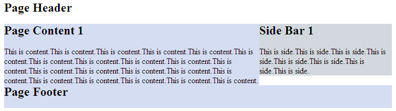
效果图:

正中间的两个div都浮动起来,且包含块的宽度是固定值。Footer清除浮动防止浮动块覆盖。
1-2-1布局(绝对定位)
<html xmlns="http://www.w3.org/1999/xhtml">

<head>

<title>固定宽度-absolute</title>

<style type="text/css">

#header,#footer,#container{

    width: 760px;

    margin: 0 auto;

}

#container{

    position:relative;

}

#content {

    width: 500px;

    margin-right:260px;

    background: #d5ddf3;

}

#side {

    position:absolute;

    top:0;

    right:0;

    width: 260px;

    background: #d2d8de;

}

#footer {

    background: #d5ddf3;

}

</style>

</head>

<body>

    <h2>Page Header</h2>

</div>

<div id="container">

    <div id="content">

        <h2>Page Content 1</h2>

        <p>This is content.This is content.This is content.This is content.This is content.This is content.This is content.This is content.This is content.This is content.This is content.This is content.This is content.This is content.This is content.This is content.This is content.This is content.This is content.This is content.This is content.</p>

    </div>

    <div id="side">

        <h2>Side Bar 1</h2>

        <p>This is side.This is side.This is side.This is side.This is side.This is side.This is side.This is side.</p>

    </div>

</div>

<div id="footer">

        <h2>Page Footer</h2>

</div>

</body>

</html>
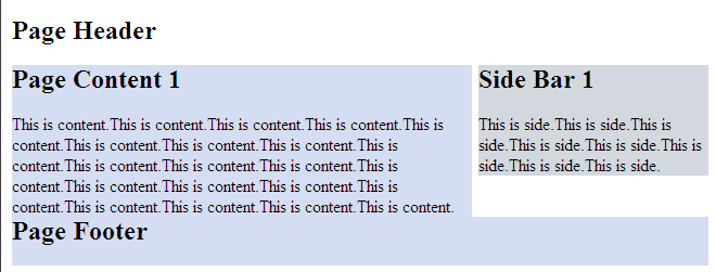
效果图:
但是有一点要注意,由于用绝对定位的块脱离的文档流,当绝对定位块高度小于旁边块高度的时候,会与其他块重叠。
流式布局
<html xmlns="http://www.w3.org/1999/xhtml">

<head>

<title>float</title>

<style type="text/css">

#header,#footer,#container{

    width: 85%;

    margin:0 auto;

}

#content {

    float:left;

    width: 66%;

    background: #d5ddf3;

}

#side {

    float:right;

    width: 33%;

    background: #d2d8de;

}

#footer {

    cleat:both;

    background: #d5ddf3;

}

</style>

</head>

<body>

<div id="header">

    <h2>Page Header</h2>

</div>

<div id="container">

    <div id="content">

        <h2>Page Content 1</h2>

        <p>This is content.This is content.This is content.This is content.This is content.This is content.This is content.This is content.This is content.This is content.This is content.This is content.This is content.This is content.This is content.This is content.This is content.This is content.This is content.This is content.This is content.</p>

    </div>

    <div id="side">

        <h2>Side Bar 1</h2>

        <p>This is side.This is side.This is side.This is side.This is side.This is side.This is side.This is side.</p>

    </div>

</div>

<div id="footer">

        <h2>Page Footer</h2>

</div>

</body>

</html>
效果图:
注意:确保不要使得某列的宽度太大。
另外,百分比布局经常会结合min-width和max-width使用。
CSS常用布局整理的更多相关文章
- CSS常用布局整理(二)
1-2-1单列变宽布局 side列定宽300px,content列变宽,尺寸是100%-300px.核心的问题就是浮动列的宽度应该等于“100% - 300px”,而CSS显然不支持这种带有减法运算的 ...
- CSS常用布局实现方法
CSS 布局对我来说,既熟悉又陌生.我既能实现它,又没有很好的了解它.所以想总结一下,梳理一下 CSS 中常用的一列,两列,三列布局等的实现方法.本文小白,仅供参考.但也要了解下浮动,定位等. 一.一 ...
- css常用布局
1.一列布局 html: <div class="header"></div> <div class="body">< ...
- css 常用布局
「前端那些事儿」③ CSS 布局方案 我们在日常开发中经常遇到布局问题,下面罗列几种常用的css布局方案 话不多说,上代码! 居中布局 以下居中布局均以不定宽为前提,定宽情况包含其中 1.水平居中 a ...
- HTML/CSS 常用单词整理
页面布局(layout) header 头部/页眉: index 首页/索引: logo 标志: nav/sub_nav 导航/子导航: banner 横幅广告: main/content 主体/内容 ...
- CSS常用布局方式-两列布局、三列布局
CSS基础 2.几种布局方式1)table布局 当年主流的布局方式,第一种是通过table tr td布局 示例: <style type="text/css"> ta ...
- html+css 常用布局
1.中间固定宽度,两侧自适应 1.1 flex布局 <!DOCTYPE html><html lang="en"> <head> <met ...
- CSS常用样式整理
元素边框显示圆角:-moz-border-radius适用于火狐浏览器,-webkit-border-radius适用于Safari和Chrome两种浏览器. 浏览器渐变背景颜色: FILTER: p ...
- CSS Flex布局整理
Flex布局 display: flex; 将对象作为弹性伸缩盒展示,用于块级元素 display: inline-flex; 将对象作为弹性伸缩盒展示,用于行内元素 注意兼容问题: webkit内核 ...
随机推荐
- .NET中值得体验的精妙设计
转自: http://developer.51cto.com/art/201104/255455_all.htm .NET 是 Microsoft XML Web services 平台.MEF是.N ...
- Android一 流
补充Java知识:流 java.io 四个抽象类: 字节流:InputStream OutputStream 字符流:Reader Writer 站在程序角度上,输入(读入到程序)输出(从程序写出) ...
- about_并查集
前天刚学了并查集,挺好用的,虽然我现在只会用它来解决是不是亲戚啊,是不是朋友啊,带权并查集还不是很理解. 并查集也叫做不相交集合,主要有3个操作,初始化,查找,合并. 并查集其中一个很大的应用就是kr ...
- Uvision5不能进行软件仿真
Uvision5不能进行软件仿真不能进行软件仿真,报错: error 65: access violation at 0x40021000 : no 'read' permission(软件仿真出错) ...
- mysql随机更新时间
UPDATE data_arch_point SET click_time = DATE_ADD('2016-06-15 00:00:00', INTERVAL )) SECOND) WHERE DA ...
- ssh 连接ubuntu的虚拟机问题
我在winxp的虚拟机上装了一个ubuntu9.04的系统,winxp的ip为10.118.62.157,ubuntu的ip为192.168.116.1 两个ip互相ping都是正常的,但是,我在wi ...
- 学习MongoDB--(11):应用举例(利用java操作MongoDB)
原文地址:http://blog.csdn.net/drifterj/article/details/7948090 目录地址:http://blog.csdn.net/DrifterJ/articl ...
- 织梦DEDECMS文章、栏目页获取当前页面顶级栏目名称的方法
在用织梦做一些项目时,时常会碰到需要在当前页面调用顶级栏目名称的时候,织梦默认{dede:field name='typename' /} 可以获取当前栏目页上一级栏目的名称,而不是当前栏目顶级栏目名 ...
- JAVA中日期处理
一.日期和long类型数据的相互转换 public class Hello { public static void main(String[] args) throws Exception { // ...
- CRM报表打印
删除路径下的文件 C:\Windows\Downloaded Program Files\rsclientprint.dll路径下的这个dll文件,重新登录crm选择一个面单点击打印按钮重新安装插件