Caffe---Pycaffe 绘制loss和accuracy曲线
Caffe---Pycaffe 绘制loss和accuracy曲线
《Caffe自带工具包---绘制loss和accuracy曲线》:可以看出使用caffe自带的工具包绘制loss曲线和accuracy曲线十分的方便简单,而这种方法看起来貌似只能分开绘制曲线,无法将两种曲线绘制在一张图上。但,我们有时为了更加直观的观察训练loss和测试loss,往往需要将这两种曲线绘制在一张图上。那如何解决呢?python接口,Pycaffe可以实现将这两种曲线绘制在一张图上。
目前,我知道的知识面中,Pycaffe有两种方式可以画出loss和accuracy曲线:一种是,根据之前博文里保存的训练日志.log文件,Pycaffe进行绘制;另一种是,Pycaffe自己进行训练,训练完后自动出图。
目录
1,Pycaffe---只绘图(前提已有训练的.log文件)
2,Pycaffe---训练+绘图
正文
1,Pycaffe---只绘图
这种方式属于绘制训练后的loss和accuracy曲线,绘图所需的信息,利用python从log日志里面获取。一般步骤:train_xxx_log.sh文件训练,然后保存xxx.log文件,手动将xxx.log文件名改成xxx.txt,然后用Pycaffe绘图。
(1)示例,写一个FromLogTxt_draw_LossAccuracy.py文件(参考:https://blog.csdn.net/u014593748/article/details/76152622):
------------------------------------------------------------------------------------
# -*- coding: utf-8 -*-
#!/usr/bin/env python
import sys
import re
import matplotlib.pyplot as plt
import numpy as np
in_log_path='/home/wp/caffe/myself/road/Log/record_train_road_log.txt' #输入日志文件的位置
out_fig_path='/home/wp/caffe/myself/road/Log/record_train_road_log.jpg' #输出图片的位置
f=open(in_log_path,'r')
accuracy=[]
train_loss=[]
test_loss=[]
max_iter=0
test_iter=0
test_interval=0
display=0
target_str=['accuracy = ','Test net output #1: loss = ','Train net output #0: loss = ',
'max_iter: ','test_iter: ','test_interval: ','display: ']
while True:
line=f.readline()
# print len(line),line
if len(line)<1:
break
for i in range(len(target_str)):
str=target_str[i]
idx = line.find(str)
if idx != -1:
num=float(line[idx + len(str):idx + len(str) + 5])
if(i==0):
accuracy.append(num)
elif(i==1):
test_loss.append(num)
elif(i==2):
train_loss.append(num)
elif(i==3):
max_iter=float(line[idx + len(str):])
elif(i==4):
test_iter=float(line[idx + len(str):])
elif(i==5):
test_interval=float(line[idx + len(str):])
elif(i==6):
display=float(line[idx + len(str):])
else:
pass
f.close()
# print test_iter
# print max_iter
# print test_interval
# print len(accuracy),len(test_loss),len(train_loss)
_,ax1=plt.subplots()
ax2=ax1.twinx()
#绘制train_loss曲线图像,颜色为绿色'g'
ax1.plot(display*np.arange(len(train_loss)),train_loss,color='g',label='train loss',linestyle='-')
#绘制test_loss曲线图像,颜色为黄色'y'
ax1.plot(test_interval*np.arange(len(test_loss)),test_loss,color='y',label='test loss',linestyle='-')
#绘制accuracy曲线图像,颜色为红色'r'
ax2.plot(test_interval*np.arange(len(accuracy)),accuracy,color='r',label='accuracy',linestyle='-')
ax1.legend(loc=(0.7,0.8)) #使用二元组(0.7,0.8)定义标签位置
ax2.legend(loc=(0.7,0.72))
ax1.set_xlabel('iteration')#设置X轴标签
ax1.set_ylabel('loss') #设置Y1轴标签
ax2.set_ylabel('accuracy') #设置Y2轴标签
plt.savefig(out_fig_path,dpi=100) #将图像保存到out_fig_path路径中,分辨率为100
plt.show() #显示图片
------------------------------------------------------------------------------------
# python FromLogTxt_draw_LossAccuracy.py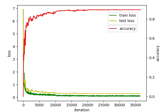
(2)或者,在shell下根据XXX.log文件,提取loss值以及accuracy值,保存到test_loss.txt,train_loss.txt,test_acc.txt。参考https://blog.csdn.net/m0_37477175/article/details/78431717。
终端下,进入相应的目录下:cat train_road_20180525.log | grep "Train net output" | awk '{print $11}',如下:
python+pandas来间接绘图!首先我们查看一下网络训练参数:
#训练每迭代500次,进行一次预测

test_interval: 500

#每经过100次迭代,在屏幕打印一次运行log

display: 100

#最大迭代次数

max_iter: 10000
#!/usr/bin/env python
# -*- coding:utf-8 -*-
"""
Created on Tue Oct 17 2017
@author: jack wang
This program for visualize the loss and accuracy
"""
import pandas as pd
import numpy as np
import matplotlib.pyplot as plt
train_interval = 100 #display = 100
test_interval = 500
max_iter = 10000
def loadData(file):
dataMat = []
fr = open(file)
for line in fr.readlines():
lineA = line.strip().split()
dataMat.append(float(lineA[0]))
return dataMat
trainloss = loadData('trainloss.txt')
testloss = loadData('testloss.txt')
trainLoss = pd.Series(trainloss, index = range(0,max_iter,100))
testLoss = pd.Series(testloss, index = range(0,max_iter+500,500))
fig = plt.figure()
plt.plot(trainLoss)
plt.plot(testLoss)
plt.xlabel(u"iter")
plt.ylabel(u"loss")
plt.title(u"trainloss vs testloss")
plt.legend((u'trainloss', u'testloss'),loc='best')
plt.show()
testacc = loadData('testacc.txt')
testAcc = pd.Series(testacc, index = range(0,max_iter+500,500))
plt.plot(testAcc)
plt.show()注明:这种方法,个人没有顺利的做下来,留作下次继续研究。
2,Pycaffe---训练+绘图
这种方式属于绘制训练过程的loss和accuracy曲线。一般步骤:Pycaffe自己写一个文件,里面既能训练网络,又能保存信息,然后绘制图。示例,写一个Pycaffe_TrainTest_then_loss_accuracy.py(参考https://www.cnblogs.com/denny402/p/5686067.html):
------------------------------------------------------------------------------------
# -*- coding: utf-8 -*-
#!/usr/bin/env python
from pylab import *
import matplotlib.pyplot as plt
import caffe
solver = caffe.SGDSolver('/home/wp/caffe/myself/road/prototxt_files/solver.prototxt')
niter = 200
display= 10
test_iter = 200
test_interval =100
train_loss = zeros(ceil(niter * 1.0 / display))
test_loss = zeros(ceil(niter * 1.0 / test_interval))
test_acc = zeros(ceil(niter * 1.0 / test_interval))
solver.step(1)
_train_loss = 0; _test_loss = 0; _accuracy = 0
for it in range(niter):
solver.step(1)
_train_loss += solver.net.blobs['loss'].data
if it % display == 0:
train_loss[it // display] = _train_loss / display
_train_loss = 0
if it % test_interval == 0:
for test_it in range(test_iter):
solver.test_nets[0].forward()
_test_loss += solver.test_nets[0].blobs['loss'].data
_accuracy += solver.test_nets[0].blobs['accuracy'].data
test_loss[it / test_interval] = _test_loss / test_iter
test_acc[it / test_interval] = _accuracy / test_iter
_test_loss = 0
_accuracy = 0
print '\nplot the train loss and test accuracy\n'
_, ax1 = plt.subplots()
ax2 = ax1.twinx()
ax1.plot(display * arange(len(train_loss)), train_loss, 'g')
ax1.plot(test_interval * arange(len(test_loss)), test_loss, 'y')
ax2.plot(test_interval * arange(len(test_acc)), test_acc, 'r')
ax1.set_xlabel('iteration')
ax1.set_ylabel('loss')
ax2.set_ylabel('accuracy')
plt.show()
plt.pause(0.000001)
------------------------------------------------------------------------------------
# cd caffe
#python Pycaffe_TrainTest_then_loss_accuracy.py
# .py这里放在caffe目录下,不在caffe目录下修改相应的路径即可。
# 代码含义,根据参考文章理解,.py文件中少出现汉字注释,否则会出现[ python: can't open file 'Pycaffe_TrainTest_then_loss_accuracy.py002.py': [Errno 2] No such file or directory ]这样的提示。
最后,训练完后,就会出现loss和accuracy曲线图了。设置niter = 200,快速迭代出图。
附,相关代码说明:
------------------------------------------------------------------------------------
# -*- coding: utf-8 -*-
#加载必要的库
import matplotlib.pyplot as plt

import caffe

caffe.set_device(0)

caffe.set_mode_gpu()

# 使用SGDSolver,即随机梯度下降算法

solver = caffe.SGDSolver('/home/xxx/mnist/solver.prototxt')

# 等价于solver文件中的max_iter,即最大解算次数

niter = 9380

# 每隔100次收集一次数据

display= 100

# 每次测试进行100次解算,10000/100

test_iter = 100

# 每500次训练进行一次测试(100次解算),60000/64

test_interval =938

#初始化

train_loss = zeros(ceil(niter * 1.0 / display))

test_loss = zeros(ceil(niter * 1.0 / test_interval))

test_acc = zeros(ceil(niter * 1.0 / test_interval))

# iteration 0,不计入

solver.step(1)

# 辅助变量

_train_loss = 0; _test_loss = 0; _accuracy = 0

# 进行解算

for it in range(niter):

    # 进行一次解算

    solver.step(1)

    # 每迭代一次,训练batch_size张图片

    _train_loss += solver.net.blobs['SoftmaxWithLoss1'].data

    if it % display == 0:

        # 计算平均train loss

        train_loss[it // display] = _train_loss / display

        _train_loss = 0

    if it % test_interval == 0:

        for test_it in range(test_iter):

            # 进行一次测试

            solver.test_nets[0].forward()

            # 计算test loss

            _test_loss += solver.test_nets[0].blobs['SoftmaxWithLoss1'].data

            # 计算test accuracy

            _accuracy += solver.test_nets[0].blobs['Accuracy1'].data

        # 计算平均test loss

        test_loss[it / test_interval] = _test_loss / test_iter

        # 计算平均test accuracy

        test_acc[it / test_interval] = _accuracy / test_iter

        _test_loss = 0

        _accuracy = 0

# 绘制train loss、test loss和accuracy曲线

print '\nplot the train loss and test accuracy\n'

_, ax1 = plt.subplots()

ax2 = ax1.twinx()

# train loss -> 绿色

ax1.plot(display * arange(len(train_loss)), train_loss, 'g')

# test loss -> 黄色

ax1.plot(test_interval * arange(len(test_loss)), test_loss, 'y')

# test accuracy -> 红色

ax2.plot(test_interval * arange(len(test_acc)), test_acc, 'r')

ax1.set_xlabel('iteration')

ax1.set_ylabel('loss')

ax2.set_ylabel('accuracy')

plt.show()
------------------------------------------------------------------------------------
Caffe---Pycaffe 绘制loss和accuracy曲线的更多相关文章
- Caffe---自带工具 绘制loss和accuracy曲线
Caffe自带工具包---绘制loss和accuracy曲线 为什么要绘制loss和accuracy曲线?在训练过程中画出accuracy 和loss曲线能够更直观的观察网络训练的状态,以便更好的优化 ...
- caffe的python接口学习(7):绘制loss和accuracy曲线
使用python接口来运行caffe程序,主要的原因是python非常容易可视化.所以不推荐大家在命令行下面运行python程序.如果非要在命令行下面运行,还不如直接用 c++算了. 推荐使用jupy ...
- Caffe学习系列(19): 绘制loss和accuracy曲线
如同前几篇的可视化,这里采用的也是jupyter notebook来进行曲线绘制. // In [1]: #加载必要的库 import numpy as np import matplotlib.py ...
- 解决caffe绘制训练过程的loss和accuracy曲线时候报错:paste: aux4.txt: 没有那个文件或目录 rm: 无法删除"aux4.txt": 没有那个文件或目录
我用的是faster-rcnn,在绘制训练过程的loss和accuracy曲线时候,抛出如下错误,在网上查找无数大牛博客后无果,自己稍微看了下代码,发现,extract_seconds.py文件的 g ...
- caffe绘制训练过程的loss和accuracy曲线
转自:http://blog.csdn.net/u013078356/article/details/51154847 在caffe的训练过程中,大家难免想图形化自己的训练数据,以便更好的展示结果.如 ...
- Caffe 根据log信息画出loss,accuracy曲线
在执行训练的过程中,若指定了生成log信息,log信息包含初始化,网络结构初始化和训练过程随着迭代数的loss信息. 注意生成的log文件可能没有.log后缀,那么自己加上.log后缀.如我的log信 ...
- 【Caffe】利用log文件绘制loss和accuracy(转载)
(原文地址:http://blog.csdn.net/liuweizj12/article/details/64920428) 在训练过程中画出accuracy 和loss曲线能够更直观的观察网络训练 ...
- 将caffe训练时loss的变化曲线用matlab绘制出来
1. 首先是提取 训练日志文件; 2. 然后是matlab代码: clear all; close all; clc; log_file = '/home/wangxiao/Downloads/43_ ...
- caffe-windows画loss与accuracy曲线
参考博客: http://blog.csdn.net/sunshine_in_moon/article/details/53541573 进入tools/extra/文件夹中,修改plot_train ...
随机推荐
- Flutter安卓客户端打包
想要安装到手机上,必须要进行打包,因为没有苹果手机,所以只能打包Android客户端的apk. 检查 App的配置 查看默认应用程序清单文件(位于/android/app/src/main/中的And ...
- OPC API 简介
————————————————版权声明:本文为CSDN博主「lgbisha」的原创文章,遵循 CC 4.0 BY-SA 版权协议,转载请附上原文出处链接及本声明.原文链接:https://blog. ...
- Linux基础(特基本的那种)知识
(自己的随手笔记,记得有点乱请轻喷) which:查看某个命令的完整路径df -h:查看系统磁盘情况history:查看历史输入的命令 网卡配置路径:vim /etc/sysconfig/networ ...
- HOG算法总结
1.HOG特征提取所针对的图像的尺寸是固定的.输入的图像应首先resize到这个尺寸. 2.尺寸的划分3个等级:window,block,cell window即输入的需要提取特征的图片大小.然后将w ...
- 【FFMEPG】windows下编译ffmpeg2.5——使用VS2013,ARMLINUX,ANDORID编译ffmpeg
原文:http://blog.csdn.net/finewind/article/details/42784557 一.准备: 1. 本机环境: win7 64bit: 2. 安装MinGW到C:\M ...
- php redis mysql apache 下载地址
Mysql:https://dev.mysql.com/get/Downloads/MySQL-5.6/mysql-5.6.36-linux-glibc2.5-x86_64.tar.gz php:ht ...
- mongodb 连接后无法使用 发现已经有进程在运行
mongod 命令执行发现已经有进程在运行mongod数据库--errno:48 Address already in use for socket: 0.0.0.0:27017 错误信息: list ...
- 最新 美图java校招面经 (含整理过的面试题大全)
从6月到10月,经过4个月努力和坚持,自己有幸拿到了网易雷火.京东.去哪儿.美图等10家互联网公司的校招Offer,因为某些自身原因最终选择了美图.6.7月主要是做系统复习.项目复盘.LeetCode ...
- 36.HTTP协议
HTTP简介 HTTP协议是Hyper Text Transfer Protocol(超文本传输协议)的缩写,是用于从万维网(WWW:World Wide Web )服务器传输超文本到本地浏览器的传送 ...
- 2019SDN第四次作业
一.配置java环境 输入命令sudo gedit ~/.bashrc 添加如下内容 二.启动并安装插件 cd distribution-karaf-0.4.4-Beryllium-SR4/bin/ ...