
android 自定义进度条颜色
先看图
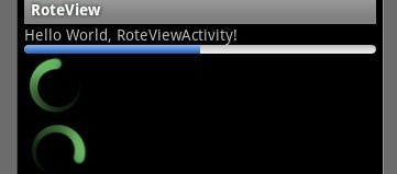
基于产品经理各种自定义需求,经过查阅了解,下面是自己对Android自定义进度条的学习过程!
这个没法了只能看源码了,还好下载了源码, sources\base\core\res\res\ 下应有尽有,修改进度条颜色只能找progress ,因为是改变样式,首先找styles.xml
找到xml后,进去找到
- <span style="font-size: 18px;"> <style name="Widget.ProgressBar">
- <item name="android:indeterminateOnly">true</item>
- <item name="android:indeterminateDrawable">@android:drawable/progress_medium_white</item>
- <item name="android:indeterminateBehavior">repeat</item>
- <item name="android:indeterminateDuration">3500</item>
- <item name="android:minWidth">48dip</item>
- <item name="android:maxWidth">48dip</item>
- <item name="android:minHeight">48dip</item>
- <item name="android:maxHeight">48dip</item>
- </style></span>
这是默认转圈的效果style,但今天我们修改的是水平进度条颜色!
所以找到
- <span style="font-size: 18px;"> <style name="Widget.ProgressBar.Horizontal">
- <item name="android:indeterminateOnly">false</item>
- <item name="android:progressDrawable">@android:drawable/progress_horizontal</item>
- <item name="android:indeterminateDrawable">@android:drawable/progress_indeterminate_horizontal</item>
- <item name="android:minHeight">20dip</item>
- <item name="android:maxHeight">20dip</item>
- </style></span>
你看系统一步一步关联的,扩展性很性,低耦合,所以我们现在只要改变进度条是怎么样画出来的就行了 ,但是负责画进度条的是
<item name="android:progressDrawable"> 所以我们可以找到"drawable下的 progress_horizontal 文件,改变他就可以改变进度条颜色
- <span style="font-size: 18px;"><?xml version="1.0" encoding="utf-8"?>
- <!-- Copyright (C) 2008 The Android Open Source Project
- Licensed under the Apache License, Version 2.0 (the "License");
- you may not use this file except in compliance with the License.
- You may obtain a copy of the License at
- http://www.apache.org/licenses/LICENSE-2.0
- Unless required by applicable law or agreed to in writing, software
- distributed under the License is distributed on an "AS IS" BASIS,
- WITHOUT WARRANTIES OR CONDITIONS OF ANY KIND, either express or implied.
- See the License for the specific language governing permissions and
- limitations under the License.
- -->
- <layer-list xmlns:android="http://schemas.android.com/apk/res/android">
- <item android:id="@android:id/background">
- <shape>
- <corners android:radius="5dip" />
- <gradient
- android:startColor="#ff9d9e9d"
- android:centerColor="#ff5a5d5a"
- android:centerY="0.75"
- android:endColor="#ff747674"
- android:angle="270"
- />
- </shape>
- </item>
- <item android:id="@android:id/secondaryProgress">
- <clip>
- <shape>
- <corners android:radius="5dip" />
- <gradient
- android:startColor="#80ffd300"
- android:centerColor="#80ffb600"
- android:centerY="0.75"
- android:endColor="#a0ffcb00"
- android:angle="270"
- />
- </shape>
- </clip>
- </item>
- <item android:id="@android:id/progress">
- <clip>
- <shape>
- <corners android:radius="5dip" />
- <gradient
- android:startColor="#ffffd300"
- android:centerColor="#ffffb600"
- android:centerY="0.75"
- android:endColor="#ffffcb00"
- android:angle="270"
- />
- </shape>
- </clip>
- </item>
- </layer-list>
- </span>
看到没有,这是系统的进度条画出的布局条件
android:startColor="#80ffd300"
android:centerColor="#80ffb600"
android:endColor="#ff747674"
我们只要改变这个色值就能改变他的颜色,主要改变的是<item android:id="@android:id/progress">下的色值就行了
说了这么多,到底怎么做呢, 很简单
1 。 在我们的项目下新建一个 style.xml 文件
创建一个style 标签,集成系统默认样式,然后自定义一个新的progressDrawable 文件,随后面在layout 中的progress 中引用这个文件就行
<style name="ProgressBar_Mini" parent="@android:style/Widget.ProgressBar.Horizontal">
<item name="android:maxHeight">50dip</item>
<item name="android:minHeight">8dip</item>
<item name="android:indeterminateOnly">false</item>
<item name="android:indeterminateDrawable">@android:drawable/progress_indeterminate_horizontal</item>
<item name="android:progressDrawable">@drawable/progressbar_mini</item>
</style>
下面是我的 progressbar_mini 文件,改变了下android:endColor="#F5F5F5" android:startColor="#BEBEBE" 的色值
- <span style="font-size: 18px;"><layer-list xmlns:android="http://schemas.android.com/apk/res/android" >
- <item android:id="@android:id/background">
- <shape >
- <corners android:radius="5dip" />
- <gradient
- android:angle="270"
- android:centerY="0.75"
- android:endColor="#F5F5F5"
- android:startColor="#BEBEBE" />
- </shape>
- </item>
- <item android:id="@android:id/secondaryProgress">
- <clip >
- <shape >
- <corners android:radius="0dip" />
- <gradient
- android:angle="270"
- android:centerY="0.75"
- android:endColor="#165CBC"
- android:startColor="#85B0E9" />
- </shape>
- </clip>
- </item>
- <item android:id="@android:id/progress">
- <clip >
- <shape >
- <corners android:radius="5dip" />
- <gradient
- android:angle="270"
- android:centerY="0.75"
- android:endColor="#165CBC"
- android:startColor="#85B0E9" />
- </shape>
- </clip>
- </item>
- </layer-list></span>
最后在中引用就可以了
<ProgressBar
android:id="@+id/progress"
style="@style/ProgressBar_Mini"
android:layout_width="fill_parent"
android:layout_height="wrap_content"
android:progress="50" />
转载申明初入:http://blog.csdn.net/liao3841054/article/details/7556551
- 顶
- 0
- 踩
- 0
android 自定义进度条颜色的更多相关文章
- Android自定义进度条颜色
这个没法了只能看源码了,还好下载了源码, sources\base\core\res\res\ 下应有尽有,修改进度条颜色只能找progress ,因为是改变样式,首先找styles.xml ? 1 ...
- 最简单的android自定义进度条样式
一.自定义圆形进度条样式 1.在安卓项目drawable目录下新建一个xml文件如下:<?xml version="1.0" encoding="utf-8&quo ...
- Android自定义进度条
Android原生控件只有横向进度条一种,而且没法变换样式,比如原生rom的样子很丑是吧,当伟大的产品设计要求更换前背景,甚至纵向,甚至圆弧状的,咋办,比如ok,我们开始吧: 一)变换前背景 先来看看 ...
- Android自定义进度条-带文本(文字进度)的水平进度条(ProgressBar)
水平进度条,显示进度的文本随着进度而移动. 效果如下,截的静态图. 代码如下 TextProgressBar.java public class TextProgressBar extends Pro ...
- android圆形进度条ProgressBar颜色设置
花样android Progressbar http://www.eoeandroid.com/thread-1081-1-1.html http://www.cnblogs.com/xirihanl ...
- BitBlt()函数实现带数字百分比进度条控件、静态文本(STATIC)控件实现的位图进度条、自定义进度条控件实现七彩虹颜色带数字百分比
Windows API BitBlt()函数实现带数字百分比进度条控件. 有两个例子:一用定时器实现,二用多线程实现. 带有详细注解. 此例是本人原创,绝对是网上稀缺资源(本源码用Windows AP ...
- Android 设置进度条背景
Android 设置进度条背景 直接上代码 <ProgressBar android:id="@+id/progressBar" android:layout_width=& ...
- android113 自定义进度条
MainActivity: package com.itheima.monitor; import android.os.Bundle; import android.app.Activity; im ...
- 自定义进度条PictureProgressBar——从开发到开源发布全过程
自定义进度条PictureProgressBar——从开发到开源发布全过程 出处: 炎之铠邮箱:yanzhikai_yjk@qq.com 本文原创,转载请注明本出处! 本项目JCenter地址:htt ...
随机推荐
- XML相关操作
一.简单介绍 using System.Xml; //初始化一个xml实例 XmlDocument xml=new XmlDocument(); //导入指定xml文件 xml.Load(path); ...
- Windows手动添加开机启动项
@方法1. 添加程序完整路径到注册表HKEY_LOCAL_MACHINE\SOFTWARE\Microsoft\Windows\CurrentVersion\Run下 或者添加到HKEY_CURREN ...
- 2016年11月21日 星期一 --出埃及记 Exodus 20:12
2016年11月21日 星期一 --出埃及记 Exodus 20:12 "Honor your father and your mother, so that you may live lo ...
- 2016年10月15日 星期六 --出埃及记 Exodus 18:26
2016年10月15日 星期六 --出埃及记 Exodus 18:26 They served as judges for the people at all times. The difficult ...
- WebForm 发送邮箱
首先在设置发件邮箱的SMTP服务,以新浪邮箱为例:设置区----客户端pop/imap/smtp----"POP3/SMTP服务"和"IMAP4服务/SMTP服务&quo ...
- WDCP控制面板如何安装PDO_mysql组件
http://osacar.iteye.com/blog/2098431 执行wget -c http://down.wdlinux.cn/in/pdo_mysql_ins.sh再执行chmod 75 ...
- 【Java】Map杂谈,hashcode()、equals()、HashMap、TreeMap、LinkedHashMap、ConcurrentHashMap
参考的优秀文章: <Java编程思想>第四版 <Effective Java>第二版 Map接口是映射表的结构,维护键对象与值对象的对应关系,称键值对. > hashco ...
- 高通APQ8074 spi 接口配置
高通APQ8074 spi 接口配置 8074 平台含有两个BLSP(BAM Low-Speed Peripheral) , 每一个BLSP含有两个QUP, 每一个QUP可以被配置为I2C, SPI, ...
- 【转载】创建和使用动态链接库 (C++)
原文:http://blog.csdn.net/handforcpp/article/details/3478254 也可参考MSDN: 演练:创建和使用动态链接库 (C++) 我们将创建的第一种类型 ...
- Some Useful Property Settings Explained Of Oracle Forms
In Oracle forms when we have two or more blocks and there is a requirement to join them or make a re ...