如何构建一个很棒网站页脚(Website Footer)
对于很多人来说,制作页脚是只是设计师顺手而为的任务。它似乎很容易,似乎可以忽略不计。因为很多人都觉得网站底部很少人会去看,而且页脚链接的所有链接的点击率(CTR)都是最低的,何必呢?
真是这样的吗?下面为您解析。
页脚 & CTR(点击率)
Well, the fact about the low CTR may be true, but it doesn’t present the whole picture. The low CTR is mainly a result of the fact that few people see the footer in the first place.
So I have a theory of my own about this.
Although, apparently, there’s no study done on the topic (at least I wasn’t able to find it; feel free to chip in if you have some data), I believe that the CTR is actually quite high for footers if we only count the people who have scrolled all the way down on the page.
I did some quick number crunching with my CrazyEgg account to examine this more closely. When I compare the estimated number of people who see my footer (through the scroll map tool) and the total number of clicks my footer generates, I can see that between 14 percent and 20 percent of people end up clicking on something once they see the footer (depending on the page tested).
Of course, this is just a very simple test with a rather small heap of data, so it’s difficult to draw any reliable conclusions. Also, my footer is huge. It takes around 55-60 percent of the screen, so it’s hard to resist clicking on something. Anyway, even despite the shortcomings, the results are still very interesting.
So the lesson is simple…
Footers matter.
And here’s what you can do to make your footer properly awesome.
1. Don’t treat it as an SEO dumpster
Some people still try to inflate their rankings by using keyword links in the footer. And I know that doing so is hard to resist. It’s just too easy, and the links don’t even look out of place. But this really should be avoided in 2014. Mainly because it isn’t much of a challenge for Google to recognize the footer and give the links a low SEO value.
The whole practice is just so 2008 – or even worse.
Actually, it was 2008 when Rand Fishkin already talked about this being not effective.
2. Introduce hierarchy
There are always some elements that are more important than others, and you should reinforce this idea through alignment, scale, and placement within your footer.
For instance, if you go to Smart Passive Income, you’ll see that getting you to opt in is the most important goal for Pat – the owner. The footer for every page on the site starts with a big subscription box.
Then, additional links and disclosures follow.
Try adopting the same idea. Start with what’s important and then continue with everything else.
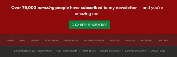
3. Try one last time to get a conversion
Speaking of opt-ins, these days, getting someone to opt in is one of the most popular website goals, and site owners are willing to do almost anything it takes to raise their conversion rates.
Hard to blame them for that, to be honest.
The footer is the last chance to get a conversion. And that’s regardless of what the conversion represents in your individual case. Take advantage of that chance, you owe it to your site’s main goal.
For example, here’s the footer at Codeinwp.com – a company providing PSD-to-WordPress services that I’m part of. The footer is huge and it has one main goal – to convince people to submit their designs and have them turned into a working WordPress theme.
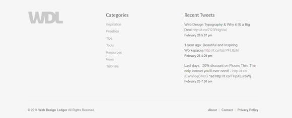
4. Use white space
White space is so underrated right now. Actually, it’s been underrated since ever. When in fact, there’s no other easier way to give your footer some additional emphasis and make the links pop more.
We don’t have to go far for examples – just scroll down to see the footer here at WDL.
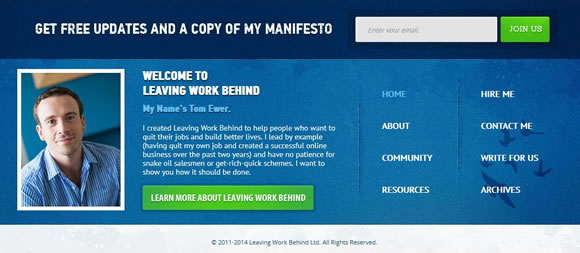
5. Experiment with “about the author” blocks
If you’re designing a single author site/blog then it’s often a good idea to use the available space to present a nice “about the author” block.
Now, the goal here isn’t increasing the CTR. People rarely click on author blocks (at least in my tests), but it does introduce a personal touch and makes it clear who the author is no matter what page is viewed at the moment.
Here’s a great example from Leaving Work Behind:
6. Don’t forget about the must-have links
It’s really hard to imagine a footer without some of the following links:
- About
- Contact
- Home
- Blog (if there is one)
The reason why they’re essential is simple. Over the years, people have gotten used to seeing those pages in footers. It’s become a convention, and breaking it rarely pays off.
A good way to go about this when picking the things to mention in your footer is to ask yourself the following:
Will my audience expect to see this link in the footer?
7. Display social media links
Here are two of the most popular approaches to social media vs. footers:
- Use default buttons. For example, to get a Facebook Like button, go to this section in the developers area. They tend to be effective because of their official nature – people are very familiar with them and know exactly what to do when they see one.
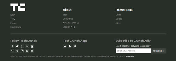
- Use some custom buttons. They may not have the same CTR, but you don’t always want to click-optimize these buttons, especially if you attempt to show more than a handful of them. Take a look at TechCrunch, to get an idea:
8. Consider using a sub-footer
Your sub-footer is the part that comes after your main footer area. It’s most commonly used to display various legal links or other things that you don’t necessarily want people to click on, but they do regulate and disclose some of your operations.
I’m talking about things like privacy policy, terms, earnings disclosure, copyright clause, DMCA, etc.
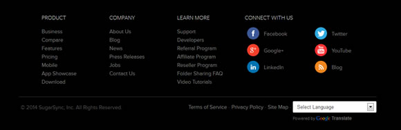
Example from SugarSync.com:
9. Showcase social proof, badges, and safety seals
Depending on the kind of business that the site you’re working on is in, displaying some additional social proof can work well for the site’s overall credibility.
Let’s take another look at Pat Flynn’s site to get an example (this time it’s the homepage):
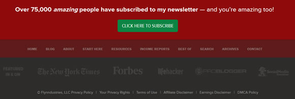
These company logos are not clickable, plus the contrast is very low. But you don’t really need more. The logos are there to provide social proof, not to catch too much attention.
10. Link to your best content
This is something that can work well on blogs and online publishing sites in general; not so much on business sites or product sites.
The main idea is that popular content is usually popular for a reason, so showcasing it in the footer can improve the readership numbers even further.
It’s a simple rule – it’s much easier to grow the popularity of something that’s already popular, than to build the popularity of something that’s not.
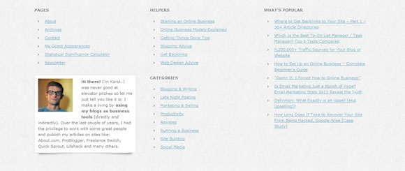
An example by newInternetOrder.com:
11. Be careful about turning your footer into “master navigation”
This goes back to the first item on this very list – treating your footer as an SEO dumpster.
Footers should be neither an SEO dumpster, nor a master navigation.
You really shouldn’t try cramping all the links you have in the footer. This will not have a good effect on your readers.
A lot better approach is to create a custom archives page and then link to it from the footer. That way, you still have a readable and clear footer, and if someone wants to find a specific resource, they can do so via the archives.
What’s wrong with your footer, my friend?
To be honest with you, when gathering the data for this post and then writing it, I found at least a handful of things wrong with the footers I use on my sites. So my question is simple: What’s wrong with your footer? And more importantly, what will you do to fix it?
如何构建一个很棒网站页脚(Website Footer)的更多相关文章
- 利用angular4和nodejs-express构建一个简单的网站(五)—用户的注册和登录-HttpClient
上一节简单介绍了一下利用angular构建的主路由模块,根据上一节的介绍,主页面加载时直接跳转到用户管理界面,下面就来介绍一下用户管理模块.启动应用后,初始界面应该是这样的: 用户管理模块(users ...
- 国外大神制作的一个很棒的matplotlib 可视化教程
国外大神制作的一个很棒的matplotlib 可视化教程 参考:https://www.machinelearningplus.com/plots/top-50-matplotlib-visualiz ...
- 给SharePoint页面加入自己定义页脚Custom footer
给SharePoint页面加入自己定义页脚Custom footer 在公司做站点设计项目时,须要在页面上加入页脚. 非常多人都把页脚忽视了,认为没什么多大用处,事实上 ...
- 基于Vue2.0+Vue-router构建一个简单的单页应用
爱编程爱分享,原创文章,转载请注明出处,谢谢!http://www.cnblogs.com/fozero/p/6185492.html 一.介绍 vue.js 是 目前 最火的前端框架,vue.js ...
- Makefile经典教程(一个很棒很清晰的讲解)【转】
转自:https://blog.csdn.net/seven_amber/article/details/70216216 该篇文章为转载,是对原作者系列文章的总汇加上标注. 支持原创,请移步陈浩大神 ...
- 快速构建一个简单的单页vue应用
技术栈 vue-cli webpack vux,vux-loader less,less-loader vue-jsonp vue-scroller ES6 vue-cli:一个vue脚手架工具,利用 ...
- 粘性页脚 Sticky Footer 最佳方式
前段时间工作中遇到粘性页脚的需求,以前用过JS控制过,最后发现flex布局是解决这类问题的好帮手. 粘性页脚:即使没有足够的内容填充页面,也要将页脚固定到窗口的底部. <!DOCTYPE htm ...
- 【MVC】快速构建一个图片浏览网站
当抄完MusicStore时,你应该对MVC有一个比较清晰的认识了.接下来就需要做个网站来继续增加自己的知识了.那么,该做个什么网站呢.做个图片浏览网站吧,简单而实用. 简单设计 1.首先,页面中间是 ...
- 利用angular4和nodejs-express构建一个简单的网站(一)——构建前后端开发环境
学习了一段时间的angular4知识,结合以前自学的nodejs-express后端框架知识,做了一个利用angular4作为前端,node-express作为后端服务器的网站.这个网站的功能很简单, ...
随机推荐
- wamp上能够访问jsp(未解决 游客勿看)
Windows下使用apache的jk_mod连接WAMP和Tomcat 发表于 2013 年 4 月 29 日 由 www.tonitech.com的站长 | 暂无评论 | Apache,Windo ...
- 60行代码:Javascript 写的俄罗斯方块游戏
哈哈这个实在是有点意思 备受打击当初用java各种类写的都要几百行啦 先看效果图: 游戏结束图: javascript实现源码: [javascript] view plaincopyprint? & ...
- 团队项目利用Msbuild自定义Task实现增量发布
最近一直在做自动部署工具,主要利用到了Msbuild的自定义Task,通过Task我们可以自定义编译.部署过程减少人工直接干预.Msbuild的详细用法,可以去园子里搜一下,有很多的基础教程,这里就不 ...
- WPF和Expression Blend开发实例:模拟QQ登陆界面打开和关闭特效
不管在消费者的心中腾讯是一个怎么样的模仿者抄袭者的形象,但是腾讯在软件交互上的设计一直是一流的.正如某位已故的知名产品经理所说的:设计并非外观怎样,感觉如何.设计的是产品的工作原理.我觉得腾讯掌握了其 ...
- php关于static和self的一点理解
在使用和学习laravel的过程中,总会看到类似与static::methods或者static::variable的使用方式,对此感觉到疑惑和不解,后来查阅了相关的资料才知道他是php5.3之后新加 ...
- mb_strlen(,utf-8);可以除去中文字符,统一返回是几个字符
mb_strlen(,utf-8);可以除去中文字符,统一返回是几个字符
- RFID标签、读卡器、终端、接口的概念
RFID标签:(引用)RFID无线射频识别是一种非接触式的自动识别技术,它通过射频信号自动识别目标对象并获取相关数据,识别工作无须人工干预,可工作于各种恶劣环境.RFID技术可识别高速运动物体并可同时 ...
- promise你懂了吗?
你能答对几题? 题目一 const promise = new Promise((resolve, reject) => { console.log(1) resolve() console.l ...
- 【明哥报错簿】之【解决eclipse项目小红叉】
解决方案: 0.如果是jdk版本不一致,直接右击项目名称,选择maven里面的update project.原因一般是maven的pom.xml里面设置的编译插件org.apache.maven.pl ...
- Unbuntu+nginx+mysql+php
1/准备 sudo su --切换到root 2/nginx安装 apt-get update apt-get install nginx 3/mysql 安装 apt-get install mys ...