
【转】WPF自定义控件与样式(3)-TextBox & RichTextBox & PasswordBox样式、水印、Label标签、功能扩展
一.前言.预览
申明:WPF自定义控件与样式是一个系列文章,前后是有些关联的,但大多是按照由简到繁的顺序逐步发布的等。
本文主要是对文本输入控件进行样式开发,及相关扩展功能开发,主要内容包括:
- 基本文本框TextBox控件样式及扩展功能,实现了样式、水印、Label标签、功能扩展;
- 富文本框RichTextBox控件样式;
- 密码输入框PasswordBox控件样式及扩展功能;
效果图:

二.基本文本框TextBox控件样式及扩展功能
2.1 TextBox基本样式
样式代码如下:
<!--TextBox默认样式-->

    <Style TargetType="{x:Type TextBox}" x:Key="DefaultTextBox">

        <Setter Property="ContextMenu" Value="{DynamicResource TextBoxContextMenu}" />

        <Setter Property="SelectionBrush" Value="{StaticResource TextSelectionBrush}" />

        <Setter Property="FontFamily" Value="{StaticResource FontFamily}" />

        <Setter Property="FontSize" Value="{StaticResource FontSize}" />

        <Setter Property="BorderThickness" Value="1" />

        <Setter Property="MinHeight" Value="26" />

        <Setter Property="Width" Value="100" />

        <Setter Property="Background" Value="{StaticResource TextBackground}" />

        <Setter Property="Foreground" Value="{StaticResource TextForeground}" />

        <Setter Property="Padding" Value="0" />

        <Setter Property="BorderBrush" Value="{StaticResource ControlBorderBrush}" />

        <Setter Property="local:ControlAttachProperty.FocusBorderBrush" Value="{StaticResource FocusBorderBrush}" />

        <Setter Property="local:ControlAttachProperty.MouseOverBorderBrush" Value="{StaticResource MouseOverBorderBrush}" />

        <Setter Property="VerticalContentAlignment" Value="Center" />

        <!-- change SnapsToDevicePixels to True to view a better border and validation error -->

        <Setter Property="SnapsToDevicePixels" Value="True" />

        <!--英 ['kærət]  美 ['kærət]  插入符号-->

        <Setter Property="CaretBrush" Value="{StaticResource TextForeground}" />

        <Setter Property="Template">

            <Setter.Value>

                <ControlTemplate TargetType="{x:Type TextBox}">

                    <Grid x:Name="PART_Root">

                        <Border x:Name="Bg" SnapsToDevicePixels="{TemplateBinding SnapsToDevicePixels}"

                                CornerRadius="{TemplateBinding local:ControlAttachProperty.CornerRadius}"

                                BorderBrush="{TemplateBinding BorderBrush}" BorderThickness="{TemplateBinding BorderThickness}" Background="{TemplateBinding Background}" />

                        <Grid x:Name="PART_InnerGrid">

                            <Grid.ColumnDefinitions>

                                <ColumnDefinition  Width="Auto" />

                                <ColumnDefinition Width="*" />

                                <ColumnDefinition  Width="Auto" />

                            </Grid.ColumnDefinitions>

                            <!--Label区域-->

                            <ContentControl x:Name="Label" Margin="1" Template="{TemplateBinding local:ControlAttachProperty.LabelTemplate}"

                                            Content="{TemplateBinding local:ControlAttachProperty.Label}"/>

                            <!--内容区域-->

                            <ScrollViewer x:Name="PART_ContentHost" BorderThickness="0" Grid.Column="1" IsTabStop="False" Margin="2"

                                          VerticalAlignment="Stretch" Background="{x:Null}" />

                            <!--水印-->

                            <TextBlock x:Name="Message"  Padding="{TemplateBinding Padding}" Visibility="Collapsed"

                                       Text="{TemplateBinding local:ControlAttachProperty.Watermark}" Grid.Column="1"

                                       Foreground="{TemplateBinding Foreground}" IsHitTestVisible="False" Opacity="{StaticResource WatermarkOpacity}"

                                       HorizontalAlignment="{TemplateBinding HorizontalContentAlignment}"

                                       VerticalAlignment="{TemplateBinding VerticalContentAlignment}" Margin="5,2,5,2" />

                            <!--附加内容区域-->

                            <Border x:Name="PART_AttachContent" Grid.Column="2" Margin="2" VerticalAlignment="Center" HorizontalAlignment="Center" >

                                <ContentControl VerticalAlignment="Center" VerticalContentAlignment="Center" Template="{TemplateBinding local:ControlAttachProperty.AttachContent}" />

                            </Border>

                        </Grid>

                    </Grid>

                    <ControlTemplate.Triggers>

                        <!--显示水印-->

                        <DataTrigger Binding="{Binding RelativeSource={RelativeSource Self}, Path=Text}" Value="">

                            <Setter TargetName="Message" Property="Visibility" Value="Visible" />

                        </DataTrigger>

                        <Trigger Property="IsMouseOver" Value="True">

                            <Setter Property="BorderBrush" Value="{Binding Path=(local:ControlAttachProperty.MouseOverBorderBrush),RelativeSource={RelativeSource Self}}"/>

                        </Trigger>

                        <Trigger Property="IsFocused" Value="True">

                            <Setter  Property="BorderBrush" Value="{Binding Path=(local:ControlAttachProperty.FocusBorderBrush),RelativeSource={RelativeSource Self}}"/>

                        </Trigger>

                        <!--不可用-->

                        <Trigger Property="IsEnabled" Value="False">

                            <Setter TargetName="PART_Root" Property="Opacity" Value="{StaticResource DisableOpacity}" />

                        </Trigger>

                        <!--只读时,禁用PART_AttachContent-->

                        <Trigger Property="IsReadOnly" Value="True">

                            <Setter TargetName="PART_AttachContent" Property="IsEnabled" Value="False" />

                            <Setter TargetName="Bg" Property="Opacity" Value="{StaticResource ReadonlyOpacity}" />

                            <Setter TargetName="PART_ContentHost" Property="Opacity" Value="{StaticResource ReadonlyOpacity}" />

                            <Setter TargetName="Label" Property="Opacity" Value="{StaticResource ReadonlyOpacity}" />

                        </Trigger>

                    </ControlTemplate.Triggers>

                </ControlTemplate>

            </Setter.Value>

        </Setter>

    </Style>
模板内容主要包含四部分:
- 用于实现Label标签的预留区域;
- TextBox本身的文本输入显示部分;
- 水印显示部分;
- 功能扩展的预留区域;
其中Label标签、功能扩展,还有输入框的不同状态显示效果都是通过附加属性来实现的,其实从本质上附加属性和控件上定义的依赖属性是同一个概念,有些时候附加属性会更加方便,对于一些可共用的属性,就比较方便,这一点怎本文是有体现的。上面代码使用到的附加属性代码:
#region FocusBorderBrush 焦点边框色,输入控件

        public static readonly DependencyProperty FocusBorderBrushProperty = DependencyProperty.RegisterAttached(

            "FocusBorderBrush", typeof(Brush), typeof(ControlAttachProperty), new FrameworkPropertyMetadata(null));

        public static void SetFocusBorderBrush(DependencyObject element, Brush value)

        {

            element.SetValue(FocusBorderBrushProperty, value);

        }

        public static Brush GetFocusBorderBrush(DependencyObject element)

        {

            return (Brush)element.GetValue(FocusBorderBrushProperty);

        }

        #endregion

        #region MouseOverBorderBrush 鼠标进入边框色,输入控件

        public static readonly DependencyProperty MouseOverBorderBrushProperty =

            DependencyProperty.RegisterAttached("MouseOverBorderBrush", typeof(Brush), typeof(ControlAttachProperty),

                new FrameworkPropertyMetadata(Brushes.Transparent,

                    FrameworkPropertyMetadataOptions.AffectsRender | FrameworkPropertyMetadataOptions.Inherits));

        /// <summary>

        /// Sets the brush used to draw the mouse over brush.

        /// </summary>

        public static void SetMouseOverBorderBrush(DependencyObject obj, Brush value)

        {

            obj.SetValue(MouseOverBorderBrushProperty, value);

        }

        /// <summary>

        /// Gets the brush used to draw the mouse over brush.

        /// </summary>

        [AttachedPropertyBrowsableForType(typeof(TextBox))]

        [AttachedPropertyBrowsableForType(typeof(CheckBox))]

        [AttachedPropertyBrowsableForType(typeof(RadioButton))]

        [AttachedPropertyBrowsableForType(typeof(DatePicker))]

        [AttachedPropertyBrowsableForType(typeof(ComboBox))]

        [AttachedPropertyBrowsableForType(typeof(RichTextBox))]

        public static Brush GetMouseOverBorderBrush(DependencyObject obj)

        {

            return (Brush)obj.GetValue(MouseOverBorderBrushProperty);

        }

        #endregion

        #region AttachContentProperty 附加组件模板

        /// <summary>

        /// 附加组件模板

        /// </summary>

        public static readonly DependencyProperty AttachContentProperty = DependencyProperty.RegisterAttached(

            "AttachContent", typeof(ControlTemplate), typeof(ControlAttachProperty), new FrameworkPropertyMetadata(null));

        public static ControlTemplate GetAttachContent(DependencyObject d)

        {

            return (ControlTemplate)d.GetValue(AttachContentProperty);

        }

        public static void SetAttachContent(DependencyObject obj, ControlTemplate value)

        {

            obj.SetValue(AttachContentProperty, value);

        }

        #endregion

        #region WatermarkProperty 水印

        /// <summary>

        /// 水印

        /// </summary>

        public static readonly DependencyProperty WatermarkProperty = DependencyProperty.RegisterAttached(

            "Watermark", typeof(string), typeof(ControlAttachProperty), new FrameworkPropertyMetadata(""));

        public static string GetWatermark(DependencyObject d)

        {

            return (string)d.GetValue(WatermarkProperty);

        }

        public static void SetWatermark(DependencyObject obj, string value)

        {

            obj.SetValue(WatermarkProperty, value);

        }

        #endregion

        #region CornerRadiusProperty Border圆角

        /// <summary>

        /// Border圆角

        /// </summary>

        public static readonly DependencyProperty CornerRadiusProperty = DependencyProperty.RegisterAttached(

            "CornerRadius", typeof(CornerRadius), typeof(ControlAttachProperty), new FrameworkPropertyMetadata(null));

        public static CornerRadius GetCornerRadius(DependencyObject d)

        {

            return (CornerRadius)d.GetValue(CornerRadiusProperty);

        }

        public static void SetCornerRadius(DependencyObject obj, CornerRadius value)

        {

            obj.SetValue(CornerRadiusProperty, value);

        }

        #endregion

        #region LabelProperty TextBox的头部Label

        /// <summary>

        /// TextBox的头部Label

        /// </summary>

        public static readonly DependencyProperty LabelProperty = DependencyProperty.RegisterAttached(

            "Label", typeof(string), typeof(ControlAttachProperty), new FrameworkPropertyMetadata(null));

        [AttachedPropertyBrowsableForType(typeof(TextBox))]

        public static string GetLabel(DependencyObject d)

        {

            return (string)d.GetValue(LabelProperty);

        }

        public static void SetLabel(DependencyObject obj, string value)

        {

            obj.SetValue(LabelProperty, value);

        }

        #endregion

        #region LabelTemplateProperty TextBox的头部Label模板

        /// <summary>

        /// TextBox的头部Label模板

        /// </summary>

        public static readonly DependencyProperty LabelTemplateProperty = DependencyProperty.RegisterAttached(

            "LabelTemplate", typeof(ControlTemplate), typeof(ControlAttachProperty), new FrameworkPropertyMetadata(null));

        [AttachedPropertyBrowsableForType(typeof(TextBox))]

        public static ControlTemplate GetLabelTemplate(DependencyObject d)

        {

            return (ControlTemplate)d.GetValue(LabelTemplateProperty);

        }

        public static void SetLabelTemplate(DependencyObject obj, ControlTemplate value)

        {

            obj.SetValue(LabelTemplateProperty, value);

        }

        #endregion
2.2 水印效果实现
通过2.1的代码示例,可以看出,水印是内置了一个TextBlock,用附加属性ControlAttachProperty.Watermark设置水印内容,在触发器中检测,当TextBox中有输入值,则隐藏水印的TextBlock,使用示例:
<StackPanel>

            <TextBox Width="140" Height="40" Margin="3" TextWrapping="Wrap" VerticalScrollBarVisibility="Visible">333333333333333</TextBox>

            <TextBox Width="150" Height="30" Margin="3" core:ControlAttachProperty.Watermark="我是水印" core:ControlAttachProperty.CornerRadius="2"></TextBox>

            <TextBox Width="150" Height="30" Margin="3" IsReadOnly="True" core:ControlAttachProperty.CornerRadius="15" SnapsToDevicePixels="True" >我是只读的</TextBox>

            <TextBox Width="150" Height="30" Margin="3" IsEnabled="False">IsEnabled="False"</TextBox>

            <TextBox Width="150" Height="30" core:ControlAttachProperty.Watermark="我是水印"></TextBox>

        </StackPanel>
效果:

2.3 Label标签实现
参考2.1的代码,预留了Label的区域,通过设置附加属性local:ControlAttachProperty.Label设置标签文本,local:ControlAttachProperty.LabelTemplate设置Label标签的模板样式,即可自定义实现Label标签,自定义样式:
<!--TextBox包含附加属性Label的样式-->

    <Style TargetType="{x:Type TextBox}" x:Key="LabelTextBox" BasedOn="{StaticResource DefaultTextBox}">

        <Setter Property="local:ControlAttachProperty.LabelTemplate" >

            <Setter.Value>

                <ControlTemplate TargetType="ContentControl">

                    <Border Width="60" Background="{StaticResource TextLabelBackground}">

                        <TextBlock VerticalAlignment="Center" HorizontalAlignment="Right" Margin="3" Text="{TemplateBinding Content}"></TextBlock>

                    </Border>

                </ControlTemplate>

            </Setter.Value>

        </Setter>

    </Style>
使用示例及效果:
<TextBox Width="200" Height="30" Margin="3" core:ControlAttachProperty.Watermark="请输入姓名"

                         Style="{StaticResource LabelTextBox}" core:ControlAttachProperty.Label="姓名:"></TextBox>

2.4 扩展功能及自定义扩展
思路和2.3的Label标签实现相似,清除文本框内的内容是一个常用需求,我们就线扩展一个这么一个功能的TextBox,通过附加属性ControlAttachProperty.AttachContent定义扩展功能的模板,模板内定义的是一个按钮FButton(可参考上一篇,本文末尾附录中有链接)
<!--TextBox包含清除Text按钮的样式-->
<Style TargetType="{x:Type TextBox}" x:Key="ClearButtonTextBox" BasedOn="{StaticResource DefaultTextBox}">
<Setter Property="local:ControlAttachProperty.AttachContent">
<Setter.Value>
<ControlTemplate>
<local:FButton FIcon="" Style="{StaticResource FButton_Transparency}" IsTabStop="False" FIconMargin="0"
local:ControlAttachProperty.IsClearTextButtonBehaviorEnabled="True" Command="local:ControlAttachProperty.ClearTextCommand"
CommandParameter="{Binding RelativeSource={RelativeSource FindAncestor,AncestorType={x:Type TextBox}}}"
Margin="1,3,1,4" FIconSize="14" Foreground="{StaticResource TextForeground}" Cursor="Arrow"/>
</ControlTemplate>
</Setter.Value>
</Setter>
</Style>
这里定义的是显示效果,清除TextBox内容的逻辑代码如何实现的呢?还是附加属性:
- ControlAttachProperty.IsClearTextButtonBehaviorEnabled="True" :注入事件到当前Button
- Command="local:ControlAttachProperty.ClearTextCommand":定义Fbutton的命令对象实例Command
- CommandParameter="{Binding RelativeSource={RelativeSource FindAncestor,AncestorType={x:Type TextBox}}}":把TextBox作为参数传入
逻辑代码如下,从代码不难看出,它是支持多种输入控件的内容清除的,也就是说该扩展功能可以轻松支持其他输入控件,第四节密码数据的清除也是这样使用的。
#region IsClearTextButtonBehaviorEnabledProperty 清除输入框Text值按钮行为开关(设为ture时才会绑定事件)

        /// <summary>

        /// 清除输入框Text值按钮行为开关

        /// </summary>

        public static readonly DependencyProperty IsClearTextButtonBehaviorEnabledProperty = DependencyProperty.RegisterAttached("IsClearTextButtonBehaviorEnabled"

            , typeof(bool), typeof(ControlAttachProperty), new FrameworkPropertyMetadata(false, IsClearTextButtonBehaviorEnabledChanged));

        [AttachedPropertyBrowsableForType(typeof(TextBox))]

        public static bool GetIsClearTextButtonBehaviorEnabled(DependencyObject d)

        {

            return (bool)d.GetValue(IsClearTextButtonBehaviorEnabledProperty);

        }

        public static void SetIsClearTextButtonBehaviorEnabled(DependencyObject obj, bool value)

        {

            obj.SetValue(IsClearTextButtonBehaviorEnabledProperty, value);

        }

        /// <summary>

        /// 绑定清除Text操作的按钮事件

        /// </summary>

        private static void IsClearTextButtonBehaviorEnabledChanged(DependencyObject d, DependencyPropertyChangedEventArgs e)

        {

            var button = d as FButton;

            if (e.OldValue != e.NewValue && button != null)

            {

                button.CommandBindings.Add(ClearTextCommandBinding);

            }

        }

        #endregion

        #region ClearTextCommand 清除输入框Text事件命令

        /// <summary>

        /// 清除输入框Text事件命令,需要使用IsClearTextButtonBehaviorEnabledChanged绑定命令

        /// </summary>

        public static RoutedUICommand ClearTextCommand { get; private set; }

        /// <summary>

        /// ClearTextCommand绑定事件

        /// </summary>

        private static readonly CommandBinding ClearTextCommandBinding;

        /// <summary>

        /// 清除输入框文本值

        /// </summary>

        private static void ClearButtonClick(object sender, ExecutedRoutedEventArgs e)

        {

            var tbox = e.Parameter as FrameworkElement;

            if (tbox == null) return;

            if (tbox is TextBox)

            {

                ((TextBox)tbox).Clear();

            }

            if (tbox is PasswordBox)

            {

                ((PasswordBox)tbox).Clear();

            }

            if (tbox is ComboBox)

            {

                var cb = tbox as ComboBox;

                cb.SelectedItem = null;

                cb.Text = string.Empty;

            }

            if (tbox is MultiComboBox)

            {

                var cb = tbox as MultiComboBox;

                cb.SelectedItem = null;

                cb.UnselectAll();

                cb.Text = string.Empty;

            }

            if (tbox is DatePicker)

            {

                var dp = tbox as DatePicker;

                dp.SelectedDate = null;

                dp.Text = string.Empty;

            }

            tbox.Focus();

        }

        #endregion

        /// <summary>

        /// 静态构造函数

        /// </summary>

        static ControlAttachProperty()

        {

            //ClearTextCommand

            ClearTextCommand = new RoutedUICommand();

            ClearTextCommandBinding = new CommandBinding(ClearTextCommand);

            ClearTextCommandBinding.Executed += ClearButtonClick;

            //OpenFileCommand

            OpenFileCommand = new RoutedUICommand();

            OpenFileCommandBinding = new CommandBinding(OpenFileCommand);

            OpenFileCommandBinding.Executed += OpenFileButtonClick;

            //OpenFolderCommand

            OpenFolderCommand = new RoutedUICommand();

            OpenFolderCommandBinding = new CommandBinding(OpenFolderCommand);

            OpenFolderCommandBinding.Executed += OpenFolderButtonClick;

            SaveFileCommand = new RoutedUICommand();

            SaveFileCommandBinding = new CommandBinding(SaveFileCommand);

            SaveFileCommandBinding.Executed += SaveFileButtonClick;

        }
效果:

当然我们也可以自定义扩展其他功能,如:
<TextBox Width="200" Height="30" Margin="3" core:ControlAttachProperty.Watermark="查询关键词" IsEnabled="True">
<core:ControlAttachProperty.AttachContent>
<ControlTemplate>
<StackPanel Orientation="Horizontal">
<core:FButton FIcon="" Style="{StaticResource FButton_Transparency}" IsTabStop="False" FIconMargin="0"
FIconSize="18" Margin="1,1,2,3" Foreground="{StaticResource TextForeground}" Cursor="Arrow"/>
<core:FButton FIcon="" Style="{StaticResource FButton_Transparency}" IsTabStop="False" FIconMargin="0"
FIconSize="22" Foreground="{StaticResource TextForeground}" Cursor="Arrow"/>
</StackPanel>
</ControlTemplate>
</core:ControlAttachProperty.AttachContent>
</TextBox>
效果:

由上不难同时实现Label标签和清除文本内容的样式:
<!--TextBox包含附加属性Label,以及ClearText按钮的样式-->
<Style TargetType="{x:Type TextBox}" x:Key="LabelClearButtonTextBox" BasedOn="{StaticResource DefaultTextBox}">
<Setter Property="local:ControlAttachProperty.LabelTemplate" >
<Setter.Value>
<ControlTemplate TargetType="ContentControl">
<Border Width="60" Background="{StaticResource TextLabelBackground}">
<TextBlock VerticalAlignment="Center" HorizontalAlignment="Right" Margin="3" Text="{TemplateBinding Content}"></TextBlock>
</Border>
</ControlTemplate>
</Setter.Value>
</Setter>
<Setter Property="local:ControlAttachProperty.AttachContent">
<Setter.Value>
<ControlTemplate>
<local:FButton FIcon="" Style="{StaticResource FButton_Transparency}" IsTabStop="False" FIconMargin="0"
local:ControlAttachProperty.IsClearTextButtonBehaviorEnabled="True" Command="local:ControlAttachProperty.ClearTextCommand"
CommandParameter="{Binding RelativeSource={RelativeSource FindAncestor,AncestorType={x:Type TextBox}}}"
Margin="0,3,1,4" FIconSize="14" Foreground="{StaticResource TextForeground}" Cursor="Arrow"/>
</ControlTemplate>
</Setter.Value>
</Setter>
</Style>
2.6 文件选择输入相关扩展
先看看效果,就明白了。
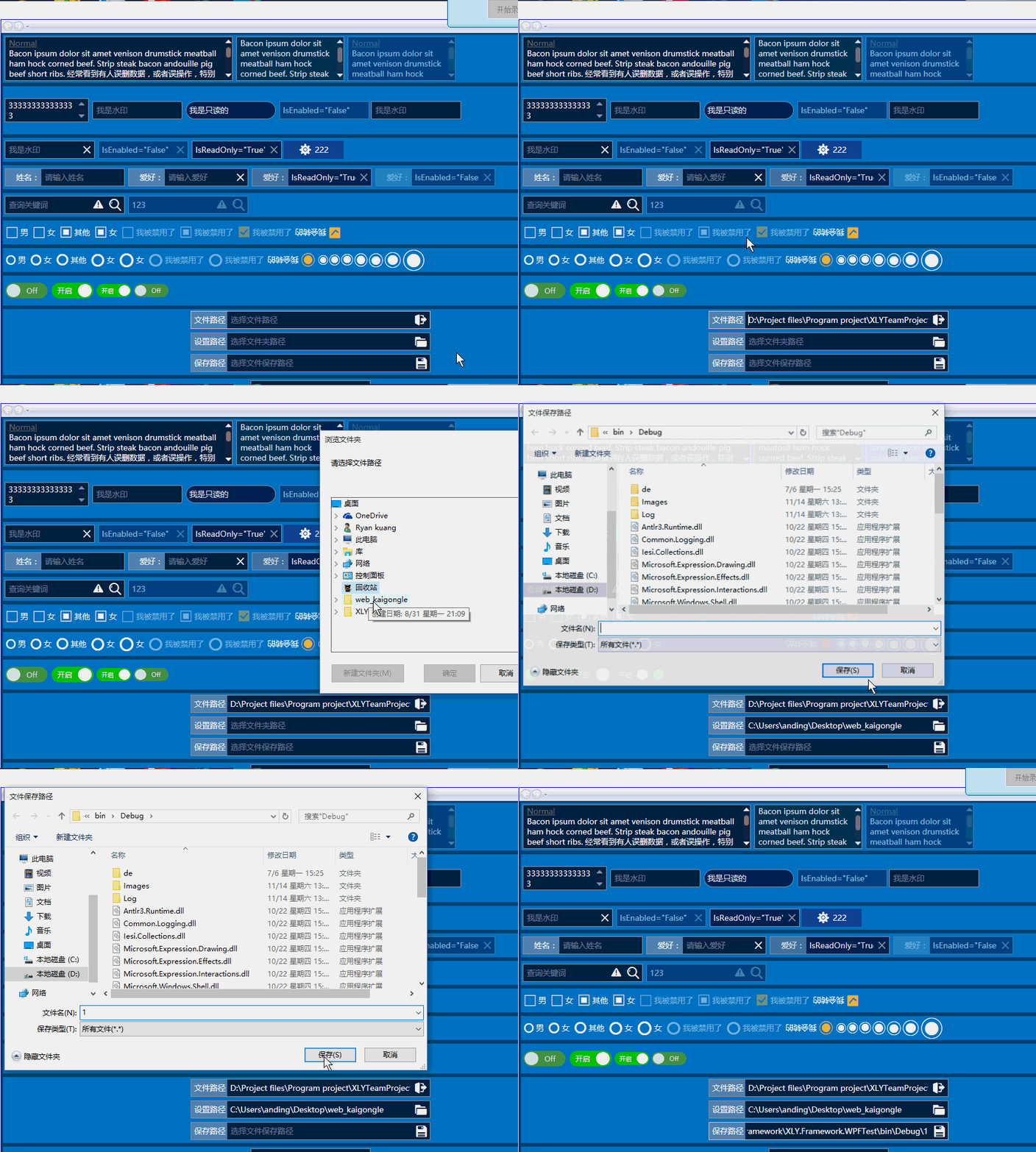
具体实现原理和上面2.4差不多 ,实现了三个文件、文件夹选择相关的功能扩展,样式代码:
<!--LabelOpenFileTextBox-->
<Style TargetType="{x:Type TextBox}" x:Key="LabelOpenFileTextBox" BasedOn="{StaticResource LabelClearButtonTextBox}">
<Setter Property="local:ControlAttachProperty.Label" Value="文件路径"/>
<Setter Property="local:ControlAttachProperty.Watermark" Value="选择文件路径"/>
<Setter Property="local:ControlAttachProperty.AttachContent">
<Setter.Value>
<ControlTemplate>
<local:FButton FIcon="" Style="{StaticResource FButton_Transparency}" IsTabStop="False" FIconMargin="0"
local:ControlAttachProperty.IsOpenFileButtonBehaviorEnabled="True" Command="local:ControlAttachProperty.OpenFileCommand"
CommandParameter="{Binding RelativeSource={RelativeSource FindAncestor,AncestorType={x:Type TextBox}}}"
Margin="0,1,0,1" FIconSize="22" Foreground="{StaticResource TextForeground}" Cursor="Arrow"/>
</ControlTemplate>
</Setter.Value>
</Setter>
</Style> <!--LabelOpenFolderTextBox-->
<Style TargetType="{x:Type TextBox}" x:Key="LabelOpenFolderTextBox" BasedOn="{StaticResource LabelClearButtonTextBox}">
<Setter Property="local:ControlAttachProperty.Label" Value="设置路径"/>
<Setter Property="local:ControlAttachProperty.Watermark" Value="选择文件夹路径"/>
<Setter Property="local:ControlAttachProperty.AttachContent">
<Setter.Value>
<ControlTemplate>
<local:FButton FIcon="" Style="{StaticResource FButton_Transparency}" IsTabStop="False" FIconMargin="0"
local:ControlAttachProperty.IsOpenFolderButtonBehaviorEnabled="True" Command="local:ControlAttachProperty.OpenFolderCommand"
CommandParameter="{Binding RelativeSource={RelativeSource FindAncestor,AncestorType={x:Type TextBox}}}"
Margin="0,1,0,1" FIconSize="22" Foreground="{StaticResource TextForeground}" Cursor="Arrow"/>
</ControlTemplate>
</Setter.Value>
</Setter>
</Style> <!--LabelSaveFileTextBox-->
<Style TargetType="{x:Type TextBox}" x:Key="LabelSaveFileTextBox" BasedOn="{StaticResource LabelClearButtonTextBox}">
<Setter Property="local:ControlAttachProperty.Label" Value="保存路径"/>
<Setter Property="local:ControlAttachProperty.Watermark" Value="选择文件保存路径"/>
<Setter Property="local:ControlAttachProperty.AttachContent">
<Setter.Value>
<ControlTemplate>
<local:FButton FIcon="" Style="{StaticResource FButton_Transparency}" IsTabStop="False" FIconMargin="0"
local:ControlAttachProperty.IsSaveFileButtonBehaviorEnabled="True" Command="local:ControlAttachProperty.SaveFileCommand"
CommandParameter="{Binding RelativeSource={RelativeSource FindAncestor,AncestorType={x:Type TextBox}}}"
Margin="0,1,0,1" FIconSize="20" Foreground="{StaticResource TextForeground}" Cursor="Arrow"/>
</ControlTemplate>
</Setter.Value>
</Setter>
</Style>
当然实现原理和2.4一样,都是依赖属性来实现事件的注入和绑定的,所以就不多废话了:
#region IsOpenFileButtonBehaviorEnabledProperty 选择文件命令行为开关

        /// <summary>

        /// 选择文件命令行为开关

        /// </summary>

        public static readonly DependencyProperty IsOpenFileButtonBehaviorEnabledProperty = DependencyProperty.RegisterAttached("IsOpenFileButtonBehaviorEnabled"

            , typeof(bool), typeof(ControlAttachProperty), new FrameworkPropertyMetadata(false, IsOpenFileButtonBehaviorEnabledChanged));

        [AttachedPropertyBrowsableForType(typeof(TextBox))]

        public static bool GetIsOpenFileButtonBehaviorEnabled(DependencyObject d)

        {

            return (bool)d.GetValue(IsOpenFileButtonBehaviorEnabledProperty);

        }

        public static void SetIsOpenFileButtonBehaviorEnabled(DependencyObject obj, bool value)

        {

            obj.SetValue(IsOpenFileButtonBehaviorEnabledProperty, value);

        }

        private static void IsOpenFileButtonBehaviorEnabledChanged(DependencyObject d, DependencyPropertyChangedEventArgs e)

        {

            var button = d as FButton;

            if (e.OldValue != e.NewValue && button != null)

            {

                button.CommandBindings.Add(OpenFileCommandBinding);

            }

        }

        #endregion

        #region IsOpenFolderButtonBehaviorEnabledProperty 选择文件夹命令行为开关

        /// <summary>

        /// 选择文件夹命令行为开关

        /// </summary>

        public static readonly DependencyProperty IsOpenFolderButtonBehaviorEnabledProperty = DependencyProperty.RegisterAttached("IsOpenFolderButtonBehaviorEnabled"

            , typeof(bool), typeof(ControlAttachProperty), new FrameworkPropertyMetadata(false, IsOpenFolderButtonBehaviorEnabledChanged));

        [AttachedPropertyBrowsableForType(typeof(TextBox))]

        public static bool GetIsOpenFolderButtonBehaviorEnabled(DependencyObject d)

        {

            return (bool)d.GetValue(IsOpenFolderButtonBehaviorEnabledProperty);

        }

        public static void SetIsOpenFolderButtonBehaviorEnabled(DependencyObject obj, bool value)

        {

            obj.SetValue(IsOpenFolderButtonBehaviorEnabledProperty, value);

        }

        private static void IsOpenFolderButtonBehaviorEnabledChanged(DependencyObject d, DependencyPropertyChangedEventArgs e)

        {

            var button = d as FButton;

            if (e.OldValue != e.NewValue && button != null)

            {

                button.CommandBindings.Add(OpenFolderCommandBinding);

            }

        }

        #endregion

        #region IsSaveFileButtonBehaviorEnabledProperty 选择文件保存路径及名称

        /// <summary>

        /// 选择文件保存路径及名称

        /// </summary>

        public static readonly DependencyProperty IsSaveFileButtonBehaviorEnabledProperty = DependencyProperty.RegisterAttached("IsSaveFileButtonBehaviorEnabled"

            , typeof(bool), typeof(ControlAttachProperty), new FrameworkPropertyMetadata(false, IsSaveFileButtonBehaviorEnabledChanged));

        [AttachedPropertyBrowsableForType(typeof(TextBox))]

        public static bool GetIsSaveFileButtonBehaviorEnabled(DependencyObject d)

        {

            return (bool)d.GetValue(IsSaveFileButtonBehaviorEnabledProperty);

        }

        public static void SetIsSaveFileButtonBehaviorEnabled(DependencyObject obj, bool value)

        {

            obj.SetValue(IsSaveFileButtonBehaviorEnabledProperty, value);

        }

        private static void IsSaveFileButtonBehaviorEnabledChanged(DependencyObject d, DependencyPropertyChangedEventArgs e)

        {

            var button = d as FButton;

            if (e.OldValue != e.NewValue && button != null)

            {

                button.CommandBindings.Add(SaveFileCommandBinding);

            }

        }

        #endregion

        #region OpenFileCommand 选择文件命令

        /// <summary>

        /// 选择文件命令,需要使用IsClearTextButtonBehaviorEnabledChanged绑定命令

        /// </summary>

        public static RoutedUICommand OpenFileCommand { get; private set; }

        /// <summary>

        /// OpenFileCommand绑定事件

        /// </summary>

        private static readonly CommandBinding OpenFileCommandBinding;

        /// <summary>

        /// 执行OpenFileCommand

        /// </summary>

        private static void OpenFileButtonClick(object sender, ExecutedRoutedEventArgs e)

        {

            var tbox = e.Parameter as FrameworkElement;

            var txt = tbox as TextBox;

            string filter = txt.Tag == null ? "所有文件(*.*)|*.*" : txt.Tag.ToString();

            if (filter.Contains(".bin"))

            {

                filter += "|所有文件(*.*)|*.*";

            }

            if (txt == null) return;

            OpenFileDialog fd = new OpenFileDialog();

            fd.Title = "请选择文件";

            //“图像文件(*.bmp, *.jpg)|*.bmp;*.jpg|所有文件(*.*)|*.*”

            fd.Filter = filter;

            fd.FileName = txt.Text.Trim();

            if (fd.ShowDialog() == true)

            {

                txt.Text = fd.FileName;

            }

            tbox.Focus();

        }

        #endregion

        #region OpenFolderCommand 选择文件夹命令

        /// <summary>

        /// 选择文件夹命令

        /// </summary>

        public static RoutedUICommand OpenFolderCommand { get; private set; }

        /// <summary>

        /// OpenFolderCommand绑定事件

        /// </summary>

        private static readonly CommandBinding OpenFolderCommandBinding;

        /// <summary>

        /// 执行OpenFolderCommand

        /// </summary>

        private static void OpenFolderButtonClick(object sender, ExecutedRoutedEventArgs e)

        {

            var tbox = e.Parameter as FrameworkElement;

            var txt = tbox as TextBox;

            if (txt == null) return;

            FolderBrowserDialog fd = new FolderBrowserDialog();

            fd.Description = "请选择文件路径";

            fd.SelectedPath = txt.Text.Trim();

            if (fd.ShowDialog() == DialogResult.OK)

            {

                txt.Text = fd.SelectedPath;

            }

            tbox.Focus();

        }

        #endregion

        #region SaveFileCommand 选择文件保存路径及名称

        /// <summary>

        /// 选择文件保存路径及名称

        /// </summary>

        public static RoutedUICommand SaveFileCommand { get; private set; }

        /// <summary>

        /// SaveFileCommand绑定事件

        /// </summary>

        private static readonly CommandBinding SaveFileCommandBinding;

        /// <summary>

        /// 执行OpenFileCommand

        /// </summary>

        private static void SaveFileButtonClick(object sender, ExecutedRoutedEventArgs e)

        {

            var tbox = e.Parameter as FrameworkElement;

            var txt = tbox as TextBox;

            if (txt == null) return;

            SaveFileDialog fd = new SaveFileDialog();

            fd.Title = "文件保存路径";

            fd.Filter = "所有文件(*.*)|*.*";

            fd.FileName = txt.Text.Trim();

            if (fd.ShowDialog() == DialogResult.OK)

            {

                txt.Text = fd.FileName;

            }

            tbox.Focus();

        }

        #endregion

        /// <summary>

        /// 静态构造函数

        /// </summary>

        static ControlAttachProperty()

        {

            //ClearTextCommand

            ClearTextCommand = new RoutedUICommand();

            ClearTextCommandBinding = new CommandBinding(ClearTextCommand);

            ClearTextCommandBinding.Executed += ClearButtonClick;

            //OpenFileCommand

            OpenFileCommand = new RoutedUICommand();

            OpenFileCommandBinding = new CommandBinding(OpenFileCommand);

            OpenFileCommandBinding.Executed += OpenFileButtonClick;

            //OpenFolderCommand

            OpenFolderCommand = new RoutedUICommand();

            OpenFolderCommandBinding = new CommandBinding(OpenFolderCommand);

            OpenFolderCommandBinding.Executed += OpenFolderButtonClick;

            SaveFileCommand = new RoutedUICommand();

            SaveFileCommandBinding = new CommandBinding(SaveFileCommand);

            SaveFileCommandBinding.Executed += SaveFileButtonClick;

        }
三.富文本框RichTextBox控件样式
RichTextBox的样式比较简单:
<!--***************************DefaultRichTextBox***************************-->

    <Style x:Key="DefaultRichTextBox" TargetType="{x:Type RichTextBox}">

        <Setter Property="ContextMenu" Value="{DynamicResource TextBoxContextMenu}" />

        <Setter Property="SelectionBrush" Value="{StaticResource TextSelectionBrush}" />

        <Setter Property="FontFamily" Value="{StaticResource FontFamily}" />

        <Setter Property="FontSize" Value="{StaticResource FontSize}" />

        <Setter Property="BorderThickness" Value="1" />

        <Setter Property="BorderBrush" Value="{StaticResource ControlBorderBrush}" />

        <Setter Property="MinHeight" Value="26" />

        <Setter Property="MinWidth" Value="10" />

        <Setter Property="Background" Value="{StaticResource TextBackground}" />

        <Setter Property="Foreground" Value="{StaticResource TextForeground}" />

        <Setter Property="CaretBrush" Value="{StaticResource TextForeground}" />

        <Setter Property="local:ControlAttachProperty.FocusBorderBrush" Value="{StaticResource FocusBorderBrush}" />

        <Setter Property="local:ControlAttachProperty.MouseOverBorderBrush" Value="{StaticResource MouseOverBorderBrush}" />

        <Setter Property="Padding" Value="1" />

        <Setter Property="AllowDrop" Value="True" />

        <Setter Property="VerticalScrollBarVisibility" Value="Auto" />

        <Setter Property="FocusVisualStyle" Value="{x:Null}" />

        <Setter Property="ScrollViewer.PanningMode" Value="VerticalFirst" />

        <!--该值指示是否启用了笔势-->

        <Setter Property="Stylus.IsFlicksEnabled" Value="False" />

        <!--SnapsToDevicePixels:该值来确定呈现此元素是否应使用特定于设备的像素设置-->

        <Setter Property="SnapsToDevicePixels" Value="True" />

        <Setter Property="Template">

            <Setter.Value>

                <ControlTemplate TargetType="{x:Type TextBoxBase}">

                    <Grid>

                        <Border x:Name="Bd"

                                BorderBrush="{TemplateBinding BorderBrush}" BorderThickness="{TemplateBinding BorderThickness}"

                                Background="{TemplateBinding Background}" SnapsToDevicePixels="{TemplateBinding SnapsToDevicePixels}">

                            <ScrollViewer x:Name="PART_ContentHost" SnapsToDevicePixels="{TemplateBinding SnapsToDevicePixels}" />

                        </Border>

                    </Grid>

                    <ControlTemplate.Triggers>

                        <Trigger Property="IsMouseOver" Value="True">

                            <Setter Property="BorderBrush" Value="{Binding Path=(local:ControlAttachProperty.MouseOverBorderBrush),RelativeSource={RelativeSource Self}}"/>

                        </Trigger>

                        <Trigger Property="IsFocused" Value="True">

                            <Setter  Property="BorderBrush" Value="{Binding Path=(local:ControlAttachProperty.FocusBorderBrush),RelativeSource={RelativeSource Self}}"/>

                        </Trigger>

                        <Trigger Property="IsEnabled" Value="False">

                            <Setter TargetName="Bd" Property="Opacity" Value="0.5" />

                        </Trigger>

                        <Trigger Property="IsReadOnly" Value="True">

                            <Setter TargetName="Bd" Property="Opacity" Value="0.85" />

                        </Trigger>

                    </ControlTemplate.Triggers>

                </ControlTemplate>

            </Setter.Value>

        </Setter>

    </Style>
使用实力及效果:

四.密码输入框PasswordBox控件样式及扩展功能
密码输入控件的样式和第二节文本框TextBox基本一致,就不做详细的说明了,直接上样式的代码,相关逻辑(C#) 代码和上面是一样的(复用)。
<!--TextBox默认样式-->
<Style TargetType="{x:Type PasswordBox}" x:Key="DefaultPasswordBox">
<Setter Property="ContextMenu" Value="{DynamicResource TextBoxContextMenu}" />
<Setter Property="SelectionBrush" Value="{StaticResource TextSelectionBrush}" />
<Setter Property="FontFamily" Value="{StaticResource FontFamily}" />
<Setter Property="FontSize" Value="{StaticResource FontSize}" />
<Setter Property="BorderThickness" Value="1" />
<Setter Property="PasswordChar" Value="●"/>
<Setter Property="Height" Value="30" />
<Setter Property="Width" Value="200" />
<Setter Property="Background" Value="{StaticResource TextBackground}" />
<Setter Property="Foreground" Value="{StaticResource TextForeground}" />
<Setter Property="Padding" Value="0" />
<Setter Property="BorderBrush" Value="{StaticResource ControlBorderBrush}" />
<Setter Property="local:ControlAttachProperty.FocusBorderBrush" Value="{StaticResource FocusBorderBrush}" />
<Setter Property="local:ControlAttachProperty.MouseOverBorderBrush" Value="{StaticResource MouseOverBorderBrush}" />
<Setter Property="VerticalContentAlignment" Value="Center" />
<!-- change SnapsToDevicePixels to True to view a better border and validation error -->
<Setter Property="SnapsToDevicePixels" Value="True" />
<!--英 ['kærət] 美 ['kærət] 插入符号-->
<Setter Property="CaretBrush" Value="{StaticResource TextForeground}" />
<Setter Property="Template">
<Setter.Value>
<ControlTemplate TargetType="{x:Type PasswordBox}">
<Grid x:Name="PART_Root">
<Border x:Name="Bg" SnapsToDevicePixels="{TemplateBinding SnapsToDevicePixels}"
CornerRadius="{TemplateBinding local:ControlAttachProperty.CornerRadius}"
BorderBrush="{TemplateBinding BorderBrush}" BorderThickness="{TemplateBinding BorderThickness}" Background="{TemplateBinding Background}" />
<Grid x:Name="PART_InnerGrid">
<Grid.ColumnDefinitions>
<ColumnDefinition Width="Auto" />
<ColumnDefinition Width="*" />
<ColumnDefinition Width="Auto" />
</Grid.ColumnDefinitions>
<!--Label区域-->
<ContentControl x:Name="Label" Margin="1" Template="{TemplateBinding local:ControlAttachProperty.LabelTemplate}"
Content="{TemplateBinding local:ControlAttachProperty.Label}"/>
<!--内容区域-->
<ScrollViewer x:Name="PART_ContentHost" BorderThickness="0" Grid.Column="1" IsTabStop="False" Margin="2"
VerticalAlignment="Stretch" Background="{x:Null}" />
<!--附加内容区域-->
<Border x:Name="PART_AttachContent" Grid.Column="2" Margin="2" VerticalAlignment="Center" HorizontalAlignment="Center" >
<ContentControl VerticalAlignment="Center" VerticalContentAlignment="Center" Template="{TemplateBinding local:ControlAttachProperty.AttachContent}" />
</Border>
</Grid>
</Grid>
<ControlTemplate.Triggers>
<Trigger Property="IsMouseOver" Value="True">
<Setter Property="BorderBrush" Value="{Binding Path=(local:ControlAttachProperty.MouseOverBorderBrush),RelativeSource={RelativeSource Self}}"/>
</Trigger>
<Trigger Property="IsFocused" Value="True">
<Setter Property="BorderBrush" Value="{Binding Path=(local:ControlAttachProperty.FocusBorderBrush),RelativeSource={RelativeSource Self}}"/>
</Trigger>
<!--不可用-->
<Trigger Property="IsEnabled" Value="False">
<Setter TargetName="PART_Root" Property="Opacity" Value="{StaticResource DisableOpacity}"></Setter>
</Trigger>
</ControlTemplate.Triggers>
</ControlTemplate>
</Setter.Value>
</Setter>
</Style> <!--TextBox包含清除Text按钮的样式-->
<Style TargetType="{x:Type PasswordBox}" x:Key="ClearButtonPasswordBox" BasedOn="{StaticResource DefaultPasswordBox}">
<Setter Property="local:ControlAttachProperty.AttachContent">
<Setter.Value>
<ControlTemplate>
<local:FButton FIcon="" Style="{StaticResource FButton_Transparency}" IsTabStop="False" FIconMargin="0"
local:ControlAttachProperty.IsClearTextButtonBehaviorEnabled="True" Command="local:ControlAttachProperty.ClearTextCommand"
CommandParameter="{Binding RelativeSource={RelativeSource FindAncestor,AncestorType={x:Type PasswordBox}}}"
Margin="1,3,1,4" FIconSize="14" Foreground="{StaticResource TextForeground}" Cursor="Arrow"/>
</ControlTemplate>
</Setter.Value>
</Setter>
</Style> <!--TextBox包含附加属性Label的样式-->
<Style TargetType="{x:Type PasswordBox}" x:Key="LabelPasswordBox" BasedOn="{StaticResource DefaultPasswordBox}">
<Setter Property="local:ControlAttachProperty.LabelTemplate" >
<Setter.Value>
<ControlTemplate TargetType="ContentControl">
<Border Width="60" Background="{StaticResource TextLabelBackground}">
<TextBlock VerticalAlignment="Center" HorizontalAlignment="Right" Margin="3" Text="{TemplateBinding Content}"></TextBlock>
</Border>
</ControlTemplate>
</Setter.Value>
</Setter>
</Style> <!--TextBox包含附加属性Label,以及ClearText按钮的样式-->
<Style TargetType="{x:Type PasswordBox}" x:Key="LabelClearButtonPasswordBox" BasedOn="{StaticResource DefaultPasswordBox}">
<Setter Property="local:ControlAttachProperty.LabelTemplate" >
<Setter.Value>
<ControlTemplate TargetType="ContentControl">
<Border Width="60" Background="{StaticResource TextLabelBackground}">
<TextBlock VerticalAlignment="Center" HorizontalAlignment="Right" Margin="3" Text="{TemplateBinding Content}"></TextBlock>
</Border>
</ControlTemplate>
</Setter.Value>
</Setter>
<Setter Property="local:ControlAttachProperty.AttachContent">
<Setter.Value>
<ControlTemplate>
<local:FButton FIcon="" Style="{StaticResource FButton_Transparency}" IsTabStop="False" FIconMargin="0"
local:ControlAttachProperty.IsClearTextButtonBehaviorEnabled="True" Command="local:ControlAttachProperty.ClearTextCommand"
CommandParameter="{Binding RelativeSource={RelativeSource FindAncestor,AncestorType={x:Type PasswordBox}}}"
Margin="0,3,1,4" FIconSize="14" Foreground="{StaticResource TextForeground}" Cursor="Arrow"/>
</ControlTemplate>
</Setter.Value>
</Setter>
</Style>
使用示例及效果:

原文地址:http://www.cnblogs.com/anding/p/4970845.html
【转】WPF自定义控件与样式(3)-TextBox & RichTextBox & PasswordBox样式、水印、Label标签、功能扩展的更多相关文章
- WPF自定义控件与样式(3)-TextBox & RichTextBox & PasswordBox样式、水印、Label标签、功能扩展
一.前言.预览 申明:WPF自定义控件与样式是一个系列文章,前后是有些关联的,但大多是按照由简到繁的顺序逐步发布的等,若有不明白的地方可以参考本系列前面的文章,文末附有部分文章链接. 本文主要是对文本 ...
- 【转】WPF TextBox和PasswordBox加水印
Textbox加水印 Textbox加水印,需要一个VisualBrush和触发器验证Text是否为空,在空的时候设置背景的Brush就可以实现水印效果. <TextBox Name=" ...
- WPF自定义控件(二)——TextBox
和之前一样,先来看看效果: 这个TextBox可设置水印,可设置必填和正则表达式验证. 验证?没错,就是验证! 就是在输入完成后,控件一旦失去焦点就会自动验证!会根据我开放出来的“是否可以为空”属性进 ...
- WPF的TextBox以及PasswordBox显示水印文字
1.TextBox <ControlTemplate x:Key="WaterMarkTextBox" TargetType="{x:Type TextBox}&q ...
- WPF自定义控件与样式(1)-矢量字体图标(iconfont)
一.图标字体 图标字体在网页开发上运用非常广泛,具体可以网络搜索了解,网页上的运用有很多例子,如Bootstrap.但在C/S程序中使用还不多,字体图标其实就是把矢量图形打包到字体文件里,就像使用一般 ...
- WPF自定义控件与样式(2)-自定义按钮FButton
一.前言.效果图 申明:WPF自定义控件与样式是一个系列文章,前后是有些关联的,但大多是按照由简到繁的顺序逐步发布的等,若有不明白的地方可以参考本系列前面的文章,文末附有部分文章链接. 还是先看看效果 ...
- WPF自定义控件与样式(15)-终结篇 & 系列文章索引 & 源码共享
系列文章目录 WPF自定义控件与样式(1)-矢量字体图标(iconfont) WPF自定义控件与样式(2)-自定义按钮FButton WPF自定义控件与样式(3)-TextBox & Ric ...
- WPF自定义控件与样式(4)-CheckBox/RadioButton自定义样式
一.前言 申明:WPF自定义控件与样式是一个系列文章,前后是有些关联的,但大多是按照由简到繁的顺序逐步发布的等,若有不明白的地方可以参考本系列前面的文章,文末附有部分文章链接. 本文主要内容: Che ...
- WPF自定义控件与样式(5)-Calendar/DatePicker日期控件自定义样式及扩展
一.前言 申明:WPF自定义控件与样式是一个系列文章,前后是有些关联的,但大多是按照由简到繁的顺序逐步发布的等,若有不明白的地方可以参考本系列前面的文章,文末附有部分文章链接. 本文主要内容: 日历控 ...
随机推荐
- C# 使用PrintDocument 绘制表格 完成 打印预览 DataTable
经过不断的Google与baidu,最终整理出来的打印类 主要是根据两个参考的类组合而成,稍微修改了一下,参考代码及来源见最后(其中一份是VB语言的) 其中遇到的一些问题也已经得到了解决(分页,打印预 ...
- 洛谷P1198 [JSOI2008]最大数(BZOJ.1012 )
To 洛谷.1198 最大数 题目描述 现在请求你维护一个数列,要求提供以下两种操作: 1. 查询操作. 语法:Q L 功能:查询当前数列中末尾L个数中的最大的数,并输出这个数的值. 限制:L不超过当 ...
- 洛谷P1886 滑动窗口(POJ.2823 Sliding Window)(区间最值)
To 洛谷.1886 滑动窗口 To POJ.2823 Sliding Window 题目描述 现在有一堆数字共N个数字(N<=10^6),以及一个大小为k的窗口.现在这个从左边开始向右滑动,每 ...
- Codeforces.297C.Splitting the Uniqueness(构造)
题目链接 \(Description\) 给定一个长为n的序列A,求两个长为n的序列B,C,对任意的i满足B[i]+C[i]=A[i],且B,C序列分别至少有\(\lfloor\frac{2*n}{3 ...
- 关于Oracle游标out参数多层调用的BUG,ORA-06504
数据库版本 Oracle Database 10g Enterprise Edition Release 10.2.0.1.0 - 64bit 测试代码 declare p_cur sys_refcu ...
- 47. 全排列 II
47. 全排列 II 题意 给定一个可包含重复数字的序列,返回所有不重复的全排列. 示例: 输入: [1,1,2]输出:[ [1,1,2], [1,2,1], [2,1,1]] 解题思路 去重的全排列 ...
- 几种Unity运行平台的判断
这里就介绍几种常见的,也是便于使用的几种平台判断的方法. 1.先说第一种,也是我用的顺手的一个.利用RuntimePlatform判断,API上的解释是[The platform applicatio ...
- 利用gsoap工具,通过wsdl文件生成webservice的C++工程文件
一.下载gsoap文件,下载地址:https://zh.osdn.net/projects/sfnet_gsoap2/releases/ 二.以gsoap-2.8为例,解压到D盘,在D:/gsoap- ...
- Qt 4.6.2静态编译后,创建工程出现中文乱码的解决办法
一.如果静态编译是用mingw编译的 1)在pro文件里增加QTPLUGIN += qcncodecs 2)在main函数所在的文件里面增加#include <QtPlugin>和Q_IM ...
- Shell Step by Step (4) —— Cron & Echo
6.脚本定时任务 # Example of job definition: # .------------------------- minute (0 - 59) # | .------------ ...