利用css3选择器及css3边框做出的特效(1)
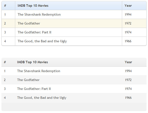
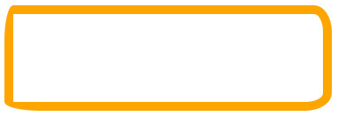
利用border-radius及box-shadow制作圆角表格
界面效果图如下:
css样式如下所示:
* {

            margin:;

            padding:;

        }

        body {

            padding: 40px 100px;

        }

        .demo {

            width: 600px;

            margin: 40px auto;

            font-family: 'trebuchet MS', 'Lucida sans', Arial;

            font-size: 14px;

            color: #444;

        }

        /*表格的默认设置*/

        table {

            *border-collapse: collapse; /* IE7 and lower */

            border-spacing:;

            width: 100%;

        }

        /*========制作圆角表格========*/

        .bordered {

            border: solid #ccc 1px; /*给表格添加边框*/

            border-radius: 6px; /*设置表格圆角*/

            box-shadow: 0 1px 1px #ccc; /*表格阴影设置*/

        }

            .bordered tr {

                -o-transition: all 0.1s ease-in-out;

                -webkit-transition: all 0.1s ease-in-out;

                -moz-transition: all 0.1s ease-in-out;

                -ms-transition: all 0.1s ease-in-out;

                transition: all 0.1s ease-in-out;

            }

                .bordered .highlight,

                .bordered tr:hover {

                    background: #fbf8e9; /*表格行的悬浮状态效果*/

                }

            .bordered td,

            .bordered th {

                border-left: 1px solid #ccc;

                border-top: 1px solid #ccc;

                padding: 10px;

                text-align: left;

            }

            .bordered th {

                /*表格表头添加渐变背景色*/

                background-color: #dce9f9;

                background-image: -webkit-gradient(linear, left top, left bottom, from(#ebf3fc), to(#dce9f9));

                background-image: -webkit-linear-gradient(top, #ebf3fc, #dce9f9);

                background-image: -moz-linear-gradient(top, #ebf3fc, #dce9f9);

                background-image: -ms-linear-gradient(top, #ebf3fc, #dce9f9);

                background-image: -o-linear-gradient(top, #ebf3fc, #dce9f9);

                background-image: linear-gradient(top, #ebf3fc, #dce9f9);

                filter: progid:DXImageTransform.Microsoft.gradient(GradientType=0, startColorstr=#ebf3fc, endColorstr=#dce9f9);

                -ms-filter: "progid:DXImageTransform.Microsoft.gradient (GradientType=0, startColorstr=#ebf3fc, endColorstr=#dce9f9)";

                box-shadow: 0 1px 0 rgba(255,255,255,.8) inset; /*表格表头设置内阴影*/

                border-top: none;

                text-shadow: 0 1px 0 rgba(255,255,255,.5); /*表格表头设置文字阴影*/

            }

                /*使用:first-child去除表格每行的第一个单元格的左边框*/

                .bordered td:first-child,

                .bordered th:first-child {

                    border-left: none;

                }

                /*使用:first-child设置表格表头第一个单元格仅左上角为圆角*/

                .bordered th:first-child {

                    border-radius: 6px 0 0 0;

                }

                /*使用:last-child设置表格表头最后一个单元格仅右上角为圆角*/

                .bordered th:last-child {

                    border-radius: 0 6px 0 0;

                }

            /*使用:first-child和:last-child设置表格最后一行的第一个单元格左下角为圆角*/

            .bordered tr:last-child td:first-child {

                border-radius: 0 0 0 6px;

            }

            /*使用:last-child设置表格最后一行的最后一个单元格右上角为圆角*/

            .bordered tr:last-child td:last-child {

                border-radius: 0 0 6px 0;

            }

        /*=======制作Zebra表格(斑马线表格)效果==========*/

        .zebra td,

        .zebra th {

            padding: 10px;

            border-bottom: 1px solid #f2f2f2;

        }

        /*使用:nth-child(even)给表格的奇数行添加背景和阴影效果*/

        .zebra .alternate,

        .zebra tbody tr:nth-child(even) {

            background: #f5f5f5;

            box-shadow: 0 1px 0 rgba(255,255,255,.8) inset;

        }

        .zebra th {

            text-align: left;

            text-shadow: 0 1px 0 rgba(255,255,255,.5);

            border-bottom: 1px solid #ccc;

            background-color: #eee;

            background-image: -webkit-gradient(linear, left top, left bottom, from(#f5f5f5), to(#eee));

            background-image: -webkit-linear-gradient(top, #f5f5f5, #eee);

            background-image: -moz-linear-gradient(top, #f5f5f5, #eee);

            background-image: -ms-linear-gradient(top, #f5f5f5, #eee);

            background-image: -o-linear-gradient(top, #f5f5f5, #eee);

            background-image: linear-gradient(top, #f5f5f5, #eee);

            filter: progid:DXImageTransform.Microsoft.gradient(GradientType=0, startColorstr=#f5f5f5, endColorstr=#eeeeee);

            -ms-filter: "progid:DXImageTransform.Microsoft.gradient (GradientType=0, startColorstr=#f5f5f5, endColorstr=#eeeeee)";

        }

            /*使用 :first-child设置表格表头第一个单元格左上角为圆角*/

            .zebra th:first-child {

                border-radius: 6px 0 0 0;

            }

            /*使用 :last-child设置表格表头最后一个单元格右上角为圆角*/

            .zebra th:last-child {

                border-radius: 0 6px 0 0;

            }

        .zebra tfoot td {

            border-bottom:;

            border-top: 1px solid #fff;

            background-color: #f1f1f1;

        }

            /*使用 :first-child设置表格脚部第一个单元格左下角为圆角*/

            .zebra tfoot td:first-child {

                border-radius: 0 0 0 6px;

            }

            /*使用 :last-child设置表格脚部最后一个单元格右下角为圆角*/

            .zebra tfoot td:last-child {

                border-radius: 0 0 6px 0;

            }
页面HTML代码如下所示:
<div class="demo">
<table class="bordered">
<thead>
<tr>
<th>#</th>
<th>IMDB Top 10 Movies</th>
<th>Year</th>
</tr>
</thead>
<tbody>
<tr>
<td>1</td>
<td>The Shawshank Redemption</td>
<td>1994</td>
</tr>
<tr>
<td>2</td>
<td>The Godfather</td>
<td>1972</td>
</tr>
<tr>
<td>3</td>
<td>The Godfather: Part II</td>
<td>1974</td>
</tr>
<tr>
<td>4</td>
<td>The Good, the Bad and the Ugly</td>
<td>1966</td>
</tr>
</tbody>
</table>
<p style="height: 50px"></p>
<table class="zebra">
<thead>
<tr>
<th>#</th>
<th>IMDB Top 10 Movies</th>
<th>Year</th>
</tr>
</thead>
<tbody>
<tr>
<td>1</td>
<td>The Shawshank Redemption</td>
<td>1994</td>
</tr>
<tr>
<td>2</td>
<td>The Godfather</td>
<td>1972</td>
</tr>
<tr>
<td>3</td>
<td>The Godfather: Part II</td>
<td>1974</td>
</tr>
<tr>
<td>4</td>
<td>The Good, the Bad and the Ugly</td>
<td>1966</td>
</tr>
</tbody>
<tfoot>
<tr>
<td> </td>
<td></td>
<td></td>
</tr>
</tfoot>
</table>
</div>
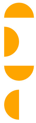
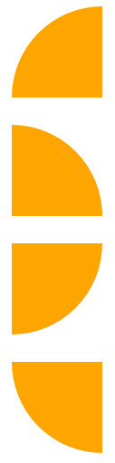
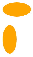
利用border-radius制作各种图形效果
界面效果图如下:
css样式如下所示:
/*制作半圆效果*/

        .semicircle {

            background-color: orange;

            margin: 30px;

        }

        .top {

            width: 100px;

            height: 50px;

            border-radius: 50px 50px 0 0;

        }

        .right {

            height: 100px;

            width: 50px;

            border-radius: 0 50px 50px 0;

        }

        .bottom {

            width: 100px;

            height: 50px;

            border-radius: 0 0 50px 50px;

        }

        .left {

            width: 50px;

            height: 100px;

            border-radius: 50px 0 0 50px;

        }

/*制作扇形效果*/

    .quarterCircle {

      background-color: orange;

      margin: 30px;

    }

    .top {

      width: 100px;

      height: 100px;

      border-radius: 100px 0 0 0;

    }

    .right {

      width: 100px;

      height: 100px;

      border-radius: 0 100px 0 0;

    }

    .bottom {

      width: 100px;

      height: 100px;

      border-radius: 0 0  100px 0;

    }

    .left {

      width: 100px;

      height: 100px;

      border-radius: 0 0 0 100px;

    }

/*制作椭圆*/

        .oval {

            background-color: orange;

            margin: 30px;

        }

        .hov {

            width: 100px;

            height: 50px;

            border-radius: 100px / 50px;

        }

        .ver {

            width: 50px;

            height: 100px;

            border-radius: 50px / 100px;

        }
页面HTML代码如下所示:
    <!--制作扇形效果-->

    <div class="semicircle top"></div>

    <div class="semicircle right"></div>

    <div class="semicircle bottom"></div>

    <div class="semicircle left"></div>

    <!--制作扇形效果-->

    <div class="quarterCircle top"></div>

    <div class="quarterCircle right"></div>

    <div class="quarterCircle bottom"></div>

    <div class="quarterCircle left"></div>

    <!--制作椭圆效果-->

    <div class="oval hov"></div>

    <div class="oval ver"></div>
看了上面的效果图和代码之后,大家肯定知道如果制作圆形效果那自然就是border-radius: 50%;
再看一个效果图:
其实实现代码很简单:
    .border-radius {

      width: 350px;

      height: 100px;

      border: 10px solid orange;

      border-radius: 10px  20px  30px  40px / 40px 30px 20px 10px;

    }
原理很简单就是用了border-radius
我还是原来的那句话,同样是手机为什么是苹果很贵但却依旧那么受人的喜欢,把平凡简单的事情做到好才是最重要的。
利用动态伪类美化按钮
界面效果图如下:

css样式如下所示:
        .download-info {

            text-align: center;

        }

        /*默认状态下的按钮效果*/

        .btn {

            background-color: #0074cc;

            *background-color: #0055cc;

            background-image: -ms-linear-gradient(top, #0088cc, #0055cc);

            background-image: -webkit-gradient(linear, 0 0, 0 100%, from(#0088cc), to(#0055cc));

            background-image: -webkit-linear-gradient(top, #0088cc, #0055cc);

            background-image: -o-linear-gradient(top, #0088cc, #0055cc);

            background-image: -moz-linear-gradient(top, #0088cc, #0055cc);

            background-image: linear-gradient(top, #0088cc, #0055cc);

            background-repeat: repeat-x;

            display: inline-block;

            *display: inline;

            border: 1px solid #cccccc;

            *border:;

            border-color: #ccc;

            border-color: rgba(0, 0, 0, 0.1) rgba(0, 0, 0, 0.1) rgba(0, 0, 0, 0.25);

            border-radius: 6px;

            color: #ffffff;

            cursor: pointer;

            font-size: 20px;

            font-weight: normal;

            filter: progid:dximagetransform.microsoft.gradient(startColorstr='#0088cc', endColorstr='#0055cc', GradientType=0);

            filter: progid:dximagetransform.microsoft.gradient(enabled=false);

            line-height: normal;

            padding: 14px 24px;

            text-align: center;

            text-shadow: 0 -1px 0 rgba(0, 0, 0, 0.25);

            text-decoration: none;

            vertical-align: middle;

            *zoom:;

        }

        /*悬浮状态下按钮效果*/

        .btn:hover {

            background-position: 0 -15px;

            background-color: #0055cc;

            *background-color: #004ab3;

            color: #ffffff;

            text-decoration: none;

            text-shadow: 0 -1px 0 rgba(0, 0, 0, 0.25);

            -webkit-transition: background-position 0.1s linear;

            -moz-transition: background-position 0.1s linear;

            -ms-transition: background-position 0.1s linear;

            -o-transition: background-position 0.1s linear;

            transition: background-position 0.1s linear;

        }

        /*点击时按钮效果*/

        .btn:active {

            background-color: #0055cc;

            *background-color: #004ab3;

            background-color: #004099 \9;

            background-image: none;

            outline:;

            box-shadow: inset 0 2px 4px rgba(0, 0, 0, 0.15), 0 1px 2px rgba(0, 0, 0, 0.05);

            color: rgba(255, 255, 255, 0.75);

        }

        /*获得焦点按钮效果*/

        .btn:focus {

            outline: thin dotted #333;

            outline: 5px auto -webkit-focus-ring-color;

            outline-offset: -2px;

        }
页面HTML代码如下所示:
    <div class="download-info">

        <a href="#" class="btn">View project on GitHub</a>

    </div>
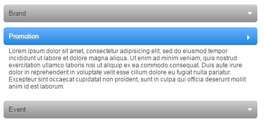
利用动态伪类:target制作垂直手风琴
界面效果图如下:
css样式如下所示:
        .accordionMenu {

            background: #fff;

            color: #424242;

            font: 12px Arial, Verdana, sans-serif;

            margin: 0 auto;

            padding: 10px;

            width: 500px;

        }

            .accordionMenu h2 {

                margin: 5px 0;

                padding:;

                position: relative;

            }

                .accordionMenu h2:before {/*向下箭头*/

                    border: 5px solid #fff;

                    border-color: #fff transparent transparent;

                    content: "";

                    height:;

                    position: absolute;

                    right: 10px;

                    top: 15px;

                    width:;

                }

                .accordionMenu h2 a {

                    background: #8f8f8f;

                    background: -moz-linear-gradient( top, #cecece, #8f8f8f);

                    background: -webkit-gradient(linear, left top, left bottom, from(#cecece), to(#8f8f8f));

                    background: -webkit-linear-gradient( top, #cecece, #8f8f8f);

                    background: -o-linear-gradient( top, #cecece, #8f8f8f);

                    background: linear-gradient( top, #cecece, #8f8f8f);

                    border-radius: 5px;

                    color: #424242;

                    display: block;

                    font-size: 13px;

                    font-weight: normal;

                    margin:;

                    padding: 10px 10px;

                    text-shadow: 2px 2px 2px #aeaeae;

                    text-decoration: none;

                }

                    .accordionMenu :target h2 a,

                    .accordionMenu h2 a:focus,

                    .accordionMenu h2 a:hover,

                    .accordionMenu h2 a:active {/*选中、聚焦、激活状态下的样式*/

                        background: #2288dd;

                        background: -moz-linear-gradient( top, #6bb2ff, #2288dd);

                        background: -webkit-gradient(linear, left top, left bottom, from(#6bb2ff), to(#2288dd));

                        background: -webkit-linear-gradient( top, #6bb2ff, #2288dd);

                        background: -o-linear-gradient( top, #6bb2ff, #2288dd);

                        background: linear-gradient( top, #6bb2ff, #2288dd);

                        color: #FFF;

                    }

            .accordionMenu p {/*所有未选中的段落 都默认overflow:hidden*/

                margin:;

                height:;

                overflow: hidden;

                padding: 0 10px;

                -moz-transition: height 0.5s ease-in;

                -webkit-transition: height 0.5s ease-in;

                -o-transition: height 0.5s ease-in;

                transition: height 0.5s ease-in;

            }

            .accordionMenu :target p {/*如果是选中 则将选中的段落显示*/

                height: 100px;

                overflow: auto;

            }

            .accordionMenu :target h2:before {

                border-color: transparent transparent transparent #fff;/*向下箭头效果*/

            }
页面HTML代码如下所示:
<div class="accordionMenu">

        <div class="menuSection" id="brand">

            <h2><a href="#brand">Brand</a></h2>

            <p>Lorem ipsum dolor sit amet, consectetur adipisicing elit, sed do eiusmod tempor incididunt ut labore et dolore magna aliqua. Ut enim ad minim veniam, quis nostrud exercitation ullamco laboris nisi ut aliquip ex ea commodo consequat. Duis aute irure dolor in reprehenderit in voluptate velit esse cillum dolore eu fugiat nulla pariatur. Excepteur sint occaecat cupidatat non proident, sunt in culpa qui officia deserunt mollit anim id est laborum.Lorem ipsum dolor sit amet, consectetur adipisicing elit, sed do eiusmod tempor incididunt ut labore et dolore magna aliqua. Ut enim ad minim veniam, quis nostrud exercitation ullamco laboris nisi ut aliquip ex ea commodo consequat. Duis aute irure dolor in reprehenderit in voluptate velit esse cillum dolore eu fugiat nulla pariatur. Excepteur sint occaecat cupidatat non proident, sunt in culpa qui officia deserunt mollit anim id est laborum.</p>

        </div>

        <div class="menuSection" id="promotion">

            <h2><a href="#promotion">Promotion</a></h2>

            <p>Lorem ipsum dolor sit amet, consectetur adipisicing elit, sed do eiusmod tempor incididunt ut labore et dolore magna aliqua. Ut enim ad minim veniam, quis nostrud exercitation ullamco laboris nisi ut aliquip ex ea commodo consequat. Duis aute irure dolor in reprehenderit in voluptate velit esse cillum dolore eu fugiat nulla pariatur. Excepteur sint occaecat cupidatat non proident, sunt in culpa qui officia deserunt mollit anim id est laborum.</p>

        </div>

        <div class="menuSection" id="event">

            <h2><a href="#event">Event</a></h2>

            <p>Lorem ipsum dolor sit amet, consectetur adipisicing elit, sed do eiusmod tempor incididunt ut labore et dolore magna aliqua. Ut enim ad minim veniam, quis nostrud exercitation ullamco laboris nisi ut aliquip ex ea commodo consequat. Duis aute irure dolor in reprehenderit in voluptate velit esse cillum dolore eu fugiat nulla pariatur. Excepteur sint occaecat cupidatat non proident, sunt in culpa qui officia deserunt mollit anim id est laborum.</p>

        </div>

    </div>
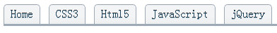
利用border-image制作tabs效果
界面效果图如下:
css样式如下所示:
        .tabs-box {

            border-bottom: 3px solid #9eaab6;

            margin:;

            padding:;

            overflow: hidden;

            zoom:;

        }

            .tabs-box li {

                float: left;

                display: inline;

                margin: 0 12px 0 0;

                list-style: none outside none;

                border: 1px solid #9EAAB6;

                padding: 5px;

                border-image: url("border-image-tab.gif") 0 5 0 5;

                -moz-border-image: url("border-image-tab.gif") 0 5 0 5;

                -webkit-border-image: url("border-image-tab.gif") 0 5 0 5;

                -o-border-image: url("border-image-tab.gif") 0 5 0 5;

                -ms-border-image: url("border-image-tab.gif") 0 5 0 5;

                border-width: 0 5px;

                text-align: center;

                text-shadow: 0 -1px 0 rgba(0,0,0,0.8);

                color: rgba(0, 125, 200, 0.3);

            }
样式中的image下载地址为:border-image-tab.gif
页面HTML代码如下所示:
    <ul class="tabs-box">

        <li>Home</li>

        <li>CSS3</li>

        <li>Html5</li>

        <li>JavaScript</li>

        <li>jQuery</li>

    </ul>
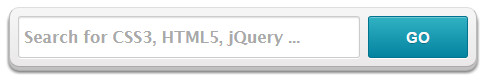
利用box-shadow制作立体导航search框
界面效果图如下:
css样式如下所示:
        #formWrapper {

            width: 450px;

            padding: 8px;

            margin: 20px;

            overflow: hidden;

            border-width: 1px;

            border-style: solid;

            border-color: #dedede #bababa #aaa #bababa;

            box-shadow: 0 3px 3px rgba(255,255,255,.1), 0 3px 0 #bbb, 0 4px 0 #aaa, 0 5px 5px #444;

            border-radius: 10px;

            background-color: #f6f6f6;

            background-image: -webkit-gradient(linear, left top, left bottom, from(#f6f6f6), to(#eae8e8));

            background-image: -webkit-linear-gradient(top, #f6f6f6, #eae8e8);

            background-image: -moz-linear-gradient(top, #f6f6f6, #eae8e8);

            background-image: -ms-linear-gradient(top, #f6f6f6, #eae8e8);

            background-image: -o-linear-gradient(top, #f6f6f6, #eae8e8);

            background-image: linear-gradient(top, #f6f6f6, #eae8e8);

        }

            #formWrapper .search {

                width: 330px;

                height: 20px;

                padding: 10px 5px;

                float: left;

                font: bold 16px 'lucida sans', 'trebuchet MS', 'Tahoma';

                border: 1px solid #ccc;

                box-shadow: 0 1px 1px #ddd inset, 0 1px 0 #fff;

                border-radius: 3px;

            }

                #formWrapper .search:focus {

                    outline:;

                    border-color: #aaa;

                    box-shadow: 0 1px 1px #bbb inset;

                }

                #formWrapper .search::-webkit-input-placeholder,

                #formWrapper .search:-moz-placeholder,

                #formWrapper .search:-ms-input-placeholder {

                    color: #999;

                    font-weight: normal;

                }

            #formWrapper .btn {

                float: right;

                border: 1px solid #00748f;

                height: 42px;

                width: 100px;

                padding:;

                cursor: pointer;

                font: bold 15px Arial, Helvetica;

                color: #fafafa;

                text-transform: uppercase;

                background-color: #0483a0;

                background-image: -webkit-gradient(linear, left top, left bottom, from(#31b2c3), to(#0483a0));

                background-image: -webkit-linear-gradient(top, #31b2c3, #0483a0);

                background-image: -moz-linear-gradient(top, #31b2c3, #0483a0);

                background-image: -ms-linear-gradient(top, #31b2c3, #0483a0);

                background-image: -o-linear-gradient(top, #31b2c3, #0483a0);

                background-image: linear-gradient(top, #31b2c3, #0483a0);

                border-radius: 3px;

                text-shadow: 0 1px 0 rgba(0, 0,0, .3);

                box-shadow: 0 1px 0 rgba(255, 255, 255, 0.3) inset, 0 1px 0 #fff;

            }

                #formWrapper .btn:hover,

                #formWrapper .btn:focus {

                    background-color: #31b2c3;

                    background-image: -webkit-gradient(linear, left top, left bottom, from(#0483a0), to(#31b2c3));

                    background-image: -webkit-linear-gradient(top, #0483a0, #31b2c3);

                    background-image: -moz-linear-gradient(top, #0483a0, #31b2c3);

                    background-image: -ms-linear-gradient(top, #0483a0, #31b2c3);

                    background-image: -o-linear-gradient(top, #0483a0, #31b2c3);

                    background-image: linear-gradient(top, #0483a0, #31b2c3);

                }

                #formWrapper .btn:active {

                    outline:;

                    box-shadow: 0 1px 4px rgba(0, 0, 0, 0.5) inset;

                }

            #formWrapper::-moz-focus-inner {

                border:;

            }
页面HTML代码如下所示:
    <form id="formWrapper">

        <div class="formFiled clearfix">

            <input type="text" required="" placeholder="Search for CSS3, HTML5, jQuery ..." class="search">

            <input type="submit" class="btn submit" value="go">

        </div>

    </form>
利用background url多背景制作图片花边框
界面效果图如下:

(其中这五张背景图片分别为上左、上右、下左、下右、中间背景图)
css样式如下所示:
        .demo {

            width: 240px;

            border: 20px solid rgba(104, 104, 142,0.5);

            border-radius: 10px;

            padding: 80px 60px;

            color: #f36;

            font-size: 25px;

            line-height: 1.5;

            text-align: center;

        }

        .multipleBg {

            background: url("bg-tl.png") no-repeat left top,url("bg-tr.png") no-repeat right top,url("bg-bl.png") no-repeat left bottom,url("bg-br.png") no-repeat right bottom,url("bg-repeat.png") repeat left top;

            /*改变背景图片的position起始点,四朵花都是border边缘处起,而平铺背景是在paddin内边缘起*/

            -webkit-background-origin: border-box, border-box,border-box,border-box,padding-box;

            -moz-background-origin: border-box, border-box,border-box,border-box,padding-box;

            -o-background-origin: border-box, border-box,border-box,border-box,padding-box;

            background-origin: border-box, border-box,border-box,border-box,padding-box;

            /*控制背景图片的显示区域,所有背景图片超边border外边缘都将被剪切掉*/

            -moz-background-clip: border-box;

            -webkit-background-clip: border-box;

            -o-background-clip: border-box;

            background-clip: border-box;

        }
页面HTML代码如下所示:
<div class="demo multipleBg">我使用了五张背景图片。制作这样的效果</div>
利用text-shadow制作3D立体文本效果
界面效果图如下:
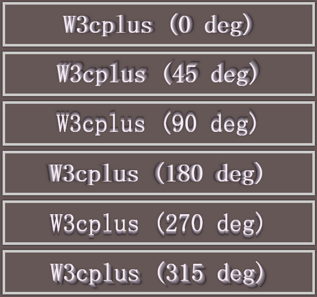
css样式如下所示:
        body {

            background-color: #665757;

        }

        .text-wrap {

            width: 600px;

            margin: 10px auto;

            padding: 10px 0;

            border: 5px solid #ccc;

            position: relative;

            box-shadow: 0 0 4px rgba(0, 0, 0, 0.80);

            clear: both;

            font-family: 'Airal', serif;

            font-size: 50px;

            text-align: center;

            color: #f7edf7;

        }

        .box1 {

            text-shadow: 0px 0px 0 rgb(188,178,188),1px 0px 0 rgb(173,163,173),2px 0px 0 rgb(157,147,157),3px 0px 0 rgb(142,132,142),4px 0px 0 rgb(126,116,126),5px 0px 0 rgb(111,101,111),6px 0px 0 rgb(95,85,95), 7px 0px 0 rgb(79,69,79),8px 0px 7px rgba(0,0,0,0.35),8px 0px 1px rgba(0,0,0,0.5),0px 0px 7px rgba(0,0,0,.2);

        }

        .box2 {

            text-shadow: 0px 0px 0 rgb(188,178,188),1px -1px 0 rgb(173,163,173),2px -2px 0 rgb(157,147,157),3px -3px 0 rgb(142,132,142),4px -4px 0 rgb(126,116,126),5px -5px 0 rgb(111,101,111),6px -6px 0 rgb(95,85,95), 7px -7px 0 rgb(79,69,79),8px -8px 7px rgba(0,0,0,0.35),8px -8px 1px rgba(0,0,0,0.5),0px 0px 7px rgba(0,0,0,.2);

        }

        .box3 {

            text-shadow: 0px 0px 0 rgb(188,178,188),0px -1px 0 rgb(173,163,173),0px -2px 0 rgb(157,147,157),0px -3px 0 rgb(142,132,142),0px -4px 0 rgb(126,116,126),0px -5px 0 rgb(111,101,111),0px -6px 0 rgb(95,85,95), 0px -7px 0 rgb(79,69,79),0px -8px 7px rgba(0,0,0,0.35),0px -8px 1px rgba(0,0,0,0.5),0px 0px 7px rgba(0,0,0,.2);

        }

        .box5 {

            text-shadow: 0px 0px 0 rgb(188,178,188),-1px 0px 0 rgb(173,163,173),-2px 0px 0 rgb(157,147,157),-3px 0px 0 rgb(142,132,142),-4px 0px 0 rgb(126,116,126),-5px 0px 0 rgb(111,101,111),-6px 0px 0 rgb(95,85,95), -7px 0px 0 rgb(79,69,79),-8px 0px 7px rgba(0,0,0,0.35),-8px 0px 1px rgba(0,0,0,0.5),0px 0px 7px rgba(0,0,0,.2);

        }

        .box7 {

            text-shadow: 0px 0px 0 rgb(188,178,188),0px 1px 0 rgb(173,163,173),0px 2px 0 rgb(157,147,157),0px 3px 0 rgb(142,132,142),0px 4px 0 rgb(126,116,126),0px 5px 0 rgb(111,101,111),0px 6px 0 rgb(95,85,95), 0px 7px 0 rgb(79,69,79),0px 8px 7px rgba(0,0,0,0.35),0px 8px 1px rgba(0,0,0,0.5),0px 0px 7px rgba(0,0,0,.2);

        }

        .box8 {

            text-shadow: 0px 0px 0 rgb(188,178,188),1px 1px 0 rgb(173,163,173),2px 2px 0 rgb(157,147,157),3px 3px 0 rgb(142,132,142),4px 4px 0 rgb(126,116,126),5px 5px 0 rgb(111,101,111),6px 6px 0 rgb(95,85,95), 7px 7px 0 rgb(79,69,79),8px 8px 7px rgba(0,0,0,0.35),8px 8px 1px rgba(0,0,0,0.5),0px 0px 7px rgba(0,0,0,.2);

        }
页面HTML代码如下所示:
    <div class="text-wrap box1">W3cplus (0 deg)</div>

    <div class="text-wrap box2">W3cplus (45 deg)</div>

    <div class="text-wrap box3">W3cplus (90 deg)</div>

    <div class="text-wrap box5">W3cplus (180 deg)</div>

    <div class="text-wrap box7">W3cplus (270 deg)</div>

    <div class="text-wrap box8">W3cplus (315 deg)</div>
暂时先写到这里吧。事实上这些效果都是看《图解CSS3》,根据书中理论利用css相关属性制作的效果图。(在此强烈推荐一下这本书,确实是理论与实践结合的好书)
未完待续
利用css3选择器及css3边框做出的特效(1)的更多相关文章
- CSS3选择器02—CSS3部分选择器
该部分主要为CSS3新增的选择器 接上一篇 CSS(CSS3)选择器(1) 一.通用兄弟选择器: 24:E ~ F,匹配任何E元素之后的同级F元素. div ~ p{ background-color ...
- css3鼠标悬停图片边框线条动画特效
css3鼠标经过内容区时,边框线条特效效果制作. html: <div class="strength grWidth hidden"> <div class ...
- CSS3 选择器浏览器兼容性汇总 IE8
1.css选择器 css(包括css1.css2和css3)有哪些选择器? http://www.w3school.com.cn/cssref/css_selectors.asp 2.CSS3选择器 ...
- CSS3选择器归类整理
CSS3选择器归类整理(附CSS优先级要点) CSS是用于网页设计可用的最强大的工具之一.使用它我们可以在几分钟内改变一个网站的界面,而不用改变页面的标签.在深入研究CSS选择器之前,我们应该先搞懂C ...
- css3选择器归类整理---基本选择器和属性选择器
css3选择器分类 CSS3选择器分类如下图所示 选择器的语法 1.基本选择器 类型 代码 功能描述 通配选择器 *{ margin: 0; padding: 0; border: none; } 选 ...
- (转)利用 SVG 和 CSS3 实现有趣的边框动画
目录 SVG 学习<一>基础图形及线段 SVG 学习<二>进阶 SVG世界,视野,视窗 stroke属性 svg分组 SVG 学习<三>渐变 SVG 学习<四 ...
- 利用CSS3选择器实现表格的斑马纹
要用到的Css3选择器 element:nth-child(number){ } 选择器匹配属于其父元素的第 number 个子元素 参数 Number odd 奇数 even 偶数 W3School ...
- CSS3 选择器——伪类选择器
前面花了两节内容分别在<CSS3选择器——基本选择器>和<CSS3选择器——属性选择器>介绍了CSS3选择器中的基本选择器和属性选择器使用方法,今天要和大家一起学习CSS3选择 ...
- CSS3 选择器——笔记+实战案例(基本选择器、组合选择器、属性选择器、伪类选择器)
使用CSS3 选择器——笔记 CSS通过选择器控制HTML元素,CSS选择器对网页对象可以实现一对一.一对多或者多对一的匹配. 一.CSS3选择器分类 CSS选择器在CSS2.1选择器的基础上新增了属 ...
随机推荐
- 开源 XFControls , 用于 Xamarin.Forms 的自定义控件集
从此以后不会在博客园上发表任何言论,观注我的同志们,洗洗睡吧. ---------------------- 博文移至: http://www.jianshu.com/p/3ed1a3f10955
- 准备.Net转前端开发-WPF界面框架那些事,UI快速实现法
题外话 打开博客园,查看首页左栏的”推荐博客”,排名前五的博客分别是(此处非广告):Artech.小坦克.圣殿骑士.腾飞(Jesse).数据之巅.再看看它们博客的最新更新时间:Artech(2014- ...
- 天龙客户端的ResourceManager
今天培训的时候,Leader针对项目结构讲了很多分层架构的思想,思路,对我而言有很大的助益,学会了将需求分层,或者说先设计出各个层次,然后有需求后落实到对应的层次上,尤其对于刚开始的架构设计阶段,能把 ...
- 关于Hellas和Greece
一直以来我就好奇,为什么希腊的中文名字“希腊”和英文名字”Greece”听起来都不像(就像“德国”不像“Germany”一样),而且,为什么在很多体育比赛中看到希腊运动员的衣服上都是“Hellas”, ...
- getopt
头文件 #include<unistd.h> 定义函数 int getopt(int argc,char * const argv[ ],const char * optstring); ...
- 35-less 简明笔记
分屏显示文本文件 less [options] [file-list] less与more类似,但比more更加完善 例如:在显示一屏文本之后,less将显示提示副等待下一条命令的输入;可以向前或向后 ...
- xml文件的生成与解析
生成方法一:同事StringBuffer类对xml文件格式解析写入 package com.steel_rocky.xml; import android.app.Activity; import a ...
- android之ViewPager的使用
XML代码 <android.support.v4.view.ViewPager ViewPager控件 android:layout_width="wrap_con ...
- 侧滑菜单SlidingMenu
想要使用SlidingMenu 需要下载文件SlidingMenu-master 并导入SlidingMenu-master中的第三方library 如图所示: 修改library里的build.gr ...
- [转] DBCP 的validationQuery
原文地址:http://blog.csdn.net/fgakjfd/article/details/5600462 网上很多评论说DBCP有很多BUG,但是都没有指明是什么BUG,只有一部分人说数据库 ...