CSS+DIV自适应布局
CSS+DIV自适应布局
1.两列布局(左右两侧,左侧固定宽度200px;右侧自适应占满)
代码如下:
<!doctype html>

<html>

    <head>

        <meta charset="utf-8"/>

        <title>左右两侧,左侧固定宽度200px;右侧自适应占满</title>

        <style>

        .box{

            width:800px;

            height:300px;

            margin:0 auto;

        }

        .left{

            width:200px;

            height:300px;

            background:#f00;

            float:left;

        }

        .right{

            height:300px;

            margin-left:200px;

            background:#0f0;

        }

        </style>

    </head>

    <body>

        <div class="box">

            <div class="left"></div>

            <div class="right"></div>

        </div>

    </body>

</html>
运行结果如下图:

- 两栏布局(左定宽,右自动)
- float + margin
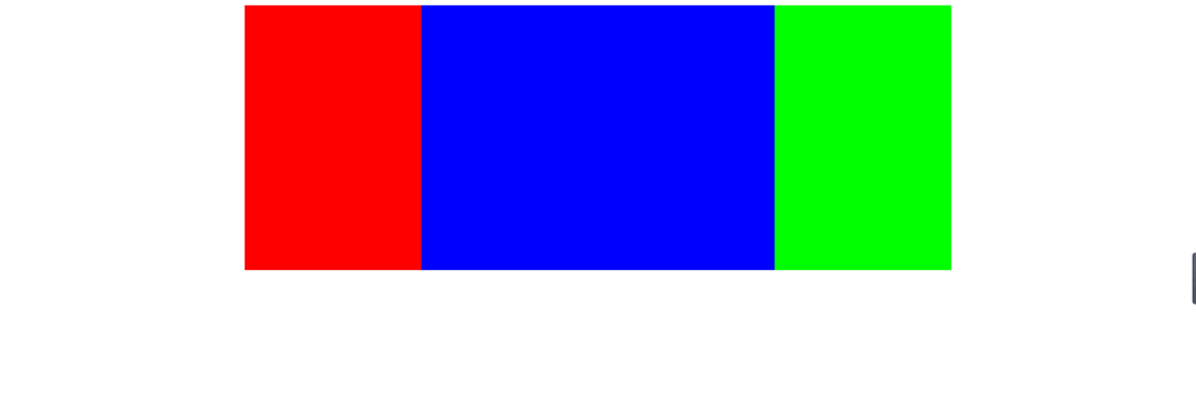
2.三列布局(左中右三列,左右200px固定,中间自适应占满)
方法一(左右浮动,中间 margin-left,margin-right,中间div在最后)
- 代码如下
<!doctype html>

<html>

    <head>

        <meta charset="utf-8"/>

        <title>左中右三列,左右200px固定,中间自适应占满 方法一</title>

        <style>

.box{

    width:800px;

    height:300px;

    margin:0 auto;

}

.left{

    width:200px;

    height:300px;

    background:#f00;

    float:left;

}

.right{

    width:200px;

    height:300px;

    float:right;

    background:#0f0;

}

.center{

    height:300px;

    background-color:#00f;

    margin:0 200px;

}

        </style>

    </head>

    <body>

        <div class="box">

            <div class="left"></div>

            <div class="right"></div>

            <div class="center"></div>

        </div>

    </body>

</html>- 运行结果如下图
方法二(左中右定位):
- 代码如下
<!doctype html>

<html>

    <head>

        <meta charset="utf-8"/>

        <title>左中右三列,左右200px固定,中间自适应占满 方法二</title>

        <style>

.box{

    width:1000px;

    height:300px;

    margin:0 auto;

    position:relative;

}

.left{

    width:200px;

    height:300px;

    background:#f00;

    position:absolute;

    top:0px;

    left:0px;

}

.right{

    width:200px;

    height:300px;

    background:#0f0;

    position:absolute;

    top:0px;

    right:0px;

}

.center{

    height:300px;

    background-color:#00f;

    position:absolute;

    left:200px;

    right:200px;

}

        </style>

    </head>

    <body>

        <div class="box">

            <div class="left"></div>

            <div class="center"></div>

            <div class="right"></div>

        </div>

    </body>

</html>
- 运行结果如下图:
3.上中下三行,头部,底部固定高200px,中间自适应占满
中间定位,底部定位
- 代码如下:
<!doctype html>

<html>

    <head>

        <meta charset="utf-8"/>

        <title>上中下三行,头部,底部固定高200px,中间自适应占满</title>

        <style>

*{

    margin:0;

}

html{

    height:100%;

}

body{

    min-height:100%;

}

.header{

    width:100%;

    height:100px;

    background-color:#ccc;

}

.main{

    width:100%;

    background-color:#f00;

    position:absolute;

    top:100px;

    bottom:100px;

}

.footer{

    height:100px;

    width:100%;

    position:absolute;

    bottom:0px;

    background-color:#ccc;

}

        </style>

    </head>

    <body>

            <div class="header"></div>

            <div class="main"></div>

            <div class="footer"></div>

    </body>

</html>
- 运行代码如下图:

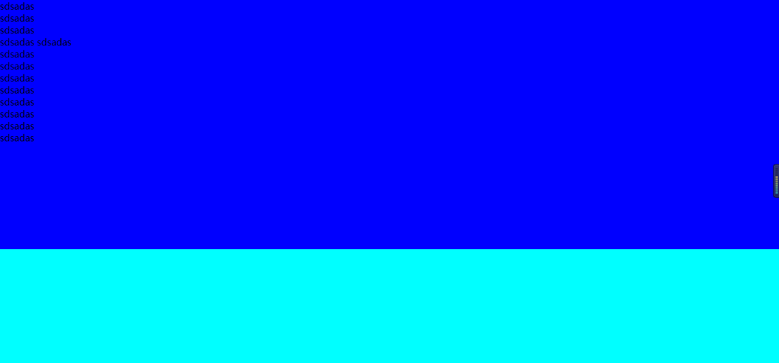
4.上下两部分,地下这个股东高度200px,如果上面的内容少,那么这个footer就固定在底部,如果内容多,就把footer往下挤
- 代码如下:
<!doctype html>

<html>

    <head>

        <meta charset="utf-8"/>

        <title>上下两部分,地下这个股东高度200px,如果上面的内容少,

        那么这个footer就固定在底部,如果内容多,就把footer往下挤</title>

        <style>

*{

    margin:0;

}

html{

    height:100%;

}

body{

    min-height:100%;

    background-color:#00f;

    position:relative;

}

.header{

    height:100%;

    background-color:#00f;

    padding-bottom:200px;

}

.footer{

    width:100%;

    height:200px;

    position:absolute;

    bottom:0px;

    background-color:#0ff;

}

        </style>

    </head>

    <body>

            <div class="header">

        sdsadas<br/>

        sdsadas<br/>

        sdsadas<br/>

        sdsadas

        sdsadas<br/>

        sdsadas<br/>

        sdsadas<br/>

        sdsadas<br/>

        sdsadas<br/>

        sdsadas<br/>

        sdsadas<br/>

        sdsadas<br/>

        sdsadas<br/>

            </div>

            <div class="footer"></div>

    </body>

</html>- 运行结果如下图:
新手入门,请多多关照
CSS+DIV自适应布局的更多相关文章
- 演示:纯CSS实现自适应布局表格
<!DOCTYPE html> <html> <head> <meta charset="utf-8"> <title> ...
- CSS流体(自适应)布局下宽度分离原则
CSS流体(自适应)布局下宽度分离原则 这篇文章发布于 2011年02月28日,星期一,00:48,归类于 css相关. 阅读 73990 次, 今日 5 次 by zhangxinxu from h ...
- 常见css垂直自适应布局(css解决方法)
css3的盒模型, css3中添加弹性盒模型,最新弹性盒模型是flex,之前为box <!DOCTYPE html> <html > <head> <titl ...
- 常见css水平自适应布局
左右布局,左边固定,右边自适应布局 BFC方法解决 <!DOCTYPE html PUBLIC "-//W3C//DTD XHTML 1.0 Transitional//EN" ...
- CSS流体(自适应)布局下宽度分离原则——张鑫旭
by zhangxinxu from http://www.zhangxinxu.com本文地址:http://www.zhangxinxu.com/wordpress/?p=1463 一.简短的前言 ...
- css+div页面布局
div标签是html页面中用于分组的块元素,是专门用于元素布局的标签. 标签的级别: 1.行级标签:可设置大小,但一行只能容下一个行级标签(默认宽度==页面宽度,默认高度==填充高度) 2.块级标签: ...
- CSS之自适应布局webkit-box
自适应布局webkit-box,在平常的web横排布局中,会经常用到float或display:inline-block,但是在多种不同宽度的移动设备的自适应布局中用的话,还得设置百分比宽度和考虑清除 ...
- 一个简单的模板了解css+div网页布局
直接附上最终效果图: index.html内容: <html> <!--20170730 soulsjie--> <head> <meta http-equi ...
- div自适应布局
<%@ Page Language="C#" AutoEventWireup="true" CodeBehind="OnlineShowPage ...
随机推荐
- [LC] 1048. Longest String Chain
Given a list of words, each word consists of English lowercase letters. Let's say word1 is a predece ...
- 吴裕雄--天生自然python机器学习:使用朴素贝叶斯过滤垃圾邮件
使用朴素贝叶斯解决一些现实生活中 的问题时,需要先从文本内容得到字符串列表,然后生成词向量. 准备数据:切分文本 测试算法:使用朴素贝叶斯进行交叉验证 文件解析及完整的垃圾邮件测试函数 def cre ...
- plsql中文显示问号
1. select userenv('language') from dual 2. 复制查询的值配置系统环境变量 NLS_LANG=AMERICAN_AMERICA.ZHS16GBK 3.配置系统环 ...
- Python爬虫之爬取站内所有图片
title date tags layut Python爬虫之爬取站内所有图片 2018-10-07 Python post 目标是 http://www.5442.com/meinv/ 如需在非li ...
- css样式表----------样式属性(背景与前景、边界和边框、列表与方块、格式与布局)
一.背景与前景 (1).背景 line-height: 1.5 !important;">90; /*背景色(以样式表为主,样式表优先.)*/ background-image:url ...
- 学习python-20191107
一.导入模块的两种方式 方式1:import 包名.模块名 [ as 别名]方式2:from 包名 import 模块名 from 包名.模块名 import 变量|函数|类 # ...
- MAC上安装maven以及配置Intellij IDEA
大前提:java环境已经配置好 maven是对于java工程的管理 一.maven安装到mac 1.首先,maven下载地址http://maven.apache.org/download.cgi 点 ...
- jquery框架概览(一)
参照jQuery 2.0.3版本(http://files.cnblogs.com/files/snoy/jquery-2.0.3.js")来进行的源码分析 从代码的最外层可以看到是一个II ...
- 吴裕雄--天生自然python学习笔记:Python3 JSON 数据解析
JSON (JavaScript Object Notation) 是一种轻量级的数据交换格式.它基于ECMAScript的一个子集. Python3 中可以使用 json 模块来对 JSON 数据进 ...
- 有空要解决的错误log
E/FaceSDK (): FACESDKTimer face score =0.999912 I/FaceTracker(): face_verification used: I/DEBUG ( ) ...