css3 动画实例
animation 动画
animation-duration
代码实例:
<!DOCTYPE html>
<html>
<head>
<meta charset="utf-8">
<title>动画</title>
<style type="text/css">
.animation_duration{
left:10px;
top:100px;
position:absolute;
-webkit-animation:.5s ease forwards;
-webkit-animation-duration:2s;
-webkit-animation-name:demo;
-moz-animation:.5s ease forwards;
-moz-animation-name:demo;
-moz-animation-duration:2s;
}
@-webkit-keyframes demo{
%{left:10px;}
%{left:400px;}
}
</style>
</head>
<body>
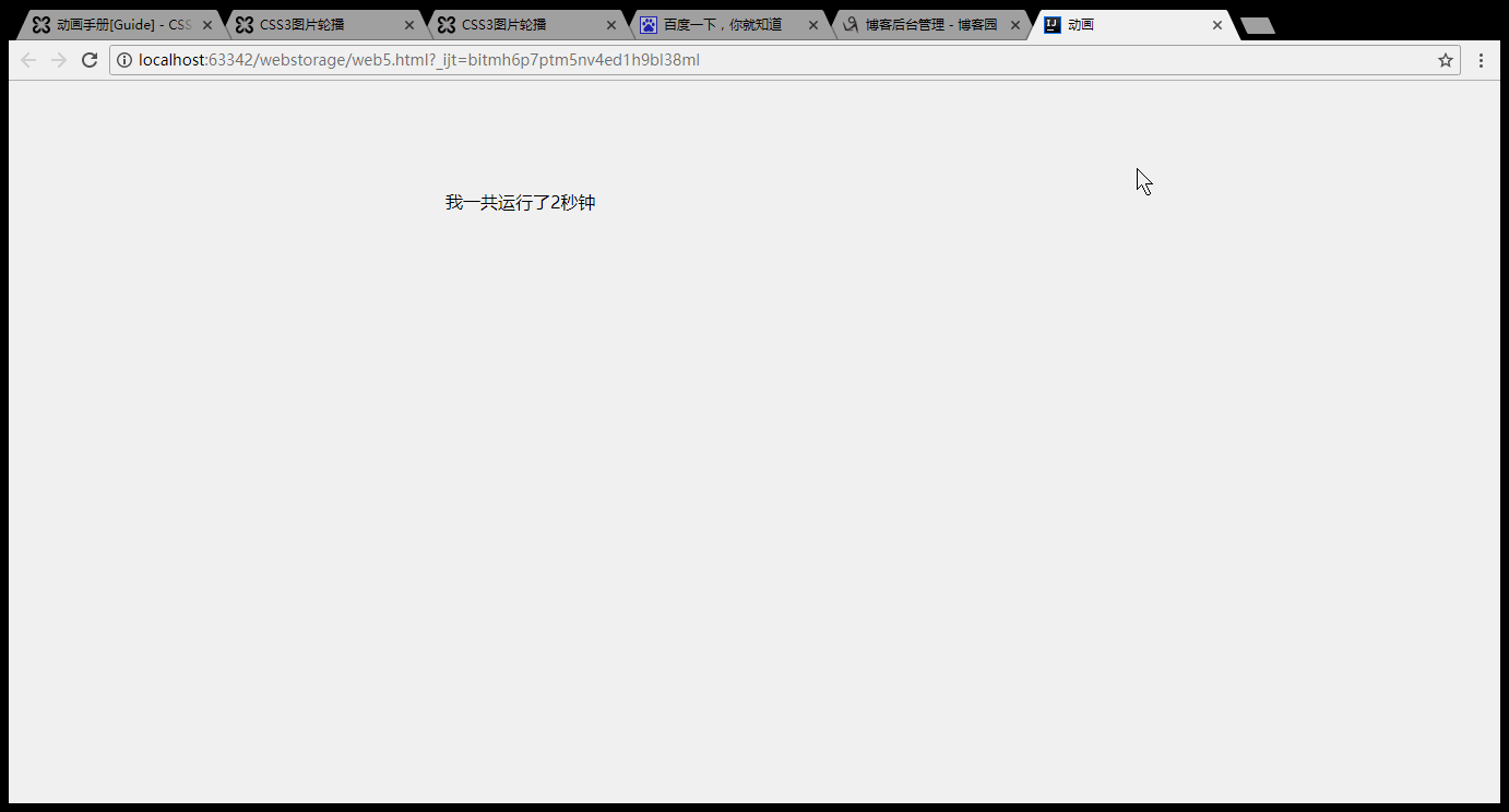
<div class="demo_box animation_duration">我一共运行了2秒钟</div>
</body>
</html>
效果:
animation-name
代码实例:
<!DOCTYPE html>

<html>

<head>

    <meta charset="utf-8">

    <title>动画</title>

    <style type="text/css">

        .animation_name{

            left:;

            top:100px;

            position:absolute;

            -webkit-animation:.5s .5s ease infinite alternate;

            -webkit-animation-name:demo;

            -moz-animation:.5s .5s ease infinite alternate;

            -moz-animation-name:demo;

        }

        @-webkit-keyframes demo{

            %{left:;}

            %{left:400px;}

        }

    </style>

</head>

<body>

<div class="demo_box animation_name">看我没事来回跑</div>

</body>

</html>
效果:

animation-timing-function
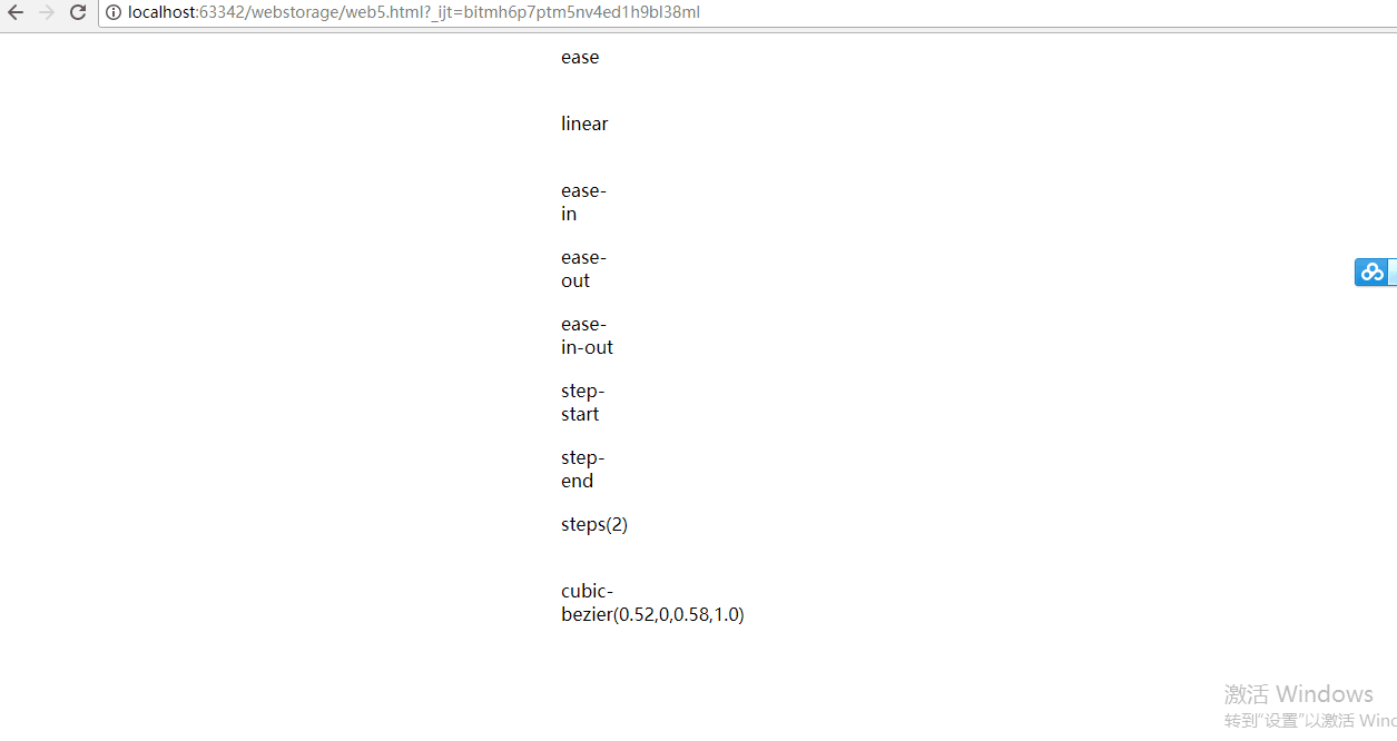
语法animation-timing-function: linear | ease | ease-in |
 ease-out | ease-in-out | step-start | step-end |
steps(<number>[, [ start | end ] ]?) | cubic-bezier(<number>, <number>, <number>, <number>)
[, linear | ease | ease-in | ease-out | ease-in-out | step-start | step-end | steps(<number>[, [ start | end ] ]?) | cubic-bezier(<number>, <number>, <number>, <number>) ]*; 指定对象动画的持续时间 。
ease:缓解效果,等同于cubic-bezier(0.25,0.1,0.25,1.0)函数,既立方贝塞尔。
linear:线性效果,等同于cubic-bezier(0.0,0.0,1.0,1.0)函数。
ease-in:渐显效果,等同于cubic-bezier(0.42,0,1.0,1.0)函数。
ease-out:渐隐效果,等同于cubic-bezier(0,0,0.58,1.0)函数。
ease-in-out:渐显渐隐效果,等同于cubic-bezier(0.42,0,0.58,1.0)函数。
step-start:马上转跳到动画结束状态。
step-end:保持动画开始状态,直到动画执行时间结束,马上转跳到动画结束状态。
steps(<number>[, [ start | end ] ]?):第一个参数number为指定的间隔数,即把动画分为n步阶段性展示,第二个参数默认为end,设置最后一步的状态,start为结束时的状态,end为开始时的状态,若设置与animation-fill-mode的效果冲突,而以animation-fill-mode的设置为动画结束的状态。
cubic-bezier(<number>, <number>, <number>, <number>):特殊的立方贝塞尔曲线效果。
代码实例:
<!DOCTYPE html>

<html>

<head>

    <meta charset="utf-8">

    <title>动画</title>

    <style type="text/css">

        .demo_box{

            -webkit-animation:f1 3s .5s forwards;

            -moz-animation:f1 3s .5s forwards;

            position:relative;

            left:10px;

            width:50px;

            height:50px;

            margin:10px ;

        }

        .ease{

            -webkit-animation-timing-function:ease;

            -moz-animation-timing-function:ease;

        }

        .linear{

            -webkit-animation-timing-function:linear;

            -moz-animation-timing-function:linear;

        }

        .ease-in{

            -webkit-animation-timing-function:ease-in;

            -moz-animation-timing-function:ease-in;

        }

        .ease-out{

            -webkit-animation-timing-function:ease-out;

            -moz-animation-timing-function:ease-out;

        }

        .ease-in-out{

            -webkit-animation-timing-function:ease-in-out;

            -moz-animation-timing-function:ease-in-out;

        }

        .step-start{

            -webkit-animation-timing-function:step-start;

            -moz-animation-timing-function:step-start

        }

        .step-end{

            -webkit-animation-timing-function:step-end;

            -moz-animation-timing-function:step-end;

        }

        .steps{

            -webkit-animation-timing-function:steps();

            -moz-animation-timing-function:steps()

        }

        .cubic-bezier{

            -webkit-animation-timing-function:cubic-bezier(0.52,,0.58,1.0);

            -moz-animation-timing-function:cubic-bezier(0.52,,0.58,1.0);

        }

        @-webkit-keyframes f1{

            %{left:10px;}

            %{left:500px;}

        }

        @-moz-keyframes f1{

            %{left:10px;}

            %{left:500px;background:#f00}

        }

    </style>

</head>

<body>

<div class="demo_box ease">ease</div>

<div class="demo_box linear">linear</div>

<div class="demo_box ease-in">ease-in</div>

<div class="demo_box ease-out">ease-out</div>

<div class="demo_box ease-in-out">ease-in-out</div>

<div class="demo_box step-start">step-start</div>

<div class="demo_box step-end">step-end</div>

<div class="demo_box steps">steps()</div>

<div class="demo_box cubic-bezier">cubic-bezier(0.52,,0.58,1.0)</div>

</body>

</html>
效果:
animation-delay
语法
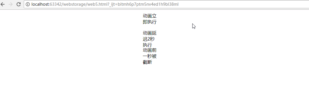
0:不延迟,立即执行。
正数:按照设置的时间延迟。
负数:设置时间前的动画将被截断
代码实例:
<!DOCTYPE html>

<html>

<head>

    <meta charset="utf-8">

    <title>动画</title>

    <style type="text/css">

        .demo_box{

            -webkit-animation:f1 3s  forwards;

            -moz-animation:f1 3s  forwards;

            position:relative;

            left:10px;

            width:50px;

            height:50px;

            margin:10px ;

        }

         .no_delay {

             -webkit-animation-delay: 0s;

             -moz-animation-delay: 0s;

         }

         .delay_2s{

             -webkit-animation-delay: 2s;

             -moz-animation-delay: 2s;

         }

        .delay_-1s{

            -webkit-animation-delay:-1s;

            -moz-animation-delay:-1s;

        }

        @-webkit-keyframes f1{

            %{left:10px;}

            %{left:500px;}

        }

        @-moz-keyframes f1{

            %{left:10px;}

            %{left:500px;background:#f00}

        }

    </style>

</head>

<body>

<div class="demo_box no_delay">动画立即执行</div>

<div class="demo_box delay_2s">动画延迟2秒执行</div>

<div class="demo_box delay_-1s">动画前一秒被截断</div>

</body>

</html>
效果:
animation-direction
语法
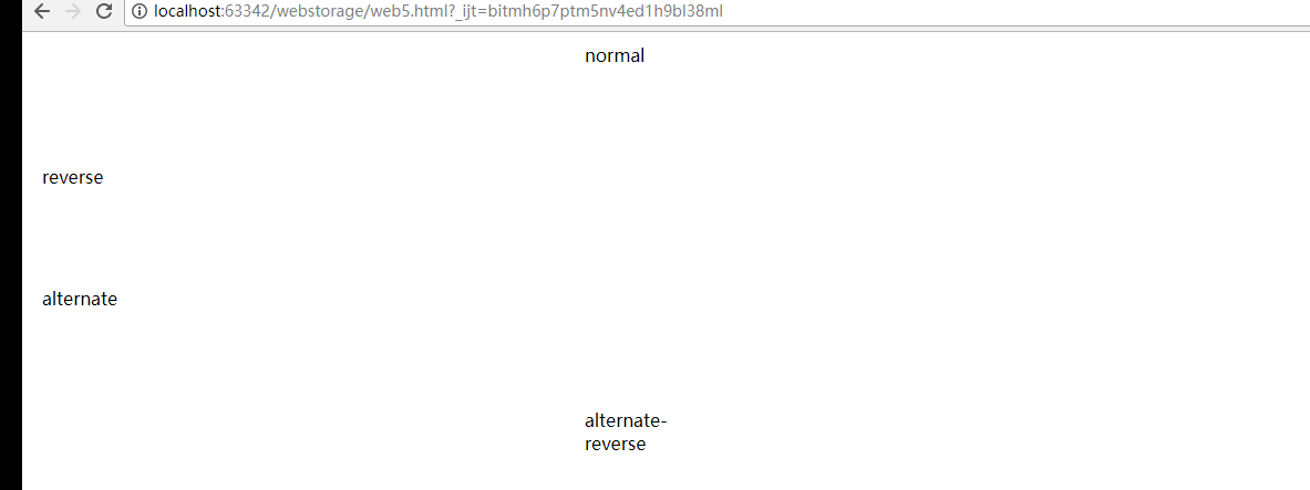
animation-direction: normal | reverse | alternate | alternate-reverse [, normal | reverse | alternate | alternate-reverse ]*; 指定对象动画运动的方向。
normal:正常方向。
reverse:动画反向运行,方向始终与normal相反。(FF14.0.1以下不支持)
alternate:动画会循环正反方向交替运动,奇数次(1、3、5……)会正常运动,偶数次(2、4、6……)会反向运动,即所有相关联的值都会反向。
alternate-reverse:动画从反向开始,再正反方向交替运动,运动方向始终与alternate定义的相反。(FF14.0.1以下不支持)
语法
animation-direction: normal | reverse | alternate | alternate-reverse [, normal | reverse | alternate | alternate-reverse ]*; 指定对象动画运动的方向。
normal:正常方向。
reverse:动画反向运行,方向始终与normal相反。(FF14.0.1以下不支持)
alternate:动画会循环正反方向交替运动,奇数次(1、3、5……)会正常运动,偶数次(2、4、6……)会反向运动,即所有相关联的值都会反向。
alternate-reverse:动画从反向开始,再正反方向交替运动,运动方向始终与alternate定义的相反。(FF14.0.1以下不支持)
代码实例:
<!DOCTYPE html>

<html>

<head>

    <meta charset="utf-8">

    <title>动画</title>

    <style type="text/css">

        .demo_box{

            -webkit-animation:f1 2s .5s  forwards linear;

            -moz-animation:f1 2s .5s  forwards linear;

            position:relative;

            left:10px;

            width:100px;

            height:100px;

            margin:10px ;

            overflow:hidden;

        }

        .normal{

            -webkit-animation-direction:normal;

            -moz-animation-direction:normal;

        }

        .reverse{

            -webkit-animation-direction:reverse;

            -moz-animation-direction:reverse;

        }

        .alternate{

            -webkit-animation-direction:alternate;

            -moz-animation-direction:alternate;

        }

        .alternate-reverse{

            -webkit-animation-direction:alternate-reverse;

            -moz-animation-direction:alternate-reverse;

        }

        @-webkit-keyframes f1{

            %{left:10px;}

            %{left:500px;}

        }

        @-moz-keyframes f1{

            %{left:10px;}

            %{left:500px;}

        }

    </style>

</head>

<body>

<div class="demo_box normal">normal</div>

<div class="demo_box reverse">reverse</div>

<div class="demo_box alternate">alternate</div>

<div class="demo_box alternate-reverse">alternate-reverse</div>

</body>

</html>
效果:
animation-iteration-count
代码实例:
<!DOCTYPE html>
<html>
<head>
<meta charset="utf-8">
<title>动画</title>
<style type="text/css"> .demo_box{
-webkit-animation:f1 3s .5s forwards linear;
-moz-animation:f1 3s .5s forwards linear;
position:relative;
left:10px;
width:50px;
height:50px; margin:10px ; }
.one {
-moz-animation-iteration-count: ;
-webkit-animation-iteration-count: ;
}
.infinite{
-moz-animation-iteration-count: infinite;
-webkit-animation-iteration-count: infinite;
}
.some {
-moz-animation-iteration-count: ,;
-webkit-animation-iteration-count:,;
} @-webkit-keyframes f1{
%{left:10px;}
%{left:500px;}
}
@-moz-keyframes f1{
%{left:10px;}
%{left:500px;}
} </style>
</head>
<body>
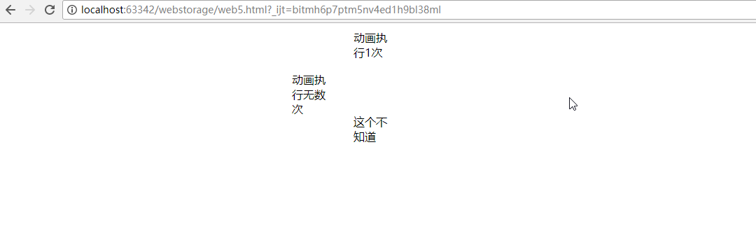
<div class="demo_box one">动画执行1次</div>
<div class="demo_box infinite">动画执行无数次</div>
<div class="demo_box some">这个不知道</div> </body>
</html>
效果:
animation-fill-mode
语法
animation-fill-mode: none | forwards | backwards | both; 检索或设置对象动画时间之外的状态。
none:默认值。不设置对象动画之外的状态
forwards:结束后保持动画结束时的状态,但当animation-direction为0,则动画不执行,持续保持动画开始时的状态
backwards:结束后返回动画开始时的状态
both:结束后可遵循forwards和backwards两个规则。
代码实例:
<!DOCTYPE html>
<html>
<head>
<meta charset="utf-8">
<title>动画</title>
<style type="text/css"> .demo_box{
-webkit-animation:f1 2s .5s forwards linear;
-moz-animation:f1 2s .5s forwards linear;
position:relative;
left:10px;
width:100px;
height:100px;
margin:10px ;
overflow:hidden;
}
.forwards{
-webkit-animation-fill-mode:forwards;
-moz-animation-fill-mode:forwards;
}
.backwards{
-webkit-animation-fill-mode:backwards;
-moz-animation-fill-mode:backwards;
}
@-webkit-keyframes f1{
%{left:10px;}
%{left:500px;}
}
@-moz-keyframes f1{
%{left:10px;}
%{left:500px;}
} </style>
</head>
<body>
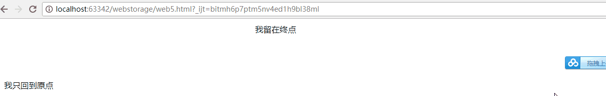
<div class="demo_box forwards">我留在终点</div>
<div class="demo_box backwards">我只回到原点</div>
</body>
</html>
效果:
animation-play-state2017-08-22
语法
<!DOCTYPE html>
<html>
<head>
<meta charset="utf-8">
<title>动画</title>
<style type="text/css"> .demo_box{
-webkit-animation:f1 2s .5s linear forwards alternate;
-moz-animation:f1 2s .5s linear forwards alternate;
position:relative;
left:10px;
width:100px;
height:100px;
margin:10px ;
overflow:hidden;
}
.play-state:hover{
-webkit-animation-play-state:paused;
-moz-animation-play-state:paused;
}
@-webkit-keyframes f1{
%{left:10px;}
%{left:500px;}
}
@-moz-keyframes f1{
%{left:10px;}
%{left:500px;}
} </style>
</head>
<body>
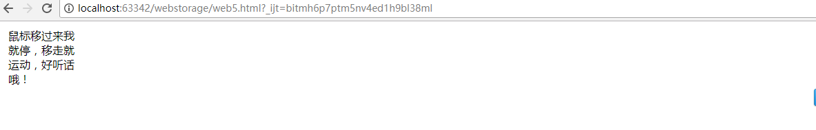
<div class="demo_box play-state">鼠标移过来我就停,移走就运动,好听话哦!</div>
</body>
</html>
效果:
转载:http://isux.tencent.com/css3
16:47:48 16:47:53
css3 动画实例的更多相关文章
- css3动画实例测试
1.css3动画属性分析(2016-5-11) 1.transition: 规定属性变换规则,可以这样讲.transition(a,b,c,d); a:要变换的属性: b:过渡时间: c:运动方式: ...
- css3动画实例
<!doctype html> <html> <head> <meta charset="utf-8"> <title> ...
- CSS3动画详解(结合实例)
一.使用CSS3动画代替JS动画 JS动画频繁操作DOM导致效率非常低 在频繁的操作DOM和CSS时,浏览器会不停的执行重排(reflow)和重绘(repaint) 可以避免占用JS主线程 这边就不细 ...
- CSS3动画几个平时没注意的属性
一.timing-function: steps() 一开始在使用CSS3的时候并没有太注意这个timing-function,只是注意到自定义贝塞尔曲线. 1)一个项目中的实例 先来看看左边加了st ...
- CSS3 动画
通过 CSS3,我们能够创建动画,这可以在许多网页中取代动画图片.Flash 动画以及 JavaScript. CSS3 动画 CSS3 @keyframes 规则 如需在 CSS3 中创建动画, ...
- 高性能 CSS3 动画
注:本文出自腾讯AlloyTeam的元彦,文章也可以在github上浏览.请尊重版权,转载请注明来源,多谢-- 高性能移动Web相较PC的场景需要考虑的因素也相对更多更复杂,我们总结为以下几点: 流量 ...
- 美妙的 CSS3 动画!一组梦幻般的按钮效果
今天给大家带来的是五款梦幻般的动画按钮效果.下面是在线演示,把鼠标放在按钮上试试,有惊喜哦!CSS3 引入了众多供功能强大的新特性,让设计和开发人员能够轻松的创作出各种精美的界面效果. 温馨提示:为保 ...
- CSS3动画基本的转换和过渡
理论知识不扎实,在一定程度上能体现你解决问题的能力.今天我们拿CSS3动画来说,简单回忆下他的一些基本属性,这些我们在平常应用中会经常用到. 常用动画属性: transform:translate(x ...
- CSS3动画制作的简单示例
CSS3 大大强化了制作动画的能力,但是如果要做出图案比较复杂的动画,选择 GIF 依然是一个不错的选择.今天给大家介绍一个使用 CSS animation 配合雪碧图(CSS sprite)来制作动 ...
随机推荐
- 基于自定义的动态数组实现一个栈(Java语言)
关于动态数组,参见我的上一篇关于动态数组的博文https://www.cnblogs.com/inu6/p/11717129.html 1.什么是栈? (1)只能从一端添加元素,也只能从一端取出元素, ...
- NSIS打包后无法解压7z资源包的问题
以前产品一直都是好好的.今天突然不行了.找了半天原因,原来发现7Z的压缩属性变成了"LZMA2"了. 要LZMA才行.
- sshd使用
sshd服务 1.sshd介绍 sshd为secure shell的简称:可以通过网络在主机中开机shell的服务 连接方式(在客户端):ssh username@ip #文本模式 ...
- Delphi XE2 之 FireMonkey 入门(1)
Delphi XE2 的 FireMonkey 是跨平台的, 暂时只准备看看它在 Windows 下(我是 32 位 Win7)的应用情况. 很新的东西, 相信有了它, 以后的界面将会更灵活.漂亮, ...
- 《计算机程式设计》Week2 课堂笔记
本笔记记录自 Coursera课程 <计算机程式设计> 台湾大学 刘邦锋老师 Week2 Control Structure 2-1 If-then-else if then 判断 if ...
- base64编解码的另外几个版本
#include "crypto/encode/base64.h" static const std::string base64_chars = "ABCDEFGHIJ ...
- MVC 源码系列之路由(一)
路由系统 注释:这部分的源码是通过Refector查看UrlRoutingModule的源码编写,这部分的代码没有写到MVC中,却是MVC的入口. 简单的说一下激活路由之前的一些操作.一开始是由MVC ...
- Haystack Python全文检索框架
Haystack 1.什么是Haystack Haystack是django的开源全文搜索框架(全文检索不同于特定字段的模糊查询,使用全文检索的效率更高 ),该框架支持Solr,Elasticsear ...
- Maven父项目 以SpringBoot项目为例
父项目pom <?xml version="1.0" encoding="UTF-8"?> <project xmlns="http ...
- [19/05/07-星期二] JDBC(Java DataBase Connectivity)_CLOB(存储大量的文本数据)与BLOB(存储大量的二进制数据)
一. CLOB(Character Large Object ) – 用于存储大量的文本数据 – 大字段有些特殊,不同数据库处理的方式不一样,大字段的操作常常是以流的方式来处理的.而非一般的字段,一次 ...