CSS动画实例:太极图在旋转
利用CSS可以构造出图形,然后可以对构造的图形添加动画效果。下面我们通过旋转的太极图、放大的五角星、跳“双人舞”的弯月等实例来体会纯CSS实现动画的方法。
1.旋转的太极图
设页面中有<div class="shape"></div>,若为. shape设置样式规则如下:
.shape
{
width: 192px;
height: 96px;
background: #fff;
border-color: #000;
border-style: solid;
border-width: 4px 4px 100px 4px;
border-radius: 50%;
}
可在页面中显示如图1所示的图形。
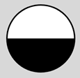
图1 上下两个半圆
若将. Shape的样式规则设置如下:
.shape
{
background: #000;
border: 36px solid #fff;
border-radius: 50%;
width: 24px;
height: 24px;
}
则可在页面中显示如图2所示的图形。

图2 黑心圆
如将黑心圆的背景填充色和边框填充色交换一下,则可在页面中显示如图3所示的图形。

图3 白心圆
将图2和图3适当地放入图1中,则可以绘制出一个太极图。
为这个太极图定义关键帧,使得它旋转起来。编写的HTML文件内容如下。


<!DOCTYPE html>

<html>

<head>

<title>旋转的太极图</title>

<style>

  .container

  {

    margin: 0 auto;

    width: 300px;

    height:300px;

    position: relative;

    display:flex;

    justify-content:center;

    align-items:center;

    background:#d8d8d8;

    border: 4px solid rgba(255, 0, 0, 0.9);

    border-radius: 10%;

  }

  .shape

  {

    width: 192px;

    height: 96px;

    background: #fff;

    border-color: #000;

    border-style: solid;

    border-width: 4px 4px 100px 4px;

    border-radius: 50%;

    position: relative;

    animation:rotate 2s linear infinite;

  }

  .shape:before

  {

    content: "";

    position: absolute;

    top: 50%;

    left: 0;

    background: #fff;

    border: 36px solid #000;

    border-radius: 50%;

    width: 24px;

    height: 24px;

  }

  .shape:after

  {

    content: "";

    position: absolute;

    top: 50%;

    left: 50%;

    background: #000;

    border: 36px solid #fff;

    border-radius:50%;

    width: 24px;

    height: 24px;

   }

   @keyframes rotate

   {

      0%   { transform: rotate(0deg); }

      100% { transform:rotate(360deg); }

   }

</style>

</head>

<body>

<div  class="container">

    <div class="shape"></div>

</div>

</body>

</html>
在浏览器中打开包含这段HTML代码的html文件,可以呈现出如图4所示的动画效果。
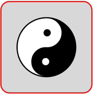
图4 旋转的太极图
2.由小到大的五角星
设页面中有<div class="shape"></div>,若为. shape设置样式规则如下:
.shape
{
position: relative;
display: block;
width:0px;
height:0px;
border-left: 100px solid transparent;
border-right: 100px solid transparent;
border-bottom:70px solid red;
transform:rotate(35deg);
}
.shape:before
{
content: '';
position: absolute;
width: 0px;
height: 0px;
top: -45px;
left: -62.5px;
border-left: 30px solid transparent;
border-right: 30px solid transparent;
border-bottom: 80px solid green;
transform: rotate(-35deg);
}
.shape:after
{
content: '';
position: absolute;
width: 0px;
height: 0px;
top: 3px;
left: -105px;
border-left: 100px solid transparent;
border-right: 100px solid transparent;
border-bottom: 70px solid blue;
transform:rotate(-70deg);
}
可在页面中显示如图5所示的五角星。这个五角星是由三个三角形拼成的,为了方便理解,将三个三角形设置成不同的颜色。
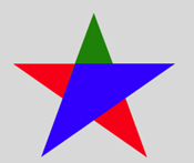
图5 由三个三角形拼成的五角星
将三个三角形的颜色都设置成红色,得到一个红色五角星,并为这个五角星定义关键帧,使得它由小慢慢放大。编写的HTML文件内容如下。
<!DOCTYPE html>

<html>

<head>

<title>放大的五角星</title>

<style>

  .container

  {

    margin: 0 auto;

    width: 300px;

    height:300px;

    position: relative;

    display:flex;

    justify-content:center;

    align-items:center;

    background:#d8d8d8;

    border: 4px solid rgba(255, 0, 0, 0.9);

    border-radius: 10%;

  }

  .shape

  {

    position: relative;

    display: block;

    width:0px;

    height:0px;

    border-left:  100px solid transparent;

    border-right: 100px solid transparent;

    border-bottom:70px  solid red;

    transform:rotate(35deg);

    animation:anim 2s linear infinite;

  }

  .shape:before

  {

    content: '';

    position: absolute;

    width: 0px;

    height: 0px;

    top: -45px;

    left: -62.5px;

    border-left:   30px solid transparent;

    border-right:  30px solid transparent;

    border-bottom: 80px solid red;

    transform: rotate(-35deg);

  }

  .shape:after

  {

    content: '';

    position: absolute;

    width: 0px;

    height: 0px;

    top: 3px;

    left: -105px;

    border-left: 100px solid transparent;

    border-right: 100px solid transparent;

    border-bottom: 70px solid red;

    transform:rotate(-70deg);

  }

  @keyframes anim

  {

     0%   { transform:  rotate(35deg) scale(0.2);  opacity: 0.1; }

     80%,100% { transform:  rotate(35deg) scale(1.2);  opacity: 1;  }

  }

</style>

</head>

<body>

<div  class="container">

    <div class="shape"></div>

</div>

</body>

</html>
在浏览器中打开包含这段HTML代码的html文件,可以呈现出如图6所示的动画效果。
图6 放大的五角星
3.弯月在跳舞
设页面中有<div class="shape"></div>,若为. shape设置样式规则如下:
.shape
{
display: block;
width: 160px;
height: 160px;
background:#ff0000;
border-radius: 50%;
transform: rotateZ(45deg) rotateX(70deg);
}
可在页面中显示如图7所示的图形。
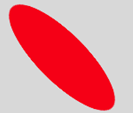
图7 红色斜椭圆
若在.shape样式定义中加上一句:box-shadow: 32px 0px 0 0px #ffffff;,则在页面中显示如图8所示的图形,红色斜椭圆带白色阴影。
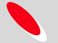
图8 带白色阴影的红色斜椭圆(1)
若再将rotateX(70deg)修改为rotateY(70deg),则在页面中显示如图9所示的图形。

图9 带白色阴影的红色斜椭圆(2)
若定义如下的关键帧,让红色椭圆带的白色阴影在给定的8个点循环运动,可呈现出如图10所示的动画效果。
@keyframes spin
{
0%,100% { box-shadow: 32px 0px 0 0px #ffffff; }
12% { box-shadow: 32px 32px 0 0 #ffffff; }
25% { box-shadow: 0 32px 0 0px #ffffff; }
37% { box-shadow: -32px 32px 0 0 #ffffff; }
50% { box-shadow: -32px 0 0 0 #ffffff; }
62% { box-shadow: -32px -32px 0 0 #ffffff;}
75% { box-shadow: 0px -32px 0 0 #ffffff; }
87% { box-shadow: 32px -32px 0 0 #ffffff; }
}

图10 白色阴影运动效果(1)
若将斜椭圆的填充色设置为背景色,只见到移动的白色阴影,则呈现出如图11所示的动画效果。
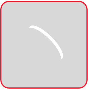
图11 白色阴影运动效果(2)
图9对应的白色阴影运动效果如图12所示。
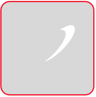
图12 白色阴影运动效果(3)
将图11和图12中运动的两个白色阴影组合起来,编写如下的HTML文件。
<!DOCTYPE html>

<html>

<head>

<title>跳舞的弯月</title>

<style>

  .container

  {

    margin: 0 auto;

    width: 300px;

    height:300px;

    position: relative;

    display:flex;

    justify-content:center;

    align-items:center;

    background:#d8d8d8;

    border: 4px solid rgba(255, 0, 0, 0.9);

    border-radius: 10%;

  }

  .shape

  {

    width: 160px;

    height: 160px;

    border-radius: 50%;

    transform: rotateZ(45deg);

  }

  .shape:before, .shape:after

  {

    content: '';

    display: block;

    position: absolute;

    top: 0;

    left: 0;

    width: 160px;

    height: 160px;

    border-radius: 50%;

    animation: 1s spin linear infinite;

  }

  .shape:before

  {

    transform: rotateX(70deg);

  }

  .shape:after

  {

    transform: rotateY(70deg);

    animation-delay: 0.5s;

  }

  @keyframes spin

  {

    0%,100%  { box-shadow: 32px 0px 0 0px #ffffff; }

    12%      { box-shadow: 32px 32px 0 0 #ffffff;  }

    25%      { box-shadow: 0 32px 0 0px #ffffff;   }

    37%      { box-shadow: -32px 32px 0 0 #ffffff; }

    50%      { box-shadow: -32px 0 0 0 #ffffff;    }

    62%      { box-shadow: -32px -32px 0 0 #ffffff;}

    75%      { box-shadow: 0px -32px 0 0 #ffffff;  }

    87%      { box-shadow: 32px -32px 0 0 #ffffff; }

  }

</style>

</head>

<body>

<div  class="container">

    <div class="shape"></div>

</div>

</body>

</html>
在浏览器中打开包含这段HTML代码的html文件,可以呈现出如图13所示的动画效果,好像两个弯月在跳“双人舞”。
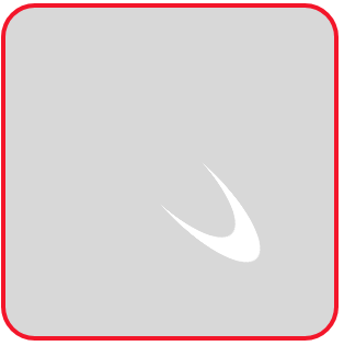
图13 跳“双人舞”的弯月
仿照上面的思想,我们还可以编写如下的HTML文件,实现以原子为中心的电子旋转的动画效果。
<!DOCTYPE html>

<html>

<head>

<title>旋转的电子</title>

<style>

  .container

  {

    margin: 0 auto;

    width: 300px;

    height:300px;

    position: relative;

    display:flex;

    justify-content:center;

    align-items:center;

    background:#d8d8d8;

    border: 4px solid rgba(255, 0, 0, 0.9);

    border-radius: 10%;

  }

  .shape

  {

    position: relative;

    width: 24px;

    height: 24px;

    background-color: #f00;

    border-radius: 50%;

    animation: anim1 20s infinite linear;

  }

  .shape:before, .shape:after

  {

    content: '';

    border-radius: 100%;

    position: absolute;

    top: 50%;

    left: 50%;

    transform: translate(-50%, -50%);

  }

  .shape:before

  {

    width: 60px;

    height: 200px;

    animation: anim2 .8s linear infinite;

  }

  .shape:after

  {

    width: 200px;

    height: 60px;

    animation: anim2 1.2s linear infinite;

  }

  @keyframes anim1

  {

     0%   { transform: rotate(0deg);   }

     100% { transform: rotate(360deg); }

  }

  @keyframes anim2

  {

     0%, 100%  { box-shadow: 2px -2px 0 1.5px #fff; }

     25%       { box-shadow: 2px 2px 0 1.5px #fff;  }

     50%       { box-shadow: -2px 2px 0 1.5px #fff; }

     75%       { box-shadow: -2px -2px 0 1.5px #fff;}

  }

</style>

</head>

<body>

<div  class="container">

    <div class="shape"></div>

</div>

</body>

</html>
在浏览器中打开包含这段HTML代码的html文件,可以呈现出如图14所示的动画效果,好像两个电子绕中心原子在各自轨道旋转。

图14 绕中心原子旋转的电子
CSS动画实例:太极图在旋转的更多相关文章
- CSS动画实例
上一篇讲过css动画transform transition的语法,这一节展示自己做的几个小例子加深印象 1. 线条动画效果 代码:最外层div包含2个小的div : a和b. a有左右边框(高度 ...
- CSS动画实例:旋转的圆角正方形
在页面中放置一个类名为container的层作为效果呈现容器,在该层中再定义十个名为shape的层层嵌套的子层,HTML代码描述如下: <div class="container&qu ...
- CSS动画实例:移动的眼珠子
适当地利用CSS的box-shadow可以构造图形,然后可以对构造的图形添加动画效果.下面我们通过移动的眼珠子.圆珠一二三.一分为四.四小圆旋转扩散等实例来体会box-shadow属性在动画制作中的使 ...
- CSS动画实例:小圆球的海洋
CSS背景属性用于定义HTML元素的背景,在CSS提供的背景属性中, background-image:指定要使用的一个或多个背景图像: background-color:指定要使用的背景颜色: ba ...
- CSS动画实例:一颗躁动的心
在页面中放置一个类名为container的层作为盛放心心的容器,在该层中再定义一个名为heart的子层,HTML代码描述如下: <div class="container"& ...
- CSS动画实例:Loading加载动画效果(三)
3.小圆型Loading 这类Loading动画的基本思想是:在呈现容器中定义1个或多个子层,再对每个子层进行样式定义,使得其均显示为一个实心圆形,最后编写关键帧动画控制,使得各个实心圆或者大小发生改 ...
- CSS动画实例:行星和卫星
设页面中有<div class=" planet "></div>,用来绘制一个行星和卫星图形.这个图形包括三部分:行星.卫星和卫星旋转的轨道.定义. pl ...
- CSS动画实例:跳跃的字符
1.翻转的字符 在页面中放置一个类名为container的层作为容器,在该层中放置5个字符区域,HTML代码描述如下: <div class="container"> ...
- CSS动画实例:Loading加载动画效果(一)
一些网站或者APP在加载新东西的时候,往往会给出一个好看有趣的Loading图,大部分的Loading样式都可以使用CSS3制作出来,它不仅比直接使用gif图简单方便,还能节省加载时间和空间.下面介绍 ...
随机推荐
- DICOM 相关概念了解
前言: 正如前述文章中提到的,DICOM(Digitial Image Communications in Medicine)是所有从事医学影像处理的工作者需要了解的最基本的图像格式. 假 ...
- 前端学习(四):body标签(二)
进击のpython ***** 前端学习--body标签 接着上一节,我们看一下还有没有什么网址 果不其然,在看到新闻类的网址的时候 我们发现还有许多的不一样的东西! 使用ul,添加新闻信息列表 这个 ...
- Java 匿名对象、内部类
一.匿名对象 1.概念 匿名对象是指创建对象时,只有创建对象的语句,却没有把对象地址值赋值给某个变量. public class Person{ public void eat(){ System.o ...
- 「从零单排canal 06」 instance模块源码解析
基于1.1.5-alpha版本,具体源码笔记可以参考我的github:https://github.com/saigu/JavaKnowledgeGraph/tree/master/code_read ...
- Oracle DataGuard故障转移(failover)后使用RMAN还原失败的主库
(一)DG故障转移后切换为备库的方法 在DG执行故障转移之后,主库与从库的关系就被破坏了.这个时候如果要恢复主从关系,可以使用下面的3种方法: 将失败的主库重新搭建为备库,该方法比较耗时: 使用数据库 ...
- matplotlib基础汇总_04
3D图形 导包 import numpy as np import matplotlib.pyplot as plt #3d图形必须的 from mpl_toolkits.mplot3d.axes3d ...
- 使用AOP获取自定义注解的内容
目录结构: 一:自定义注解 package org.example.annotation; import java.lang.annotation.ElementType; import java.l ...
- PHP NULL 合并运算符
HP 7 新增加的 NULL 合并运算符(??)是用于执行isset()检测的三元运算的快捷方式. NULL 合并运算符会判断变量是否存在且值不为NULL,如果是,它就会返回自身的值,否则返回它的第二 ...
- PDOStatement::setFetchMode
PDOStatement::setFetchMode — 为语句设置默认的获取模式.(PHP 5 >= 5.1.0, PECL pdo >= 0.2.0)高佣联盟 www.cgewang. ...
- 如何优雅的设计 Spring Boot API 接口版本号
原文:https://blog.mariojd.cn/how-to-design-spring-boot-api-version-number-elegantly.html 一般来说,系统上线以后,需 ...