Bootstrap-CSS:表单
| ylbtech-Bootstrap-CSS:表单 |
| 1.返回顶部 |
Bootstrap 表单
在本章中,我们将学习如何使用 Bootstrap 创建表单。Bootstrap 通过一些简单的 HTML 标签和扩展的类即可创建出不同样式的表单。
表单布局
Bootstrap 提供了下列类型的表单布局:
- 垂直表单(默认)
- 内联表单
- 水平表单
垂直或基本表单
基本的表单结构是 Bootstrap 自带的,个别的表单控件自动接收一些全局样式。下面列出了创建基本表单的步骤:
- 向父 <form> 元素添加 role="form"。
- 把标签和控件放在一个带有 class .form-group 的 <div> 中。这是获取最佳间距所必需的。
- 向所有的文本元素 <input>、<textarea> 和 <select> 添加 class ="form-control" 。
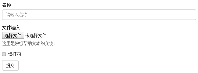
实例
<form role="form">

  <div class="form-group">

    <label for="name">名称</label>

    <input type="text" class="form-control" id="name" placeholder="请输入名称">

  </div>

  <div class="form-group">

    <label for="inputfile">文件输入</label>

    <input type="file" id="inputfile">

    <p class="help-block">这里是块级帮助文本的实例。</p>

  </div>

  <div class="checkbox">

    <label>

      <input type="checkbox">请打勾

    </label>

  </div>

  <button type="submit" class="btn btn-default">提交</button>

</form>
结果如下所示:
内联表单
如果需要创建一个表单,它的所有元素是内联的,向左对齐的,标签是并排的,请向 <form> 标签添加 class .form-inline。
实例
<form class="form-inline" role="form">

  <div class="form-group">

    <label class="sr-only" for="name">名称</label>

    <input type="text" class="form-control" id="name" placeholder="请输入名称">

  </div>

  <div class="form-group">

    <label class="sr-only" for="inputfile">文件输入</label>

    <input type="file" id="inputfile">

  </div>

  <div class="checkbox">

    <label>

      <input type="checkbox">请打勾

    </label>

  </div>

  <button type="submit" class="btn btn-default">提交</button>

</form>
结果如下所示:

- 默认情况下,Bootstrap 中的 input、select 和 textarea 有 100% 宽度。在使用内联表单时,您需要在表单控件上设置一个宽度。
- 使用 class .sr-only,您可以隐藏内联表单的标签。
水平表单
水平表单与其他表单不仅标记的数量上不同,而且表单的呈现形式也不同。如需创建一个水平布局的表单,请按下面的几个步骤进行:
- 向父 <form> 元素添加 class .form-horizontal。
- 把标签和控件放在一个带有 class .form-group 的 <div> 中。
- 向标签添加 class .control-label。
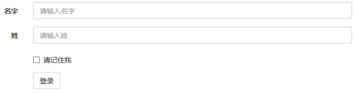
实例
<form class="form-horizontal" role="form">

  <div class="form-group">

    <label for="firstname" class="col-sm-2 control-label">名字</label>

    <div class="col-sm-10">

      <input type="text" class="form-control" id="firstname" placeholder="请输入名字">

    </div>

  </div>

  <div class="form-group">

    <label for="lastname" class="col-sm-2 control-label">姓</label>

    <div class="col-sm-10">

      <input type="text" class="form-control" id="lastname" placeholder="请输入姓">

    </div>

  </div>

  <div class="form-group">

    <div class="col-sm-offset-2 col-sm-10">

      <div class="checkbox">

        <label>

          <input type="checkbox">请记住我

        </label>

      </div>

    </div>

  </div>

  <div class="form-group">

    <div class="col-sm-offset-2 col-sm-10">

      <button type="submit" class="btn btn-default">登录</button>

    </div>

  </div>

</form>
结果如下所示:
支持的表单控件
Bootstrap 支持最常见的表单控件,主要是 input、textarea、checkbox、radio 和 select。
输入框(Input)
最常见的表单文本字段是输入框 input。用户可以在其中输入大多数必要的表单数据。Bootstrap 提供了对所有原生的 HTML5 的 input 类型的支持,包括:text、password、datetime、datetime-local、date、month、time、week、number、email、url、search、tel 和 color。适当的 type 声明是必需的,这样才能让 input 获得完整的样式。
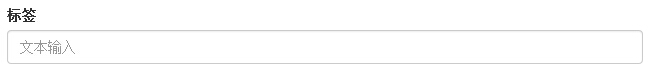
实例
<form role="form">

  <div class="form-group">

    <label for="name">标签</label>

    <input type="text" class="form-control" placeholder="文本输入">

  </div>

 </form>
结果如下所示:
文本框(Textarea)
当您需要进行多行输入的时,则可以使用文本框 textarea。必要时可以改变 rows 属性(较少的行 = 较小的盒子,较多的行 = 较大的盒子)。
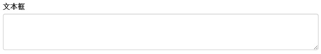
实例
<form role="form">

  <div class="form-group">

    <label for="name">文本框</label>

    <textarea class="form-control" rows="3"></textarea>

  </div>

</form>
结果如下所示:
复选框(Checkbox)和单选框(Radio)
复选框和单选按钮用于让用户从一系列预设置的选项中进行选择。
- 当创建表单时,如果您想让用户从列表中选择若干个选项时,请使用 checkbox。如果您限制用户只能选择一个选项,请使用 radio。
- 对一系列复选框和单选框使用 .checkbox-inline 或 .radio-inline class,控制它们显示在同一行上。
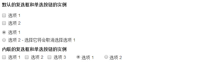
下面的实例演示了这两种类型(默认和内联):
实例
<label for="name">默认的复选框和单选按钮的实例</label>

<div class="checkbox">

    <label><input type="checkbox" value="">选项 1</label>

</div>

<div class="checkbox">

    <label><input type="checkbox" value="">选项 2</label>

</div>

<div class="radio">

    <label>

        <input type="radio" name="optionsRadios" id="optionsRadios1" value="option1" checked> 选项 1

    </label>

</div>

<div class="radio">

    <label>

        <input type="radio" name="optionsRadios" id="optionsRadios2" value="option2">选项 2 - 选择它将会取消选择选项 1

    </label>

</div>

<label for="name">内联的复选框和单选按钮的实例</label>

<div>

    <label class="checkbox-inline">

        <input type="checkbox" id="inlineCheckbox1" value="option1"> 选项 1

    </label>

    <label class="checkbox-inline">

        <input type="checkbox" id="inlineCheckbox2" value="option2"> 选项 2

    </label>

    <label class="checkbox-inline">

        <input type="checkbox" id="inlineCheckbox3" value="option3"> 选项 3

    </label>

    <label class="radio-inline">

        <input type="radio" name="optionsRadiosinline" id="optionsRadios3" value="option1" checked> 选项 1

    </label>

    <label class="radio-inline">

        <input type="radio" name="optionsRadiosinline" id="optionsRadios4"  value="option2"> 选项 2

    </label>

</div>
结果如下所示:
选择框(Select)
当您想让用户从多个选项中进行选择,但是默认情况下只能选择一个选项时,则使用选择框。
- 使用 <select> 展示列表选项,通常是那些用户很熟悉的选择列表,比如州或者数字。
- 使用 multiple="multiple" 允许用户选择多个选项。
下面的实例演示了这两种类型(select 和 multiple):
实例
<form role="form">

  <div class="form-group">

    <label for="name">选择列表</label>

    <select class="form-control">

      <option>1</option>

      <option>2</option>

      <option>3</option>

      <option>4</option>

      <option>5</option>

    </select>

    <label for="name">可多选的选择列表</label>

    <select multiple class="form-control">

      <option>1</option>

      <option>2</option>

      <option>3</option>

      <option>4</option>

      <option>5</option>

    </select>

  </div>

</form>
结果如下所示:

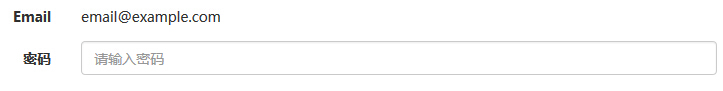
静态控件
当您需要在一个水平表单内的表单标签后放置纯文本时,请在 <p> 上使用 class .form-control-static。
实例
<form class="form-horizontal" role="form">

  <div class="form-group">

    <label class="col-sm-2 control-label">Email</label>

    <div class="col-sm-10">

      <p class="form-control-static">email@example.com</p>

    </div>

  </div>

  <div class="form-group">

    <label for="inputPassword" class="col-sm-2 control-label">密码</label>

    <div class="col-sm-10">

      <input type="password" class="form-control" id="inputPassword" placeholder="请输入密码">

    </div>

  </div>

</form>
结果如下所示:
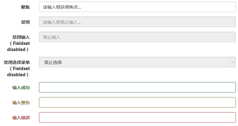
表单控件状态
除了 :focus 状态(即,用户点击 input 或使用 tab 键聚焦到 input 上),Bootstrap 还为禁用的输入框定义了样式,并提供了表单验证的 class。
输入框焦点
当输入框 input 接收到 :focus 时,输入框的轮廓会被移除,同时应用 box-shadow。
禁用的输入框 input
如果您想要禁用一个输入框 input,只需要简单地添加 disabled 属性,这不仅会禁用输入框,还会改变输入框的样式以及当鼠标的指针悬停在元素上时鼠标指针的样式。
禁用的字段集 fieldset
对 <fieldset> 添加 disabled 属性来禁用 <fieldset> 内的所有控件。
验证状态
Bootstrap 包含了错误、警告和成功消息的验证样式。只需要对父元素简单地添加适当的 class(.has-warning、 .has-error 或 .has-success)即可使用验证状态。
下面的实例演示了所有控件状态:
实例
<form class="form-horizontal" role="form">

  <div class="form-group">

    <label class="col-sm-2 control-label">聚焦</label>

    <div class="col-sm-10">

      <input class="form-control" id="focusedInput" type="text" value="该输入框获得焦点...">

    </div>

  </div>

  <div class="form-group">

    <label for="inputPassword" class="col-sm-2 control-label">禁用</label>

    <div class="col-sm-10">

      <input class="form-control" id="disabledInput" type="text" placeholder="该输入框禁止输入..." disabled>

    </div>

  </div>

  <fieldset disabled>

    <div class="form-group">

      <label for="disabledTextInput" class="col-sm-2 control-label">禁用输入(Fieldset disabled)</label>

      <div class="col-sm-10">

        <input type="text" id="disabledTextInput" class="form-control" placeholder="禁止输入">

      </div>

    </div>

    <div class="form-group">

      <label for="disabledSelect" class="col-sm-2 control-label">禁用选择菜单(Fieldset disabled)</label>

      <div class="col-sm-10">

        <select id="disabledSelect" class="form-control">

          <option>禁止选择</option>

        </select>

      </div>

    </div>

  </fieldset>

  <div class="form-group has-success">

    <label class="col-sm-2 control-label" for="inputSuccess">输入成功</label>

    <div class="col-sm-10">

      <input type="text" class="form-control" id="inputSuccess">

    </div>

  </div>

  <div class="form-group has-warning">

    <label class="col-sm-2 control-label" for="inputWarning">输入警告</label>

    <div class="col-sm-10">

      <input type="text" class="form-control" id="inputWarning">

    </div>

  </div>

  <div class="form-group has-error">

    <label class="col-sm-2 control-label" for="inputError">输入错误</label>

    <div class="col-sm-10">

      <input type="text" class="form-control" id="inputError">

    </div>

  </div>

</form>
结果如下所示:
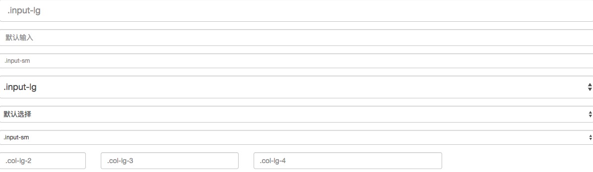
表单控件大小
您可以分别使用 class .input-lg 和 .col-lg-* 来设置表单的高度和宽度。下面的实例演示了这点:
实例
<form role="form">

  <div class="form-group">

    <input class="form-control input-lg" type="text" placeholder=".input-lg">

  </div>

  <div class="form-group">

    <input class="form-control" type="text" placeholder="默认输入">

  </div>

  <div class="form-group">

    <input class="form-control input-sm" type="text" placeholder=".input-sm">

  </div>

  <div class="form-group"></div>

  <div class="form-group">

    <select class="form-control input-lg">

      <option value="">.input-lg</option>

    </select>

  </div>

  <div class="form-group">

    <select class="form-control">

      <option value="">默认选择</option>

    </select>

  </div>

  <div class="form-group">

    <select class="form-control input-sm">

      <option value="">.input-sm</option>

    </select>

  </div>

  <div class="row">

    <div class="col-lg-2">

      <input type="text" class="form-control" placeholder=".col-lg-2">

    </div>

    <div class="col-lg-3">

      <input type="text" class="form-control" placeholder=".col-lg-3">

    </div>

    <div class="col-lg-4">

      <input type="text" class="form-control" placeholder=".col-lg-4">

    </div>

  </div>

</form>
结果如下所示:
表单帮助文本
Bootstrap 表单控件可以在输入框 input 上有一个块级帮助文本。为了添加一个占用整个宽度的内容块,请在 <input> 后使用 .help-block。下面的实例演示了这点:
实例
<form role="form">

  <span>帮助文本实例</span>

  <input class="form-control" type="text" placeholder="">

  <span class="help-block">一个较长的帮助文本块,超过一行,

  需要扩展到下一行。本实例中的帮助文本总共有两行。</span>

</form>
结果如下所示:

| 2.返回顶部 |
| 3.返回顶部 |
| 4.返回顶部 |
| 5.返回顶部 |
| 11.返回顶部 |
 |
作者:ylbtech 出处:http://ylbtech.cnblogs.com/ 本文版权归作者和博客园共有,欢迎转载,但未经作者同意必须保留此段声明,且在文章页面明显位置给出原文连接,否则保留追究法律责任的权利。 |
Bootstrap-CSS:表单的更多相关文章
- bootstrap -- css -- 表单控件
若干css样式 .form-control { display: block; width: 100%; height: 34px; padding: 6px 12px; font-size: 14p ...
- Bootstrap CSS 表单
表单布局 Bootstrap 提供了下列类型的表单布局: 垂直表单(默认) 内联表单 水平表单 垂直或基本表单 基本的表单结构是 Bootstrap 自带的,个别的表单控件自动接收一些全局样式.下面列 ...
- bootstrap CSS表单、按钮和字体图标
基础表单 <form role="form"> <div class="form-group"> <l ...
- Bootstrap之表单控件状态
Bootstrap中的表单控件状态主要有三种:焦点状态,禁用状态,验证状态. 一.焦点状态:该状态告诉用户可输入或选择东西 焦点状态通过伪类“:focus”以实现. bootstrap.css相应 ...
- BootStrap 智能表单系列 六 表单数据绑定(编辑页面的数据绑定)
本章介绍如何在生成表单后,将一个model的数据展示到form表单中(一般用于编辑页面) 代码如下(连接地址:https://github.com/xiexingen/Bootstrap-SmartF ...
- BootStrap 智能表单系列 七 验证的支持
但凡是涉及到用户编辑信息然后保存的页面,都涉及到一个数据是否符合要求的检查,需要客服端和服务器端的校验的问题: 客服端的校验主要是为了提高用户体验,而服务器端的校验为了数据的合格性 该插件也为您支持到 ...
- BootStrap 智能表单系列 四 表单布局介绍
表单的布局分为自动布局和自定义布局两种: 自动布局就是根据配置项中第二级配置项中数组的长度来自动使用不同的bootstrap栅格,通过设置autoLayout为true可以实现自动布局 自动以布局就是 ...
- BootStrap 智能表单系列 三 分块表单配置的介绍
相信广大博友肯定碰到过一个编辑页面分了很多块的情况,智能表单插件已经为您支持了这种情况, 代码如下(链接地址:https://github.com/xiexingen/Bootstrap-SmartF ...
- BootStrap 智能表单系列 二 BootStrap支持的类型简介
代码如下(链接地址:https://github.com/xiexingen/Bootstrap-SmartForm/blob/master/demo/form1-basic.html): <! ...
- bootstrap 基础表单 内联表单 横向表单
bootstrap 基础表单 内联表单 横向表单 <!DOCTYPE html> <html> <head> <title></title> ...
随机推荐
- 新闻:融资600万 他用一套系统优化15大HR工作场景 精简入转调离 月开通214家 | IT桔子
新闻:融资600万 他用一套系统优化15大HR工作场景 精简入转调离 月开通214家 | IT桔子 功劳说不上
- Spring启动流程
首先,对于一个web应用,其部署在web容器中,web容器提供其一个全局的上下文环境,这个上下文就是ServletContext,其为后面的spring IoC容器提供宿主环境: 其次,在web.xm ...
- SpringCloud中Redis的使用
1.引入redis相关jar包 <dependency> <groupId>org.springframework.boot</groupId> <artif ...
- weex splash页面
1.Splash.vue <!-- splash页面 --> <template> <div class="wrap" @focus="ro ...
- Android开发Tips(3)
欢迎Follow我的GitHub, 关注我的CSDN. 我会介绍关于Android的一些有趣的小知识点. 本文是第三篇, 其余第一篇, 第二篇. imageMogr2/auto-orient/stri ...
- HDU 1248 寒冰王座 (水题的N种做法!)(含完全背包)
寒冰王座 Time Limit: 2000/1000 MS (Java/Others) Memory Limit: 65536/32768 K (Java/Others)Total Submis ...
- 淘宝数据库OceanBase SQL编译器部分 源码阅读--生成物理查询计划
淘宝数据库OceanBase SQL编译器部分 源码阅读--生成物理查询计划 SQL编译解析三部曲分为:构建语法树,制定逻辑计划,生成物理执行计划.前两个步骤请参见我的博客<<淘宝数据库O ...
- c# 连接各种数据库 Access、Server等
1.C#连接连接Access程序代码: using System.Data;using System.Data.OleDb;..string strConnection="Provider= ...
- Linux fork函数具体图解-同一时候分析一道腾讯笔试题
原创blog.转载请注明出处 头文件: #include<unistd.h> #include<sys/types.h> 函数原型: pid_t fork( void); (p ...
- These interactions can be expressed as complicated, large scale graphs. Mining data requires a distributed data processing engine
https://databricks.com/blog/2014/08/14/mining-graph-data-with-spark-at-alibaba-taobao.html